New ESPN column today — here’s the link.
Meanwhile: Combine a boring blowout of a game, a high-def TV set, and the eagle eye of Joe Hilseberg, and what do you get? A serious uni-related revelation, as follows:
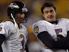
I’ve been thinking that the Ravens had changed the way their game jersey have been lettered by Reebok, but it wasn’t until I saw them play on Monday Night Football in HD that I could confirm it.
They’ve changed the order of the tackle twill layers. Normally, white or purple would be the top layer [depending on whether the number is for a home or road jersey], then the gold, and finally the black. This means the seamstress can sew the white/purple ahead of time (not attached to the jersey), then the entire number is placed on the jersey where the gold and the black are sewn.
But with this new technique, a gold outline is placed on top of the white/purple layer, which is then on top of the black. This means no sewing is done ahead of time. The entire number is put on the jersey, then both the inside and outside edges of the gold are sewn, and then the black. The white/purple layer is never sewn.
I have seen this technique before. I have a team-issued Maryland basketball jersey, made by Nike, that does the same thing with the lettering, but I don’t see the benefit in it. The only reason I can think of is that a seamstress is no longer necessary and they can go fully automated on an assembly line. The numbers could be computer-cut, applied to the jersey, and then sewn on by an embroidery machine that uses laser guides to make sure everything’s is lined up correctly. Eliminating the white/purple sewing process could speed up mass production, but it would be very troublesome for a small shop that customizes jerseys to replicate. I doubt any shop regularly uses this technique — not even NFLshop.com.
As many of you know, Joe used to work in the shop that does all the lettering for the Ravens and Orioles, so he knows what he’s talking about (plus you’ve gotta hand it to him for whipping up that little diagram). And as it happens, the folks at Liebe demonstrated this very technique for me when I visited them back in July. They were all proud of it and didn’t want me to talk about it, because they said it was a proprietary technique. Guess they’re not the only ones who’ve figured out how to do it.
Uni Watch News Ticker: High school sock-o-rama!: First, check out these, which are worn by El Modena High School in Orange, California (as spotted by Bryce Ashland). But that’s nothing compared to Laconia High in New Hampshire (great find by Erik Little). ”¦ Good primer on the role of red jerseys in Giants history here. As noted in the text, the Giants have previously paired the red jersey with both their home and away pants. They’ll be going with the aways this Sunday. And see that historical inset photo of Mel Hein, circa 1945? Here’s a larger version (dig that helmet!), plus a 1952 shot of Rosie Brown. ”¦ A huge variety of Pistons uniforms can be seen in this very short video clip (with thanks to Doug Mooney). ”¦ Here’s the latest on the Jaison Williams glove expletive story (with thanks to new Uni Watch bench coach Bryan Redemske). ”¦ Good spot by Jon Eisen, who notes that the cover photos for the Game of My Life book series all feature regular, non-Cool Flow helmets — except for the Dodgers entry. ”¦ Nice little gallery of old MLS logos here (with thanks to Mitchell Pinta).
I know we have all seen the pictures, but today the Rays officially unveil the new logo/unis/name.
link
I didn’t see the Dodger book/helmet from the ‘Game of My Life’ series on that Amazon page. I did notice that the Cubs helmet has a link instead of the embroidered one they actually wear.
Sorry that I couldn’t get a screen cap last night (juggling my 11 month old son at the time) but during last night’s Ohio U. vs. Akron game, they cut to a booth shoot of Reece Davis, Lou Holtz and Mark May. At one point, Mark May was trying to make a point and raised his left hand, which had a receiver’s glove on it.
His right hand was gloveless, but when he rose his left hand (that had been hidden behind Holtz) he was wearing a receiver’s glove.
Anyone else see (or hopefully capture) that?
[quote comment=”167553″]I didn’t see the Dodger book/helmet from the ‘Game of My Life’ series on that Amazon page. I did notice that the Cubs helmet has a link instead of the embroidered one they actually wear.[/quote]
im surprised that they used actual team helmets at all. i would have expected them to simply get a blank helmet template and adjust the color for the different teams and throw on a logo…
[quote comment=”167551″]I know we have all seen the pictures, but today the Rays officially unveil the new logo/unis/name.[/quote]
I’m going to the ceremony today in St. Pete. I’m going to take a bunch of photos — Paul, keep an eye out for an email.
[quote comment=”167555″]His right hand was gloveless, but when he rose his left hand (that had been hidden behind Holtz) he was wearing a receiver’s glove.
Anyone else see (or hopefully capture) that?[/quote]
I don’t have time to grab it, but the game’s on my DVR (I record all the Bobcat games) — I’ll try and snatch it up this afternoon.
My uni-related complaint there is that the Bobcats’ new screen-printed numbers look awful in HD during night games. So shiny. Augh.
Those old MLS logos are horrid. Why did the Galaxy once have a twirling squid for a logo?
Its good to see that most of the MLS teams have cleaned up their act and went more traditional.
Also, its generally a bad idea to have the sports equipment in the logo in my opinion.
Paul! This is what I’ve waited three hours for? I kid because I love. I will wait even more (im)patiently for the ESPN link.
Thanks for including the bit about the Giants’ history with red unis. I am going to have to consider adding red into my ‘all-black’ campaign–maybe, just the shoelaces in red–and the numbers. And names. Black and red. I like!
(from yesterday)
“I am too young to remember MLB before Interleague, but it seems natural to me, as the NBA, NHL, and NFL all play between the leagues evenly. I don’t mind it at all.”
Uh, no. The NBA, NHL, and NFL are each ONE league with two conferences. The NL and AL in baseball were, until pretty recently, truly two separate leagues, each with its own office, president, umpire staffs, official ball, administrative rules, and even playing rules. You couldn’t even make a player trade between leagues except during a fairly limited time window. And of course, they didn’t play each other at all except in the World Series, one of the things that made the Series pretty damn special and memorable, much more so than in other sports. Sadly, most of that has been lost. (The Super Bowl hasn’t been as good since the NFL-AFL merger, either. The Jets beating the Colts had a meaning that no Super Bowl today could have.)
I just saw some pictures of the Rays new uniforms (not photos, just mock ups), wow. Way to make the most borining team even more boring. Sure the uniforms before were awful, but this is terrible. It looks like some sort of Capt. Morrigan Parrot Bay liqour product. The Tampa Bay Coconut Rums.
With the Rays news jerseys being unveiled today….
LET THE COMPLAINING BEGIN!!!!
[quote comment=”167563″]I just saw some pictures of the Rays new uniforms (not photos, just mock ups), wow. Way to make the most borining team even more boring. Sure the uniforms before were awful, but this is terrible. It looks like some sort of Capt. Morrigan Parrot Bay liqour product. The Tampa Bay Coconut Rums.[/quote]
I haven’t seen that mock-up in a while, but as I recall it was a combination of link and link. Maybe they should have leaned more toward link to appeal to their fan base.
[quote comment=”167556″][quote comment=”167553″]I didn’t see the Dodger book/helmet from the ‘Game of My Life’ series on that Amazon page. I did notice that the Cubs helmet has a link instead of the embroidered one they actually wear.[/quote]
im surprised that they used actual team helmets at all. i would have expected them to simply get a blank helmet template and adjust the color for the different teams and throw on a logo…[/quote]
I think that’s exactly what they did.
The link uses the wrong logo – the link, not the link (or even the link, which would at least be closer).
[quote comment=”167567″][quote comment=”167556″][quote comment=”167553″]I didn’t see the Dodger book/helmet from the ‘Game of My Life’ series on that Amazon page. I did notice that the Cubs helmet has a link instead of the embroidered one they actually wear.[/quote]
im surprised that they used actual team helmets at all. i would have expected them to simply get a blank helmet template and adjust the color for the different teams and throw on a logo…[/quote]
I think that’s exactly what they did.
The link uses the wrong logo – the link, not the link (or even the link, which would at least be closer).[/quote]
exactly what I was going to post. Any do the helmets look ‘fake’ to anyone?
i forget who brought it up this weekend, but Wayne Rooney was wearing the compression shirt again instead of the long sleeve jersey yesterday.
[quote comment=”167571″][quote comment=”167567″][quote comment=”167556″][quote comment=”167553″]I didn’t see the Dodger book/helmet from the ‘Game of My Life’ series on that Amazon page. I did notice that the Cubs helmet has a link instead of the embroidered one they actually wear.[/quote]
im surprised that they used actual team helmets at all. i would have expected them to simply get a blank helmet template and adjust the color for the different teams and throw on a logo…[/quote]
I think that’s exactly what they did.
The link uses the wrong logo – the link, not the link (or even the link, which would at least be closer).[/quote]
exactly what I was going to post. Any do the helmets look ‘fake’ to anyone?[/quote]
The Helmets do look sort of fake and i was going to comment on the yankees helmet being the only right handed helmet in the list.
In case you’re wondering: Yes, I realize the site is behaving badly this morning. Our web-hosting company is aware of it (it’s not just us – it’s all of their clients) and working on it.
Yes, it’s frustrating. Even more for me than for you.
Paul,
Didn’t you say earlier in the season that Joe Skiba was trying to get league approval for something in regards to the giants red jersey? What happened to that?
PAUL,
As a University of Pittsburgh Panthers Football fan, I want to know your thoughts on the Pitt Panthers vintage Dan Marino era jerseys. i really miss them and think they should bring them back! The current uniforms suck!
On the tackle twill:
I’m the production manager for an ad-specialty/marketing firm. We do some tackle twill applications, namely badges for schwag like golf towels or to go on hats, jackets, etc. Have done some full front lettering for a company’s softball jerseys. (Wish I had a picture of these to send you because they were fully decked out, shoulder patches, captains “C”…)
I’ve made the nouveau Ravens type practice the standard here. 2 reasons:
1. When you laser the layers of twill they stick together because of the heat anyway. Peel out the middle of that top layer and you have a nice clean border all around. When you go to sew them (or sometimes heat press) them on they don’t shift.
2. The “scrap” material in the middle can come in handy for other applications some times. Companies love saving money, and if it’s a basic cut (as the interior of a letter or number would be) the guts of the border piece can be used on another product without addition material cost.
My personal non-money-wise take: I think the raised borders look better on three-plus layer twill anyways.
Are the link link of the old way or the new way?
Although I understand the difference in technique, I can’t really tell the difference visually. Can anyone shed some light on how to tell the differences? Perhaps a side-by-side comparison?
[quote comment=”167576″][quote comment=”167571″][quote comment=”167567″][quote comment=”167556″][quote comment=”167553″]I didn’t see the Dodger book/helmet from the ‘Game of My Life’ series on that Amazon page. I did notice that the Cubs helmet has a link instead of the embroidered one they actually wear.[/quote]
im surprised that they used actual team helmets at all. i would have expected them to simply get a blank helmet template and adjust the color for the different teams and throw on a logo…[/quote]
I think that’s exactly what they did.
The link uses the wrong logo – the link, not the link (or even the link, which would at least be closer).[/quote]
exactly what I was going to post. Any do the helmets look ‘fake’ to anyone?[/quote]
The Helmets do look sort of fake and i was going to comment on the yankees helmet being the only right handed helmet in the list.[/quote]
The publishers obviously don’t Get It and probably had no idea that there were a bunch of uni-geeks like us waiting to pick their artwork apart. Silly publishers.
Interesting blurb on the NYG red jersey. I knew there were rules regarding alternative versus throwback/vintage unis but I didn’t know it was so specific. I’m not surprised what with the way the NFL are control freaks of all things uni related.
The story makes me ask two questions:
1. Regarding “exact replica of early-era uniform”, wouldn’t the Steelers be in violation of this because of the black facemask instead of gray and the “STEELERS” instead of “STEEL” that was used on that helmet?
2. Is a team permitted to have both an alternate and a throwback? For instance, the Chargers updated the powder blue look and therefore it’s not a throwback. Would they still be permitted to wear the Lance Alworth-era style complete with numbers on the helmets if they wished?
[quote comment=”167575″]i forget who brought it up this weekend, but Wayne Rooney was wearing the compression shirt again instead of the long sleeve jersey yesterday.[/quote]
Yes, getting old. I wonder if he just found the link cumbersome. I think the new cut on the Nike long sleeve kits is more form fitting though. I like the fit of my Arsenal 3rd strip and I’m picky about my sleeves.
But the compression shirt just doesn’t look good. They need to at least tailor it to match the sleeve pattern on the actual kits.
[quote comment=”167583″]
2. Is a team permitted to have both an alternate and a throwback? For instance, the Chargers updated the powder blue look and therefore it’s not a throwback. Would they still be permitted to wear the Lance Alworth-era style complete with numbers on the helmets if they wished?[/quote]
My understanding is no. You don’t get to wear four different uniforms in the course of a 16-game season (which makes complete sense to me).
[quote comment=”167555″]Sorry that I couldn’t get a screen cap last night (juggling my 11 month old son at the time) but during last night’s Ohio U. vs. Akron game, they cut to a booth shoot of Reece Davis, Lou Holtz and Mark May. At one point, Mark May was trying to make a point and raised his left hand, which had a receiver’s glove on it.
His right hand was gloveless, but when he rose his left hand (that had been hidden behind Holtz) he was wearing a receiver’s glove.
Anyone else see (or hopefully capture) that?[/quote]
I didn’t see Mark May’s glove, but what caught my eye were the massively large uni numbers on the link
Man 0 Man, Giants in long sleeved reds, total perfection. BTW, there was an additional link that lead to the new stadium for the Jets and Gotham’s Giants. I checked them out and realized that the stadium is not going to have a retractible roof. Wasn’t that in the original plans so New York can host championships? or was I mislead. The new stadium looks too similar to their current, as per the pics on that site.
In regards to the Detroit Pistons uniform history video clip, one shot totally caught my attention. If memory serves me, Isiah never wore link in his career. Would make for an awesome bootleg throwback, however!
Apparently one of the reasons we Giant fans have to put up with the Red Jersey is Ernie Arcorsi. The first Giant game he saw was a game against the Eagles in Hershey PA and the Giants were wearing the red uniforms and beat the Eagles. The book GM claims Ernie made the decision for the Giants alternate to reflect that 1940’s team.
It’s really nice that you mention the “overlap” link (zoom on the number). I don’t agree with Joe Hilsberg, especially on the small shop issue. The thing is you get more accuracy when placing the last layer, and you can even prepare the numbers and letters before embroidery, heatpress them together if they have adhesive backing. You can also save the inside of the gold outline and use it for the home jersey, without wasting any tackle twill.
It’s also been seen on the Suns, the Cavs or the Pistons unis.
Anyone having troubleshoot with the page 2 video?
Marquette University had new uniforms made by Converse (Dwayne Wade). Not sure if Paul will have this up in the ESPN Column or not so here they are
Road
link
Home
link
They have a crazy powder blue alternate too, but i cant find pics anywhere.
[quote comment=”167578″]Paul,
Didn’t you say earlier in the season that Joe Skiba was trying to get league approval for something in regards to the giants red jersey? What happened to that?[/quote]
Not for this season.
Today’s ESPN column link.
[quote comment=”167558″]
Also, its generally a bad idea to have the sports equipment in the logo in my opinion.[/quote]
link link link link.
[quote comment=”167579″]PAUL,
As a University of Pittsburgh Panthers Football fan, I want to know your thoughts on the Pitt Panthers vintage Dan Marino era jerseys. i really miss them and think they should bring them back! The current uniforms suck![/quote]
I’m not Paul, but I miss the Pitt unis from the 70s & 80s.
Growing up watching the Backyard Brawl, it just doesn’t look right nowadays.
YINZ BRING BACK THE MUSTARD!!! ;0)
You guys should like this vintage link jersey.
the new flat gray home treatment for troy is awesome…
[quote comment=”167592″]Marquette University had new uniforms made by Converse (Dwayne Wade). Not sure if Paul will have this up in the ESPN Column or not so here they are
Road
link
Home
link
They have a crazy powder blue alternate too, but i cant find pics anywhere.[/quote]
Are they honoring Al McGuire this year, or is that AL lettering permanent?
[quote comment=”167587″][quote comment=”167555″]Sorry that I couldn’t get a screen cap last night (juggling my 11 month old son at the time) but during last night’s Ohio U. vs. Akron game, they cut to a booth shoot of Reece Davis, Lou Holtz and Mark May. At one point, Mark May was trying to make a point and raised his left hand, which had a receiver’s glove on it.
His right hand was gloveless, but when he rose his left hand (that had been hidden behind Holtz) he was wearing a receiver’s glove.
Anyone else see (or hopefully capture) that?[/quote]
I didn’t see Mark May’s glove, but what caught my eye were the massively large uni numbers on the link[/quote]
WHOA!!!! That’s REALLY big!!!
[quote comment=”167575″]i forget who brought it up this weekend, but Wayne Rooney was wearing the compression shirt again instead of the long sleeve jersey yesterday.[/quote]
Pretty sure Louis Saha was doing the same thing.
[quote comment=”167597″][quote comment=”167579″]PAUL,
As a University of Pittsburgh Panthers Football fan, I want to know your thoughts on the Pitt Panthers vintage Dan Marino era jerseys. i really miss them and think they should bring them back! The current uniforms suck![/quote]
I’m not Paul, but I miss the Pitt unis from the 70s & 80s.
Growing up watching the Backyard Brawl, it just doesn’t look right nowadays.
YINZ BRING BACK THE MUSTARD!!! ;0)[/quote]
any of you pittsburgh folk catch the pregame on monday night?
they had a camera outside primanti’s and then they went inside and showed a few sandwiches being made.(if youve ever eaten there, you know that the sandwich is a primanti’s, its too unique to confuse)
back to the studio and berman says something like, “making some roethlisburgers”. which kinda pissed me off because primanti’s doesnt have roethlisburgers, peppi’s does.
berman should have known better…
[quote comment=”167586″][quote comment=”167583″]
2. Is a team permitted to have both an alternate and a throwback? For instance, the Chargers updated the powder blue look and therefore it’s not a throwback. Would they still be permitted to wear the Lance Alworth-era style complete with numbers on the helmets if they wished?[/quote]
My understanding is no. You don’t get to wear four different uniforms in the course of a 16-game season (which makes complete sense to me).[/quote]
yeah…i had asked the same (sort of) question the other night with regard to the iggles wearing their alt-black jersey…i guess their wearing the heinous throwbacks earlier this year precluded their wearing the alternate blacks this season…and while not a fan of the alt black, it was far preferable to this
[quote comment=”167600″][quote comment=”167592″]Marquette University had new uniforms made by Converse (Dwayne Wade). Not sure if Paul will have this up in the ESPN Column or not so here they are
Road
link
Home
link
They have a crazy powder blue alternate too, but i cant find pics anywhere.[/quote]
Are they honoring Al McGuire this year, or is that AL lettering permanent?[/quote]
They have honored AL for the last few years….being a Badgers fan it looks kinda stupid
[quote comment=”167599″]the new flat gray home treatment for troy is awesome…[/quote]
Are you talking about the Troy University Trojans? Any pictures?
[quote comment=”167607″][quote comment=”167599″]the new flat gray home treatment for troy is awesome…[/quote]
Are you talking about the Troy University Trojans? Any pictures?[/quote]
Read Paul’s ESPN column. Link in comment #32.
[quote comment=”167596″][quote comment=”167558″]
Also, its generally a bad idea to have the sports equipment in the logo in my opinion.[/quote]
link link link link.[/quote]
Also the link link takes on the best teal-series logos and uniforms ever.
In reference to Florida wearing the system of dress in the ESPN article…In the one game they wore the system of dress last season, they played horribly against Tennessee. Later in the season, someone asked Joakim Noah about the jerseys and he said they would never wear them again because they are bad luck. But I can’t seem to find the story to confirm this online.
[quote comment=”167603″][quote comment=”167575″]i forget who brought it up this weekend, but Wayne Rooney was wearing the compression shirt again instead of the long sleeve jersey yesterday.[/quote]
Pretty sure Louis Saha was doing the same thing.[/quote]
link from yesterday.
Saha was wearing a long sleeve shirt. Can’t get a direct link but if you link and view picture 13 you can see it clearly. Also makes me wonder if Ronaldo is simply rolling his sleeves under or if he has a 3/4 shirt custom cut.
And is there another Shane??? I may have to go FNOP. (Full name on post)
[quote comment=”167592″]Marquette University had new uniforms made by Converse (Dwayne Wade). Not sure if Paul will have this up in the ESPN Column or not so here they are
Road
link
Home
link
They have a crazy powder blue alternate too, but i cant find pics anywhere.[/quote]
I like those. I think the colors on the shoulders (gold-road, blue-home) are a bit unnecessary, and I don’t care for the outlining around “Marquette”, but over all, they’re good.
[quote comment=”167591″]It’s really nice that you mention the “overlap” link (zoom on the number). I don’t agree with Joe Hilsberg, especially on the small shop issue. The thing is you get more accuracy when placing the last layer, and you can even prepare the numbers and letters before embroidery, heatpress them together if they have adhesive backing. You can also save the inside of the gold outline and use it for the home jersey, without wasting any tackle twill.
It’s also been seen on the Suns, the Cavs or the Pistons unis.
Anyone having troubleshoot with the page 2 video?[/quote]
I say that about small shops because a lot of them still “hand cut” the letters and numbers. Not everyone can afford custom cutters and laser guided embroidery machines. Hand cutting the inside portion of the outline layer is the most difficult part, and the inside number that is left behind will not be useable in most cases because you have to make an initial cut into the number to get your scissors in there…I’ve done it.
Also “You can also save the inside of the gold outline and use it for the home jersey” is incorrect because the left over gold number would be the same size as the white portion of the home jersey number, thus making it useless as an outline layer for the home, or away jersey.
Personally I think both styles look good, but I like seeing the sewing on each color level. I don’t care for this new technique as much because I’m viewing it from a small shop workflow stance, but I can see how it can be effective for mass production.
Scratch the Ronaldo speculation. He’s just pulling them up.
[quote comment=”167583″]Interesting blurb on the NYG red jersey. I knew there were rules regarding alternative versus throwback/vintage unis but I didn’t know it was so specific. I’m not surprised what with the way the NFL are control freaks of all things uni related.
The story makes me ask two questions:
1. Regarding “exact replica of early-era uniform”, wouldn’t the Steelers be in violation of this because of the black facemask instead of gray and the “STEELERS” instead of “STEEL” that was used on that helmet?
[/quote]
I wondered the same about the nameplates. It was cool to see the Eagles in their Yellow/Blues but the nameplates took away from the look. If you don’t know the players on your team by their number, then you don’t know your team.
[quote comment=”167585″][quote comment=”167575″]i forget who brought it up this weekend, but Wayne Rooney was wearing the compression shirt again instead of the long sleeve jersey yesterday.[/quote]
Yes, getting old. I wonder if he just found the link cumbersome. I think the new cut on the Nike long sleeve kits is more form fitting though. I like the fit of my Arsenal 3rd strip and I’m picky about my sleeves.
But the compression shirt just doesn’t look good. They need to at least tailor it to match the sleeve pattern on the actual kits.[/quote]
The answer is quite simple. As a Nike-sponsored guy (many are but he’s marquee), Nike gets to advertise TWO shirts on his back at once. If he wears a long sleeve, you don’t see the compression wear until the end of the game – and only if he takes off or swaps his shirt. This way, you know he’s got two on, and Nike gets to advertise their underwear by making it outerwear.
And yes, it looks much crappier than a traditional long sleeved version of the kit.
SB
I have a game-used Boston Bruins jersey, which has gold-black-gold three-layer lettering, and it’s actually just black with a yellow outline sewn on (and painted where it’s uneven), leaving a few millimeters of black on the outside edge to make another “layer”.
My amateur Japanese team does something even more exotic. The main lettering is made up of hundreds of thin chain-stitching-like strings, and then the border is embroidered — all the way around the eight-inch numbers! There’s no second layer of twill at all. It looks great but too many washings will create gaps as individual embroidered strings come off. I’m not sure which style I like more.
[quote comment=”167618″][quote comment=”167583″]Interesting blurb on the NYG red jersey. I knew there were rules regarding alternative versus throwback/vintage unis but I didn’t know it was so specific. I’m not surprised what with the way the NFL are control freaks of all things uni related.
The story makes me ask two questions:
1. Regarding “exact replica of early-era uniform”, wouldn’t the Steelers be in violation of this because of the black facemask instead of gray and the “STEELERS” instead of “STEEL” that was used on that helmet?
[/quote]
I wondered the same about the nameplates. It was cool to see the Eagles in their Yellow/Blues but the nameplates took away from the look. If you don’t know the players on your team by their number, then you don’t know your team.[/quote]
I never even thought of that. You really don’t need names to know your players. The Yankees and Penn State football are great examples of this.
I guess this is a case where an NFL rule would trump the replication of the uniform. In other words, because by rule you must have names on the jerseys, you have to follow that as the law of the land so to speak.
[quote comment=”167619″][quote comment=”167585″][quote comment=”167575″]i forget who brought it up this weekend, but Wayne Rooney was wearing the compression shirt again instead of the long sleeve jersey yesterday.[/quote]
Yes, getting old. I wonder if he just found the link cumbersome. I think the new cut on the Nike long sleeve kits is more form fitting though. I like the fit of my Arsenal 3rd strip and I’m picky about my sleeves.
But the compression shirt just doesn’t look good. They need to at least tailor it to match the sleeve pattern on the actual kits.[/quote]
The answer is quite simple. As a Nike-sponsored guy (many are but he’s marquee), Nike gets to advertise TWO shirts on his back at once. If he wears a long sleeve, you don’t see the compression wear until the end of the game – and only if he takes off or swaps his shirt. This way, you know he’s got two on, and Nike gets to advertise their underwear by making it outerwear.
And yes, it looks much crappier than a traditional long sleeved version of the kit.
SB[/quote]
I suppose, although there is no visible swoosh on the compression shirt, only when he takes off his kit at the end of the match is there a very small one just to the left of the collar.
Baseball GMs have decided that first and third base coaches will wear helmets (after the Mike Coolbaugh tragedy):
link
Today’s ESPN column is a good reminder that this is generally not a good period for college basketball uniforms.
I really have no idea what Kansas is thinking with that new font. Any time I hear phrases like “standardize the brand” in relation to uniforms, my eyes kind of glaze over.
I may be the minority, but those new Winthrop uniforms are gorgeous.
Paul, are you sure the Creighton jersey you linked to isn’t just a practice jersey? They played EA sports in that game and it was there only exhibition of the year. link shows different uniforms.
[quote comment=”167626″]Baseball GMs have decided that first and third base coaches will wear helmets (after the Mike Coolbaugh tragedy):
link[/quote]
This seems like an overreaction. This is the first such tragedy in many thousands of MLB and minor league games played over the past 100+ years, and the odds of a repeat are slim.
Aren’t players in the dugout at similar risk? And there are fans in many stadiums who are as close to home plate as the base coaches, right?
I won’t swear to this, but I thought that I read somewhere that wearing a helmet would not have saved Coolbaugh because of where the ball struck him. Does anyone else remember this?
Regardless, it is interesting that the article mentions that the type of helmet to be worn has not been decided. It would be fun to see the crazy inside liners return to use.
God the System of Dress is ugly. Ugly ugly ugly. Ugly.
Washington State looks pretty sharp, though.
[quote comment=”167633″][quote comment=”167626″]Baseball GMs have decided that first and third base coaches will wear helmets (after the Mike Coolbaugh tragedy):
link[/quote]
This seems like an overreaction. This is the first such tragedy in many thousands of MLB and minor league games played over the past 100+ years, and the odds of a repeat are slim.
Aren’t players in the dugout at similar risk? And there are fans in many stadiums who are as close to home plate as the base coaches, right?
I won’t swear to this, but I thought that I read somewhere that wearing a helmet would not have saved Coolbaugh because of where the ball struck him. Does anyone else remember this?
Regardless, it is interesting that the article mentions that the type of helmet to be worn has not been decided. It would be fun to see the crazy inside liners return to use.[/quote]
This is just like when the NHL put the nets up after the girl was killed in Columbus. Classic overreaction.
Paul, I’ve stared and stared at the link you linked to and I’m just not seeing the Texas A&M logo. To me it looks like ‘KD’, whatever that means.
[quote comment=”167633″][quote comment=”167626″]Baseball GMs have decided that first and third base coaches will wear helmets (after the Mike Coolbaugh tragedy):
link[/quote]
This seems like an overreaction. This is the first such tragedy in many thousands of MLB and minor league games played over the past 100+ years, and the odds of a repeat are slim.
Aren’t players in the dugout at similar risk? And there are fans in many stadiums who are as close to home plate as the base coaches, right?
[/quote]
Yes, but does it really hurt anything? If there’s a very small upside, and no downside, what’s the problem?
[quote comment=”167618″][quote comment=”167583″]Interesting blurb on the NYG red jersey. I knew there were rules regarding alternative versus throwback/vintage unis but I didn’t know it was so specific. I’m not surprised what with the way the NFL are control freaks of all things uni related.
The story makes me ask two questions:
1. Regarding “exact replica of early-era uniform”, wouldn’t the Steelers be in violation of this because of the black facemask instead of gray and the “STEELERS” instead of “STEEL” that was used on that helmet?
[/quote]
I wondered the same about the nameplates. It was cool to see the Eagles in their Yellow/Blues but the nameplates took away from the look. If you don’t know the players on your team by their number, then you don’t know your team.[/quote]
While I assume the throw-backs have to be generally the same, I am sure there are exceptions for current jersey requirements. Thus, even if the eagles wanted to go without nameplates to make the look “authentic”, I would assume the league requires they have nameplates.
AAARGH!!! Post eaten! Help!
[quote comment=”167640″][quote comment=”167633″][quote comment=”167626″]Baseball GMs have decided that first and third base coaches will wear helmets (after the Mike Coolbaugh tragedy):
link[/quote]
This seems like an overreaction. This is the first such tragedy in many thousands of MLB and minor league games played over the past 100+ years, and the odds of a repeat are slim.
Aren’t players in the dugout at similar risk? And there are fans in many stadiums who are as close to home plate as the base coaches, right?
[/quote]
Yes, but does it really hurt anything? If there’s a very small upside, and no downside, what’s the problem?[/quote]
I’ve got your downside – it could conceivably make a base coach complacent and less likely to watch the ball every time, increasing ever so subtly the possibility for a non-head-related injury.
Hey, the odds may be overwhelmingly against it, but so what? They’re also overwhelmingly against another base coach being seriously injured or killed by a batted ball….
[quote comment=”167633″][quote comment=”167626″]Baseball GMs have decided that first and third base coaches will wear helmets (after the Mike Coolbaugh tragedy):
link[/quote]
This seems like an overreaction. This is the first such tragedy in many thousands of MLB and minor league games played over the past 100+ years, and the odds of a repeat are slim.
Aren’t players in the dugout at similar risk? And there are fans in many stadiums who are as close to home plate as the base coaches, right?
I won’t swear to this, but I thought that I read somewhere that wearing a helmet would not have saved Coolbaugh because of where the ball struck him. Does anyone else remember this?[/quote]
i was under the impression that coolbaugh was hit in the neck. if coolbaugh would have been wearing a helmet he still would have been hit in the neck and died.
his injury is no different than if the ball had been hit fair and hit the pitcher in the neck.
[quote comment=”167641″]
While I assume the throw-backs have to be generally the same, I am sure there are exceptions for current jersey requirements. Thus, even if the eagles wanted to go without nameplates to make the look “authentic”, I would assume the league requires they have nameplates.[/quote]
Yes. Players are also required to wear full pads and modern helmets with their throwbacks.
[quote comment=”167640″][quote comment=”167633″][quote comment=”167626″]Baseball GMs have decided that first and third base coaches will wear helmets (after the Mike Coolbaugh tragedy):
link[/quote]
This seems like an overreaction. This is the first such tragedy in many thousands of MLB and minor league games played over the past 100+ years, and the odds of a repeat are slim.
Aren’t players in the dugout at similar risk? And there are fans in many stadiums who are as close to home plate as the base coaches, right?
[/quote]
Yes, but does it really hurt anything? If there’s a very small upside, and no downside, what’s the problem?[/quote]
There would be little downside to having hitters cover themselves with protective gear from head to toe, but no such mandate is in place, and the risks to hitters are much greater than they are to base coaches.
Let the coaches decide. If they would to wear protection, that would be fine. If they do not care to do so, then that would be fine as well.
I need help. I’m looking for a website where i can make customized button down baseball jerseys for my Wiffle ball team on the cheap. Yes, Wiffle ball. Any help would be greatly appreciated.
[quote comment=”167647″]
i was under the impression that coolbaugh was hit in the neck. if coolbaugh would have been wearing a helmet he still would have been hit in the neck and died.
his injury is no different than if the ball had been hit fair and hit the pitcher in the neck.[/quote]
Wow – link.
This makes it even more of an over-reaction.
[quote comment=”167639″]Paul, I’ve stared and stared at the link you linked to and I’m just not seeing the Texas A&M logo. To me it looks like ‘KD’, whatever that means.[/quote]
Looks like a link logo to me.
Compression-shirt-gate, part 2:
I’ve noticed at least two Bolton players sporting compression shirts under a short sleeve kit in the game they’re playing right now. Does Reebok not make a long sleeve version?
Still not a fan of this Bayern Munich black strip either.
[quote comment=”167654″][quote comment=”167639″]Paul, I’ve stared and stared at the link you linked to and I’m just not seeing the Texas A&M logo. To me it looks like ‘KD’, whatever that means.[/quote]
Looks like a link logo to me.[/quote]
It is the Texas A&M Logo. Look for the big T in the center first, and then flank it with the smaller A and M. It’s there.
[quote comment=”167652″]I need help. I’m looking for a website where i can make customized button down baseball jerseys for my Wiffle ball team on the cheap. Yes, Wiffle ball. Any help would be greatly appreciated.[/quote]
How much are you looking to spend per shirt? Number of shirts?
First I have to say that I was almost too excited to see my old high school (Laconia) featured on Uni Watch. Interesting story about the logo, since its placement on the socks is the reason for the coverage.
In the mid nineties the football team changed from a generic Indian head design to one drawn by a player on the team. It was based on the newly revealed “flying Elvis” Patriot’s logo and I could probably dig up a picture if people were really interested. Anyway, in my senior year (2002) there was a crackdown on Native American mascots, and that included the “flying Sachem” logo. The explanation was that he was gritting his teeth, which made him seem angry. So a student, who just happened to be another football player, was commissioned to draw a new logo as described by the protesters. The result was, at the artist’s admission, a terrible logo that didn’t work for sports teams at all so our team switched to “Sachems” in script, a little bit like the Florida Gators. After that they went to a Michigan-style helmet (for some odd reason), then to a block L.
I was back there a few weeks ago to observe my coach for a class and I asked him about the logo since I remember him suggesting it back when I was a senior. He informed me that he had been suggesting it every year since and kept getting shut down because of the feathers, so last season he decided to just put it on the helmets and see what happened. This year it became the school’s official athletic logo.
Again, not exactly sock related, but how many more times will I have an opening like this to talk about LHS?
[quote comment=”167626″]Baseball GMs have decided that first and third base coaches will wear helmets (after the Mike Coolbaugh tragedy):
link[/quote]
On a uniwatch note, will the coaches don the link, the link or the single ear flap? Glenallen Hill was a pioneer in the second half last year and postseason as he donned the link coaching first.
[quote comment=”167659″][quote comment=”167626″]Baseball GMs have decided that first and third base coaches will wear helmets (after the Mike Coolbaugh tragedy):
link[/quote]
On a uniwatch note, will the coaches don the link, the link or the single ear flap? Glenallen Hill was a pioneer in the second half last year and postseason as he donned the link coaching first.[/quote]
According to the article, they haven’t yet decided about the flaps.
[quote comment=”167657″][quote comment=”167652″]I need help. I’m looking for a website where i can make customized button down baseball jerseys for my Wiffle ball team on the cheap. Yes, Wiffle ball. Any help would be greatly appreciated.[/quote]
How much are you looking to spend per shirt? Number of shirts?[/quote]
I need 4 jerseys and I was planning on spending no more than about 40 each.
The Buckeyes have added a gray Frocks set.
link
link
Notice how the shorts are pretty much the link.
Maybe a good reason for UGA to link
[quote comment=”167663″]The Buckeyes have added a gray Frocks set.
link
link
Notice how the shorts are pretty much the link.[/quote]
What’s with the LeBron logo on the shirt?
[quote comment=”167659″][quote comment=”167626″]Baseball GMs have decided that first and third base coaches will wear helmets (after the Mike Coolbaugh tragedy):
link[/quote]
On a uniwatch note, will the coaches don the link, the link or the single ear flap? Glenallen Hill was a pioneer in the second half last year and postseason as he donned the link coaching first.[/quote]
That no-flap helmet looks so freakin’ cool. I mess those.
[quote comment=”167660″][quote comment=”167659″][quote comment=”167626″]Baseball GMs have decided that first and third base coaches will wear helmets (after the Mike Coolbaugh tragedy):
link[/quote]
On a uniwatch note, will the coaches don the link, the link or the single ear flap? Glenallen Hill was a pioneer in the second half last year and postseason as he donned the link coaching first.[/quote]
According to the article, they haven’t yet decided about the flaps.[/quote]
Thanks Paul. I know you will be able to break the news on this UniWatch moment as soon as it breaks.
Looks like the site is running smooth again..knock on wood..
[quote comment=”167654″][quote comment=”167639″]Paul, I’ve stared and stared at the link you linked to and I’m just not seeing the Texas A&M logo. To me it looks like ‘KD’, whatever that means.[/quote]
Looks like a link logo to me.[/quote]
I thought the same thing.
[quote comment=”167662″][quote comment=”167657″][quote comment=”167652″]I need help. I’m looking for a website where i can make customized button down baseball jerseys for my Wiffle ball team on the cheap. Yes, Wiffle ball. Any help would be greatly appreciated.[/quote]
How much are you looking to spend per shirt? Number of shirts?[/quote]
I need 4 jerseys and I was planning on spending no more than about 40 each.[/quote]
Try link…I don’t know how much they are charging for tackle twill lettering though…if you are just doing screen printing any local t-shirt shop can hook it up for under $40
Re: ESPN column…
New slogan for Wyoming basketball:
“What can brown do for you?”
(No, wait, that’s taken. Ummmm, how about:)
“We will make three attempts to deliver your package.”
Ran across link about items owned by former Reds manager Bill McKechnie going up for auction at the Fourth Annual Louisville Slugger Museum & Factory Auction.
The story says that the most valuable piece of his will be this beautiful link from his playing days.
Also up for auction is a link Too cool!
[quote comment=”167637″]This is just like when the NHL put the nets up after the girl was killed in Columbus. Classic overreaction.[/quote]
link
[quote comment=”167633″][quote comment=”167626″]Baseball GMs have decided that first and third base coaches will wear helmets (after the Mike Coolbaugh tragedy):
link[/quote]
This seems like an overreaction. This is the first such tragedy in many thousands of MLB and minor league games played over the past 100+ years, and the odds of a repeat are slim.
Aren’t players in the dugout at similar risk? And there are fans in many stadiums who are as close to home plate as the base coaches, right?
I won’t swear to this, but I thought that I read somewhere that wearing a helmet would not have saved Coolbaugh because of where the ball struck him. Does anyone else remember this?
[/quote]
True. It hit him below the ear, and tore an artery in his neck. Nevertheless, Rockies 1B coach Glenallen Hill wore a helmet the rest of the year. I agree, the requirement is an overreaction, but that’s the way society is going. Look at the NHL with the netting after that girl in Columbus was killed. Probably baseball will end up with all fielders wearing helmets and netting from dugout to dugout.
Take two on this one…. computer ate my previous post.
Loved the article on the Women’s Uniforms. They sure have come a long way. I remember the Old Dominion unis of the Nancy Lieberman Era with the square tops, and even remember our sister school still wearing tops that covered the shorts.
I still wonder what the Australian Women’s teams think about their uniforms (the unitards). I have heard some players say they are great – harder to grab onto for physical players. Others have said they love coming to the states to lose the unis.
Does anyone else remember the Liberty League – with the streamlined uniforms and 8 foot baskets?
To the present day…
I work with the University of Washington producing their Big Screen presentation, and we recently did a video shoot with the Women’s team. This season, they have a new set of uniforms from the Swoosh.
It actually uses up to three different fabrics including a vented mesh over the shoulders and outside a tback design on the back.
Also, they have become the first modern team in college hoops (that I know of) that have the NOB under the number. (I remember Marquette doing this in the 70s)
Many of the ladies said it makes perfect sense for the name to be underneath as many have long hair “and it was just covered up the old way.” I never thought of it that way.
The trim on the uniforms contains not only straight but angled lines, which looks like a fashion designer might have looked at before putting them on the uniforms. I say that because the lines are strategically placed so as to make each uniform look like it fits properly on each player. As with many women’s teams, there are people of all different sizes. In the case of the Huskies, we go from the very small Emily Florence (5-5) to Jess McCormack and Kali Bennett at 6-5. In each case, the lines are flattering to each woman – no lines cross where they look bad or make them look big or small. I was impressed by the detail.
The women’s unis seem to be a hit. The mens with the System of Dress, are getting mixed reviews – including some message boards and even a staff member to ask “What is the memorial band for?” There is no memorial band, but a single stripe across the left shoulder that from a distance, looks like a memorial band. It’s the only trim on the front of the jersey while a thin trim line separates the name from the number on the back.
Wish I had good pics for you, but I don’t know where to host the vid caps.
[quote comment=”167653″][quote comment=”167647″]
i was under the impression that coolbaugh was hit in the neck. if coolbaugh would have been wearing a helmet he still would have been hit in the neck and died.
his injury is no different than if the ball had been hit fair and hit the pitcher in the neck.[/quote]
Wow – link.
This makes it even more of an over-reaction.[/quote]
The article says the ball hit him in the base of the skull. Whether or not a helmet would have prevented the injury depends on the helmet type and the position of his head, but it wasn’t like he took it in the Adam’s apple.
is the front logo/wordmark/design sit really low on the Frocks for Jocks, or is it the really high collar line that throws it off? Or am I just seeing things?
The MLS “Retro Logos” page is interesting, but for some reason it omits the link logo and the link logo.
[quote comment=”167655″]Compression-shirt-gate, part 2:
I’ve noticed at least two Bolton players sporting compression shirts under a short sleeve kit in the game they’re playing right now. Does Reebok not make a long sleeve version?
Still not a fan of this Bayern Munich black strip either.[/quote]
If you look around the Premier League, you ‘ll see a lot of players wearing UnderArmour mock turtle neck cmpression shirts too. Of course, the UA logo is on the neck.
SB
[quote comment=”167646″][quote comment=”167640″][quote comment=”167633″][quote comment=”167626″]Baseball GMs have decided that first and third base coaches will wear helmets (after the Mike Coolbaugh tragedy):
link[/quote]
This seems like an overreaction. This is the first such tragedy in many thousands of MLB and minor league games played over the past 100+ years, and the odds of a repeat are slim.
Aren’t players in the dugout at similar risk? And there are fans in many stadiums who are as close to home plate as the base coaches, right?
[/quote]
Yes, but does it really hurt anything? If there’s a very small upside, and no downside, what’s the problem?[/quote]
I’ve got your downside – it could conceivably make a base coach complacent and less likely to watch the ball every time, increasing ever so subtly the possibility for a non-head-related injury.
Hey, the odds may be overwhelmingly against it, but so what? They’re also overwhelmingly against another base coach being seriously injured or killed by a batted ball….[/quote]
And look at Juan Encarnacion of the Cardinals, he is most likely going to lose his eyesight from being hit by a foul ball while waiting on deck. He WAS wearing a helmet when hit….I wonder if anyone had ever considered putting a clear face shield on the helmets, like hockey? Anyone here have any insight on that?
When I read System of Dress, my brain automatically melds it with System of a Down and I get System of a Dress. Seems to happen every time. Which is fitting, because as Paul points out on ESPN.com today, the result is a dress-like silhouette.
Look at Georgia Tech’s #31 in link. Look at the size of those shorts. They look exactly like the bloomers we saw the ladies wearing yesterday. It is one of those fashion things that looks off-kilter in it’s own time, and in the future we’ll look back and say “God, I never liked that but it really was terrible!” Like acid wash, only worse. They’ve been getting bigger for years, but we’ve reached the MC Hammer shorts era.
To me the weirdest shot of the new unis was one of a player sitting down for an interview and his shorts still went halfway down his shin.
Anyways, I am trying to prepare myself for the Nike System of Dress II, probably featuring tight shorts and baggy tops, that we will have to endure before they end up with something that looks like it fits.
(Please note, I am not calling for a return to the really link, but what was so wrong link?
The Buckeyes have added a gray Frocks set.
Jersey
Shorts
Notice how the shorts are pretty much the football pants.
What’s with the LeBron logo on the shirt?
With the success of the Lebron line of signature and team based shoes they dove into the uniform market last March, designing the new Ohio State System of Dress basketball gear for the tournament complete with Player(team )exclusive colorways of the Nike Zoom Lebron IV for Conley, Oden and company.
link
link
link
By the way, I was creating a Power Point presentation for my Design, Drawing for Production class on the Evolution of Design and I found a website that would have been useful a few days ago when we were discussing whose dome looks more like Gazoo from the Flintstones, Tom Brady, Peyton Manning, or the original:Mark Kelso.
link
And look at Juan Encarnacion of the Cardinals, he is most likely going to lose his eyesight from being hit by a foul ball while waiting on deck. He WAS wearing a helmet when hit….I wonder if anyone had ever considered putting a clear face shield on the helmets, like hockey? Anyone here have any insight on that?[/quote]
Look to link to lead the way.
I’m sure I’ve seen clear ones too.
SB
link is the inspiration for link
ok, I suck at the links,
He
link
is the Inspiration for these
link
Nice ESPN article! Did you have to show a picture of Juan Palacios with crutches, though? I know its par for the course, but what a downer.
Today is a good day for the Ray’s to unveil their new uniforms…this blog about bad basketball uni’s will keep it somewhat under the radar screen.
I agree with Paul…I hate the System of Dress. Let’s just call it SOD because they are uglier than DIRT.
I will give Marquette credit for the uniqueness, but hate the black straps.
I am probably in the minority, but despite all the Nike has ruined in the world (the Oregan football uniforms are enough for capital punishment)…I actually like the Nike “horns”.
I also HATE the Yellow C on UCLA. Developed by some no talent with too much time on their hands.
I like the new looks at Missouri State and Florida State.
[quote comment=”167666″][quote comment=”167663″]The Buckeyes have added a gray Frocks set.
link
link
Notice how the shorts are pretty much the link.[/quote]
What’s with the LeBron logo on the shirt?[/quote]
i am a big fan of the osu sod shorts, simply because they so closely mimic the football pants.
when osu went to sod last postseason, it was determined that they were to be the 1st collegiate “lebron” team. just like there are brand jordan teams.
i think reebok tried this when they had memphis in their stable. memphis was and I3 team (iverson).
I’m sad Maryland basketball changed their uniforms, but the new look ain’t too bad, but I still like the other one better.
[quote comment=”167633″][quote comment=”167626″]Baseball GMs have decided that first and third base coaches will wear helmets (after the Mike Coolbaugh tragedy):
link[/quote]
This seems like an overreaction. This is the first such tragedy in many thousands of MLB and minor league games played over the past 100+ years, and the odds of a repeat are slim.
Aren’t players in the dugout at similar risk? And there are fans in many stadiums who are as close to home plate as the base coaches, right?
I won’t swear to this, but I thought that I read somewhere that wearing a helmet would not have saved Coolbaugh because of where the ball struck him. Does anyone else remember this?
Regardless, it is interesting that the article mentions that the type of helmet to be worn has not been decided. It would be fun to see the crazy inside liners return to use.[/quote]
Over-reaction? Perhaps. Look what the NHL did a few years back by putting up the ‘safety netting’ over the glass behind the goals after the girl got hit in the head with a puck and died. Percentage of that happening was/is pretty slim, too. Same with pitchers getting hit by comebackers. Why not use the pitching cage to protect the pitcher during games? Not meaning to trivialize what happened, but no matter how much you try, you cannot eliminate all risk.
[quote comment=”167692″]I’m sad Maryland basketball changed their uniforms, but the new look ain’t too bad, but I still like the other one better.[/quote]
Agreed!
[quote comment=”167693″][quote comment=”167633″][quote comment=”167626″]Baseball GMs have decided that first and third base coaches will wear helmets (after the Mike Coolbaugh tragedy):
link[/quote]
This seems like an overreaction. This is the first such tragedy in many thousands of MLB and minor league games played over the past 100+ years, and the odds of a repeat are slim.
Aren’t players in the dugout at similar risk? And there are fans in many stadiums who are as close to home plate as the base coaches, right?
I won’t swear to this, but I thought that I read somewhere that wearing a helmet would not have saved Coolbaugh because of where the ball struck him. Does anyone else remember this?
Regardless, it is interesting that the article mentions that the type of helmet to be worn has not been decided. It would be fun to see the crazy inside liners return to use.[/quote]
Over-reaction? Perhaps. Look what the NHL did a few years back by putting up the ‘safety netting’ over the glass behind the goals after the girl got hit in the head with a puck and died. Percentage of that happening was/is pretty slim, too. Same with pitchers getting hit by comebackers. Why not use the pitching cage to protect the pitcher during games? Not meaning to trivialize what happened, but no matter how much you try, you cannot eliminate all risk.[/quote]
What everyone fails to forget with the tragic Coolbaugh incident is the fact that he was not hit in the head, he was hit in the neck. The force of the ball ruptured the main artery in his nexk cutting off the blood supply to his brain. It was a tragic, freak accident. The doctors who treated Coolbaugh said that if he was hit a half-inch to either side, he would have been OK. A helmet WOULD NOT have saved him.
[quote comment=”167681″][quote comment=”167646″][quote comment=”167640″][quote comment=”167633″][quote comment=”167626″]Baseball GMs have decided that first and third base coaches will wear helmets (after the Mike Coolbaugh tragedy):
link[/quote]
This seems like an overreaction. This is the first such tragedy in many thousands of MLB and minor league games played over the past 100+ years, and the odds of a repeat are slim.
Aren’t players in the dugout at similar risk? And there are fans in many stadiums who are as close to home plate as the base coaches, right?
[/quote]
Yes, but does it really hurt anything? If there’s a very small upside, and no downside, what’s the problem?[/quote]
I’ve got your downside – it could conceivably make a base coach complacent and less likely to watch the ball every time, increasing ever so subtly the possibility for a non-head-related injury.
Hey, the odds may be overwhelmingly against it, but so what? They’re also overwhelmingly against another base coach being seriously injured or killed by a batted ball….[/quote]
And look at Juan Encarnacion of the Cardinals, he is most likely going to lose his eyesight from being hit by a foul ball while waiting on deck. He WAS wearing a helmet when hit….I wonder if anyone had ever considered putting a clear face shield on the helmets, like hockey? Anyone here have any insight on that?[/quote]
This is where its heading.
I have been waiting for Maryland to update their uniforms for years. I love the new design, however the yello has got to go.
link
It is a shame they have never marketed the home white “swingman” version of the shorts. Only at their official online store can you find the white shorts and they are the screeb printed replicas.
I am also wondering why they haven’t become the flagship school for Under Armour-Basketball unless it has something to do with Gary William’s affiliations.
The lacrosse team has gone with UA for a few years now:
link
Re: Ravens Lettering
Many other NFL teams use this number/name application technique, including the Chargers, Bears and Vikings. Most if not all of the NBA jerseys are done in the same way. (Incidentally, none of the pre-lettered NFL or NBA retail authentics are lettered this way.)
I noticed this application trend starting to happen a couple years ago when I saw a Chargers game-used jersey up close. Also, in a playoff game a couple seasons ago, Kobe Bryant’s outer yellow border on the “Lakers” wordmark on his road jersey started falling off, and only a thick white layer was left exposed underneath. The Clippers home jerseys also use this process, though only on the wordmark and not on the numbers (for whatever reason).
My impression was and is that this new lettering technique is used to reduce the overall weight of the jersey. If you’ve ever held up a jersey with single-layer tackle twill as opposed to 3 or 4-layer tackle twill, it’s quite a difference! Of course, the benefits of using the new technique are probably minimal to nil, but we all know that the athletes (and the jersey manufacturers) are looking for any edge possible, however slight it may be.
No mention of Oregon’s basketball uni changes? Maybe the world is just tired of bringing up anything UO related anymore…
[quote comment=”167696″]This is where its heading.[/quote]
or maybe here?
As much as Paul dislikes purple, I adore all things Oregon Duck related and as far as my “intel” has helped me to observe, there are no visible changes. Now I realize that many of you have eagle eyes for just such subtleties, so take it easy on the newbie. What is interesting is that last year Eastbay sold all four versions of the Swingman Nike Elite versions of the shorts, (Lightning-Home/Alternate, White-Home, Forest-Road, Black-Road/Alternate). This year they have omitted the Forest and perhaps they are solely using the black for the road
link?
link
link
I know in the college football preview we talked about Temple having new helmets. In that article the decal word “Temple” on the helmet was one decal but according to link the letters are individual decals.
Sorry, this link to Eastbay should work:
link
The shorts are no longer mesh though, they seem to be more of a Dri-Fit material, which if you have ever worked out in, wicks sweat away from your body however after you’re done, the clothes smell awful…or maybe it’s just me!Hope not.
Also, how did Ball State get the new link helmet before other schools and pro teams?
The Temple helmet decals must be a p.i.t.a. to apply. Although, they have interesting “Finish” nose bumpers on what definitely appears to be the new Schutt Ion helmets. You can tell from the larger vent holes on the crown, however the telltale earhole design isn’t visible for that pic.
link
[quote comment=”167610″]In reference to Florida wearing the system of dress in the ESPN article…In the one game they wore the system of dress last season, they played horribly against Tennessee. Later in the season, someone asked Joakim Noah about the jerseys and he said they would never wear them again because they are bad luck. But I can’t seem to find the story to confirm this online.[/quote]
They didn’t wear S.o.D. unis against Tennessee. They were a gator print fabric, like the S.o.D. but the normal uniform cut
Apart from Ball State, I noticed a few of the Penn State defensive backs wearing the Schutt Ion last Saturday. I love the DNA but I think these look like the cheapo plastic helmets that come in those awful kid’s NFL Halloween costumes.
link
[quote comment=”167706″]The Temple helmet decals must be a p.i.t.a. to apply. Although, they have interesting “Finish” nose bumpers on what definitely appears to be the new Schutt Ion helmets. You can tell from the larger vent holes on the crown, however the telltale earhole design isn’t visible for that pic.
link
Thats just a schutt air helmet, the ion is much different, see the pic above of that ball state player. Also as an fyi the DNA has jagged vent holes
I actually think they were SOD, but they ordered them in larger sizes so they would not fit as tight.
Also, how did Ball State get the new ION helmet before other schools and pro teams?
By the way, is it just me or do the Indiana uniforms in the background look off? The helmets look to be a deeper shade of red than the !
[quote comment=”167705″]Also, how did Ball State get the new link helmet before other schools and pro teams?[/quote]
I know I am quoting myself here but I also noticed that this is the first time I have seen the ION helmet being used with the new chinstrap system that goes through the facemask.
[quote comment=”167707″][quote comment=”167610″]In reference to Florida wearing the system of dress in the ESPN article…In the one game they wore the system of dress last season, they played horribly against Tennessee. Later in the season, someone asked Joakim Noah about the jerseys and he said they would never wear them again because they are bad luck. But I can’t seem to find the story to confirm this online.[/quote]
They didn’t wear S.o.D. unis against Tennessee. They were a gator print fabric, like the S.o.D. but the normal uniform cut[/quote]
you’re wrong it was SOD
Chad G., I’m sorry. I called the Temple helmet the Ion. I meant to call it the Air XP.
link
Julius Jones has been wearing it for the Cowboys as well as Shockey with the Giants.
[quote comment=”167716″]Chad G., I’m sorry. I called the Temple helmet the Ion. I meant to call it the Air XP.
link
Julius Jones has been wearing it for the Cowboys as well as Shockey with the Giants.[/quote]
Matt, it’s probably just the AIR, the AIR and the AIR XP have the same crown
[quote comment=”167662″][quote comment=”167657″][quote comment=”167652″]I need help. I’m looking for a website where i can make customized button down baseball jerseys for my Wiffle ball team on the cheap. Yes, Wiffle ball. Any help would be greatly appreciated.[/quote]
How much are you looking to spend per shirt? Number of shirts?[/quote]
I need 4 jerseys and I was planning on spending no more than about 40 each.[/quote]
Email me with exactly what you need, I’ll see what I can do.
shane.a.nicholson at gmail.com
RE: Maryland basketball unis
The “checkerboard” that Paul refers to in the column is an homage to the black-and-gold checkerboard pattern on the Maryland flag:
link
Little-known Maryland athletic fact: the school colors are not red and white, but red and white and black and gold, because of the colors on the state flag. This is why, despite one poster’s wish, Maryland is never going to ditch the “yellow” altogether. All of the Maryland uniforms, regardless of sport, have some combination of those four colors. Sometimes one predominates more than others — for example, I think the football team played a game last year in all-black uniforms — but the numbers/trim/etc. will somehow combine so that the full uni features all four.
Many Maryland loyalists are quite partial to the gold basketball uniforms that they wore during the Len Bias era. I tend to go back and forth on them, myself.
Just a small correction for the ESPN article. Unfortunately Syracuse didn’t make the NCAA Tourney last year. They did wear the Frocks for Jocks uni’s in the Big East and NIT Tournaments.
[quote comment=”167589″]In regards to the Detroit Pistons uniform history video clip, one shot totally caught my attention. If memory serves me, Isiah never wore link in his career. Would make for an awesome bootleg throwback, however![/quote]
He didn’t – they switched away from the lightning bolts in time for his rookie season. They wore them again a couple times in 2005.
[quote comment=”167670″][quote comment=”167654″][quote comment=”167639″]Paul, I’ve stared and stared at the link you linked to and I’m just not seeing the Texas A&M logo. To me it looks like ‘KD’, whatever that means.[/quote]
Looks like a link logo to me.[/quote]
I thought the same thing.[/quote]
Yeah, I thought it was a big “KD” at first, but if you look at it for awhile, it is an A&M logo, particulary link one. In the Gillispie picture, the light makes it look different.
Here are th all-balck Maryland uniforms, which could have only looked better had they had yellow accents on the cleats.
link;
I was too young to have been a fan at the time of Lenny Bias, therefore I really never appreciated his talent or the very admirable, timeless love for him and his era by Maryland fans
[quote comment=”167702″]As much as Paul dislikes purple, I adore all things Oregon Duck related and as far as my “intel” has helped me to observe, there are no visible changes. Now I realize that many of you have eagle eyes for just such subtleties, so take it easy on the newbie. What is interesting is that last year Eastbay sold all four versions of the Swingman Nike Elite versions of the shorts, (Lightning-Home/Alternate, White-Home, Forest-Road, Black-Road/Alternate). This year they have omitted the Forest and perhaps they are solely using the black for the road
link?
link
link
You know what, I think you’re right. Actually, I know you’re right…since it’s your ‘job’. Sorry. I guess I just don’t remember the black unis much last year so I figured they were redesigned and new. Friggin black…joke! Although UO’s unis aren’t as bad as some others, they could be so much better. I really miss the one’s from 3 years ago. Simple, true to color, unique. How hard is that??
[quote comment=”167652″]I need help. I’m looking for a website where i can make customized button down baseball jerseys for my Wiffle ball team on the cheap. Yes, Wiffle ball. Any help would be greatly appreciated.[/quote]
customink.com
Sorry again, here is that link to the Maryland all-blacks:
Impressions after reading Paul’s article:
[1] GREAT research job (as always)
[2] I like the link color of the Troy unis over the link from last year…but I can’t get past the hideous font in the “TroJanS” wordmark.
[3] I am deeply disturbed at my alma mater’s decision to switch to the link link link.
Third times a charm, Maryland all-blacks:
link
*sigh* my post got eaten. please help!
[quote comment=”167719″]RE: Maryland basketball unis
The “checkerboard” that Paul refers to in the column is an homage to the black-and-gold checkerboard pattern on the Maryland flag:
link
Little-known Maryland athletic fact: the school colors are not red and white, but red and white and black and gold, because of the colors on the state flag. This is why, despite one poster’s wish, Maryland is never going to ditch the “yellow” altogether. All of the Maryland uniforms, regardless of sport, have some combination of those four colors. Sometimes one predominates more than others — for example, I think the football team played a game last year in all-black uniforms — but the numbers/trim/etc. will somehow combine so that the full uni features all four.
Many Maryland loyalists are quite partial to the gold basketball uniforms that they wore during the Len Bias era. I tend to go back and forth on them, myself.[/quote]
during the len bias era, maryland wore
link
link
link
and link
uniforms
check out this youtube of bias.
link
for those of you who never got to see bias play, he was something special.
as a lifelong tarheel fan and jordan fan, this man was an absolutely amazing player and had no equal in college.
he was air jordan before air jordan.
[quote comment=”167682″]
(Please note, I am not calling for a return to the really link, but what was so wrong link?[/quote]
Man, I hate it when I click on a link that says “really old days,” and it’s not from something like 1910 or 1930, but from when I was in high school. :-)
[quote comment=”167719″]RE: Maryland basketball unis
The “checkerboard” that Paul refers to in the column is an homage to the black-and-gold checkerboard pattern on the Maryland flag:
link
Little-known Maryland athletic fact: the school colors are not red and white, but red and white and black and gold, because of the colors on the state flag. This is why, despite one poster’s wish, Maryland is never going to ditch the “yellow” altogether. All of the Maryland uniforms, regardless of sport, have some combination of those four colors. Sometimes one predominates more than others — for example, I think the football team played a game last year in all-black uniforms — but the numbers/trim/etc. will somehow combine so that the full uni features all four.
Many Maryland loyalists are quite partial to the gold basketball uniforms that they wore during the Len Bias era. I tend to go back and forth on them, myself.[/quote]
There is no greater state flag in the country than Maryland’s. I may be biased as I grew up there. I wish the football team had helmets with the black and gold Calvert crest pattern on one side and the red and white Crossland crest pattern on the other. Would it be busy and loud? Yes. Would it be unique. Yes!
[quote comment=”167724″]I was too young to have been a fan at the time of Lenny Bias, therefore I really never appreciated his talent or the very admirable, timeless love for him and his era by Maryland fans[/quote]
here’s what bill simmons wrote about lenny on the 20th anniversary of his passing…
Nothing about Lenny Bias was contrived. He went out of his way to dunk on people. He grabbed rebounds and spat out an occasional “Arrrrrrggggggghhhh!” for show. He barked at his teammates, he barked at referees, he barked at opponents. He exhibited a refreshingly honest amount of passion and heart.
Quite simply, he stood out. And if he had arrived on the scene seven or eight years later, I’m sure he would have been wearing baggy shorts and woofing it up just like everyone else, but that’s the beautiful thing about this — not just that Bias arrived when he did, but that he wasn’t contrived.
that about sums up his play and his ‘tude…he was awesum…it’s scary to think how many more championships the celts may have won…unfortunately, there was also this…
Sometimes I see white. That’s a pile of cocaine on a coffee table. Maybe it happened this way, maybe it didn’t, but I always imagine Lenny Bias turning that Celtics hat around so the bill of his cap wouldn’t dip into the pile … then I imagine him sticking his face into it like Tony Montana. He’s happy, he’s celebrating, he’s kicking butt and taking names, he’s feeling like he could bench-press Luther Vandross, he’s the life of the party, he’s suddenly a millionaire, he’s the next James Worthy, he’s the heir apparent to Bird in Boston, his prime awaits, and he’s utterly and completely invincible. And he crams his face into that white pile. And he takes the Celtic Dynasty with him.
There is no greater state flag in the country than Maryland’s. I may be biased as I grew up there. I wish the football team had helmets with the black and gold Calvert crest pattern on one side and the red and white Crossland crest pattern on the other. Would it be busy and loud? Yes. Would it be unique. Yes!
I wholeheartedly endorse this position (it’s why I wrote in with the trivia about the checkerboard and the colors and all that) and, yes, I may be biased because I grew up there too. But Maryland is on that short list of states that have wonderful, unique, distinctive flags, and I love how the U. of Maryland has paid tribute to the flag in its various uni designs.
I don’t know if I am on board for the dueling-pattern helmets suggested here. What I will say is that I can’t stand the current helmets with the script “Terps” on them. The black helmets with the M-and-flag pennant logo were the best thing, by far, of the dark days of the pre-Friedgen era of Maryland football.
[quote comment=”167690″][quote comment=”167666″][quote comment=”167663″]The Buckeyes have added a gray Frocks set.
link
link
Notice how the shorts are pretty much the link.[/quote]
What’s with the LeBron logo on the shirt?[/quote]
i am a big fan of the osu sod shorts, simply because they so closely mimic the football pants.
when osu went to sod last postseason, it was determined that they were to be the 1st collegiate “lebron” team. just like there are brand jordan teams.
i think reebok tried this when they had memphis in their stable. memphis was and I3 team (iverson).[/quote]
I love the shorts! Granted, I am a buckeye fan, but I love the idea of tying a school’s various sports uniforms together with common design aspects. If they incorporated that same striping into the collar, it would be amazing. And to clear it up ahead of time, I am not endorising the SOD, merely this kit’s design. Go Bucks.
Also, what other examples can we think of where different sports from the same school used such similar designs? I seem to remember other sports at Michigan using their helemt design at one time. Thoughts?
Let’s not forget that many base coaches at the major league level are gentlemen in their 50s and 60s whose reflexes are not quite as sharp as they were when they were playing. (No calling ageism on me – I’m 49, and my reflexes are surely not what they were 20 years ago).
Can we protect everything and everyone? Of course not. That is no reason not to protect what we can without overly diminishing the game, and I can’t for the life of me see how Sandy Alomar Sr. wearing a helmet diminishes the game in any way.
[quote comment=”167738″]
There is no greater state flag in the country than Maryland’s. I may be biased as I grew up there. I wish the football team had helmets with the black and gold Calvert crest pattern on one side and the red and white Crossland crest pattern on the other. Would it be busy and loud? Yes. Would it be unique. Yes![/quote]
That would be absolutely amazing as a helmet; the Maryland flag is fantastic anyway, and they already use the checkerboard pattern a lot in a variety of uniforms. Busy, yes, but there would be nothing like it in the world.
I love the Florida State feather pattern.
[quote comment=”167737″][quote comment=”167682″]
(Please note, I am not calling for a return to the really link, but what was so wrong link?[/quote]
Man, I hate it when I click on a link that says “really old days,” and it’s not from something like 1910 or 1930, but from when I was in high school. :-)[/quote]
Haha, sorry. Don’t worry, my time is coming.
[quote comment=”167551″]I know we have all seen the pictures, but today the Rays officially unveil the new logo/unis/name.
link
What’s with the “Rays presented by St. Petersburg Times”.
Are teams allowed to be corporately sponsored to that level?
Ugh!
Man I am so utterly disappointed in link. The team always sucked, but their most recent jerseys were, seriously, my favorite in the league. That shade of green was awesome, the font, everything. And even the “Devil Ray” is a cool mascot, I mean anything that can kill Steve Irwin has to be badass (too soon?). The new jerseys are so boring…and man…being named after Sun beams? Seriously? I mean they just made themselves the biggest bitch team in sports. I’m a Mariners fan, but am actually upset that people could be this stupid.
[quote comment=”167738″]
There is no greater state flag in the country than Maryland’s. [/quote]
Wrongo.
link
It would be pretty cool if the Giants actually wore that 1940’s throwback uni with the brown pants and winged helmet.
[quote comment=”167689″]I agree with Paul…I hate the System of Dress. Let’s just call it SOD because they are uglier than DIRT.
Lay off the SOD hatred, granted it can screw up some jerseys:Cuse’, Miami’s, The Yellow Maryland jersey, but look some of the better SOD jerseys :tOSU (compared to last year’s original) and of course the UNC jerseys (then again you can’t really F*** that look up, unless you count the Guthridge Days with the interlocking NC, he got them to the Final Four, but that’s no excuse for ugly ass-ed jerseys).
I live in TX but I admit the MD flag is better, slightly better, only slightly
[quote comment=”167750″][quote comment=”167738″]
There is no greater state flag in the country than Maryland’s. [/quote]
Wrongo.
link
Texas’ is just the biggest…not necessarily the best.
[quote comment=”167697″]I have been waiting for Maryland to update their uniforms for years. I love the new design, however the yello has got to go.
link
It is a shame they have never marketed the home white “swingman” version of the shorts. Only at their official online store can you find the white shorts and they are the screeb printed replicas.
I am also wondering why they haven’t become the flagship school for Under Armour-Basketball unless it has something to do with Gary William’s affiliations.
The lacrosse team has gone with UA for a few years now:
link
I’ve been wishing and searching for the twill white Maryland shorts my whole life, I wish they made them too brother
Cutting Edge Sports in Woburn, MA letters jerseys that way too. They do the work for the NHL’s Capitals, Panthers, a few other teams, plus a bunch of teams in the AHL. If you see a closeup picture of a number or letter on a game worn Caps jersey with the blue/bronze/black color scheme, you can definitely notice that the middle color is an outline sewn on top.
Between the NC Carolina Jerseys and the Jamal Crawford era Michigan M jerseys, I don’t know which was worse.
link
link
Paul, just a note on the ESPN article…Winthrop actually wore link link last year.
The year before, Winthrop wore link.
One reason I know the “old” uniforms you linked to are at least that old is that you linked to a picture of James Shuler, who graduated two years ago (and who, by the way, was one of the scariest dudes you’d ever meet at a distance, but when you got to know him, he was pretty chill.)
[quote comment=”167564″]With the Rays news jerseys being unveiled today….
LET THE COMPLAINING BEGIN!!!![/quote]
For a team that plays in a dome with a fixed roof, I just don’t get why the new logo has sunrays all over it. On that note, I really liked their previous black & green style. Green isn’t used enough in pro sports uniforms anymore.
You saw Crawford in the UofM gear. Here’s Eddie Cota in the UNC atrocity:
link
[quote comment=”167754″][quote comment=”167750″][quote comment=”167738″]
There is no greater state flag in the country than Maryland’s. [/quote]
Wrongo.
link
Texas’ is just the biggest…not necessarily the best.[/quote]
what??? no love for the link
…sigh
I apologize, the Jamal Crawford era lasted just shorter than it took me to type this post.
[quote comment=”167759″][quote comment=”167564″]With the Rays news jerseys being unveiled today….
LET THE COMPLAINING BEGIN!!!![/quote]
For a team that plays in a dome with a fixed roof, I just don’t get why the new logo has sunrays all over it. On that note, I really liked their previous black & green style. Green isn’t used enough in pro sports uniforms anymore.[/quote]
Green in Pro Sports:
MLB: Oakland A’s
NBA: Sonics, Celtics
NFL: Packers, Jets, Eagles
NHL: Wild, Stars
So long Devil Rays
If you want to wear green and look good, I guess you need to have good secondary colors, too
I know they”re not necessarily a pro team, but how can you leave out the Incredibly innovative, yet sometimes gaudy mother of all uniforms?
link
[quote comment=”167766″]I know they”re not necessarily a pro team, but how can you leave out the Incredibly innovative, yet sometimes gaudy mother of all uniforms?
link
I was so close to including them, but I did have them on my mind believe me
[quote comment=”167760″]You saw Crawford in the UofM gear. Here’s Eddie Cota in the UNC atrocity:
link
Why????
*relives nightmares, crawls in the fetal position*
Seriously while those Michigan jersey were bad. really, really, bad. The UNC uniforms (and I use the term loosely) were just…VILE!!!
And while were on ACC teams, I know what the black bars are for (and it’s appreciated!) but seriously why are they in different places on other teams jerseys, this goes for football and basketball, they could’ve done that differently, black strap on the shoulders or heel a ribbon patch like we got on the football jersey. I’m not knocking it , I’m just sayin’ it could’ve a bit better
And before someone says they could’ve not done it at all. I repeat I’m not knocking it, i’m just sayin’…..
[quote comment=”167763″][quote comment=”167759″][quote comment=”167564″]With the Rays news jerseys being unveiled today….
LET THE COMPLAINING BEGIN!!!![/quote]
For a team that plays in a dome with a fixed roof, I just don’t get why the new logo has sunrays all over it. On that note, I really liked their previous black & green style. Green isn’t used enough in pro sports uniforms anymore.[/quote]
Green in Pro Sports:
MLB: Oakland A’s
NBA: Sonics, Celtics
NFL: Packers, Jets, Eagles
NHL: Wild, Stars
So long Devil Rays
If you want to wear green and look good, I guess you need to have good secondary colors, too[/quote]
And for the Stars the Green is barely existent anymore
Louisville is going with black pants this evening in Morganhole.
Gold on gold and white on black. Ick.
[quote comment=”167761″][quote comment=”167754″][quote comment=”167750″][quote comment=”167738″]
There is no greater state flag in the country than Maryland’s. [/quote]
Wrongo.
link
Texas’ is just the biggest…not necessarily the best.[/quote]
what??? no love for the link
…sigh[/quote]
In my unbiased (did not include my home state) opinion the 5 best looking state flags include link, link, link, link and link. Honorable mention goes to link.
Does anyone else find it strange that link is wearing Uni’s made by Adidas that are the same design that Miami wore in the linkand linkwore last year that is clearly a nike template?
[quote comment=”167775″]Does anyone else find it strange that link is wearing Uni’s made by Adidas that are the same design that Miami wore in the linkand linkwore last year that is clearly a nike template?[/quote]
so does New Mexico
[quote comment=”167769″][quote comment=”167763″][quote comment=”167759″][quote comment=”167564″]With the Rays news jerseys being unveiled today….
LET THE COMPLAINING BEGIN!!!![/quote]
For a team that plays in a dome with a fixed roof, I just don’t get why the new logo has sunrays all over it. On that note, I really liked their previous black & green style. Green isn’t used enough in pro sports uniforms anymore.[/quote]
Green in Pro Sports:
MLB: Oakland A’s
NBA: Sonics, Celtics
NFL: Packers, Jets, Eagles
NHL: Wild, Stars
So long Devil Rays
If you want to wear green and look good, I guess you need to have good secondary colors, too[/quote]
And for the Stars the Green is barely existent anymore[/quote]
Also, Milwaukee Bucks.
The chest piping is very similar however I fyou look closely at the side trim on the jersey and pants, there are major differences. With the “Canes” uniforms the jersey piping continued down into the pants a la the Broncos.
link
link
Oh and by the way, I would assume that the consensus on The Hawai”i uniforms is disgust because of the monochromatic feature, I do think they”re unique. I could be mistaken, but I do believe that they were one of the first teams to go with the all blacked out padding, chin straps, and nose bumpers.
link
link
In the second pic, check out his mock turtleneck. Nike was making their uniforms at the time! Uh,oh.
Checking out the Michigan basketball gear reminded me of a scoop I read about on Niketalk about two months ago. As of this year, Nike’s all sports contract with Ann Arbor is ending and a new partnership with Adidas is starting. It was a very sad day for me when I read those words considering my first true uniform obsession, and I mean OBSESSION was with these gorgeous sets:
link
link
The braintrust in Beaverton would be wise to issue high quality retro Fab-Five gear this year while they still can. Loyal subjects, like myself would be first in line.
The tiny “M” logo just doesn’t get it done for me!
link
Sorry this link should work:
link
[quote comment=”167781″]The chest piping is very similar however I fyou look closely at the side trim on the jersey and pants, there are major differences. With the “Canes” uniforms the jersey piping continued down into the pants a la the Broncos.
link
link
Oh and by the way, I would assume that the consensus on The Hawai”i uniforms is disgust because of the monochromatic feature, I do think they”re unique. I could be mistaken, but I do believe that they were one of the first teams to go with the all blacked out padding, chin straps, and nose bumpers.
link
link
In the second pic, check out his mock turtleneck. Nike was making their uniforms at the time! Uh,oh.[/quote]
Matt, I’m not saying that they are exactly the same as Miami’s, I’m just saying they are made with the same template. Go to niketeam.com and play with the custom uniform creator (that template should be under oregon state, or corvalis I believe) the piping patterns can be modified within a template. Also if NMSU had been wearing white pants the piping would have matched.
West Virginia is in solid gold uniforms. Might need some sunglasses.
Good call, Chad, I believe Colorado has a modified version of that template this year as well.
link
However, their authentics have a 3M type of reflective material outlining the numbers. There was a post last week concerning them with a great night time game pic.
link
As rough as watching West Virginia is right now, it’s going to be fun tomorrow. You know Paul is going to unload on these guys.
[quote comment=”167785″]West Virginia is in solid gold uniforms. Might need some sunglasses.[/quote]
IT’S AWFUL! MY EYES!!
Monochromatics should be considered a worse sin than Oregon has ever committed!
link
Maybe not!
This was absolutely gorgeous though:
link
I was googling Mid 90″s Oregon uniforms and look what my eyes hath uncovered:
link
[quote comment=”167786″]Good call, Chad, I believe Colorado has a modified version of that template this year as well.
link
However, their authentics have a 3M type of reflective material outlining the numbers. There was a post last week concerning them with a great night time game pic.
link
Colorado actually has a template that is new this year for nike. It is not yet included on the niketeam.com cusyomizer. Other teams with brand new nike templates that aren’t on niketeam yet are Miami’s and Oregon States.
I was googling Mid 90″s Oregon uniforms and look what my eyes hath uncovered:
link…
I’ll take guesses as to what the WR stands for on his helmet.
If it’s what I think it is, I believe that he misunderstood the term wide receiver
really ugly unis link
Good call, Chad, I believe Colorado has a modified version of that template this year as well.
link…
However, their authentics have a 3M type of reflective material outlining the numbers. There was a post last week concerning them with a great night time game pic.
link…
Colorado actually has a template that is new this year for nike. It is not yet included on the niketeam.com cusyomizer. Other teams with brand new nike templates that aren’t on niketeam yet are Miami’s and Oregon States.
No worries, Chad. I seemed to have found Nike’s template for the Beavers unis:
link
[quote comment=”167790″]I was googling Mid 90″s Oregon uniforms and look what my eyes hath uncovered:
link
Damn!!! I thought i was a load at 6’6″ 325, but geez, I feel kinda skinny now (It’s superficial, I know, but you know what, maybe them chicks in Hollywood, should look at that pic, and get over their “issues”)
That may have brightened my night more than the West Virginia jerseys.
I think the same firm that designed the Rays new jerseys must have been a fan of these incredibly boring getups:
link
I was googling Mid 90″s Oregon uniforms and look what my eyes hath uncovered:
link…
Damn!!! I thought i was a load at 6′6″ 325, but geez, I feel kinda skinny now (It’s superficial, I know, but you know what, maybe them chicks in Hollywood, should look at that pic, and get over their “issues”)
That may have brightened my night more than the West Virginia jerseys.
Do you think the guys at Nike had our “wide receiver” in mind when they created the “Frocks for jocks” as our esteemed leader calls them?
Lemme re-phrase that, before who knows someone who is anorexic gets on my case, i don’t need anymore Uni-Watch unrelated uni-squabbles. It is a serious disease. It’s just kinda sad, that someone could have that mindset about themselves. I’m just saying I’m big but I’m active enough to not worry, and if i’m not worried, anexoria shouldn’t either, but that’s my take..
Erin Andrews just said “chest”. That made my night!
*that’s anexoric people shouldn’t worry. I’m dumbing out right now
And if i didnt say it before….. Damn those WVU jerseys!!!!
West Virginia’s solid Gold/Yellow’s make link look positively beautiful
[quote comment=”167800″]Erin Andrews just said “chest”. That made my night![/quote]
that could make any man’s night!!!That or Ashley Judd in a Kentucky cheerleader uniforms (You gotta love that, no matter what your affiliation.)
My apologies for bringing up our husky friend as well as the Erin Andrews comment. In my excitement to post, I neglected to remember what a reputable community this is. I would never want to tarnish the good name of Uni-Watch. It will not happen again, you have my word.
West Virginia’s solid Gold/Yellow’s make Oregon’s look positively beautiful
Oregon doesn’t need any help in that department
Long live the Belotti Bold of Autzen
[quote comment=”167787″]As rough as watching West Virginia is right now, it’s going to be fun tomorrow. You know Paul is going to unload on these guys.[/quote]
Louisville isn’t much worse! Those black pants with the red stripes and red socks to go with white tops and helmet look awful.
[quote comment=”167804″]My apologies for bringing up our husky friend as well as the Erin Andrews comment. In my excitement to post, I neglected to remember what a reputable community this is. I would never want to tarnish the good name of Uni-Watch. It will not happen again, you have my word.[/quote]
Same Here, but to be fair, I’ve read worse…on the comments section. But yeah, I got caught in it too, my fault.
er, make that–
Louisville isn’t much better.
I think the Mountaineers would look much better with black cleats and either black or navy blue socks. Even short black socks with black spat
[quote comment=”167805″]West Virginia’s solid Gold/Yellow’s make Oregon’s look positively beautiful
Oregon doesn’t need any help in that department
Long live the Belotti Bold of Autzen[/quote]
Uh, Belotti Bold, not so much, I can live with the rest, the numbers just throw me off…
[quote comment=”167567″][quote comment=”167556″][quote comment=”167553″]I didn’t see the Dodger book/helmet from the ‘Game of My Life’ series on that Amazon page. I did notice that the Cubs helmet has a link instead of the embroidered one they actually wear.[/quote]
im surprised that they used actual team helmets at all. i would have expected them to simply get a blank helmet template and adjust the color for the different teams and throw on a logo…[/quote]
I think that’s exactly what they did.
The link uses the wrong logo – the link, not the link (or even the link, which would at least be closer).[/quote]
Why can’t the Yankees pick one logo and stick with it? Geez.
Maybe it’s just me, but I basically think of these three teams in the same mold.
link
link
link
Good god, West Virgina looks terrible. Thing is, Louisville looks even worse. They have white tops, black pants, red socks, AND MOST ANNOYING OF ALL they have red handwarmers around their waists, which looks really screwy with the red socks and black pants. Very annoying.
Ugh, this game is crucially cruel on the eyes, not just ’cause Louisville is getting spanked. (At This point.)
[quote comment=”167813″]Good god, West Virgina looks terrible. Thing is, Louisville looks even worse. They have white tops, black pants, red socks, AND MOST ANNOYING OF ALL they have red handwarmers around their waists, which looks really screwy with the red socks and black pants. Very annoying.[/quote]
Are you kidding me? Both teams look absolutely awesome. I love the Gold Rush and the Blakc Pants for L’VILLE
What a pleasure to watch
[quote comment=”167788″][quote comment=”167785″]West Virginia is in solid gold uniforms. Might need some sunglasses.[/quote]
IT’S AWFUL! MY EYES!![/quote]
IT BURNS! IT BURNS!
WHOA!!!! That’s REALLY big!!![/quote]
Thats what SHE said
I know we have all seen the pictures, but today the Rays officially unveil the new logo/unis/name.
The Tampa Bay PadRays…boring and listless just like the entire Rays organization. Snoozerama.
Clean and classic//Code for buttass dull.
The Mississippi RiverKings hockey team will be wearing “building-themed” jerseys for a promotional night that incorportates bricks, 2x4s, and paintbrush strokes, as well as an altered team logo.
link, and a drawing of the jersey can be seen on the rotating slideshow of news topics on the home page of the website.
[quote comment=”167822″][quote comment=”167788″][quote comment=”167785″]West Virginia is in solid gold uniforms. Might need some sunglasses.[/quote]
IT’S AWFUL! MY EYES!![/quote]
IT BURNS! IT BURNS![/quote]
no kiddin…i just got back from the gym, and im SOOOO glad i didn’t bother to DVR this game
hey…question…
whut’s the difference between l’ville and cheerios?
[quote comment=”167754″][quote comment=”167750″][quote comment=”167738″]
There is no greater state flag in the country than Maryland’s. [/quote]
Wrongo.
link
Texas’ is just the biggest…not necessarily the best.[/quote]
From a design point of view, there’s nothing really special about the Texas flag. Maybe not as boring as the multitude of blue flags with state crest, but not that much different from North Carolina. My 5 are California, New Mexico, Maryland, Wyoming, Ohio.
I’m not a big fan of Louisville’s combo here tonight, but I must admit I like West Virginia’s all gold look. I think they looked better with the navy/gold/navy look, though.
I want to see them try out the navy/gold/white combo!
Wow. Positively the ugliest football game I’ve ever seen.
[quote comment=”167845″]Wow. Positively the ugliest football game I’ve ever seen.[/quote]
Just wait ’til the Oregon-Oregon State game. Sartorial fireworks!
is it just me or did tampa’s baseball team go from the swimming type of rays to the sun kind of rays???
Looking at the new Rays jerseys… they didn’t go totally new on that design. I still see a patch of a “ray”, as in the underwater species, on the left arm. So much for a new and fresh identity.
I do however like the hats. They have kinda a retro feel. But not.
[quote comment=”167848″]is it just me or did tampa’s baseball team go from the swimming type of rays to the sun kind of rays???[/quote]
it’s not just you
from the press release:
A yellow sunburst that Rays principal owner Stuart Sternberg said was made to represent the Florida sunshine twinkles toward the top of the “R,” and there is a patch of a ray on the uniform’s sleeve.
the florida sunshine no one in the trop will ever see
From the Rays website…
“The new colors are unique within Major League Baseball. The Rays worked closely with MLB on the design, and also conducted internal research with employees, fans and local leaders.”
Unique? Really? Dark blue is unique? What did they say to MLB? “We really want to look more like the Padres”?
[quote comment=”167794″]really ugly unis link
That is horrible…it’s just trying to say that “we are soo happy” it should be called the “Gays”!
[quote comment=”167750″][quote comment=”167738″]
There is no greater state flag in the country than Maryland’s. [/quote]
Wrongo.
link
What’s this ? Chile ?
[quote comment=”167682″]
Look at Georgia Tech’s #31 in link. Look at the size of those shorts. They look exactly like the bloomers we saw the ladies wearing yesterday. It is one of those fashion things that looks off-kilter in it’s own time, and in the future we’ll look back and say “God, I never liked that but it really was terrible!” Like acid wash, only worse. They’ve been getting bigger for years, but we’ve reached the MC Hammer shorts era.
[/quote]
Georgia Tech is a Russell school, those are not system of dress uniforms. Just really big shorts.
[quote comment=”167846″][quote comment=”167845″]Wow. Positively the ugliest football game I’ve ever seen.[/quote]
Just wait ’til the Oregon-Oregon State game. Sartorial fireworks![/quote]
Oh dear. Sports Bras vs. Tire Treads. I’m expecting Craigslist HDTV sales to skyrocket that week because of all the people who don’t want to see that
The Rangers went without nameplates tonight.
[quote comment=”167789″]Monochromatics should be considered a worse sin than Oregon has ever committed!
link
Maybe not!
This was absolutely gorgeous though:
link
love the rose bowl logos on the shoulders for some reason. never seen that before.
[quote comment=”167872″][quote comment=”167846″][quote comment=”167845″]Wow. Positively the ugliest football game I’ve ever seen.[/quote]
Just wait ’til the Oregon-Oregon State game. Sartorial fireworks![/quote]
Oh dear. Sports Bras vs. Tire Treads. I’m expecting Craigslist HDTV sales to skyrocket that week because of all the people who don’t want to see that[/quote]
I wold say it’s more link than tire tread. Ugly nonetheless.
As a Devil Rays fan (I know), I’m really, really p!ssed right now. I actually emailed them months ago warning them not to change the name to Rays. They have been brutal since they came into the league, why not make a clean break from the past and go with a totally new name? And if anyone saw the St Pete Saints and Tampa Tarpons uniforms they wore in the past 2 years, you know they can make wonderful uniforms. So I’d like to say a big f*ck you to Saul Steinberg & Co.
[quote comment=”167885″]The Rangers went without nameplates tonight.[/quote]
I link (look closely at Betts).
[quote comment=”167987″][quote comment=”167885″]The Rangers went without nameplates tonight.[/quote]
I link (look closely at Betts).[/quote]
link
[quote comment=”167763″][quote comment=”167759″][quote comment=”167564″]With the Rays news jerseys being unveiled today….
LET THE COMPLAINING BEGIN!!!![/quote]
For a team that plays in a dome with a fixed roof, I just don’t get why the new logo has sunrays all over it. On that note, I really liked their previous black & green style. Green isn’t used enough in pro sports uniforms anymore.[/quote]
Green in Pro Sports:
MLB: Oakland A’s
NBA: Sonics, Celtics
NFL: Packers, Jets, Eagles
NHL: Wild, Stars
So long Devil Rays
If you want to wear green and look good, I guess you need to have good secondary colors, too[/quote]
You forgot the Vancouver Canucks. They probably have the best hue of green than anyone else.
[quote comment=”167581″]
Although I understand the difference in technique, I can’t really tell the difference visually. Can anyone shed some light on how to tell the differences? Perhaps a side-by-side comparison?[/quote]
[quote comment=”167580″]On the tackle twill:
To those interested, we use the term “kiss cut” in the industry for that outlined layer. As one user said it uses less material. This is true, it makes the garments lighter and they hold less moisture. It’s also used on two-color applications more regularly than is obvious.[/quote]