Aside from conference logos and the like, it’s not often that you see two players on different teams wearing the same jersey patch. But that’s the case with Kansas State’s Ian Campbell and Army’s Mike Viti. What are they wearing? A Kansas State fan who prefers to remain anonymous explains:
K-State is very near Fort Riley, home of the Big Red One and now the 28th Infantry, known as the Black Lions. The football team has been partnering with them in several ways since Coach Ron Prince arrived last year. The latest is the Black Lion Award, which traditionally has been given to high schools all over the country. It is currently given to only two universities: the U.S. Military Academy at West Point and, now, Kansas State.
What is the award? It honors Don Holleder, a West Point All-American who was asked (and agreed) to change positions his senior year despite losing any chance at individual honors. He later was killed in Vietnam while attempting to rescue other members of his unit — the Black Lions. The award is given to one player each year who represents this unselfishness, courage, leadership, and the act of putting the team before the individual.
When you win the award, you get a certificate and also a jersey patch. Our winner at K-State this year was Ian Campbell, a very successful defensive end for us who’d been asked (and agreed) to change positions for this year. He will be wearing a Black Lions patch on his jersey all season. In addition, coach Prince has been wearing a Black Lion collar pin.
Interesting stuff. But listen, while I’m sure all the recipients of this award have been very deserving, could someone please explain exactly what’s so remarkable about changing positions when your coach tells you to? Like, isn’t that what you’re supposed to do? Just askin’.
Iggles Exposed as Dangerous Left-Wing Radicals: As has been discussed here several times, last Sunday’s Eagles throwbacks were based on the Philly city flag, which was in turn based on the colors of the Swedish national flag — or at least that’s what I thought. But reader Jonathan Nussbaum has just contributed some new insights, courtesy of a recent lecture in his American history class:
In 1933, one of the first acts of the New Deal was to establish the National Recovery Administration, which sought to stem unemployment by coordinating prices and wages in certain industries. Participation was voluntary, and companies who did participate would display the Blue Eagle symbol of the NRA.
That year, over 250,000 people marched in Philadelphia to support the NRA. Lud Wray and Bert Bell, who had just bought and resurrected a Philadelphia football team, were so inspired that they named the team the Eagles in honor of that Blue Eagle symbol. The blue and yellow on the NRA symbol happened to match the city flag, so that is how the team’s uniform was designed.
Big thanks to Jonathan for that insight. Now let’s sit back and see how many malcontents complain about the New Deal reference constituting “inappropriate political content” on the site.
(Oh, and speaking of the Eagles’ throwbacks, they’re the basis for a little video rant currently running on Yahoo Sports.)

Raffle Reminder: You’ve got until Tuesday, 10 p.m. eastern, to get in on the raffle for the game-used futuristic Royals jersey. To enter, send an e-mail to uniraffle at earthlink dot net (please note that this is not the usual Uni Watch address). One e-mail per person, but everyone enrolled in the Uni Watch membership program at the time of the drawing automatically gets three bonus entries. I’ll announce the winner next Wednesday.
Membership News: We had a software glitch yesterday on the membership roster. I’ll spare you the details, but the practical result is that about 90 enrollees got wiped off the page. We are (read: John is) restoring them, but it may take a few days, so don’t be alarmed if you suddenly don’t see your name listed. Actually, that brings up a question I’ve been pondering: I know people like to keep up with the latest additions to the card design gallery, but does anyone even look at the membership roster? Or do you just check it once to see that your name is there and then never look at it again? Just wonderin’.
Uni Watch News Ticker: As you can see at the top of the page, we have a new sponsor, Jersey-Joe, which is offering a discount to Uni Watch readers. A fine operation that I’m proud to have represented on the site, just like our other display advertisers. Check out their stuff. ”¦ The Hornets unveiled a new alternate logo yesterday — not bad. It will be worn as a patch on the team’s uniforms and will be called — wait for it — the Fleur de Bee. Read-it-to-believe-it details here. ”¦ Who knew there was an NFL Alumni logo? (Robert Eden did, actually.) ”¦ UGA linebacker Dannell Ellerbe’s helmet has gone askew or come off completely several times this year, so he plans to wear a different helmet model this weekend (with thanks to Brent Hardman). ”¦ Amazing case of logo creep discovered by Andy Head: “My wife is taking an online business course through a local community college, and she just got her textbook yesterday. Look what’s on the cover! And the spine, too! I thought, well, surely the author is somehow connected to that company, but no, she’s a proffessor at Lehigh U. Well, maybe there’s a major Nike business case discussed inside, right? It’s a business book, so they are discussed, but the sections on, say Starbucks and Wal-Mart are much, much more substantial.” Incredible. ”¦ Not hard to guess what Sunday’s Open Thread photo will be, because New Mexico State will be wearing pink tomorrow. ”¦ Throwbacks aren’t limited to sports: James Yeh reports that the Navy is testing some old-school khakis that haven’t been used since the Vietnam era. ”¦ Jason Marquis’s helmet logo was AWOL on Wednesday night (with thanks to Ryan Kendall). ”¦ Spectacular article here on the varied styles of pinstriping. Although written with the collectors’ market in mind, it’s filled with worthwhile info for any Uni Watch reader — highly recommended (with thanks to Todd Radom, who sent me the link over a month ago but it got buried in my in-box until I discovered it yesterday — sorry, Todd!). ”¦ The Astros have been wearing their brick red road jerseys on the road for months now, because owner Drayton McLane prefers them. But last night was the final road game of Craig Biggio’s career, so the team honored his request to wear the road grays one last time. A team source tells me they had to make road jerseys for all the September call-ups — just for this one game. ”¦ Speaking of the ’Stros, Brian Crisp attended a recent game at Minute Maid park and noticed that the ushers had ad patches on their right sleeves. And what was the ad for? Here’s a closer look. “And just so you don’t think it is a coincidence, that dealership is owned by THE Alex Rodriguez,” says Brian. “It’s a good thing he doesn’t own dealerships in Boston. Can you think of another active player sponsoring another team?” … The Vikings will be wearing 1970s throwbacks this Sunday. ”¦ Yusuke Toyoda notes that Chivas de Guadalajara has been wearing off-center uni numbers. ”¦ Here’s a better (i.e., non-Photoshopped) look at the new Iowa State helmet (with thanks to James Ferguson). … By the time you read this, I’ll be headed upstate for a long-weekend getaway on the lovely shores of Lake Seneca. Vince will be minding the store until Monday, so if you have any site-related issues (spam filter acting up, abusive commenters, etc.), let him know. Ticker contributions can still come to me. See you Monday.
The Fort Wayne Komets (IHL) have a “design a jersey” link.
Lake Seneca? Are you sure you don’t mean Seneca Lake, one of the Finger Lakes?
I grew up in Ithaca, on the South end of Cayuga Lake, or as I like to call it, the ‘Middle Finger’ Lake.
I read through the New Mexico State press release a few times, and I don’t think it actually says the the players will wear pink. The coaches will wear pink shirts, the fans will be encourage to wear pink, and there will be pink ribbons painted on the field. But I haven’t found anything about the on-field attire.
Maybe pink zebra stripes for the refs?
Only Drayton McLane would think those Astros brick, sand and black uniforms look nice. I can’t wait until he sells the team. maybe then the Astros under a new owner will look and play like a real team.
I’m not too sure I like the Chargers’ uniforms. The yellow bolt may be bordered by navy and powder blue, but on distant shots their white helmets look almost logoless. As much as I detest dark colors, the dark blue helmets looked better. I do wish the Chargers would turn things around and make powder blue their primary color and use the navy as a trim color.
Hmm. I wonder if those cars from A-Rod’s dealership come with chokes?
ed
Anybody see SportsCenter or the Mets game last night? Pedro Martinez changed his jersey in the middle of the game! The stats showed he pitched better after that. Anyone know why he switched?
Not that it mattered. The Mets continued one of history’s biggest choke jobs.
[quote comment=”149160″]Anybody see SportsCenter or the Mets game last night? Pedro Martinez changed his jersey in the middle of the game! The stats showed he pitched better after that. Anyone know why he switched?
Not that it mattered. The Mets continued one of history’s biggest choke jobs.[/quote]
I was watching the Cardinals version of the broadcast and they said that Pedro was having problems with the buttons coming undone on the first jersey.
Why do people hate the red Astros jerseys so much? I like them — that color hadn’t been used by any other teams when they introduced it (I wish the Phillies still had it), and it’s nicer-looking than dull, featureless gray.
I’ve never understood why people like gray so much in these pajama-pants days. Forty years ago, when every player showed colored socks, and the gray was that “heathered” stuff and not plain polyester, things were a little more colorful. I don’t think it’s a coincidence that the explosion of alternate uniforms in the last ten eyars has coincided with the pajama-pant look — they need to get some color in there somewhere!
Gray is only acceptable if all the players have their pants pulled up. Otherwise it is dull and boring.
Actually, there is one thing I really hate about those Astros jerseys. I can’t find any photos now, but they position the name and number way too far down the player’s back. If someone like Mike Fontenot were to be traded to Houston, his number would be stuffed down the back of his pants.
Here’s a photo gallery from ABCNews showing a sample of the link. Scroll through and check out the vintage football helmet one trader at the Chicago Board of Trade was wearing one day.
I look at the membership roster every couple of weeks to see the pictures of people. Maybe it’s kind of weird, but I like to see what my fellow unifreaks look like.
Also, FDR was a hack! I come here for uniforms, not content on American history. Just kidding, keep up the great job.
[quote comment=”149159″]Hmm. I wonder if those cars from A-Rod’s dealership come with chokes?
ed[/quote]
Yeah because arod didnt get any game winning hits this year has he? And lets also forget about his 51 homeruns and 151 rbi’s, none of those were important were they?
One more red Astros jersey update: here’s a photo of the link isn’t quite as bad, but it’s still off. (Batboy jersey with Astros font “BB” in the background there, if you’re interested.)
The link. Anyone know why this is?
I like the Fleur de Bee. They did a nice incorporating some local flavor into the logo. The lower part of the bee’s body could use some tweaking, however. It looks like a raccoon tail.
Fleur de Bee is great, even if its not Paul’s favorite colors. I like that it really connects to New Orleans (or Quebec if the franchise ever moves there, haha)
About the A-Rod Mercedes Benz dealer, I believe Lou Pinella owns car dealerships in NJ, even though he’s been managing other teams since.
Re: the Yahoo! sports rant about the Eagles throwbacks–take a look at the set’s background colors for the Yahoo! Sports video…it’s the same frickin’ yellow and blue!!!! Talk about hypocrisy!
[quote comment=”149169″][quote comment=”149159″]Hmm. I wonder if those cars from A-Rod’s dealership come with chokes?
ed[/quote]
Yeah because arod didnt get any game winning hits this year has he? And lets also forget about his 51 homeruns and 151 rbi’s, none of those were important were they?[/quote]
Am I the only one that finds irony in this poster’s name?
My primary complaint about the Astros’ uniforms is that they wear the brick jersey in nearly all of their road games. The traditional gray should be the primary jersey, while the brick should be used as an alternate.
There was some talk about the Astros looking in to signing A-Rod after his Yankees contract was up…I wonder if this was the reason…
Here is a partial run down for the teams that wore MaxPro helmets in the 70’s and early 80’s. Pro teams; Cowboys, Eagles and Steelers all had numerous players wear them. College; Penn State, Pitt, SMU, Baylor, Maryland and Auburn all had numerous players wear them. Helmet Hut has a few odds and ends like a Bengals and Texas A&M. Also, I know Iowa State had at least one sample made.
What a shock, Mexican soccer jerseys looking stupid.
The national team’s new kits are ugly and formulaic, and teams like Pumas, Chivas and Club America all wear really, really ugly designs.
I guess it’s appropriate that I hate their uniforms since Mexico is my least favorite soccer nation. A bunch of hacks.
[quote comment=”149157″]Only Drayton McLane would think those Astros brick, sand and black uniforms look nice. I can’t wait until he sells the team. maybe then the Astros under a new owner will look and play like a real team.[/quote]
Well, the ‘stros did play in a World Series under his ownership, so it could be worse.
This would have been a better comment on yesterday’s entry: Given all the hooplah over the Iowa St. helmet votes being ultimately moot, I found it odd when I opened my mailbox this morning to find this email:
Dear Chaminade Logo Contest Entrant:
The Chaminade Logo Contest was a tremendous success and I can assure you that selecting the new Silversword logo was a very difficult process because of all of the great work that we had to consider. More than 25 artists submitted more than 30 entries, all of which were excellent. I am sorry to say that your entry was not selected. I want to thank you so much for all of your hard work. I assure you that we will keep all of your contact information and consider the best artists for future graphic design work for Chaminade.
Understandable. I wouldn’t pick something that looked like a link either. I STILL don’t even know what a Silversword is. So I wasn’t expecting a winner. But then the letter goes on to say this:
The logo that was selected will be unveiled soon. It was a collaborative effort between several entities and portions have been used previously by Chaminade sports teams so the unveiling will not be as big of a deal as anticipated.
‘Not as big a deal as anticipated’? What does that even mean? The way it’s worded makes it seem like the whole deal ended up being an in-house project.
The NFL Alumni logo has been around for quite a few years. If you take a look at photos of past HOF inductions, all the enshrined members are wearing the gold jackets with that logo on it.
It seems that the story about the Eagles taking their name from the National Recovery Act is true, but the bit about the colors seems to be questionable. The eagle symbol they used was dark blue, with red text. I think the only yellow is the yellowing of old paper or fabric. Doesn’t look anything like Swedish colors.
(as an aside, I don’t really care either way about non-uni portions of the blog. My only thought about the bit yesterday was that it was going to cause a shitstorm in the comments. Most readers let it lie, and didn’t feel the need to get caught up with it in one way or another. But it seems weird to try to goad a response the next day when you deleted all of the discussion about it yesterday)
[quote comment=”149174″]Re: the Yahoo! sports rant about the Eagles throwbacks–take a look at the set’s background colors for the Yahoo! Sports video…it’s the same frickin’ yellow and blue!!!! Talk about hypocrisy![/quote]
Take a look at the bad eyebrows and the bad spread collar of the commentator!!! Talk about Hypocrisy!!!
[quote comment=”149191″]This would have been a better comment on yesterday’s entry: Given all the hooplah over the Iowa St. helmet votes being ultimately moot, I found it odd when I opened my mailbox this morning to find this email:
Dear Chaminade Logo Contest Entrant:
The Chaminade Logo Contest was a tremendous success and I can assure you that selecting the new Silversword logo was a very difficult process because of all of the great work that we had to consider. More than 25 artists submitted more than 30 entries, all of which were excellent. I am sorry to say that your entry was not selected. I want to thank you so much for all of your hard work. I assure you that we will keep all of your contact information and consider the best artists for future graphic design work for Chaminade.
Understandable. I wouldn’t pick something that looked like a link either. I STILL don’t even know what a Silversword is. So I wasn’t expecting a winner. But then the letter goes on to say this:
The logo that was selected will be unveiled soon. It was a collaborative effort between several entities and portions have been used previously by Chaminade sports teams so the unveiling will not be as big of a deal as anticipated.
‘Not as big a deal as anticipated’? What does that even mean? The way it’s worded makes it seem like the whole deal ended up being an in-house project.[/quote]
Kris, I really dig your ‘Flying Furby’ Chaminade design. Kind of has an Oscar the Grouch feel to it.
As far as the Georgia player’s helmet not staying on, I’ve seen this quite a bit this year in both college in pros. I would say 95% of the time the player is wearing dreadlocks. Makes me think that maybe that isn’t the best hairstyle for football.
I like the Iowa State helmet a little better now that I see the logo. The “I” has a beveled 3-D look to it, and the red therefore looks slightly lighter than the helmet, so it stands out more.
I would still prefer to see the gold helmet, and the new uni looks a little too USC-like, but it’s at least better than I thought.
does anyone even look at the membership roster? Or do you just check it once to see that your name is there and then never look at it again?
I used to go and check it out, but it got boring and seems pointless.
[quote comment=”149188″][quote comment=”149157″]Only Drayton McLane would think those Astros brick, sand and black uniforms look nice. I can’t wait until he sells the team. maybe then the Astros under a new owner will look and play like a real team.[/quote]
Well, the ‘stros did play in a World Series under his ownership, so it could be worse.[/quote]
Even a blind squirrel finds a nut every so often.
I don’t know if it has been reported here, if it has I missed it, but the Vikings will be wearing their thorwbacks to the early 70’s this Sunday.
[quote comment=”149202″][quote comment=”149188″][quote comment=”149157″]Only Drayton McLane would think those Astros brick, sand and black uniforms look nice. I can’t wait until he sells the team. maybe then the Astros under a new owner will look and play like a real team.[/quote]
Well, the ‘stros did play in a World Series under his ownership, so it could be worse.[/quote]
Even a blind squirrel finds a nut every so often.[/quote]
The Rangers are still looking for that nut.
[quote comment=”149203″]I don’t know if it has been reported here, if it has I missed it, but the Vikings will be wearing their thorwbacks to the early 70’s this Sunday.[/quote]
Its in today’s Ticker.
Lifelong Cub fan and Wilmette native Bill Murray was in Florida cheering on the Cubs wearing the approriate link even though it is hard to tell in this photo.
Hornets Fleur-de-bee is a nice touch. The Fleur-de-lis is a common theme in southern Louisiana, from the link to the link.
I think it would great as a center court design.
link is a better Murray/Cub pic. Look at those socks!
Not uni-watch related AT ALL, but logo related:
link
[quote comment=”149169″][quote comment=”149159″]Hmm. I wonder if those cars from A-Rod’s dealership come with chokes?
ed[/quote]
Yeah because arod didnt get any game winning hits this year has he? And lets also forget about his 51 homeruns and 151 rbi’s, none of those were important were they?[/quote]
Derek? Derek Jeter? Is that you?
Vikings.com on the throwbacks:
[quote comment=”149207″]Hornets Fleur-de-bee is a nice touch. The Fleur-de-lis is a common theme in southern Louisiana, from the link to the link.[/quote]
Wow! Thanks for pointing that out!
I also recently found out the the interlocked N and Y on the Yankees’ hats stand for “New” and “York.”
Vikings link.
link.
[quote comment=”149162″]Why do people hate the red Astros jerseys so much? I like them — that color hadn’t been used by any other teams when they introduced it (I wish the Phillies still had it), and it’s nicer-looking than dull, featureless gray.
I’ve never understood why people like gray so much in these pajama-pants days. Forty years ago, when every player showed colored socks, and the gray was that “heathered” stuff and not plain polyester, things were a little more colorful. I don’t think it’s a coincidence that the explosion of alternate uniforms in the last ten eyars has coincided with the pajama-pant look — they need to get some color in there somewhere!
Gray is only acceptable if all the players have their pants pulled up. Otherwise it is dull and boring.[/quote]
The solution is simple: MAKE THEM SHOW SOCKS!
Why do the Astro’s brick unis look so bad? The same reason EVERY team looks like crap when they wear their dark tops with either the home white or road gray pants. This is baseball. The shirts are supposed to match the pants. Period. When a team wears their dark tops, they look like they’re wearing practice uniforms.
As much as I detest the Yankees, they do get their uniforms right – when was the last time you saw a regular-season or playoff Yankee game when they wore their solid navy blue shirts? NEVER!! Because they’re smart enough not to have one!!!
Interesting stuff. But listen, while I’m sure all the recipients of this award have been very deserving, could someone please explain exactly what’s so remarkable about changing positions when your coach tells you to? Like, isn’t that what you’re supposed to do? Just askin’.
Think of it this way: Your Uniwatch column finished second for a Web journalism award last year. This year, ESPN.com wants you to write the Tuesday Morning Quarterback column.
While it’s likely that you could do it and succeed, it requires a whole new approach and arguably skill set.
Similarly in football. If you finish as a 2nd team All-Conference performer at Defensive End and the coach asks you to move to Tight End, you’ve very likely cost yourself any shot at First team honors and you have to go back and learn the inticaies of blocking, releasing from the line, etc.
Good coaches always ask a player to move, rather than tell him.
[quote comment=”149218″]Vikings link.
link.[/quote]
Much better than their current jerseys. Love the sleeve stripes over all that extraneous piping that have now. If only players would still wear sleeves.
[quote comment=”149144″]The Fort Wayne Komets (IHL) have a “design a jersey” link.[/quote]
This is fairly common in minor league hockey. You can see some of the ECHL Charlotte Checkers’ designs at my link. They’re the ugly(est) ones if you can’t find them. LOL
[quote comment=”149220″]. . . the Yankees, they do get their uniforms right – when was the last time you saw a regular-season or playoff Yankee game when they wore their solid navy blue shirts? NEVER!! Because they’re smart enough not to have one!!![/quote]
Amen. The Yankees have the best uniform in all of sports. Iconic, unchanged, classic.
[quote comment=”149224″][quote comment=”149144″]The Fort Wayne Komets (IHL) have a “design a jersey” link.[/quote]
This is fairly common in minor league hockey. You can see some of the ECHL Charlotte Checkers’ designs at my link. They’re the ugly(est) ones if you can’t find them. LOL[/quote]
How do you actually design the jersey once you have the templete? I havnt found out how to and i would really like to know how to. It looks like fun. Thanks in advanced
[quote comment=”149226″][quote comment=”149220″]. . . the Yankees, they do get their uniforms right – when was the last time you saw a regular-season or playoff Yankee game when they wore their solid navy blue shirts? NEVER!! Because they’re smart enough not to have one!!![/quote]
Amen. The Yankees have the best uniform in all of sports. Iconic, unchanged, classic.[/quote]
Well, unchanged since 1936… they did have 30+ years of differing uniforms before that.
;)
[quote comment=”149213″]Vikings.com on the throwbacks:
[/quote]
I love that they are using helmets with the matte finish. I can’t stand the shiny ones.
[quote comment=”149220″]Why do the Astro’s brick unis look so bad? The same reason EVERY team looks like crap when they wear their dark tops with either the home white or road gray pants. This is baseball. The shirts are supposed to match the pants. Period. When a team wears their dark tops, they look like they’re wearing practice uniforms.
As much as I detest the Yankees, they do get their uniforms right – when was the last time you saw a regular-season or playoff Yankee game when they wore their solid navy blue shirts? NEVER!! Because they’re smart enough not to have one!!![/quote]
Qouted for thruth. If there is one sport where traditional unis are the rule, it’s baseball. Baseball tradition = American history. For my money, the Yanks and the Tigers have the best unis going.
As a Brewers fan I do have to admit I kinda like the Brewers navy jerseys as a stand alone jersey though. And I’m sure I’m the only one here that thinks so, but after watching last nights game, I have to admit I like the Paders sand color road unis. :)
[quote comment=”149169″][quote comment=”149159″]Hmm. I wonder if those cars from A-Rod’s dealership come with chokes?
ed[/quote]
Yeah because arod didnt get any game winning hits this year has he? And lets also forget about his 51 homeruns and 151 rbi’s, none of those were important were they?[/quote]
A little sensitive are we… His true choking has always come in the playoffs… so we’ll have to wait and see.
Enjoyed the site while it lasted. Everybody is entitled to their own opinion but I come to this site to read about uni-information not Paul’s Political views. I find it strange that all of the post that did not agree with the comment in yesterday’s column was taken off the site but the comment that started it all was left up and the so called it’s just a joke excuse did not cut it with me, I was expecting so sort of my bad guys lets just stick to uniforms in todays column but instead it seems like you were trying to get another firestorm started.
[quote comment=”149202″][quote comment=”149188″][quote comment=”149157″]Only Drayton McLane would think those Astros brick, sand and black uniforms look nice. I can’t wait until he sells the team. maybe then the Astros under a new owner will look and play like a real team.[/quote]
Well, the ‘stros did play in a World Series under his ownership, so it could be worse.[/quote]
Even a blind squirrel finds a nut every so often.[/quote]
Has anyone ever seen a blind squirrel find a nut? Is this even true?
I treat the political chatter the same way I treat rugby chatter. Ignore it and move on.
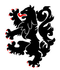
Anybody know why the 28th Infantry adopted the Lion of Flanders as their symbol? I understand that it is technically a representation of a “black lion,” but the identical black lion rampant symbol has been a symbol of a the Flanders region of Belgium since the 12th century.
See the official Flanders flag here: link
Odd that a US military regiment would adopt a well-knon symbol of a foreign country as their own. Anybody know the history of the adoption by the 28th of the Flanders Lion?
[quote comment=”149232″][quote comment=”149220″]Why do the Astro’s brick unis look so bad? The same reason EVERY team looks like crap when they wear their dark tops with either the home white or road gray pants. This is baseball. The shirts are supposed to match the pants. Period. When a team wears their dark tops, they look like they’re wearing practice uniforms.
As much as I detest the Yankees, they do get their uniforms right – when was the last time you saw a regular-season or playoff Yankee game when they wore their solid navy blue shirts? NEVER!! Because they’re smart enough not to have one!!![/quote]
Qouted for thruth. If there is one sport where traditional unis are the rule, it’s baseball. Baseball tradition = American history. For my money, the Yanks and the Tigers have the best unis going.
As a Brewers fan I do have to admit I kinda like the Brewers navy jerseys as a stand alone jersey though. And I’m sure I’m the only one here that thinks so, but after watching last nights game, I have to admit I like the Padres sand color road unis. :)[/quote]
The only reason alternate jerseys exist in baseball is to sell more jerseys to the public. They often look better as street clothes than they do on the field. The jerseys that look best on the field, like the Yankees’ pinstripes, tend to not look right with jeans or shorts.
Call me cynical, but this whole alternate jersey trend is just a money maker.
I remember in past posts someone asking if the new NHL jerseys had a fight strap on them?
Well I was at the Red Wings/ Lightning game last night and seeing TB was wearing their white unis, you could clearly see an outline of a fight strap on the inside. It was kind of distracting.
Check link out. It’s a survey of best NFL Uniforms.
[quote comment=”149240″]I remember in past posts someone asking if the new NHL jerseys had a fight strap on them?
Well I was at the Red Wings/ Lightning game last night and seeing TB was wearing their white unis, you could clearly see an outline of a fight strap on the inside. It was kind of distracting.[/quote]
What’s a fight strap? Something that keeps people from pulling your sweater over your head in a fight?
Anyone care to explain why the jocktag on the Royals jersey in the raffle say says “Genuine Merchandise” and not Authentic Collection?
[quote comment=”149235″]Enjoyed the site while it lasted. Everybody is entitled to their own opinion but I come to this site to read about uni-information not Paul’s Political views. I find it strange that all of the post that did not agree with the comment in yesterday’s column was taken off the site but the comment that started it all was left up and the so called it’s just a joke excuse did not cut it with me, I was expecting so sort of my bad guys lets just stick to uniforms in todays column but instead it seems like you were trying to get another firestorm started.[/quote]
I’m pretty sure the site is still “lasting.”
I’m also pretty sure that if Paul’s political views were in line with yours, you wouldn’t be complaining about his tiny little political comments here and there in his overwhelmingly uni-centric blog posts.
I mean…there’s no way I’d ever vote for Hillary, but I still read and enjoy Paul’s blog. :)
[quote comment=”149241″]Check link out. It’s a survey of best NFL Uniforms.[/quote]
Lot’s of diverse, and homeristic, opinions there. Mine best would be:
1) Rams home
2) Bucs (either)
3) Cowboys Blue
Worst:
1) Buffalo (either, esp. white’s)
2) Cleveland (white)
3) Jacksonville Teal (teal to me is as purple is to Paul L)
Philllies?
link
[quote comment=”149242″][quote comment=”149240″]I remember in past posts someone asking if the new NHL jerseys had a fight strap on them?
Well I was at the Red Wings/ Lightning game last night and seeing TB was wearing their white unis, you could clearly see an outline of a fight strap on the inside. It was kind of distracting.[/quote]
What’s a fight strap? Something that keeps people from pulling your sweater over your head in a fight?[/quote]
Exactly.
[quote comment=”149242″][quote comment=”149240″]I remember in past posts someone asking if the new NHL jerseys had a fight strap on them?
Well I was at the Red Wings/ Lightning game last night and seeing TB was wearing their white unis, you could clearly see an outline of a fight strap on the inside. It was kind of distracting.[/quote]
What’s a fight strap? Something that keeps people from pulling your sweater over your head in a fight?[/quote]
Yes. It is a strap that snaps a loop around the past so the jersey does not come off. If it becomes unattached in a fight, you are supposed to be ejected from the game, but I’ve seen it where they are not as well.
If I was more handy at this I would post a picture of a fight strap. But for now……. go here
link
Regarding the Bobby Hull photo, the sweater may say Gunzo’s, which is a Chicago area hockey apparel/equipment store.
Amen. (Although I’d add soccer and WNBA to the list too)
Tomorrow’s Grand Final for the Australian Football League (to be held at the Melbourne Cricket Ground) will feature the link against the link
Views of the jumpers (jerseys), current and historical, for the entire league are link
[quote comment=”149247″][quote comment=”149241″]Check link out. It’s a survey of best NFL Uniforms.[/quote]
Lot’s of diverse, and homeristic, opinions there. Mine best would be:
1) Rams home
2) Bucs (either)
3) Cowboys Blue
Worst:
1) Buffalo (either, esp. white’s)
2) Cleveland (white)
3) Jacksonville Teal (teal to me is as purple is to Paul L)[/quote]
Best:
1. Raiders
2. Jets
3. Packers
4. Bucs
5. Giants (white)
Worst:
28. Titans
29. Bengals
30. Falcons
31. Cardinals
32. Vikings
CV, you’re not the only person here who both likes the Brewers and loves the Padres’ sand unis. Unlike several gray-wearing teams that wear a shade of gray so light it cannot be distinguished from white in direct sunlight, the tan Padres cannot possibly be confused for the home team, even at a glance or in one’s peripheral vision. From a simple purpose-of-the-design point of view, the Padres simply have the best-designed road uniforms in baseball.
I love the idea of the Army sponsoring an award for players who “take one for the team.” Makes me wish they still ran the program nationwide for high school players.
[quote comment=”149258″]CV, you’re not the only person here who both likes the Brewers and loves the Padres’ sand unis. Unlike several gray-wearing teams that wear a shade of gray so light it cannot be distinguished from white in direct sunlight, the tan Padres cannot possibly be confused for the home team, even at a glance or in one’s peripheral vision. From a simple purpose-of-the-design point of view, the Padres simply have the best-designed road uniforms in baseball.[/quote]
Unfortunately they are also ugly. Very ugly.
I don’t think the Black Lion represents only changing positions. Think selflessnenss. Team unity. Leadership. It’s what the Army and West Point is all about.
And in case anyone wonders, after all of his back-and-forth during his two years in Oklahoma City…George Shinn is clearly taking a page from Sally Field with this new logo. He’s telling New Orleans, regardless of all of the uncomplimentary things he said about them the past two years…”I like you! I really like you!”
[quote comment=”149258″]CV, you’re not the only person here who both likes the Brewers and loves the Padres’ sand unis. Unlike several gray-wearing teams that wear a shade of gray so light it cannot be distinguished from white in direct sunlight, the tan Padres cannot possibly be confused for the home team, even at a glance or in one’s peripheral vision. From a simple purpose-of-the-design point of view, the Padres simply have the best-designed road uniforms in baseball.
I love the idea of the Army sponsoring an award for players who “take one for the team.” Makes me wish they still ran the program nationwide for high school players.[/quote]
Your reasoning is exectly why teams should consider returning to the powder blue road unis.
A thought: Could teams be dragging their feet on the powder blues because it would be harder to match the pants with a dark alt. jersey, and therefore harder for them to move merchandise?
That ISU helmet needs some minor changes. If that is an actual helmet, the reds are quite different and I think it would stand out better on a white or yellow /gold helmet. IMO
[quote comment=”149235″]Enjoyed the site while it lasted. Everybody is entitled to their own opinion but I come to this site to read about uni-information not Paul’s Political views. I find it strange that all of the post that did not agree with the comment in yesterday’s column was taken off the site but the comment that started it all was left up and the so called it’s just a joke excuse did not cut it with me, I was expecting so sort of my bad guys lets just stick to uniforms in todays column but instead it seems like you were trying to get another firestorm started.[/quote]
Now come on, not this again!!!
Some people just need to let stuff roll off of their backs.
I would rather kill myself than listen to Rush Limbaugh but I don’t go out and call his show and complain about how I dont agree with what he says. I just change the station.
If Mr. Lukas wants to include political jokes in his blog, then he will. If you get that fired up about it, then please leave.
I have never seen a country so divided with hatred among the parties.
And now back to uniforms!!!
Paul, Are Mets fans sick of seeing the Cardinals yet, or what? Shut out by Joel Piniero? Yikes.
[quote comment=”149226″][quote comment=”149220″]. . . the Yankees, they do get their uniforms right – when was the last time you saw a regular-season or playoff Yankee game when they wore their solid navy blue shirts? NEVER!! Because they’re smart enough not to have one!!![/quote]
Amen. The Yankees have the best uniform in all of sports. Iconic, unchanged, classic.[/quote]
don’t you mean boring, unchanged, ugly?
[quote comment=”149242″][quote comment=”149240″]I remember in past posts someone asking if the new NHL jerseys had a fight strap on them?
Well I was at the Red Wings/ Lightning game last night and seeing TB was wearing their white unis, you could clearly see an outline of a fight strap on the inside. It was kind of distracting.[/quote]
What’s a fight strap? Something that keeps people from pulling your sweater over your head in a fight?[/quote]
Exactly. Players, especially enforcers, used to have the equipment manager stitch in a loop for tying it down to the pants with a skate lace. That way Tiger Williams et al couldn’t pull your shirt over your head and beat you into a bloody pulp.
The league mandated fight straps in the 80’s, I think. Too many shots of guys brawling in stinky, sweat-stained hockey equipment (before the current days of concussion-causing body armor). Now they are stitched right into the jersey, with a nice fat velcro closure.
Too bad the new RBK edge jersey stretch and tear easily, which defeat the purpose of the fighet strap
[quote comment=”149194″]It seems that the story about the Eagles taking their name from the National Recovery Act is true, but the bit about the colors seems to be questionable. The eagle symbol they used was dark blue, with red text. I think the only yellow is the yellowing of old paper or fabric. Doesn’t look anything like Swedish colors.[/quote]
Agreed. I tend not to believe the bit about the colors – strains credulity a little too far.
Surprised Paul took it at face value, since the link he chose to illustrate the claim was navy and red.
As far as I know, the Eagles have always recognized the inspiration for the nickname.
[quote comment=”149267″]
don’t you mean boring, unchanged, ugly?[/quote]
Yes, as opposed to the super attractive use of black by the Mets.
[quote comment=”149267″][quote comment=”149226″][quote comment=”149220″]. . . the Yankees, they do get their uniforms right – when was the last time you saw a regular-season or playoff Yankee game when they wore their solid navy blue shirts? NEVER!! Because they’re smart enough not to have one!!![/quote]
Amen. The Yankees have the best uniform in all of sports. Iconic, unchanged, classic.[/quote]
don’t you mean boring, unchanged, ugly?[/quote]
Unchanged? Yes.
Boring and ugly? Not in the slightest. Frankly, the Mets would have been better off not changing their uniforms – they took a classic and made them extremely ugly.
[quote comment=”149271″][/quote]
Unchanged? Yes.
Boring and ugly? Not in the slightest. Frankly, the Mets would have been better off not changing their uniforms – they took a classic and made them extremely ugly.[/quote]
Exactly. The Mets’ uniforms are heinous. They are one of the worst offenders when it comes to adding black as a third color in a misguided attempt to look more hip.
Sorry, Chance, I screwed up the formatting where I quoted you.
[quote comment=”149271″][quote comment=”149267″][quote comment=”149226″][quote comment=”149220″]. . . the Yankees, they do get their uniforms right – when was the last time you saw a regular-season or playoff Yankee game when they wore their solid navy blue shirts? NEVER!! Because they’re smart enough not to have one!!![/quote]
Amen. The Yankees have the best uniform in all of sports. Iconic, unchanged, classic.[/quote]
don’t you mean boring, unchanged, ugly?[/quote]
Unchanged? Yes.
Boring and ugly? Not in the slightest. Frankly, the Mets would have been better off not changing their uniforms – they took a classic and made them extremely ugly.[/quote]
Just look at the Yankee uniform graphicly and don’t compare it to the Mets. The NY looks like it was drawn by a drunkard. The NY on the cap is different than the NY on the jersey and there is nothing to the uniform. No color, no style. nothing. plain. boring. YUCK!!
Yes I agree the Mets should ditch the black but that has nothing to do with the fact that the Yankees have boring uniforms.
Worst:
28. Titans
29. Bengals
30. Falcons
31. Cardinals
32. Vikings
What’s wrong with the Titans’ unis? I think they look good. And the cowboys’ white jerseys with the greenish-silver pants need to be in the list of worst unis.
[quote comment=”149271″][quote comment=”149267″][quote comment=”149226″][quote comment=”149220″]. . . the Yankees, they do get their uniforms right – when was the last time you saw a regular-season or playoff Yankee game when they wore their solid navy blue shirts? NEVER!! Because they’re smart enough not to have one!!![/quote]
Amen. The Yankees have the best uniform in all of sports. Iconic, unchanged, classic.[/quote]
don’t you mean boring, unchanged, ugly?[/quote]
Unchanged? Yes.
Boring and ugly? Not in the slightest. Frankly, the Mets would have been better off not changing their uniforms – they took a classic and made them extremely ugly.[/quote]
The Mets better be in blue caps and pinstripes tonight and the rest of the weekend. They need a little of the ’69 miracle mets vibe. (or Tom Seaver pitching a complete game shutout)
[quote comment=”149275″]Just look at the Yankee uniform graphicly and don’t compare it to the Mets. The NY looks like it was drawn by a drunkard. The NY on the cap is different than the NY on the jersey and there is nothing to the uniform. No color, no style. nothing. plain. boring. YUCK!![/quote]
I don’t think you get it.
/and it’s graphically
Why do people hate the red Astros jerseys so much? I like them – that color hadn’t been used by any other teams when they introduced it (I wish the Phillies still had it), and it’s nicer-looking than dull, featureless gray.
As one who HATES dark-colored alternates, I take offense at the idea that gray uniforms are “dull, featureless.” Baseball teams look terrific in white and gray, and, like the Astros, look bush league when wearing dark tops. Biggio has more common sense than his owner, thankfully.
[quote comment=”149282″]Why do people hate the red Astros jerseys so much? I like them – that color hadn’t been used by any other teams when they introduced it (I wish the Phillies still had it), and it’s nicer-looking than dull, featureless gray.
As one who HATES dark-colored alternates, I take offense at the idea that gray uniforms are “dull, featureless.” Baseball teams look terrific in white and gray, and, like the Astros, look bush league when wearing dark tops. Biggio has more common sense than his owner, thankfully.[/quote]
I just like the fact that the team had to specially make their PRIMARY road uniforms for their September call-ups.
my personal list(I know that alot of you hate these unis):
1. Titans (White jerseys with light blue pants, or navy jerseys, with any color pants.
2. Panthers (Black jerseys, silver pants)
3. Chargers (powder blue jersey)
4. Saints (Black jersey with gold pants, i’d like to see the gold pants have a white stripe in between the black.)
5. Broncos (Orange alternate jersey, only worn once but still active)
Re: Membership roster
I do look at the roster from time to time. When I first joined I was the only #4 and now there are 12. I like reading each member’s reasoning for choosing a number, and makes me wish I kept the same number throughout my youth baseball career rather than changing every year. I also like the member pictures, especially since most feature the member decked out in his/her favorite sports team’s colors. I wish more members would submit pictures, but it’s cool seeing what a wide variety of people we Uni Watchers are.
Any other 1980’s Viking fans find it interesting that Jarvis Redwine is considered an alumni of the NFL? I mean, 3 years, 17 carries, 1 catch? Technically an alumni, I suppose, but…almost like saying that the guy who delivers pizzas to Yale is an alumnus.
With my luck, Jarvis Redwine reads this and can still kick my a$$ all over the block.
[quote comment=”149281″][quote comment=”149275″]Just look at the Yankee uniform graphicly and don’t compare it to the Mets. The NY looks like it was drawn by a drunkard. The NY on the cap is different than the NY on the jersey and there is nothing to the uniform. No color, no style. nothing. plain. boring. YUCK!![/quote]
I don’t think you get it.
/and it’s graphically[/quote]
Oh I get it. I just happen to think that their uniforms are very ugly. Just because they haven’t changed them doesn’t mean they’re any good.
I remember a reader response on TMQ from a European reader claiming that the uniform style was an important factor in rooting for a football team. He had an interesting mix of what he thought was good: he had traditional outfits like Packer and Raiders, but he also had newer uniform styles like the Broncos and the Patriots.
So a question to European readers about the Eagles uniforms: are they fab or drab? They look ugly to most American eyes, but do they look great when you factor in European sensibilities? I mean, they’re using the colors of a Swedish flag and all. Or, based on my trip to Europe earlier this year, do the fashion trends favor muted colors?
(By the way, I hope I’m not the only one who did a double take when Paul equated NRA with Left-WIng Radicals. I had to read that through again to realized it was the OTHER NRA.)
[quote comment=”149207″]Hornets Fleur-de-bee is a nice touch. The Fleur-de-lis is a common theme in southern Louisiana, from the link to the link.
I think it would great as a center court design.[/quote]
I couldn’t agree more. It would look awesome at center court in the greenhouse next to the dome.
Heck, the link will probably result in this New Orleans-area native buying his first ever New Orleans Hornets merchandise.
and the worst unis:
1.Bengals (Black jersey with black pants, worst unis ever.)
2.Seahawks (All jerseys)
3.Vikings (Purple jersey with white pants, but the white/purple looks is ok)
4.Cowboys (White jerseys with greenish-silver pants)
5.Patriots (Navy jerseys with navy pants)
whoops, i meant to say the white/purple look on the vikings is ok, not looks is ok.
Worst:
28. Titans
29. Bengals
30. Falcons
31. Cardinals
32. Vikings
Agree 100%
What’s wrong with the Titans’ unis? I think they look good. And the cowboys’ white jerseys with the greenish-silver pants need to be in the list of worst unis.
Nate, for me personally, the contrasting shoulder ruins the Titans’ unis for me, anyone else?
Jabooby, I actually liked the black shadows on the Mets uniforms around 1999 when they had only numbers on the backs, and wore plain white and black jerseys.
Now that the names are back, the jerseys look really cluttered and clunky as they try to squeeze orange or black shadows onto all those letters in the guys’ names. It just looks ridiculous and hard to read.
A lot of minor league teams have used shadows, and they look fine on the number-only jerseys.
I’ve got a theory going that a team’s jersey can have a certain amount of “extras” added on to it, but once it crosses a certain line, the jersey looks ugly.
Here are some elements that make a jersey look too busy:
* Pinstripes/sleeve piping
* A third layer or shadow on the numbers
* Player surnames
* Color that differs from the pants
Add three or more of these things and you’ve got clutter. The Mets, some of those purple and teal D-backs jerseys, the Marlins in black (four layers of lettering!), the Rockies and their triple-layer-lettered black vests.
Teams who get it just right: the Red Sox at home, the Cubs at home (particularly without the names), the Orioles, the Cardinals, the Phillies, the Pirates, San Francisco, the Angels in white or gray. Braves too.
I could endure “The Black” if the Mets “ditched the names”.
Nate, for me personally, the contrasting shoulder ruins the Titans’ unis for me, anyone else?
to me, they look cool. But then again, i’m an 8th grader so maybe thats why I like them.
Best NFL Unis:
1. Packers
2. Bears
3. Browns(but only when they wear the striped socks)
4. Jets
5. Giants
Worst:
28.Jaguars
29.Panthers
30.Cardinals
31.Vikings
32.Bengals
[quote comment=”149298″]Jabooby, I actually liked the black shadows on the Mets uniforms around 1999 when they had only numbers on the backs, and wore plain white and black jerseys.
Now that the names are back, the jerseys look really cluttered and clunky as they try to squeeze orange or black shadows onto all those letters in the guys’ names. It just looks ridiculous and hard to read.
A lot of minor league teams have used shadows, and they look fine on the number-only jerseys.
I’ve got a theory going that a team’s jersey can have a certain amount of “extras” added on to it, but once it crosses a certain line, the jersey looks ugly.
Here are some elements that make a jersey look too busy:
* Pinstripes/sleeve piping
* A third layer or shadow on the numbers
* Player surnames
* Color that differs from the pants
Add three or more of these things and you’ve got clutter. The Mets, some of those purple and teal D-backs jerseys, the Marlins in black (four layers of lettering!), the Rockies and their triple-layer-lettered black vests.
Teams who get it just right: the Red Sox at home, the Cubs at home (particularly without the names), the Orioles, the Cardinals, the Phillies, the Pirates, San Francisco, the Angels in white or gray. Braves too.
I could endure “The Black” if the Mets “ditched the names”.[/quote]
to add to your thoughts…
IMHO if a team wants to use a shadow they should remove the outline…if they want an outline, no drop shdows.
[quote comment=”149287″]Re: Membership roster
I do look at the roster from time to time. When I first joined I was the only #4 and now there are 12. I like reading each member’s reasoning for choosing a number, and makes me wish I kept the same number throughout my youth baseball career rather than changing every year. I also like the member pictures, especially since most feature the member decked out in his/her favorite sports team’s colors. I wish more members would submit pictures, but it’s cool seeing what a wide variety of people we Uni Watchers are.[/quote]
I need to send in a new picture — I look terrible in mine. That’s none other than link, BTW.
Shaftman, yeah, like the Rangers inhockey. They know how to handle a shadow (and retained them all through an era when nobody else was adventurous enough to use shadows; now they’re in vogue again).
[quote comment=”149239″][quote comment=”149232″][quote comment=”149220″]Why do the Astro’s brick unis look so bad? The same reason EVERY team looks like crap when they wear their dark tops with either the home white or road gray pants. This is baseball. The shirts are supposed to match the pants. Period. When a team wears their dark tops, they look like they’re wearing practice uniforms.
As much as I detest the Yankees, they do get their uniforms right – when was the last time you saw a regular-season or playoff Yankee game when they wore their solid navy blue shirts? NEVER!! Because they’re smart enough not to have one!!![/quote]
Qouted for thruth. If there is one sport where traditional unis are the rule, it’s baseball. Baseball tradition = American history. For my money, the Yanks and the Tigers have the best unis going.
As a Brewers fan I do have to admit I kinda like the Brewers navy jerseys as a stand alone jersey though. And I’m sure I’m the only one here that thinks so, but after watching last nights game, I have to admit I like the Padres sand color road unis. :)[/quote]
The only reason alternate jerseys exist in baseball is to sell more jerseys to the public. They often look better as street clothes than they do on the field. The jerseys that look best on the field, like the Yankees’ pinstripes, tend to not look right with jeans or shorts.
Call me cynical, but this whole alternate jersey trend is just a money maker.[/quote]
AMEN!
seems to me that the main factor in deciding a team’s identity (color scheme, logo, uniforms) is strictly marketability
[quote comment=”149312″]Shaftman, yeah, like the Rangers inhockey. They know how to handle a shadow (and retained them all through an era when nobody else was adventurous enough to use shadows; now they’re in vogue again).[/quote]
To be fair, I actually prefer the outline than the drop shadows. And I REALLY like what the Islanders did when they changed from the Fishstick uni’s back to the semi-originals.
The link had a basic outline but the new link seperated the outline from the base color. I thought it made a great jersey perfect. And then they went and link.
I think the Texas Rangers need to switch back to red for their main color. If they change everything blue in their uniforms to red, they would look great. Except the blue alternate. That looks great with red helmets and pants piping.
[quote comment=”149301″]Best NFL Unis:
1. Packers
2. Bears
3. Browns(but only when they wear the striped socks)
4. Jets
5. Giants
Worst:
28.Jaguars
29.Panthers
30.Cardinals
31.Vikings
32.Bengals[/quote]
Why no love for the Chiefs from anybody?? ours are just as classic…plus our link show off our link that we’ve had for link.
[quote comment=”149316″]I think the Texas Rangers need to switch back to red for their main color. If they change everything blue in their uniforms to red, they would look great. Except the blue alternate. That looks great with red helmets and pants piping.[/quote]
Plus their only playoff trips in their history came with the red caps, right?
(And with Johnny Oates at the helm — R.I.P.)
[quote comment=”149297″]Worst:
28. Titans
29. Bengals
30. Falcons
31. Cardinals
32. Vikings
Agree 100%
What’s wrong with the Titans’ unis? I think they look good. And the cowboys’ white jerseys with the greenish-silver pants need to be in the list of worst unis.
Nate, for me personally, the contrasting shoulder ruins the Titans’ unis for me, anyone else?[/quote]
The shoulder yoke is too NHL. And the numerals are the worst in the league.
I think the Texas Rangers need to switch back to red for their main color. If they change everything blue in their uniforms to red, they would look great. Except the blue alternate. That looks great with red helmets and pants piping.
Plus their only playoff trips in their history came with the red caps, right?
(And with Johnny Oates at the helm – R.I.P.)
Exactly my point.
[quote comment=”149318″][quote comment=”149301″]Best NFL Unis:
1. Packers
2. Bears
3. Browns(but only when they wear the striped socks)
4. Jets
5. Giants
Worst:
28.Jaguars
29.Panthers
30.Cardinals
31.Vikings
32.Bengals[/quote]
Why no love for the Chiefs from anybody?? ours are just as classic…plus our link show off our link that we’ve had for link.[/quote]
heres the link that didnt work in my previous post: link
[quote comment=”149318″][quote comment=”149301″]Best NFL Unis:
1. Packers
2. Bears
3. Browns(but only when they wear the striped socks)
4. Jets
5. Giants
Worst:
28.Jaguars
29.Panthers
30.Cardinals
31.Vikings
32.Bengals[/quote]
Why no love for the Chiefs from anybody?? ours are just as classic…plus our link show off our link that we’ve had for link.[/quote]
I was actually torn whether to have the Gianst or Chiefs in 5th, I decided Giants by a nose…they use gray facemasks, what can I say?
[quote comment=”149298″]Jabooby, I actually liked the black shadows on the Mets uniforms around 1999 when they had only numbers on the backs, and wore plain white and black jerseys.
Now that the names are back, the jerseys look really cluttered and clunky as they try to squeeze orange or black shadows onto all those letters in the guys’ names. It just looks ridiculous and hard to read.
A lot of minor league teams have used shadows, and they look fine on the number-only jerseys.
I’ve got a theory going that a team’s jersey can have a certain amount of “extras” added on to it, but once it crosses a certain line, the jersey looks ugly.
Here are some elements that make a jersey look too busy:
* Pinstripes/sleeve piping
* A third layer or shadow on the numbers
* Player surnames
* Color that differs from the pants
Add three or more of these things and you’ve got clutter. The Mets, some of those purple and teal D-backs jerseys, the Marlins in black (four layers of lettering!), the Rockies and their triple-layer-lettered black vests.
Teams who get it just right: the Red Sox at home, the Cubs at home (particularly without the names), the Orioles, the Cardinals, the Phillies, the Pirates, San Francisco, the Angels in white or gray. Braves too.
I could endure “The Black” if the Mets “ditched the names”.[/quote]
I still get a chuckle out of link uniforms. Its like they had a menu of uniform items that they could order a la carte. “Lets see, I’ll have the contrasting sleeves, with the wacky number font, a really bad logo and for dessert let me have the pinstripes on the road uniforms – oh and let me have a sleeve patch on the side.”
[quote comment=”149264″][quote comment=”149235″]Enjoyed the site while it lasted. Everybody is entitled to their own opinion but I come to this site to read about uni-information not Paul’s Political views. I find it strange that all of the post that did not agree with the comment in yesterday’s column was taken off the site but the comment that started it all was left up and the so called it’s just a joke excuse did not cut it with me, I was expecting so sort of my bad guys lets just stick to uniforms in todays column but instead it seems like you were trying to get another firestorm started.[/quote]
Now come on, not this again!!!
Some people just need to let stuff roll off of their backs.
I would rather kill myself than listen to Rush Limbaugh but I don’t go out and call his show and complain about how I dont agree with what he says. I just change the station.
If Mr. Lukas wants to include political jokes in his blog, then he will. If you get that fired up about it, then please leave.
I have never seen a country so divided with hatred among the parties.
And now back to uniforms!!![/quote]
Listening to political partisans talk about each other these days is like listening to a 12-year-old Yankee fan talk about the Mets.
Speaking of Seattle and Cincy, has anyone studied whether the bright green or orange gloves, as worn by the “skill” players, help on replays? I’m thinking of the whole “hand on the turf, under the ball” thing we obsess over about 5x a game.
[quote comment=”149320″][quote comment=”149297″]Worst:
28. Titans
29. Bengals
30. Falcons
31. Cardinals
32. Vikings
Agree 100%
What’s wrong with the Titans’ unis? I think they look good. And the cowboys’ white jerseys with the greenish-silver pants need to be in the list of worst unis.
Nate, for me personally, the contrasting shoulder ruins the Titans’ unis for me, anyone else?[/quote]
The shoulder yoke is too NHL. And the numerals are the worst in the league.[/quote]
I agree 100%. I don’t much care for the helmet design either. Light blue with the link logo and a dark blue and white center stripe would look pretty sharp.
[quote comment=”149327″]I still get a chuckle out of link uniforms. Its like they had a menu of uniform items that they could order a la carte. “Lets see, I’ll have the contrasting sleeves, with the wacky number font, a really bad logo and for dessert let me have the pinstripes on the road uniforms – oh and let me have a sleeve patch on the side.”[/quote]
That link didn’t work for me.
[quote comment=”149288″]Any other 1980’s Viking fans find it interesting that Jarvis Redwine is considered an alumni of the NFL? I mean, 3 years, 17 carries, 1 catch? Technically an alumni, I suppose, but…almost like saying that the guy who delivers pizzas to Yale is an alumnus.
With my luck, Jarvis Redwine reads this and can still kick my a$$ all over the block.[/quote]
Marv’lous Jarvis just didn’t get an opportunity . . . his coach didn’t understand him . . . he wasn’t used correctly . . . ok, I give up. He just wasn’t a good pro.
[quote comment=”149332″][quote comment=”149327″]I still get a chuckle out of link uniforms. Its like they had a menu of uniform items that they could order a la carte. “Lets see, I’ll have the contrasting sleeves, with the wacky number font, a really bad logo and for dessert let me have the pinstripes on the road uniforms – oh and let me have a sleeve patch on the side.”[/quote]
That link didn’t work for me.[/quote]
Hmmm. Its from Dressed to the Nines (from the links over on the right side of the page) and its the 1999 Angels get-up.
Jabooby, I actually liked the black shadows on the Mets uniforms around 1999 when they had only numbers on the backs, and wore plain white and black jerseys.
OK. Teams that add black as a third color when it’s not part of their original color scheme is HUGE pet peeve of mine. What’s good for the Pirates and White Sox is not good for the Mets.
I was especially upset as a Jets fan when they had that black facemask period in the 90s. Thank God they went back to the classic look.
[quote comment=”149320″][quote comment=”149297″]
Nate, for me personally, the contrasting shoulder ruins the Titans’ unis for me, anyone else?[/quote]
The shoulder yoke is too NHL. And the numerals are the worst in the league.[/quote]
I’ll agree on the numerals, but I love the shoulder yoke. Rather than being too hockey, it looks very link to me.
I just wish the rest of their uniforms matched it.
[quote comment=”149230″][quote comment=”149226″][quote comment=”149220″]. . . the Yankees, they do get their uniforms right – when was the last time you saw a regular-season or playoff Yankee game when they wore their solid navy blue shirts? NEVER!! Because they’re smart enough not to have one!!![/quote]
Amen. The Yankees have the best uniform in all of sports. Iconic, unchanged, classic.[/quote]
Well, unchanged since 1936… they did have 30+ years of differing uniforms before that.
;)[/quote]
Actually, the road jersey in its current form has only been around since the 1970’s. I think its time to remove the white outline and the ugly blue piping on the sleeves, and make the NEW YORK a bit larger.
[quote comment=”149337″]Jabooby, I actually liked the black shadows on the Mets uniforms around 1999 when they had only numbers on the backs, and wore plain white and black jerseys.
OK. Teams that add black as a third color when it’s not part of their original color scheme is HUGE pet peeve of mine. What’s good for the Pirates and White Sox is not good for the Mets.
I was especially upset as a Jets fan when they had that black facemask period in the 90s. Thank God they went back to the classic look.[/quote]
Wasn’t the Mets’ claim that black, like the orange, represents the NY Giants? However, there is no red front numbers like the Dodgers, and the new Citi Field, with all its Ebbets Field imagery has no design aspects of the Polo Grounds.
[quote comment=”149338″][quote comment=”149320″][quote comment=”149297″]
Nate, for me personally, the contrasting shoulder ruins the Titans’ unis for me, anyone else?[/quote]
The shoulder yoke is too NHL. And the numerals are the worst in the league.[/quote]
I’ll agree on the numerals, but I love the shoulder yoke. Rather than being too hockey, it looks very link to me.
I just wish the rest of their uniforms matched it.[/quote]
Darn – messed up the link.
link
Point of parliamentary procedure: It’s generally called “Seneca Lake,” not “Lake Seneca.”
Enjoy wine country, though. It’s beautiful this time of year.
[quote comment=”149340″][quote comment=”149230″][quote comment=”149226″][quote comment=”149220″]. . . the Yankees, they do get their uniforms right – when was the last time you saw a regular-season or playoff Yankee game when they wore their solid navy blue shirts? NEVER!! Because they’re smart enough not to have one!!![/quote]
Amen. The Yankees have the best uniform in all of sports. Iconic, unchanged, classic.[/quote]
Well, unchanged since 1936… they did have 30+ years of differing uniforms before that.
;)[/quote]
Actually, the road jersey in its current form has only been around since the 1970’s. I think its time to remove the white outline and the ugly blue piping on the sleeves, and make the NEW YORK a bit larger.[/quote]
I don’t mind the white outline because it ties into the white on the hat. The Dodgers got rid of the white on the road unis recently and it just looks weird to me, even though its closer to how their uniforms used to look.
[quote comment=”149342″]Wasn’t the Mets’ claim that black, like the orange, represents the NY Giants? However, there is no red front numbers like the Dodgers, and the new Citi Field, with all its Ebbets Field imagery has no design aspects of the Polo Grounds.[/quote]
Wow. That’s stupid.
I know the Mets colors were originally chosen because of the previous New York NL teams, orange for the Giants and blue for the Dodgers. That bit about adding black because of the Giants is ridiculous. They added black because it sells better.
[quote comment=”149346″][quote comment=”149342″]Wasn’t the Mets’ claim that black, like the orange, represents the NY Giants? However, there is no red front numbers like the Dodgers, and the new Citi Field, with all its Ebbets Field imagery has no design aspects of the Polo Grounds.[/quote]
Wow. That’s stupid.
I know the Mets colors were originally chosen because of the previous New York NL teams, orange for the Giants and blue for the Dodgers. That bit about adding black because of the Giants is ridiculous. They added black because it sells better.[/quote]
Right. And, are they saying they got it wrong and forgot to add the black for some 40 years?
[quote comment=”149318″][quote comment=”149301″]Best NFL Unis:
1. Packers
2. Bears
3. Browns(but only when they wear the striped socks)
4. Jets
5. Giants
Worst:
28.Jaguars
29.Panthers
30.Cardinals
31.Vikings
32.Bengals[/quote]
Why no love for the Chiefs from anybody?? ours are just as classic…plus our link show off our link that we’ve had for link.[/quote]
I LOVE the Chiefs helmets, but something about the ketchup and mustard unis just doesn’t do it for me. I would like thenm better in black and red like teh helmets, but I bet that wouldn’t fly with Chiefs fans.
Tradition is OK and all for me in football, but not like baseball. I like alot of the newer football designs, but not many of the newer baseball one.
I forgot the Giants for my bottom 5. I hate the Goodwill inspired grey pants and made in mom’s basement jerseys.
[quote comment=”149266″]Paul, Are Mets fans sick of seeing the Cardinals yet, or what? Shut out by Joel Piniero? Yikes.[/quote]
Cards fans, feel free to also take Eric Gagne and his wrinkly cap off of our hands.
[quote comment=”149177″]My primary complaint about the Astros’ uniforms is that they wear the brick jersey in nearly all of their road games. The traditional gray should be the primary jersey, while the brick should be used as an alternate.[/quote]
Well said Robert. Short and simple and couldn’t agree more. And if the Astros wear the reds all the time, are they still technically ‘alternates’? I think for terminology sake, we can nearly switch those two labels now since the Astros only wear the grays in the first two months of the season.
paul thank you for running the article on the Black Lion. The award has nothing to do with switch ing positions it is about putting team first and your needs second. Don Hollender who played at Army also served and died in service dieing while saving his fellow service men.
Also am I the only one that likes the Eagles throwback unis. A lot of is it is the helmet. I like the old school helmets b/c the are based off the old leather helmets. Teams would die the helmets in different patterns so the QBs could tell who to throw to. That is how the so called Michagan wing helmet came from, which started at Princton. I wish the Eagles would wear them for the rest of the year.
I’ve never completely understood why political talk in a non-political forum is such an anathema for people. I mean, I understand being turned off by thoughtless stuff like “Bush sucks!” or “typical liberal/PC…”. It seems too many people are incapable of meaningful political discourse (as opposed to the kind you see nightly on the cable news outlets), and that expressing a view is seen as aligning oneself with a camp completely.
The thing is, in ways that aren’t always obvious, politics have, and have always been a part of sports, and likewise, sports have always been part of politics. To separate the two seems awfully naive and/or closed minded. There’s an undeniable conservative ethos to sports culture in general, while at the same time, it has also been an ally of progressive politics. And intended or not, race always matters, maybe not to the extent it did 40, 50 years ago, but it helps shape our perspective.
Yeah, we come to this blog for nerdy discussions about goofy outfits for men, basically, and we can go elsewhere for politics. But considering how much content Paul pumps out daily, I just can’t see how a few comments make someone feel uncomfortable or insecure or whatever enough to not enjoy the rest of the nerdiness.
[quote comment=”149238″]Anybody know why the 28th Infantry adopted the Lion of Flanders as their symbol? I understand that it is technically a representation of a “black lion,” but the identical black lion rampant symbol has been a symbol of a the Flanders region of Belgium since the 12th century.
See the official Flanders flag here: link
Odd that a US military regiment would adopt a well-knon symbol of a foreign country as their own. Anybody know the history of the adoption by the 28th of the Flanders Lion?[/quote]
While taking the symbol is somewhat unusual, it’s not completely out of left field. Lots of army units and divions got their nicknames based upon actions in previous wars. The 3rd Infantry Division is, for example, known as the “Rock of the Marne” for it’s actions in stubbornly defending positions on the Marne River against a German offensive in World War I.
Many symbols of foreign countries are also heraldic symbols. The Pentagon even has a department of heraldry to design new unit patches and governmental seals based upon the laws of heraldry.
link
[quote comment=”149354″][quote comment=”149177″]My primary complaint about the Astros’ uniforms is that they wear the brick jersey in nearly all of their road games. The traditional gray should be the primary jersey, while the brick should be used as an alternate.[/quote]
Well said Robert. Short and simple and couldn’t agree more. And if the Astros wear the reds all the time, are they still technically ‘alternates’? I think for terminology sake, we can nearly switch those two labels now since the Astros only wear the grays in the first two months of the season.[/quote]
The red jersey is the Astros only Cool-Base jersey. Maybe that explains why they were it most of the summer, and also the name/number diffrerences.
Dang I hate it when I say “it’s” when I meant “its”….
[quote comment=”149354″][quote comment=”149177″]My primary complaint about the Astros’ uniforms is that they wear the brick jersey in nearly all of their road games. The traditional gray should be the primary jersey, while the brick should be used as an alternate.[/quote]
Well said Robert. Short and simple and couldn’t agree more. And if the Astros wear the reds all the time, are they still technically ‘alternates’? I think for terminology sake, we can nearly switch those two labels now since the Astros only wear the grays in the first two months of the season.[/quote]
I believe the Brewers have worn their blue jerseys for 3/4ths of their road games, and almost 1/2 of their home games. Uecker gave the records in each uni combo one day during a slow inning. If I remember right, they wore blue for about 2/3rds of their games this year, home and away.
[quote comment=”149318″][quote comment=”149301″]Best NFL Unis:
1. Packers
2. Bears
3. Browns(but only when they wear the striped socks)
4. Jets
5. Giants
Worst:
28.Jaguars
29.Panthers
30.Cardinals
31.Vikings
32.Bengals[/quote]
Why no love for the Chiefs from anybody?? ours are just as classic…plus our link show off our link that we’ve had for link.[/quote]
I want to like the Chiefs uniforms, but I don’t understand how there’s yellow accents on the uniform, but none on the helmet, and black outlines on the helmet logo, but no black on the uniform. it looks a bit disconnected to me. I love the helmet and the arrowhead logo rocks.
My selections would be:
1. Bears
2. Raiders
3. Colts (Those shoulder stripes should go ALL THE DAMN WAY AROUND, people.)
4. Steelers (although I prefer the old fonts)
5. Packers
Bottom five:
32. Bengals (WTF? … the helmets, though, are awesome)
31. Bills (how many shades of blue can you have on a jersey?)
30. Vikings (so sick of all the damn piping)
29. Falcons (see Vikings)
28. Cardinals (see Falcons)
I’m also the only person in the universe that likes the Seahawks all-blues, save for the fact that the sleeves are a darker shade than the rest of the jersey. I think I’m just intrigued by the fact that it’s a totally different blue than most others. And the very spare use of the neon green is nice.
[quote comment=”149279″]Worst:
28. Titans
29. Bengals
30. Falcons
31. Cardinals
32. Vikings
What’s wrong with the Titans’ unis? I think they look good. And the cowboys’ white jerseys with the greenish-silver pants need to be in the list of worst unis.[/quote]
Dude, I’m with you. I like the Titans uniforms. I just don’t like the logo.
[quote comment=”149228″][quote comment=”149224″][quote comment=”149144″]The Fort Wayne Komets (IHL) have a “design a jersey” link.[/quote]
This is fairly common in minor league hockey. You can see some of the ECHL Charlotte Checkers’ designs at my link. They’re the ugly(est) ones if you can’t find them. LOL[/quote]
How do you actually design the jersey once you have the templete? I havnt found out how to and i would really like to know how to. It looks like fun. Thanks in advanced[/quote]
So no one can help me out with this, i would greatly appreciate it
[quote comment=”149359″][quote comment=”149354″][quote comment=”149177″]My primary complaint about the Astros’ uniforms is that they wear the brick jersey in nearly all of their road games. The traditional gray should be the primary jersey, while the brick should be used as an alternate.[/quote]
Well said Robert. Short and simple and couldn’t agree more. And if the Astros wear the reds all the time, are they still technically ‘alternates’? I think for terminology sake, we can nearly switch those two labels now since the Astros only wear the grays in the first two months of the season.[/quote]
The red jersey is the Astros only Cool-Base jersey. Maybe that explains why they were it most of the summer, and also the name/number diffrerences.[/quote]
And the grays won’t get the Cool Flo treatment while Drayton continues to be in love with the reds. At least they still follow their uniform protocol at home.
[quote comment=”149351″][quote comment=”149318″][quote comment=”149301″]Best NFL Unis:
1. Packers
2. Bears
3. Browns(but only when they wear the striped socks)
4. Jets
5. Giants
Worst:
28.Jaguars
29.Panthers
30.Cardinals
31.Vikings
32.Bengals[/quote]
Why no love for the Chiefs from anybody?? ours are just as classic…plus our link show off our link that we’ve had for link.[/quote]
I LOVE the Chiefs helmets, but something about the ketchup and mustard unis just doesn’t do it for me. I would like thenm better in black and red like teh helmets, but I bet that wouldn’t fly with Chiefs fans.
Tradition is OK and all for me in football, but not like baseball. I like alot of the newer football designs, but not many of the newer baseball one.
I forgot the Giants for my bottom 5. I hate the Goodwill inspired grey pants and made in mom’s basement jerseys.[/quote]
ketchup and mustard? really? and, no, black wouldn’t fly in KC. Case in point: the Royals finally tanked their black uni’s, thank the lord above. I still think the Chiefs’ are better than the pack’s, with those bright yellow pants and the screen pressed shoulder stripes that don’t even go all the way around. Bears have ruined their uni-cred with those orange jerseys and their all-navy escapades. I can’t say anything against the Jets, those are just plain awesome.
[quote comment=”149368″] I can’t say anything against the Jets, those are just plain awesome.[/quote]
My only issue with the Jets is when they wear green pants with green jerseys. That monochromatic look is horrible in any color other than white.
[quote comment=”149366″][quote comment=”149359″][quote comment=”149354″][quote comment=”149177″]My primary complaint about the Astros’ uniforms is that they wear the brick jersey in nearly all of their road games. The traditional gray should be the primary jersey, while the brick should be used as an alternate.[/quote]
Well said Robert. Short and simple and couldn’t agree more. And if the Astros wear the reds all the time, are they still technically ‘alternates’? I think for terminology sake, we can nearly switch those two labels now since the Astros only wear the grays in the first two months of the season.[/quote]
The red jersey is the Astros only Cool-Base jersey. Maybe that explains why they were it most of the summer, and also the name/number diffrerences.[/quote]
And the grays won’t get the Cool Flo treatment while Drayton continues to be in love with the reds. At least they still follow their uniform protocol at home.[/quote]
I think I remember someone reporting on this site that Majestic couldn’t figure out how to make a grey cool-base jersey.
[quote comment=”149301″]I’m also the only person in the universe that likes the Seahawks all-blues, save for the fact that the sleeves are a darker shade than the rest of the jersey. I think I’m just intrigued by the fact that it’s a totally different blue than most others. And the very spare use of the neon green is nice.[/quote]
thats a good one. next, thing you’ll say is that the Patriots would look good in all silver.
The Hornets unveiled a new alternate logo yesterday – not bad. It will be worn as a patch on the team’s uniforms and will be called – wait for it – the Fleur de Bee.
This is the first time I’ve seen something attractive come out of the NBA/Adidas design group since the Cavs and Nuggets unis. Nice work!
I think university at buffalo pulls off the blue on blue look pretty good
heres the link
its not working, just go here
link
better look here
link
[quote comment=”149370″][quote comment=”149366″][quote comment=”149359″][quote comment=”149354″][quote comment=”149177″]My primary complaint about the Astros’ uniforms is that they wear the brick jersey in nearly all of their road games. The traditional gray should be the primary jersey, while the brick should be used as an alternate.[/quote]
Well said Robert. Short and simple and couldn’t agree more. And if the Astros wear the reds all the time, are they still technically ‘alternates’? I think for terminology sake, we can nearly switch those two labels now since the Astros only wear the grays in the first two months of the season.[/quote]
The red jersey is the Astros only Cool-Base jersey. Maybe that explains why they were it most of the summer, and also the name/number diffrerences.[/quote]
And the grays won’t get the Cool Flo treatment while Drayton continues to be in love with the reds. At least they still follow their uniform protocol at home.[/quote]
I think I remember someone reporting on this site that Majestic couldn’t figure out how to make a grey cool-base jersey.[/quote]
That kind of sounds like a bullshit excuse from Majestic. Then again, they can’t seem to figure out how to put pin stripes on there either: link
[quote comment=”149380″][quote comment=”149370″][quote comment=”149366″][quote comment=”149359″][quote comment=”149354″][quote comment=”149177″]My primary complaint about the Astros’ uniforms is that they wear the brick jersey in nearly all of their road games. The traditional gray should be the primary jersey, while the brick should be used as an alternate.[/quote]
Well said Robert. Short and simple and couldn’t agree more. And if the Astros wear the reds all the time, are they still technically ‘alternates’? I think for terminology sake, we can nearly switch those two labels now since the Astros only wear the grays in the first two months of the season.[/quote]
The red jersey is the Astros only Cool-Base jersey. Maybe that explains why they were it most of the summer, and also the name/number diffrerences.[/quote]
And the grays won’t get the Cool Flo treatment while Drayton continues to be in love with the reds. At least they still follow their uniform protocol at home.[/quote]
I think I remember someone reporting on this site that Majestic couldn’t figure out how to make a grey cool-base jersey.[/quote]
That kind of sounds like a bullshit excuse from Majestic. Then again, they can’t seem to figure out how to put pin stripes on there either: link
I haven’t played ball in the Cool Base jerseys, but can the temperature, comfort, and performance difference be that significant that a team will NOT wear a uniform because it’s not available as a Cool Base?
[quote comment=”149379″]better look here
link
Those look pretty similar to link. Just a little different with the white patch of trim. I was getting ready to say I liked Kentucky’s all blue look minus the the basketball over a t-shirt look. However, a few years ago KY wore a link that they should be using every game.
Scratch what I said about the red Iowas State helmet yesterday… the real deal looks like the floor of a frat house the morning after!
[quote comment=”149385″][quote comment=”149379″]better look here
link
Those look pretty similar to link. Just a little different with the white patch of trim. I was getting ready to say I liked Kentucky’s all blue look minus the the basketball over a t-shirt look. However, a few years ago KY wore a link that they should be using every game.[/quote]
That should say “basketball jersey over a t-shirt”. Also link another pic of the throwbacks.
[quote comment=”149188″][quote comment=”149157″]Only Drayton McLane would think those Astros brick, sand and black uniforms look nice. I can’t wait until he sells the team. maybe then the Astros under a new owner will look and play like a real team.[/quote]
Well, the ‘stros did play in a World Series under his ownership, so it could be worse.[/quote]
And we got swept (she says with unused game 5 tickets to the first ever World Series in Texas in her hand…). Problem wasn’t the manager…..
[quote comment=”149197″][quote comment=”149191″]This would have been a better comment on yesterday’s entry: Given all the hooplah over the Iowa St. helmet votes being ultimately moot, I found it odd when I opened my mailbox this morning to find this email:
Dear Chaminade Logo Contest Entrant:
The Chaminade Logo Contest was a tremendous success and I can assure you that selecting the new Silversword logo was a very difficult process because of all of the great work that we had to consider. More than 25 artists submitted more than 30 entries, all of which were excellent. I am sorry to say that your entry was not selected. I want to thank you so much for all of your hard work. I assure you that we will keep all of your contact information and consider the best artists for future graphic design work for Chaminade.
Understandable. I wouldn’t pick something that looked like a link either. I STILL don’t even know what a Silversword is. So I wasn’t expecting a winner. But then the letter goes on to say this:
The logo that was selected will be unveiled soon. It was a collaborative effort between several entities and portions have been used previously by Chaminade sports teams so the unveiling will not be as big of a deal as anticipated.
‘Not as big a deal as anticipated’? What does that even mean? The way it’s worded makes it seem like the whole deal ended up being an in-house project.[/quote]
Kris, I really dig your ‘Flying Furby’ Chaminade design. Kind of has an Oscar the Grouch feel to it.[/quote]
Thanks. No where for him to go now though. Poor little guy had his heart set on Hawaii… Oh well, I think I’ll start renting him out to the really bad fantasy football leagues next season.
I’ll be headed upstate for a long-weekend getaway on the lovely shores of Lake Seneca.
See if you can find the angle inspiration for the Wild logo while you’re up there Paul?
link
Because you hear it everywhere. Sometimes it is nice to be able to turn down the noise and concentrate on something that you enjoy and that brings people together.
Back on the NFL uniform issue, the Rams are horrible. Why did they feel the need to go to that heinous metallic gold.
I hate the Patriots unis for the same reason. What was wrong with red, white and blue? Why did they need silver? It’s a sports franchise, not an SUV.
[quote comment=”149355″]paul thank you for running the article on the Black Lion. The award has nothing to do with switch ing positions it is about putting team first and your needs second. Don Hollender who played at Army also served and died in service dieing while saving his fellow service men.
Also am I the only one that likes the Eagles throwback unis. A lot of is it is the helmet. I like the old school helmets b/c the are based off the old leather helmets. Teams would die the helmets in different patterns so the QBs could tell who to throw to. That is how the so called Michagan wing helmet came from, which started at Princton. I wish the Eagles would wear them for the rest of the year.[/quote]
That is amazing… is that really true? I always wondered where thewings came from!
Paul, this is the description of “Exploring Business” from the Prentice Hall website:
“Collins is the only Introduction to Business book to teach students the topics of business through an in-depth study of a single company–Nike.”
That sounds like it might provide enough excuse for branding. Just sayin’.
[quote comment=”149362″][quote comment=”149318″][quote comment=”149301″]Best NFL Unis:
1. Packers
2. Bears
3. Browns(but only when they wear the striped socks)
4. Jets
5. Giants
Worst:
28.Jaguars
29.Panthers
30.Cardinals
31.Vikings
32.Bengals[/quote]
Why no love for the Chiefs from anybody?? ours are just as classic…plus our link show off our link that we’ve had for link.[/quote]
I want to like the Chiefs uniforms, but I don’t understand how there’s yellow accents on the uniform, but none on the helmet, and black outlines on the helmet logo, but no black on the uniform. it looks a bit disconnected to me. I love the helmet and the arrowhead logo rocks.
My selections would be:
1. Bears
2. Raiders
3. Colts (Those shoulder stripes should go ALL THE DAMN WAY AROUND, people.)
4. Steelers (although I prefer the old fonts)
5. Packers
Bottom five:
32. Bengals (WTF? … the helmets, though, are awesome)
31. Bills (how many shades of blue can you have on a jersey?)
30. Vikings (so sick of all the damn piping)
29. Falcons (see Vikings)
28. Cardinals (see Falcons)
I’m also the only person in the universe that likes the Seahawks all-blues, save for the fact that the sleeves are a darker shade than the rest of the jersey. I think I’m just intrigued by the fact that it’s a totally different blue than most others. And the very spare use of the neon green is nice.[/quote]
I’m with you. I was at the MNF game last year when the Seahawks and Packers played in the snow…the Seahawks unis look awesome against that white background.
[quote comment=”149396″]Back on the NFL uniform issue, the Rams are horrible. Why did they feel the need to go to that heinous metallic gold.[/quote]
I love it, IMO since the swtich, the Rams have the best unis in the whole league. They and the Vikings have always had the best helmets.
Worst Uniform
The root of all evil in contemporary uniforms has to be the 1997 Denver Broncos.
[quote comment=”149408″]Worst Uniform
The root of all evil in contemporary uniforms has to be the 1997 Denver Broncos.[/quote]
Amen!
Is there a good website somewhere where you can see all the NFL uniform designs? Or is it best just to look at pictures?
Phladelphia Flyer Danny Briere threw the first pitch in last night’s Phillies/Braves game. He was wearing the Premier (replica) version of his jersey. Note the notched hemline, jocktag and screen-printed twill numbers.
link
Worst:
28. Titans
29. Bengals
30. Falcons
31. Cardinals
32. Vikings
What’s wrong with the Titans’ unis? I think they look good. And the cowboys’ white jerseys with the greenish-silver pants need to be in the list of worst unis.
Dude, I’m with you. I like the Titans uniforms. I just don’t like the logo.
Yes! Finally someone on my side. And yes, I think their alternate logo is better than their main logo
Not uni-related, but uni-related-related.
Is the frieze (mistakenly called a facade by many) above Yankee Stadium copywritten? Can I sell T-shirts with a design that looks like that fencing?
Also, is the abbreviation NYY protected by trademark or copyright by the Yankees or MLB?
[quote comment=”149414″]Not uni-related, but uni-related-related.
Is the frieze (mistakenly called a facade by many) above Yankee Stadium copywritten? Can I sell T-shirts with a design that looks like that fencing?
Also, is the abbreviation NYY protected by trademark or copyright by the Yankees or MLB?[/quote]
If you’re planning on making money off this, you shouldn’t be asking strangers on a website. You should be asking a lawyer.
[quote comment=”149297″]Worst:
28. Titans
29. Bengals
30. Falcons
31. Cardinals
32. Vikings
Agree 100%
What’s wrong with the Titans’ unis? I think they look good. And the cowboys’ white jerseys with the greenish-silver pants need to be in the list of worst unis.
Nate, for me personally, the contrasting shoulder ruins the Titans’ unis for me, anyone else?[/quote]
I agree. Plus their helmet logo stinks. After reading Easterbrook, I can no longer think of them as anything but the Flaming Thumbtacks. My bottom 5 off the top of my head would be Titans, Seahawks, Bengals, Dolphins, Bills.
[quote comment=”149311″][quote comment=”149287″]Re: Membership roster
I do look at the roster from time to time. When I first joined I was the only #4 and now there are 12. I like reading each member’s reasoning for choosing a number, and makes me wish I kept the same number throughout my youth baseball career rather than changing every year. I also like the member pictures, especially since most feature the member decked out in his/her favorite sports team’s colors. I wish more members would submit pictures, but it’s cool seeing what a wide variety of people we Uni Watchers are.[/quote]
I need to send in a new picture — I look terrible in mine. That’s none other than link, BTW.[/quote]
Philly Bill, glad to see you joined. And could your reasoning for a number be any more simple? I chose #4 for the reasons I said but also because my other favorite numbers (21, 52) have personal, non-sports related stories to them that wouldn’t translate well to a blog. We still need more pictures on the membership roster though!
And I hope Paul is enjoying his weekend getaway to Lake Seneca. I wonder if he’ll be watching the Mets’ weekend series? It may make his vacation less enjoyable if he does…
[quote comment=”149401″][quote comment=”149362″]
I’m also the only person in the universe that likes the Seahawks all-blues, save for the fact that the sleeves are a darker shade than the rest of the jersey. I think I’m just intrigued by the fact that it’s a totally different blue than most others. And the very spare use of the neon green is nice.[/quote]
I’m with you. I was at the MNF game last year when the Seahawks and Packers played in the snow…the Seahawks unis look awesome against that white background.[/quote]
Count me in as another fan. I didn’t like it at first — thought it was too trendy — but then I caught the Seattle Sounder going down to the stadium. It was one of those bleak days. I looked out the window, and what do you know… the shades of blue over Puget Sound were actually represented in the Seahawks color scheme!
And yes, the Snow Game from last year’s MNF had some slick visuals. It may have been one of the most aesthetic moments in franchise history. I remember just gaping at those photographs. A very epic look.
(Also my girlfriend is a fan of lime green, so it’s to our enjoyment that there’s ONE team that uses it as a color, and that team happens to be the one we’re rooting for.)
[quote comment=”149416″][quote comment=”149414″]Not uni-related, but uni-related-related.
Is the frieze (mistakenly called a facade by many) above Yankee Stadium copywritten? Can I sell T-shirts with a design that looks like that fencing?
Also, is the abbreviation NYY protected by trademark or copyright by the Yankees or MLB?[/quote]
If you’re planning on making money off this, you shouldn’t be asking strangers on a website. You should be asking a lawyer.[/quote]I second the “get a lawyer” advice and IANAL, but I should point out that design/architectural features are intellectual property, and the use of something as distinctive as the Yankee Stadium may be considered infringing on intellectual property rights.
For example, the design of the Empire State Building is a registered trademark of the Empire State Building Company L.L.C., so you’d have to get their permission to use it in an ad or whatever.
[quote comment=”149239″]Call me cynical, but this whole alternate jersey trend is just a money maker.[/quote]
Since the 90’s, almost certainly. But does that reason apply for 70’s/80’s alternates? Like the A’s (white, gold & green jerserys, plus the old-fashioned jersey from ’81) & Rangers (the white, red & blue jerseys circa 1984)?
Anybody notice that the third sleeve stripe on the Bears’ uniform is elasticized? Looks bad to me. For one thing, it makes that “stripe” much thinner than the others, and in my view, it throws off the balance. I want to think there are three stripes on the Bears’ sleeves, but at times, I only see two. Very disturbing.
Not to mention that the top two stripes are usually half-stripes (thanks, skin-tight generation!), but the bottom one (the elastic) always wraps around. It looks like Madden’s digi-pen circling everybody’s armpits. Yuck-o. I don’t think Papa Bear Halas would put his initials on these modern bastardized jerseys if he had any say in this matter.
[quote comment=”149426″]Since the 90’s, almost certainly. But does that reason apply for 70’s/80’s alternates? Like the A’s (white, gold & green jerserys, plus the old-fashioned jersey from ’81) & Rangers (the white, red & blue jerseys circa 1984)?[/quote]
Honestly, that’s a good question. Someone get an intern on that!
[quote comment=”149365″][quote comment=”149228″][quote comment=”149224″][quote comment=”149144″]The Fort Wayne Komets (IHL) have a “design a jersey” link.[/quote]
This is fairly common in minor league hockey. You can see some of the ECHL Charlotte Checkers’ designs at my link. They’re the ugly(est) ones if you can’t find them. LOL[/quote]
How do you actually design the jersey once you have the templete? I havnt found out how to and i would really like to know how to. It looks like fun. Thanks in advanced[/quote]
So no one can help me out with this, i would greatly appreciate it[/quote]
Sorry, I’ve been busy most of the day. I’m not positive, but I assume you either print it out and mail it in or use a design program to put it together on the PC.
[quote comment=”149426″][quote comment=”149239″]Call me cynical, but this whole alternate jersey trend is just a money maker.[/quote]
Since the 90’s, almost certainly. But does that reason apply for 70’s/80’s alternates? Like the A’s (white, gold & green jerserys, plus the old-fashioned jersey from ’81) & Rangers (the white, red & blue jerseys circa 1984)?[/quote]
Yeah, growing up in the 70’s and 80’s, I have a soft spot for a few of the colored jerseys. The Orioles orange, The A’s yellow, Indians Blue, Giants black. Don’t know the reason behind them, maybe it was money too. I mean they did sell jerseys in those days.
Y’all remember that interactive map that was linked to a couple months ago that showed what baseball teams folks in a given region root for?
I can’t for the life of me find it.
[quote comment=”149435″]Y’all remember that interactive map that was linked to a couple months ago that showed what baseball teams folks in a given region root for?
I can’t for the life of me find it.[/quote]
I have it as my backround on my desktop, if I knew how to direct it to ya I would..sorry. It’s an amazing find..good luck.
[quote comment=”149435″]Y’all remember that interactive map that was linked to a couple months ago that showed what baseball teams folks in a given region root for?
I can’t for the life of me find it.[/quote]
Is linkwhat you’re looking for?
Thanks, but that’s not it. This thing allowed you to click on it, and it listed the top-three teams for that given region. People were commenting about how a bunch of counties in Florida had more Yankees fans than Marlins or Devil Rays.
Thanks again for looking around though.
[quote comment=”149433″][quote comment=”149426″][quote comment=”149239″]Call me cynical, but this whole alternate jersey trend is just a money maker.[/quote]
Since the 90’s, almost certainly. But does that reason apply for 70’s/80’s alternates? Like the A’s (white, gold & green jerserys, plus the old-fashioned jersey from ’81) & Rangers (the white, red & blue jerseys circa 1984)?[/quote]
Yeah, growing up in the 70’s and 80’s, I have a soft spot for a few of the colored jerseys. The Orioles orange, The A’s yellow, Indians Blue, Giants black. Don’t know the reason behind them, maybe it was money too. I mean they did sell jerseys in those days.[/quote]
Not so much, really. Certainly I don’t recall people wearing authentics or near-authentic replicas much until maybe the late 80s/early 90s. T-shirt versions, but that was about it. No internet, of course, and few “sports apparel” stores like every mall has now. Maybe you could get them in stadium souvenir shops, or from catalogs, but they probably were about 1% as available/common in the early 80s as today.
[quote comment=”149401″][quote comment=”149362″][quote comment=”149318″][quote comment=”149301″]Best NFL Unis:
1. Packers
2. Bears
3. Browns(but only when they wear the striped socks)
4. Jets
5. Giants
Worst:
28.Jaguars
29.Panthers
30.Cardinals
31.Vikings
32.Bengals[/quote]
Why no love for the Chiefs from anybody?? ours are just as classic…plus our link show off our link that we’ve had for link.[/quote]
I want to like the Chiefs uniforms, but I don’t understand how there’s yellow accents on the uniform, but none on the helmet, and black outlines on the helmet logo, but no black on the uniform. it looks a bit disconnected to me. I love the helmet and the arrowhead logo rocks.
My selections would be:
1. Bears
2. Raiders
3. Colts (Those shoulder stripes should go ALL THE DAMN WAY AROUND, people.)
4. Steelers (although I prefer the old fonts)
5. Packers
Bottom five:
32. Bengals (WTF? … the helmets, though, are awesome)
31. Bills (how many shades of blue can you have on a jersey?)
30. Vikings (so sick of all the damn piping)
29. Falcons (see Vikings)
28. Cardinals (see Falcons)
I’m also the only person in the universe that likes the Seahawks all-blues, save for the fact that the sleeves are a darker shade than the rest of the jersey. I think I’m just intrigued by the fact that it’s a totally different blue than most others. And the very spare use of the neon green is nice.[/quote]
I’m with you. I was at the MNF game last year when the Seahawks and Packers played in the snow…the Seahawks unis look awesome against that white background.[/quote]
I like the Seahawks uniforms design-wise but I can’t stand the blue-over-blue look. The blue-over-white, white-over-blue, and white-over-white outfits look fantastic, IMO. I agree with you about the unique shades of blue with a little bright green as accent, and I like the sleeve treatment. I also like the use of standard numerals. As is the case with a certain alternate-uniform-with-road-cap-at-home-wearing, dugout-jacket-matching, non-black-ditching, division-title-choking, baseball-club-which-must-not-be-named, it’s frustrating to see a team choose an unsightly combo when a much more attractive one is available to it within its existing wardrobe.
[quote comment=”149442″][quote comment=”149401″][quote comment=”149362″][quote comment=”149318″][quote comment=”149301″]Best NFL Unis:
1. Packers
2. Bears
3. Browns(but only when they wear the striped socks)
4. Jets
5. Giants
Worst:
28.Jaguars
29.Panthers
30.Cardinals
31.Vikings
32.Bengals[/quote]
Why no love for the Chiefs from anybody?? ours are just as classic…plus our link show off our link that we’ve had for link.[/quote]
I want to like the Chiefs uniforms, but I don’t understand how there’s yellow accents on the uniform, but none on the helmet, and black outlines on the helmet logo, but no black on the uniform. it looks a bit disconnected to me. I love the helmet and the arrowhead logo rocks.
My selections would be:
1. Bears
2. Raiders
3. Colts (Those shoulder stripes should go ALL THE DAMN WAY AROUND, people.)
4. Steelers (although I prefer the old fonts)
5. Packers
Bottom five:
32. Bengals (WTF? … the helmets, though, are awesome)
31. Bills (how many shades of blue can you have on a jersey?)
30. Vikings (so sick of all the damn piping)
29. Falcons (see Vikings)
28. Cardinals (see Falcons)
I’m also the only person in the universe that likes the Seahawks all-blues, save for the fact that the sleeves are a darker shade than the rest of the jersey. I think I’m just intrigued by the fact that it’s a totally different blue than most others. And the very spare use of the neon green is nice.[/quote]
I’m with you. I was at the MNF game last year when the Seahawks and Packers played in the snow…the Seahawks unis look awesome against that white background.[/quote]
I like the Seahawks uniforms design-wise but I can’t stand the blue-over-blue look. The blue-over-white, white-over-blue, and white-over-white outfits look fantastic, IMO. I agree with you about the unique shades of blue with a little bright green as accent, and I like the sleeve treatment. I also like the use of standard numerals. As is the case with a certain alternate-uniform-with-road-cap-at-home-wearing, dugout-jacket-matching, non-black-ditching, division-title-choking, baseball-club-which-must-not-be-named, it’s frustrating to see a team choose an unsightly combo when a much more attractive one is available to it within its existing wardrobe.[/quote]
And BTW, I think I’m the only one in the universe who really likes the Detroit Lions’ current uniform with the black accents (NOT the black alternate). I think those are excellent.
[quote comment=”149191″]This would have been a better comment on yesterday’s entry: Given all the hooplah over the Iowa St. helmet votes being ultimately moot, I found it odd when I opened my mailbox this morning to find this email:
Dear Chaminade Logo Contest Entrant:
The Chaminade Logo Contest was a tremendous success and I can assure you that selecting the new Silversword logo was a very difficult process because of all of the great work that we had to consider. More than 25 artists submitted more than 30 entries, all of which were excellent. I am sorry to say that your entry was not selected. I want to thank you so much for all of your hard work. I assure you that we will keep all of your contact information and consider the best artists for future graphic design work for Chaminade.
Understandable. I wouldn’t pick something that looked like a link either. I STILL don’t even know what a Silversword is. So I wasn’t expecting a winner. But then the letter goes on to say this:
The logo that was selected will be unveiled soon. It was a collaborative effort between several entities and portions have been used previously by Chaminade sports teams so the unveiling will not be as big of a deal as anticipated.
‘Not as big a deal as anticipated’? What does that even mean? The way it’s worded makes it seem like the whole deal ended up being an in-house project.[/quote]
If anybody has kids or knows anything about “Club Penguin” . . . that “silversword” looks like an angry Puffle.
[quote comment=”149218″]Vikings link.
link.[/quote]
These are a million times better than what they wear today. I hope they switch back to these in a few years when their eligible to change their jerseys again. I refuse to buy the current jersey.
Anyone notice that the jersey is not 100% acurate? The Vikings jerseys had the numbers on the sleeves from 1961 until the mid 90’s (above the stripes). I’m guessing the move to the shoulders is because NFL jerseys don’t have sleeves any more, and they don’t want the sleeve stripes to be completely cut off.
[quote comment=”149248″]Philllies?
link
For all the crap folks (myself included) have given to the D-baacks, check out the triple L “Philllies” in that pic.
[quote comment=”149446″][quote comment=”149218″]Vikings link.
link.[/quote]
These are a million times better than what they wear today. I hope they switch back to these in a few years when their eligible to change their jerseys again. I refuse to buy the current jersey.
Anyone notice that the jersey is not 100% acurate? The Vikings jerseys had the numbers on the sleeves from 1961 until the mid 90’s (above the stripes). I’m guessing the move to the shoulders is because NFL jerseys don’t have sleeves any more, and they don’t want the sleeve stripes to be completely cut off.[/quote]
The only thing I (nominally) like about the new look Vikings is the new number font. It looks like Wilson varsity treated with a nail file. Not too off the board, yet unique. Probably wouldn’t look good with a retro-feel jersey, but I have to say, the rounded numbers work with the otherwise disgustingly modern Vikings unis.
[quote comment=”149401″][quote comment=”149362″][quote comment=”149318″][quote comment=”149301″]Best NFL Unis:
1. Packers
2. Bears
3. Browns(but only when they wear the striped socks)
4. Jets
5. Giants
Worst:
28.Jaguars
29.Panthers
30.Cardinals
31.Vikings
32.Bengals[/quote]
Why no love for the Chiefs from anybody?? ours are just as classic…plus our link show off our link that we’ve had for link.[/quote]
I want to like the Chiefs uniforms, but I don’t understand how there’s yellow accents on the uniform, but none on the helmet, and black outlines on the helmet logo, but no black on the uniform. it looks a bit disconnected to me. I love the helmet and the arrowhead logo rocks.
My selections would be:
1. Bears
2. Raiders
3. Colts (Those shoulder stripes should go ALL THE DAMN WAY AROUND, people.)
4. Steelers (although I prefer the old fonts)
5. Packers
Bottom five:
32. Bengals (WTF? … the helmets, though, are awesome)
31. Bills (how many shades of blue can you have on a jersey?)
30. Vikings (so sick of all the damn piping)
29. Falcons (see Vikings)
28. Cardinals (see Falcons)
I’m also the only person in the universe that likes the Seahawks all-blues, save for the fact that the sleeves are a darker shade than the rest of the jersey. I think I’m just intrigued by the fact that it’s a totally different blue than most others. And the very spare use of the neon green is nice.[/quote]
I’m with you. I was at the MNF game last year when the Seahawks and Packers played in the snow…the Seahawks unis look awesome against that white background.[/quote]
I was there too…GREAT game. The four drive home in that snow storm sucked though…
[quote comment=”149437″][quote comment=”149435″]Y’all remember that interactive map that was linked to a couple months ago that showed what baseball teams folks in a given region root for?
I can’t for the life of me find it.[/quote]
Is linkwhat you’re looking for?[/quote]
When I was in Phoenix a few days ago, I was amazed at how much SF Giants stuff there was on talk radio. I know their Triple-A team was there for a long time and you can still get 680 KNBR from SF carrying the Giants games down there at night. It just struck me as weird considering the D-Backs have won more championships in the last 53 years than the Giants have.
So, my beloved hometown of Atlanta is now flooded with crappy hat designs more than ever before courtesy of the link Much rejoicing, indeed.
…more details on this local tragedy link.
[quote comment=”149459″]So, my beloved hometown of Atlanta is now flooded with crappy hat designs more than ever before courtesy of the link Much rejoicing, indeed.[/quote]
Ho-Lee Crap. Those are some ugly hats.
This may be the worst Yankees hat I’ve ever seen in my life
link
Some more rookie hazing
link
link
And BTW, I think I’m the only one in the universe who really likes the Detroit Lions’ current uniform with the black accents (NOT the black alternate). I think those are excellent.
Nope, you’re not alone – I think the black outlines are crisp.
[quote comment=”149474″]And BTW, I think I’m the only one in the universe who really likes the Detroit Lions’ current uniform with the black accents (NOT the black alternate). I think those are excellent.
Nope, you’re not alone – I think the black outlines are crisp.[/quote]
The black on the collar is stupid and the black on the armbands look like Yankees memorial strips, but it is nicely done on the helmet and the pant stripes. Makes the blue and silver pop out even more.
Yes, the black jersey is inane.
[quote comment=”149478″][quote comment=”149474″]And BTW, I think I’m the only one in the universe who really likes the Detroit Lions’ current uniform with the black accents (NOT the black alternate). I think those are excellent.
Nope, you’re not alone – I think the black outlines are crisp.[/quote]
The black on the collar is stupid and the black on the armbands look like Yankees memorial strips, but it is nicely done on the helmet and the pant stripes. Makes the blue and silver pop out even more.
Yes, the black jersey is inane.[/quote]
Forgot to add: by itself, it’s a pretty good jersey (I’m still not talking about the black alt, but the other two), but I think some of the backlash against it is due to the fact that it feels like a change merely for the sake of change. (Or maybe it has something to do with the fact that that is the only thing Matt Millen has done for the Lions, aside from drafting every wide receiver ever to walk the Earth and compiling a 25% winning percentage before this year, yet somehow earning a contract extension and approval from the Ford family. I’m not sure.)
[quote comment=”149162″]Why do people hate the red Astros jerseys so much? I like them — that color hadn’t been used by any other teams when they introduced it (I wish the Phillies still had it), and it’s nicer-looking than dull, featureless gray.
I’ve never understood why people like gray so much in these pajama-pants days. Forty years ago, when every player showed colored socks, and the gray was that “heathered” stuff and not plain polyester, things were a little more colorful. I don’t think it’s a coincidence that the explosion of alternate uniforms in the last ten eyars has coincided with the pajama-pant look — they need to get some color in there somewhere!
Gray is only acceptable if all the players have their pants pulled up. Otherwise it is dull and boring.[/quote]
Why? Because they’re called the Astros–short for Astronaut and derived from the Greek word for star. Why on earth would a teams’ uniforms be patterned after the stadium and its location? I understand that Minute Maid Park used to be the site of a big train depot in Houston, but who cares? That was then, this is now. Since the team’s name is a homage to Houston’s space industry, the logo, colors and uniform should reflect that. black is way, way overdone, and the brick color looks like it can’t decide if it wants to be red or orange.
I’d like to see Houston go to a modernized shooting star look of the sixties (and bring back the orange and blue), return to the nineties blue and gold or do a new uniform altogether using blue, red and silver–the colors from the NASA logo. Anything but the putrid outfits they wear now.
Woohoo, Mets in blue caps and pinstripes…I’m starting to feel better already
[quote comment=”149361″][quote comment=”149354″][quote comment=”149177″]My primary complaint about the Astros’ uniforms is that they wear the brick jersey in nearly all of their road games. The traditional gray should be the primary jersey, while the brick should be used as an alternate.[/quote]
Well said Robert. Short and simple and couldn’t agree more. And if the Astros wear the reds all the time, are they still technically ‘alternates’? I think for terminology sake, we can nearly switch those two labels now since the Astros only wear the grays in the first two months of the season.[/quote]
I believe the Brewers have worn their blue jerseys for 3/4ths of their road games, and almost 1/2 of their home games. Uecker gave the records in each uni combo one day during a slow inning. If I remember right, they wore blue for about 2/3rds of their games this year, home and away.[/quote]
I’m not sure on the exact stats, but I heard those numbers too.
Also, I know that while the starting pitcher normally decides, they were doing so well in the dark blues for awhile that they wore them all the time.
My favorite nfl unis:
49ers (I’m a cowboys fan, but I love the niners logo and color scheme)
Redskins throwbacks (I’ve seen them once and think they’re great)
Colts (I love royal blue)
Chargers throwbacks (powder blue is wonderful)
Kc chiefs (it’s a nice red that’s not too dark)
Worst:
Vikings (I like purple a lot, but the new unis look, well, dumb)
Cardinals (see above; also, the gray facemasks have to go)
New york jets (there are classic styles, and then there are those that should’ve been left in the sixties; the jet’s bland logo and jerseys is an example)
Cincinnati Bengals (black and orange are hideous enough, but these are horrific)
Most overrated
Raiders (sorry, but I see very little aesthetic appeal in silver and black. Though not bad, they are by no means the best)
[quote comment=”149486″][quote comment=”149361″][quote comment=”149354″][quote comment=”149177″]My primary complaint about the Astros’ uniforms is that they wear the brick jersey in nearly all of their road games. The traditional gray should be the primary jersey, while the brick should be used as an alternate.[/quote]
Well said Robert. Short and simple and couldn’t agree more. And if the Astros wear the reds all the time, are they still technically ‘alternates’? I think for terminology sake, we can nearly switch those two labels now since the Astros only wear the grays in the first two months of the season.[/quote]
I believe the Brewers have worn their blue jerseys for 3/4ths of their road games, and almost 1/2 of their home games. Uecker gave the records in each uni combo one day during a slow inning. If I remember right, they wore blue for about 2/3rds of their games this year, home and away.[/quote]
I’m not sure on the exact stats, but I heard those numbers too.
Also, I know that while the starting pitcher normally decides, they were doing so well in the dark blues for awhile that they wore them all the time.[/quote]
About half way through the Brewers season I noticed this trend as well. And it came as a surprise to me as last year they didn’t wear the alternate nearly as much. Especially at home. I came across an article on Brewers.com saying they choose to wear the blue alternate because it is their only Cool Base jersey.
[quote comment=”149496″][quote comment=”149486″][quote comment=”149361″][quote comment=”149354″][quote comment=”149177″]My primary complaint about the Astros’ uniforms is that they wear the brick jersey in nearly all of their road games. The traditional gray should be the primary jersey, while the brick should be used as an alternate.[/quote]
Well said Robert. Short and simple and couldn’t agree more. And if the Astros wear the reds all the time, are they still technically ‘alternates’? I think for terminology sake, we can nearly switch those two labels now since the Astros only wear the grays in the first two months of the season.[/quote]
I believe the Brewers have worn their blue jerseys for 3/4ths of their road games, and almost 1/2 of their home games. Uecker gave the records in each uni combo one day during a slow inning. If I remember right, they wore blue for about 2/3rds of their games this year, home and away.[/quote]
I’m not sure on the exact stats, but I heard those numbers too.
Also, I know that while the starting pitcher normally decides, they were doing so well in the dark blues for awhile that they wore them all the time.[/quote]
About half way through the Brewers season I noticed this trend as well. And it came as a surprise to me as last year they didn’t wear the alternate nearly as much. Especially at home. I came across an article on Brewers.com saying they choose to wear the blue alternate because it is their only Cool Base jersey.[/quote]
I’m watching the Brewers/Padres on ESPN and those retro-inspired Brewers uniforms are sooo much better than their regular unis.
[quote comment=”149485″]Woohoo, Mets in blue caps and pinstripes…I’m starting to feel better already[/quote]
Maybe the pitching staff should wear the black. After all, they’re the ones who are responsible for burying the Mets’ big lead.
[quote comment=”149487″]My favorite nfl unis:
49ers (I’m a cowboys fan, but I love the niners logo and color scheme)
Redskins throwbacks (I’ve seen them once and think they’re great)
Colts (I love royal blue)
Chargers throwbacks (powder blue is wonderful)
Kc chiefs (it’s a nice red that’s not too dark)
Worst:
Vikings (I like purple a lot, but the new unis look, well, dumb)
Cardinals (see above; also, the gray facemasks have to go)
New york jets (there are classic styles, and then there are those that should’ve been left in the sixties; the jet’s bland logo and jerseys is an example)
Cincinnati Bengals (black and orange are hideous enough, but these are horrific)
Most overrated
Raiders (sorry, but I see very little aesthetic appeal in silver and black. Though not bad, they are by no means the best)[/quote]
Wait…the Jets are bland but the Colts aren’t? Neither team has a third color, both have over-the-shoulder UCLA stripes, white helmets, standard numerals, TV numbers on the sleeves, flanking stripes on the pants… The only difference, really, is that the Jets have opposite-color sleeves and flanking stripes on the helmet instead of the single stripe; other than that, the helmet decals which are purely a matter of taste, and the base color (green instead of blue), they’re practically the exact same uniform.
[quote comment=”149505″][quote comment=”149485″]Woohoo, Mets in blue caps and pinstripes…I’m starting to feel better already[/quote]
Maybe the pitching staff should wear the black. After all, they’re the ones who are responsible for burying the Mets’ big lead.[/quote]
Doesn’t matter what the team-who-must-not-be-named wears in these games. Their season ended the moment they blew the lead on Wednesday night.
Black in the Lions uniform is really unnecessary. I think if you got rid of the black jersey and changed the face mask to blue, they’d be a lot better. I would rather see them use navy if they wanted to add contrast around the numbers or Lion logo. The main thing that bugs me now is that you can hardly find any Lions gear (non-Jersey stuff) that isn’t mostly black with some blue. Might as well be the Panthers.
[quote comment=”149508″][quote comment=”149505″][quote comment=”149485″]Woohoo, Mets in blue caps and pinstripes…I’m starting to feel better already[/quote]
Maybe the pitching staff should wear the black. After all, they’re the ones who are responsible for burying the Mets’ big lead.[/quote]
Doesn’t matter what the team-who-must-not-be-named wears in these games. Their season ended the moment they blew the lead on Wednesday night.[/quote]
They really didn’t have a chance after link came out in June. Begs the question: Isn’t every team a melting-pot?
[quote comment=”149508″][quote comment=”149505″][quote comment=”149485″]Woohoo, Mets in blue caps and pinstripes…I’m starting to feel better already[/quote]
Maybe the pitching staff should wear the black. After all, they’re the ones who are responsible for burying the Mets’ big lead.[/quote]
Doesn’t matter what the team-who-must-not-be-named wears in these games. Their season ended the moment they blew the lead on Wednesday night.[/quote]
Agreed.
Wow, yeah Brewers are looking good. Padres in their navy batting jerseys and khakis are looking like they work at Blockbuster.
Great rookie hazing article Paul!
To honor Craig Biggio the Astros are wearing the three uniforms of his career. Tonight is the rainbow sleeve jerseys. They look GREAT!
Tomorrow is the blue and gold ones. Sunday will be the current ones.
[quote comment=”149516″][quote comment=”149508″][quote comment=”149505″][quote comment=”149485″]Woohoo, Mets in blue caps and pinstripes…I’m starting to feel better already[/quote]
Maybe the pitching staff should wear the black. After all, they’re the ones who are responsible for burying the Mets’ big lead.[/quote]
Doesn’t matter what the team-who-must-not-be-named wears in these games. Their season ended the moment they blew the lead on Wednesday night.[/quote]
Agreed.[/quote]
link
[quote comment=”149388″][quote comment=”149385″][quote comment=”149379″]better look here
link
Those look pretty similar to link. Just a little different with the white patch of trim. I was getting ready to say I liked Kentucky’s all blue look minus the the basketball over a t-shirt look. However, a few years ago KY wore a link that they should be using every game.[/quote]
That should say “basketball jersey over a t-shirt”. Also link another pic of the throwbacks.[/quote]
Kentucky also lost that game to Ohio. Yes, that would be Ohio University.
Those jerseys should have been burned.
With sincere apologies to those who abhor digressions, my literary sensibility compels me to provide this elegy for the team-who-must-not-be-named, dedicated to my fellow fans thereof.
—
The outlook wasn’t brilliant for the Mudville nine that day
The score stood four to two with but one inning more to play
And then when Cooney died at first, and Barrows did the same
A sickly silence fell upon the patrons of the game.
A straggling few got up to go in deep despair. The rest
Clung to the hope which springs eternal in the human breast.
They thought if only Casey could but get a whack at that —
We’d put up even money now with Casey at the bat.
But Flynn preceded Casey, as did also Jimmy Blake,
And the former was a lulu and the latter was a cake;
So upon that stricken multitude grim melancholy sat,
For there seemed but little chance of Casey’s getting to the bat.
But Flynn let drive a single, to the wonderment of all,
And Blake, the much despis-ed, tore the cover off the ball;
And when the dust had lifted, and the men saw what had occurred,
There was Jimmy safe at second, and Flynn a-hugging third.
Then from five thousand throats and more there rose a lusty yell;
It rumbled through the valley, it rattled in the dell;
It knocked upon the mountain and recoiled upon the flat,
For Casey, mighty Casey, was advancing to the bat.
There was ease in Casey’s manner as he stepped into his place;
There was pride in Casey’s bearing and a smile on Casey’s face.
And when, responding to the cheers, he lightly doffed his hat,
No stranger in the crowd could doubt ‘twas Casey at the bat.
Ten thousand eyes were on him as he rubbed his hands with dirt;
Five thousand tongues applauded when he wiped them on his shirt.
Then while the writhing pitcher ground the ball into his hip,
Defiance gleamed in Casey’s eye, a sneer curled Casey’s lip.
And now the leather-covered sphere came hurtling through the air,
And Casey stood a-watching it in haughty grandeur there.
Close by the sturdy batsman the ball unheeded sped —
“That ain’t my style,” said Casey. “Strike one,” the umpire said.
From the benches, black with people, there went up a muffled roar,
Like the beating of the storm-waves on a stern and distant shore.
“Kill him! Kill the umpire!” shouted someone on the stand;
And it’s likely they’d have killed him had not Casey raised his hand
With a smile of distant charity great Casey’s visage shone;
He stilled the rising tumult; he bade the game go on;
He signaled to the pitcher, and once more the spheroid flew;
But Casey still ignored it, and the umpire said, “Strike two.”
“Fraud!” cried the maddened thousands, and echo answered, “Fraud!”
But one scornful look from Casey and the audience was awed.
They saw his face grow stern and cold, they saw his muscles strain,
And they knew that Casey wouldn’t let that ball go by again.
The sneer is gone from Casey’s lip, his teeth are clenched in hate;
He pounds with cruel violence his bat upon the plate.
And now the pitcher holds the ball, and now he lets it go,
And now the air is shattered by the force of Casey’s blow.
Oh, somewhere in this favored land the sun is shining bright;
The band is playing somewhere, and somewhere hearts are light,
And somewhere men are laughing, and somewhere children shout;
But there is no joy in Mudville — mighty Casey has struck out.
[quote comment=”149533″]With sincere apologies to those who abhor digressions, my literary sensibility compels me to provide this elegy for the team-who-must-not-be-named, dedicated to my fellow fans thereof.
—
The outlook wasn’t brilliant for the Mudville nine that day
The score stood four to two with but one inning more to play
And then when Cooney died at first, and Barrows did the same
A sickly silence fell upon the patrons of the game.
A straggling few got up to go in deep despair. The rest
Clung to the hope which springs eternal in the human breast.
They thought if only Casey could but get a whack at that —
We’d put up even money now with Casey at the bat.
But Flynn preceded Casey, as did also Jimmy Blake,
And the former was a lulu and the latter was a cake;
So upon that stricken multitude grim melancholy sat,
For there seemed but little chance of Casey’s getting to the bat.
But Flynn let drive a single, to the wonderment of all,
And Blake, the much despis-ed, tore the cover off the ball;
And when the dust had lifted, and the men saw what had occurred,
There was Jimmy safe at second, and Flynn a-hugging third.
Then from five thousand throats and more there rose a lusty yell;
It rumbled through the valley, it rattled in the dell;
It knocked upon the mountain and recoiled upon the flat,
For Casey, mighty Casey, was advancing to the bat.
There was ease in Casey’s manner as he stepped into his place;
There was pride in Casey’s bearing and a smile on Casey’s face.
And when, responding to the cheers, he lightly doffed his hat,
No stranger in the crowd could doubt ‘twas Casey at the bat.
Ten thousand eyes were on him as he rubbed his hands with dirt;
Five thousand tongues applauded when he wiped them on his shirt.
Then while the writhing pitcher ground the ball into his hip,
Defiance gleamed in Casey’s eye, a sneer curled Casey’s lip.
And now the leather-covered sphere came hurtling through the air,
And Casey stood a-watching it in haughty grandeur there.
Close by the sturdy batsman the ball unheeded sped —
“That ain’t my style,” said Casey. “Strike one,” the umpire said.
From the benches, black with people, there went up a muffled roar,
Like the beating of the storm-waves on a stern and distant shore.
“Kill him! Kill the umpire!” shouted someone on the stand;
And it’s likely they’d have killed him had not Casey raised his hand
With a smile of distant charity great Casey’s visage shone;
He stilled the rising tumult; he bade the game go on;
He signaled to the pitcher, and once more the spheroid flew;
But Casey still ignored it, and the umpire said, “Strike two.”
“Fraud!” cried the maddened thousands, and echo answered, “Fraud!”
But one scornful look from Casey and the audience was awed.
They saw his face grow stern and cold, they saw his muscles strain,
And they knew that Casey wouldn’t let that ball go by again.
The sneer is gone from Casey’s lip, his teeth are clenched in hate;
He pounds with cruel violence his bat upon the plate.
And now the pitcher holds the ball, and now he lets it go,
And now the air is shattered by the force of Casey’s blow.
Oh, somewhere in this favored land the sun is shining bright;
The band is playing somewhere, and somewhere hearts are light,
And somewhere men are laughing, and somewhere children shout;
But there is no joy in Mudville — mighty Casey has struck out.[/quote]
The anti-plagiarism watchdog in me requests that you give Ernest Lawrence Thayer his due with his timeless epic poem, “Casey at the Bat.”
(In my best Cliff Clavin voice) You know, its a little known fact that the Mudville in the poem is actually Stockton, CA.
I lived through the Giants winning 103 games and missing the playoffs because Dusty started Salomon Torres the final game of the season in ’93. I feel your pain.
Of course; I had no intention of slighting Mr. Thayer. I just figured everyone would recognize it so the by-line was not needed. And let’s not forget the subtitle:
“A Ballad of the Republic”
NESN’s coverage of the Red Sox post game celebrations included Johnathan Paplebon wearing what appeared to be a child’s link.
Also, when being interviewed about how the team killed time between the end of their game and the end of the Yankees v. Orioles extra inning game, Aaron Hinske noted that the team watched in the clubhouse and then changed from their street clothes into warm ups when the game got close. When they showed the clubhouse getting hosed in champagne and beer, the entire Sox roster was wearing Red Sox Under Armour. Not by coincidence I assume.
[quote comment=”149226″][quote comment=”149220″]. . . the Yankees, they do get their uniforms right – when was the last time you saw a regular-season or playoff Yankee game when they wore their solid navy blue shirts? NEVER!! Because they’re smart enough not to have one!!![/quote]
Amen. The Yankees have the best uniform in all of sports. Iconic, unchanged, classic.[/quote]
Their aways are cool. The home jerseys blow.
1st : Giants home (love the gray pants)
2nd : Cleveland (white jersey striped socks)
3rd: Chargers (powder blue throwbacks)
4th: Steelers (black jersey)
4th : Rams (1980’s unis)
6th Bucs (Bucco bruce orange jerseys)
7th: Packers (home)
9th : 49ers (home)
10th : Patriots (pat patriots red unis)
[quote comment=”149520″]To honor Craig Biggio the Astros are wearing the three uniforms of his career. Tonight is the rainbow sleeve jerseys. They look GREAT!
Tomorrow is the blue and gold ones. Sunday will be the current ones.[/quote]
They looked great. Biggio is the same size he was when he entered the league (Barry, I’m looking at you) so he looked like a rookie again. As disappointed as I was with the Braves getting eliminated the night before, it was nice to see an inning or 2 of sharp unis.
[quote comment=”149169″][quote comment=”149159″]Hmm. I wonder if those cars from A-Rod’s dealership come with chokes?
ed[/quote]
Yeah because arod didnt get any game winning hits this year has he? And lets also forget about his 51 homeruns and 151 rbi’s, none of those were important were they?[/quote]
i belive hes talking about the playoffs
[quote comment=”149507″][quote comment=”149487″]
Wait…the Jets are bland but the Colts aren’t? Neither team has a third color, both have over-the-shoulder UCLA stripes, white helmets, standard numerals, TV numbers on the sleeves, flanking stripes on the pants… The only difference, really, is that the Jets have opposite-color sleeves and flanking stripes on the helmet instead of the single stripe; other than that, the helmet decals which are purely a matter of taste, and the base color (green instead of blue), they’re practically the exact same uniform.[/quote]
The Colts’ logo is like the Yankees–a classic that needs no updating. The jets logo looks very boring–the word Jets superimposed over NY. I suppose some diehards like them because Joe Namath wore them, but I liked the eighties look (the word jets slanted to have an aeronautical feel) much better. Besides, the shoulders on the sixties jets jerseys looks way too cluttered.
[quote comment=”149705″][quote comment=”149507″][quote comment=”149487″]
Wait…the Jets are bland but the Colts aren’t? Neither team has a third color, both have over-the-shoulder UCLA stripes, white helmets, standard numerals, TV numbers on the sleeves, flanking stripes on the pants… The only difference, really, is that the Jets have opposite-color sleeves and flanking stripes on the helmet instead of the single stripe; other than that, the helmet decals which are purely a matter of taste, and the base color (green instead of blue), they’re practically the exact same uniform.[/quote]
The Colts’ logo is like the Yankees–a classic that needs no updating. The jets logo looks very boring–the word Jets superimposed over NY. I suppose some diehards like them because Joe Namath wore them, but I liked the eighties look (the word jets slanted to have an aeronautical feel) much better. Besides, the shoulders on the sixties jets jerseys looks way too cluttered.[/quote]
I think they would look better if they moved the stripes further down, and had a bit less of the opposite color on the sleeve. One way to do this would be to reverse the stripe sequence of the inserts, i.e., a green-white-green insert on the green jersey and vice-versa. If you look at the uniform from ’98, the shoulder stripes were a bit farther apart, more diagonal than vertical as they are now.
I’m sorry, but I can’t see how the Jets logo is “boring” next to the Colts’, and not “classic” like same. It incorporates three different elements (the “NY,” the “JETS,” and the little football) quite nicely, I think. I prefer the original football-shaped version (a fourth element) from the Namath years, but this is much preferable to the slanted, modernistic “JETS” they wore from ’78-97. That wasn’t so much a logo as it was the name of the team emblazoned on the side of the helmet, a design treatment I’ve never really liked no matter how it’s rendered.
[quote comment=”149408″]Worst Uniform
The root of all evil in contemporary uniforms has to be the 1997 Denver Broncos.[/quote]
The funny thing is, now they look pretty tame to all those craptacular overly-designed uniforms of today. (Ahem, Vikings)