First and foremost: The site is finally back in business. Full archives, full comment functionality, full everything. For further details, look here. Many thanks for your patience during the hassles of the past week.
Meanwhile: The Mets wore their first responder caps last night, as has been their longstanding custom on September 11th. All other teams wore American flag cap patches (although, as usual, there were a few players whose caps were flag-free), and the Blue Jays went a step further by wearing the American flag on one side and the Canadian flag on the other.
And that leads us back, in a roundabout way, to something that first popped up on Monday, when I suggested it might have been inappropriate for LaDainian Tomlinson to run around waving the stars and stripes prior to Sunday’s Chargers/Bears game. I’ll have more to say about that later on in this post. But before I get to that, here’s an irony: You know how all NFL helmets have an American flag decal on the back? In the Chargers’ case it’s positioned near the back tip of the right bolt (which it sometimes overlaps). But it turns out that one Charger didn’t wear a flag decal on Sunday. Care to guess who it was? That’s right: LaDainian Tomlinson.
LT didn’t play during the preseason, but I did find this shot from a July 30th practice session — no flag, but also no NFL logo, so maybe they just hadn’t added all the little details so early in training camp. Tomlinson did wear the NFL logo on Sunday, however — but not the flag. He appears to have worn the flag throughout last season, as seen here, here, here, here, and here, so I assume this was just an oversight, not a conscious statement of any kind.
I’m not sure the same can be said, however, for Willie Parker of the Steelers, whose helmet has been flag-free since last season. Look at pics of Parker from last season or this season (that shot is from a preseason game) and you’ll see no flag. But if you look at pre-2006 photos, you’ll see that Parker used to be flag-clad (and that includes his appearance in Super Bowl XL).
This raises several questions, only some of which I can answer:
• Why did Parker stop wearing the flag? Not sure. I have a call in to the Steelers, but I have a feeling I won’t get a straight answer out of them because just about any answer is bound to stir up controversy.
• Even if he wants to stop wearing the flag, it’s part of the uniform, so shouldn’t he have to wear it? You’d think so, yeah. I’ve asked the NFL to clarify whether the flag decal is officially part of the uniform or if it’s a non-mandatory accessory. Will advise.
• Why do NFL helmets have flag decals to begin with? To my knowledge, the first appearance of flag decals in the NFL was in Super Bowl XXV, when the Giants and Bills wore them to show support for U.S. troops in the Gulf War. The flags were gone the following season but reappeared in 2001 after the 9/11 attacks. The other major sports made post-9/11 flag gestures as well, but only for one season (or, in MLB’s case, the balance of the season that was already in progress). Only the NFL retained the flag on a full-time basis the following year, and they’ve kept it there ever since.
• Well, we’re still at war, so why not still wear the flag? There is indeed a tradition of sports teams wearing flags or flag-inspired imagery during wartime. This dates back at least to World War I, when baseball teams wore flag patches, flag-inspired shields, red/white/blue armbands, and even red/white/blue stockings.
That said, the flags that began appearing on uniforms in 2001 weren’t about war per se — they were to commemorate those who died on 9/11. (Remember, the Iraq War didn’t start until 2003.) That’s why most sports only kept them for one year. Some might argue that we’re still engaged in the “war on terror,” but that’s really more of a political term than a military one. While the threat it refers to is real, it’s a threat (and, hence, a “war”) that is likely to extend throughout our lifetimes and beyond. It renders the concept of wartime — and signifiers thereof, including flag decals — meaningless.
• Isn’t it wrong to wear a flag on a sports uniform anyway? Arguably, yes. According to the United States Code, Title 36, Chapter 10, §176(j): “No part of the flag should ever be used as a costume or athletic uniform. However, a flag patch may be affixed to the uniform of military personnel, firemen, policemen, and members of patriotic organizations.” The first sentence is vague, because it says the flag shouldn’t be used as a uniform, not on on a uniform. But the list of acceptable uni applications in the next sentence pointedly excludes sports. In any case, this isn’t binding law — it’s just official etiquette. And we’ve all seen how often that etiquette has been ignored.
Now then, about LT waving that flag during the pregame ceremonies: I want to make it clear that I love the American flag — always have, ever since I was a kid. Gorgeous piece of design, lovely symbolism. I had one displayed in my window for months after 9/11, I always have one displayed on Independence Day, and for years I had an old 48-star version that I used as a backdrop in a display case (I later sold it at a stoop sale because I thought someone else should get to enjoy it). My concern regarding Tomlinson’s antics was the context. Pregame introductions are pretty much designed to get the home crowd whipped up in an us-vs.-them frenzy. And if “us” is carrying an American flag, where does that leave “them”? By using the flag, I thought Tomlinson was essentially appropriating the concept of patriotism in a way that the visiting team — in this case, the Bears — couldn’t realistically hope to match or answer. The implicit message was, “Our team is representing America, which means the other team isn’t,” which crosses the line into poor sportsmanship and being a bad host. Or at least that’s how it felt to me. I would’ve preferred to see Tomlinson waving a Chargers flag, or a San Diego flag, or something that was more team-specific, instead of essentially taking home-field ownership of something that rightly belonged to both teams.
Finally, some of the comments about this issue back on Monday mentioned the playing of the national anthem before games. It may surprise you to learn that this ritual is a relatively recent phenomenon. I was surprised to learn this myself back in 2001, when I was researching an article about “God Bless America” being played at ballparks in the aftermath of 9/11. Here’s the pertinent section of the piece I wrote back then:
The tradition of “The Star-Spangled Banner” being played prior to every game may seem eternal, but keep in mind that the tune wasn’t even officially adopted as the national anthem until the 1930s. According to James Charlton’s The Baseball Chronology, the first instance of the song being played at a ballgame was on May 15th, 1862 — during the Civil War — at Union Grounds in Brooklyn. Over 50 years later, during World War I, a military band played the tune during the 7th-inning stretch of a 1918 World Series game. “From then on,” reports the Chronology, “the song [was] played at every World Series game, every season opener, and, whenever a band [was] present to play it.”
Playing the anthem didn’t become more the rule than the exception until World War II, when public-address systems — which were installed at stadiums in part for civil defense reasons during the war — became sufficiently widespread to enable recorded versions to be played. Even then, there were some holdouts — as recently as the mid-1960s, the Cubs only played the anthem on special holidays like Memorial Day and the Fourth of July, because team owner P.K. Wrigley felt that playing the song at each game effectively trivialized it. And Royals owner Ewing Kaufman cited a similar rationale in 1972, when he ordered that the anthem only be played “on Sundays and special occasions,” because it “was not receiving the respect it deserved.” Public reaction, however, was highly negative, and Kaufman quickly relented.
Six years after I wrote that, it’s hard not to see the growing parallel between the sports-related use of the anthem and the uni-related use of the flag, both of which have gone from the very occasional to the much more commonplace. Some may think this is a good thing; others may disagree. But the similarities are striking.
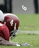
Flight of the Bumblebee Nine, Continued: Yesterday’s entry about the flying Alabama helmet numeral prompted some interesting follow-up contributions. For starters, Doug Simpson found another photo of the play in question. At first I didn’t see the airborne 9, but that’s because I wasn’t looking high enough — it’s right in front of the receiver’s left hand.
Then Wade Harder, who had brought the situation to my attention in the first place, checked in with some additional info: “I was able to watch a replay of the play. The decal flew off in a helicopter motion with a good amount of speed and landed about four yards away from Johnson. He was completely unaware of the mishap as he got off the ground and just trotted back to the huddle.”
Uni Watch News Ticker: This quiz was practically made for Uni Watch readers (with thanks to Allie Hinderstein). ”¦ I can’t find a good photo, but Vince has noted that USF is wearing a pair of memorial decals. Details here. ”¦ Another kicker who wears a wedding band: Rian Lindell. ”¦ Tim Sheehan got some nice pics of a vintage Portland Beavers jersey. ”¦ Attention Minna H. Your worst nightmare is here, here, and here. ”¦ Reprinted from yesterday’s comments: Nice survey of Maple Leafs uni history here. ”¦ Jeremy Brahm just informed me of something called the Golden Players Club, which is reserved for players who have 2,000 hits, 250 saves, or 200 wins in Japan. Members get a blazer (lots of additional pics on the four pages that begin here). ”¦ Intern Vince Grzegorek, increasingly flexing his journalistic muscles beyond the realm of the uni-centric, has a pair of Cleveland Scene sports blog entries here and here. ”¦ Douglas Brei and I would both like to know who the dark-uniformed team is in this photo. ”¦ Apparently PTI didn’t get the memo explaining that the new NFL logo isn’t supposed to be used until next year (with thanks to Jason Farmand). ”¦ Switzerland’s socks look like upside-down stirrups (thanks, Vince). ”¦ According to this video clip, wearing the visiting team’s cap to a ballgame can increase your chances of going home with a baseball (credit Vince yet again). ”¦ You’ve heard of throwback uniforms? Here in New York we had a throwback subway the other day. ”¦ Latest Bengals uni-related problem: Bryan Robinson’s sleeve stripes appeared to be peeling off on Monday night (good spot by Scott Yager). ”¦ Justin Tokarczyk notes that Andy Reid was wearing last year’s headset on Sunday. … Esteban Loaiza wore solid stockings for his Dodgers debut last week, but he must have asked the equipment manager for some stirrups, because that’s what he was wearing last night (good catch by Ros Yoshida). … Several readers have noted that the Cardinals’ coaching staff wears a logo that faces one way on the cap and the other way on the jacket.
It looks like a bastardized version of the Colorado Rockies dark uni.
Sorry, omitted the link. link
The B&W photo of the Habs appears to have a Russian team as the opponent. I’m a little young to know the specifics, but I do know the before Communism fell in Russia (and it appears on it’s way back in) Russian teams would visit and play NHL teams in exhibitions during the season as a way to showcase their talent and their beliefe that they were suprior.
I looked for pictures of the USF helmet stickers, but couldn’t find a good shot. As a student I will have a chance to take pictures next game.
Also Paul, I mentioned this before. You are a New Yorker where the real LT played, Lawrence Taylor, and you call Ladanian Tomlinson LT. Forshame, forshame.
From the Article: “Douglas Brei and I would both like to know who the dark-uniformed team is in this photo. ”
That’s the Colorado Rockies, 1976-1982…then they became the NJ Devils.
The team playing against Montreal is the Moscow Spartak
Here is a Wikipedia link to the Rockies..
link
Apologies if this has been posted: ranking the NFL uniforms on Fox:
link
Sprry Try this one…
link
Douglas Brei and I would both like to know who the dark-uniformed team is in this photo
I think it’s Spartak Moscow. That’s the current logo of the Spartak soccer team (except it has a soccer ball inside the Cyrillic “C”), but the current Spartak hockey club logo has two hockey sticks in it, and not the slash.
Colorado Rockies?
As far as the flag…how did you feel when George Teague ran out with the American flag after 9/11/01? It was stirring. I don’t find anything wrong with what LT did.
I believe the dark uniformed team playing the Canadiens in the hockey photo is the Colorado Rockies. They were only in the league in the late 70s – early 80s.
Paul,
Sorry, but you’re completely wrong about the Tomlinson flag thing. I really don’t think that many people at all would make the stretch to say that one team carrying the flag makes the other team less patriotic. Nobody expects that a visiting team should travel with a large American flag to wave just in case. It’s completely reasonable that a member of the home team would wave a flag (especially when the home team is in a big military town) on opening day just a couple days before 9/11. I seriously doubt that anyone saw that and said, “You know, I’m going to cheer for the Chargers now, because obviously they’re so much more patriotic than the Bears.”
Besides, couldn’t you say exactly the same thing about the Mets wearing first responder caps? By wearing them, are they giving the impression that they care more about 9/11 than the other teams?
Or what about you displaying a flag in your window after 9/11? Were you trying to give the impression that you cared more about America than your neighbor?
Sorry, Paul, I just don’t buy your “us” and “them” argument.
Dark uni hockey team
link
I think that this is the Old Colorado Rockies of the NHL, the logo seems to match
link
(Thanks Chris)
“Douglas Brei and I would both like to know who the dark-uniformed team is in link.”
I think it is some variation of teh Colorado Rockies…if you check out their jersey logo link you can see it is very similar, what with teh C and the stripes
Just testing all the comment buttons.
Don’t know for sure – and I’m not sure – but that might be some sort of Junior Canadiens – a junior team owned or supported by the big club – playing one of their games. I know we used to get lower-level Maple Leafs games on TV here, with teams dressed like the Leafs and playing in Maple Leaf Gardens. Again, this is just a guess.
My big issue with the “God Bless America” at MLB games is that it removes the significance of “Take Me Out to the Ball Game”. At Yankee Stadium, they show the words to GBA on the screen, but not for TMOTTBG. You see more and more people sitting down and not participating in singing TMOTTBG. However, I LOVE Bob Sheppard’s pre-God Bless America speech, and I hope they play that even after he one day is no longer there.
And one thing that was ignored by the media when Roger Clemens made his announcement to return to the Yankees, was that the team stopped TMOTTBG mid-song, and didn’t restart it after the announcement…
Apparently LSU will be wearing a special uniform combo against Tulane on September 29. Instead of link, the team will be wearing white helmets link along with purple jerseys and white pants. The helmet is supposedly the same one which was worn in the 1997 Independance bowl. A good photoshopped version of what the uni could possibly look like can be seen link. This site is also good for seeing some amateur views on the uni subject. As a lifelong tiger fan and an avid UniWatch reader, I have to say that I am pretty excited. I love our normal unis and don’t want to see them changed to something akin to Oregon, but a little change for one game will be quite refreshing.
I’ve noticed a preponderance of NFL lineman this year whose sleeves do not cover their shoulder pad caps… Is this a function of the exceptionally short sleeves not doing their job or the player making a (surely rules violating) choice??
New NFL logo on PTI actually does not look so bad.
[quote comment=”141301″]”Douglas Brei and I would both like to know who the dark-uniformed team is in link.”
I think it is some variation of teh Colorado Rockies…if you check out their jersey logo link you can see it is very similar, what with teh C and the stripes[/quote]
link
and an Alternate Logo Shown here
Moscow Spartak Website
Im guessing that the uni in the hockey photo might be some sort of variation of the linklink but I could be wrong.
The problem with patriotic displays is that they’re like a ratchet — motion is only allowed in one direction. Stop playing “GBA” and you hate America, remove a decal and you don’t support the troops, etc.
It’s so freakin’ annoying.
Column request: Women’s World Cup. There are only 16 teams so it’s not as much work as the Men’s operation…
What hockey teams have jersey unveilings today? If I recall corectly the list Teebz posted the other day had at least one team scheduled to unveil today. Unfortunately, the list has been lost in the shuffle.
Not at all uni related, but- link.
The unknown hocky team looks like it may be the Colorado Rockies possibly a variation of this.
…
Regarding the dark jersey: I am 90% sure that it belongs to the Spartak Moscow who played games against NHL teams in 1978 according to link.
Here’s a link to the team’s current logo. The team also has a history of international competition.
I was thinking Rockies as well based on the C in the logo. My memory of the logo (I guess later) was the C within a mountain. Great use of the CO st flag for the logo and uni colors.
link
I still disagree with Paul about the whole LT flag thing, but this example kind of reminds me of a similar (albeit fake) situation that makes me lean towards his side a little.
That being said, the WWE is clearly fake and Hulk was a character with an agenda. I don’t think that was the case with LT.
That hockey team in the photo was Moscow Spartak.
link
This logo may help.
By the way, Paul, thanks for getting the site back up. Classes haven’t been the same without it. I also have some more observations about LSU that I need to get off my chest. It seems that every player uses the link For some reason I’m finding it hard to put links in here, so if you all don’t mind doing some research, you will clearly see that EVERY PLAYER, save those who wear Revolution helmets have the low hook up. The only time a player has a high hookup is when they have the 6 point strap hook up. PLEASE, someone check this out, its been in my head for so long. I hate that I can’t link the photos because I had some really good examples. Anyway, I have no idea why, maybe some team rule or something, but I have no idea what the reasoning is, maybe keeps the helmet tighter? I don’t know, anyway I would appreciate anyone’s thoughts on the subject.
Paul I think the dark uniformed hockey team playing the Habs could be Moscow Dynamo or another Russian pro team from their tour of the NHL in the mid-70’s.
Great point on the LT – Flag issue. I had originally suggested both teams could bring out a flag. But then fans can’t really boo the opposing team because it looks like you’re booing America.
I don’t think it’s the Rockies as their crest had the “C”, but with a mountain in the background as seen on link in the early 1980s.
[quote comment=”141300″]Dark uni hockey team
link
I think that this is the Old Colorado Rockies of the NHL, the logo seems to match
link
(Thanks Chris)[/quote]
If you go to nhluniforms.com and look at the late 70’s, early 80’s you’ll see the Colorado Rockies uni’s didn’t look like that. But maybee it was a ‘One and Done’ uni everyone missed in the recent article?
also, thanks to cnn.com, cool shots of sports 25 yrs ago: link
sure does make one feel old.
Wow, adidas has really stretched itself creatively in the Womens’ World Cup.
I’ve seen bits of four games while doing my morning channel-surf, and over half the teams I’ve seen are wearing the same uniform template. (It’s the one worn by the Houston Dynamo in MLS, for those who pay attention to such things.)
[quote comment=”141299″]Besides, couldn’t you say exactly the same thing about the Mets wearing first responder caps? By wearing them, are they giving the impression that they care more about 9/11 than the other teams?[/quote]
9/11 happened in New York. The Mets are a New York team. The caps they wear are for New York agencies (NYPD, FDNY, etc.).
“Stoop sale.” New York does intrigue me so. I guess that it’s like a garage sale or yard sale, but without the garage or the yard. I imagine there being hooligans who would run off with the items for sale, like the “Seinfeld” episode where the, uh, thugs took Elaine’s armoir?
Here’s a 2001 Spartak jersey. Looks like we have a winner.link
link
Not to take this too off topic but anyone prefer America the Beautiful over God Bless America?
9/11 happened in New York.
And DC, and Pennsylvania, and everywhere where people had TV and radio that day.
I mean no disrespect, Paul, just pointing it out. I personally think the whole patritotism/sports uniform matrix is tired no matter what form it takes.
[quote comment=”141314″]Not at all uni related, but- link.[/quote]
Why is he wearing white after Labor Day?
[quote comment=”141314″]Not at all uni related, but- link.[/quote]
You’ve got to be kiddin me…the guy works as a meat cutter at Sam’s?? Oh, the irony/millions of steers finally exact a small measure of revenge.
I think the Montreal player pictured is Jaque Lemaire. Current coach of the Minnesota Wild.
Email him. maybe he will remember.
link
link
[quote comment=”141339″]9/11 happened in New York.
And DC, and Pennsylvania, and everywhere where people had TV and radio that day.
I mean no disrespect, Paul, just pointing it out. I personally think the whole patritotism/sports uniform matrix is tired no matter what form it takes.[/quote]
No offense taken. Valid points, all.
9/11 also happened in DC.
Great work on getting the site up and running again.
and Pennsylvania. And those that died came from everywhere.
As a Chargers fan my opinion may be a bit biased, but I don’t mind LT carrying the flag out as much as I do the histrionics…Just run it out/ the jumping around was a bit much/ but I agree with a previous comment, San Diego is home to a large military contingent nad this may have been the teams way to honor them on Opening Day. As for the flag on his helmet, maybe he got “bama’ed”..the Bears were definitely hitting hard enough to rattle teeth and dislodge decals.
Looking at that photo again — and zooming and enhancing and squinting — there’s a serif on the C, definitely.
I’ve conceded to the Spartak crowd — thought I can’t seem to find a Spartak uniform like that one. Logo’s a match, though.
[quote comment=”141313″]What hockey teams have jersey unveilings today? If I recall corectly the list Teebz posted the other day had at least one team scheduled to unveil today. Unfortunately, the list has been lost in the shuffle.[/quote]
The Toronto Maple Leafs are releasing their Jersey today. Around 3pm EST I think…….
What happened to the full text feed for this site? I swear I got some yesterday!
Those vintage Portland jerseys are gorgeous beyond belief, and those Cardinals coach photos look absolutely silly with the logos facing opposite directions.
[quote comment=”141305″]Apparently LSU will be wearing a special uniform combo against Tulane on September 29. Instead of link, the team will be wearing white helmets link along with purple jerseys and white pants. The helmet is supposedly the same one which was worn in the 1997 Independance bowl. A good photoshopped version of what the uni could possibly look like can be seen link. This site is also good for seeing some amateur views on the uni subject. As a lifelong tiger fan and an avid UniWatch reader, I have to say that I am pretty excited. I love our normal unis and don’t want to see them changed to something akin to Oregon, but a little change for one game will be quite refreshing.[/quote]
Didn’t they wear gold jerseys for the 97 Independence Bowl?
[quote comment=”141323″]I don’t think it’s the Rockies as their crest had the “C”, but with a mountain in the background as seen on link in the early 1980s.[/quote]
Definately is Moscow Spartak
Spartak played against the Canadiens in the Superseries ’77 ’78
Two things.
First, you guys keep linking to stuff about the Colorado Rockies, and nowhere in any of those links are they wearing uniforms that look like that.
Second, did you really think you needed to explain to people who post on this board that there used to be a hockey team called the Colorado Rockies?
I agree with Paul about the flag. It’s like when a player wants to thank God after winning a game. (I already know that some thank God for giving them the talent and ability … blah blah blah.) A lot of players thank God for helping them win. As if the other team was full of athiests and satanists and God didn’t look kindly upon them that day. God wanted to see them humiliated.
I listen to WOXY at work (cool indie rock type station)…anyway today the morning DJ was wearing link.
i wrote him an email to ask him where he got it, what it was, etc. he wrote back saying he didn’t know what it was, but he found it at goodwill. what an awesome find at Goodwill.
anyone know what it is? there doesn’t appear to be a name/number on the back, but it does have a “NY” stitched on the left arm sleeve.
[quote comment=”141332″][quote comment=”141299″]Besides, couldn’t you say exactly the same thing about the Mets wearing first responder caps? By wearing them, are they giving the impression that they care more about 9/11 than the other teams?[/quote]
9/11 happened in New York. The Mets are a New York team. The caps they wear are for New York agencies (NYPD, FDNY, etc.).[/quote]
This is truly the most ignorant thing I have ever read. It’s also exactly what I would expect from most New Yorkers. The arrogance of that city, and really that whole region is disgusting. It is the reason that I, and much of so called “fly over country”, hate the entire northeast portion of our country.
interesting the flag-on-the-helmet issue surfaced here today. I was SKEWERED on cris creamer’s board for bringing up willie parker’s absence of flag. I stated that it upset me he didnt’ have it on his helmet and I was lambasted; accused of many things, mostly political… when my post had no political angle whatsoever and still does not. I have never read so many opinions critical and nasty of patriotism.
before tomlinson was flag-less on sunday, parker was 1 out of 1,696 players in the NFL not wearing one.
the vitriol that followed was an eye-opening experience… and disturbing.
so be careful where you tread!!
I don’t hate the North East, I just hate the North East bias in the media because that’s where the big offices are located and they think news only happens there. Look no further than how “big” the Red Sox-Yankees rivalry is, yet the Cubs Cardinals rivalry never gets mentioned.
Lukas, I expect to see pictures of stirrup clad Ian Kennedy after his start tommorow night.
A clarification on the United States Code, Title 36, Chapter 10, §176(j): “No part of the flag should ever be used as a costume or athletic uniform. However, a flag patch may be affixed to the uniform of military personnel, firemen, policemen, and members of patriotic organizations.”
I was in the Army and was given a very specific lesson on wearing the flag.
Patches and images of the flag on apparel are all good. Wearing a flag is disrepectful and wrong. As is cutting up a flag to use as material for an outfit, or an outfit designed to look like it was made from parts of a flag.
link is wrong.
link is terribly wrong.
So is link.
[quote comment=”141361″][quote comment=”141332″][quote comment=”141299″]Besides, couldn’t you say exactly the same thing about the Mets wearing first responder caps? By wearing them, are they giving the impression that they care more about 9/11 than the other teams?[/quote]
9/11 happened in New York. The Mets are a New York team. The caps they wear are for New York agencies (NYPD, FDNY, etc.).[/quote]
This is truly the most ignorant thing I have ever read. It’s also exactly what I would expect from most New Yorkers. The arrogance of that city, and really that whole region is disgusting. It is the reason that I, and much of so called “fly over country”, hate the entire northeast portion of our country.[/quote]
My favorite city is Milwaukee. My favorite state is Wisconsin. My favorite part of the country is the Great Lakes region, followed by the Deep South. Please save your generalities for someone else.
#62, Jeff…
I don’t agree with Paul on the Tomlinson flag issue, but calm yourself down. Your post is inappropriate. You’re embarassing yourself.
I like the notion of teams carrying a city flag- if only because it would encourage the Bears to bring out the truly excellent link (which I fondly remember making a brief appearance on the back of White Sox batting helmets several years ago).
Long-time hockey watchers will remember the years when Russian teams — Spartak, Dynamo, et al — would visit NHL teams for exhibition games.
Uniwatchers looking for clues as to the identity of the team can start with:
– Paul’s personal favorite — the sock striping, which was common among Russian teams in that era;
– the goalie’s helmet/cage combo. Helmet type (Jofa? Koho? My memory fades…) was another Russian standard and the cage did not become common in North America until our goalies started to notice fewer facial scars on their Euro counterparts;
– the goal number (24). Again, an unconventional goalie number that we’d see on Russians at a time when our goals wore only 1 or 30 and occasionally a 29, 31, or 35.
Those are the biggies. Hope that helps.
[quote comment=”141366″]A clarification on the United States Code, Title 36, Chapter 10, §176(j): “No part of the flag should ever be used as a costume or athletic uniform. However, a flag patch may be affixed to the uniform of military personnel, firemen, policemen, and members of patriotic organizations.”
I was in the Army and was given a very specific lesson on wearing the flag.
Patches and images of the flag on apparel are all good. Wearing a flag is disrepectful and wrong. As is cutting up a flag to use as material for an outfit, or an outfit designed to look like it was made from parts of a flag.
link is wrong.
link is terribly wrong.
So is link.[/quote]
link is okay.
link is not okay.
If you look at Magic at the end of the line, in this link. He draped a flag over his shoulder to cover the logo of the apparel manufacturer that he was not affiliated with. Draping yourself in a flag is a big no no. So is handling it like link.
There is flag protocol and etiquette taught to most service men. For example, flags are never thrown away. The stars are removed and then the flag burned (of all things.)
[quote comment=”141299″]Besides, couldn’t you say exactly the same thing about the Mets wearing first responder caps? By wearing them, are they giving the impression that they care more about 9/11 than the other teams?
[/quote]
As a New Yorker, I do find the “first responder” caps to be crass. Didn’t like them in 2001, but at least I understood what they were trying to do. Now that it’s a regular tradition, it seems even more crass to me.
[quote comment=”141369″][quote comment=”141344″][quote comment=”141339″]9/11 happened in New York.
And DC, and Pennsylvania, and everywhere where people had TV and radio that day.
I mean no disrespect, Paul, just pointing it out. I personally think the whole patritotism/sports uniform matrix is tired no matter what form it takes.[/quote]
No offense taken. Valid points, all.[/quote]
I am so relieved that you are not offended. Nevermind that you have offended everyone else on this board.
I also appreciate that you have deemed others’ points of views “valid”. You are such a worthy final arbitor.
Your arrogance astounds me.
Today is my last day reading your site sir.[/quote]
Paul didn’t offend me. Thanks for speaking for the rest of us…
Jeff on 09.12.07 10:41 am | Quote
Your arrogance astounds me. Today is my last day reading your site sir.
Don’t let the door hit you in the ass on the way out.
[quote comment=”141363″]interesting the flag-on-the-helmet issue surfaced here today. I was SKEWERED on cris creamer’s board for bringing up willie parker’s absence of flag. I stated that it upset me he didnt’ have it on his helmet and I was lambasted; accused of many things, mostly political… when my post had no political angle whatsoever and still does not. I have never read so many opinions critical and nasty of patriotism.
[/quote]
When you question the patriotism of a player for not wearing a sticker on his helmet, you ought to expect a strong response.
Here’s a shot of the USF memorial stickers from the SouthFloridaBulls TheBullspen.com website:
9/11 is an emotional subject for us all reguardless where we come from. Patriotism is different for everybody, and I relate it to religion because of that. Therefore, like we do with other people’s religion, we need to respect their views on patriotism if not for them, but for the brave men and women who have/are fightinig to defend our freedom.
On another note. This is Paul’s site, therefor giving him the right to say whatever he darn well pleases. He’s also nice enough to let us say out piece of mind and gie our points of view. If he can respect what we have to say, why can’t we respect his even if we may not agree with it.
Not to single you out Jeff, but I can see Paul struck a nerve with you. I understand that and you have every right to be upset. I ask you this though. Is it better to continue threads of anger that only fuel a fire, or is it better to say OK, that’s their thoughts and I think they are wrong and move on? As our moms all used to tell us, “two wrongs don’t make a right.”
So how bouth them Devil Rays and their beautiful team colors?
Uni Watch covered the whole Spartak Moscow question back on Dec. 11, 2006. Look at post #95; I think it was the exact same photo being referred to.
[quote comment=”141307″]New NFL logo on PTI actually does not look so bad.[/quote]
I really disliked the newq NFL logo when released … but it’s growing – quickly on me. When taken purely for what it is, it screams NFL much more than the 1970s version it’s replacing. Is it perfect? No. But outside of the simplicity of the Chicago Cubs cap, what is?
Jeff,
Isn’t it also ignorant to “hate the entire northeast portion of our country.” based on one city?
Have you been to other parts in New York? Upstate? Western? What about New Hampshire or Vermont? Don’t generalize a region of the U.S. by one city.
On that note, why don’t we get back to talking about uniforms.
US and NYC arguments on 9/11? Who’d have guessed it? I’ll be back tomorrow after saying this:
In the 70s, NHL teams didn’t have “one and done” uniforms…they were lucky if a shirt was used less than 3 years. You guys can squint and alter the pic as much as you want, that is 100% without question Spartak Moscow.
[quote comment=”141294″]Apologies if this has been posted: ranking the NFL uniforms on Fox:
link
For the most part, I agree with this guy and his reasoning.
Phil Hughes did not have a flag on his hat last night because he was wearing last years version (grey under brim).
9/11 happened in New York.
And DC, and Pennsylvania, and everywhere where people had TV and radio that day.
I mean no disrespect, Paul, just pointing it out. I personally think the whole patritotism/sports uniform matrix is tired no matter what form it takes.
No offense taken. Valid points, all.
I am so relieved that you are not offended. Nevermind that you have offended everyone else on this board.
I also appreciate that you have deemed others’ points of views “valid”. You are such a worthy final arbitor.
Your arrogance astounds me.
Today is my last day reading your site sir.
Paul didn’t offend me. Thanks for speaking for the rest of us…
I’m not offended, plus Paul is stating that the Mets wear the First Responders caps to show their gratitude. If you have a problem with that take it up with the Mets.
Yes there were other incidents throughout the country…so why don’t the Nationals and Pirates/Phillies wear the caps of their local agencies?? I believe this is the Mets way of honoring the New York victims who put their lives on the line.
[quote comment=”141386″][quote comment=”141294″]Apologies if this has been posted: ranking the NFL uniforms on Fox:
link
For the most part, I agree with this guy and his reasoning.[/quote]
I agree. He at least gives logical reasons for his rankings too other than a prebubescent explination like they look “totaly sweet, and hey, Deion wore that uniform.”
Let’s try that again:
link
and once more, just in case…
link
link
As was mentioned in post #86, why don’t the Nats wear theri first responder’s caps on 9/11. This makes me think, instead of weaing a hat with a glued on flag, why not alow every team to wear first responder caps from their home city. This would even work for the Jays as I believe (maybe a bit bias as my dad is a Chicago firefighter who also happened to be dispatched to Ground Zero on 9/12) that all our first respnders are under apprechiated and a simple sign of respect to the true hearos by those who are false heros in my opinion is a nice touch, even if it is forced. It at least send the right message to our kids.
[quote comment=”141361″][quote comment=”141332″][quote comment=”141299″]Besides, couldn’t you say exactly the same thing about the Mets wearing first responder caps? By wearing them, are they giving the impression that they care more about 9/11 than the other teams?[/quote]
9/11 happened in New York. The Mets are a New York team. The caps they wear are for New York agencies (NYPD, FDNY, etc.).[/quote]
This is truly the most ignorant thing I have ever read. It’s also exactly what I would expect from most New Yorkers. The arrogance of that city, and really that whole region is disgusting. It is the reason that I, and much of so called “fly over country”, hate the entire northeast portion of our country.[/quote]
I relocated to the south and it amazes me how many hyper-patriotic people are so quick to hate on the metropolitan areas of the country.
It’s almost as if these red staters pride themselves on being more patriotic that blue staters, but could really care less about these regions and that is the exact opposite of being patriotic. You either love the whole country or you just love your region … in which case, you should just fly your states flag … or the stars and bars.
The bottom line is that Jeff happens to be ignorant. But that’s okay — ignorance is rampant, and this site is not immune to that. I have posted exactly ONE comment on this site in the year + I have been stopping by. I like to be an observer, check out the links, and see who is doing what to their uni’s. I disagree with people regularly, but this is the first time I have wanted to speak up simply because Jeff is as wrong as he sees Paul to be. It sickens me about what happened six years ago. But everyone will have strong emotions about it and their own opinions. Jeff is nothing more than an asshole — he jumps in, criticizes Paul’s thoughts and opinions while being blind to the fact that Paul has given Jeff THIS VERY FORUM to share HIS opinions. Ignorance IS bliss, after all…
[quote comment=”141395″]You know what, F it. Obviously I am just a bitter whack job and a piece of s*$&. Ignore me. Carry on[/quote]
Somebody needs a puppy.
The alleged mistake outlined in the photo of the pitcher with the American flag on his right shoulder, seemingly reversed, wasn’t oversight or a mistake. That’s the way the colors should be presented on the right sleeve.
The flag should always appear with the blue field leading on a moving object (such as a person), the same it would appear if it were being carried on a flagpole and viewed from that direction. This is a common presentation on military uniforms. If there was another mistake in the photo being referred to, my apolgies. Here’s a link that explains it in detail:
link
To the poster asking about NHL uniform releases today, there’s a big one: Toronto. They are redoing the uniform AND updating the classic maple leaf logo.
Here’s the link to the countdown page for all NHL jersey unveilings, in the lower right corner:
link
[quote comment=”141380″]So how bouth them Devil Rays and their beautiful team colors?[/quote]
The new ones or the old ones?
;-)
[quote comment=”141388″][quote comment=”141377″]Jeff on 09.12.07 10:41 am | Quote
Your arrogance astounds me. Today is my last day reading your site sir.
Don’t let the door hit you in the ass on the way out.[/quote]
I wish I had a chance to beat your ass on my out, buddy.
I would love the chance to fight you[/quote]
Who is this guy? He’s making me laugh though…..
Looking through the last couple days, and saw this (looks like only 2 entries survived The Move, so I apologize if this has been said before):
link
I’m intrigued by the fact that with very little creativity, the shadow can look very much like A) obviously – a baseball player catching a ball, B) a basketball player getting ready to dunk – can’t just just see a 23 on his back?, or C) an NFL receiver catching a deep pass.
I like my trolls better with a bit of creativity.
Time to put the old “Ban” on Jeff.
The Avs and Leafs are unveiling their new RBK uniforms today.
Its a damn shame what’s going on with this message board. Is this CNN or FOX News? NO! it is UNIwatch. Why can’t we talk about something like how good the black chin strap looked on Chad Johnson? or ANYTHING but this political/social argument going on. Can we please get back to the subject matter meant for this place. For once I thought I had made a good point with the LSU chin strap thing, but of course it happens on the day this became the guide to American Flag use.
[quote comment=”141370″]I like the notion of teams carrying a city flag- if only because it would encourage the Bears to bring out the truly excellent link (which I fondly remember making a brief appearance on the back of White Sox batting helmets several years ago).[/quote]
link
[quote comment=”141409″]Looking through the last couple days, and saw this (looks like only 2 entries survived The Move, so I apologize if this has been said before):
link
I’m intrigued by the fact that with very little creativity, the shadow can look very much like A) obviously – a baseball player catching a ball, B) a basketball player getting ready to dunk – can’t just just see a 23 on his back?, or C) an NFL receiver catching a deep pass.[/quote]
Looks more like a lay up than a dunk to me. Both that and the flying number picture look to good to be true. You’d almost think they were photoshoppped. Very intresting pictures.
Ray Lewis is still wearing “R Lewis” on his jersey even though hes the only Lewis on the Ravens.
Can sort of see here.
Sorry
Here
link
Sorry, I can show signs of illiteracy at times. The link in post #99 is to a pretty cool informational/interactive web page for the Flag of the City of Chicago, explaining all of the symbolism.
Everyone’s forgetting that the Ave’s jersey also comes out today. And with that maroon, they run on a very thin line of what’s good and bad….
When you referred to flag etiquette and had the shot of Roger Clemens pitching for Team USA, to what are you referring? If you mean the flag on his sleeve with the blue field on the right, that is correct. Flags worn on the right arm are always presented as such on military uniforms. It goes back centuries to when an army would actually march into battle behind a flag bearer. Viewing the troops and the flag from their right hand side, the blue is viewed in that direction as they charge forward into battle. If the blue field was on the left then the army would be retreating.
[quote comment=”141424″]Everyone’s forgetting that the Ave’s jersey also comes out today. And with that maroon, they run on a very thin line of what’s good and bad….[/quote]
You have something against Maroon? My high school colors were Maroon and Burnt Orange. You say it’s a bad combo, but look at VT and tell me how nice that looks. As far as I know we were the only high school in the nation with that combo too. After college I did some high school hockey coaching and our colors were Maroon and gold. At both schools all the appearal looked great as the right shade of maroon (not quite purple, not quite brown) really allows the secondary color to pop.
[quote comment=”141373″][quote comment=”141366″]A clarification on the United States Code, Title 36, Chapter 10, §176(j): “No part of the flag should ever be used as a costume or athletic uniform. However, a flag patch may be affixed to the uniform of military personnel, firemen, policemen, and members of patriotic organizations.”
I was in the Army and was given a very specific lesson on wearing the flag.
Patches and images of the flag on apparel are all good. Wearing a flag is disrepectful and wrong. As is cutting up a flag to use as material for an outfit, or an outfit designed to look like it was made from parts of a flag.
link is wrong.
link is terribly wrong.
So is link.[/quote]
link is okay.
link is not okay.
If you look at Magic at the end of the line, in this link. He draped a flag over his shoulder to cover the logo of the apparel manufacturer that he was not affiliated with. Draping yourself in a flag is a big no no. So is handling it like link.
There is flag protocol and etiquette taught to most service men. For example, flags are never thrown away. The stars are removed and then the flag burned (of all things.)[/quote]
In that case why didn’t linkcause as much controversy as Janet Jackson at Super Bowl XXXIX?
[quote comment=”141425″]When you referred to flag etiquette and had the shot of Roger Clemens pitching for Team USA, to what are you referring? If you mean the flag on his sleeve with the blue field on the right, that is correct.[/quote]
No no no — I know the flag is correctly oriented on Clemens’s sleeve, and I’ve written about that several times. I just meant that if you interpret the Flag Code to mean that flags shouldn’t be worn on sports uniforms, then that code is routinely ignored, as shown in that photo.
ajc.com ranks Georgia High Schools coolest looking helments.
[quote comment=”141361″][quote comment=”141332″][quote comment=”141299″]Besides, couldn’t you say exactly the same thing about the Mets wearing first responder caps? By wearing them, are they giving the impression that they care more about 9/11 than the other teams?[/quote]
9/11 happened in New York. The Mets are a New York team. The caps they wear are for New York agencies (NYPD, FDNY, etc.).[/quote]
This is truly the most ignorant thing I have ever read. It’s also exactly what I would expect from most New Yorkers. The arrogance of that city, and really that whole region is disgusting. It is the reason that I, and much of so called “fly over country”, hate the entire northeast portion of our country.[/quote]
You do realize that by lumping the entire population of the northeast together, you just did the exact thing you’re ranting against, right?
[quote comment=”141389″]9/11 happened in New York.
And DC, and Pennsylvania, and everywhere where people had TV and radio that day.
I mean no disrespect, Paul, just pointing it out. I personally think the whole patritotism/sports uniform matrix is tired no matter what form it takes.
No offense taken. Valid points, all.
I am so relieved that you are not offended. Nevermind that you have offended everyone else on this board.
I also appreciate that you have deemed others’ points of views “valid”. You are such a worthy final arbitor.
Your arrogance astounds me.
Today is my last day reading your site sir.
Paul didn’t offend me. Thanks for speaking for the rest of us…
I’m not offended, plus Paul is stating that the Mets wear the First Responders caps to show their gratitude. If you have a problem with that take it up with the Mets.
Yes there were other incidents throughout the country…so why don’t the Nationals and Pirates/Phillies wear the caps of their local agencies?? I believe this is the Mets way of honoring the New York victims who put their lives on the line.[/quote]
Hey guys,
Lets remember this is a site to talk about sport uni’s. This is one of those topics like politics or religion, no matter how good a point you have, someone else is going to disagree and/or get insulted. Paul has his view, some have others. Let it be at that. No one is right, no one is wrong. The fact is we live in a country where link if they want to, or have link, and that is a great right to have, thats why the United States is great place to live. NOW LETS TALK SPORTS.
Try this link
link
[quote comment=”141380″]9/11 is an emotional subject for us all reguardless where we come from. Patriotism is different for everybody, and I relate it to religion because of that. Therefore, like we do with other people’s religion, we need to respect their views on patriotism if not for them, but for the brave men and women who have/are fightinig to defend our freedom.
On another note. This is Paul’s site, therefor giving him the right to say whatever he darn well pleases. He’s also nice enough to let us say out piece of mind and gie our points of view. If he can respect what we have to say, why can’t we respect his even if we may not agree with it.
Not to single you out Jeff, but I can see Paul struck a nerve with you. I understand that and you have every right to be upset. I ask you this though. Is it better to continue threads of anger that only fuel a fire, or is it better to say OK, that’s their thoughts and I think they are wrong and move on? As our moms all used to tell us, “two wrongs don’t make a right.”
So how bouth them Devil Rays and their beautiful team colors?[/quote]
Well said
one more time
link
[quote comment=”141426″][quote comment=”141424″]Everyone’s forgetting that the Ave’s jersey also comes out today. And with that maroon, they run on a very thin line of what’s good and bad….[/quote]
You have something against Maroon? My high school colors were Maroon and Burnt Orange. You say it’s a bad combo, but look at VT and tell me how nice that looks. As far as I know we were the only high school in the nation with that combo too. After college I did some high school hockey coaching and our colors were Maroon and gold. At both schools all the appearal looked great as the right shade of maroon (not quite purple, not quite brown) really allows the secondary color to pop.[/quote]
I doin’t think he was dissing the color so much as suggesting that it’s an easy color to overdo on a uni.
By the way Phoenix and Vegas were awesome and I’m back to the board that I missed most.
Just to add to the Flag issue, In Serie ‘A’ the winner of the previous campaign wears the the Italian Flag colors on the front of their shirt
link
Also, the winner of the the Cup competition wears a ‘Bullseye’ of the Italian colors
link
Wonder how that would look for World Series or Super bowl Winners? Any Ideas?
[quote comment=”141430″]ajc.com ranks Georgia High Schools coolest looking helments.
[/quote]
Good find Chris. Here’s a link to a picture of all 10:
link
Last night I got to see the replay of the Florida International vs. Maryland game. This was my first peek at the white uni’s for the season, and there appears to be a small black rectangle above the left sleeve number. link.
Anyone know what this is?
[quote comment=”141437″]Just to add to the Flag issue, In Serie ‘A’ the winner of the previous campaign wears the the Italian Flag colors on the front of their shirt
link
Also, the winner of the the Cup competition wears a ‘Bullseye’ of the Italian colors
link
Wonder how that would look for World Series or Super bowl Winners? Any Ideas?[/quote]
It would probably look like the link.
As was mentioned in post #86, why don’t the Nats wear their first responder’s caps on 9/11.
Because they didn’t have first responder caps when baseball came back after 9/11/01.
In 2001 I went to Montreal to see Coupe Grey Cup. The CFL helmets had Canada and US flag stickers, and the Star Spangled Banner was played before the game (after O Canada, I think).
It was my only Grey Cup (to date–waiting for the Roughriders to get back in–it may be my last) and I don’t know if that’s a continued practice.
The key to the code is no part of THE flag. Flag stickers are totally different and I woudl imagine it is purely up to the that team equipment guy and/owner whether or not a flag is worn. On my pro women’s team, our helmets came with flags. It is AMERICAN FOOTBALL, by the way!
[quote comment=”141373″][quote comment=”141366″]
There is flag protocol and etiquette taught to most service men. For example, flags are never thrown away. The stars are removed and then the flag burned (of all things.)[/quote]
What happens to the stars after they’re removed?
Flags and memorials do not always mix with sporting events.
I was at the NCAA Basketball Championship Game in Atlanta in 2002. Maryland was playing Indiana and the atmosphere was electric – music, colors, excitement, noise.
Then they brought out the World Trade Center flag carried by NYC firemen for the national anthem. What a buzzkill. I would very much have wanted to see the flag and honor the firemen – but in a respectful, thoughtful manner – not as part of the excitement at the Final Four.
You could feel it take the air out of the crowd as they walked in – peole trying to reduce their excitement to respect the flag. After the song, as they walked out, the teams seemed unsure what to do until the flag left.
My thoughts was that it was an inappropriate way to display the flag and honor the firemen.
Note: maybe not completely uni-related, but interesting nonetheless
I was browsing at the NC State (where I’m a student) bookstore earlier this week and found a New Era cap with quite a misprint.
link and note that “MS State” is over 600 miles away from here.
[quote comment=”141327″]also, thanks to cnn.com, cool shots of sports 25 yrs ago: link
sure does make one feel old.[/quote]
Some great shots. Don’t know where they got the info about “future actor Mark Harmon” kicking the FG that gave Stanford the lead in the 1982 Cal game that ended with Cal’s TD-through-the-band, though. Mark Harmon played QB at UCLA a decade earlier.
[quote comment=”141338″]Not to take this too off topic but anyone prefer America the Beautiful over God Bless America?[/quote]
Actually, I do.
Texas A&M’s tight End Michael Bennett will switch numbers from 13 to 85 for injured Buffalo Bills tight end Kevin Everett.
link
I personally give an exemption to all the service academies and USA National Teams, and I think the US Code does as well. The academies are extensions of the respective branches, and the United States Olympic Committee (along with the various national teams) would be considered a “Patriotic organization”. So it is appropriate for the United States Baseball Team to have flag patches on their sleeves, but it is technically wrong for Magic to use the flag to cover up a competitor’s logo on the Gold Medal stand in 1992.
Was reading the stuff about the Pink hats and made me want to share this. I went to the Broncos/Cards pre-season game. I went with a date and when I got to her house she opened the door and was wearing a Broncos jersey with pink numbers and letters. i have never been so embarrassed walking to my seats. Seriously people, leave the pink stuff at home!
[quote comment=”141440″]Last night I got to see the replay of the Florida International vs. Maryland game. This was my first peek at the white uni’s for the season, and there appears to be a small black rectangle above the left sleeve number. link.
Anyone know what this is?[/quote]
It’s a tribute/memorial to the victims of the VT shootings. A lot, if not all ACC teams are doing it.
ex.
link
link
Saw a neat commercial last night! “The logo is there to tell you what the car is… not who you are”.
Check out the link. A random commercial will play. And then you can click the bottom box to see the logo commercial. More words at the end of the commercial says “You define the car, not the other way around”.
[quote comment=”141453″][quote comment=”141440″]Last night I got to see the replay of the Florida International vs. Maryland game. This was my first peek at the white uni’s for the season, and there appears to be a small black rectangle above the left sleeve number. link.
Anyone know what this is?[/quote]
It’s a tribute/memorial to the victims of the VT shootings. A lot, if not all ACC teams are doing it.
ex.
link
link
What I noticed first in that first link is that the RBK logo appears to be coming off the right pant leg of the BC player.
New Avalanche jerseys from their press conference:
link
[quote comment=”141314″]Not at all uni related, but- link.[/quote]
A meat cutter… the irony!
link
[quote comment=”141452″]…Seriously people, leave the pink stuff at home![/quote]
That was your problem you brought the pink stuff
[quote comment=”141455″][quote comment=”141453″][quote comment=”141440″]Last night I got to see the replay of the Florida International vs. Maryland game. This was my first peek at the white uni’s for the season, and there appears to be a small black rectangle above the left sleeve number. link.
Anyone know what this is?[/quote]
It’s a tribute/memorial to the victims of the VT shootings. A lot, if not all ACC teams are doing it.
ex.
link
link
What I noticed first in that first link is that the RBK logo appears to be coming off the right pant leg of the BC player.[/quote]
I think that it actually the NC State players jersey decal that’s causing that illusion, I don’t think it’s actually coming off. I zoomed in, and it llooks just like the logo on the NCState players visible left arm.
That Av’s jersey is awful!!
[quote comment=”141426″][quote comment=”141424″]Everyone’s forgetting that the Ave’s jersey also comes out today. And with that maroon, they run on a very thin line of what’s good and bad….[/quote]
You have something against Maroon? My high school colors were Maroon and Burnt Orange. You say it’s a bad combo, but look at VT and tell me how nice that looks. As far as I know we were the only high school in the nation with that combo too. After college I did some high school hockey coaching and our colors were Maroon and gold. At both schools all the appearal looked great as the right shade of maroon (not quite purple, not quite brown) really allows the secondary color to pop.[/quote]
VT’s colors are so bad they leave a bad taste in my mouth, in order to improve that taste it I am forced to throw up in my mouth.
I agree that the Canadiens are playing against Moscow Spartak. The Soviets sent some teams over to play WHA and NHL teams in the late 70s early 80s. The Canadiens played CSKA and Spartak in the years Lemaire played. The soviet goaltender is not Tretiak so it must be from the game against Spartak.
[quote comment=”141429″][quote comment=”141425″]When you referred to flag etiquette and had the shot of Roger Clemens pitching for Team USA, to what are you referring? If you mean the flag on his sleeve with the blue field on the right, that is correct.[/quote]
No no no — I know the flag is correctly oriented on Clemens’s sleeve, and I’ve written about that several times. I just meant that if you interpret the Flag Code to mean that flags shouldn’t be worn on sports uniforms, then that code is routinely ignored, as shown in that photo.[/quote]
The Flag Code clearly states: However, a flag patch may be affixed to the uniform of military personnel, firemen, policemen, and members of patriotic organizations.”
Paul, are you calling Roger Clemens and the USA Baseball team a nonpatriotic organization?
How dare you, I will never read your site again because of your arrogance!
Damn, I couldn’t make it two minutes. Never mind my ban.
There is nothing wrong with running around out of the tunnel with an American flag and jumping around to get people excited. Also, there is nothing wrong with wearing green plaid shorts with black socks up to your knees. Similarly, both actions are tacky and make you look stupid.
I hate God Bless America during the 7th Inning Stretch with the fire of a nova.
Thought you all would enjoy these (from Sports Guys site), or maybe just the fighting that may ensue:
link
link
[quote comment=”141460″]link[/quote]
Well go ahead and put the Avs at the top of the worst RBK Edge jersey. All that maroon and blue. They look like some kind of twisted candy cane.
[quote comment=”141426″][quote comment=”141424″]Everyone’s forgetting that the Ave’s jersey also comes out today. And with that maroon, they run on a very thin line of what’s good and bad….[/quote]
You have something against Maroon? My high school colors were Maroon and Burnt Orange. You say it’s a bad combo, but look at VT and tell me how nice that looks. As far as I know we were the only high school in the nation with that combo too. After college I did some high school hockey coaching and our colors were Maroon and gold. At both schools all the appearal looked great as the right shade of maroon (not quite purple, not quite brown) really allows the secondary color to pop.[/quote]
No offense… but maroon doesn’t go with anything excpet white and gray (and black). Gig’em, by the way!
[quote comment=”141474″][quote comment=”141426″][quote comment=”141424″]Everyone’s forgetting that the Ave’s jersey also comes out today. And with that maroon, they run on a very thin line of what’s good and bad….[/quote]
You have something against Maroon? My high school colors were Maroon and Burnt Orange. You say it’s a bad combo, but look at VT and tell me how nice that looks. As far as I know we were the only high school in the nation with that combo too. After college I did some high school hockey coaching and our colors were Maroon and gold. At both schools all the appearal looked great as the right shade of maroon (not quite purple, not quite brown) really allows the secondary color to pop.[/quote]
No offense… but maroon doesn’t go with anything excpet white and gray (and black). Gig’em, by the way![/quote]
Gig ’em right back at ya!
Ducks revealed, Sabres revealed, Avs revealed. Quite the day for bad sweaters… But it still turns me on ever so slightly.
New Sabres Jersey
link
Check out this Mexican soccer players protective face mask
link
He should have color coordinated at least!
regarding Tomlinson waving the flag. Hey LT, we know where you are from and that you are playing in the U.S. Oh by the way, were you playing for the American Flag on Sunday? or for the Chargers.
Before you mock the Maroon and Burnt Orange combo, check out how nice they look togther on stirups link.
[quote comment=”141482″]Before you mock the Maroon and Burnt Orange combo, check out how nice they look togther on stirups link.[/quote]
Joe, great find. Love the stirrups, and the white cleats just kind of completely the whole look, a nice touch.
[quote comment=”141482″]Before you mock the Maroon and Burnt Orange combo, check out how nice they look togther on stirups link.[/quote]
Act “manfully”?
[quote comment=”141482″]Before you mock the Maroon and Burnt Orange combo, check out how nice they look togther on stirups link.[/quote]
When I think Burnt Orange, I think link. Is the orange in the stirrups also burnt orange and I can’t tell?
my response at today’s NHL unveilings so far.
Avalanche: gasp to horror to frowny:(
Duck: i guess it’s ok, i need a better look
buffaslug: lol they kept the slug despite their third last year being extremely popular among fans
[quote comment=”141484″][quote comment=”141482″]Before you mock the Maroon and Burnt Orange combo, check out how nice they look togther on stirups link.[/quote]
Act “manfully”?[/quote]
Yes. Act Manfully in Christ Jesus is the schools motto, meaning act as a responsible man, caring, polite man they way Christ would. It’s an all guys Catholic high school if you couldn’t guess. Also the alma mater of NY Giant Dave Deil
Interesting arm bands… not something I would think a player would be advertising
link
Last night Mike Timlin for the Red Sox was wearing his camoflauge glove, and a cap with a grey underbrim, although I can’t find a photo. Need to work on my screen grabbing skills.
Mark Spitz flag speedos? Apollo Creed trunks? Anyone? Bueller?
Paul, thanks a whole lot. Now I WILL be having nightmare of pink hats. I had no idea the Twins were to blame for that fiasco–now, I am doubly ashamed. I am glad the pink hat is going out of style–may it never come back in again.
As for the flag and uniforms–I still don’t see any reason to have a flag on a sports’ uniform at all. It’s a sporting event, entertainment, for goodness sakes. From an aesthetic standpoint, I would prefer no flag as less is more, and the flag patches just clutter things up.
I agree with Matt B. that there is no way to gracefully back out of having the flag on your uni without being accused of not being patriotic.
I am glad the Wild!’s new unis are not so far off from the old ones.
Minna H. I disagree with you comment that flags shouldn’t be on uniforms. I think international play is the perfect place for the flag patch. I also like in the NHL all-star game how they put the flag of the star’s home country on one shoulder, and their team logo on the other.
I think there are places for the flag, but I do agree thatmaybe we’ve gone a bit over board with it. I do like the small decal on the back of helmets though as it’s small enough not to call attention to it like the flag patch MLB wore after 9/11, but big enough to be noticed.
I have a nice small decal on the back of my goalie helmet. It’s right next to my Chicago flag (my home town).
P.S. Maroon goes juuuuust fine with gold. Like link.
P.P.S. One of my actual worst nightmares included Jack Nicholson sexually harassing me–the pink lids are a close second.
Is it just me or do those Avs jerseys without the side piping make the players look extremely overweight?
Joe D., given that most NFL, NHL, MLB and NBA games are played in the states, there’s not much reason for the flag. When Team USA plays? Fine. Plunk the flag on the uni, but for everyday sports, I don’t think it’s necessary. Then again, I don’t think the anthem should be sung at every game, but that’s neither here nor there.
[quote comment=”141490″]Interesting arm bands… not something I would think a player would be advertising
link
Last night Mike Timlin for the Red Sox was wearing his camoflauge glove, and a cap with a grey underbrim, although I can’t find a photo. Need to work on my screen grabbing skills.[/quote]
Help me out. What’s written on the arm band?
[quote comment=”141492″]Mark Spitz flag speedos? Apollo Creed trunks? Anyone? Bueller?[/quote]
Offending two countries’ flags at once: link
The arm bands (one on each arm) read:
Beer Pong Champ
[quote comment=”141499″][quote comment=”141490″]Interesting arm bands… not something I would think a player would be advertising
link
Last night Mike Timlin for the Red Sox was wearing his camoflauge glove, and a cap with a grey underbrim, although I can’t find a photo. Need to work on my screen grabbing skills.[/quote]
Help me out. What’s written on the arm band?[/quote]
I think it says “Beer Pong Champ”
I am 99% sure that “Buffalo, NY” jersey being worn by the DJ is simply from Steve and Barry’s and costs about $10 even brand new.
Pirates Uni news: they have a callup player wearing R SANCHEZ 58 but Freddy Sanchez’s jersey still just says SANCHEZ.
And gross, that Avs jersey is easily bottom-5 of everything announced so far (along with Florida, Nashville, Islanders, and Dallas).
[quote comment=”141502″][quote comment=”141499″]Help me out. What’s written on the arm band?[/quote]
I think it says “Beer Pong Champ”[/quote]
Now help ME out: Who is that?
America : where people are allowed to have different opinions. In fact, respectful public discourse is what we’re all about.
I’m not even going to weigh in, and give my opinion. None of you care what I think, and I know it. Follow suit, all of you. This isn’t debate team. And please, let’s not let the “act manly” posts get us started again.
Now about uniforms…
From the Fox uniforms list, I see that the Ravens were almost dead last. Paul hates the “fade to black” trend, but which is better : purple uniforms, or all black ?
I don’t mind the Ravens uniforms, but maybe I’m just a homer. What would you all suggest in their place ? What color scheme would be better, or what would improve the current color scheme ?
[quote comment=”141498″]Joe D., given that most NFL, NHL, MLB and NBA games are played in the states, there’s not much reason for the flag. When Team USA plays? Fine. Plunk the flag on the uni, but for everyday sports, I don’t think it’s necessary. Then again, I don’t think the anthem should be sung at every game, but that’s neither here nor there.[/quote]
One of my favorite things about sporting events is the show of patriotism. We are obviously passionate people if we are there at the game in person. Fly-overs – moving, the newest addition of God Bless the USA at baseball games – I cry every time, the natioanl anthem – goose bumps! (Now, give me some slack before you think I am too passionate – it has crossed my mind that the goose bumps may be because I am at some amazing sporting event (which reminds me of another cool addition to our flickr slide shows – memorabilia from the greatest events you have been to) and not due to my absolutely loyalty to my country… being funny here! Anyway, a sporting event without the anthem would me missing a major piece, to me.
[quote comment=”141506″][quote comment=”141502″][quote comment=”141499″]Help me out. What’s written on the arm band?[/quote]
I think it says “Beer Pong Champ”[/quote]
Now help ME out: Who is that?[/quote]
[quote comment=”141506″][quote comment=”141502″][quote comment=”141499”]Help me out. What’s written on the arm band?[/quote]
I think it says “Beer Pong Champ”[/quote]
Now help ME out: Who is that?[/quote]
link
is there an official department issue FDNY and NYPD hat?
[quote comment=”141366″]A clarification on the United States Code, Title 36, Chapter 10, §176(j): “No part of the flag should ever be used as a costume or athletic uniform. However, a flag patch may be affixed to the uniform of military personnel, firemen, policemen, and members of patriotic organizations.”
I was in the Army and was given a very specific lesson on wearing the flag.
Patches and images of the flag on apparel are all good. Wearing a flag is disrepectful and wrong. As is cutting up a flag to use as material for an outfit, or an outfit designed to look like it was made from parts of a flag.
link is wrong.
link is terribly wrong.
So is link.[/quote]
i understand that to mean that when “a flag”, one you buy as, an american flag, out of a box and folded, is used as the textile for a garment or apparell, then it is wrong. (i dont view those quasi-american flags sold at gas stations and on the side of road in that group, you know, the ones that are bunched between a jack daniels flag and a bob marley flag)
i also view it to mean that anytime the image of the stars and stripes, or any variation of the stars and stripes is used on apparell, ie, a shirt, hat, underwear, etc. that is ok.
whether i agree with it or not, that is how i interpret the code.
so based on my interpretation of that code, the only “violation” would be the second picture, in which “a flag” was being used a garment, or clothing. the others are just images of “a flag”.
am i wrong in that interpretation?
[quote comment=”141507″]America : where people are allowed to have different opinions. In fact, respectful public discourse is what we’re all about.
I’m not even going to weigh in, and give my opinion. None of you care what I think, and I know it. Follow suit, all of you. This isn’t debate team. And please, let’s not let the “act manly” posts get us started again.
Now about uniforms…
From the Fox uniforms list, I see that the Ravens were almost dead last. Paul hates the “fade to black” trend, but which is better : purple uniforms, or all black ?
I don’t mind the Ravens uniforms, but maybe I’m just a homer. What would you all suggest in their place ? What color scheme would be better, or what would improve the current color scheme ?[/quote]
I’m not sure a team called the Ravens have any options other than the one they are using. I really dislike their all black look though. I don’t mind the purple at all. I know this puts me in the minority, so maybe someone else would have a suggestion as to an alternate color scheme.
[quote comment=”141506″][quote comment=”141502″][quote comment=”141499″]Help me out. What’s written on the arm band?[/quote]
I think it says “Beer Pong Champ”[/quote]
Now help ME out: Who is that?[/quote]
According the guys blog I found it on, it’s Aaron Rowand
[quote comment=”141511″][quote comment=”141506″][quote comment=”141502″][quote comment=”141499″]Help me out. What’s written on the arm band?[/quote]
I think it says “Beer Pong Champ”[/quote]
Now help ME out: Who is that?[/quote]
[quote comment=”141506″][quote comment=”141502″][quote comment=”141499”]Help me out. What’s written on the arm band?[/quote]
I think it says “Beer Pong Champ”[/quote]
Now help ME out: Who is that?[/quote]
link[/quote]
It looks like Aaron Rowand.
Can MLB teams please stop playing God Bless America during the seventh inning? It’s a fucking BALLGAME, not a political rally for the religious right!
I hate to be ‘that guy’ but isn’t the kicker in the Ticker note Rian Lindell?
[quote comment=”141514″]is there an official department issue FDNY and NYPD hat?
[quote comment=”141366″]A clarification on the United States Code, Title 36, Chapter 10, §176(j): “No part of the flag should ever be used as a costume or athletic uniform. However, a flag patch may be affixed to the uniform of military personnel, firemen, policemen, and members of patriotic organizations.”
I was in the Army and was given a very specific lesson on wearing the flag.
Patches and images of the flag on apparel are all good. Wearing a flag is disrepectful and wrong. As is cutting up a flag to use as material for an outfit, or an outfit designed to look like it was made from parts of a flag.
link is wrong.
link is terribly wrong.
So is link.[/quote]
i understand that to mean that when “a flag”, one you buy as, an american flag, out of a box and folded, is used as the textile for a garment or apparell, then it is wrong. (i dont view those quasi-american flags sold at gas stations and on the side of road in that group, you know, the ones that are bunched between a jack daniels flag and a bob marley flag)
i also view it to mean that anytime the image of the stars and stripes, or any variation of the stars and stripes is used on apparell, ie, a shirt, hat, underwear, etc. that is ok.
whether i agree with it or not, that is how i interpret the code.
so based on my interpretation of that code, the only “violation” would be the second picture, in which “a flag” was being used a garment, or clothing. the others are just images of “a flag”.
am i wrong in that interpretation?[/quote]
That’s exactly how I read it.
[quote comment=”141506″][quote comment=”141502″][quote comment=”141499″]Help me out. What’s written on the arm band?[/quote]
I think it says “Beer Pong Champ”[/quote]
Now help ME out: Who is that?[/quote]
aaron rowand.
from last year
link
and from this year (see philllies 6 marlins 4)
link
[quote comment=”141520″][quote comment=”141514″]is there an official department issue FDNY and NYPD hat?
[quote comment=”141366″]A clarification on the United States Code, Title 36, Chapter 10, §176(j): “No part of the flag should ever be used as a costume or athletic uniform. However, a flag patch may be affixed to the uniform of military personnel, firemen, policemen, and members of patriotic organizations.”
I was in the Army and was given a very specific lesson on wearing the flag.
Patches and images of the flag on apparel are all good. Wearing a flag is disrepectful and wrong. As is cutting up a flag to use as material for an outfit, or an outfit designed to look like it was made from parts of a flag.
link is wrong.
link is terribly wrong.
So is link.[/quote]
i understand that to mean that when “a flag”, one you buy as, an american flag, out of a box and folded, is used as the textile for a garment or apparell, then it is wrong. (i dont view those quasi-american flags sold at gas stations and on the side of road in that group, you know, the ones that are bunched between a jack daniels flag and a bob marley flag)
i also view it to mean that anytime the image of the stars and stripes, or any variation of the stars and stripes is used on apparell, ie, a shirt, hat, underwear, etc. that is ok.
whether i agree with it or not, that is how i interpret the code.
so based on my interpretation of that code, the only “violation” would be the second picture, in which “a flag” was being used a garment, or clothing. the others are just images of “a flag”.
am i wrong in that interpretation?[/quote]
That’s exactly how I read it.[/quote]
ditto! nothing wrong with stars and stripes printed or woven on clothing – especially, when the stars or stripes are styled differently, or more clustered stars…
In the first link on the ticker, the one with the quiz, if you look at the picture, does the guy with the red t-shirt and the blue/white cap have a misprinted shirt? It looks like it reads “Natinals”. I thought it was one of the differences at first, but it is in both pics.
link
Please pay attention people. This will be posted every day.
A. The Tampa Bay Buccaneers wore the odd font numbers on their practice jerseys only. They are not for regular game use.
B. The new NFL logo starts NEXT year.
C. The green dot on an NFL players helmet means there’s a radio in the helmet.
My problem with Team USA jerseys isn’t on using flag patches, its on using elements of the flag in the jersey design.
This includes the use of the flag stripes for the S in USA on the hockey and baseball jerseys. Not only do I think its an inapporpriate use of hte flag, but I think it’s ugly to boot.
Also, flag patterned warmups are a huge no-no, but somehow they always end up being used.
[quote comment=”141524″]In the first link on the ticker, the one with the quiz, if you look at the picture, does the guy with the red t-shirt and the blue/white cap have a misprinted shirt? It looks like it reads “Natinals”. I thought it was one of the differences at first, but it is in both pics.
link[/quote]
Looks to me like it is just folded over. Look at the ripple in the fabric just above the logo.
To weigh in on the pink hat nightmare- I find it fairly insulting that the various companies supplying fan apparel think that in order for a girl to wear somehting supporting her team, they need to make everything pink, or with link. I’m a real fan, so I’ll wear my team’s actual colors, thanks. It also makes me even more mad when pink hats are accompanied by descriptions like link one. Do I want to look nice when I go to a game (or anywhere else for that matter)? Yes. Cute? Not since I was 6.
[quote comment=”141525″]Please pay attention people. This will be posted every day.
A. The Tampa Bay Buccaneers wore the odd font numbers on their practice jerseys only. They are not for regular game use.
B. The new NFL logo starts NEXT year.
C. The green dot on an NFL players helmet means there’s a radio in the helmet.[/quote]
What about the NHL? They’re going back to wearing white at home next season, right? [/sarcasm]
“Our team is representing America, which means the other team isn’t,” which crosses the line into poor sportsmanship and being a bad host.
The NFL showing poor sportsmanship? No way…….
The chest beating and jumping around after routine plays like it is 4th and 4, 00:06 to go on the clock on the 1 foot-line in the 4th Quarter of the Super Bowl???? Again, no way.
“As a New Yorker, I do find the “first responder” caps to be crass. Didn’t like them in 2001, but at least I understood what they were trying to do. Now that it’s a regular tradition, it seems even more crass to me.”
I think it is not only crass, but disrespectful to the NYPD, FDNY, etc., themselves as sloppy as MLB players dress with their hip-hop hats and their baseball slacks pulled down under the heels of their shoes and their poskets hanging out and all of the bling that hangs from their necks.
At least Manny Ramirez isn’t wearing one. (No explination needed on that one.)
The Aussie cricket team are sporting some link for the Twenty20 world cup.
[quote comment=”141529″][quote comment=”141525″]Please pay attention people. This will be posted every day.
[/quote]
What about the NHL? They’re going back to wearing white at home next season, right?
[/sarcasm][/quote]
I will add that to the post!
[quote comment=”141520″][quote comment=”141514″]is there an official department issue FDNY and NYPD hat?
[quote comment=”141366″]A clarification on the United States Code, Title 36, Chapter 10, §176(j): “No part of the flag should ever be used as a costume or athletic uniform. However, a flag patch may be affixed to the uniform of military personnel, firemen, policemen, and members of patriotic organizations.”
I was in the Army and was given a very specific lesson on wearing the flag.
Patches and images of the flag on apparel are all good. Wearing a flag is disrepectful and wrong. As is cutting up a flag to use as material for an outfit, or an outfit designed to look like it was made from parts of a flag.
link is wrong.
link is terribly wrong.
So is link.[/quote]
i understand that to mean that when “a flag”, one you buy as, an american flag, out of a box and folded, is used as the textile for a garment or apparell, then it is wrong. (i dont view those quasi-american flags sold at gas stations and on the side of road in that group, you know, the ones that are bunched between a jack daniels flag and a bob marley flag)
i also view it to mean that anytime the image of the stars and stripes, or any variation of the stars and stripes is used on apparell, ie, a shirt, hat, underwear, etc. that is ok.
whether i agree with it or not, that is how i interpret the code.
so based on my interpretation of that code, the only “violation” would be the second picture, in which “a flag” was being used a garment, or clothing. the others are just images of “a flag”.
am i wrong in that interpretation?[/quote]
That’s exactly how I read it.[/quote]
It just has to looks like it was make of flags, to be considered disrespectful and wrong.
Let’s keep in mind that I was talking about the military protocol. Civilians can wear whatever they want. Service guys are taught to revere and honor the flag in ways that may seem extreme. They’re not allowed to let it touch the ground. Most of the time, people don’t notice someone wearing those violations. However, if a higher ranking officer wanted to be a stickler for the rules (and a lot of times they do,) they could punish the offender.
Remember it’s the military. They have some wacky rules … for example, getting a tattoo is considered damaging government property and can get you in trouble. It even gets into personal life, the only acceptable sexual position is missionary. Changing up the intimate routine can get you busted.
Are these enforced? Rarely. Maybe if a tattoo becomes infected and prevents you from doing your job or you get caught in a compromising position with another soldier.
They have weird rules. Some are based on tradition, like the flag stuff and some are created to bust the trouble makers.
[quote comment=”141523″][quote comment=”141520″][quote comment=”141514″]is there an official department issue FDNY and NYPD hat?
[quote comment=”141366″]A clarification on the United States Code, Title 36, Chapter 10, §176(j): “No part of the flag should ever be used as a costume or athletic uniform. However, a flag patch may be affixed to the uniform of military personnel, firemen, policemen, and members of patriotic organizations.”
I was in the Army and was given a very specific lesson on wearing the flag.
Patches and images of the flag on apparel are all good. Wearing a flag is disrepectful and wrong. As is cutting up a flag to use as material for an outfit, or an outfit designed to look like it was made from parts of a flag.
link is wrong.
link is terribly wrong.
So is link.[/quote]
i understand that to mean that when “a flag”, one you buy as, an american flag, out of a box and folded, is used as the textile for a garment or apparell, then it is wrong. (i dont view those quasi-american flags sold at gas stations and on the side of road in that group, you know, the ones that are bunched between a jack daniels flag and a bob marley flag)
i also view it to mean that anytime the image of the stars and stripes, or any variation of the stars and stripes is used on apparell, ie, a shirt, hat, underwear, etc. that is ok.
whether i agree with it or not, that is how i interpret the code.
so based on my interpretation of that code, the only “violation” would be the second picture, in which “a flag” was being used a garment, or clothing. the others are just images of “a flag”.
am i wrong in that interpretation?[/quote]
That’s exactly how I read it.[/quote]
ditto! nothing wrong with stars and stripes printed or woven on clothing – especially, when the stars or stripes are styled differently, or more clustered stars…[/quote]
There is nothing wrong with it. Just don’t try to apply for the Honour Guard wearing that crap.
The mystery hockey team playing against the Habs is without a doubt link. I lived in Russia and followed them religiously (bad hockey team, but a top-notch soccer club). I even have a jersey.
And by the way, that technically isn’t a “C”, but a Cyrillic “S”. Just being a snarky Russophile.
Here’s a link to flag etiquette for civilians.
link
Hockey team in dark uniforms in the b&w photo is one of the Russian clubs that toured North America in either 1976 or 1983. My guess is that this was from 1983.
Here’s a better link ….
link
Scroll down to Flag Violations In The News (middle of the page.)
[quote comment=”141528″]To weigh in on the pink hat nightmare- I find it fairly insulting that the various companies supplying fan apparel think that in order for a girl to wear somehting supporting her team, they need to make everything pink, or with link. I’m a real fan, so I’ll wear my team’s actual colors, thanks. It also makes me even more mad when pink hats are accompanied by descriptions like link one. Do I want to look nice when I go to a game (or anywhere else for that matter)? Yes. Cute? Not since I was 6.[/quote]
And also somewhat uni related… why can’t I find women’s tennis shoes WITHOUT pink or baby blue on them?
[quote comment=”141419″][quote comment=”141409″]Looking through the last couple days, and saw this (looks like only 2 entries survived The Move, so I apologize if this has been said before):
link
I’m intrigued by the fact that with very little creativity, the shadow can look very much like A) obviously – a baseball player catching a ball, B) a basketball player getting ready to dunk – can’t just just see a 23 on his back?, or C) an NFL receiver catching a deep pass.[/quote]
Looks more like a lay up than a dunk to me. Both that and the flying number picture look to good to be true. You’d almost think they were photoshoppped. Very intresting pictures.[/quote]
the shadow looks like it could be the middle picture between these two
link
link
[quote comment=”141539″][quote comment=”141528″]To weigh in on the pink hat nightmare- I find it fairly insulting that the various companies supplying fan apparel think that in order for a girl to wear somehting supporting her team, they need to make everything pink, or with link. I’m a real fan, so I’ll wear my team’s actual colors, thanks. It also makes me even more mad when pink hats are accompanied by descriptions like link one. Do I want to look nice when I go to a game (or anywhere else for that matter)? Yes. Cute? Not since I was 6.[/quote]
And also somewhat uni related… why can’t I find women’s tennis shoes WITHOUT pink or baby blue on them?[/quote]
You’re shopping in all the wrong places.
link
This sight has Spartak playing Montreal in 1976
link
Sorry, 1978
[quote comment=”141527″][quote comment=”141524″]In the first link on the ticker, the one with the quiz, if you look at the picture, does the guy with the red t-shirt and the blue/white cap have a misprinted shirt? It looks like it reads “Natinals”. I thought it was one of the differences at first, but it is in both pics.
link[/quote]
Looks to me like it is just folded over. Look at the ripple in the fabric just above the logo.[/quote]
i thought one of them was going to be that in the incorrect picture, the 2 (in the 10’s column replacing cordero’s 3) is differnt than the 2 in the ones column.
New sweaters for the Colorado Avalanche
link
In that link about the Maple Leafs’ uni history in the ticker is a good read, how about this for meaning behind a logo and team colors, Stan Obodiac, the Leafs’ iconic public relations director, used to say “the blue represented a Canadian sky while the white symbolized Canadian winter”..pretty good..So where did the silver come from they wore last year, the fact that they have a lot of old players?..and Pat Quinn’s haircolor?
[quote comment=”141537″]Hockey team in dark uniforms in the b&w photo is one of the Russian clubs that toured North America in either 1976 or 1983. My guess is that this was from 1983.[/quote]
Do people even read the other posts?
Holy crap!
[quote comment=”141546″] New sweaters for the Colorado Avalanche[/quote]
anyone find it odd that they have the old colorado jerseys and they have a colorado rockies jersey, they have no part in the history of the Av’s.
[quote comment=”141550″][quote comment=”141546″] New sweaters for the Colorado Avalanche[/quote]
anyone find it odd that they have the old colorado jerseys and they have a colorado rockies jersey, they have no part in the history of the Av’s.[/quote]
Yes, it was the first thing that I thought’ve, they went from the good the bad to the ugly.
For thoseof you in Ontario, there is a half-hour show on Leafs TV right now regarding the new sweaters.
[quote comment=”141553″]For thoseof you in Ontario, there is a half-hour show on Leafs TV right now regarding the new sweaters.[/quote]
some people have jobs. Take a screenshot and post would’ya please?
Leafs new jerseys = very plain
I will try and find a picture
Still looking for a pic…they dropped the silver and the only stripes on the jersey are two on the arm. The leaf is the modern one they have use the past few decades.
p.s. I have a job:)
link
[quote comment=”141555″]Leafs new jerseys = very plain
I will try and find a picture[/quote]
please tell me the silver is gone.
Yes…yes it is. I initially missed the striping on the cuffs
[quote comment=”141556″]Still looking for a pic…they dropped the silver and the only stripes on the jersey are two on the arm. The leaf is the modern one they have use the past few decades.
p.s. I have a job:)[/quote]
hey thanks for the pic Chris, they look normal. You got Leafs TV at work? nice.
[quote comment=”141557″]link[/quote]
This is getting more and more weird. Only the Original 6 seem to have kept their sanity in getting new jerseys.
Avalanche – may be the worst yet
Buffalo – Why, oh why did they keep the buffaslug?
I never said that I was at work right now…I’m a substitute teacher (until I find a full-time gig) and I didn’t get called in today.
New Ducks Uni’s (It looks like they made the logo smaller on the jersey): link
[quote comment=”141557″]link[/quote]
They look really good.
I haven’t found a picture of the back of them yet, but the numbers are the same ones the Marlies used last year…three colour numbers…blue-white-blute on the whites and white-blue-white on the blues.
[quote comment=”141557″]link[/quote]
I am assuming that the white jersey is the ahl affiliate Toronto Marlies. Any confirmation?
[quote comment=”141563″]New Ducks Uni’s (It looks like they made the logo smaller on the jersey): link
As a comparison: link
[quote comment=”141564″][quote comment=”141557″]link[/quote]
They look really good.[/quote]
The logo on the white jersey looks new, no?
link
The white jersey belongs to the Marlies…the Leafs’ AHL affiliate
[quote comment=”141569″]link[/quote]
I guess they threw that bigger logo thing out the window huh.
what about the socks for the Maple Leafs, 2 stripes or three?
In what could possibly be a shot at the new Avalanche jersey, the Rocky Mountain News posted link slide show featuring the worst hockey jerseys ever. Nothing we haven’t seen before, but still a good look.
Unfortunately, the Avs jersey is nowhere to be found in the slide show itself.
Count me into the minority .. I think RBK Edge improved the appearance of the Avalanche sweater. Looks cleaner, less cluttered.
[quote comment=”141576″]Count me into the minority .. I think RBK Edge improved the appearance of the Avalanche sweater. Looks cleaner, less cluttered.[/quote]
So counted…
Is that the TOR home jersey on the goalie? WTF is that emblem? Marlies?
[quote comment=”141367″][quote comment=”141361″][quote comment=”141332″][quote comment=”141299″]Besides, couldn’t you say exactly the same thing about the Mets wearing first responder caps? By wearing them, are they giving the impression that they care more about 9/11 than the other teams?[/quote]
9/11 happened in New York. The Mets are a New York team. The caps they wear are for New York agencies (NYPD, FDNY, etc.).[/quote]
This is truly the most ignorant thing I have ever read. It’s also exactly what I would expect from most New Yorkers. The arrogance of that city, and really that whole region is disgusting. It is the reason that I, and much of so called “fly over country”, hate the entire northeast portion of our country.[/quote]
My favorite city is Milwaukee. My favorite state is Wisconsin. My favorite part of the country is the Great Lakes region, followed by the Deep South. Please save your generalities for someone else.[/quote]
Guys. Let’s feel the love here. We are all from somewhere and I hope that we are all proud of where we are from. Lets quit the bickering because it is becoming politics, not uni’s. And without uni’s, we just wouldn’t Get It.
An interesting sight: link
With all of the uni-related flag discussion, I am surprised to see that nobody has mentioned ABA legend Willie Wise. According to link, Wise was the “only Utah Star who doesn’t wear flag patch on shorts, owing to Jehovah’s Witness faith.”
JUst an interesting tidbit, FWIW.
It looks like my comment got swallowed up by the discussion last time, so I’ll try again ;) I believe the kicker mentioned in the ticker note is named Rian Lindell.
Is that the TOR home jersey on the goalie? WTF is that emblem? Marlies?
It’s the jersey of the Leafs’ AHL affiliate, the Toronto Marlies (short for Marlboroughs, after the Duke of Marlborough).
[quote comment=”141585″]Is that the TOR home jersey on the goalie? WTF is that emblem? Marlies?
It’s the jersey of the Leafs’ AHL affiliate, the Toronto Marlies (short for Marlboroughs, after the Duke of Marlborough).[/quote]
So I am guessing the Maple Leafs home jersey will just be a white version of the blue one…..
[quote comment=”141538″]Here’s a better link ….
link
Scroll down to Flag Violations In The News (middle of the page.)[/quote]
If you read the whole page, it’s fascinating how many ways organized sports can violate the flag.
[quote comment=”141586″][quote comment=”141585″]Is that the TOR home jersey on the goalie? WTF is that emblem? Marlies?
It’s the jersey of the Leafs’ AHL affiliate, the Toronto Marlies (short for Marlboroughs, after the Duke of Marlborough).[/quote]
So I am guessing the Maple Leafs home jersey will just be a white version of the blue one…..[/quote]
Or the blue jersey is the home jerse, and the away jersey will be a white version of the home jersey.
are the whites home this year?
[quote comment=”141550″][quote comment=”141546″] New sweaters for the Colorado Avalanche[/quote]
anyone find it odd that they have the old colorado jerseys and they have a colorado rockies jersey, they have no part in the history of the Av’s.[/quote]
Yes. I think it’s odd. They’re essentilly showing an old NJ Devils’ jersey.
[quote comment=”141589″]are the whites home this year?[/quote]
i think my head just exploded.
[quote comment=”141589″]are the whites home this year?[/quote]
Why is the flag backwards in this photo? link
;)
[quote comment=”141590″][quote comment=”141550″][quote comment=”141546″]link[/quote]
anyone find it odd that they have the old colorado jerseys and they have a colorado rockies jersey, they have no part in the history of the Av’s.[/quote]
Yes. I think it’s odd. They’re essentilly showing an old NJ Devils’ jersey.[/quote]
The old Colorado Rockies jersey has a place there in the fact that it has something to do with hockey in Denver. It would be just as weird as if they had a Nordiques jersey there.
[quote comment=”141557″]link[/quote]
The Leaf looks lost in a see of blue.
what is happening to yankee stadium when the new one opens?
ive heard that it is not going to be torn down and that the general structure of the stadim will remain and house a multi level parking deck with a soccer field above it,
however ive also read that it will simply remain a ball field… a skeleton mimicking the dimensions and edifice of the previous yankee stadium.
kinda like what they did in link (althought that is simply a creative parking lot)
Avs White Jerseys: link
Full gallery in the top link of the Avs page: link
An Avs blogger’s (me) initial reaction to these: link
link
anyone find it odd that they have the old colorado jerseys and they have a colorado rockies jersey, they have no part in the history of the Av’s.
Yes. I think it’s odd. They’re essentilly showing an old NJ Devils’ jersey.
Well, at least they’re not wearing link
[quote comment=”141597″][quote comment=”141590″][quote comment=”141550″][quote comment=”141546″]link[/quote]
anyone find it odd that they have the old colorado jerseys and they have a colorado rockies jersey, they have no part in the history of the Av’s.[/quote]
Yes. I think it’s odd. They’re essentilly showing an old NJ Devils’ jersey.[/quote]
The old Colorado Rockies jersey has a place there in the fact that it has something to do with hockey in Denver. It would be just as weird as if they had a Nordiques jersey there.[/quote]
I could be totally wrong… but I thought the Avs actually wore that jersey as an alternate at one point? Did I just make an ASSumption years ago when I saw the photo?
For what its worth, Colorado’s whites look better than the homes.
Did anyone happen to get a shot of Jeremy Hermida’s pants last night? In the 8th inning he was stranded at 3rd (about the only runner for the Marlins not to score!) and the back of his uni pants were obliterated! I only mention it because he seems to do this every game…
[quote comment=”141605″]For what its worth, Colorado’s whites look better than the homes.[/quote]
Agreed 100x over. Still bad, but much better than the darks
[quote comment=”141449″][quote comment=”141338″]Not to take this too off topic but anyone prefer America the Beautiful over God Bless America?[/quote]
Actually, I do.[/quote]
“This Land is Your Land” is better than both, and of course Woody Guthrie wrote it in direct response to the general awfulness of “God Bless America”.
[quote comment=”141608″][quote comment=”141449″][quote comment=”141338″]Not to take this too off topic but anyone prefer America the Beautiful over God Bless America?[/quote]
Actually, I do.[/quote]
“This Land is Your Land” is better than both, and of course Woody Guthrie wrote it in direct response to the general awfulness of “God Bless America”.[/quote]
This is a totally off topic subject, but I’ll throw in my two cents.
Amazing Grace is better than all three of those and the National Anthem. I would much rather hear that than “a bunch of bombs blasting in the air.”
Enrico Pollazzo rules.
It’s also overtly religious and exclusively Christian. Not exactly indicative of the American spirit of pluralism and inclusion.
On the MLS jersey patches: can’t wait to see when TFC wins something and all hell breaks loose in that regard (either the entire MLS will become a Canadian colony and the patch will be changed to our colours as a result or people here will be gloating about “stealing” the US flag patch)
Funny how elements for the flag on a uniform is such a big deal in the U.S., where if a Canadian team jersey DOESN’T have the flag incorporated in it in some way it’s a bit… off. The horrible generic national team basketball uniforms being the biggest offenders in recent years.
And here’s a thought: the blue in the Avs jersey is some horribly misguided tie-in to their Quebec years.
[quote comment=”141600″]what is happening to yankee stadium when the new one opens?
ive heard that it is not going to be torn down and that the general structure of the stadim will remain and house a multi level parking deck with a soccer field above it,
however ive also read that it will simply remain a ball field… a skeleton mimicking the dimensions and edifice of the previous yankee stadium.
kinda like what they did in link (althought that is simply a creative parking lot)[/quote]
It will be torn down. link. New Yankee Stadium on top, old one on the bottom.
[quote comment=”141602″]link
anyone find it odd that they have the old colorado jerseys and they have a colorado rockies jersey, they have no part in the history of the Av’s.
Yes. I think it’s odd. They’re essentilly showing an old NJ Devils’ jersey.
Well, at least they’re not wearing link[/quote]
The guy wearing the Rockies jersey is Avs coach Joel Quenneville, who played for the old Colorado Rockies.
link of the Leafs new unis.
What’s with the tags on the bottom left (as you’re wearing it) of the new jerseys. Some teams are tryinig to keep the tradition of stripes on the hemline, but these tags just cover them up. I think the worst is the tag sitting on top of the hurricane flags at the bottom of Carolina’s sweaters.
link
[quote comment=”141616″]link of the Leafs new unis.[/quote]
Thanks, now everyone at work thinks I’m an idiot for my burst of laughter.
[quote comment=”141577″][quote comment=”141576″]Count me into the minority .. I think RBK Edge improved the appearance of the Avalanche sweater. Looks cleaner, less cluttered.[/quote]
So counted…[/quote]
I agree, I don’t see why everyone here seems to think it’s so ugly. It’s not the best, but it’s far from the worst. Burgundy and pale blue look fine together, IMO.
WOW….link link…and link look like the link
Not sure if this has been mentioned before, theres too many commetns for me to check, but I remember attending the first Chargers game in San Diego after 9/11 (it also happened to be the home opener) and I have a solid memory of Doug Flutie storming out of the inflatable helmet thing waving the American Flag in a manner very much like LT.
I dont know this for a fact but it seems possible that this whole flag waving thing is some sort of San Diego tradition on opening day since 2001. My guess is that it was kept around since then because San Diego is such a big military town and this is a way to honour that (like the Padres wearing the camos).
If anybody has any recollection or proof of opening days in San Diego in the past six years it would be great if they could share.
[quote comment=”141617″]What’s with the tags on the bottom left (as you’re wearing it) of the new jerseys. Some teams are tryinig to keep the tradition of stripes on the hemline, but these tags just cover them up. I think the worst is the tag sitting on top of the hurricane flags at the bottom of Carolina’s sweaters.
link [/quote]
coulndt agree more…I really really can’t believe someone didnt hace a little bit of common sence.
THE HOCKEY JERSEY HAS BEEN OFFICIALLY RUINED BY WEEBOK!!!!!!
I just hope the ‘classics’ start going at blowout prices so I can hang onto a bit of real hockey.
[quote comment=”141525″]Please pay attention people. This will be posted every day.
A. The Tampa Bay Buccaneers wore the odd font numbers on their practice jerseys only. They are not for regular game use.
B. The new NFL logo starts NEXT year.
C. The green dot on an NFL players helmet means there’s a radio in the helmet.[/quote]
BUMP!!!!!!!!!
[quote comment=”141620″][quote comment=”141577″][quote comment=”141576″]Count me into the minority .. I think RBK Edge improved the appearance of the Avalanche sweater. Looks cleaner, less cluttered.[/quote]
So counted…[/quote]
I agree, I don’t see why everyone here seems to think it’s so ugly. It’s not the best, but it’s far from the worst. Burgundy and pale blue look fine together, IMO.[/quote]
2 big gripes (other than the standard it looks like their wearing a bib). There’s not enough contrast between the blue and Burgundy on the dark jerseys. It looks pretty weak.
The white bib stripes that kinda converge at the top, along with the Avs logo already make the jersey look cluttered on top and barren on the bottom, but when you add a Captain’s “C”or an “A” there it’s going to look very cluttered around the neck.
[quote comment=”141617″]What’s with the tags on the bottom left (as you’re wearing it) of the new jerseys. Some teams are tryinig to keep the tradition of stripes on the hemline, but these tags just cover them up. I think the worst is the tag sitting on top of the hurricane flags at the bottom of Carolina’s sweaters.
link [/quote]
The tags shown are only on the “Premier” jersey, meaning the replicas. They are not on the authentics.
At least the rumored tuck-in jerseys never became reality…
[quote comment=”141471″]Thought you all would enjoy these (from Sports Guys site), or maybe just the fighting that may ensue:
link
link
I really liked the Colts idea with the horseshoe turned on the side like a C…Not bad…the guy also obviously likes greay facemasks which is another point for him!
glad to see the link chose identical stripes for the sleeves…..
You think anyone wants a roundhouse kick to the face while I’m wearing these bad boys? link
[quote comment=”141617″]What’s with the tags on the bottom left (as you’re wearing it) of the new jerseys. Some teams are tryinig to keep the tradition of stripes on the hemline, but these tags just cover them up. I think the worst is the tag sitting on top of the hurricane flags at the bottom of Carolina’s sweaters.
link [/quote]
The “Premier” jerseys are Reebok’s fancy new name for NHL replicas. The patch probably isn’t on the authentics.
new Leafs jerseys I give a B+, sure they are plain, but I like the old fashioned look. I give the Avs new jerseys a B.
When I first looked at the Avs jerseys I thought they looked damn good, and didn’t understand what everyone was talking about. Then I looked again… somehow I missed all that blue when I first looked. The front piping looks kind of good here, unlike any other jerseys I’ve seen with it.
screw you reebok, screw you gary bettman, screw you teams that let reebok walk all over them with their shit redesign.
i want my game back.
[quote comment=”141596″][quote comment=”141589″]are the whites home this year?[/quote]
Why is the flag backwards in this photo? link
;)[/quote]
Because according to flag etiquette rules, the field of stars is always to the ‘front.’ Funny that they follow that rule, but ignore the ‘don’t use it’ part.
link is an interesting idea. Not sure I like the idea of argyle on my cycling jersey, but I don’t have to wear it. And, the prizes seem pretty nice, too.
[quote comment=”141625″][quote comment=”141525″]Please pay attention people. This will be posted every day.
A. The Tampa Bay Buccaneers wore the odd font numbers on their practice jerseys only. They are not for regular game use.
B. The new NFL logo starts NEXT year.
C. The green dot on an NFL players helmet means there’s a radio in the helmet.[/quote]
BUMP!!!!!!!!![/quote]
Can this be made into a “sticky” that appears at the top of every day’s comments?
[quote comment=”141611″]It’s also overtly religious and exclusively Christian. Not exactly indicative of the American spirit of pluralism and inclusion.[/quote]
Absolutely not true. Never once is Jesus Christ mentioned in the song.
Religious, maybe. Christian, no.
[quote comment=”141645″][quote comment=”141611″]It’s also overtly religious and exclusively Christian. Not exactly indicative of the American spirit of pluralism and inclusion.[/quote]
Absolutely not true. Never once is Jesus Christ mentioned in the song.
Religious, maybe. Christian, no.[/quote]
“God Bless America”, that is. And count me among the people who enjoy seeing it played at big, important (relatively) games, and who think it’s better than “America the Beautiful”.
[quote comment=”141546″] New sweaters for the Colorado Avalanche[/quote]
Why is the guy from Spartak standing in the background (HAHA)?
Dude, you seriously need a life.
Sorry if this has already been posted — I haven’t been on the site lately as much as I’d like. But I thought you guys might be interested in this link. Heh heh heh.
While I don’t agree with Paul’s assessment of the LT Flag thing, I can do one better in that light.
A couple of years ago I was at a PA State semifinal high school football game. It was between McKeesport and Bishop McDevitt (a Catholic school in Harrisburg).
Anyway, when they took the field that day during pregame, their leader came out onto the field with a huge cross in his hand, holding it in the air. I thought “are they trying to say God is on THEIR side only?!”
Needless to say, I was tickled when they lost as I’m a proud public school child K-12!
God loves us too!
[quote comment=”141658″]Sorry if this has already been posted — I haven’t been on the site lately as much as I’d like. But I thought you guys might be interested in this link. Heh heh heh.[/quote]
YOU ROCK! That is some funny stuff. Now ,can you photoshop a picture of Bill Belichick’s face onto a homeless guy’s body….oops, link
[quote comment=”141644″][quote comment=”141625″][quote comment=”141525″]Please pay attention people. This will be posted every day.
A. The Tampa Bay Buccaneers wore the odd font numbers on their practice jerseys only. They are not for regular game use.
B. The new NFL logo starts NEXT year.
C. The green dot on an NFL players helmet means there’s a radio in the helmet.[/quote]
BUMP!!!!!!!!![/quote]
Can this be made into a “sticky” that appears at the top of every day’s comments?[/quote]
If there are any others, I’ll add them too.
[quote comment=”141663″][quote comment=”141644″][quote comment=”141625″][quote comment=”141525″]Please pay attention people. This will be posted every day.
A. The Tampa Bay Buccaneers wore the odd font numbers on their practice jerseys only. They are not for regular game use.
B. The new NFL logo starts NEXT year.
C. The green dot on an NFL players helmet means there’s a radio in the helmet.[/quote]
BUMP!!!!!!!!![/quote]
Can this be made into a “sticky” that appears at the top of every day’s comments?[/quote]
If there are any others, I’ll add them too.[/quote]
The home NHL jerseys (sweater) this year will be the dark jersey, not the white one.
[quote comment=”141664″][quote comment=”141663″][quote comment=”141644″][quote comment=”141625″][quote comment=”141525″]Please pay attention people. This will be posted every day.
A. The Tampa Bay Buccaneers wore the odd font numbers on their practice jerseys only. They are not for regular game use.
B. The new NFL logo starts NEXT year.
C. The green dot on an NFL players helmet means there’s a radio in the helmet.[/quote]
BUMP!!!!!!!!![/quote]
Can this be made into a “sticky” that appears at the top of every day’s comments?[/quote]
If there are any others, I’ll add them too.[/quote]
The home NHL jerseys (sweater) this year will be the dark jersey, not the white one.[/quote]
And NHL teams won’t have a third jersey this year.
How about “Why do the Giants’ uniforms say “Gigantes”? Can’t they spell?”
[quote comment=”141665″][quote comment=”141664″][quote comment=”141663″][quote comment=”141644″][quote comment=”141625″][quote comment=”141525″]Please pay attention people. This will be posted every day.
A. The Tampa Bay Buccaneers wore the odd font numbers on their practice jerseys only. They are not for regular game use.
B. The new NFL logo starts NEXT year.
C. The green dot on an NFL players helmet means there’s a radio in the helmet.[/quote]
BUMP!!!!!!!!![/quote]
Can this be made into a “sticky” that appears at the top of every day’s comments?[/quote]
If there are any others, I’ll add them too.[/quote]
The home NHL jerseys (sweater) this year will be the dark jersey, not the white one.[/quote]
And NHL teams won’t have a third jersey this year.[/quote]
How about this Oldie But Goodie:
Yes, we’ve all seen the link unis
SB
Umpires just made Hideki Okajima remove a pair of rubber bracelets during the Sox/Rays game. One was red and one was white, not sure what they were for.
Not sure if this has been posted.
Regarding the PTI thing in a way, the new NFL logo seems to be in use on the current iTunes Store page for “2007 NFL Gameday.”
(Sorry if it’s wrong)
link
[quote comment=”141673″]Not sure if this has been posted.
Regarding the PTI thing in a way, the new NFL logo seems to be in use on the current iTunes Store page for “2007 NFL Gameday.”
(Sorry if it’s wrong)
link[/quote]
If it has the curly ‘L’ like that does, its the old (current) logo.
[quote comment=”141665″][quote comment=”141664″][quote comment=”141663″][quote comment=”141644″][quote comment=”141625″][quote comment=”141525″]Please pay attention people. This will be posted every day.
A. The Tampa Bay Buccaneers wore the odd font numbers on their practice jerseys only. They are not for regular game use.
B. The new NFL logo starts NEXT year.
C. The green dot on an NFL players helmet means there’s a radio in the helmet.[/quote]
BUMP!!!!!!!!![/quote]
Can this be made into a “sticky” that appears at the top of every day’s comments?[/quote]
If there are any others, I’ll add them too.[/quote]
The home NHL jerseys (sweater) this year will be the dark jersey, not the white one.[/quote]
And NHL teams won’t have a third jersey this year.[/quote]
And the black strip worn by ACC football teams this year is for Virginia Tech.
Tell me the Maple Leaf uniforms are just their new practicewear right?
Otherwise, Toronto fans, you’ve been hosed.
Holy blue balls, where’s all the trim?
Reebok did that to this:
link
or this?
link
And here’s a thought: the blue in the Avs jersey is some horribly misguided tie-in to their Quebec years.
I always thought it was a nice acknowledgment of their roots. It looked better with white trim between the red and blue, though.
Wow, I’m surprised that there hasn’t been more outrage over the lack of bottom stripes on the MF’s new RBK-EDGE-thingys. Since so many NHL teams go with a monochromatic scheme for the sweaters and shorts, if there is no contrast to break that up, as the link do, then they’ll start to go the way of the Seahawks and Bills of the NFL. Whoever said they look like pajamas was right. So far in the NHL, I think that Buffalo is the only team that lacks bottom stripes and wears same-colored pants.
I strongly dislike the brighter blue on the Avalanche, especially on the boring stiped socks. Also, since the old design had “mountains” around the hemline, I thought that they wouldn’t look as awkward when put on the new rounded template. Instead, they are totally abandoned.
Finally why do the link and link and Sabres have the wishbone collar style, while most other teams have a V-neck with the NHL logo set in a contrast-color triangle?
The Colorado (Denver, right?) Avalanche uniforms have always been an overly complicated mess.
The new designs have been simplified but still are just very ugly. Reflex blue, burgundy and black? I mean it just does not work and the logo is huge.
I rate it a D for dud.
Oh by the way? Who are the Marlies? What the fuck is a Marlie and what’s the McDonald’s logo doing on the road jersey? Please tell me that McDonald’s paid the Leafs like $10,000 bucks to have their logo on the unis for the unveiling ONLY?
Otherwise, here comes ice NASCAR…
[quote comment=”141563″]New Ducks Uni’s (It looks like they made the logo smaller on the jersey): link
That seriously looks like PJs, or maybe a cheap-o Halloween costume you get at Walgreen’s.
#301
The Marlies are the Maple Leafs affiliate, who play in the AHL
link
That Ducks jersey is just hilarious…is this the new Peter Pan costume for a Broadway play? Wow.
[quote comment=”141686″]Oh by the way? Who are the Marlies? What the fuck is a Marlie and what’s the McDonald’s logo doing on the road jersey? Please tell me that McDonald’s paid the Leafs like $10,000 bucks to have their logo on the unis for the unveiling ONLY?
Otherwise, here comes ice NASCAR…[/quote]
Marlies are the Maple Leafs AHL affiliate. McDonalds is one of their main sponsors.
[quote comment=”141686″]Oh by the way? Who are the Marlies? What the fuck is a Marlie and what’s the McDonald’s logo doing on the road jersey? Please tell me that McDonald’s paid the Leafs like $10,000 bucks to have their logo on the unis for the unveiling ONLY?
Otherwise, here comes ice NASCAR…[/quote]
you are a tool….thats the dumbest thing ive ever heard, the NHL is the classiest professional sports league and for it to be mentioned in the same sentence as NASCAR is a sham. Also, the leafs jerseys arent that bad if you browse and see what the rbk edge has done to other jerseys
[quote comment=”141686″]Oh by the way? Who are the Marlies? What the fuck is a Marlie and what’s the McDonald’s logo doing on the road jersey? Please tell me that McDonald’s paid the Leafs like $10,000 bucks to have their logo on the unis for the unveiling ONLY?
Otherwise, here comes ice NASCAR…[/quote]
Marlie is short for Marlborough, as in Duke of, who the original Toronto Marlboros (yeah, I know the spelling is different) OHA Junior A Team that used to be owned by the Leafs was named after. The use of Marlies for the AHL team is either an homage to the past or a lack of creativity. Personally, I think the latter.
As far as the McDonald’s logo, I’m afraid not. I’m not sure if McDonald’s is a league or team sponsor, but most AHL teams have at least one sponsor patch.
#301
The Marlies are the Maple Leafs affiliate, who play in the AHL
#303. Thanks for the clarification on afflication.
Why is an AFL team sharing the spotlight with one of the NHL’s most storied NHL franchises? So bizarre.
I just noticed from on of the previous posts that Avalanche jerseys have the hideous “ReeBox” on the back of the neck. Some of these teams just have no friggin’ backbone.
While watching the Bengals game the other night it appeared most of their jerseys contained a rubbery orange stripe at the top of the sleeve. The rest of the stripes didn’t look the same way.
[quote comment=”141699″]While watching the Bengals game the other night it appeared most of their jerseys contained a rubbery orange stripe at the top of the sleeve. The rest of the stripes didn’t look the same way.[/quote]
I remember Paul doing a riff on his ESPN column about this a while back. Might be because sleeves have gotten so short they had to add an extra stripe above the sewn-on ones.
[quote comment=”141662″][quote comment=”141658″]Sorry if this has already been posted — I haven’t been on the site lately as much as I’d like. But I thought you guys might be interested in this link. Heh heh heh.[/quote]
YOU ROCK! That is some funny stuff. Now ,can you photoshop a picture of Bill Belichick’s face onto a homeless guy’s body….oops, link[/quote]
That is very funny. Gotta send the link to Fitzy.
[quote comment=”141670″][quote comment=”141665″][quote comment=”141664″][quote comment=”141663″][quote comment=”141644″][quote comment=”141625″][quote comment=”141525″]Please pay attention people. This will be posted every day.
A. The Tampa Bay Buccaneers wore the odd font numbers on their practice jerseys only. They are not for regular game use.
B. The new NFL logo starts NEXT year.
C. The green dot on an NFL players helmet means there’s a radio in the helmet.[/quote]
BUMP!!!!!!!!![/quote]
Can this be made into a “sticky” that appears at the top of every day’s comments?[/quote]
If there are any others, I’ll add them too.[/quote]
The home NHL jerseys (sweater) this year will be the dark jersey, not the white one.[/quote]
And NHL teams won’t have a third jersey this year.[/quote]
How about this Oldie But Goodie:
Yes, we’ve all seen the link unis
SB[/quote]
And what was once known as Division I-AA is now Division I Subdivision.
[quote comment=”141703″][quote comment=”141670″][quote comment=”141665″][quote comment=”141664″][quote comment=”141663″][quote comment=”141644″][quote comment=”141625″][quote comment=”141525″]Please pay attention people. This will be posted every day.
A. The Tampa Bay Buccaneers wore the odd font numbers on their practice jerseys only. They are not for regular game use.
B. The new NFL logo starts NEXT year.
C. The green dot on an NFL players helmet means there’s a radio in the helmet.[/quote]
BUMP!!!!!!!!![/quote]
Can this be made into a “sticky” that appears at the top of every day’s comments?[/quote]
If there are any others, I’ll add them too.[/quote]
The home NHL jerseys (sweater) this year will be the dark jersey, not the white one.[/quote]
And NHL teams won’t have a third jersey this year.[/quote]
How about this Oldie But Goodie:
Yes, we’ve all seen the link unis
SB[/quote]
And what was once known as Division I-AA is now Division I Subdivision.[/quote]
The Championship Subdivision, to be more precise.
This would have a been a very acceptable logo crest for the new Maple Leafs uniform. Yeah, Reebok, open the link and feel our pain…
link;
As a Red Wings fan it kills me to say this but…the new Avalanche jerseys are actually better than the previous ones. That mountain effect around the bottom made it look like a minor league jersey. Thankfully it has been removed and the overall presentation is a lot cleaner.
[quote comment=”141707″]This would have a been a very acceptable logo crest for the new Maple Leafs uniform. Yeah, Reebok, open the link and feel our pain…
link
That logo was probably never considered by Reebok. Their new treatment of the NFL shield proves they can’t draw complex designs and can barely count past ten, as the 30-something pointed maple leaf must have scared the designers sh*tless, much like a certain insignia’s 25 stars.
Look if you don’t know what you’re talking about, shut your piehole. Why? If I see another person post “It’s so plain” about the leafs jerseys again, i’m gonna use my hax skillz, find them, and shove a spoon in his/her ear.
The Leafs have been using this style with only slight variation for a billion years (for translated hyperbole, that’s 60+ human years.)
And really, did you HONESTLY think the Leafs changed their names just for home games to the “Marlies”? Really? Then cut out the whole “ZOMG! THE LEAFS HAVE A WEIRD LOGO ON THEIR HOME UNIFORM THAT SAYS ‘MARLIES’!!!!111one!1”
Ok. Rant over. Good thing it’s late.
Grrr.
The Padres commentators were talking today about how in 1998 (or so) Jeff Shaw of the Dodgers had a bonfire at Dodger stadium’s bullpen in part because of the bad season he was having but for the most part because of the horrible fashions the team was sporting, namely the vest and the pinstriped hat.
I’ve never seen the pinstriped hat, anybody got a pic?
Hi Paul
it might be the Soviet Wings or Moscow Dynamo
Russian teams used to come over and play NHL teams on exhibition tours. Small chance it could be a Czechoslovakian team
cheers
Hi Paul,
The photo of the dark uni team playing the Canadiens is definitely Moscow Spartak from one of the Super Series games in 1978. The Habs won that game 5-2.
From 1976-1991, Soviet teams would play exhibition games vs NHL and WHA teams. This is one of those games.
The Padres commentators were talking today about how in 1998 (or so) Jeff Shaw of the Dodgers had a bonfire at Dodger stadium’s bullpen in part because of the bad season he was having but for the most part because of the horrible fashions the team was sporting, namely the vest and the pinstriped hat.
I’ve never seen the pinstriped hat, anybody got a pic
He was referring to Shaw’s term with the Reds, who wore the “ice cream vendor” looking striped hats and vests.
if you lokk at this picture it seems that the new dallas sweater is green a very dark green but green none the less
I’ve noticed it every time he’s taken the hill and you guys haven’t said a word yet. Ian Kennedy, the Yankees new starter wears the real deal on his feet every time out. He doesn’t A-Rod it, he doesn’t Manny it. He comes out old school and wears the stirrups the way it should be done.
the number serif differences makes it easier for the spotters in the press pox…..right