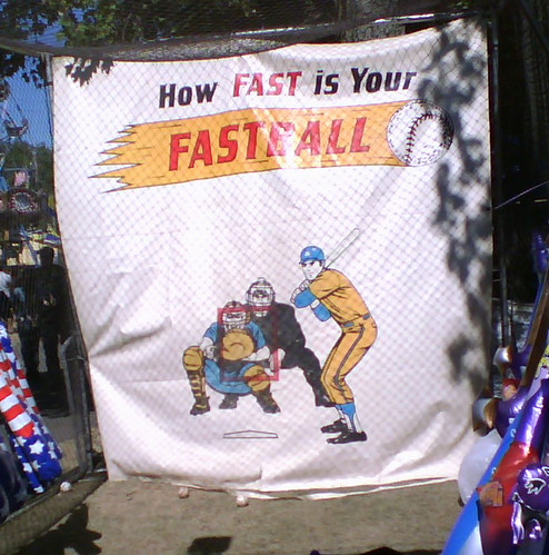
I spent Saturday at the Columbia County Fair in lovely Chatham, N.Y. In between bites of kettle corn and fried dough (remember, kids, you can’t spell “funnel cake” without f-u-n!), I photographed one of the attractions. You all know which detail I was fixated on. — Paul
Anyone know if these are a real design?
Anyone know if link are a real design?
[quote comment=”140021″]Anyone know if link are a real design?[/quote]
I don’t know, but if it’s NHL approved, it’s nice to know that section of the population can display to tens and tens of people on semi-national TV that they are PROUD of who they are.
[quote comment=”140021″]Anyone know if link are a real design?[/quote]
There are a lot of things I could say about that, but I’ll just say this: UGLY!
On another note, there was a discussion about monochromatic football teams and which ones actually pull off the look well, and I would add link to that list. I think that crimson color looks really sharp, especially under the lights at a night game.
Also, link has some interesting uniforms (chest stripes notwithstanding). I really like their use of the light blue drop shadow, and it looks even neater behind the darker blue numbers on their away unis.
Paul-
Many time the words “logo creep” get thrown around a lot around here. From what you have said in your many comments i believe i have a fairly good understainding of what you like and dont like (they are already representing a team and that is the brand ect ect) but I guess what im curious about is whether any “logo creep” offends you when the company may be the brand. I was wondering if you had every considered an article of corporate logo creep in the every day world. I was stuck in traffic and a great analogous situation occurred trhgta is a lot like nike putting their logo on another breand (the team brand). I saw a car with an additional sticker witht he individual dealership on it. That seems very similar to me, although less obtrusive. I would be very interested in a column on everyday logo creep. Everyone enjoy your day off. Unfortunatley I am stuck in class at law school.
So, in the lead picture, does anyone else find it odd that the catcher is setting up outside?
… or is that just a carney trick to make sure fewer people win a prize?
my guess would be he’s outside to make the umpire more vi visible, hence making it a more interesting work of art.
Those must be Zorro’s skates.
[quote comment=”140028″]Paul-
Many time the words “logo creep” get thrown around a lot around here. From what you have said in your many comments i believe i have a fairly good understainding of what you like and dont like (they are already representing a team and that is the brand ect ect) but I guess what im curious about is whether any “logo creep” offends you when the company may be the brand. I was wondering if you had every considered an article of corporate logo creep in the every day world. I was stuck in traffic and a great analogous situation occurred trhgta is a lot like nike putting their logo on another breand (the team brand). I saw a car with an additional sticker witht he individual dealership on it. That seems very similar to me, although less obtrusive. I would be very interested in a column on everyday logo creep. Everyone enjoy your day off. Unfortunatley I am stuck in class at law school.[/quote]
As an avowed car guy, let me say that it makes me crazy when dealers put their little (and sometimes big) stickers on the back of a car that they want to sell me. I much prefer the license plate brackets with their names on them, because they are easily removed and thrown away.
When I order a new car, I give strict instructions to the salesman that he is NOT to put a dealer advertising sticker on my car when it arrives, and that it such a sticker is present, I will not take delivery. They have not fought my insistence to date, as they do not want to lose a sale over something as silly as this.
I don’t hav pics, but linkwears stirrups!
I was at a game this season were he was proudly rockin the socks.
[quote comment=”140020″]Anyone know if these are a real design?
[/quote]
You can’t buy high-end traditional looking skates anymore. Hell i can’t even buy bauers that don’t have a goddam swoosh in the logo.
Check out link new soccer unis for link. What’s with the link thing on the right shoulder? Definitely something I’ve never link before.
On the photo: good socks, bad color scheme.
[quote comment=”140041″]Check out link new soccer unis for link. What’s with the link thing on the right shoulder? Definitely something I’ve never link before.[/quote]
As a Former D1 soccer player from the same conference as Furman, Southern, Furman has a Diadora sponsorship. I do remember their warmups from a couple years ago were similar. I do know Diadora has make those style for a few years now
I can’t get a picture of this (Damn you! Google), but yesterday I was watching ESPNU and they were showing Southern U. vs. Florida A&M… and I think (with photographic evidence) that Florida A&M has THE ugliest jersey and colors in football.
[quote comment=”140037″][quote comment=”140028″]Paul-
Many time the words “logo creep” get thrown around a lot around here. From what you have said in your many comments i believe i have a fairly good understainding of what you like and dont like (they are already representing a team and that is the brand ect ect) but I guess what im curious about is whether any “logo creep” offends you when the company may be the brand. I was wondering if you had every considered an article of corporate logo creep in the every day world. I was stuck in traffic and a great analogous situation occurred trhgta is a lot like nike putting their logo on another breand (the team brand). I saw a car with an additional sticker witht he individual dealership on it. That seems very similar to me, although less obtrusive. I would be very interested in a column on everyday logo creep. Everyone enjoy your day off. Unfortunatley I am stuck in class at law school.[/quote]
As an avowed car guy, let me say that it makes me crazy when dealers put their little (and sometimes big) stickers on the back of a car that they want to sell me. I much prefer the license plate brackets with their names on them, because they are easily removed and thrown away.
When I order a new car, I give strict instructions to the salesman that he is NOT to put a dealer advertising sticker on my car when it arrives, and that it such a sticker is present, I will not take delivery. They have not fought my insistence to date, as they do not want to lose a sale over something as silly as this.[/quote]
I also make it a firm condition of a new car purchase that the dealer sticker will not be put on my new car. If I get resistance from the sales person, I start a conversation about my advertising fees to display their advertisement. This usually makes my point and the car is delivered with the sticker.
Sorry, I meant WITHOUT —
I also make it a firm condition of a new car purchase that the dealer sticker will not be put on my new car. If I get resistance from the sales person, I start a conversation about my advertising fees to display their advertisement. This usually makes my point and the car is delivered WITHOUT the sticker.[/quote]
Don’t know if this has ever been posted but this could be the best hockey uniform site nhluniforms.comlink
nyjer morgan
link
link
Syracuse went Orange on Orange on Orange on FridaY, AND THEY WERE HIDEOUS!!!
[quote comment=”140032″]… or is that just a carney trick to make sure fewer people win a prize?[/quote]
Carnies scare me. Circus folk. Nomads, you know. Smell like cabbage. Small hands…
History of Eagles unis:
link
[quote comment=”140045″]I can’t get a picture of this (Damn you! Google), but yesterday I was watching ESPNU and they were showing Southern U. vs. Florida A&M… and I think (with photographic evidence) that Florida A&M has THE ugliest jersey and colors in football.[/quote]
I saw it too, and the orange/green mix thing was hideous.
theres the link to the media guide, which has a picture of the uni’s.
In addition to the stirrups, notice that the batter is wearing a no-ear-flap helmet. It also doesn’t look like he’s wearing batting gloves. Also no shoulder patches and no body armor, so it’s clearly a player from a bygone age…
[quote comment=”140037″][quote comment=”140028″]Paul-
Many time the words “logo creep” get thrown around a lot around here. From what you have said in your many comments i believe i have a fairly good understainding of what you like and dont like (they are already representing a team and that is the brand ect ect) but I guess what im curious about is whether any “logo creep” offends you when the company may be the brand. I was wondering if you had every considered an article of corporate logo creep in the every day world. I was stuck in traffic and a great analogous situation occurred trhgta is a lot like nike putting their logo on another breand (the team brand). I saw a car with an additional sticker witht he individual dealership on it. That seems very similar to me, although less obtrusive. I would be very interested in a column on everyday logo creep. Everyone enjoy your day off. Unfortunatley I am stuck in class at law school.[/quote]
As an avowed car guy, let me say that it makes me crazy when dealers put their little (and sometimes big) stickers on the back of a car that they want to sell me. I much prefer the license plate brackets with their names on them, because they are easily removed and thrown away.
When I order a new car, I give strict instructions to the salesman that he is NOT to put a dealer advertising sticker on my car when it arrives, and that it such a sticker is present, I will not take delivery. They have not fought my insistence to date, as they do not want to lose a sale over something as silly as this.[/quote]
I’ve done this for years. First, I started removing the decals myself, then I asked the salesman to do it. It was never an issue. Fortunately, these always have been stickers. Do the metal versions leave holes or are they glued on? If they’re glued, does the adhesive affect the finish? I wish more people would insist that these mobile advertisements be removed.
i think everyone is forgetting to ask the most important question…paul, how fast was your fastball?
Hey guys, the canucks orca is leading the red wings logo in the link… Looks like a lot of voters don’t really get it.
[quote comment=”140056″]History of Eagles unis:
link
I always liked the shoulder stripe detail from the Vermeil era. It was a distinctive look that only the Eagles could pull off.
… or is that just a carney trick to make sure fewer people win a prize?
Carnies scare me. Circus folk. Nomads, you know. Smell like cabbage. Small hands…
I absolutely love the Austin Powers reference.
Did Rick Peterson get a memo from the MLB fashion police? He’s been wearing his jersey a lot lately instead of his usual jacket.
BTW, welcome back Pedro and congrats on K 3000.
KU has some slightly updated jerseys this year…
link
link
I’m not really a fan of the new numbers, but i like the new logo quite a bit. I might be biased, but i think KU has some of the best looking football jerseys out there.
[quote comment=”140049″]Don’t know if this has ever been posted but this could be the best hockey uniform site nhluniforms.comlink[/quote]
Been a part of the links on the right for as long as I can remember.
[quote comment=”140054″]Syracuse went Orange on Orange on Orange on FridaY, AND THEY WERE HIDEOUS!!![/quote]
How did we all miss this? Thank you for pointing out this startling oversight.
[quote comment=”140064″]Hey guys, the canucks orca is leading the red wings logo in the link… Looks like a lot of voters don’t really get it.[/quote]
I think with comments like, “I chose the Penguins for the obVious rEason that their logo isn’t just a CoupLe Of letters” in the Pens/Habs poll, its hard to take it seriously…
Something wrong with Jeter’s helmet:
link
link
link
Other Yankees:
link
link
link
. . . and just for good measure:
link
i was flipping channels, and eventually landed on CFL football (i love being in Erie…except for the rain) and i noticed that the referees are wearing stirrups with stripes at the tops. very cool. if anyone can get a pic, i’d appreciated it. GO ARGOS!
Here are some grainy pics of Nyjer Morgan’s stirrups, which are just the way Paul likes ’em. I hope this works.
link
link
I lived in Erie for over 10 years and never once did I utter those words.
Argh, it didn’t work. Gonna try again.
link
link
OK I suck. I wish we could delete our own previous posts especially since I’m now filling the thread with junk. One more try:
link
link
I am having too many problems with this, so click on my name now.
Click on my name again.
Oh man, Texas Tech’s new look is eye-searingly ugly.
[quote comment=”140100″]Oh man, Texas Tech’s new look is eye-searingly ugly.[/quote]
agreed. also their quarterback’s jersey has been folding over so that the 6 on the front looks like a C about half the time.
[quote comment=”140048″]Sorry, I meant WITHOUT —
I also make it a firm condition of a new car purchase that the dealer sticker will not be put on my new car. If I get resistance from the sales person, I start a conversation about my advertising fees to display their advertisement. This usually makes my point and the car is delivered WITHOUT the sticker.[/quote][/quote]
I just recently bought a new car and I told the salesman that I did not want their name to appear on the new car. I was told that for him to give me the agreed upon price, they are lowering their price for the right to advertise on their car. I told him once I sign for the car it is my car not his and I did not want their dealerships name on my car. I was told that we would have to re do the deal for the car. I told him to go fuck himself and that he is not the only ***** dealer in new york. The second dealer gave me a better price ($200 lower) and asked if he could place a sticker on the car. I said no sticker and he asked if he could place license frames with their name on the car. I said yes and when I got home the frames went in the trash.
I was at Reds-Mets today in Cincinnati, when I peered down the first base line, and I saw an old man with a Mets ‘Ice Cream Man’ hat on. I wish I could have gotten close enough to take a picture…
Yea Paul most importantly how fast was the fastball?
Don’t know if this has been covered already, but the Lions selected five captains this afternoon, and the quintet will have “C” sewn onto their game jerseys.
The Lions spokesman said this was a mandate from the commissioner’s office.
[quote comment=”140105″]Don’t know if this has been covered already, but the Lions selected five captains this afternoon, and the quintet will have “C” sewn onto their game jerseys.
The Lions spokesman said this was a mandate from the commissioner’s office.[/quote]
Penn State, Detroit, or British Columbia ?
[quote comment=”140106″][quote comment=”140105″]Don’t know if this has been covered already, but the Lions selected five captains this afternoon, and the quintet will have “C” sewn onto their game jerseys.
The Lions spokesman said this was a mandate from the commissioner’s office.[/quote]
Penn State, Detroit, or British Columbia ?[/quote]
Seeing how Penn State is the Nittany Lions, and how most people have never heard of the British Colombia Lions(including me), and how how for the past few weeks we have been talking about how the NFL may have to appoint captains and put Cs on their jerseys, then my best guess would be Detroit.
[quote comment=”140100″]Oh man, Texas Tech’s new look is eye-searingly ugly.[/quote]
How does Texas Tech look any different than SMU? Same jersey as last year despite reports here that the numbers woul be thinner – they just wore red pants with it. Red jeresy and white pants on SMU… just reveresed. I prefer the all whites on Tech away and the all black and/or all red at home – just looks slicker when red, black, and white are your colors.
[quote comment=”140108″][quote comment=”140100″]Oh man, Texas Tech’s new look is eye-searingly ugly.[/quote]
How does Texas Tech look any different than SMU? Same jersey as last year despite reports here that the numbers woul be thinner – they just wore red pants with it. Red jeresy and white pants on SMU… just reveresed. I prefer the all whites on Tech away and the all black and/or all red at home – just looks slicker when red, black, and white are your colors.[/quote]
i think it’s mainly the red pants. just looks odd with the black stripes on the jersey and the black helmet. black or white pants would look much better. the template is terrible either way though.
[quote comment=”140109″][quote comment=”140108″][quote comment=”140100″]Oh man, Texas Tech’s new look is eye-searingly ugly.[/quote]
How does Texas Tech look any different than SMU? Same jersey as last year despite reports here that the numbers woul be thinner – they just wore red pants with it. Red jeresy and white pants on SMU… just reveresed. I prefer the all whites on Tech away and the all black and/or all red at home – just looks slicker when red, black, and white are your colors.[/quote]
i think it’s mainly the red pants. just looks odd with the black stripes on the jersey and the black helmet. black or white pants would look much better. the template is terrible either way though.[/quote]
Well, I hope they just did it because SMU was wearing waht they are. Have to say I love the new SMU helmet! There was a billboard in Dallas that had it and the text was “Let’s hope our dark horse years are behind us” or something like that. Although, they had the blue helmet/red Peruna for a few years now… just changed Peruna’s outline color from silver to white.
The captains patches are in fact the Detroit Lions as can be seen in their link . The patch looks like it will be worn on their right shoulder, close to the neck (you can kind of see it on their link just to the right under the captains box) and isn’t merely a traditional C as would be seen in the NHL. It has a C with 4 stars underneath it, one gold and three white.
[quote comment=”140057″][quote comment=”140045″]I can’t get a picture of this (Damn you! Google), but yesterday I was watching ESPNU and they were showing Southern U. vs. Florida A&M… and I think (with photographic evidence) that Florida A&M has THE ugliest jersey and colors in football.[/quote]
I saw it too, and the orange/green mix thing was hideous.
theres the link to the media guide, which has a picture of the uni’s.[/quote]
those might be some type of old uniforms cause the ones i saw were a bit diffrent.
While I also dislike ad creep on cars, the neat thing about the place where I bought my car is that they put their logo on the car rather than the dealer name.
[quote comment=”140112″]The captains patches are in fact the Detroit Lions as can be seen in their link . The patch looks like it will be worn on their right shoulder, close to the neck (you can kind of see it on their link just to the right under the captains box) and isn’t merely a traditional C as would be seen in the NHL. It has a C with 4 stars underneath it, one gold and three white.[/quote]
Any story behind the stars? Why one gold and three white?
Seeing that the Lions’ patch is blue, I hope that the Captains’ patch color coordinates with the uniform (Jets=green, 49ers=red, etc), as opposed to it being of a standard color.
[quote comment=”140027″][quote comment=”140021″]Anyone know if link are a real design?[/quote]
There are a lot of things I could say about that, but I’ll just say this: UGLY!
On another note, there was a discussion about monochromatic football teams and which ones actually pull off the look well, and I would add link to that list. I think that crimson color looks really sharp, especially under the lights at a night game.
Also, link has some interesting uniforms (chest stripes notwithstanding). I really like their use of the light blue drop shadow, and it looks even neater behind the darker blue numbers on their away unis.[/quote]
Kyle, I have to disagree with you on this one. IU should try to look like Oklahoma in their football attire (red jersey, white pants) as well as with their play.
IU should reserve the red pants for the road. Unfortunately, they have gone monochromatic there, too, with white on white.
It’s nice to know, though, that there’s another IU fan on this board.
[quote comment=”140119″][quote comment=”140112″]The captains patches are in fact the Detroit Lions as can be seen in their link . The patch looks like it will be worn on their right shoulder, close to the neck (you can kind of see it on their link just to the right under the captains box) and isn’t merely a traditional C as would be seen in the NHL. It has a C with 4 stars underneath it, one gold and three white.[/quote]
Any story behind the stars? Why one gold and three white?
Seeing that the Lions’ patch is blue, I hope that the Captains’ patch color coordinates with the uniform (Jets=green, 49ers=red, etc), as opposed to it being of a standard color.[/quote]
Beats me why there’s four stars when there are five captains. They didn’t show us the patches at the end of practice today. The Lions have won four NFL titles … maybe that means something.
[quote comment=”140123″][quote comment=”140027″][quote comment=”140021″]Anyone know if link are a real design?[/quote]
There are a lot of things I could say about that, but I’ll just say this: UGLY!
On another note, there was a discussion about monochromatic football teams and which ones actually pull off the look well, and I would add link to that list. I think that crimson color looks really sharp, especially under the lights at a night game.
Also, link has some interesting uniforms (chest stripes notwithstanding). I really like their use of the light blue drop shadow, and it looks even neater behind the darker blue numbers on their away unis.[/quote]
Kyle, I have to disagree with you on this one. IU should try to look like Oklahoma in their football attire (red jersey, white pants) as well as with their play.
IU should reserve the red pants for the road. Unfortunately, they have gone monochromatic there, too, with white on white.
It’s nice to know, though, that there’s another IU fan on this board.[/quote]
I don’t even remember what they wore when I went there, although I did like the helmets (Mallory years).
[quote comment=”140123″][quote comment=”140027″][quote comment=”140021″]Anyone know if link are a real design?[/quote]
There are a lot of things I could say about that, but I’ll just say this: UGLY!
On another note, there was a discussion about monochromatic football teams and which ones actually pull off the look well, and I would add link to that list. I think that crimson color looks really sharp, especially under the lights at a night game.
Also, link has some interesting uniforms (chest stripes notwithstanding). I really like their use of the light blue drop shadow, and it looks even neater behind the darker blue numbers on their away unis.[/quote]
Kyle, I have to disagree with you on this one. IU should try to look like Oklahoma in their football attire (red jersey, white pants) as well as with their play.
IU should reserve the red pants for the road. Unfortunately, they have gone monochromatic there, too, with white on white.
It’s nice to know, though, that there’s another IU fan on this board.[/quote]
I do like the Oklahoma look, but it got really annoying back in ’04 when Oklahoma showed up on the TV and I perked up before realizing the misidentification. (also, why would IU have shown up on the TV in ’04?) No matter what we think about red pants vs. white pants, we can all agree that it’s better than link
[quote comment=”140061″][quote comment=”140037″][quote comment=”140028″]Paul-
I’ve done this for years. First, I started removing the decals myself, then I asked the salesman to do it. It was never an issue. Fortunately, these always have been stickers. Do the metal versions leave holes or are they glued on? If they’re glued, does the adhesive affect the finish? I wish more people would insist that these mobile advertisements be removed.[/quote]
My father worked at and later owned an auto body repair shop in the 70’s and 80’s. Some of the dealers logos were attached by “prongs” with holes drilled into the trunk, but for the most part they were attached with the same double sided tape that was used to put on body side moldings. There were two ways that I knew to remove them. You could heat the logo and peel it off once the glue began to give way or you could use a razor blade (very carefully) to catch an edge and peel it off. After removing it we have a solvent remover that came in an orange can (I think it was called “quick-kleen”) to remove any remaining traces of glue. I never liked those things either, but for a long time I did collect automobile grill and side logos and hood ornaments.
[quote comment=”140134″]
I don’t even remember what they wore when I went there, although I did like the helmets (Mallory years).[/quote]
1993 Independence Bowl clip. IU had the similar unis with black outlines on the numbers and the block I on the hats.
[quote comment=”140136″][quote comment=”140061″][quote comment=”140037″][quote comment=”140028″]Paul-
I’ve done this for years. First, I started removing the decals myself, then I asked the salesman to do it. It was never an issue. Fortunately, these always have been stickers. Do the metal versions leave holes or are they glued on? If they’re glued, does the adhesive affect the finish? I wish more people would insist that these mobile advertisements be removed.[/quote]
My father worked at and later owned an auto body repair shop in the 70’s and 80’s. Some of the dealers logos were attached by “prongs” with holes drilled into the trunk, but for the most part they were attached with the same double sided tape that was used to put on body side moldings. There were two ways that I knew to remove them. You could heat the logo and peel it off once the glue began to give way or you could use a razor blade (very carefully) to catch an edge and peel it off. After removing it we have a solvent remover that came in an orange can (I think it was called “quick-kleen”) to remove any remaining traces of glue. I never liked those things either, but for a long time I did collect automobile grill and side logos and hood ornaments.[/quote]
The ones I’m referring to were metal or plastic…never just a decal.
FSU in all white……I like it…..
You will remember that it was back in ’87 or ’88 when FSU first broke out the white pants against Clemson. If I remember correctly, (1) Burt Reynolds bought those pants, and (2) FSU beat Clemson, which was ranked pretty high at the time (they may have even been #1)
[quote comment=”140084″]i was flipping channels, and eventually landed on CFL football (i love being in Erie…except for the rain) and i noticed that the referees are wearing stirrups with stripes at the tops. very cool. if anyone can get a pic, i’d appreciated it. GO ARGOS![/quote]
I was at that game, and the link almost made me throw up. It was one of the factors that made the game hard to watch. The later game didn’t make things any better for the link.
[quote comment=”140139″]FSU in all white……I like it…..[/quote]
Agreed. This is the best that they’ve looked it years. The stripes on the pants look particularly good. Unless their play improves, however, we may not see this look again.
[quote comment=”140103″]I was at Reds-Mets today in Cincinnati, when I peered down the first base line, and I saw an old man with a Mets ‘Ice Cream Man’ hat on. I wish I could have gotten close enough to take a picture…[/quote]
Hey, so was I! Didn’t see that guy (was over on the third base side) but did see a lot of Mets fans.
Looks like we almost had a Uniwatch contingent there.
[quote comment=”140084″]i was flipping channels, and eventually landed on CFL football (i love being in Erie…except for the rain) and i noticed that the referees are wearing stirrups with stripes at the tops. very cool. if anyone can get a pic, i’d appreciated it. GO ARGOS![/quote]
This is not a great pic as the official is in the background, but you can clearly see the link on the one with the sticks.
[quote comment=”140137″][quote comment=”140134″]
I don’t even remember what they wore when I went there, although I did like the helmets (Mallory years).[/quote]
1993 Independence Bowl clip. IU had the similar unis with black outlines on the numbers and the block I on the hats.[/quote]
According to the helmet project, the helmet was tweaked while I was there, going from white facemask to black and perhaps a change to the stripes.
[quote comment=”140143″]I was at that game, and the link almost made me throw up. It was one of the factors that made the game hard to watch. The later game didn’t make things any better for the link.[/quote]
Those Ti-Cats jerseys were terrible. Then again when your primary home jersey is black, and your secondary colour is yellow, its hard to do much for a third jersey.
As for the Stamps jersey, I’m not sure why they left the red bib on them. The black Stamps jersey was always pretty nice looking. Then again, the worst (but in a so-ugly its nice way) jersey in the CFL is the Montreal Alouettes link.
Burt Reynolds bought the gold pants years ago…without stripes, instead with the Seminole head logo on the waist. FSU has worn those white pants with the two simple stripes one or twice over the last couple of years…yes, a great look.
Clemson looks good with the orange on white…I’m surprized they didn’t go with orange pants.
better look at the detroit lions Captain patch
link
sorry bout tthat
Anyone know what the black “lines” are above the ACC patch on the Clemson players?
Federer’s shoes @ the US Open also have small Swiss flags (3, for the # of titles @ NY) on them..similiar to Wimbledon..
[quote comment=”140157″]Anyone know what the black “lines” are above the ACC patch on the Clemson players?[/quote]
Florida State has them too, as do all ACC teams. They are in honor of the VT victims
[quote comment=”140157″]Anyone know what the black “lines” are above the ACC patch on the Clemson players?[/quote]
They’re also on the left shoulder of the Florida State players. I don’t know what they are, but since it’s on both, it might be an ACC thing.
[quote comment=”140159″][quote comment=”140157″]Anyone know what the black “lines” are above the ACC patch on the Clemson players?[/quote]
Florida State has them too, as do all ACC teams. They are in honor of the VT victims[/quote]
o ok
i wasnt sure bc i realized FSU had it in a dif spot
Good article link about Marquette’s new basketball unis
[quote comment=”140135″][quote comment=”140123″][quote comment=”140027″][quote comment=”140021″]Anyone know if link are a real design?[/quote]
There are a lot of things I could say about that, but I’ll just say this: UGLY!
On another note, there was a discussion about monochromatic football teams and which ones actually pull off the look well, and I would add link to that list. I think that crimson color looks really sharp, especially under the lights at a night game.
Also, link has some interesting uniforms (chest stripes notwithstanding). I really like their use of the light blue drop shadow, and it looks even neater behind the darker blue numbers on their away unis.[/quote]
Kyle, I have to disagree with you on this one. IU should try to look like Oklahoma in their football attire (red jersey, white pants) as well as with their play.
IU should reserve the red pants for the road. Unfortunately, they have gone monochromatic there, too, with white on white.
It’s nice to know, though, that there’s another IU fan on this board.[/quote]
I do like the Oklahoma look, but it got really annoying back in ’04 when Oklahoma showed up on the TV and I perked up before realizing the misidentification. (also, why would IU have shown up on the TV in ’04?) No matter what we think about red pants vs. white pants, we can all agree that it’s better than link[/quote]
Most definitely. The Cam Cameron years were a dark era on IU football for a couple of reasons: (1) Really ugly uniforms with lots of black — nothing against black, it’s just not an IU color; (2) Couldn’t post a winning season with one of the best players in IU history, Antwaan Randle-El.
I was in school during part of Mallory’s era and IU had pretty good uniforms then. The block I was kind of boring but, as Cameron taught us, boring is much better than garish.
[quote comment=”140054″]Syracuse went Orange on Orange on Orange on FridaY, AND THEY WERE HIDEOUS!!![/quote]
Hey what are those green dots on the backs of the helmets during preseason games?
[quote comment=”140170″][quote comment=”140054″]Syracuse went Orange on Orange on Orange on FridaY, AND THEY WERE HIDEOUS!!![/quote]
Hey what are those green dots on the backs of the helmets during preseason games?[/quote]
Hey, did the Canucks get new uniforms?
[quote comment=”140187″][quote comment=”140170″][quote comment=”140054″]Syracuse went Orange on Orange on Orange on FridaY, AND THEY WERE HIDEOUS!!![/quote]
Hey what are those green dots on the backs of the helmets during preseason games?[/quote]
Hey, did the Canucks get new uniforms?[/quote]
I’m beginning to think Paul may not like those black uniforms the Mets have been wearing
[quote comment=”140198″][quote comment=”140187″][quote comment=”140170″][quote comment=”140054″]Syracuse went Orange on Orange on Orange on FridaY, AND THEY WERE HIDEOUS!!![/quote]
Hey what are those green dots on the backs of the helmets during preseason games?[/quote]
Hey, did the Canucks get new uniforms?[/quote]
I’m beginning to think Paul may not like those black uniforms the Mets have been wearing[/quote]
and what is with the Tampa Bay practice jerseys???