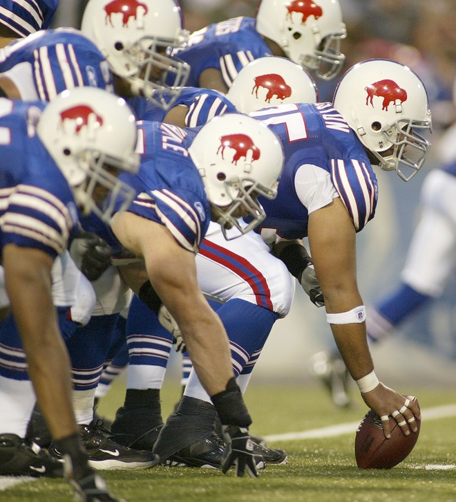
Buffalo wore their gorgeous 1965 throwback uniforms against the Titans last night. Additional views here, here, here, and here. —Vince
Tired of seeing annoying ads (like this one!) on Uni Watch? There’s a simple solution: Join Uni Watch Plus. You’ll get an ad-free site experience, plus exclusive access to our UW+ discussion forums, push notifications whenever a new blog post has been published, a special UW+ badge accompanying all your comments on the blog, and a 20% discount on our Teespring merchandise.
Already a member? Sign in here.
Those are so much better than their current ones.
[quote comment=”136431″]Those are so much better than their current ones.[/quote]
Thats about all that needs to be said on the subject. Team owners just don’t Get It sometimes.
Those unis are just about perfect. Incredible.
looks like the Texas Rangers wore their batting practice jerseys last night (against the Mariners too, what are the odds?)
link
link
link
[quote comment=”136433″]Those unis are just about perfect. Incredible.[/quote]
I don’t know if I’d say “perfect.” They still have that Reebok logo on the sleeve! Get rid of that and we can talk perfect.
While those are after all BP’s, I am a big fan of them getting back to using that script “Rangers”
The more of that we see, the better, just not with the pit stain jerseys.
Now those “gang” hats by New Era are being pulled.
link
Well at least the Bills looked nice last night to bad the same can’t be said for the titans.
It sickens me that the Bills jersey that is exquisite on the quarterback looks so bad on the linemen in all of their grotesque armpit-showing sleevelessness.
Oh, and I must add that the standing red bison on a white background is without question the best helmet the Bills have ever had.
[quote comment=”136440″]Well at least the Bills looked nice last night to bad the same can’t be said for the titans.[/quote]
You mean “The Flaming Thumbtacks?”
Why would they wear them during a preseason game?
It is way too easy to create jokes for the new NFL armpit look. Just take the “plumbers crack” jokes and change from a plumber to a NFL lineman or other appropriate player position.
[quote comment=”136444″]Why would they wear them during a preseason game?[/quote]
Good question. I was wondering that myself.
Also, Jamie Moyer and his Liberty Bell stirrups got shellacked last night by the Padres. I swear, I’m not watching the Phillies anymore.
Those unis are incredible. I really wish they would go full time to those. Their current unis are seriously so bad. They don’t even match up.
[quote comment=”136444″]Why would they wear them during a preseason game?[/quote]
To sell more of them!! They can only wear alternates twice in a regular season, this way they can wear more! I believe the Bengels are wearing their orange alts once in the preseason also.
BTW – I know that the Lightning’s icefest is going on right now…anyone found photos of the official unveiling of the new logo and uniforms?!?!?
link > link
[quote comment=”136448″][quote comment=”136444″]Why would they wear them during a preseason game?[/quote]
To sell more of them!! They can only wear alternates twice in a regular season, this way they can wear more! I believe the Bengels are wearing their orange alts once in the preseason also.
BTW – I know that the Lightning’s icefest is going on right now…anyone found photos of the official unveiling of the new logo and uniforms?!?!?[/quote]
Yeah but how many people buy the jersey just cuz that’s what they wear twice during the regular season? If they wanted to sell more you would hope they would just put more on display in the pro shop and around the stadium and not wear them in a meaningless preseason game
I love those unis. The only thing that’d make them better is they went back to the OJ era helmets.
[quote comment=”136433″]Those unis are just about perfect. Incredible.[/quote]
They would be perfect if the striping wasn’t so inconsistant. Why doesn’t the helmet stripe match the pants stripe and why doesn’t the sock stripe match the sleeve stripe?
[quote comment=”136450″][quote comment=”136448″][quote comment=”136444″]Why would they wear them during a preseason game?[/quote]
To sell more of them!! They can only wear alternates twice in a regular season, this way they can wear more! I believe the Bengels are wearing their orange alts once in the preseason also.
BTW – I know that the Lightning’s icefest is going on right now…anyone found photos of the official unveiling of the new logo and uniforms?!?!?[/quote]
Yeah but how many people buy the jersey just cuz that’s what they wear twice during the regular season? If they wanted to sell more you would hope they would just put more on display in the pro shop and around the stadium and not wear them in a meaningless preseason game[/quote]
I don’t disagree with you at all…but I know that some people will see it on TV and go…”That’s cool” and go buy one…
I know it still doesn’t actually explain why you would wear them during a preseason game…I agree its kinda stupid…Maybe its an anniversary of the bills last winning season? Maybe Marv Levy forgot those aren’t the real jerseys anymore?
[quote comment=”136452″][quote comment=”136433″]Those unis are just about perfect. Incredible.[/quote]
They would be perfect if the striping wasn’t so inconsistant. Why doesn’t the helmet stripe match the pants stripe and why doesn’t the sock stripe match the sleeve stripe?[/quote]
I don’t understand why they have to.
[quote comment=”136448″][quote comment=”136444″]Why would they wear them during a preseason game?[/quote]
To sell more of them!! They can only wear alternates twice in a regular season, this way they can wear more! I believe the Bengels are wearing their orange alts once in the preseason also.
BTW – I know that the Lightning’s icefest is going on right now…anyone found photos of the official unveiling of the new logo and uniforms?!?!?[/quote]
I was wondering the same thing. Where do they draw the line between a throwback and an alternate?
Don’t get me wrong. I know the “clinical”, if you will, definitions of alts and throwbacks. But the Bills wear those unis so much, they don’t really seem like throwbacks so much anymore. The effect has been dampened. Detroit and the Negro league throwbacks are similar in that regard, although I love any time the bigs pay homage to the Negro leagues.
And, yes, Cincinnati is wearing the orange. they also wore white at home against the Saints, which only served to give New Orleans an opportunity to wear the black uni-tard look.
[quote comment=”136453″][quote comment=”136450″][quote comment=”136448″][quote comment=”136444″]Why would they wear them during a preseason game?[/quote]
To sell more of them!! They can only wear alternates twice in a regular season, this way they can wear more! I believe the Bengels are wearing their orange alts once in the preseason also.
BTW – I know that the Lightning’s icefest is going on right now…anyone found photos of the official unveiling of the new logo and uniforms?!?!?[/quote]
Yeah but how many people buy the jersey just cuz that’s what they wear twice during the regular season? If they wanted to sell more you would hope they would just put more on display in the pro shop and around the stadium and not wear them in a meaningless preseason game[/quote]
I don’t disagree with you at all…but I know that some people will see it on TV and go…”That’s cool” and go buy one…
I know it still doesn’t actually explain why you would wear them during a preseason game…I agree its kinda stupid…Maybe its an anniversary of the bills last winning season? Maybe Marv Levy forgot those aren’t the real jerseys anymore?[/quote]
I doubt Marv Levy has anything to do with what they wear, but he does need to retire and go live in Florida or something.
[quote comment=”136432″][quote comment=”136431″]Those are so much better than their current ones.[/quote]
Thats about all that needs to be said on the subject. Team owners just don’t Get It sometimes.[/quote]
Amen to that. I’ll never understand why when teams hit upon a great uniform, like these Buffalo ones or the classic Charger’s powder blues, why they just can’t leave well enough alone. It worked for the Yankees and the Red Wings.
the lightning jerseys are up on the team website
[quote comment=”136458″]the lightning jerseys are up on the team website[/quote]
Wow. link.
Those Bills jerseys are just a sight for sore eyes, even with the lineman cut. Nice to see link available on eBay.
[quote comment=”136457″][quote comment=”136432″][quote comment=”136431″]Those are so much better than their current ones.[/quote]
Thats about all that needs to be said on the subject. Team owners just don’t Get It sometimes.[/quote]
Amen to that. I’ll never understand why when teams hit upon a great uniform, like these Buffalo ones or the classic Charger’s powder blues, why they just can’t leave well enough alone. It worked for the Yankees and the Red Wings.[/quote]
Why? $$$$$
anybody watch the mets game lastnight. all of them had los on the jerseys so it it said los mets. sorry no pics
[quote comment=”136464″]anybody watch the mets game lastnight. all of them had los on the jerseys so it it said los mets. sorry no pics[/quote]
Yes I saw that, I believe it was Hispanic night @ Shea so thats why they had that[quote comment=”136438″]Now those “gang” hats by New Era are being pulled.
link
Does anyone know exactly which hats they are?
I was just wondering
I like the new logo…gave it a little edge…
I’m VERY unsure about those sleeves…and wheres the picture of the back? or the numbers?
According to the article the Road (and only the road) version will have the players number on the FRONT…
And since I seem to have forgotten to click the QOUTE button…I was speaking of the new Tampa Bay Lightning jerseys…
[quote comment=”136465″][quote comment=”136464″]anybody watch the mets game lastnight. all of them had los on the jerseys so it it said los mets. sorry no pics[/quote]
Yes I saw that, I believe it was Hispanic night @ Shea so thats why they had that[quote comment=”136438″]Now those “gang” hats by New Era are being pulled.
link
Does anyone know exactly which hats they are?
I was just wondering[/quote]
Yea…it was either in the comments or maybe the ticker in the last day or two. They were a set of hats that used gang symbols/colors. See article link
my local single A team is wearing pink jerseys on september 1st for breast cancer awareness..
and on the lightning uniforms..i kinda like them
yeah the lightning uniforms isnt supposed to be a link..but the link is to the article about the pink jerseys
[quote comment=”136436″][quote comment=”136433″]Those unis are just about perfect. Incredible.[/quote]
I don’t know if I’d say “perfect.” They still have that Reebok logo on the sleeve! Get rid of that and we can talk perfect.[/quote]
So you mean to tell me that if you manufactured something that you wanted to make money off of, you wouldn’t put your logo on it? Especially if that logo is universally recognized? I understand that it’s annoying when the logo overpowers the jersey, but the fact is that Reebok is the one that manufactures and produces the jerseys, so there is absolutely nothing wrong with their logo being on it.
[quote comment=”136458″]the lightning jerseys are up on the team website[/quote]
I’ve always thought the logo bears a strong resemblance to this: link
[quote comment=”136465″][quote comment=”136464″]anybody watch the mets game lastnight. all of them had los on the jerseys so it it said los mets. sorry no pics[/quote]
Yes I saw that, I believe it was Hispanic night @ Shea so thats why they had that[quote comment=”136438″]Now those “gang” hats by New Era are being pulled.
link
Does anyone know exactly which hats they are?
I was just wondering[/quote]
This shows all three. They are pretty obvious in their gang symbolism (from Left to right in the photo) of the Bloods, Latin Kings, and Crips. If you read the article, a nine-year old kid figured it out.
link
Two notes from last night’s Pats/Panthers game:
1. Carolina’s rookie LB Jon Beason. The 5 on the back of his helmet was peeling off in the first quarter.
2. Quarterbacks from both teams had green dots on the backs of their helmets. What’s the story?
how about this for a concept for the new thrashers logos..
thrashers logos…
[quote comment=”136474″][quote comment=”136465″][quote comment=”136464″]anybody watch the mets game lastnight. all of them had los on the jerseys so it it said los mets. sorry no pics[/quote]
Yes I saw that, I believe it was Hispanic night @ Shea so thats why they had that[quote comment=”136438″]Now those “gang” hats by New Era are being pulled.
link
Does anyone know exactly which hats they are?
I was just wondering[/quote]
This shows all three. They are pretty obvious in their gang symbolism (from Left to right in the photo) of the Bloods, Latin Kings, and Crips. If you read the article, a nine-year old kid figured it out.
link
And who was the genius that thought these were a good idea?
[quote comment=”136472″][quote comment=”136436″][quote comment=”136433″]Those unis are just about perfect. Incredible.[/quote]
I don’t know if I’d say “perfect.” They still have that Reebok logo on the sleeve! Get rid of that and we can talk perfect.[/quote]
So you mean to tell me that if you manufactured something that you wanted to make money off of, you wouldn’t put your logo on it? Especially if that logo is universally recognized? I understand that it’s annoying when the logo overpowers the jersey, but the fact is that Reebok is the one that manufactures and produces the jerseys, so there is absolutely nothing wrong with their logo being on it.[/quote]
Uh oh, not a smart thing to say on this site.
[quote comment=”136475″]Two notes from last night’s Pats/Panthers game:
1. Carolina’s rookie LB Jon Beason. The 5 on the back of his helmet was peeling off in the first quarter.
2. Quarterbacks from both teams had green dots on the backs of their helmets. What’s the story?[/quote]
Ref: #2 – The radio…I believe Paul devoted an entire blog entry to these after the first preseason game or two….
wow look at these uniform concepts…
#1
#2
#3
#4
[quote comment=”136472″][quote comment=”136436″][quote comment=”136433″]Those unis are just about perfect. Incredible.[/quote]
I don’t know if I’d say “perfect.” They still have that Reebok logo on the sleeve! Get rid of that and we can talk perfect.[/quote]
So you mean to tell me that if you manufactured something that you wanted to make money off of, you wouldn’t put your logo on it? Especially if that logo is universally recognized? I understand that it’s annoying when the logo overpowers the jersey, but the fact is that Reebok is the one that manufactures and produces the jerseys, so there is absolutely nothing wrong with their logo being on it.[/quote]
Hmmm, I’m looking at this cool No Mas T-shirt I’m wearing, and it doesn’t say No Mas on the outside (just on the inner collar). And the shorts I’m wearing, which I think I got a few years ago at Old Navy, don’t say Old Navy on them (except, again, on an inner tag). And this cool stingy-brim hat I’ll be wearing to my friend’s birthday party tonight doesn’t have the manufacturer’s name on it (execpt, yet again, on the inside). So I guess those three manufacturers really missed the fucking boat, right?
More importantly: The Bills’ uniforms already represent a brand — the BILLS’ BRAND. That’s what a uniform is for. The Reebok logo just clutters and distracts from that mission.
Look: The notion that corporate logos are self-justifying simply because “they’re the one who manufactured it” is — and always has been — utter crap.
For the Lightning sweater… Hey no side paneling, or apron. The collar sticking up a mile is obnoxious, but they all do that now. I weep for the lack of arm & waist stripes, but what else is new. I’m ok with the logo updates and the shoulder patches look good.
[quote comment=”136483″]For the Lightning sweater… Hey no side paneling, or apron. The collar sticking up a mile is obnoxious, but they all do that now. I weep for the lack of arm & waist stripes, but what else is new. I’m ok with the logo updates and the shoulder patches look good.[/quote]
Are we sure there aren’t any side paneling…the article states they are keeping their traditional “under arm striping” but we can’t see it in those pictures…
I understand that it doesnt have the huge contrasting colors with the piping up and down the jersey (that it seems every other team is going to), but there is definatly something that we can’t see there…
Lightning jerseys — Well, I’d like to see more, but I think the jerseys themselves look decent. I’m glad they kept it simple.
As far as the logo goes, I absolutely hate the word mark above the lightning bolt. The words are unnecessary, the font is hideous, the tails on the T and the B look cheesy… Perhaps it’ll grow on me, or perhaps its that everything else looks good, so the lettering stands out as terrible to me.
Jerseys: A Logo: C- Logo w/o words: B+
[quote comment=”136482″][quote comment=”136472″][quote comment=”136436″][quote comment=”136433″]Those unis are just about perfect. Incredible.[/quote]
I don’t know if I’d say “perfect.” They still have that Reebok logo on the sleeve! Get rid of that and we can talk perfect.[/quote]
So you mean to tell me that if you manufactured something that you wanted to make money off of, you wouldn’t put your logo on it? Especially if that logo is universally recognized? I understand that it’s annoying when the logo overpowers the jersey, but the fact is that Reebok is the one that manufactures and produces the jerseys, so there is absolutely nothing wrong with their logo being on it.[/quote]
Hmmm, I’m looking at this cool No Mas T-shirt I’m wearing, and it doesn’t say No Mas on the outside (just on the inner collar). And the shorts I’m wearing, which I think I got a few years ago at Old Navy, don’t say Old Navy on them (except, again, on an inner tag). And this cool stingy-brim hat I’ll be wearing to my friend’s birthday party tonight doesn’t have the manufacturer’s name on it (execpt, yet again, on the inside). So I guess those three manufacturers really missed the fucking boat, right?
More importantly: The Bills’ uniforms already represent a brand — the BILLS’ BRAND. That’s what a uniform is for. The Reebok logo just clutters and distracts from that mission.
Look: The notion that corporate logos are self-justifying simply because “they’re the one who manufactured it” is — and always has been — utter crap.[/quote]
right, but if Old Navy and No Mas were going to put you on TV for 12 hours a week and millions of people would be watching don’t you think they might include a little logo somewhere to advertise their brand? i understand the appeal of clean unis, but it would be bad business for Reebok not to logo thier NFL equipment.
being the official outfitter of the NFL brings billions to Reebok. i wish corporate logos were not so ubiquitous in sports, but it makes sense and it far from “utter crap.”
[quote comment=”136486″][quote comment=”136483″]For the Lightning sweater… Hey no side paneling, or apron. The collar sticking up a mile is obnoxious, but they all do that now. I weep for the lack of arm & waist stripes, but what else is new. I’m ok with the logo updates and the shoulder patches look good.[/quote]
Are we sure there aren’t any side paneling…the article states they are keeping their traditional “under arm striping” but we can’t see it in those pictures…
I understand that it doesnt have the huge contrasting colors with the piping up and down the jersey (that it seems every other team is going to), but there is definatly something that we can’t see there…[/quote]
Joe – Found it courtesy of NHLlogos.blogspot.com. They kept the diamond-shaped striped panel under the arm. That’s it. link
[quote comment=”136489″][quote comment=”136486″][quote comment=”136483″]For the Lightning sweater… Hey no side paneling, or apron. The collar sticking up a mile is obnoxious, but they all do that now. I weep for the lack of arm & waist stripes, but what else is new. I’m ok with the logo updates and the shoulder patches look good.[/quote]
Are we sure there aren’t any side paneling…the article states they are keeping their traditional “under arm striping” but we can’t see it in those pictures…
I understand that it doesnt have the huge contrasting colors with the piping up and down the jersey (that it seems every other team is going to), but there is definatly something that we can’t see there…[/quote]
Joe – Found it courtesy of NHLlogos.blogspot.com. They kept the diamond-shaped striped panel under the arm. That’s it. link[/quote]
Thanks…I thought thats all it was…but I’m still sceptical that we can’t see the whole jersey…
Are they gonna change the number/nameplate font to match the new lettering? You don’t happen to have a picture with numbers do ya?
I would really like the Niners to go back to the Montana-era look. As for our other local team, the Ray-duhz will NEVER update their look. EVER.
[quote comment=”136491″]I would really like the Niners to go back to the Montana-era look. As for our other local team, the Ray-duhz will NEVER update their look. EVER.[/quote]
Never say Never…Al Davis won’t be alive that much longer…a weaker owner could (and will probably) bend to the will of the Reebok!
[quote comment=”136488″]right, but if Old Navy and No Mas were going to put you on TV for 12 hours a week and millions of people would be watching don’t you think they might include a little logo somewhere to advertise their brand?[/quote]
Just because they might WANT to do so doesn’t mean it would be the right thing to do. It’s not the right thing for Reebok to do either.
[quote comment=”136488″]i understand the appeal of clean unis, but it would be bad business for Reebok not to logo thier NFL equipment.[/quote]
The notion that “it’s just business,” and that this rationale can self-justifyingly excuse any coprorate marketing move, is bullshit. Why not plaster the word “REEBOK” in giant letters on the jersey? Wouldn’t that be even “better” business? Isn’t it “bad business” that they haven’t done this already?
This rationale is offensive. It implies that everything and every space in our culture is for sale, that every cultural interaction can be reduced to a monetary transaction. And as my hypothetical in the previous paragraph implies, once you start there’s no ceiling. Why not take a billion dollars from a company and rename your state “Visa Presents Colorado”? Why not rename the seat of your city “The Pepsi City Hall”? Hey, it’s just business!
[quote comment=”136488″]being the official outfitter of the NFL brings billions to Reebok.[/quote]
Exactly. They get all the merch revenue anyway (it’s not as if you can choose to buy a NON-Reebok NFL jersey). So why the fuck do they need to slap their logo all over the field on top of that? Thank you for making my point.
whats up with marshawn lynch’s 2 different colored gloves? I mean i know its the preseason but I don’t think I would even break this look out for an intramural game. When McGrady had different colored shoes a few years ago for the all star game I thought that looked dumb and that was in a game that the players blatantly screw around in. Get your on field fashion sense together
link
No hoody for Angry Homeless Man? What?
[quote comment=”136488″][quote comment=”136482″][quote comment=”136472″][quote comment=”136436″][quote comment=”136433″]Those unis are just about perfect. Incredible.[/quote]
I don’t know if I’d say “perfect.” They still have that Reebok logo on the sleeve! Get rid of that and we can talk perfect.[/quote]
So you mean to tell me that if you manufactured something that you wanted to make money off of, you wouldn’t put your logo on it? Especially if that logo is universally recognized? I understand that it’s annoying when the logo overpowers the jersey, but the fact is that Reebok is the one that manufactures and produces the jerseys, so there is absolutely nothing wrong with their logo being on it.[/quote]
Hmmm, I’m looking at this cool No Mas T-shirt I’m wearing, and it doesn’t say No Mas on the outside (just on the inner collar). And the shorts I’m wearing, which I think I got a few years ago at Old Navy, don’t say Old Navy on them (except, again, on an inner tag). And this cool stingy-brim hat I’ll be wearing to my friend’s birthday party tonight doesn’t have the manufacturer’s name on it (execpt, yet again, on the inside). So I guess those three manufacturers really missed the fucking boat, right?
More importantly: The Bills’ uniforms already represent a brand — the BILLS’ BRAND. That’s what a uniform is for. The Reebok logo just clutters and distracts from that mission.
Look: The notion that corporate logos are self-justifying simply because “they’re the one who manufactured it” is — and always has been — utter crap.[/quote]
right, but if Old Navy and No Mas were going to put you on TV for 12 hours a week and millions of people would be watching don’t you think they might include a little logo somewhere to advertise their brand? i understand the appeal of clean unis, but it would be bad business for Reebok not to logo thier NFL equipment.
being the official outfitter of the NFL brings billions to Reebok. i wish corporate logos were not so ubiquitous in sports, but it makes sense and it far from “utter crap.”[/quote]
It’s “utter crap” when it breaks the simplicity that gives some uniforms their charm. Reebok and NFL logos on Oakland Raider uniforms look like utter crap.
Those Lightning jerseys aren’t bad, but still have a practice jersey feel (especially the road–maybe the front numbers will help). Need to see them on the players before a final grade tho. Would it kill them to put in some stripes or something along the bottom? I thought the point of not tucking them in was to keep those details.
With the RBK EDGE uniforms being publicized as “uniform system” would it kill teams to introduce the entire look jerseys, breezers, socks and not just the jersey
The Bills uniforms look great. they should wear them all the time. They are so much better the their current uniforms
“The Pepsi City Hall”
Didn’t CitiBank already beat us to it link?
[quote comment=”136462″][quote comment=”136457″][quote comment=”136432″][quote comment=”136431″]Those are so much better than their current ones.[/quote]
Thats about all that needs to be said on the subject. Team owners just don’t Get It sometimes.[/quote]
Amen to that. I’ll never understand why when teams hit upon a great uniform, like these Buffalo ones or the classic Charger’s powder blues, why they just can’t leave well enough alone. It worked for the Yankees and the Red Wings.[/quote]
Why? $$$$$[/quote]
Not always. The Chargers and Bills uniforms were remnants of losing teams and “updating” them can help change the perception (at least with the fans) and the players often want it.
But I hate the red Bills helmets. Anyone recall the story behind them – something like Joe Ferguson had problems making them out in games with the Pats, Dolphins, Colts, Jets?
[quote comment=”136476″]how about this for a concept for the new thrashers logos..
thrashers logos…[/quote]
These are BRILLIANT. They have to be used like now.
As for the jersey concepts you posted, they’re a touch hit-and-miss. The only one on the first page I like is the Penguins alt. I think the Bruins and Rangers got it much more right than that, you can’t save the Sabres short of going old school, and the Habs just look all sorts of wrong. KC I never liked the idea anyway, and hope that any new team there will pick a better team logo/name/color set. Dallas they did a very nice job with, Toronto… um, no. I like the Canucks update, but I LOVE what they did for the Senators. That should have been the way they went with the new jerseys, instead of what happened. I hate the orange for the Sharks, but they kept the horizontal shoulder stripe that I REALLY, REALLY wish Tampa Bay kept. That and the lack of a waist stripe are my two biggest problems with the real new ones. Lightning/Blues/Avalanche… blugh. But they got the Hurricanes DEAD RIGHT there. Shame the real Hurricanes didn’t think like that. I even like the overused idea of a black alt. (though on another site someone mocked up a Hurricanes jersey in Whaler colors, and it was fantastic.) Detroit’s mockup was just bad, and the Isles, I have one major problem (besides the hideous alt). There should be four stripes, not three.
[quote comment=”136488″][quote comment=”136482″][quote comment=”136472″][quote comment=”136436″][quote comment=”136433″]Those unis are just about perfect. Incredible.[/quote]
I don’t know if I’d say “perfect.” They still have that Reebok logo on the sleeve! Get rid of that and we can talk perfect.[/quote]
So you mean to tell me that if you manufactured something that you wanted to make money off of, you wouldn’t put your logo on it? Especially if that logo is universally recognized? I understand that it’s annoying when the logo overpowers the jersey, but the fact is that Reebok is the one that manufactures and produces the jerseys, so there is absolutely nothing wrong with their logo being on it.[/quote]
Hmmm, I’m looking at this cool No Mas T-shirt I’m wearing, and it doesn’t say No Mas on the outside (just on the inner collar). And the shorts I’m wearing, which I think I got a few years ago at Old Navy, don’t say Old Navy on them (except, again, on an inner tag). And this cool stingy-brim hat I’ll be wearing to my friend’s birthday party tonight doesn’t have the manufacturer’s name on it (execpt, yet again, on the inside). So I guess those three manufacturers really missed the fucking boat, right?
More importantly: The Bills’ uniforms already represent a brand — the BILLS’ BRAND. That’s what a uniform is for. The Reebok logo just clutters and distracts from that mission.
Look: The notion that corporate logos are self-justifying simply because “they’re the one who manufactured it” is — and always has been — utter crap.[/quote]
right, but if Old Navy and No Mas were going to put you on TV for 12 hours a week and millions of people would be watching don’t you think they might include a little logo somewhere to advertise their brand? i understand the appeal of clean unis, but it would be bad business for Reebok not to logo thier NFL equipment.
being the official outfitter of the NFL brings billions to Reebok. i wish corporate logos were not so ubiquitous in sports, but it makes sense and it far from “utter crap.”[/quote]
No, because if someone wants the authentic jersey reebok will make the money from the sale regardless of if the name is on the outside.
[quote comment=”136493″][quote comment=”136488″]right, but if Old Navy and No Mas were going to put you on TV for 12 hours a week and millions of people would be watching don’t you think they might include a little logo somewhere to advertise their brand?[/quote]
Just because they might WANT to do so doesn’t mean it would be the right thing to do. It’s not the right thing for Reebok to do either.
[quote comment=”136488″]i understand the appeal of clean unis, but it would be bad business for Reebok not to logo thier NFL equipment.[/quote]
The notion that “it’s just business,” and that this rationale can self-justifyingly excuse any coprorate marketing move, is bullshit. Why not plaster the word “REEBOK” in giant letters on the jersey? Wouldn’t that be even “better” business? Isn’t it “bad business” that they haven’t done this already?
This rationale is offensive. It implies that everything and every space in our culture is for sale, that every cultural interaction can be reduced to a monetary transaction. And as my hypothetical in the previous paragraph implies, once you start there’s no ceiling. Why not take a billion dollars from a company and rename your state “Visa Presents Colorado”? Why not rename the seat of your city “The Pepsi City Hall”? Hey, it’s just business!
[quote comment=”136488″]being the official outfitter of the NFL brings billions to Reebok.[/quote]
Exactly. They get all the merch revenue anyway (it’s not as if you can choose to buy a NON-Reebok NFL jersey). So why the fuck do they need to slap their logo all over the field on top of that? Thank you for making my point.[/quote]
link
[quote comment=”136440″]Well at least the Bills looked nice last night to bad the same can’t be said for the titans.[/quote]
I really wish the Titans would wear their light blue pants with their white jerseys so that the top of their socks wouldn’t blend in with their pants.
back to the topic of number shadowing
The link went down to the right.
Better shot of the Bolts new jersey
Looks like the shoulder logo is the same as the old one. Which is a relief. I would have preferred they kept the old drop shadow on the front crest.
[quote comment=”136509″]
Better shot of the Bolts new jersey
Looks like the shoulder logo is the same as the old one. Which is a relief. I would have preferred they kept the old drop shadow on the front crest.[/quote]
wow those things look like they fit like a soccer jersey. I feel sorry for Joe Beer-gut-hockey-fan
how about this for a concept for the new thrashers logos..
thrashers logos…
These are BRILLIANT. They have to be used like now.
As for the jersey concepts you posted, they’re a touch hit-and-miss. The only one on the first page I like is the Penguins alt. I think the Bruins and Rangers got it much more right than that, you can’t save the Sabres short of going old school, and the Habs just look all sorts of wrong. KC I never liked the idea anyway, and hope that any new team there will pick a better team logo/name/color set. Dallas they did a very nice job with, Toronto… um, no. I like the Canucks update, but I LOVE what they did for the Senators. That should have been the way they went with the new jerseys, instead of what happened. I hate the orange for the Sharks, but they kept the horizontal shoulder stripe that I REALLY, REALLY wish Tampa Bay kept. That and the lack of a waist stripe are my two biggest problems with the real new ones. Lightning/Blues/Avalanche… blugh. But they got the Hurricanes DEAD RIGHT there. Shame the real Hurricanes didn’t think like that. I even like the overused idea of a black alt. (though on another site someone mocked up a Hurricanes jersey in Whaler colors, and it was fantastic.) Detroit’s mockup was just bad, and the Isles, I have one major problem (besides the hideous alt). There should be four stripes, not three.
dilbert179 i agree with you 100% on the sens and canes concepts..though i like the orange in the sharks concept..
how about these thrashers uniforms using those logos???
i liked the lightning jerseys until i found out they had that stupid ass front link
I agree with Chris F (post #19) but what do you mean by OJ era helmets? (Do you mean the canvas suspension interior and leather interior padded helmets.) OJ was one of the first to wear the ‘new’ helmet technology at the time, liquid (methyl alcohol) filled padding cells and air filled padding cells made by Riddell. His helmet interior was the prototype for the modern era helmets.
[quote comment=”136464″]anybody watch the mets game lastnight. all of them had los on the jerseys so it it said los mets. sorry no pics[/quote]
link
[quote comment=”136514″]i liked the lightning jerseys until i found out they had that stupid ass front link[/quote]
it looks like it’s only on the road whites, not the black homes.
Comments are closed.
[quote comment=”136503″][quote comment=”136462″][quote comment=”136457″][quote comment=”136432″][quote comment=”136431″]Those are so much better than their current ones.[/quote]
Thats about all that needs to be said on the subject. Team owners just don’t Get It sometimes.[/quote]
Amen to that. I’ll never understand why when teams hit upon a great uniform, like these Buffalo ones or the classic Charger’s powder blues, why they just can’t leave well enough alone. It worked for the Yankees and the Red Wings.[/quote]
Why? $$$$$[/quote]
Not always. The Chargers and Bills uniforms were remnants of losing teams and “updating” them can help change the perception (at least with the fans) and the players often want it.
But I hate the red Bills helmets. Anyone recall the story behind them – something like Joe Ferguson had problems making them out in games with the Pats, Dolphins, Colts, Jets?[/quote]
Actually, both teams won AFL Championships in the 60’s, which is the period their throwbacks are from.
[quote comment=”136482″][quote comment=”136472″][quote comment=”136436″][quote comment=”136433″]Those unis are just about perfect. Incredible.[/quote]
I don’t know if I’d say “perfect.” They still have that Reebok logo on the sleeve! Get rid of that and we can talk perfect.[/quote]
So you mean to tell me that if you manufactured something that you wanted to make money off of, you wouldn’t put your logo on it? Especially if that logo is universally recognized? I understand that it’s annoying when the logo overpowers the jersey, but the fact is that Reebok is the one that manufactures and produces the jerseys, so there is absolutely nothing wrong with their logo being on it.[/quote]
Hmmm, I’m looking at this cool No Mas T-shirt I’m wearing, and it doesn’t say No Mas on the outside (just on the inner collar). And the shorts I’m wearing, which I think I got a few years ago at Old Navy, don’t say Old Navy on them (except, again, on an inner tag). And this cool stingy-brim hat I’ll be wearing to my friend’s birthday party tonight doesn’t have the manufacturer’s name on it (execpt, yet again, on the inside). So I guess those three manufacturers really missed the fucking boat, right?
More importantly: The Bills’ uniforms already represent a brand — the BILLS’ BRAND. That’s what a uniform is for. The Reebok logo just clutters and distracts from that mission.
Look: The notion that corporate logos are self-justifying simply because “they’re the one who manufactured it” is — and always has been — utter crap.[/quote]
I’d agree … if I could just get this stinkin’ horse picture off my short sleeve collared shirt I’m wearing right now. :)
[quote comment=”136521″][quote comment=”136482″][quote comment=”136472″][quote comment=”136436″][quote comment=”136433″][/quote]
I’d agree … if I could just get this stinkin’ horse picture off my short sleeve collared shirt I’m wearing right now. :)[/quote]
I got one of those, too. It has some dude carrying some sort of stick while he’s riding a horse. My wife bought it for me. I think she wishes I was a cowboy or something!
[quote comment=”136482″][quote comment=”136472″][quote comment=”136436″][quote comment=”136433″]Those unis are just about perfect. Incredible.[/quote]
I don’t know if I’d say “perfect.” They still have that Reebok logo on the sleeve! Get rid of that and we can talk perfect.[/quote]
So you mean to tell me that if you manufactured something that you wanted to make money off of, you wouldn’t put your logo on it? Especially if that logo is universally recognized? I understand that it’s annoying when the logo overpowers the jersey, but the fact is that Reebok is the one that manufactures and produces the jerseys, so there is absolutely nothing wrong with their logo being on it.[/quote]
Hmmm, I’m looking at this cool No Mas T-shirt I’m wearing, and it doesn’t say No Mas on the outside (just on the inner collar). And the shorts I’m wearing, which I think I got a few years ago at Old Navy, don’t say Old Navy on them (except, again, on an inner tag). And this cool stingy-brim hat I’ll be wearing to my friend’s birthday party tonight doesn’t have the manufacturer’s name on it (execpt, yet again, on the inside). So I guess those three manufacturers really missed the fucking boat, right?
More importantly: The Bills’ uniforms already represent a brand — the BILLS’ BRAND. That’s what a uniform is for. The Reebok logo just clutters and distracts from that mission.
Look: The notion that corporate logos are self-justifying simply because “they’re the one who manufactured it” is — and always has been — utter crap.[/quote]
Called it.
[quote comment=”136493″][quote comment=”136488″]right, but if Old Navy and No Mas were going to put you on TV for 12 hours a week and millions of people would be watching don’t you think they might include a little logo somewhere to advertise their brand?[/quote]
Just because they might WANT to do so doesn’t mean it would be the right thing to do. It’s not the right thing for Reebok to do either.
[quote comment=”136488″]i understand the appeal of clean unis, but it would be bad business for Reebok not to logo thier NFL equipment.[/quote]
The notion that “it’s just business,” and that this rationale can self-justifyingly excuse any coprorate marketing move, is bullshit. Why not plaster the word “REEBOK” in giant letters on the jersey? Wouldn’t that be even “better” business? Isn’t it “bad business” that they haven’t done this already?
This rationale is offensive. It implies that everything and every space in our culture is for sale, that every cultural interaction can be reduced to a monetary transaction. And as my hypothetical in the previous paragraph implies, once you start there’s no ceiling. Why not take a billion dollars from a company and rename your state “Visa Presents Colorado”? Why not rename the seat of your city “The Pepsi City Hall”? Hey, it’s just business!
[quote comment=”136488″]being the official outfitter of the NFL brings billions to Reebok.[/quote]
Exactly. They get all the merch revenue anyway (it’s not as if you can choose to buy a NON-Reebok NFL jersey). So why the fuck do they need to slap their logo all over the field on top of that? Thank you for making my point.[/quote]
And called it.
[quote comment=”136493″][quote comment=”136488″]right, but if Old Navy and No Mas were going to put you on TV for 12 hours a week and millions of people would be watching don’t you think they might include a little logo somewhere to advertise their brand?[/quote]
Just because they might WANT to do so doesn’t mean it would be the right thing to do. It’s not the right thing for Reebok to do either.
[quote comment=”136488″]i understand the appeal of clean unis, but it would be bad business for Reebok not to logo thier NFL equipment.[/quote]
The notion that “it’s just business,” and that this rationale can self-justifyingly excuse any coprorate marketing move, is bullshit. Why not plaster the word “REEBOK” in giant letters on the jersey? Wouldn’t that be even “better” business? Isn’t it “bad business” that they haven’t done this already?
This rationale is offensive. It implies that everything and every space in our culture is for sale, that every cultural interaction can be reduced to a monetary transaction. And as my hypothetical in the previous paragraph implies, once you start there’s no ceiling. Why not take a billion dollars from a company and rename your state “Visa Presents Colorado”? Why not rename the seat of your city “The Pepsi City Hall”? Hey, it’s just business!
[quote comment=”136488″]being the official outfitter of the NFL brings billions to Reebok.[/quote]
Exactly. They get all the merch revenue anyway (it’s not as if you can choose to buy a NON-Reebok NFL jersey). So why the fuck do they need to slap their logo all over the field on top of that? Thank you for making my point.[/quote]
i don’t feel like i was backing your point, Paul. the ridiculous corporate bashing on this blog just gets a little tired sometimes. i was simply offering some rationale for the logoing.
it has a purpose whther you want to describe it as utter crap and back it up with extreme examples or not.
that’s all. no need for belligerence. sorry.
[quote comment=”136511″][quote comment=”136509″]
Better shot of the Bolts new jersey
Looks like the shoulder logo is the same as the old one. Which is a relief. I would have preferred they kept the old drop shadow on the front crest.[/quote]
wow those things look like they fit like a soccer jersey. I feel sorry for Joe Beer-gut-hockey-fan[/quote]
The premier replicas they are selling will have the cut of the sweaters from last year.
[quote comment=”136481″]wow look at these uniform concepts…
#1
#2
#3
#4[/quote]
First off, let me state I am a HUGE fan of “old-time” tradition (I’m a Cub fan, for goodness sake). I mention this so I’m not (as badly) crucified when I say that:
I REALLY, REALLY like the 3-D look of the Toronto Maple Leaf on those concepts. It adds a touch of update that’s been needed for decades.
I’m with Jeremy and Greg on this one. I read this blog frequently though not religiously and Paul is coming across as a real ass with his comments. You can disagree without being disagreeable.
[quote comment=”136524″]the ridiculous corporate bashing on this blog just gets a little tired sometimes.[/quote]
Yeah, it’s really ridiculous of me to be pissed off at a business culture that has given us things like “The Tostitos Fiesta Bowl” and White Sox games that start at 7:11 (as a convenience store promo). Right, I’M the one who’s ridiculous.
Jesus fucking Christ…..
[quote comment=”136530″][quote comment=”136524″]the ridiculous corporate bashing on this blog just gets a little tired sometimes.[/quote]
Yeah, it’s really ridiculous of me to be pissed off at a business culture that has given us things like “The Tostitos Fiesta Bowl” and White Sox games that start at 7:11 (as a convenience store promo). Right, I’M the one who’s ridiculous.
Jesus fucking Christ…..[/quote]
Paul,
Please do not express our opinion on your blog.
[quote comment=”136531″][quote comment=”136530″][quote comment=”136524″]the ridiculous corporate bashing on this blog just gets a little tired sometimes.[/quote]
Yeah, it’s really ridiculous of me to be pissed off at a business culture that has given us things like “The Tostitos Fiesta Bowl” and White Sox games that start at 7:11 (as a convenience store promo). Right, I’M the one who’s ridiculous.
Jesus fucking Christ…..[/quote]
Paul,
Please do not express our opinion on your blog.[/quote]
Oops… meant “Your” opinion.
I totally agree with you. When will we get the Visa Uni Watch Blog?
Somebody needs to give Paul a hug
[quote comment=”136438″]Now those “gang” hats by New Era are being pulled.
link
A similar type of situation occurred in Cleveland earlier this summer. link
[quote comment=”136533″]Somebody needs to give Paul a hug[/quote]
OK, sorry I’ve been sounding so grouchy. Please understand that the passion I bring to this particular sub-topic is rooted in the same passion I bring to, say, my enthusiasm for striped socks. It’s all about my passion for uniforms. And while some of you may disagree, my feeling is that the profusion of corporate logos on uniforms is a severe threat to something I hold dear — it’s a first step toward sponsorship ads. So yes, I get angry about that.
I also get angry about arguments that basically say, “It’s called marketing, duh” or “It’s just business.” Yes, we KNOW it’s marketing — that’s not the issue. The issue is whether it’s appropriate, and whether it’s a good thing for uniforms, which is what this site is all about.
[quote comment=”136524″][quote comment=”136493″][quote comment=”136488″]right, but if Old Navy and No Mas were going to put you on TV for 12 hours a week and millions of people would be watching don’t you think they might include a little logo somewhere to advertise their brand?[/quote]
Just because they might WANT to do so doesn’t mean it would be the right thing to do. It’s not the right thing for Reebok to do either.
[quote comment=”136488″]i understand the appeal of clean unis, but it would be bad business for Reebok not to logo thier NFL equipment.[/quote]
The notion that “it’s just business,” and that this rationale can self-justifyingly excuse any coprorate marketing move, is bullshit. Why not plaster the word “REEBOK” in giant letters on the jersey? Wouldn’t that be even “better” business? Isn’t it “bad business” that they haven’t done this already?
This rationale is offensive. It implies that everything and every space in our culture is for sale, that every cultural interaction can be reduced to a monetary transaction. And as my hypothetical in the previous paragraph implies, once you start there’s no ceiling. Why not take a billion dollars from a company and rename your state “Visa Presents Colorado”? Why not rename the seat of your city “The Pepsi City Hall”? Hey, it’s just business!
[quote comment=”136488″]being the official outfitter of the NFL brings billions to Reebok.[/quote]
Exactly. They get all the merch revenue anyway (it’s not as if you can choose to buy a NON-Reebok NFL jersey). So why the fuck do they need to slap their logo all over the field on top of that? Thank you for making my point.[/quote]
i don’t feel like i was backing your point, Paul. the ridiculous corporate bashing on this blog just gets a little tired sometimes. i was simply offering some rationale for the logoing.
it has a purpose whther you want to describe it as utter crap and back it up with extreme examples or not.
that’s all. no need for belligerence. sorry.[/quote]
Okay, I have to say I believe with one thought Paul ended this entire “good for business” bullshit.
Reebok is the only one making NFL uniforms. It isn’t as if there are 10 different companies out there for the league, there is one. When you see an NFL jersey you know it is a reebok jersey, and even if you didn’t when you go to buy one from any store or your teams stadium the money is going to go to Reebok whether their log is on the sleeve or not.
There is no good reason for the logo to be there.
[quote comment=”136535″][quote comment=”136533″]Somebody needs to give Paul a hug[/quote]
OK, sorry I’ve been sounding so grouchy. Please understand that the passion I bring to this particular sub-topic is rooted in the same passion I bring to, say, my enthusiasm for striped socks. It’s all about my passion for uniforms. And while some of you may disagree, my feeling is that the profusion of corporate logos on uniforms is a severe threat to something I hold dear — it’s a first step toward sponsorship ads. So yes, I get angry about that.
I also get angry about arguments that basically say, “It’s called marketing, duh” or “It’s just business.” Yes, we KNOW it’s marketing — that’s not the issue. The issue is whether it’s appropriate, and whether it’s a good thing for uniforms, which is what this site is all about.[/quote]
I agree wholeheartedly. One has to wonder how long it will be until something like the “Ricoh” logos worn by the Yanks and Devil Rays a few years back in Japan will come to stay.
Paul,
Is there a distinction between manufacturers’ logos on uniforms versus those on equipment? I don’t seem to see as much discussion of logos on helmets, pads, shoes, gloves (mitts and batting gloves), etc. as I do on jerseys, sweaters, and pants.
I’m not trying to be smarty here. If there is a distinction in your mind, I’d enjoy learning it.
[quote comment=”136532″][quote comment=”136531″][quote comment=”136530″][quote comment=”136524″]the ridiculous corporate bashing on this blog just gets a little tired sometimes.[/quote]
Yeah, it’s really ridiculous of me to be pissed off at a business culture that has given us things like “The Tostitos Fiesta Bowl” and White Sox games that start at 7:11 (as a convenience store promo). Right, I’M the one who’s ridiculous.
Jesus fucking Christ…..[/quote]
Paul,
Please do not express our opinion on your blog.[/quote]
Oops… meant “Your” opinion.
I totally agree with you. When will we get the Visa Uni Watch Blog?[/quote]
The very thought makes me shiver… although I suspect the Devil Rays will win a championship before that would ever happen.
I havent seen it discussed here, but what does everyone think of the USA basketball jerseys in the FIBA Tournament. I personally like the style of them.
[quote comment=”136538″]Paul,
Is there a distinction between manufacturers’ logos on uniforms versus those on equipment? I don’t seem to see as much discussion of logos on helmets, pads, shoes, gloves (mitts and batting gloves), etc. as I do on jerseys, sweaters, and pants.
I’m not trying to be smarty here. If there is a distinction in your mind, I’d enjoy learning it.[/quote]
I have to run to my friend’s bday party now, so no time for a proper response to this. But in general, I think equipment logos, while not ideal, fall into a different category, because they’re (a) not part of the official uniform, (b) not issued to the player by the team, (c) chosen by the player from among many brand choices.
Gotta run.
Forgive me if this has been mentioned, but has anyone seen the basketballs they are using for the FIBA tournament?
link
wow look at these uniform concepts…
#1
#2
#3
#4
First off, let me state I am a HUGE fan of “old-time” tradition (I’m a Cub fan, for goodness sake). I mention this so I’m not (as badly) crucified when I say that:
I REALLY, REALLY like the 3-D look of the Toronto Maple Leaf on those concepts. It adds a touch of update that’s been needed for decades.
Uh…why is the jersey of the Kansas City Scouts among these?
This is one of the best uniwatch Saturdays in awhile. I love when you get fired up Paul!
This comment brought to you by Nike.
(Sorry I can’t quote from a mobile phone connection.)
It was actually Jim Kelly’s color-blindness that forced the Bills to change from white to red helmet shells.
I can’t remember a Saturday going over 100 posts. I was clearing out my Sports Illustrated collection and was going to post some ridiculous SI covers, but I think I’ll save it for tomorrow if its slow.
[quote comment=”136550″](Sorry I can’t quote from a mobile phone connection.)
It was actually Jim Kelly’s color-blindness that forced the Bills to change from white to red helmet shells.[/quote]
The Bills helmets went red around 1983. Kelly didn’t arrive in Buffalo until after the USFL folded in 1986.
The only color blind qb from that time was Vinnie Testaverde, another Miami product.
[quote comment=”136520″][quote comment=”136503″][quote comment=”136462″][quote comment=”136457″][quote comment=”136432″][quote comment=”136431″]Those are so much better than their current ones.[/quote]
Thats about all that needs to be said on the subject. Team owners just don’t Get It sometimes.[/quote]
Amen to that. I’ll never understand why when teams hit upon a great uniform, like these Buffalo ones or the classic Charger’s powder blues, why they just can’t leave well enough alone. It worked for the Yankees and the Red Wings.[/quote]
Why? $$$$$[/quote]
Not always. The Chargers and Bills uniforms were remnants of losing teams and “updating” them can help change the perception (at least with the fans) and the players often want it.
But I hate the red Bills helmets. Anyone recall the story behind them – something like Joe Ferguson had problems making them out in games with the Pats, Dolphins, Colts, Jets?[/quote]
Actually, both teams won AFL Championships in the 60’s, which is the period their throwbacks are from.[/quote]
Yes, but they wore them through the 1980s and 1990s when their teams were bottoming out. To the fans of the day, they represented futility.
In the Pats/PAnthers preseason game last night the Pats had a kick returner wearing just number 2. Being that I thougght single digits were only for kickers and QBs, I kept watching to see if he would show up in either of those roles, but all I saw him do was play receiver after that. So anyone know what the story is? I doubt these speedy guy is trying to claim he’s a kicker or a QB so how does he get to wear that?
[quote comment=”136548″]wow look at these uniform concepts…
#1
#2
#3
#4
First off, let me state I am a HUGE fan of “old-time” tradition (I’m a Cub fan, for goodness sake). I mention this so I’m not (as badly) crucified when I say that:
I REALLY, REALLY like the 3-D look of the Toronto Maple Leaf on those concepts. It adds a touch of update that’s been needed for decades.
Uh…why is the jersey of the Kansas City Scouts among these?[/quote]
The Rangers one looks horrible
High school football is up and running and the link has made an appearance in link.
[quote comment=”136540″]I havent seen it discussed here, but what does everyone think of the USA basketball jerseys in the FIBA Tournament. I personally like the style of them.[/quote]
First off: Paul – I send you a virtual hug from Florida
Second: I watched USA beat Canada today and those USA jerseys look like the Nike System of Dress uniforms that Ohio State, Florida, Arizona and Syracuse wore (Florida only wore them once). The tops look tight…I like the simplicity of the design.
Follow up: link….but the US Jersey’s looked link with smaller arm holes
byung-hyun kim back with the marlins today and wearing his 3rd # of the season with the fish. started as 49..gave that to benitez when he arrived and switched to 38…then was claimed off waivers by the d-backs, eventually let go by ‘zona…brought back to marlins, where rookie P daniel barone is wearing 38 and kim was assigned #23…one team, one year, three numbers.
[quote comment=”136554″]In the Pats/PAnthers preseason game last night the Pats had a kick returner wearing just number 2. Being that I thougght single digits were only for kickers and QBs, I kept watching to see if he would show up in either of those roles, but all I saw him do was play receiver after that. So anyone know what the story is? I doubt these speedy guy is trying to claim he’s a kicker or a QB so how does he get to wear that?[/quote]
If there aren’t any numbers in the 80s or teens left, I guess receivers are allowed to wear single digits.
Wow. Check out this, allegedly Ray Bourque’s first #77 jersey link
Didnt know this but they just said it on the Tigers broadcast but Jimmy Leyland and Bobby Cox are the only two MLB managers to wear cleats. Leyland said on the matter “Its a baseball game not a tennis match”
[quote comment=”136504″][quote comment=”136476″]how about this for a concept for the new thrashers logos..
thrashers logos…[/quote]
These are BRILLIANT. They have to be used like now.
As for the jersey concepts you posted, they’re a touch hit-and-miss. The only one on the first page I like is the Penguins alt. I think the Bruins and Rangers got it much more right than that, you can’t save the Sabres short of going old school, and the Habs just look all sorts of wrong. KC I never liked the idea anyway, and hope that any new team there will pick a better team logo/name/color set. Dallas they did a very nice job with, Toronto… um, no. I like the Canucks update, but I LOVE what they did for the Senators. That should have been the way they went with the new jerseys, instead of what happened. I hate the orange for the Sharks, but they kept the horizontal shoulder stripe that I REALLY, REALLY wish Tampa Bay kept. That and the lack of a waist stripe are my two biggest problems with the real new ones. Lightning/Blues/Avalanche… blugh. But they got the Hurricanes DEAD RIGHT there. Shame the real Hurricanes didn’t think like that. I even like the overused idea of a black alt. (though on another site someone mocked up a Hurricanes jersey in Whaler colors, and it was fantastic.) Detroit’s mockup was just bad, and the Isles, I have one major problem (besides the hideous alt). There should be four stripes, not three.[/quote]
Don’t ever —- with the Original Six. Yes, esp. here in NY, the Rangers unis have been thoroughly f’d with [the mid-70’s shield jerseys — ooh, la la, Duguay — and the Liberty head NYR third jersey — keep the originals and their stripes.
Actually in those concepts the Fishsticks jerseys look like an improvement.
[quote comment=”136553″]
Yes, but they wore them through the 1980s and 1990s when their teams were bottoming out. To the fans of the day, they represented futility.[/quote]
???
This is incorrect four times over…
1. The Chargers did not wear their powder blues in the 80s/90s
2. The Bills did not wear those sweet AFL unis in the 80s/90s
3. The Chargers had some great years in the 80s… see the
“Greatest Game Ever” (1982)
4. The Bills did not bottom out in the 80s/90s but in fact went
to four straight Super Bowls
[quote comment=”136552″][quote comment=”136550″](Sorry I can’t quote from a mobile phone connection.)
It was actually Jim Kelly’s color-blindness that forced the Bills to change from white to red helmet shells.[/quote]
The Bills helmets went red around 1983. Kelly didn’t arrive in Buffalo until after the USFL folded in 1986.
The only color blind qb from that time was Vinnie Testaverde, another Miami product.[/quote]
1984 was the year the Bills began wearing red helmet shells. Joe Ferguson was the QB, and yes, the fact that 3 of the other 4 teams in the AFC East (Miami, New England, Baltimore/Indianapolis) wore white helmets was the reason for the switch, the idea being that Ferguson would throw fewer INTs (he threw 25 in 1983).
Unfortunately it didn’t work; the Bills went from 8-8 in ’83 to 2-14 in ’84, as Ferguson threw 17 INTs in an injury-plagued season. For 1985 the Bills replaced him with Vince Ferragamo (whose name, incidentally, roughly translates to Ferguson), who in turn was traded in mid-season. Bruce Mathison played the rest of the way, keeping the seat warm for Kelly, as the Bills again finished 2-14.
Kelly and the ’86 Bills went 4-12.
NY Yankees @ Detroit Tigers.
Old-school unis. Detroit in the classic whites.
I swear I saw Al Kaline out there.
[quote comment=”136518″][quote comment=”136514″]i liked the lightning jerseys until i found out they had that stupid ass front link[/quote]
it looks like it’s only on the road whites, not the black homes.
You get a look at the lettering of the Tampa jerseys in this video:
link
[quote comment=”136530″][quote comment=”136524″]the ridiculous corporate bashing on this blog just gets a little tired sometimes.[/quote]
Yeah, it’s really ridiculous of me to be pissed off at a business culture that has given us things like “The Tostitos Fiesta Bowl” and White Sox games that start at 7:11 (as a convenience store promo). Right, I’M the one who’s ridiculous.
Jesus fucking Christ…..[/quote]
Wow who really cares. It doesnt affect you. Maybe some people need to grow up a little.
Does anyone know why the Mets had a “Los” above the scripty Mets logo on Friday night against the Dodgers?
[quote comment=”136580″]Does anyone know why the Mets had a “Los” above the scripty Mets logo on Friday night against the Dodgers?[/quote]
It was Fiesta Night at Shea…there was a concert either before or after the game featuring Latino performers, and they did all the PA announcing in both English and Spanish…you know, the way everything’s going to be in 10 years or so.
In the Angels-Blue Jays game the Jays manager (the one who doesn’t wear a jersey) is wearing the alternbate cap while everyone else is wearing the regular one.
after seeing so many NHL teams perform major uni remodeling, i find it funny that the LA Kings are among the select few to pretty much stick to their last year design.
[quote comment=”136555″][quote comment=”136548″]wow look at these uniform concepts…
#1
#2
#3
#4
First off, let me state I am a HUGE fan of “old-time” tradition (I’m a Cub fan, for goodness sake). I mention this so I’m not (as badly) crucified when I say that:
I REALLY, REALLY like the 3-D look of the Toronto Maple Leaf on those concepts. It adds a touch of update that’s been needed for decades.
Uh…why is the jersey of the Kansas City Scouts among these?[/quote]
The Rangers one looks horrible[/quote]
How did the Islanders lose one of their Stanley Cups? Need to know the history of logos, symbols and patches before you start tinkering with them.
no one circles the wagon like those guys
[quote comment=”136582″]In the Angels-Blue Jays game the Jays manager (the one who doesn’t wear a jersey) is wearing the alternbate cap while everyone else is wearing the regular one.[/quote]
John Gibbons.
[quote comment=”136481″]wow look at these uniform concepts…
#1
#2
#3
#4[/quote]
Jacob, hats off to you for the jersey designs.
What did you use to make those? Whatever it was sure beats the crayons I used as a kid! :)
I liked the Pens (especially the alt.), Bruins alt., Leafs and the Sens. I REALLY liked the Canucks, ‘Canes & Islanders! Those 3 should be used right now!
[quote comment=”136530″][quote comment=”136524″]the ridiculous corporate bashing on this blog just gets a little tired sometimes.[/quote]
Yeah, it’s really ridiculous of me to be pissed off at a business culture that has given us things like “The Tostitos Fiesta Bowl” and White Sox games that start at 7:11 (as a convenience store promo). Right, I’M the one who’s ridiculous.
Jesus fucking Christ…..[/quote]
Don’t think that last line is appropriate, Paul.
the stirrup comeback continues! juan pierre today in the mets/dodgers game and ubaldo jimenez sported them pitching for the rocks in his winning effort against the nats. i love this. and i really think mlb needs to kill the soccer sock option. make these guys sport a REAL BASEBALL uniform.
[/quote]
Don’t think that last line is appropriate, Paul.[/quote]
His blog, his domain. If you disagree with the way his passion comes out, don’t read this blog.
Whether you think this comment is appropriate or not is not really the discussion. Look past the comment itself and try to understand what the man is saying about the corporate bullshit.
I would not have typed what Paul typed, but his passion and clarity are evident when defending the precious material that makes up a uniform.
It’s probably been discussed ad naseum, but I’m REALLY not feeling these new Charger unis. They look like some crazy mash up of throw backs and arena league.
[quote comment=”136598″][/quote]
Don’t think that last line is appropriate, Paul.[/quote]
His blog, his domain. If you disagree with the way his passion comes out, don’t read this blog.
Whether you think this comment is appropriate or not is not really the discussion. Look past the comment itself and try to understand what the man is saying about the corporate bullshit.
I would not have typed what Paul typed, but his passion and clarity are evident when defending the precious material that makes up a uniform.[/quote]
Amen.
[quote comment=”136595″][quote comment=”136530″][quote comment=”136524″]the ridiculous corporate bashing on this blog just gets a little tired sometimes.[/quote]
Yeah, it’s really ridiculous of me to be pissed off at a business culture that has given us things like “The Tostitos Fiesta Bowl” and White Sox games that start at 7:11 (as a convenience store promo). Right, I’M the one who’s ridiculous.
Jesus fucking Christ…..[/quote]
Don’t think that last line is appropriate, Paul.[/quote]
What’s wrong with it?
[quote comment=”136599″]It’s probably been discussed ad naseum, but I’m REALLY not feeling these new Charger unis. They look like some crazy mash up of throw backs and arena league.[/quote]
It hasn’t been discussed that much, but I hear you.
If they were going to hearken back to the ’60’s, they should have gone all-out like the Jets did.
A step in the right direction, but I have reservations about their compromise/indecision over whether to go with powder blue or navy blue.
Bah. It’s bad enough most of them practically wearing cap sleeves (so short there’s hardly any point in putting sripes on them), and the guard’s cutouts are particularly bad.
What takes the cake, though, is the center’s combination of pit cutouts and undershirt.
Looking at sleeve stripes effectively becoming shoulderpad stripes makes baby jeebus cry.
[quote comment=”136530″][quote comment=”136524″]the ridiculous corporate bashing on this blog just gets a little tired sometimes.[/quote]
Yeah, it’s really ridiculous of me to be pissed off at a business culture that has given us things like “The Tostitos Fiesta Bowl” and White Sox games that start at 7:11 (as a convenience store promo). Right, I’M the one who’s ridiculous.
quote]
Hmmm, those banner ads at the top of the screen distract me. Perhaps you could remove them.
/Sarcasm, just one more service I offer
//I can’t wait until the Uniwatch Bowl!
The USA basketball jerseys are pretty cool. They aren’t too fancy, but they so simple like link are hideous.
[quote comment=”136602″][quote comment=”136595″][quote comment=”136530″][quote comment=”136524″]the ridiculous corporate bashing on this blog just gets a little tired sometimes.[/quote]
Yeah, it’s really ridiculous of me to be pissed off at a business culture that has given us things like “The Tostitos Fiesta Bowl” and White Sox games that start at 7:11 (as a convenience store promo). Right, I’M the one who’s ridiculous.
Jesus fucking Christ…..[/quote]
Don’t think that last line is appropriate, Paul.[/quote]
What’s wrong with it?[/quote]
I second that…what is wrong with it?
[quote comment=”136537″][quote comment=”136535″][quote comment=”136533″]Somebody needs to give Paul a hug[/quote]
OK, sorry I’ve been sounding so grouchy. Please understand that the passion I bring to this particular sub-topic is rooted in the same passion I bring to, say, my enthusiasm for striped socks. It’s all about my passion for uniforms. And while some of you may disagree, my feeling is that the profusion of corporate logos on uniforms is a severe threat to something I hold dear — it’s a first step toward sponsorship ads. So yes, I get angry about that.
I also get angry about arguments that basically say, “It’s called marketing, duh” or “It’s just business.” Yes, we KNOW it’s marketing — that’s not the issue. The issue is whether it’s appropriate, and whether it’s a good thing for uniforms, which is what this site is all about.[/quote]
I agree wholeheartedly. One has to wonder how long it will be until something like the “Ricoh” logos worn by the Yanks and Devil Rays a few years back in Japan will come to stay.[/quote]
We’ve been lucky. That has been the norm for the rest of the world for decades.
[quote comment=”136631″]The USA basketball jerseys are pretty cool. They aren’t too fancy, but they so simple like link are hideous.[/quote]
Oh lord! The mid 90’s USA B-ball uni’s were HORENDOUS! I do love the new threads!
[quote comment=”136590″][quote comment=”136481″]wow look at these uniform concepts…
#1
#2
#3
#4[/quote]
Jacob, hats off to you for the jersey designs.
What did you use to make those? Whatever it was sure beats the crayons I used as a kid! :)
I liked the Pens (especially the alt.), Bruins alt., Leafs and the Sens. I REALLY liked the Canucks, ‘Canes & Islanders! Those 3 should be used right now![/quote]
I really dig these! I’m not feelin’ the Avalanche Alternates or the Hurricane ensembles. But awesome job on the rest!
[quote comment=”136590″][quote comment=”136481″]wow look at these uniform concepts…
#1
#2
#3
#4[/quote]
Jacob, hats off to you for the jersey designs.
What did you use to make those? Whatever it was sure beats the crayons I used as a kid! :)
I liked the Pens (especially the alt.), Bruins alt., Leafs and the Sens. I REALLY liked the Canucks, ‘Canes & Islanders! Those 3 should be used right now! [/quote]
I really dig these! I’m not feelin’ the Avalanche Alternates or the Hurricane ensembles. But awesome job on the rest!
[quote comment=”136595″][quote comment=”136530″][quote comment=”136524″]the ridiculous corporate bashing on this blog just gets a little tired sometimes.[/quote]
Yeah, it’s really ridiculous of me to be pissed off at a business culture that has given us things like “The Tostitos Fiesta Bowl” and White Sox games that start at 7:11 (as a convenience store promo). Right, I’M the one who’s ridiculous.
Jesus fucking Christ…..[/quote]
Don’t think that last line is appropriate, Paul.[/quote]
If you don’t like it, change the channel.
Don’t think that last line is appropriate, Paul.
Agreed. Gratuitous.
I mean, c’mon…We’re talking about sports uniforms here. Let’s keep some perspective and respect.
I think those NHL mock jerseys are all worse than what the team went with… except the Islanders.
Which makes me really ashamed to be an Isles fan.
[quote comment=”136530″][quote comment=”136524″]the ridiculous corporate bashing on this blog just gets a little tired sometimes.[/quote]
Yeah, it’s really ridiculous of me to be pissed off at a business culture that has given us things like “The Tostitos Fiesta Bowl” and White Sox games that start at 7:11 (as a convenience store promo). Right, I’M the one who’s ridiculous.
Jesus fucking Christ…..[/quote]
1980 Sugar Bowl
Notre Dame vs. Georgia
Notre Dame’s White Jerseys have this huge obnoxious “C” on the ends of the sleeves. After a quarter I see it s the Champion “C”.
I instinctively knew that right then that it was the true beginning of the LOGO CREEP shit train of USA athletes as shoe store billboards
[quote comment=”136506″][quote comment=”136493″][quote comment=”136488″]right, but if Old Navy and No Mas were going to put you on TV for 12 hours a week and millions of people would be watching don’t you think they might include a little logo somewhere to advertise their brand?[/quote]
Just because they might WANT to do so doesn’t mean it would be the right thing to do. It’s not the right thing for Reebok to do either.
[quote comment=”136488″]i understand the appeal of clean unis, but it would be bad business for Reebok not to logo thier NFL equipment.[/quote]
The notion that “it’s just business,” and that this rationale can self-justifyingly excuse any coprorate marketing move, is bullshit. Why not plaster the word “REEBOK” in giant letters on the jersey? Wouldn’t that be even “better” business? Isn’t it “bad business” that they haven’t done this already?
This rationale is offensive. It implies that everything and every space in our culture is for sale, that every cultural interaction can be reduced to a monetary transaction. And as my hypothetical in the previous paragraph implies, once you start there’s no ceiling. Why not take a billion dollars from a company and rename your state “Visa Presents Colorado”? Why not rename the seat of your city “The Pepsi City Hall”? Hey, it’s just business!
[quote comment=”136488″]being the official outfitter of the NFL brings billions to Reebok.[/quote]
Exactly. They get all the merch revenue anyway (it’s not as if you can choose to buy a NON-Reebok NFL jersey). So why the fuck do they need to slap their logo all over the field on top of that? Thank you for making my point.[/quot
link[/quote]
I like the giant wordmark AND manufacturers’ logo combination.