Last week I posted a Ticker item about how Red Sox jerseys sometimes have an upside-down 8 (the larger opening should be on the bottom). That prompted the following note from reader Rick Subrizio: “The error extends beyond the uniforms. On the exterior facade of Fenway Park, overlooking Van Ness Street, the Sox have a display of their retired numbers, and sure enough, Yaz’s 8 is upside-down there too. I don’t have a photo, but if I am in the neighborhood soon, I’ll try to get one.”
Subrizio knows his Red Sox stuff, because he used to work for the team. And like any team employee, he was privy to some great uni-related episodes. Here’s a really interesting one that he was willing to share:
Longtime Red Sox switchboard operator Helen Robinson used to do a lot of last-minute sewing work for the team. She was pretty much an expert seamstress, and she’d do emergency repairs, numbering, and patches, all by hand, while sitting behind the switchboard and answering calls.
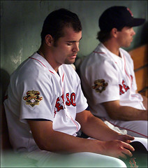
Anyhow, one day in 2001, I walked by her desk, where she was sewing the American League 100th-anniversary patch onto Sun-Woo Kim’s jersey (I don’t remember if he had been recalled from Pawtucket or just acquired), and I noticed that she had put the patch on the wrong sleeve — it was on the left instead of the right.
When I mentioned it to her, she said “It isn’t wrong — it is on the sleeve opposite the [Russell] sleeve logo.” It seems that Kim was issued an older jersey from a year or two earlier, when the Russell logo was on the right sleeve rather than the left, so Helen was thrown off by the logo and had placed the patch on the wrong sleeve. She wasn’t too happy about it (she was a stickler for detail too and very proud of her work), but it was getting close to game time, and she didn’t have time to fix it before the first pitch, so she sent it down to the clubhouse as it was.
I don’t know how long Kim wore the jersey with the patch on the wrong side, but I found this photo of him from August 15th of that year, so he appeared in at least one game with the patch error.
Great stuff. Big thanks to Rick for this behind-the-scenes tale of logo creep-induced uni dysfunction.

Raffle Reminder: Remember, our friends at Helmet Hut are giving away a free college football helmet. You’ve got until this Thursday, 10 p.m. eastern, to get your name in the hat by sending an e-mail to uniraffle at earthlink dot net (please note that this is not the usual Uni Watch e-mail address). One entry per person, but all enrollees in the Uni Watch Membership Program will automatically get three bonus entries. I’ll announce the winner on Friday.
Blame It on WordPress: I had a really big, involved entry planned for today — a different lead item, a new research project, membership news, a nice, big Ticker, etc. But when I uploaded it this morning, about two-thirds of the entry disappeared. What the fuck?! Plus my main computer’s in the shop, we’ve been having server problems, and you don’t even wanna know about the ongoing battles I’ve been having with my high-speed internet provider. In short: Technology and I haven’t been getting along too well lately. My apologies to everyone who contributed great Ticker material over the weekend — it appears to have vanished into the ether. Meanwhile, I’m gonna look into transferring the entire site onto an abacus.
Anyone have any insight into what the “X” branded undershirts all the LLWS players are wearing is? I’d never seen it before yet it was on almost all of the kids.
On this topic, I’ve noticed (and I’m sure others have as well) that link, while link. From what I’ve been able to tell, this is universal and is the easiest way to tell the replicas from the authentics.
I recently saw a baseball game featuring the Calgary Vipers of the Northern League in which they wore their road black uniform tops. It appeared the uniform numbers may have had pinstripes running through them, though I don’t know that for sure. Are there examples of teams that have worn uniform numbers with pinstripes?
[quote comment=”134222″]On this topic, I’ve noticed (and I’m sure others have as well) that link, while link. From what I’ve been able to tell, this is universal and is the easiest way to tell the replicas from the authentics.[/quote]
interesting how on the authentics you can tell that the name “PLAYER” is stitched on the back of them, rather than just using a plain item.
Going along with the unveiling of WKU’s new Russell stuff, link in their media day last week as well.
This comes two years after adidas became the official supplier for all sports at UMass. Due to a separate Nike contract with football and hockey, adidas didn’t start making the football unis until this year. The jerseys are actually link, with the trim coming up around the armpit. Stupid Broncos look.
OK, so even the American League got it wrong. The 100th season should’ve been 2000, not 2001.
And I forgot to mention how happy I was to see a picture of Wendell Kim this morning.
[quote comment=”134221″]Anyone have any insight into what the “X” branded undershirts all the LLWS players are wearing is? I’d never seen it before yet it was on almost all of the kids.[/quote]
It’s a link compression undershirt.
you can vote for the 2008 iowa state cyclones uniform/helmets at cyclones.com. looks like a major upgrade.
Is anybody else as disturbed by this picture as me?
link
[quote comment=”134236″]Is anybody else as disturbed by this picture as me?
link
Is that McLovin? ;o)
[quote comment=”134238″][quote comment=”134236″]Is anybody else as disturbed by this picture as me?
link
Is that McLovin? ;o)[/quote]
teebz is one sexy burger…
The upside down is a common occurrence with the Orioles front number too…
[quote comment=”134231″]And I forgot to mention how happy I was to see a picture of Wendell Kim this morning.[/quote]
how bout it! in college a few of us were cult followers of wendell kim (while he was with the giants). hoping to get a glimpse of him during giant highlights on ‘center.
it wasnt so much for his “aggressive” coaching as it was for seeing him in that traditional “coaches” posture.
you know, leaned over, hands on thighs… or EXACTLY how he is pictured above!
another reason was of his perfect execution of the third base coaches “home run pat”. just enough of the left handed pat, coupled with the right amount of leverage with the right hand (and if lucky, the hitter would simultaneously slap the right hand as wendell patted).
he brought us many nights of laughter…
So why does the Little League team from Curacao have ‘CB’ on their hats? They just have ‘Caribbean’ on their jerseys. Is it for ‘Curacao Baseball’ or ‘Caribbean Baseball’ or perhaps some dumbass at New Era thought it was ‘Carib Bean’?
[quote comment=”134244″][quote comment=”134231″]And I forgot to mention how happy I was to see a picture of Wendell Kim this morning.[/quote]
how bout it! in college a few of us were cult followers of wendell kim (while he was with the giants). hoping to get a glimpse of him during giant highlights on ‘center.
it wasnt so much for his “aggressive” coaching as it was for seeing him in that traditional “coaches” posture.
you know, leaned over, hands on thighs… or EXACTLY how he is pictured above!
another reason was of his perfect execution of the third base coaches “home run pat”. just enough of the left handed pat, coupled with the right amount of leverage with the right hand (and if lucky, the hitter would simultaneously slap the right hand as wendell patted).
he brought us many nights of laughter…[/quote]
The announcement of his name at Candlestick would always bring great applause from my buddies and me. Didn’t know he had a following in other parts of the country; thats pretty cool.
[quote comment=”134236″]Is anybody else as disturbed by this picture as me?
link
What’s the disturbance?
[quote comment=”134247″][quote comment=”134236″]Is anybody else as disturbed by this picture as me?
link
What’s the disturbance?[/quote]
The Knicks jersey, the red and black hat, or the knuckleball the kids throwing?
It’s Monday, Paul.
Tomorrow is a new day.
OK, so the LLWS has a bad template this year, but the Georgia uniforms make me want to hurl. A Vegas Gold jersey with red trim? What idiot thought up this idea?
Josh
[quote comment=”134253″]OK, so the LLWS has a bad template this year, but the Georgia uniforms make me want to hurl. A Vegas Gold jersey with red trim? What idiot thought up this idea?
Josh[/quote]
I actually like the international uniform template. That is, the template for the international teams. They seem less bulky and patchy with the way the underarm color is designed and things like that.
[quote comment=”134249″][quote comment=”134247″][quote comment=”134236″]Is anybody else as disturbed by this picture as me?
link
What’s the disturbance?[/quote]
The Knicks jersey, the red and black hat, or the knuckleball the kids throwing?[/quote]
Knicks jersey was my disturbance.
[quote comment=”134246″][quote comment=”134244″][quote comment=”134231″]And I forgot to mention how happy I was to see a picture of Wendell Kim this morning.[/quote]
how bout it! in college a few of us were cult followers of wendell kim (while he was with the giants). hoping to get a glimpse of him during giant highlights on ‘center.
it wasnt so much for his “aggressive” coaching as it was for seeing him in that traditional “coaches” posture.
you know, leaned over, hands on thighs… or EXACTLY how he is pictured above!
another reason was of his perfect execution of the third base coaches “home run pat”. just enough of the left handed pat, coupled with the right amount of leverage with the right hand (and if lucky, the hitter would simultaneously slap the right hand as wendell patted).
he brought us many nights of laughter…[/quote]
The announcement of his name at Candlestick would always bring great applause from my buddies and me. Didn’t know he had a following in other parts of the country; thats pretty cool.[/quote]
Perhaps I’m missing something here, but I didn’t see any pictures of Wendell Kim in today’s post.
[quote comment=”134256″][quote comment=”134249″][quote comment=”134247″][quote comment=”134236″]Is anybody else as disturbed by this picture as me?
link
What’s the disturbance?[/quote]
The Knicks jersey, the red and black hat, or the knuckleball the kids throwing?[/quote]
Knicks jersey was my disturbance.[/quote]
My disturbance is that it’s a kid playing baseball. He should be sitting on a couch playing video games.
CB is due to LL wanting to differentiate all of the hats “C” was already used for Canada.
[quote comment=”134257″][quote comment=”134246″][quote comment=”134244″][quote comment=”134231″]And I forgot to mention how happy I was to see a picture of Wendell Kim this morning.[/quote]
how bout it! in college a few of us were cult followers of wendell kim (while he was with the giants). hoping to get a glimpse of him during giant highlights on ‘center.
it wasnt so much for his “aggressive” coaching as it was for seeing him in that traditional “coaches” posture.
you know, leaned over, hands on thighs… or EXACTLY how he is pictured above!
another reason was of his perfect execution of the third base coaches “home run pat”. just enough of the left handed pat, coupled with the right amount of leverage with the right hand (and if lucky, the hitter would simultaneously slap the right hand as wendell patted).
he brought us many nights of laughter…[/quote]
The announcement of his name at Candlestick would always bring great applause from my buddies and me. Didn’t know he had a following in other parts of the country; thats pretty cool.[/quote]
Perhaps I’m missing something here, but I didn’t see any pictures of Wendell Kim in today’s post.[/quote]
Click on the ‘right sleeve’ link in the Red Sox anniversary patch story…
[quote comment=”134249″][quote comment=”134247″][quote comment=”134236″]Is anybody else as disturbed by this picture as me?
link
What’s the disturbance?[/quote]
The Knicks jersey, the red and black hat, or the knuckleball the kids throwing?[/quote]
Knuckeball won’t screw up his elbow like a slider or curve will. But that kid needs a serious uni makeover.
[quote comment=”134261″][quote comment=”134257″][quote comment=”134246″][quote comment=”134244″][quote comment=”134231″]And I forgot to mention how happy I was to see a picture of Wendell Kim this morning.[/quote]
how bout it! in college a few of us were cult followers of wendell kim (while he was with the giants). hoping to get a glimpse of him during giant highlights on ‘center.
it wasnt so much for his “aggressive” coaching as it was for seeing him in that traditional “coaches” posture.
you know, leaned over, hands on thighs… or EXACTLY how he is pictured above!
another reason was of his perfect execution of the third base coaches “home run pat”. just enough of the left handed pat, coupled with the right amount of leverage with the right hand (and if lucky, the hitter would simultaneously slap the right hand as wendell patted).
he brought us many nights of laughter…[/quote]
The announcement of his name at Candlestick would always bring great applause from my buddies and me. Didn’t know he had a following in other parts of the country; thats pretty cool.[/quote]
Perhaps I’m missing something here, but I didn’t see any pictures of Wendell Kim in today’s post.[/quote]
Click on the ‘right sleeve’ link in the Red Sox anniversary patch story…[/quote]
Thanks. I thought I clicked all the links, but I missed that one.
[quote comment=”134262″][quote comment=”134249″][quote comment=”134247″][quote comment=”134236″]Is anybody else as disturbed by this picture as me?
link
What’s the disturbance?[/quote]
The Knicks jersey, the red and black hat, or the knuckleball the kids throwing?[/quote]
Knuckeball won’t screw up his elbow like a slider or curve will. But that kid needs a serious uni makeover.[/quote]
The Knicks’ jersey is awful, but at least he’s not wearing a Rangers’ sweater.
I noticed while watching the EPL this weekend that the Arsenal jerseys aren’t consistent. Most of the gold cannons on the back are directly on the white of the collar, while some of them are directly below on the red part of the jersey. I know Eduardo (#9) had his on the red, along with a few others. Annoying.
Andy at #24 hit it on the head….I am not disturbed at all…I am happy to see a kid outdoors playing baseball instead of holed up in his room playing XBox!
[quote comment=”134260″]CB is due to LL wanting to differentiate all of the hats “C” was already used for Canada.[/quote]
So, the ‘B’ stands for what?
[quote comment=”134269″]Andy at #24 hit it on the head….I am not disturbed at all…I am happy to see a kid outdoors playing baseball instead of holed up in his room playing XBox![/quote]
AMEN! i played my fair share of atari and NES (i know, im dating myself here) growing up but video games were no match for playing sandlot or pickup for the better part of the day and night…
[quote comment=”134236″]Is anybody else as disturbed by this picture as me?
link
Yes – knuckleballers rarely make it!
Just wanted to say that I have a blog on WordPress, and it was seriously giving me huge problems on Thursday night. The warning notices said that it was preventative maintenance. All fine and well, except the maintenance notice flashed about two hours after I was getting locked out of my own blog entries, and the notice itself was wholly inaccurate (like, the maintenance routine would start up in 17,000 days). So I suspect that WordPress was hit with a virus at some point.
Comparing this years 75-patches that the Steelers-Redskins are wearing, I pick link as the winner..did the Steelers always have their logo on the upper right of their jersey?
[quote comment=”134271″][quote comment=”134260″]CB is due to LL wanting to differentiate all of the hats “C” was already used for Canada.[/quote]
So, the ‘B’ stands for what?[/quote]
CB is just Caribbean. You know, like here Missouri is “MO” or Minnesota is “MN”
it’s pretty much a staple of their uniform
link
Watching Saturday night’s Red Sox/Angels game brought Justin Speier to the mound.
He had his pant legs hiked to his knees, and had what looked like tape across the backs of both socks. What’s that all about?
Don’t have a screen grab, but it was blatantly obvious from the traditional centerfield view.
Apologies if this has been covered already.
No pictures, but did anyone else notice that Dallas’ kicker (I think it was the rookie Folk, not Gramatica) was wearing a Cowboys undershirt that could be seen THROUGH his white Jersey?
Is this something commonplace? I dont remember having seen it before, but I dont have the eye for detail that some of you do..
I don’t have screenshots but I noticed that Mexico’s pitcher’s cap had the LLWS patch falling off Saturday versus Holland.
The LLWS patches on the sides of the hats are just ironed on patches and not actually stiched on so this has been a problem that they have been having from the day they handed them out to the teams last weekend.
Julio Franco is playing for the Class A Rome Braves until September 1. He’s wearing the Rome hat, but he’s still wearing his Atlanta uniform. Notice the Majestic label vs. the other guy’s label on the top back of his uni, the 33 patch and the MLB logo on the back…check out the 3rd & 4th pictures in this gallery:
link
link
linky thingy not working for me.
link
I’m really wondering where 50 Cent found the 59fifty he’s wearing in this interview
The Georgia Bulldogs took their team photo in link.
Since football player numbers are more organized than the player numbers of other sports this may not be unique, but I’ve never noticed a team do this before (although, I’m sure it’s happened).
It’s interesting to see how the eleven guys in the front row (1-10 plus Coach Richt) are a full body smaller than the ten guys in the second row.
Not sure if this has been brought to attention but, the new Ottawa Senators unis can now be seen on the link
[quote comment=”134293″]Not sure if this has been brought to attention but, the new Ottawa Senators unis can now be seen on the link[/quote]
If it is, it’s missing the NHL Shield on the front of the collar. I don’t think it is their new jersey since the Sens’ promo page has the jersey in red with laces.
Can’t find a photo, but did anyone else notice that the Cowboys’ Brad Johnson didn’t have any blue stripes on his sleeves? I just caught a glimpse in a highlight, but it didn’t look like the sleeves were cut at all because they still had the elastic. It looked like a plain white jersey with a blue number.
[quote comment=”134293″]Not sure if this has been brought to attention but, the new Ottawa Senators unis can now be seen on the link[/quote]
That is just the alternate jersey they have been wearing for a few years now.
Though, I do hear that they are going with basically red and white versions of that jersey for their new RBK Edge unis. Same gold scalloped trim. Unveiling in 2 days…
[quote comment=”134298″][quote comment=”134293″]Not sure if this has been brought to attention but, the new Ottawa Senators unis can now be seen on the link[/quote]
That is just the alternate jersey they have been wearing for a few years now.
Though, I do hear that they are going with basically red and white versions of that jersey for their new RBK Edge unis. Same gold scalloped trim. Unveiling in 2 days…[/quote]
Got it, I guess I don’t watch enough hockey to notice. I just saw the “new” logo and got a little excited.
The new Texas A&M Univerisy adidas football uniforms were worn by the players the other day on campus. Check the gallery link.
Here’s a pick of Brad Johnson in his stripeless Cowboys jersey:
He’s the one getting smashed into the ground.
link
[quote comment=”134230″]OK, so even the American League got it wrong. The 100th season should’ve been 2000, not 2001.[/quote]
Can’t anyone do arithmetic?
Actually, since the 1st AL season was 1900, the 100th season was 1999 !
Maybe I missed a rule change somewhere along the way…weren’t the link illegal last year?
[quote comment=”134306″]Maybe I missed a rule change somewhere along the way…weren’t the link illegal last year?[/quote]
I thought that was just for college, not the pros
[quote comment=”134279″]Comparing this years 75-patches that the Steelers-Redskins are wearing, I pick link as the winner..did the Steelers always have their logo on the upper right of their jersey?[/quote]
It’s been on there since they went all Nike with their uniforms and the new number font, though I believe it is usually upper left.
[quote comment=”134307″][quote comment=”134306″]Maybe I missed a rule change somewhere along the way…weren’t the link illegal last year?[/quote]
I thought that was just for college, not the pros[/quote]
You need to get permission for a “medical reason”. That’s why link gets to wear one as well.
[quote comment=”134292″]The Georgia Bulldogs took their team photo in link.
Since football player numbers are more organized than the player numbers of other sports this may not be unique, but I’ve never noticed a team do this before (although, I’m sure it’s happened).
It’s interesting to see how the eleven guys in the front row (1-10 plus Coach Richt) are a full body smaller than the ten guys in the second row.[/quote]
This is pretty common…my link has been doing it for years. Even in the early link when I went there.
[quote comment=”134308″][quote comment=”134279″]Comparing this years 75-patches that the Steelers-Redskins are wearing, I pick link as the winner..did the Steelers always have their logo on the upper right of their jersey?[/quote]
It’s been on there since they went all Nike with their uniforms and the new number font, though I believe it is usually upper left.[/quote]
That Steelers number font doesn’t do very well when its being stretched across a big defensive lineman, like in that picture. The 9s get kinda squiggly.
[quote comment=”134292″]The Georgia Bulldogs took their team photo in link.
Since football player numbers are more organized than the player numbers of other sports this may not be unique, but I’ve never noticed a team do this before (although, I’m sure it’s happened).
It’s interesting to see how the eleven guys in the front row (1-10 plus Coach Richt) are a full body smaller than the ten guys in the second row.[/quote]
Cool concept, and clearly, the first 8 rows (bottom-up) are in numerical order, but who are those guys in the next two rows? I clearly see a couple of guys with single-digit numbers. The guys on the ends of the rows are wearing #29 and #65 . . .
I know college football rosters are so huge that they rarely have enough uniform numbers to go around, but why ruin the visual by having two rows of “riff-raff” at the top of the picture? Wouldn’t it have been better to sit the duplicate 29s or duplicate 65s next to each other?
[quote comment=”134282″]it’s pretty much a staple of their uniform
link
now the steelers have more logos on their jersey than on their helmet, 2 to 1
other nfl stuff, that is a good gallery, i still do not like the chargers unis … the use of the light and dark blue together just does not work.
[quote comment=”134292″]The Georgia Bulldogs took their team photo in link.
Since football player numbers are more organized than the player numbers of other sports this may not be unique, but I’ve never noticed a team do this before (although, I’m sure it’s happened).
It’s interesting to see how the eleven guys in the front row (1-10 plus Coach Richt) are a full body smaller than the ten guys in the second row.[/quote]
Not to be nit-picky (especially since I’m a Yellow Jackets fan), but there are 12 guys on the second row.
And when I played football in high school, we took our team photos in numerical order. I always thought that was SOP.
[quote comment=”134308″][quote comment=”134279″]Comparing this years 75-patches that the Steelers-Redskins are wearing, I pick link as the winner..did the Steelers always have their logo on the upper right of their jersey?[/quote]
the jersey patch is where the decal went when it fell off the left side of the helmet…
link of UCF’s managers putting the new decals on.
[quote comment=”134253″] A Vegas Gold jersey with red trim? What idiot thought up this idea?
[/quote]
Vegas Gold with anything is a bad idea.
Obviously this is not an Earl Campbell tear away… link
link putting the new decals on the helmets
I had thought about getting a pair of the player workout shorts until I saw this picture…
link
Maybe that isn’t such a good idea….thanks for tipping me off Kenny
[quote comment=”134330″]I had thought about getting a pair of the player workout shorts until I saw this picture…
link
Maybe that isn’t such a good idea….thanks for tipping me off Kenny[/quote]
Shouldn’t the caption say something like “Chesney, who says he is a huge fan, is actually a remarkably tiny fellow”?
Can’t tell for certain, but it seems like the Georgia players are wearing white pants. Is that right? They’ve been wearing “silver britches” since Herschel’s second year, I think.
ARiZZona actually has a sharp color scheme, it accurately reflects the diamondback rattlesnake, well the brick red does anyways. If only they can get a 2nd grader to correct their link
last week there was discussion about numbers being visible to the camera for television purposes, check this pic out, no numbers and/or logo are visible, except on the bottom of the bat, it’s obviously the Blue Jays..but it could be mistaken for an ad in the local flyer in which all logos/numbers have to be removed or proper licensing is required. link
Wisconsin Football has moved from screenprinted Jerseys by adidas to new tackle twill ones for this year
[quote comment=”134339″]ARiZZona actually has a sharp color scheme, it accurately reflects the diamondback rattlesnake, well the brick red does anyways. If only they can get a 2nd grader to correct their link[/quote]
I think you mean spelling. Penmanship is the legibility of your handwriting.
[quote comment=”134305″][quote comment=”134230″]OK, so even the American League got it wrong. The 100th season should’ve been 2000, not 2001.[/quote]
Can’t anyone do arithmetic?
Actually, since the 1st AL season was 1900, the 100th season was 1999 ![/quote]
But it wasn’t a major league until 1901.
I guess we can expect to see Michael Vick’s new uniform soon.
[quote comment=”134346″][quote comment=”134339″]ARiZZona actually has a sharp color scheme, it accurately reflects the diamondback rattlesnake, well the brick red does anyways. If only they can get a 2nd grader to correct their link[/quote]
I think you mean spelling. Penmanship is the legibility of your handwriting.[/quote]
No, i think he meant penmanship. Nothing is spelled wrong; the font isn’t illegible but it is close.
[quote comment=”134352″][quote comment=”134346″][quote comment=”134339″]ARiZZona actually has a sharp color scheme, it accurately reflects the diamondback rattlesnake, well the brick red does anyways. If only they can get a 2nd grader to correct their link[/quote]
I think you mean spelling. Penmanship is the legibility of your handwriting.[/quote]
No, i think he meant penmanship. Nothing is spelled wrong; the font isn’t illegible but it is close.[/quote]
Yeah, I meant penmanship, it’s the style I was talking about.
[quote comment=”134346″][quote comment=”134339″]ARiZZona actually has a sharp color scheme, it accurately reflects the diamondback rattlesnake, well the brick red does anyways. If only they can get a 2nd grader to correct their link[/quote]
I think you mean spelling. Penmanship is the legibility of your handwriting.[/quote]
Penmanship or handwriting is the art of writing with the hand and a writing instrument. Styles of handwriting link
[quote comment=”134351″]I guess we can expect to see Michael Vick’s new uniform soon.[/quote]
best post today…
interesting how vick, an employee of arthur blank, should now be wearing orange…
most former employees of blank wore orange when he had his other business.
The following item will be included on the site tomorrow, but I want to get a head start, so here it is for those of you who read the comments:
Research Project: Last week’s link about link led many readers to suggest a related topic: uniforms that made it onto the field (or court, or ice) but were worn only once. Classic examples would include the Phillies’ solid-maroon design shown at left (worn on May 19th, 1979, and then quietly abandoned after intensely negative fan reaction) and the link (October 28th, 2003). I agree that this is a good topic, and I’m going to write an ESPN column about it for later this week, as a follow-up to the prototypes column.
Before you flood me with additional examples, let me spell out what I’m not looking for. I don’t want throwbacks, commemoratives, MLB’s futuristic jerseys, or anything else that was only supposed to have been worn once in the first place. I’m also not interested in uni elements that are technically active today but rarely worn (I already devoted a column to that topic link).
What I want here are designs that were supposed to be full-fledged components of a team’s wardrobe but barely got out of the starting gate before being mothballed. Limiting the project to things that were worn only once would probably make for a very small list, so let’s expand the parameters to include things that were worn, say, up to three or four times. This would allow us to include the link (worn twice in 1971, according to link from Bill Henderson’s CD, although I’d prefer to know the exact dates), the link (worn on April 6th and 21st, 1997, according to reader Tim McCabe), and even the link, which were worn just a handful of times in early 1997 (anyone know exactly how many, or when?). I’d also like to include the Phillies’ blue “bad luck” caps from 1994, but I can’t even find any photos of those, much less narrow down how many times they were worn. Anyone..?
I’d like to include more non-baseball examples, but of course more MLB contributions are fine too. So if you’ve got good ideas to pass along, link (it’s fine if you also post them in the Comments, but please e-mail me directly as well). And don’t delay — I’ll be delivering this column to my ESPN editors on Wednesday afternoon.
I loved the Phillies all-maroon and the Orioles all-orange. Would love to see colored pants return to MLB. The Mets white caps weren’t too bad, either.
[quote comment=”134363″]I loved the Phillies all-maroon and the Orioles all-orange. Would love to see colored pants return to MLB. The Mets white caps weren’t too bad, either.[/quote]
*ahem* let’s not forget the bumblebee unis….
link
Discovery channel wore special uniforms with green accents for this year’s tour de france to show they were racing “carbon neutral” and purchasing greeen credits. It was for 1 race only.
As US Postal they also wore special uniforms on the final stage of the 2002 (I think) tour to commemorate Lance’s TDF win. They were fined by the race organizers for non-standard unis. I can’t find photos from work.
Paul clearly stated he wanted uniforms that were meant to become part of the common uniform, not things that were supposed to only be worn once.
[quote comment=”134302″]Here’s a pick of Brad Johnson in his stripeless Cowboys jersey:
He’s the one getting smashed into the ground.
link
You can see the stripes rolling away a few yards downfield, like hubcaps that get knocked off a car when it’s in a wreck…
[quote comment=”134309″]
You need to get permission for a “medical reason”. That’s why link gets to wear one as well.[/quote]
Anyone who’s ever been poked in the eye understands that. I got that in high school — my right pupil doesn’t constrict properly, and I can’t wear contact lenses any more. I wear a tinted visor when I play hockey to cut down on glare.
The Mets wore a blue jersey infrequently in 1982, and only, I believe, on the road. I’m not sure if this was worn too often to qualify, but I don’t remember seeing it too many times.
I can’t find pics, but the Phillies blue caps of 1994 were used in day games during the week. I don’t know if that helps you find pics, but it should narrow it down!
(Remember Kruk shredding one on Letterman?)
[quote comment=”134343″]Wisconsin Football has moved from screenprinted Jerseys by adidas to new tackle twill ones for this year[/quote]
They’ve been tackle twill for a while – at least since last season, but I believe as early as the year before that.
finally! the twins red jersey!
anyone with a game pic?
[quote comment=”134379″]finally! the twins red jersey!
anyone with a game pic?[/quote]
What game on what day?
I am a long time UniWatcher and I have a “proposition” if you will to the UniWatch audience interested in logos. I am an intern a the Rose-Hulman Institute of Technology and they are trying to come up with a new logo for their athletic teams. I now that some of you are logo designers and may have some great ideas. RH’s current logo can be found here (link) I have talked to the Sports Info. Director and he would like to keep the elephant as a part of the logo but it will be voted on by the athletic department staff for a final design. Any ideas are welcome and monetary compensation could be possible for a logo that is head and shoulders above the rest. If you are interested or have any sketches/designs in mind, please feel free to email me at link.
[quote comment=”134380″][quote comment=”134379″]finally! the twins red jersey!
anyone with a game pic?[/quote]
What game on what day?[/quote]
Nevermind, I didn’t see what you were referring to. Scratch my question.
I know its been overdone, but don’t forget the White Sox shorts. Game worn twice, shelved forever thereafter…
In 1973 the A’s had 5 uniform combos. In future years, only 4. I gotta believe one of those was used rarely?
I don’t have the time to research now… but maybe that’s a good starter?
Paul, if you can find pics of Opening Day in 1994, I think you’ll find the blue Phils caps.
Here’s an odd question – but this might be the answer to next year’s Phillies alternates – what IS this doing in Wikipedia?
link
Oh, wait, that’s the BP jersey. Confusing the hell out of me. . . I should go back to work.
[quote comment=”134378″][quote comment=”134343″]Wisconsin Football has moved from screenprinted Jerseys by adidas to new tackle twill ones for this year[/quote]
They’ve been tackle twill for a while – at least since last season, but I believe as early as the year before that.[/quote]
Confirmation from the 2006 season (this one the November 4 game against Penn State):
link
Man, I wish we could have included the Pirates red vests in the ‘worn-only-a-few-times-and-then-shelved’ category.
[quote comment=”134390″]Here’s an odd question – but this might be the answer to next year’s Phillies alternates – what IS this doing in Wikipedia?
link
I wouldn’t really mind if those were the phillies alternates, but i really want to see them get a whole new uniform design. it took them nearly 20 years b4 they made a uniform change last, and its coming up on another 20 years. i just want to c them get rid of the pinstripes, b/c when they started up in 1899 all the way to 1950, they had solid jerseys. there AAA team the ironpigs just showed there uniform selection, i want to see something like that. i want the phillies to get new home/road jersey’s, a saturday and sunday jersey and a alternate jersey, i am tired of seeing them only have 2 jerseys and wearing them over and over again. its always been that way for the phillies, but every other team in philly has an alternate jersey.
What about link? Even though it has never been worn, it was supposed to be a part of the on field uni.
[quote comment=”134399″]What about link? Even though it has never been worn, it was supposed to be a part of the on field uni.[/quote]
I’m pretty sure that the black A’s jersey was worn in games.
[quote comment=”134390″]Here’s an odd question – but this might be the answer to next year’s Phillies alternates – what IS this doing in Wikipedia?
link
[quote comment=”134391″]Oh, wait, that’s the BP jersey. Confusing the hell out of me. . . I should go back to work.[/quote]
It could be be the BP, but i can pretty clearly tell that it’s a photoshop job, and not a very good one, either.
PTI just did a bit about the Chargers new white helmets and they argued they needed to get back the Powder Blues, and Wilbon went off how the Chargers didn’t “get it” a couple times.
[quote comment=”134292″]The Georgia Bulldogs took their team photo in link.
Since football player numbers are more organized than the player numbers of other sports this may not be unique, but I’ve never noticed a team do this before (although, I’m sure it’s happened).
It’s interesting to see how the eleven guys in the front row (1-10 plus Coach Richt) are a full body smaller than the ten guys in the second row.[/quote]
I have a team photo of the 1997 Denver Broncos and they are in numerical order. It sure makes it easier finding players that way.
I emailed all of these to Mr. Lukas, but this is what I’ve thought of so far.
1) Florida’s abandoned System of Dress uniforms (worn only once, in a loss to Tennessee).
2) NC State’s one-piece skin-tight basketball uniforms (with over-shorts, at the insisting of the players).
3) Dallas Stars “Fallopian Tubes” jersey, worn sparingly for one year. Infrequently enough to qualify for the column?
I know Im making light of a serious situation
but did anyone else notice Michael Vick’s career both on and off the field went south as soon as the Falcons switched jerseys? Think about it, in the old Falcons gear he was at the top of the world beating Green Bay in Green Bay for the first time in the playoffs. Ever since then both on the field and off its been going down
[quote comment=”134400″][quote comment=”134399″]What about link? Even though it has never been worn, it was supposed to be a part of the on field uni.[/quote]
I’m pretty sure that the black A’s jersey was worn in games.[/quote]
They were definitely won in games. I believe it was 1999 only
[quote comment=”134427″][quote comment=”134400″][quote comment=”134399″]What about link? Even though it has never been worn, it was supposed to be a part of the on field uni.[/quote]
I’m pretty sure that the black A’s jersey was worn in games.[/quote]
They were definitely won in games. I believe it was 1999 only[/quote]
*worn*
[quote comment=”134422″]I know Im making light of a serious situation
but did anyone else notice Michael Vick’s career both on and off the field went south as soon as the Falcons switched jerseys? Think about it, in the old Falcons gear he was at the top of the world beating Green Bay in Green Bay for the first time in the playoffs. Ever since then both on the field and off its been going down[/quote]
Sounds about as legit as any excuse the dozen or so Vick-Supporters can come up with.
I wouldn’t really mind if those were the phillies alternates, but i really want to see them get a whole new uniform design.
Why spoil a classic? The Dodgers, Phillies and Yankees are among the few teams that don’t have alternates, and that should be praised, not ridiculed.
What about last year when Oregon unveiled the 3 helmets, I believe that either the white or yellow were not worn.
Does anyone remember, or have a picture of, the one time the Syracuse basketball team wore blue unis in the 80’s? It was a game at Kentucky and they never wore them again.
The Pacers in the mid 1990s were looking at adding a light blue to their uniforms. Pictures of this adaptation are available for viewing at the Conseco Fieldhouse. I saw them personally in March 2005.
If someone is in the Indy area and can take a tour of the Fieldhouse, take your camera.
I know there are several college football uniforms used only a time or two. Most notably in bowl games. Notre Dame’s green jerseys. Georgia sported black pants instead of silver a few years back. Mississippi State wore an all white get up about 4 years ago.
Okay, before y’all laugh your asses off. Let me say that I am a huge, huge fan of this site. I’ve been an avid reader for years. But, I’ve never posted. How do I link to a page??? I know, ha ha ha ha ha! Thanks
Grey Pirates and Royals caps
White Red Sox caps
Those 1918-style White Sox sunday alternates? It seems like they weren’t used on every sunday like initially planned…
[quote comment=”134462″]Okay, before y’all laugh your asses off. Let me say that I am a huge, huge fan of this site. I’ve been an avid reader for years. But, I’ve never posted. How do I link to a page??? I know, ha ha ha ha ha! Thanks[/quote]
easiest way is to just paste a link and make sure you have spaces around it. the other way, is to type it all up, highlight a word you want linked, click the “link” button above the text box, paste your link into the pop-up box, and click ok. if the word doesn’t show up in the preview thing (below the text box), put a space directly before the first letter of the word you highlighted.
hopefully that’s understandable.
oh, and hahahahahaha :P
also. Paul, I emailed you a link or two concerning never-worn NHL jerseys, hopefully you got it. if not, shoot me an email, i’ll have it sent again by morning
Welcome “link” to Shea…
[quote comment=”134404″][quote comment=”134390″]Here’s an odd question – but this might be the answer to next year’s Phillies alternates – what IS this doing in Wikipedia?
link
[quote comment=”134391″]Oh, wait, that’s the BP jersey. Confusing the hell out of me. . . I should go back to work.[/quote]
It could be be the BP, but i can pretty clearly tell that it’s a photoshop job, and not a very good one, either.[/quote]
That isn’t the bp jersey for one, they dont have solid white pants, and 2 they have 2 bp jerseys, red for home and blue for road.
[quote comment=”134292″]The Georgia Bulldogs took their team photo in link.
Since football player numbers are more organized than the player numbers of other sports this may not be unique, but I’ve never noticed a team do this before (although, I’m sure it’s happened).
It’s interesting to see how the eleven guys in the front row (1-10 plus Coach Richt) are a full body smaller than the ten guys in the second row.[/quote]
Um actually there are 12 people in the 2nd row.
[quote comment=”134466″][quote comment=”134462″]Okay, before y’all laugh your asses off. Let me say that I am a huge, huge fan of this site. I’ve been an avid reader for years. But, I’ve never posted. How do I link to a page??? I know, ha ha ha ha ha! Thanks[/quote]
easiest way is to just paste a link and make sure you have spaces around it. the other way, is to type it all up, highlight a word you want linked, click the “link” button above the text box, paste your link into the pop-up box, and click ok. if the word doesn’t show up in the preview thing (below the text box), put a space directly before the first letter of the word you highlighted.
hopefully that’s understandable.
oh, and hahahahahaha :P
also. Paul, I emailed you a link or two concerning never-worn NHL jerseys, hopefully you got it. if not, shoot me an email, i’ll have it sent again by morning[/quote]
Thanx
1st timer here, hope it works
link
link
link
link
The Florida State Seminoles only wore link once and lost in the 2004 Orange Bowl if we’re counting uniform combos.
Is anybody else as disturbed by this picture as me?
link…
What’s the disturbance?
The Knicks jersey, the red and black hat, or the knuckleball the kids throwing?
If that disturbs you, you should never go near a summer camp (sleepaway especially) with many Jewish boys. (The URL on the picture is from the New Jersey Y(MHA) camps.) You will see hundreds of kids wearing very similar outfits: Long shorts, basketball jersey and baseball cap. The kids play different sports all day, so no one set of clothes is appropriate for them all.
Wasn’t there a link or something posted here about some Michigan / Ohio St. helmet? I can’t find it on here.
[quote comment=”134293″]Not sure if this has been brought to attention but, the new Ottawa Senators unis can now be seen on the link[/quote]
I don’t know if this has been brought to your attention, but that picture of Jason Spezza on the cover features the Senators 3rd jersey they’ve been wearing since, oh, about 2001!
It ISN’T the new jersey, set to be released on Wednesday.
WHY do SO many people use video games as their source for uniform info around here?
[quote comment=”134486″]Wasn’t there a link or something posted here about some Michigan / Ohio St. helmet? I can’t find it on here.[/quote]
link
[quote comment=”134493″][quote comment=”134486″]Wasn’t there a link or something posted here about some Michigan / Ohio St. helmet? I can’t find it on here.[/quote]
link[/quote]
Thank you! I have a OSU fan that’s gonna scream when she sees this! >:) (as for me, I’m not really into college sports)
Did anyone notice that the “S” on the large Twins Dairy Queen jersey was upside down?
OSU’s colors will always make me want to puke. I miss John Cooper though…
Were Florida State’s all black “unconquered” uniforms a one time deal?
[quote comment=”134489″][quote comment=”134293″]Not sure if this has been brought to attention but, the new Ottawa Senators unis can now be seen on the link[/quote]
I don’t know if this has been brought to your attention, but that picture of Jason Spezza on the cover features the Senators 3rd jersey they’ve been wearing since, oh, about 2001!
It ISN’T the new jersey, set to be released on Wednesday.
WHY do SO many people use video games as their source for uniform info around here?[/quote]
ESPN NHL 2k5 (i believe it was 2k5, could’ve been 2k4) DID accidentally leak the flames red jerseys that have become so popular…
plus, the video game creators were among the very few to see these new jerseys. because they’re not directly controlled by the nhl or any team, an accidentally slipped pic of a jersey isn’t all that outlandish
not to mention that it’s given us some of the best examples of how the jerseys will look in action: mainly, crappy
[quote comment=”134489″][quote comment=”134293″]Not sure if this has been brought to attention but, the new Ottawa Senators unis can now be seen on the link[/quote]
I don’t know if this has been brought to your attention, but that picture of Jason Spezza on the cover features the Senators 3rd jersey they’ve been wearing since, oh, about 2001!
It ISN’T the new jersey, set to be released on Wednesday.
WHY do SO many people use video games as their source for uniform info around here?[/quote]
I know, I know it was cleared up shortly after I posted, and I apologized for the simple fact that I don’t follow the NHL and was unaware of that jersey.
I just noticed (while watching the Yankees game) that Phil Hughes appears to be wearing a Yankees cap from last season (grey under-brim) even though he didn’t make his major debut until earlier this year! I don’t have a screen grab, but I’m sure the picture will appear at some point tomorrow…
Actually, I just found a pic of Hughes’ cap from tonight… link
Has he been wearing this cap for the whole year, or is it something he just started wearing because he dislikes the new style?
He has been wearing the cap the whole year.
Anybody remember the University of Kentucky’s stone washed denim looking unis from 1996?
link
“King Philip” Hughes also appears to be wearing the new baseball specific Nike Shox…
I thought those gray Pirates hats were worn for an entire season, but I could be wrong. As far as the research project, how about Cooperalls?
Here is one for the reason an athlete wears a number…In ESPN the Mag, Frank Gore of the 49ers says that he wears number 21 because his football number has always been 3 but in the pros RBs cannot have single digit numbers so naturally 2+1 =3
I believe that Wisconsin came out in snazzy new uniforms one season and got routed on national TV. Barry Alvarez immediately ditched the fancy duds and put the Badgers back in their old basic standbys.
[quote comment=”134375″]I can’t find pics, but the Phillies blue caps of 1994 were used in day games during the week. I don’t know if that helps you find pics, but it should narrow it down!
(Remember Kruk shredding one on Letterman?)[/quote]
Lived in Philly during that time, they used to have what was called a business mens special. It was a weekday day game, and it used to be once a month (think it was only in the warm months). I definitely remember the hats bc they were the in Phils hat to buy when you were a 12 year old…
[quote comment=”134404″][quote comment=”134390″]Here’s an odd question – but this might be the answer to next year’s Phillies alternates – what IS this doing in Wikipedia?
link
[quote comment=”134391″]Oh, wait, that’s the BP jersey. Confusing the hell out of me. . . I should go back to work.[/quote]
It could be be the BP, but i can pretty clearly tell that it’s a photoshop job, and not a very good one, either.[/quote]
btw and looking on wikipedia by clicking the picture of that, u can read that some1 had to photoshop that to be able to post it, some1 had found that they will wear that though
Ohio University is switching from adidas to Russell Athletic this year. They haven’t officially unveiled their new unis but here is a link of all of the seniors in them. and here is a pic of last years home jerseys to compare.
Whoops, here’s the link and as always GO CATS!
I thought those gray Pirates hats were worn for an entire season, but I could be wrong.
You’re right. 1997.
As far as the research project, how about Cooperalls?
Also worn for a full season by the Flyers and Whalers.
Okay, 1901 to 2000 were the 100 seasons. 2001 was the year they celebrated this. It wasn’t “celebrating our 100th season this year,” it was “celebrating the fact that we’ve now completed 100 seasons.” Except for 1994, ha. It also looks like Paxton Crawford has his name on the back of his home jersey. Doesn’t that red line on the back look awfully thin for a normal-sized “3”? (He wore 63.) Could just be some white material folded over part of the 3….
[quote comment=”134527″]I thought those gray Pirates hats were worn for an entire season, but I could be wrong. As far as the research project, how about Cooperalls?[/quote]
The gray Buccos hats were worn from 1997 to 2000 on the road, I believe. As for one-game unis, how about Pitt’s three shades of gold (helmets, jerseys and pants) against Louisville on November 25th last year? Speaking of Pitt, I don’t know if it’s been posted, but there will be new jerseys this season and the return of the blue pants. The home ones have been leaked. “Panthers” is gone from the front and replaced with the arch logo, and the gold side piping is gone.
link
link
link
link
My bad
[quote comment=”134530″]I believe that Wisconsin came out in snazzy new uniforms one season and got routed on national TV. Barry Alvarez immediately ditched the fancy duds and put the Badgers back in their old basic standbys.[/quote]
Do you remember a specific year on this? ‘Cause in the Alverez era, I can’t remember a different uni than white pants/white jersey (road) and white pants/red jersey (home) What other options would there be? Red on red? I e-mailed the equipment manager of the Badgers last week because we thought Bucky would don new threads because of the new NCAA football game, but he said Bucky has never worn red on red. I’m not saying you are wrong, I am just having a hard time remembering. (and i am from Wisconsin)
Notre Dame used green numbers in their unis for the ’92 Sugar Bowl (2nd half I believe)
link
[quote comment=”134533″][quote comment=”134375″]I can’t find pics, but the Phillies blue caps of 1994 were used in day games during the week. I don’t know if that helps you find pics, but it should narrow it down!
(Remember Kruk shredding one on Letterman?)[/quote]
Lived in Philly during that time, they used to have what was called a business mens special. It was a weekday day game, and it used to be once a month (think it was only in the warm months). I definitely remember the hats bc they were the in Phils hat to buy when you were a 12 year old…[/quote]
That’s hilarious because I was born in ’82, became a baseball fan solely because I went to school with John Kruk’s nephew, and I had one of those hats for the longest time- starting when I was 12. Solid blue with the red “P” outlined in white, right?
Here’s a pic of the upside-down 8 on outside of Fenway Park:
link
I took the pic in 2005, but never noticed the wrong placement of the 8.
[quote comment=”134542″]Okay, 1901 to 2000 were the 100 seasons. 2001 was the year they celebrated this. It wasn’t “celebrating our 100th season this year,” it was “celebrating the fact that we’ve now completed 100 seasons.” Except for 1994, ha. It also looks like Paxton Crawford has his name on the back of his home jersey. Doesn’t that red line on the back look awfully thin for a normal-sized “3”? (He wore 63.) Could just be some white material folded over part of the 3….[/quote]
Then the patch should indicate that, which it doesn’t.
[quote comment=”134463″]
Those 1918-style White Sox sunday alternates? It seems like they weren’t used on every sunday like initially planned…[/quote]
I’m pretty sure they were (and they were 1917 World Series uniforms). However, last year they had 1906-style alternates, and I was under the impression they were going to be a fairly common thing, but they were only worn once or twice. I might have been mistaken, though.
[quote comment=”134297″]Can’t find a photo, but did anyone else notice that the Cowboys’ Brad Johnson didn’t have any blue stripes on his sleeves? I just caught a glimpse in a highlight, but it didn’t look like the sleeves were cut at all because they still had the elastic. It looked like a plain white jersey with a blue number.[/quote]
I caught a repeat of the game last night on the NFL Network and noticed the same thing. At first I thought it was a practice jersey, but the Cowboys have link as their white practice jersey.