Got an interesting note a few days ago from reader Jim Borwick, as follows:
I was watching the Blue Jays play the Sox in Chicago a couple of weeks ago and saw something I found odd on the White Sox home unis. Even though their logo is only on one side of the shirt, the second button from the top is positioned higher than it should be. Other teams obviously do this to accommodate the insignia running across the chest area, but with the Sox there is no need for that. I did a bit more research and discovered that most of the other teams with “one-sided” jersey logos also do this, including the Tigers, Reds, and Cubs — but not the Yankees. Their buttons are evenly spaced.
Have you ever noticed this ? What am I saying, of course you have.
Coupla things here. First, yes, I have noticed that even teams with simple chest logos, as opposed to full-chest insignia, use the unevenly spaced buttons (another team that does so: the Rockies), which has always struck me as a lazy move by Majestic. I’d never noticed that the Yankees were bucking this trend, however, so I was feeling pretty unobservant after reading Borwick’s note (especially after he showed so much faith in me at the end of his communiqué).
But then I discovered that he appears to have gotten some of his research mixed up: Contrary to what he wrote, the Yankees do indeed have the uneven spacing (here’s another example). And although he cited the Cubs among the unevenly button-spaced contingent, it appears that the Cubbies actually have nice, even button spacing on their home jersey (but, as you’d expect, uneven spacing to clear a path for their road jersey insignia).
Are the Cubs the only ones with evenly spaced buttons? Not sure — I haven’t yet had time to check the status of every left-chest-logo’d team, but I hope to get moving on that soon. (Translation: Vince, can you please look into this?)
A more serious research project would be to investigate the history of button placement. Did all teams use evenly spaced buttons years ago, and did this lead to buttonholes in the middle of chest lettering? If so, when did that second button migrate upward, creating the open real estate for the insignia? Is the uneven spacing just a Majestic thing, or were Russell, Rawlings, and other recently MLB uni manufacturers also doing it? I hope to look into all of these questions soon. If anyone has info or wants to contribute any research or their own, you know what to do.
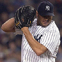
Rocket Science: New York Times Yankees beat reporter Tyler Kepner wrote a little item about Roger Clemens last week, but it only made the early edition of the paper and doesn’t appear to be linked on the paper’s web site. Fortunately, he passed it along for me to reprint here:
There is a strategic reason, Roger Clemens explained, that he carries a black, hard-shell equipment trunk with him at home and on the road. Clemens insists on putting his gloves in the trunk so they do not get banged up during travel. He wants the leather to be stiff so hitters can not see the movement of his hand as he grips the ball.
Early in his career, Clemens noticed how veteran teammates like Marty Barrett and Dwight Evans could tell what a pitcher was going to throw by reading the subtle movements of his fingers and wrist. Clemens is careful to conceal his intentions, using a glove with no openings that would show any part of his hand or fingers.
Clemens said he tries to never wear long sleeves for the same reason. He might reach deeper into his glove to grip a certain pitch, and he figures that if the hitter sees only skin — not the end of a sleeve — he might be unable to tell when Clemens is changing his grip.
Clemens said he wants the leather in his glove to be soft enough to catch a grounder or a flip from the first baseman, but essentially he wants it firm. If a glove gets even the slightest bit floppy, he said, he will give it to his agent, Randy Hendricks, an accomplished softball player who can use a deep pocket in his glove.
Good Things Happen to Good People Dept.: I don’t know how I ever got by without an intern. More specifically, I don’t know how I got by without Vince Grzegorek, who’s become an indispensable member of the Uni Watch team and a good friend besides. Incredible as this may seem, Vince’s sportswriting aspirations go beyond the realm of uniforms, and lately he’s been trying his hand at non-uni pieces, one of which has just been published by Cleveland Scene (the Forest City’s alterna-weekly). Enjoy it here, and please join me in congratulating Vince.
Uni Watch News Ticker: Reprinted from yesterday’s comments: There’s an amazing old Montana football jersey being sold on eBay. … That same seller is also auctioning off a bunch of 1930s Montana game programs, many of which have really gorgeous cover art, as seen here, here, here, here, here, here, and here. … Interesting article about the use of the Cubs trademark here (with thanks to Laura Koenig). … Boston College is slated to unveil new uniforms today. … Here’s a minor league promotion I hadn’t seen before: Backwards Night. Details here (with thanks to Jason Adkins). … A few days ago I linked to this article, which reputedly showed all sorts of reasons why Barry Bonds’s swing is improved by his elbow armor (and not just because it allows him to sit on the inside part of the plate). That article has been widely ridiculed in baseball circles over the past few days. But the author isn’t giving up — he answers his critics here. … Someone’s put together a nice little gallery of bespectacled ballplayers (thanks, Vince). … Thanks to Barry Bonds, Mike Bacsik is now wearing MLB’s most famous stirrups. They’re even mentioned in this article about Bacsik, which includes the following passage: “Bacsik is not your typical major leaguer. He wears old-fashioned stirrups. He studies baseball lore.” But Bacsik’s not the only stirrups-clad hurler out there. Check out, for example, last night’s starter for the Rockies, Ubaldo Jimenez (additional views here, here, and here).
I think the Cardinals are even-spaced on both home and roads.
Glad to see Paul mention the Jiminez stirrup thing in the ticker. GoTerrerier blasted me in the comments section last night when I mentioned it, putting the Jiminez stirrup issue in the same category as Tampa practice Jersey. I thought maybe I had missed it.
[quote comment=”130792″]I think the Cardinals are even-spaced on both home and roads.[/quote]
Sure enough: link, link.
I was flipping through the channels last night and caught some of the southeast regional little league game, and the Georgia team was wearing some pretty sweet link
Phillies are unevenly spaced, home and away. Kinda obvious, but gotta add it.
Side note: If you search Google images for baseball stirrups, the fourth from the left on the top row, is the fencing image I linked to from this blog. Sweet.
[quote comment=”130793″]Glad to see Paul mention the Jiminez stirrup thing in the ticker. GoTerrerier blasted me in the comments section last night when I mentioned it, putting the Jiminez stirrup issue in the same category as Tampa practice Jersey. I thought maybe I had missed it.[/quote]
I didn’t “blast” you . . .I’m sorry you were offended. You did miss it. Someone has commented on it every time he’s pitched since his call up . . . .
Not sure if UBS has another trademark but the “3 keys” doesn’t appear to be similar at all to the Cubs trademark.
link
1977 – “Summer of Sam”
2007 – “Summer of Stirrups”
As badly as U-ball has pitched in his last two starts, I’m afraid he might be asked to ditch the stirrups.
A few years ago [3-4 years?], the Cardinals briefly had the 2-high button version, but it lasted only a short time. I think it was even only certain players who wore that version. I can’t find any photos in my on-line file, but I’ll look in my archives at home later. On the current uni, there is actually a slightly longer space between the 2nd and 3rd button to accomodate the logo. In my women’s cut jersey, they put a piece of velcro inside to prevent an unseemly gap.
[quote comment=”130799″]Not sure if UBS has another trademark but the “3 keys” doesn’t appear to be similar at all to the Cubs trademark.
link
I think they were saying that they would not recognize that link spells out Cubs instead of just seeing the UBS in two circles.
[quote comment=”130803″][quote comment=”130799″]Not sure if UBS has another trademark but the “3 keys” doesn’t appear to be similar at all to the Cubs trademark.
link
I think they were saying that they would not recognize that link spells out Cubs instead of just seeing the UBS in two circles.[/quote]
link!!! It all makes sense now. It was like recognizing the arrow in the link logo for to the first time.
Never noticed the FedEx arrow before!
[quote comment=”130799″]Not sure if UBS has another trademark but the “3 keys” doesn’t appear to be similar at all to the Cubs trademark.
link
I think the possible trademark infringement stems from the the smaller letters UBS that follow and are somewhat surrounded by the larger C. If you didn’t know that it stood for CUBS, it could be confused for UBS in a Red semi-circle
That arrow in the fed FedEx logo is crazy. I was looking at it and was like where the hell is that arrow, and now I’m amazed.
Hey everybody. Quick question.
I’m not very versed in this computer stuff, so bear with me.
How do you do a screengrab from mlb.tv or any other flash enabled gallery? I’m using windows, firefox, and have tried the ctr-alt-prnt suggestion from a post awhile back, but all that gave me was the entire mlb.tv gamecast page pasted into a document, and I couldn’t take just the game image out. Understand? I certainly don’t.
Help would be much appreciated.
Great job with the writing, Vince. As one of no doubt many who aspired to be a sportswriter but was too cowardly to even give it a try, I wish you the best of luck with it.
The Cubs need to get rid of the registered trademark symbol on their link…makes it look like a link!
[quote comment=”130794″][quote comment=”130792″]I think the Cardinals are even-spaced on both home and roads.[/quote]
Sure enough: link, link.[/quote]
am i reading this wrong?
there is an obvious spacing difference between buttons 2 and 3…
[quote comment=”130821″][quote comment=”130794″][quote comment=”130792″]I think the Cardinals are even-spaced on both home and roads.[/quote]
Sure enough: link, link.[/quote]
am i reading this wrong?
there is an obvious spacing difference between buttons 2 and 3…[/quote]
Thank you. I thought I was the only on that saw a different spacing there.
I did mention that already. But the 1st 2 buttons are evenly spaced on StL’s uni, as opposed to the uneven spacing many teams use for the first 2 “high button” vs. all the other buttons.
[quote comment=”130798″][quote comment=”130793″]Glad to see Paul mention the Jiminez stirrup thing in the ticker. GoTerrerier blasted me in the comments section last night when I mentioned it, putting the Jiminez stirrup issue in the same category as Tampa practice Jersey. I thought maybe I had missed it.[/quote]
I didn’t “blast” you . . .I’m sorry you were offended. You did miss it. Someone has commented on it every time he’s pitched since his call up . . . .[/quote]
Actually, I kinda thought you kinda blasted her, too.
As a reader who doesn’t always read every post every day, I think a little slack needs to be cut to folks who mention something that’s been discussed previously. Not everybody gets to (or wants to) read post 187 from 4 days ago.
Remember, Frankie says relax. ;)
[quote comment=”130821″][quote comment=”130794″][quote comment=”130792″]I think the Cardinals are even-spaced on both home and roads.[/quote]
Sure enough: link, link.[/quote]
am i reading this wrong?
there is an obvious spacing difference between buttons 2 and 3…[/quote]
You’re right. I hadn’t noticed that because I was too busy focusing on the fact that the 2nd button wasn’t raised up near the first one.
Visual evidence (I think) of the Giants wearing an even-spaced-button scheme on a one-side-logo jersey in the mid ’80s.
link
[quote comment=”130814″]Hey everybody. Quick question.
I’m not very versed in this computer stuff, so bear with me.
How do you do a screengrab from mlb.tv or any other flash enabled gallery? I’m using windows, firefox, and have tried the ctr-alt-prnt suggestion from a post awhile back, but all that gave me was the entire mlb.tv gamecast page pasted into a document, and I couldn’t take just the game image out. Understand? I certainly don’t.
Help would be much appreciated.[/quote]
Vine: I recently told PL about a great screen grab program from Techsmith called link. It will do just what you want, and you can get a free trial version that just leaves a small watermark behind.
Lets you grab the whole screen, a certain area… keep the hyperlinks… your choice.
If anyone has any update on the Boston College jersey unveiling, make mention of it. Also, I’m guessing that because no sport was specified it’s for football.
Incidentally, Jared Wheeler from Mitchell & Ness has just informed me that the raised 2nd button is known as the “pro button” style; evenly spaced buttons are the “regular button” style. I love learning stuff like this.
No word on what the Cardinals’ style is called….
[quote comment=”130829″]If anyone has any update on the Boston College jersey unveiling, make mention of it. Also, I’m guessing that because no sport was specified it’s for football.[/quote]
Hopefully its the classy mesh half-shirt jerseys that Flutie used to wear.
[quote comment=”130814″]Hey everybody. Quick question.
I’m not very versed in this computer stuff, so bear with me.
How do you do a screengrab from mlb.tv or any other flash enabled gallery? I’m using windows, firefox, and have tried the ctr-alt-prnt suggestion from a post awhile back, but all that gave me was the entire mlb.tv gamecast page pasted into a document, and I couldn’t take just the game image out. Understand? I certainly don’t.
Help would be much appreciated.[/quote]
Do you have any skills in Photoshop or GIMP?
Hell, even MS Paint could do the job.
Print Screen, Paste into editing program, crop image to preferences.
Somehow, this seems too simple me. May just be experience.
Cubs link has the even spacing as well.
[quote comment=”130813″]That arrow in the fed FedEx logo is crazy. I was looking at it and was like where the hell is that arrow, and now I’m amazed.[/quote]
I still can’t see it. Do you gotta squint?…
It makes the white space between the E and X.
[quote comment=”130839″][quote comment=”130813″]That arrow in the fed FedEx logo is crazy. I was looking at it and was like where the hell is that arrow, and now I’m amazed.[/quote]
I still can’t see it. Do you gotta squint?…[/quote]
Look in the link between the “E” and “X”
[quote comment=”130839″][quote comment=”130813″]That arrow in the fed FedEx logo is crazy. I was looking at it and was like where the hell is that arrow, and now I’m amazed.[/quote]
I still can’t see it. Do you gotta squint?…[/quote]
Look in the link between the “E” and “X”
[quote comment=”130832″][quote comment=”130814″]Hey everybody. Quick question.
I’m not very versed in this computer stuff, so bear with me.
How do you do a screengrab from mlb.tv or any other flash enabled gallery? I’m using windows, firefox, and have tried the ctr-alt-prnt suggestion from a post awhile back, but all that gave me was the entire mlb.tv gamecast page pasted into a document, and I couldn’t take just the game image out. Understand? I certainly don’t.
Help would be much appreciated.[/quote]
Do you have any skills in Photoshop or GIMP?
Hell, even MS Paint could do the job.
Print Screen, Paste into editing program, crop image to preferences.
Somehow, this seems too simple me. May just be experience.[/quote]
MS Paint was what I tried, and it pasted an image that when I tried to move it, moved something like an “imaginary” box, and the image itself was left where it was, but was only visible when the box was over it. Understand?
[quote comment=”130841″][quote comment=”130839″][quote comment=”130813″]That arrow in the fed FedEx logo is crazy. I was looking at it and was like where the hell is that arrow, and now I’m amazed.[/quote]
I still can’t see it. Do you gotta squint?…[/quote]
Look in the link between the “E” and “X”[/quote]
you fu**ers!! that is awesome!!!
[quote comment=”130841″][quote comment=”130839″][quote comment=”130813″]That arrow in the fed FedEx logo is crazy. I was looking at it and was like where the hell is that arrow, and now I’m amazed.[/quote]
I still can’t see it. Do you gotta squint?…[/quote]
Look in the link between the “E” and “X”[/quote]
There’s a similar effect in most standard link.
[quote comment=”130845″][quote comment=”130841″][quote comment=”130839″][quote comment=”130813″]That arrow in the fed FedEx logo is crazy. I was looking at it and was like where the hell is that arrow, and now I’m amazed.[/quote]
I still can’t see it. Do you gotta squint?…[/quote]
Look in the link between the “E” and “X”[/quote]
There’s a similar effect in most standard link.[/quote]
I see two opposing arrows. Now I’ll be confused as to which way to exit.
[quote comment=”130845″][quote comment=”130841″][quote comment=”130839″][quote comment=”130813″]That arrow in the fed FedEx logo is crazy. I was looking at it and was like where the hell is that arrow, and now I’m amazed.[/quote]
I still can’t see it. Do you gotta squint?…[/quote]
Look in the link between the “E” and “X”[/quote]
There’s a similar effect in most standard link.[/quote]
Art, hidden messages with words and letters, just wonderful.
[quote comment=”130839″][quote comment=”130813″]That arrow in the fed FedEx logo is crazy. I was looking at it and was like where the hell is that arrow, and now I’m amazed.[/quote]
I still can’t see it. Do you gotta squint?…[/quote]
I still remember when I was first shown the arrow. It was something you never notice, but when someone points it out, it’s all you see. It also seems like they intended it to be there and it’s not just a coincidence. This would mean it could quite possibly be the most unsuccessful marketing gimic ever.
[quote comment=”130843″]Do you have any skills in Photoshop or GIMP?
Hell, even MS Paint could do the job.
Print Screen, Paste into editing program, crop image to preferences.
Somehow, this seems too simple me. May just be experience.[/quote]
MS Paint was what I tried, and it pasted an image that when I tried to move it, moved something like an “imaginary” box, and the image itself was left where it was, but was only visible when the box was over it. Understand?[/quote]
No. =P
I can try and give step by step instructions for you to try.
1. Print Screen (just hit the key) when you are at whatever frame you need.
2. Open Paint
3. Ctrl V or go Edit -> Paste
4. It should give you an error message. Hit yes.
5. Click one of the other tools, then click the rectangular dotted line tool.
6. Box whatever you need.
7. Ctrl X or Edit -> Cut.
8. Ctrl A to select everything.
9. Delete key
10. Ctrl V or Edit -> Paste
That’s how to isolate. It leaves a large white background that I don’t know how to get rid of in Paint.
That was probably inefficient. Anyone else with ideas, specifically the elimination of the leftover size from the copy/paste?
Anyone watch the Colts/Cowboys game last night? From the Uni-Etiquette discussion from the other day… there was a family of 3 at the game one wore a Steelers jersey, another the Lions and the other I believe can’t remember (don’t flame me if I’m wrong) was a Jets jersey… I mean, c’mon, none of them were even in the same region of the country!
[quote comment=”130848″][quote comment=”130839″][quote comment=”130813″]That arrow in the fed FedEx logo is crazy. I was looking at it and was like where the hell is that arrow, and now I’m amazed.[/quote]
I still can’t see it. Do you gotta squint?…[/quote]
I still remember when I was first shown the arrow. It was something you never notice, but when someone points it out, it’s all you see. It also seems like they intended it to be there and it’s not just a coincidence. This would mean it could quite possibly be the most unsuccessful marketing gimic ever.[/quote]
link seems like it was intentional. link.
[quote comment=”130847″][quote comment=”130845″][quote comment=”130841″][quote comment=”130839″][quote comment=”130813″]That arrow in the fed FedEx logo is crazy. I was looking at it and was like where the hell is that arrow, and now I’m amazed.[/quote]
I still can’t see it. Do you gotta squint?…[/quote]
Look in the link between the “E” and “X”[/quote]
There’s a similar effect in most standard link.[/quote]
Art, hidden messages with words and letters, just wonderful.[/quote]
I read an article a while back about how the creator of the logo had to manipulate the font a lot to create that arrow. I’ll see if I can find it.
link (FedEx logo creator).
[quote comment=”130820″]The Cubs need to get rid of the registered trademark symbol on their link…makes it look like a link![/quote]
I never noticed that before, good catch.
I have a Red Cardinals BP Jersey from last season and the prior seasons and it has the 2 top buttons real close to each other…
The Big Ten does the same thing with the negative space, making the number “11” appear in reference to the 11-schools in the conference (it increased when Penn State joined, but the conference elected to keep its name in tact).
This can be seen link
[quote comment=”130847″][quote comment=”130845″][quote comment=”130841″][quote comment=”130839″][quote comment=”130813″]That arrow in the fed FedEx logo is crazy. I was looking at it and was like where the hell is that arrow, and now I’m amazed.[/quote]
I still can’t see it. Do you gotta squint?…[/quote]
Look in the link between the “E” and “X”[/quote]
There’s a similar effect in most standard link.[/quote]
Art, hidden messages with words and letters, just wonderful.[/quote]
Kinda like this?
[quote comment=”130859″]link (FedEx logo creator).[/quote]
Thanks, Anthony M. BTW, that Lindon Leader dude looks alot like link from ‘Project Runway’.
Vince, I use a free program you can find on the ‘Net called ZapGrab. I’ve never had a problem grabbing any images except on Windows Media Player.
Flash pictures/movies are an easy grab with that program. It’s simply highlighting the area you want to capture, and then pasting into MS Paint.
Despite the “Roy Hobbs-esque” quality of the moment, was anyone else (especially Red-bird nation)dissapointed in Ankiel not wearing the striped hose last night?
Uni Watch just got a shout out on The Ticket, 1310 AM, here in Dallas in regards to the green sticker on football helmets this year.
Okay, who just called into 1310 The Ticket morning show? The morning drive team is asking about the green dot on helmet. The caller explained it and dropped “find out more at Uni Watch Blog” on air!
[quote comment=”130862″]The Big Ten does the same thing with the negative space, making the number “11” appear in reference to the 11-schools in the conference (it increased when Penn State joined, but the conference elected to keep its name in tact).
This can be seen link[/quote]
I’m no designer, but the Big Ten(Eleven) seems very forced and contrived to me. The indentation in the downward stroke of the “T” sticks out like a sore thumbs.
The FedEx arrow is much more natural and graceful to me . . .
[quote comment=”130843″][quote comment=”130832″][quote comment=”130814″]Hey everybody. Quick question.
I’m not very versed in this computer stuff, so bear with me.
How do you do a screengrab from mlb.tv or any other flash enabled gallery? I’m using windows, firefox, and have tried the ctr-alt-prnt suggestion from a post awhile back, but all that gave me was the entire mlb.tv gamecast page pasted into a document, and I couldn’t take just the game image out. Understand? I certainly don’t.
Help would be much appreciated.[/quote]
Do you have any skills in Photoshop or GIMP?
Hell, even MS Paint could do the job.
Print Screen, Paste into editing program, crop image to preferences.
Somehow, this seems too simple me. May just be experience.[/quote]
MS Paint was what I tried, and it pasted an image that when I tried to move it, moved something like an “imaginary” box, and the image itself was left where it was, but was only visible when the box was over it. Understand?[/quote]
Open Window Media Player
Then go to Tools | Options
In Options, select the Performance Tab
Way below you click on the Advanced Button
Uncheck “Use Overlays’
Click Ok
And you are ready.
NOW you can do normal old screen caps.
More info:
link
Petyon Manning had a little green circle sticker on the back of his helmet last night. Made me think of a poison control sticker.
Paul,
I tried the screen grab of a streamed Windows Media file (like MLBTV) and it did some bizarre things.
Try right clicking on the playing video, go to “options” and turn OFF “video acceleration” or “Web acceleration (can’t remember which its called). That should help you grab the image instead of an empty box.
[quote comment=”130875″][quote comment=”130862″]The Big Ten does the same thing with the negative space, making the number “11” appear in reference to the 11-schools in the conference (it increased when Penn State joined, but the conference elected to keep its name in tact).
This can be seen link[/quote]
I’m no designer, but the Big Ten(Eleven) seems very forced and contrived to me. The indentation in the downward stroke of the “T” sticks out like a sore thumbs.
The FedEx arrow is much more natural and graceful to me . . .[/quote]
Agreed, but it’s still a neat visual. I’d like to know what the Big Ten is planning on doing if they add a 12th team. Now there’s a challenge…
[quote comment=”130882″]Paul,
I tried the screen grab of a streamed Windows Media file (like MLBTV) and it did some bizarre things.
Try right clicking on the playing video, go to “options” and turn OFF “video acceleration” or “Web acceleration (can’t remember which its called). That should help you grab the image instead of an empty box.[/quote]
you want to disable ovelays like it says above, not video acceleration.
PS, I use Screenhunter 4.0 free which you can get from download.com for as it says in the name, free. It works very well.
I was taking a quick look at some of my older baseball cards and saw some interesting things having to do with the button holes. Sorry, but I don’t have access to a scanner at the moment but you may be able to find samples somewhere on the ‘net.
First, I noticed that the Cards (see 1970 Topps Lou Brock #330) had the Pro Button style but the logo rode higher than it does now. The number also seems a little bigger and it seems that the bat is angled a little higher on the right (the Cardinal is about on his left shoulder).
Also, the Cubs Road had both the Pro and Regular styles. You can’t be sure these photos were taken during the same season but Billy Williams (1970 Topps #170) has the Pro style while Ernie Banks (1970 Topps #630) has the Regular style where the button rests inside the 2nd “C”.
The White Sox also wore the Regular style (70T Luis Aparicio #315) where the button also resides within the second “c” (GREAT uniforms, those, with the white lettering and the white socks).
I also see that the Reds wore the Regular style in the 1971 Topps card of Don Gullett (#124) where the button rests smack-dab in-between the 2nd “NI” but there is evidence that the Expos wore the Pro style with their left-only logo as seen in the 1970 Topps card of Mack Jones (#38). So, I guess it was a little haphazard at best.
[quote comment=”130860″][quote comment=”130820″]The Cubs need to get rid of the registered trademark symbol on their link…makes it look like a link![/quote]
I never noticed that before, good catch.[/quote]
I wrote a column about this back in Uni Watch’s link.
[quote comment=”130824″][quote comment=”130798″][quote comment=”130793″]Glad to see Paul mention the Jiminez stirrup thing in the ticker. GoTerrerier blasted me in the comments section last night when I mentioned it, putting the Jiminez stirrup issue in the same category as Tampa practice Jersey. I thought maybe I had missed it.[/quote]
I didn’t “blast” you . . .I’m sorry you were offended. You did miss it. Someone has commented on it every time he’s pitched since his call up . . . .[/quote]
Actually, I kinda thought you kinda blasted her, too.
As a reader who doesn’t always read every post every day, I think a little slack needs to be cut to folks who mention something that’s been discussed previously. Not everybody gets to (or wants to) read post 187 from 4 days ago.
Remember, Frankie says relax. ;)[/quote]
I completely agree. I think there is kind of Uni-Watch holier than thou (to go along with the title of today’s post) attitude. Kind of like when someone got jumped on about a week ago for bringing up the Tampa Bay practice jersey number font. Yea, so some of us had seen it before and it had been discussed before on this site. If so, just ignore it. Is that so hard, instead of giving a wise ass answer or saying “I’m so sick of people saying this or that!”
I think a little common courtesy should be shown to new comers who don’t know what has been and has not been discussed.
Give em a break guys.
Nice to see some link today for link.
I find all of this “negative space” in logos extremely interesting. Does anyone have other logos they can share with the “awesomeness” of the FedEx logo???
[quote comment=”130875″][quote comment=”130862″]The Big Ten does the same thing with the negative space, making the number “11” appear in reference to the 11-schools in the conference (it increased when Penn State joined, but the conference elected to keep its name in tact).
This can be seen link[/quote]
I’m no designer, but the Big Ten(Eleven) seems very forced and contrived to me. The indentation in the downward stroke of the “T” sticks out like a sore thumbs.
The FedEx arrow is much more natural and graceful to me . . .[/quote]
Maybe, but it’s still very effective. Most people don’t even realize it’s there until you point it out to them. Since you’re looking at it from a standpoint of knowing it’s there, it seems to stand out more.
Borderline link
[quote comment=”130849″][quote comment=”130843″]Do you have any skills in Photoshop or GIMP?
Hell, even MS Paint could do the job.
Print Screen, Paste into editing program, crop image to preferences.
Somehow, this seems too simple me. May just be experience.[/quote]
MS Paint was what I tried, and it pasted an image that when I tried to move it, moved something like an “imaginary” box, and the image itself was left where it was, but was only visible when the box was over it. Understand?[/quote]
No. =P
I can try and give step by step instructions for you to try.
1. Print Screen (just hit the key) when you are at whatever frame you need.
2. Open Paint
3. Ctrl V or go Edit -> Paste
4. It should give you an error message. Hit yes.
5. Click one of the other tools, then click the rectangular dotted line tool.
6. Box whatever you need.
7. Ctrl X or Edit -> Cut.
8. Ctrl A to select everything.
9. Delete key
10. Ctrl V or Edit -> Paste
That’s how to isolate. It leaves a large white background that I don’t know how to get rid of in Paint.[/quote]
Instead of deleting everything, after copying the desired image:
1. go to File — New
2. Image — Attributes
3. Adjust the image size to a size that is smaller than the image you copied.
4. Paste the copied image and the “white background” should expand to exactly that size.
Hope that was clear and helpful.
[quote comment=”130899″]Nice to see some link today for link.[/quote]
More love for purple here today.
Northwestern State (La) recently announced a change in their unis from linkand linklast year to link, linkand link.
I really hate the trend of schools going to this more Nike-esque Denver Broncos style unis. GARBAGE!
Vince, welcome to the world of alternative weekly writing! The Free Times printed a couple articles of mine waaaaay back in 1999. It’s a shame that paper has been in shambles, as their archives don’t go back that far on the website (link)
I’m surprised that the Yankees have that same issue with the buttonholes on their home jersey, especially since I believe adidas makes their uniforms (and with the MLB rules about logos, the three-stripe isn’t allowed on the sleeve like Majestic is).
[quote comment=”130827″]Visual evidence (I think) of the Giants wearing an even-spaced-button scheme on a one-side-logo jersey in the mid ’80s.
link[/quote]
I see the Giants wore contrasting-coloured buttons on their uniforms back then. How many teams do that now?
If you have different coloured buttons, the pro-button style will look strange. That configuration only works with same coloured buttons and shirts.
Do the shirts still have a velcro tab to close the gap between buttons?
SB
I know this is a few days late, but I’ve been under the weather. I was at the Dave Matthews Band concert in Camden, NJ on Wednesday night and DMB’s drummer, Carter Beauford, was sporting some logo creep. I don’t have any pictures, but from the jumbo video monitors, it was clear that Beauford was wearing Under Armour wristbands and Footjoy golf gloves while we drummed. Guest trumpeter Roshown Ross also sports a Brian Dawkins jersey much to the delight of the Philly audienece.
[quote comment=”130897″][quote comment=”130860″][quote comment=”130820″]The Cubs need to get rid of the registered trademark symbol on their link…makes it look like a link![/quote]
I never noticed that before, good catch.[/quote]
I wrote a column about this back in Uni Watch’s link.[/quote]
Great story…but what a weak explanation by everyone involved! Just take the dam thing off then!
[quote comment=”130914″]I know this is a few days late, but I’ve been under the weather. I was at the Dave Matthews Band concert in Camden, NJ on Wednesday night and DMB’s drummer, Carter Beauford, was sporting some logo creep. I don’t have any pictures, but from the jumbo video monitors, it was clear that Beauford was wearing Under Armour wristbands and Footjoy golf gloves while we drummed. Guest trumpeter Roshown Ross also sports a Brian Dawkins jersey much to the delight of the Philly audienece.[/quote]
Carter Beauford has been know to rock out hockey jerseys too!
[quote comment=”130916″][quote comment=”130914″]I know this is a few days late, but I’ve been under the weather. I was at the Dave Matthews Band concert in Camden, NJ on Wednesday night and DMB’s drummer, Carter Beauford, was sporting some logo creep. I don’t have any pictures, but from the jumbo video monitors, it was clear that Beauford was wearing Under Armour wristbands and Footjoy golf gloves while we drummed. Guest trumpeter Roshown Ross also sports a Brian Dawkins jersey much to the delight of the Philly audienece.[/quote]
Carter Beauford has been know to rock out hockey jerseys too![/quote]
link
Here is what one fan thought the new Columbus Blue Jackets jerseys should look like. link..a few ideas for the Florida Panthers link but diagonal sucks__and wrapping the elbow stripes completely around the sleeve as opposed to just halfway.link there are a number of people who are annoyed by the halfway elbow stripes, wonder how they would look on the ice.
Red Sox have “pro” buttons on home, road, and alt. Though their old BP jerseys do have even spacing (actually kinda like it, spaces the words out):
link
Always wondered why they have the pro button on home & alt, what with the tuxedo trim that divides the RED from the SOX.
[quote comment=”130917″][quote comment=”130916″][quote comment=”130914″]I know this is a few days late, but I’ve been under the weather. I was at the Dave Matthews Band concert in Camden, NJ on Wednesday night and DMB’s drummer, Carter Beauford, was sporting some logo creep. I don’t have any pictures, but from the jumbo video monitors, it was clear that Beauford was wearing Under Armour wristbands and Footjoy golf gloves while we drummed. Guest trumpeter Roshown Ross also sports a Brian Dawkins jersey much to the delight of the Philly audienece.[/quote]
Carter Beauford has been know to rock out hockey jerseys too![/quote]
link[/quote
I saw him wear a Sixers jersey in May of 1999 at the Vet when the there was a playoff game across the street at the same time. It was definitely too hot for jerseys on Wednesday night. Perhaps a Cool Flo would have been in order?
[quote comment=”130901″]I find all of this “negative space” in logos extremely interesting. Does anyone have other logos they can share with the “awesomeness” of the FedEx logo???[/quote]
Goodwill (face is a g)
link
I did a little research on the Texas Rangers’ vest and it has uneven buttoning. You can see it best in this picture:
link
It’s harder to see in these pics:
link
link
[quote comment=”130915″][quote comment=”130897″][quote comment=”130860″][quote comment=”130820″]The Cubs need to get rid of the registered trademark symbol on their link…makes it look like a link![/quote]
I never noticed that before, good catch.[/quote]
I wrote a column about this back in Uni Watch’s link.[/quote]
Great story…but what a weak explanation by everyone involved! Just take the dam thing off then![/quote]
I had heard something about the Cubs not actually owning the logo in question. That it was actually owned by the Chicago Athletic Club or something and since the Cubs were using their logo, the (R) became necessary. The only thing would be that if this was the case, John McDonough, who is now the Cubs President, would know this. Although 5 years ago I don’t know his status in the organization, and he could have easily just said ‘I don’t know’ just to dispense with Paul.
[quote comment=”130921″][quote comment=”130901″]I find all of this “negative space” in logos extremely interesting. Does anyone have other logos they can share with the “awesomeness” of the FedEx logo???[/quote]
Goodwill (face is a g)
link
That kind of reminds me of the link.
[quote comment=”130909″][quote comment=”130899″]Nice to see some link today for link.[/quote]
More love for purple here today.
Northwestern State (La) recently announced a change in their unis from linkand linklast year to link, linkand link.
I really hate the trend of schools going to this more Nike-esque Denver Broncos style unis. GARBAGE![/quote]
I always have love for purple in college uniforms, but the new Northwestern State unis are a step down. And what’s with the back number? I realize there will probably be a nameplate there, but doesn’t it seem absurdly low?
[quote comment=”130927″][quote comment=”130915″][quote comment=”130897″][quote comment=”130860″][quote comment=”130820″]The Cubs need to get rid of the registered trademark symbol on their link…makes it look like a link![/quote]
I never noticed that before, good catch.[/quote]
I wrote a column about this back in Uni Watch’s link.[/quote]
Great story…but what a weak explanation by everyone involved! Just take the dam thing off then![/quote]
I had heard something about the Cubs not actually owning the logo in question. That it was actually owned by the Chicago Athletic Club or something and since the Cubs were using their logo, the (R) became necessary. The only thing would be that if this was the case, John McDonough, who is now the Cubs President, would know this. Although 5 years ago I don’t know his status in the organization, and he could have easily just said ‘I don’t know’ just to dispense with Paul.[/quote]
I got this link and I removed the “TM” stitching. It being there was so pointless.
[quote comment=”130912″]I’m surprised that the Yankees have that same issue with the buttonholes on their home jersey, especially since I believe adidas makes their uniforms (and with the MLB rules about logos, the three-stripe isn’t allowed on the sleeve like Majestic is).[/quote]
I have no evidence of this other than having read it here at some point, but I believe that Yankees uniforms are made by Majestic like all the others, they just pay Majestic to not include the logo.
a quick reminder that for tonight’s Yankees-Indians game the entire Indians team will be wearing #14 to honor Larry Doby. A tribute LONG overdue!
anyhow, from a uni perspective, here’s hoping:
there are no names on the jerseys
AND
pants are worn in “baseball” style, at the knees!
Interesting note about the Chicago Atheltic Club (Association) ownign that logo. Check out the logo on link
The Yankee’s uniforms are made by Wilson, not Majestic. The was also the case when Rawlings and Russell had the MLB Diamond collection license.
If you purchase an Authentic collection Yankeee jersey, it will be a Majestic. The actual on field Yankeee jersey is Wilson.
The Yankees do use the crappy Majestic BP jerseys.
I teach post-secondary graphic design– the “FedEx thing” you’re talking about is known in the industry as figure-ground ambiguity. Hartford Whalers logo is a good example. It’s nothing new in design, actually.
[quote comment=”130898″][quote comment=”130824″][quote comment=”130798″][quote comment=”130793″]Glad to see Paul mention the Jiminez stirrup thing in the ticker. GoTerrerier blasted me in the comments section last night when I mentioned it, putting the Jiminez stirrup issue in the same category as Tampa practice Jersey. I thought maybe I had missed it.[/quote]
I didn’t “blast” you . . .I’m sorry you were offended. You did miss it. Someone has commented on it every time he’s pitched since his call up . . . .[/quote]
Actually, I kinda thought you kinda blasted her, too.
As a reader who doesn’t always read every post every day, I think a little slack needs to be cut to folks who mention something that’s been discussed previously. Not everybody gets to (or wants to) read post 187 from 4 days ago.
Remember, Frankie says relax. ;)[/quote]
I completely agree. I think there is kind of Uni-Watch holier than thou (to go along with the title of today’s post) attitude. Kind of like when someone got jumped on about a week ago for bringing up the Tampa Bay practice jersey number font. Yea, so some of us had seen it before and it had been discussed before on this site. If so, just ignore it. Is that so hard, instead of giving a wise ass answer or saying “I’m so sick of people saying this or that!”
I think a little common courtesy should be shown to new comers who don’t know what has been and has not been discussed.
Give em a break guys.[/quote]
Consider me humbled and apologetic . . .It was not my intention to offend.
But I still think we need to draft a letter to Ubalbo Jimenez commedning him on his choice of hoisery and imploring him to wear them “correctly”
[quote comment=”130929″][quote comment=”130909″][quote comment=”130899″]Nice to see some link today for link.[/quote]
More love for purple here today.
Northwestern State (La) recently announced a change in their unis from linkand linklast year to link, linkand link.
I really hate the trend of schools going to this more Nike-esque Denver Broncos style unis. GARBAGE![/quote]
I always have love for purple in college uniforms, but the new Northwestern State unis are a step down. And what’s with the back number? I realize there will probably be a nameplate there, but doesn’t it seem absurdly low?[/quote]
I hear you. Why link went out of style perplexes me.
[quote comment=”130933″]Interesting note about the Chicago Atheltic Club (Association) ownign that logo. Check out the logo on link[/quote]
From link
“The history of the CAA logo, often confused with the Cubs’ logo, dates back to 1915 when CAA member William Wrigley and other members bought the Chicago team, and adopted the CAA logo.”
[quote comment=”130941″][quote comment=”130929″][quote comment=”130909″][quote comment=”130899″]Nice to see some link today for link.[/quote]
More love for purple here today.
Northwestern State (La) recently announced a change in their unis from linkand linklast year to link, linkand link.
I really hate the trend of schools going to this more Nike-esque Denver Broncos style unis. GARBAGE![/quote]
I always have love for purple in college uniforms, but the new Northwestern State unis are a step down. And what’s with the back number? I realize there will probably be a nameplate there, but doesn’t it seem absurdly low?[/quote]
I hear you. Why link went out of style perplexes me.[/quote]
Of course, this is pretty link and simple. And purple.
I, of course, prefer the link look.
When I first saw that item on the minor league backwards night, I was hoping it meant they put everything on backwards like link.
[quote comment=”130948″]When I first saw that item on the minor league backwards night, I was hoping it meant they put everything on backwards like link.[/quote]
i was thinking the same thing
I want to thank Jim for asking about the jersey buttons. I have been meaning to do the same for months. Jim Borwick Thank You.
For how long has Orlando Hudson been getting away with wearing link?
[quote comment=”130953″]I want to thank Jim for asking about the jersey buttons. I have been meaning to do the same for months. Jim Borwick Thank You.[/quote]
I actually posted a question like that a few weeks ago, but it never took off so I was thrilled to see it as todays topic. Thanks Jim.
[quote comment=”130948″]When I first saw that item on the minor league backwards night, I was hoping it meant they put everything on backwards like link.[/quote]
the daddy mac will make ya….jump, jump.
[quote comment=”130916″][quote comment=”130914″]I know this is a few days late, but I’ve been under the weather. I was at the Dave Matthews Band concert in Camden, NJ on Wednesday night and DMB’s drummer, Carter Beauford, was sporting some logo creep. I don’t have any pictures, but from the jumbo video monitors, it was clear that Beauford was wearing Under Armour wristbands and Footjoy golf gloves while we drummed. Guest trumpeter Roshown Ross also sports a Brian Dawkins jersey much to the delight of the Philly audienece.[/quote]
Carter Beauford has been know to rock out hockey jerseys too![/quote]
This is well late, but wen I aw the Police in Montreal (2 weeks or so ago) Andy Sumners whas sporting a guitar strap with “Oh God! They kiled Kenny!” with the requesite pictures on it.
SB
[quote comment=”130914″]I know this is a few days late, but I’ve been under the weather. I was at the Dave Matthews Band concert in Camden, NJ on Wednesday night and DMB’s drummer, Carter Beauford, was sporting some logo creep. I don’t have any pictures, but from the jumbo video monitors, it was clear that Beauford was wearing Under Armour wristbands and Footjoy golf gloves while we drummed. Guest trumpeter Roshown Ross also sports a Brian Dawkins jersey much to the delight of the Philly audienece.[/quote]
I’m going to the DMB concert here in a three weeks…I’ll try to get pictures of any logo creep/uniform wearing by various band members.
[quote comment=”130955″]For how long has Orlando Hudson been getting away with wearing link?[/quote]
That might be a white shinguard. I’m not aware of any white cleats, but the double-flap helmet goes way baack. (Sorry, but I had to throw that in.)
[quote comment=”130963″][quote comment=”130955″]For how long has Orlando Hudson been getting away with wearing link?[/quote]
That might be a white shinguard. I’m not aware of any white cleats, but the double-flap helmet goes way baack. (Sorry, but I had to throw that in.)[/quote]
Looks like spats. The bottom of the shoe looks black. Kinda like link clown shoes.
For bringing up Kriss Kross, I give you all incredible props.
Any word yet on those new BC uniforms?
funny thing about the cubs logo—it looks identical to a copyright symbol
[quote comment=”130848″][quote comment=”130839″][quote comment=”130813″]That arrow in the fed FedEx logo is crazy. I was looking at it and was like where the hell is that arrow, and now I’m amazed.[/quote]
I still can’t see it. Do you gotta squint?…[/quote]
I still remember when I was first shown the arrow. It was something you never notice, but when someone points it out, it’s all you see. It also seems like they intended it to be there and it’s not just a coincidence. This would mean it could quite possibly be the most unsuccessful marketing gimic ever.[/quote]
link About the FedEx Arrow
Sorry if this has been mentioned, but did anyone else see the Little League World Series last night? Georgia’s team was wearing perfect red stirrups. I immediately thought Paul would be so proud. This link shows them pretty well.
[quote comment=”130944″]I, of course, prefer the link look.[/quote]
link.
I have always felt that this was a good look. I especially like the elastic waistband/neckline/stirrup matching colors thing they usually had going on.
That Boston uniform is quite possibly the most gorgeous thing ever put on by a baseball team.
i seem to remember hearing that when the Cardinals got rid of the front jersey numbers in ’98, the birds-on-bat logo was enlarged slightly. this might have caused the button spacing to be offset to allow for the logo so i did some googling.
apparently, the BP jerseys featured offset buttonholes.
link
the road game jerseys did not.
link
neither did the home jerseys.
link
seems odd that the BP jersey would be different.
[quote comment=”130940″]Consider me humbled and apologetic . . .It was not my intention to offend.
But I still think we need to draft a letter to Ubalbo Jimenez commedning him on his choice of hoisery and imploring him to wear them “correctly”[/quote]
Good on ya for the apology, Terriers. Very classy.
I agree with you on the letter to Jimenez as well. If yer gonna wear ’em, wear ’em right!
[quote comment=”130850″]That was probably inefficient. Anyone else with ideas, specifically the elimination of the leftover size from the copy/paste?[/quote]
In MS Paint, there are small navy-blue blocks at the edge of the whitespace. These are size handles. If you want a quick crop of a large image: paste the image, click any other tool, and then grab one of these size handles (the cursor will turn into an arrow of some shape) and drag the canvas to the extent you would like. You will want to Ctrl-A (Select All) and move the portion of the image you want to crop out to the top-left of the paint window first, then use the size handles. That should do it.
For what it’s worth, PaintShopPro or Photoshop are much easier than Paint, but Paint will work.
Re: Backwards Night. In 1972 the Phillies had lost 18 of 19 games, they tried to break the streak by playing a Turn It Around Night. The scoreboard started keeping score in the 9th inning, lineups were introduced in reverse order, 7th inning stretch happened in the 3rd inning. (Reprint of SI article: link)
Didn’t change their fortune, they were still terrible. Although that was the year Lefty won 27 games and accounted for 46% of their total wins (27 out of 59 wins)which is really amazing.
[quote comment=”130961″]
This is well late, but wen I aw the Police in Montreal (2 weeks or so ago) Andy Sumners whas sporting a guitar strap with “Oh God! They kiled Kenny!” with the requesite pictures on it.
SB[/quote]
Do you mean Andy Summers or Gordon Sumner, better known as Sting?
I follow you, but it was an interesting typo. And I’d like to see Andy Summers sport a guitar strap with something better than a 1998 catchphrase.
[quote comment=”130988″][quote comment=”130961″]
This is well late, but wen I aw the Police in Montreal (2 weeks or so ago) Andy Sumners whas sporting a guitar strap with “Oh God! They kiled Kenny!” with the requesite pictures on it.
SB[/quote]
Do you mean Andy Summers or Gordon Sumner, better known as Sting?
I follow you, but it was an interesting typo. And I’d like to see Andy Summers sport a guitar strap with something better than a 1998 catchphrase.[/quote]
link
I’m pretty sure he meant what he said.
[quote comment=”130989″][quote comment=”130988″][quote comment=”130961″]
This is well late, but wen I aw the Police in Montreal (2 weeks or so ago) Andy Sumners whas sporting a guitar strap with “Oh God! They kiled Kenny!” with the requesite pictures on it.
SB[/quote]
Do you mean Andy Summers or Gordon Sumner, better known as Sting?
I follow you, but it was an interesting typo. And I’d like to see Andy Summers sport a guitar strap with something better than a 1998 catchphrase.[/quote]
link
I’m pretty sure he meant what he said.[/quote]
Damn it…ignore me. I didn’t read the original post well.
[quote comment=”130942″][quote comment=”130933″]Interesting note about the Chicago Atheltic Club (Association) ownign that logo. Check out the logo on link[/quote]
From link
“The history of the CAA logo, often confused with the Cubs’ logo, dates back to 1915 when CAA member William Wrigley and other members bought the Chicago team, and adopted the CAA logo.”[/quote]
Glad to see my memory has some reliability. That doesn’t account for the (R) on the logo, but it may have just happened to be on the image of the logo given the company making the uniforms at the time and never removed. It’d be cool if there was some backstory where the company lost the logo and scrambled to find another copy and the one they found had that on there.
[quote comment=”130969″]For bringing up Kriss Kross, I give you all incredible props.
Any word yet on those new BC uniforms?[/quote]
Nothing on the BC website, but I did find this blog entry from August 1:
link
Sort-of uni related. A baseball game being played at the Louisiana Superdome in New Orleans:
link
Look at the white helmets and awkward striped uniforms on the team in green!
[quote comment=”130992″][quote comment=”130969″]For bringing up Kriss Kross, I give you all incredible props.
Any word yet on those new BC uniforms?[/quote]
Nothing on the BC website, but I did find this blog entry from August 1:
link
Wow, all those numerals look horrendous.
I think we may have overloaded the CAA site…. for anyone interested, this is their logo link
[quote comment=”130940″][quote comment=”130898″][quote comment=”130824″][quote comment=”130798″][quote comment=”130793″]Glad to see Paul mention the Jiminez stirrup thing in the ticker. GoTerrerier blasted me in the comments section last night when I mentioned it, putting the Jiminez stirrup issue in the same category as Tampa practice Jersey. I thought maybe I had missed it.[/quote]
I didn’t “blast” you . . .I’m sorry you were offended. You did miss it. Someone has commented on it every time he’s pitched since his call up . . . .[/quote]
Actually, I kinda thought you kinda blasted her, too.
As a reader who doesn’t always read every post every day, I think a little slack needs to be cut to folks who mention something that’s been discussed previously. Not everybody gets to (or wants to) read post 187 from 4 days ago.
Remember, Frankie says relax. ;)[/quote]
I completely agree. I think there is kind of Uni-Watch holier than thou (to go along with the title of today’s post) attitude. Kind of like when someone got jumped on about a week ago for bringing up the Tampa Bay practice jersey number font. Yea, so some of us had seen it before and it had been discussed before on this site. If so, just ignore it. Is that so hard, instead of giving a wise ass answer or saying “I’m so sick of people saying this or that!”
I think a little common courtesy should be shown to new comers who don’t know what has been and has not been discussed.
Give em a break guys.[/quote]
Consider me humbled and apologetic . . .It was not my intention to offend.
But I still think we need to draft a letter to Ubalbo Jimenez commedning him on his choice of hoisery and imploring him to wear them “correctly”[/quote]
Thanks GoTerriers…I agree on the letter to jiminez, maybe complete with drawings/diagrams.
[quote comment=”130929″][quote comment=”130909″][quote comment=”130899″]Nice to see some link today for link.[/quote]
More love for purple here today.
Northwestern State (La) recently announced a change in their unis from linkand linklast year to link, linkand link.
I really hate the trend of schools going to this more Nike-esque Denver Broncos style unis. GARBAGE![/quote]
I always have love for purple in college uniforms, but the new Northwestern State unis are a step down. And what’s with the back number? I realize there will probably be a nameplate there, but doesn’t it seem absurdly low?[/quote]
Definitely a step down. I would think that the uni numbers are so low due to the different panels on the jersey – divided by the narrow orange piping abut the numbers.
[quote comment=”130997″]Sort-of uni related. A baseball game being played at the Louisiana Superdome in New Orleans:
link
Look at the white helmets and awkward striped uniforms on the team in green![/quote]
Tulane’s uniforms look like a green and white version of the link…
[quote comment=”130948″]When I first saw that item on the minor league backwards night, I was hoping it meant they put everything on backwards like link.[/quote]
Even their jerseys have the added space between the first and second buttons.
Well in 1911 evenly spaced buttons were present, all the way to the top mind you. link
[quote comment=”130944″]I, of course, prefer the link look.[/quote]
I disagree. Pullovers have always looked cheap and easy. True, the wordmark or emblem doesn’t have to be arranged around a split. But that isn’t a difficult thing to do if done properly. The D-Baacks should just go to the pullovers though, because they look terrible. In the Marine Corps we call this, ‘attention to detail.’
[quote comment=”131002″][quote comment=”130997″]Sort-of uni related. A baseball game being played at the Louisiana Superdome in New Orleans:
link
Look at the white helmets and awkward striped uniforms on the team in green![/quote]
Tulane’s uniforms look like a green and white version of the link…[/quote]
Is there anyway someone can do a screen grab of the video? My work blocks youtube.
[quote comment=”131010″][quote comment=”131002″][quote comment=”130997″]Sort-of uni related. A baseball game being played at the Louisiana Superdome in New Orleans:
link
Look at the white helmets and awkward striped uniforms on the team in green![/quote]
Tulane’s uniforms look like a green and white version of the link…[/quote]
Is there anyway someone can do a screen grab of the video? My work blocks youtube.[/quote]
link a shot of it.
[quote comment=”131016″][quote comment=”131010″][quote comment=”131002″][quote comment=”130997″]Sort-of uni related. A baseball game being played at the Louisiana Superdome in New Orleans:
link
Look at the white helmets and awkward striped uniforms on the team in green![/quote]
Tulane’s uniforms look like a green and white version of the link…[/quote]
Is there anyway someone can do a screen grab of the video? My work blocks youtube.[/quote]
link a shot of it.[/quote]
WOW! Thanks for doing that. GREAT shot. I grew up in the New Orleans area all my life and NEVER saw that uni!
Forgive me if this has been covered the last couple days, but I found the concept for the Anaheim Ducks logo and jerseys over on link that I think look really good. link. I would have much rather seen them hoist the Cup in these than the ones they have.
[quote comment=”131021″]Forgive me if this has been covered the last couple days, but I found the concept for the Anaheim Ducks logo and jerseys over on link that I think look really good. link. I would have much rather seen them hoist the Cup in these than the ones they have.[/quote]
weird striping on the hemline and sleeves reminds me of the islanders fisherman jersey, and to a lesser extent, the gretzky blues jersey. otherwise, i liked it.
[quote comment=”130998″][quote comment=”130992″][quote comment=”130969″]For bringing up Kriss Kross, I give you all incredible props.
Any word yet on those new BC uniforms?[/quote]
Nothing on the BC website, but I did find this blog entry from August 1:
link
Wow, all those numerals look horrendous.[/quote]
True, but they’re pretty much the same as the ones BC has been using since 2000 when they went from link, to link, to link in one year incriments.
[quote comment=”130943″][quote comment=”130941″][quote comment=”130929″][quote comment=”130909″][quote comment=”130899″]Nice to see some link today for link.[/quote]
More love for purple here today.
Northwestern State (La) recently announced a change in their unis from linkand linklast year to link, linkand link.
I really hate the trend of schools going to this more Nike-esque Denver Broncos style unis. GARBAGE![/quote]
I always have love for purple in college uniforms, but the new Northwestern State unis are a step down. And what’s with the back number? I realize there will probably be a nameplate there, but doesn’t it seem absurdly low?[/quote]
I hear you. Why link went out of style perplexes me.[/quote]
Of course, this is pretty link and simple. And purple.[/quote]
I’m trying to visualize how Penn State’s link will look once Joe Pa retires, a new coach comes in and tries an “updated” look.
[quote comment=”130934″]The Yankee’s uniforms are made by Wilson, not Majestic. The was also the case when Rawlings and Russell had the MLB Diamond collection license.
If you purchase an Authentic collection Yankeee jersey, it will be a Majestic. The actual on field Yankeee jersey is Wilson.
The Yankees do use the crappy Majestic BP jerseys.[/quote]
The Yankees on field jerseys are still Majestic, every team is now Majestic. On the rare chance that one of the jock tags comes in to view it will be Majestic. No team has an individual contract with any company for their game day jerseys since Majestic took everything over. Majestic Majestic Majestic, this post was sponsored by Majestic Athletic (pretend the little mountain logo thing is here) [/sarcasm].
And I was at the first two nights of the DMB tour in Mansfield, had a great time, night one Rashawn Ross wore a Pats jersey, both nights (I’m 99% sure) Carter wore soccer jerseys with the Footjoy gloves.
I was flipping through the channels last night and caught some of the southeast regional little league game, and the Georgia team was wearing some pretty sweet stirrups
I can’t believe no one noticed the WHOLE team had their stirrups on BACKWARDS! I almost got sick to my stomach.
I’m trying to visualize how Penn State’s uniforms will look once Joe Pa retires, a new coach comes in and tries an “updated†look.
Could range from link to link.
[quote comment=”131027″][quote comment=”130943″][quote comment=”130941″][quote comment=”130929″][quote comment=”130909″][quote comment=”130899″]Nice to see some link today for link.[/quote]
More love for purple here today.
Northwestern State (La) recently announced a change in their unis from linkand linklast year to link, linkand link.
I really hate the trend of schools going to this more Nike-esque Denver Broncos style unis. GARBAGE![/quote]
I always have love for purple in college uniforms, but the new Northwestern State unis are a step down. And what’s with the back number? I realize there will probably be a nameplate there, but doesn’t it seem absurdly low?[/quote]
I hear you. Why link went out of style perplexes me.[/quote]
Of course, this is pretty link and simple. And purple.[/quote]
I’m trying to visualize how Penn State’s link will look once Joe Pa retires, a new coach comes in and tries an “updated” look.[/quote]
nah, i think it was lloyd carr’s first year at michigan, and at his first press conference, he made a joke “the first thing we do is get rid of those stupid helmets”
and NOBODY laughed.
i get the feeling that’s about as far as the new guy’s gonna get at PSU
RE: BC Eagles uniforms.
From today’s Boston Globe:
“The Eagles today will unveil new uniforms with four combinations, instead of the traditional home and road uniforms. The combos, which will be modeled by Matt Ryan and Jolonn Dunbar, will include maroon jerseys and gold pants, maroon jerseys and white pants, white jerseys and gold pants, and white jerseys and white pants. The Eagles will also wear a black stripe on their uniforms in honor of the victims of the Virginia Tech campus shooting last spring .”
NFL and Motorola Unveil New Communication Equipment for 2007 Season and Beyond
link
Lets Go Devils
[quote comment=”131031″]
I’m trying to visualize how Penn State’s uniforms will look once Joe Pa retires, a new coach comes in and tries an “updated†look.
Could range from link to link
Interestingly, if you look carefully, they have updated the uniforms over the years. Most noticeably,
Late link
Current link
As you can see, the White stripes on the sleeves and collar are much more pronounced. But I’ll do you one better,
late link
No white at all on the home jerseys! Penn State current uniforms are positively gaudy by comparison.
Most interestingly, all Penn State jerseys are emblazoned with a PSU logo on the sleeve. It is no more than an inch long, and is embroidered on the jersey in the same color as the jersey, so you can’t see it unless you are standing right next to it. If you can find a picture of this you are a better uniwatcher then me.
Michigan has its winged helmets, Ohio State has it merit stickers, we have plain. We take plain very seriously.
For the Glory…Beat Florida International
[quote comment=”131037″][quote comment=”130839″][quote comment=”130813″]That arrow in the fed FedEx logo is crazy. I was looking at it and was like where the hell is that arrow, and now I’m amazed.[/quote]
I still can’t see it. Do you gotta squint?…[/quote]
Dumb fuck.
You really are a dumb piece of shit.
First your retard-ass misses the arrow and then you further your stupidity by asking, “Do you gotta…” Learn English, you hillbilly motherfucker.[/quote]
There is no room for that kind of language or abuse of somebody else’s comments here. Since day one those who post have been very respectful of other’s coment if they agree with them or not, or in your case, annoy them.
It all goes back to Thumper in the movie Bambi – “If you don’t go nuttin nice to say, don’t say nuttin at all.”
Good day!
Here is another try at 1980’s link jersey.
I still get the biggest kick out of watching Michael Irvin drop passes in that Fiesta Bowl, especially now that he is in the Hall of Fame.
[quote comment=”131037″][quote comment=”130839″][quote comment=”130813″]That arrow in the fed FedEx logo is crazy. I was looking at it and was like where the hell is that arrow, and now I’m amazed.[/quote]
I still can’t see it. Do you gotta squint?…[/quote]
Dumb fuck.
You really are a dumb piece of shit.
First your retard-ass misses the arrow and then you further your stupidity by asking, “Do you gotta…” Learn English, you hillbilly motherfucker.[/quote]
Dude, chill out
[quote comment=”131037″][quote comment=”130839″][quote comment=”130813″]That arrow in the fed FedEx logo is crazy. I was looking at it and was like where the hell is that arrow, and now I’m amazed.[/quote]
I still can’t see it. Do you gotta squint?…[/quote]
Dumb fuck.
You really are a dumb piece of shit.
First your retard-ass misses the arrow and then you further your stupidity by asking, “Do you gotta…” Learn English, you hillbilly motherfucker.[/quote]
I’ll learn english, if you wash your mouth out with soap.
Guys, just ignore this Joe Johnson character. I’ve seen him on here once before and he and his posts were taken care of rather quickly.
[quote comment=”131040″][quote comment=”131031″]
I’m trying to visualize how Penn State’s uniforms will look once Joe Pa retires, a new coach comes in and tries an “updated†look.
Could range from link to link
Interestingly, if you look carefully, they have updated the uniforms over the years. Most noticeably,
Late link
Current link
As you can see, the White stripes on the sleeves and collar are much more pronounced. But I’ll do you one better,
late link
No white at all on the home jerseys! Penn State current uniforms are positively gaudy by comparison.
Most interestingly, all Penn State jerseys are emblazoned with a PSU logo on the sleeve. It is no more than an inch long, and is embroidered on the jersey in the same color as the jersey, so you can’t see it unless you are standing right next to it. If you can find a picture of this you are a better uniwatcher then me.
Michigan has its winged helmets, Ohio State has it merit stickers, we have plain. We take plain very seriously.
For the Glory…Beat Florida International[/quote]
Where did you here about this emboidered Navy PSU logo? I am an alum and I have never heard of it or seen it, and yes I have been right next to the players when the are suited up. Where did this info come from?
O my god, the guy is a troll, just wait a few minutes and Paul will delete the comments and block the address, just like every time he posts.
Don’t even bother with it.
Seriously…why does anyone respond to his comments? He comes on here every now and then and tries to stir shit up. Just ignore it.
As for Penn State, I don’t see them making and major changes to the unis. I think that would be prevented by alumni, boosters and anyone else in their right mind.
Plus, if they stay “in-house” when they do need to find a new coach, I would wager that that person would have a sense of tradition and leave it alone.
[quote comment=”131054″][quote comment=”131040″][quote comment=”131031″]
I’m trying to visualize how Penn State’s uniforms will look once Joe Pa retires, a new coach comes in and tries an “updated†look.
Could range from link to link
Interestingly, if you look carefully, they have updated the uniforms over the years. Most noticeably,
Late link
Current link
As you can see, the White stripes on the sleeves and collar are much more pronounced. But I’ll do you one better,
late link
No white at all on the home jerseys! Penn State current uniforms are positively gaudy by comparison.
Most interestingly, all Penn State jerseys are emblazoned with a PSU logo on the sleeve. It is no more than an inch long, and is embroidered on the jersey in the same color as the jersey, so you can’t see it unless you are standing right next to it. If you can find a picture of this you are a better uniwatcher then me.
Michigan has its winged helmets, Ohio State has it merit stickers, we have plain. We take plain very seriously.
For the Glory…Beat Florida International[/quote]
Where did you here about this emboidered Navy PSU logo? I am an alum and I have never heard of it or seen it, and yes I have been right next to the players when the are suited up. Where did this info come from?[/quote]
I’ve seen it. It’s very small, borderline invisible, but its on the right sleeve. It is a P.S.U in the font that the end zones used to be.
Also, the way they wear the pads, if they were suited up, it would likely be under the sholder pads. Finally, you would have to be no more than a few feet away to see it.
[quote comment=”131061″][quote comment=”131054″][quote comment=”131040″][quote comment=”131031″]
I’m trying to visualize how Penn State’s uniforms will look once Joe Pa retires, a new coach comes in and tries an “updated†look.
Could range from link to link
Interestingly, if you look carefully, they have updated the uniforms over the years. Most noticeably,
Late link
Current link
As you can see, the White stripes on the sleeves and collar are much more pronounced. But I’ll do you one better,
late link
No white at all on the home jerseys! Penn State current uniforms are positively gaudy by comparison.
Most interestingly, all Penn State jerseys are emblazoned with a PSU logo on the sleeve. It is no more than an inch long, and is embroidered on the jersey in the same color as the jersey, so you can’t see it unless you are standing right next to it. If you can find a picture of this you are a better uniwatcher then me.
Michigan has its winged helmets, Ohio State has it merit stickers, we have plain. We take plain very seriously.
For the Glory…Beat Florida International[/quote]
Where did you here about this emboidered Navy PSU logo? I am an alum and I have never heard of it or seen it, and yes I have been right next to the players when the are suited up. Where did this info come from?[/quote]
I’ve seen it. It’s very small, borderline invisible, but its on the right sleeve. It is a P.S.U in the font that the end zones used to be.[/quote]
What year was this? I’m just curious because as a uniwatcher and some who was that close to the UNis I can’t believe I wouldn’t notice such a thing. The last time I’ve been up close was 2004, my last year in the Blue Band.
[quote comment=”131055″]O my god, the guy is a troll, just wait a few minutes and Paul will delete the comments and block the address, just like every time he posts.
Don’t even bother with it.[/quote]
Yeah, and if people quote the trolls it just makes more work or litters the thread with his hate…
[quote comment=”131017″][quote comment=”131016″][quote comment=”131010″][quote comment=”131002″][quote comment=”130997″]Sort-of uni related. A baseball game being played at the Louisiana Superdome in New Orleans:
link
Look at the white helmets and awkward striped uniforms on the team in green![/quote]
Tulane’s uniforms look like a green and white version of the link…[/quote]
Is there anyway someone can do a screen grab of the video? My work blocks youtube.[/quote]
link a shot of it.[/quote]
WOW! Thanks for doing that. GREAT shot. I grew up in the New Orleans area all my life and NEVER saw that uni![/quote]
Too bad the video quality is also very 1987… heh.
Anyone have a better photo of these unis?
Most interestingly, all Penn State jerseys are emblazoned with a PSU logo on the sleeve. It is no more than an inch long, and is embroidered on the jersey in the same color as the jersey, so you can’t see it unless you are standing right next to it. If you can find a picture of this you are a better uniwatcher then me.
Actually, such a steath element would be pretty cool and would be a good way to deter game-worn jersey counterfeiters.
[quote comment=”131069″]Most interestingly, all Penn State jerseys are emblazoned with a PSU logo on the sleeve. It is no more than an inch long, and is embroidered on the jersey in the same color as the jersey, so you can’t see it unless you are standing right next to it. If you can find a picture of this you are a better uniwatcher then me.
Actually, such a stealth element would be pretty cool and would be a good way to deter game-worn jersey counterfeiters.[/quote]
[quote comment=”131065″][quote comment=”131061″][quote comment=”131054″][quote comment=”131040″][quote comment=”131031″]
I’m trying to visualize how Penn State’s uniforms will look once Joe Pa retires, a new coach comes in and tries an “updated†look.
Could range from link to link
Interestingly, if you look carefully, they have updated the uniforms over the years. Most noticeably,
Late link
Current link
As you can see, the White stripes on the sleeves and collar are much more pronounced. But I’ll do you one better,
late link
No white at all on the home jerseys! Penn State current uniforms are positively gaudy by comparison.
Most interestingly, all Penn State jerseys are emblazoned with a PSU logo on the sleeve. It is no more than an inch long, and is embroidered on the jersey in the same color as the jersey, so you can’t see it unless you are standing right next to it. If you can find a picture of this you are a better uniwatcher then me.
Michigan has its winged helmets, Ohio State has it merit stickers, we have plain. We take plain very seriously.
For the Glory…Beat Florida International[/quote]
Where did you here about this emboidered Navy PSU logo? I am an alum and I have never heard of it or seen it, and yes I have been right next to the players when the are suited up. Where did this info come from?[/quote]
I’ve seen it. It’s very small, borderline invisible, but its on the right sleeve. It is a P.S.U in the font that the end zones used to be.[/quote]
What year was this? I’m just curious because as a uniwatcher and some who was that close to the UNis I can’t believe I wouldn’t notice such a thing. The last time I’ve been up close was 2004, my last year in the Blue Band.[/quote]
I saw it previous to 2004. Frankly, I cannot be 100% sure that the jersey in question was legit, but if I had to bet on it, I would say it was without hesitation.
Thank you, Joe Drennan, for bringing it all together with a quote of Thumper. Awesome!
Not to diminish how close the Blue Band gets to the action, this logo is smaller than two dimes side by side. It would be very hard to see in the stir pre/post game even if you were looking for it.
New Celtics’ numbers note/quote:
“House will wear No. 50 and Pollard No. 66. The reason?
“Because all the other (expletive) numbers were taken here,†Pollard said, looking around a conference room that had the numbers of Bill Russell (6), Tom Heinsohn (15), John Havlicek (17), Robert Parish (00), Larry Bird (33) and Kevin McHale (32) hanging on the wall. . . . “
Just saw a picture on a Tulane baseball fan site of the rennovations to Turchin Stadium and it appears that the school is going with a link. Other views link, link and link.
I know we discussed this a while back and thought some of you might be interested.
[quote comment=”130988″][quote comment=”130961″]
This is well late, but wen I aw the Police in Montreal (2 weeks or so ago) Andy Sumners whas sporting a guitar strap with “Oh God! They kiled Kenny!” with the requesite pictures on it.
SB[/quote]
Do you mean Andy Summers or Gordon Sumner, better known as Sting?
I follow you, but it was an interesting typo. And I’d like to see Andy Summers sport a guitar strap with something better than a 1998 catchphrase.[/quote]
stupid fingers… It was Andy Summers, and yes, it’s a dated cliche.
Which is sorta appropriate in a way…
SB
[quote comment=”131068″][quote comment=”131017″][quote comment=”131016″][quote comment=”131010″][quote comment=”131002″][quote comment=”130997″]Sort-of uni related. A baseball game being played at the Louisiana Superdome in New Orleans:
link
Look at the white helmets and awkward striped uniforms on the team in green![/quote]
Tulane’s uniforms look like a green and white version of the link…[/quote]
Is there anyway someone can do a screen grab of the video? My work blocks youtube.[/quote]
link a shot of it.[/quote]
WOW! Thanks for doing that. GREAT shot. I grew up in the New Orleans area all my life and NEVER saw that uni![/quote]
Too bad the video quality is also very 1987… heh.
Anyone have a better photo of these unis?[/quote]
I just found link of the 1979 Tulane team (as the site I got it from claims). It’s really small, but you can clearly see the striped jerseys and the “Tulane” lettering on the chests.
[quote comment=”131075″]Not to diminish how close the Blue Band gets to the action, this logo is smaller than two dimes side by side. It would be very hard to see in the stir pre/post game even if you were looking for it.[/quote]
I’m talking close as in after the game we go on the field and often pat the players on the back and such (before post game), can’t really get closer than that.
I was searching for pics of the Tulane striped jerseys and came across link picture of, I think, Texas A&M. Dig those stripes!
I’m also a big fan of the two dudes wearing neckties.
[quote comment=”131083″]I was searching for pics of the Tulane striped jerseys and came across link picture of, I think, Texas A&M. Dig those stripes!
I’m also a big fan of the two dudes wearing neckties.[/quote]
Sorry, can’t get the link to work.
[quote comment=”131084″][quote comment=”131083″]I was searching for pics of the Tulane striped jerseys and came across link picture of, I think, Texas A&M. Dig those stripes!
I’m also a big fan of the two dudes wearing neckties.[/quote]
Sorry, can’t get the link to work.[/quote]
link we go…
Paul, didn’t you do a blog entry about Texas A&M’s library image collection a while back? There are a lot more cool pictures in their collection.
New BC uniforms have been released. Strange but the BC athletic site doesn’t have pictures of them. Here’s the best I can do for the link. As compared to the link.
Minor changes on the home but what’s up with the white pants? Is it just me or does all white look bad with silver or gold helmets? Here’s betting we see the maroon jersey/white pant combo at home way more often than will look good.
[quote comment=”131069″]Most interestingly, all Penn State jerseys are emblazoned with a PSU logo on the sleeve. It is no more than an inch long, and is embroidered on the jersey in the same color as the jersey, so you can’t see it unless you are standing right next to it. If you can find a picture of this you are a better uniwatcher then me.
Actually, such a steath element would be pretty cool and would be a good way to deter game-worn jersey counterfeiters.[/quote]
Actually Penn State isn’t the first Nike school in the Big Ten to do this. In the Scott Dreisbach era, Michigan had a block M on the shoulders that couldn’t be seen unless you put your face about 4 inches from the jersey. It was an M shaped piece of fabric (maybe vinyl?) stitched onto the underside of the shoulder with navy thread to match the jersey. It was extremely subtle but when noticed it actually looked very cool.
I’m late to this, but damn….now I won’t be able to look at a FedEx truck! arrow….arrow….aghhhhh
[quote comment=”131091″]New BC uniforms have been released. Strange but the BC athletic site doesn’t have pictures of them. Here’s the best I can do for the link. As compared to the link.
Minor changes on the home but what’s up with the white pants? Is it just me or does all white look bad with silver or gold helmets? Here’s betting we see the maroon jersey/white pant combo at home way more often than will look good.[/quote]
That shoulder logo looks alot like the Philadelphia Eagles link
[quote comment=”131092″][quote comment=”131069″]Most interestingly, all Penn State jerseys are emblazoned with a PSU logo on the sleeve. It is no more than an inch long, and is embroidered on the jersey in the same color as the jersey, so you can’t see it unless you are standing right next to it. If you can find a picture of this you are a better uniwatcher then me.
Actually, such a steath element would be pretty cool and would be a good way to deter game-worn jersey counterfeiters.[/quote]
Actually Penn State isn’t the first Nike school in the Big Ten to do this. In the Scott Dreisbach era, Michigan had a block M on the shoulders that couldn’t be seen unless you put your face about 4 inches from the jersey. It was an M shaped piece of fabric (maybe vinyl?) stitched onto the underside of the shoulder with navy thread to match the jersey. It was extremely subtle but when noticed it actually looked very cool.[/quote]
USC also did this back in 1998 (thats the only year in know for sure), just like michigan’s shoulder M but with the SC logo. The only reason i know is because a friend of mine was able to get an authentic game jersey from the USC bookstore. It was stealth unless you were inches away.
OK, I am fascinated over the Cubs logo in that the Cubs may in fact not own their own logo. Which should come to light during the sale of the team this off-seasaon.
However, considering that MLB was attempting to register the logo in Japan, could this mean that the CAC does not own the logo?
Have any other sports teams not owned thier logo?
[quote comment=”131097″]OK, I am fascinated over the Cubs logo in that the Cubs may in fact not own their own logo. Which should come to light during the sale of the team this off-seasaon.
However, considering that MLB was attempting to register the logo in Japan, could this mean that the CAC does not own the logo?
Have any other sports teams not owned thier logo?[/quote]
From the CAA site:
The history of the Club’s logo, often confused with the Cub’s logo, dates back to 1915 when CAA member William Wrigley and other members bought the Chicago team, thus adopting our logo.
I wonder what would happen if the CAA got mad at them? Sell it to the White Sox for a better price? ;)
[quote comment=”131092″][quote comment=”131069″]Most interestingly, all Penn State jerseys are emblazoned with a PSU logo on the sleeve. It is no more than an inch long, and is embroidered on the jersey in the same color as the jersey, so you can’t see it unless you are standing right next to it. If you can find a picture of this you are a better uniwatcher then me.
Actually, such a steath element would be pretty cool and would be a good way to deter game-worn jersey counterfeiters.[/quote]
Actually Penn State isn’t the first Nike school in the Big Ten to do this. In the Scott Dreisbach era, Michigan had a block M on the shoulders that couldn’t be seen unless you put your face about 4 inches from the jersey. It was an M shaped piece of fabric (maybe vinyl?) stitched onto the underside of the shoulder with navy thread to match the jersey. It was extremely subtle but when noticed it actually looked very cool.[/quote]
the Univ. of Washington did that too. I think it was 1997 (the Brock Huard/Rashaan Shehee era) that had the logo W embroidered in purple on the shoulder of the purple jersey.
[quote comment=”131100″][quote comment=”131097″]OK, I am fascinated over the Cubs logo in that the Cubs may in fact not own their own logo. Which should come to light during the sale of the team this off-seasaon.
However, considering that MLB was attempting to register the logo in Japan, could this mean that the CAC does not own the logo?
Have any other sports teams not owned thier logo?[/quote]
From the CAA site:
The history of the Club’s logo, often confused with the Cub’s logo, dates back to 1915 when CAA member William Wrigley and other members bought the Chicago team, thus adopting our logo.
I wonder what would happen if the CAA got mad at them? Sell it to the White Sox for a better price? ;)[/quote]
Yes, but just think of the monopoly on that Royalty fee the Cubs must have to pay to CAC. Unless the CAC was shortsighted in 1915 and signed a 99 year agreement??
They adapted the logo, making it not quite the same.
So long as the CAC doesn’t protest (and if they haven’t by now, they have long lost the right to do so), the Cubs should be able to own their version of the logo free and clear.
[quote comment=”131095″][quote comment=”131091″]New BC uniforms have been released. Strange but the BC athletic site doesn’t have pictures of them. Here’s the best I can do for the link. As compared to the link.
Minor changes on the home but what’s up with the white pants? Is it just me or does all white look bad with silver or gold helmets? Here’s betting we see the maroon jersey/white pant combo at home way more often than will look good.[/quote]
That shoulder logo looks alot like the Philadelphia Eagles link[/quote]
The Stripe on pants look like the Redskins.
[quote comment=”130969″]For bringing up Kriss Kross, I give you all incredible props.
Any word yet on those new BC uniforms?[/quote]
Kriss Kross will make you Jump, Jump!
[quote comment=”130943″][quote comment=”130941″][quote comment=”130929″][quote comment=”130909″][quote comment=”130899″]Nice to see some link today for link.[/quote]
More love for purple here today.
Northwestern State (La) recently announced a change in their unis from linkand linklast year to link, linkand link.
I really hate the trend of schools going to this more Nike-esque Denver Broncos style unis. GARBAGE![/quote]
I always have love for purple in college uniforms, but the new Northwestern State unis are a step down. And what’s with the back number? I realize there will probably be a nameplate there, but doesn’t it seem absurdly low?[/quote]
I hear you. Why link went out of style perplexes me.[/quote]
Of course, this is pretty link and simple. And purple.[/quote]
God bless you — Go Cats!! K-State changed their jerseys this year, but they’re still quite simple and look good. I was so afraid they’d Bronco-ize them.
If you go to:
link
you will see a nice 1907 photo of Solly Hofman. The other guy “playing catcher†is pitcher Jack Pfiester. Zoom in on his letters and you will clearly see the even button spacing resulting in the button at the top of the inner part of the “Câ€Â.
I’m betting this is off topic, but why would anyone want to buy one of these? Those are just nasty.
[quote comment=”130942″][quote comment=”130933″]Interesting note about the Chicago Atheltic Club (Association) ownign that logo. Check out the logo on link[/quote]
From link
“The history of the CAA logo, often confused with the Cubs’ logo, dates back to 1915 when CAA member William Wrigley and other members bought the Chicago team, and adopted the CAA logo.”[/quote]
___________
Let’s be clear about what constitutes the Cubs logo in the Japan suit. I think the issue is with respect to a “C” encircling “ubs” which first appeared on the 1909 Cubs road uni – hence CAC would have nothing to do with it.
[quote comment=”130907″]Borderline link[/quote]
Sometimes, link
“The history of the CAA logo, often confused with the Cubs’ logo, dates back to 1915 when CAA member William Wrigley and other members bought the Chicago team, and adopted the CAA logo.â€Â
———
This is all nonsense as the Cubs did not adopt the CAC logo (blue circle around a red C). Nothing like it appeared on the uni until many decades later (1950’s), and it always included “ubs” inside the C.
[quote comment=”131101″][quote comment=”131092″][quote comment=”131069″]Most interestingly, all Penn State jerseys are emblazoned with a PSU logo on the sleeve. It is no more than an inch long, and is embroidered on the jersey in the same color as the jersey, so you can’t see it unless you are standing right next to it. If you can find a picture of this you are a better uniwatcher then me.
Actually, such a steath element would be pretty cool and would be a good way to deter game-worn jersey counterfeiters.[/quote]
Actually Penn State isn’t the first Nike school in the Big Ten to do this. In the Scott Dreisbach era, Michigan had a block M on the shoulders that couldn’t be seen unless you put your face about 4 inches from the jersey. It was an M shaped piece of fabric (maybe vinyl?) stitched onto the underside of the shoulder with navy thread to match the jersey. It was extremely subtle but when noticed it actually looked very cool.[/quote]
the Univ. of Washington did that too. I think it was 1997 (the Brock Huard/Rashaan Shehee era) that had the logo W embroidered in purple on the shoulder of the purple jersey.[/quote]
Syracuse did it too in the mid-90’s with a block-S; you really could not see it in action, but if you bought a jersey (yes, I did) it was there. Based on the schools listed here, it must have been a Nike thing.
[quote comment=”131127″][quote comment=”131101″][quote comment=”131092″][quote comment=”131069″]Most interestingly, all Penn State jerseys are emblazoned with a PSU logo on the sleeve. It is no more than an inch long, and is embroidered on the jersey in the same color as the jersey, so you can’t see it unless you are standing right next to it. If you can find a picture of this you are a better uniwatcher then me.
Actually, such a steath element would be pretty cool and would be a good way to deter game-worn jersey counterfeiters.[/quote]
Actually Penn State isn’t the first Nike school in the Big Ten to do this. In the Scott Dreisbach era, Michigan had a block M on the shoulders that couldn’t be seen unless you put your face about 4 inches from the jersey. It was an M shaped piece of fabric (maybe vinyl?) stitched onto the underside of the shoulder with navy thread to match the jersey. It was extremely subtle but when noticed it actually looked very cool.[/quote]
the Univ. of Washington did that too. I think it was 1997 (the Brock Huard/Rashaan Shehee era) that had the logo W embroidered in purple on the shoulder of the purple jersey.[/quote]
Syracuse did it too in the mid-90’s with a block-S; you really could not see it in action, but if you bought a jersey (yes, I did) it was there. Based on the schools listed here, it must have been a Nike thing.[/quote]
I think the verdict here is that these are all nike jerseys from the 90’s. The current jeserys probably do not include this feature anymore.
Carter was wearing Foot Joy golf gloves Sunday in Hartford too. I never would have noticed though if my extremely intoxicated buddy didnt lean over and scream…DUDE….FOOT JOYS!
[quote comment=”130901″]I find all of this “negative space” in logos extremely interesting. Does anyone have other logos they can share with the “awesomeness” of the FedEx logo???[/quote]
Q. How many arrows are in this logo?
link
A. 5
Why aren’t the Indians wearing player names over their uniform numbers?
[quote comment=”131079″][quote comment=”131068″][quote comment=”131017″][quote comment=”131016″][quote comment=”131010″][quote comment=”131002″][quote comment=”130997″]Sort-of uni related. A baseball game being played at the Louisiana Superdome in New Orleans:
link
Look at the white helmets and awkward striped uniforms on the team in green![/quote]
Tulane’s uniforms look like a green and white version of the link…[/quote]
Is there anyway someone can do a screen grab of the video? My work blocks youtube.[/quote]
link a shot of it.[/quote]
WOW! Thanks for doing that. GREAT shot. I grew up in the New Orleans area all my life and NEVER saw that uni![/quote]
Too bad the video quality is also very 1987… heh.
Anyone have a better photo of these unis?[/quote]
I just found link of the 1979 Tulane team (as the site I got it from claims). It’s really small, but you can clearly see the striped jerseys and the “Tulane” lettering on the chests.[/quote]
Similarly The University of Dayton Men’s Basketball team used to have a navy/baby blue and white version of the Astros unis that they wore in pre-game. In the late 70s and early 80’s I’m efforting a photo, no luck so far.
[quote comment=”131073″][quote comment=”131065″][quote comment=”131061″][quote comment=”131054″][quote comment=”131040″][quote comment=”131031″]
I’m trying to visualize how Penn State’s uniforms will look once Joe Pa retires, a new coach comes in and tries an “updated†look.
Could range from link to link
Interestingly, if you look carefully, they have updated the uniforms over the years. Most noticeably,
Late link
Current link
As you can see, the White stripes on the sleeves and collar are much more pronounced. But I’ll do you one better,
late link
No white at all on the home jerseys! Penn State current uniforms are positively gaudy by comparison.
Most interestingly, all Penn State jerseys are emblazoned with a PSU logo on the sleeve. It is no more than an inch long, and is embroidered on the jersey in the same color as the jersey, so you can’t see it unless you are standing right next to it. If you can find a picture of this you are a better uniwatcher then me.
Michigan has its winged helmets, Ohio State has it merit stickers, we have plain. We take plain very seriously.
For the Glory…Beat Florida International[/quote]
Where did you here about this emboidered Navy PSU logo? I am an alum and I have never heard of it or seen it, and yes I have been right next to the players when the are suited up. Where did this info come from?[/quote]
I’ve seen it. It’s very small, borderline invisible, but its on the right sleeve. It is a P.S.U in the font that the end zones used to be.[/quote]
What year was this? I’m just curious because as a uniwatcher and some who was that close to the UNis I can’t believe I wouldn’t notice such a thing. The last time I’ve been up close was 2004, my last year in the Blue Band.[/quote]
I saw it previous to 2004. Frankly, I cannot be 100% sure that the jersey in question was legit, but if I had to bet on it, I would say it was without hesitation.[/quote]
I go the PSU currently and I had no clue about this. I wish I would have known about it last week, because my roommate is on the team and he brought one of his game jerseys home after a photo shoot. I would gotten a picture for you guys.
[quote comment=”131164″]Why aren’t the Indians wearing player names over their uniform numbers?[/quote]
The Tribe are honoring Larry Doby today.
Larry was the first African-American to play in the AL, and all the players are wearing #14 as well.
Niners rename field
link
[quote comment=”131136″]Carter was wearing Foot Joy golf gloves Sunday in Hartford too. I never would have noticed though if my extremely intoxicated buddy didnt lean over and scream…DUDE….FOOT JOYS![/quote]
shouldn’t that be considered “hand joy” and be restricted to pay-per-view?
Does anybody have an explanation for Hanley Ramirez’s undershirt?
[quote comment=”131104″][quote comment=”131095″][quote comment=”131091″]New BC uniforms have been released. Strange but the BC athletic site doesn’t have pictures of them. Here’s the best I can do for the link. As compared to the link.
Minor changes on the home but what’s up with the white pants? Is it just me or does all white look bad with silver or gold helmets? Here’s betting we see the maroon jersey/white pant combo at home way more often than will look good.[/quote]
That shoulder logo looks alot like the Philadelphia Eagles link[/quote]
The Stripe on pants look like the Redskins.[/quote]
From what I can see, it’s a pretty nice and simple change. Love the pants striping. Just hoping and praying that link logo (one of the best logos in history), will make it on the helmet one day.
[quote comment=”130918″]Here is what one fan thought the new Columbus Blue Jackets jerseys should look like. link..a few ideas for the Florida Panthers link but diagonal sucks__and wrapping the elbow stripes completely around the sleeve as opposed to just halfway.link there are a number of people who are annoyed by the halfway elbow stripes, wonder how they would look on the ice.[/quote]
Glad to see whoever designed the Columbus jersey truly is a hockey fan. At least Adam Foote is still wearing the ‘C’.
[quote comment=”131053″]Guys, just ignore this Joe Johnson character. I’ve seen him on here once before and he and his posts were taken care of rather quickly.[/quote]
Boy, what kinda person talks like that?
I could be wrong, but I think I saw Luis Ayala of the Nationals also wearing stirrups while pitching a few days ago. I can’t seem to find a picture of him online though.