
So I figured I’d just take all the membership cash and head to the South of France.
Wouldn’t blame anyone who thought that was the case yesterday. We had a server problem, which put the site out of commission for most of the day. Compounding the problem, I was out covering a non-uni story yesterday, so I couldn’t answer any of the “What’s wrong with the site?” e-mails that came pouring in. And after I got home, my internet service went down at about 9 p.m. So even after Ek got the site back up and running at about 11, I still wasn’t able to access it. In fact, I didn’t even realize he’d fixed it, because he sent me an “It’s fixed!” e-mail, which I wasn’t able to retrieve. Quite a day.
Woke up at about 6 a.m. today to find everything back to normal. For now.
Best comment came from reader David Berger: “Did you take the site ‘dark’ today in deference to Jose Cruz Jr. being released? It’s a sad, sad day for stirrups.” Indeed. Anyway, if you missed yesterday’s post, which was up for only an hour or so before the site went down, go back and check it out.
As for today: Got a note the other day from longtime contributor Todd Davis. His band has been working on a song called “1963,” so he started looking through that year’s Sports Illustrated covers for inspiration. Along the way he found lots of interesting early-’60s material in the SI cover gallery. Here’s his report:
• December 16th, 1963:: “First of all, the legendary front shield. Second, the dark blue seriously resembles what the Chargers are trying to do with the new unis. Third, the headline is about a possible AFL/NFL title game a full four years before any such thing happened.”
• June 3rd, 1963:: Uh…
• July 20th, 1964:: Double-uh…
• June 24th, 1963:: His Boy Elroy has some mighty fine hosiery.
• May 29th, 1963:: Look at the size of that uniform number.
• June 4th, 1962:: Say HEY? Are Willie’s stirrups on backward?
• April 23rd, 1962:: The only lacrosse cover in SI history. The cover boy is Johns Hopkins All American Jerry Schmidt, who went on to coach Hobart to seven national championship games and an .808 winning percentage.
• December 19th, 1960:: Interesting how the numbers on the sleeve differ from the ones on the chest.
• March 2nd, 1964:: Superimposed, since they are both in home pinstripes. [Also, note that Yogi is wearing a set-in sleeve, not a raglan sleeve like the Yanks currently wear. — PL]
• January 6th, 1964:: I believe that’s the Redskins feather stripe above the Browns helmet. And couldn’t find a Bears helmet with the same style facemask as all the others?
• February 17th 1964:: The fact that this was “First of a Series” undoubtedly made my Mom happy, if she ever saw it at all.
• February 13th, 1965:: Weird how the number is assembled — blue-yellow-blue on white.
• February 28th, 1966:: The Cubs need better detergent. [Actually, this is a really good demonstration of how home “whites” weren’t always as white as they are now. They used to be a bit more oatmeal-y, as you can see by comparing Duroscher’s jersey to his white logo patch. Scott and I have tried to account for this when designing membership cards: A current Pirates design would look like this, but when asked to do a 1960 Pirates treatment, we did this. — PL]
Nice work, Todd. Thanks to all for your patience with yesterday’s server hiccup — let’s never speak of it again.
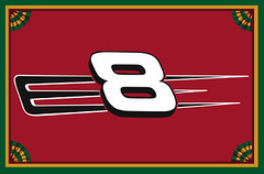
Membership News: Scott and I are slowly making our way through the avalanche of orders that came through at the Charter Membership deadline. I probably won’t have everyone added to the roster until tomorrow or Saturday — hang in there. Meanwhile, new designs are being added to the membership gallery once or twice a day (including, as you can see at right, our first NASCAR-based design). And although the Charter Membership deadline has passed, non-charter members will always be welcome, hint-hint.
Uni Watch News Ticker: Yesterday’s entry about the Expos possibly wearing a pillbox-style cap in 1976 had been posted for all of about five minutes when Todd Radom sent me this. Definitely hadn’t seen that before. … The double-A Binghamton Mets recently held a “Halloween in July” promotion, with little bats (the flying kind) on their jerseys (with thanks to Eric Hawkins). … “Thursday marks the 100th anniversary of Walter Johnson’s first major league start (against Ty Cobb’s Detroit Tigers),” writes Jonathon Binet. “His daugther and grandson will be in attendance, with the grandson throwing out the first pitch, and the Nats will wear 1927 throwbacks (or at the very least, the hat).” Details here. … Good report from Rob Montoya, who writes: “The University of New Mexico will be changing their shade of ‘cherry’ red from PMS 485 to PMS 200 in all sports, as part of an effort to rebrand the athletics dept. Inconsistencies in some of the changes can already be seen on the official athletics web site, where the two different colors are next to each other until complete changes are made. Here is the complete art sheet.” … The Utes will have new uniforms this fall (with thanks to Paul Bridge).
Are you kidding me, Utah? U Us and the Muss on your shorts? what the hell is the matter with you people?
The “hope” for the Phillies in ’63 certainly was smashed the next year. Perpetual suckitude is the mantra for my Phils. Last night, Uncle Charlie puts Myers, the closer, in a non-save situation. Of course he wild pitches the winning run home.
Also, great shot of Norm van Brocklin. A forgotten Eagles great.
Did anyone ever fix the link for the Rangers’ new 07/08 jersey?
The Rangers pulled the images of the new jerseys that Paul had previously linked to, but here they are (on the right):
link
uh, wow, sorry…can’t get the link in there correctly.
link
I’d be surprised if the Duke lax case never made the cover of SI. I don’t have proof on hand though.
Lots of Uni happenings in Beantown last night.
link to throw out the first pitch. (Note that they put his name on the jersey at home).
Another new arrival, link will wear 83.
I guess link isn’t quite a cover shot.
On Tuesday night when Salty got to Arlington, he was sitting in the dugout with Hank Blalock, where they discovered similar taste in tattoos – both have their daughters name on their inner left forearm, and both have their wedding band tattooed on. Josh and Tom, of course, were quite enamored with this development.
[quote comment=”127387″]Lots of Uni happenings in Beantown last night.
link to throw out the first pitch. (Note that they put his name on the jersey at home).
Another new arrival, link will wear 83.[/quote]
Looks like that cap Garnett is wearing is straight from the merchandise counter…the price tag/sticker is still on the underside of the bill.
I have a general question: Is there anyone else who kind of regrets what style they requested for their membership card? Not that mine isn’t great, the workmanship and design are excellent and I’m really happy with it. But I think I underestimated Mr. Turner’s skill, and after seeing some sweet but esoteric designs( an indoor soccer team, for Crissakes!) I kinda wish I’d pushed the envelope a bit more. Am I alone on that?
If I remember correctly, when the Phillies first switched to the “P” jerseys (the year they moved into Veterans Stadium, if I recall), the numbers on the backs of the jerseys (which didn’t have names at first) were rather big.
Garnett’s Red Sox jersey also did not use a nameplate.
that utah jersey is terrible
link
[quote comment=”127392″]I have a general question: Is there anyone else who kind of regrets what style they requested for their membership card? Not that mine isn’t great, the workmanship and design are excellent and I’m really happy with it. But I think I underestimated Mr. Turner’s skill, and after seeing some sweet but esoteric designs( an indoor soccer team, for Crissakes!) I kinda wish I’d pushed the envelope a bit more. Am I alone on that?[/quote]
You can request a new design when renewing your membership next year. Or, if you’re having a serious case of buyer’s remorse, we’ll do a new card for anyone right now for $15 (that’s to cover the time and effort involved with designing, producing, and mailing the cards).I’ve already done this for one member.
“Runnin’ Ute head coach Jim Boylen has announced that his squad will have new uniforms, shoes and apparel for the 2007-08 season – all provided by adidas.
‘We’re very excited about our relationship with adidas,” said Boylen. “The way they’ve treated us so far is an awesome statement about their commitment to University of Utah men’s basketball. The products and service they’ve provided to us are first-rate. We are thankful for our relationship with adidas. As we grow this program, we look forward to having adidas come along with us for the ride.'”
Wow, you think he mentioned the compnay’s name enough times in that quote? I think they edited out the follow-up, where he just muttered “adidas” for 20 minutes.
Just for the uninformed like me…what’s the story behind the “U US MUSS” on the new Utah uniforms?
[quote comment=”127383″]uh, wow, sorry…can’t get the link in there correctly.
link
Why is it that the Rangers are the only team to try and match their established style? I think it looks great considering what they had to work with.
[quote comment=”127403″]Just for the uninformed like me…what’s the story behind the “U US MUSS” on the new Utah uniforms?[/quote]
Read the link, it’s in there..
“Both the home and away uniforms will include a reference to the Muss – Utah’s student section. Included on the shorts in the home uniform will be a reference to the team’s motto “U, Us & The Muss.” The home uniforms will have U, US and MUSS on both legs of the shorts. The word MUSS will be in the same position on the shorts in the away uniform.”
[quote comment=”127387″]Lots of Uni happenings in Beantown last night.
link to throw out the first pitch. (Note that they put his name on the jersey at home).
Another new arrival, link will wear 83.[/quote]
Garnett will wear the #5 for the Celtics.
I love those giant numbers on the old Phillies jerseys. Especially in these days of binocular-requiring upper deck seats, teams should dump the names and just make the numbers an inch taller.
The Braves, despite the surnames, do a great job of this. You can read those big fat numbers easily.
Yesterday’s blog mentioned Noah Lowry with “22” written on his cap, in ‘memory of’ just-traded Matt Morris. Matt himself switched from his usual no. 35 to 22 this season, in honor of his long time teammate, catcher Mike Matheny, who had to retire because of post-concussion syndrome. Morris was also giving up his own 35 to Rich Aurelia. The Cardinals were on the verge of stitching no. 35 on a StL uni for Matt on Tuesday, when the Pirates surprisingly got him at the last second. So now Joel Pineiro gets no. 35.
The University of Tennessee at Chattanooga unveiled link for the 2007-08 season yesterday.
Examples of the old uniform can be found at the school athletic web site, and a direct comparison of the new (left) and old (right) helmets can be seen link.
In an link announcing the changes (scroll down to “New Lookâ€Â) there is an interesting point that the uniform will be worn “every home and away game this season†because “the gold jerseys should not be similar to those of any opponent the Mocs play this fallâ€Â. How many schools have only one football uniform option?
Anybody have pics of Salty in his new threads? Kinda curious to see how the Rangers handle “Saltalamacchia”…
[quote comment=”127391″][quote comment=”127387″]Lots of Uni happenings in Beantown last night.
link to throw out the first pitch. (Note that they put his name on the jersey at home).
Another new arrival, link will wear 83.[/quote]
Looks like that cap Garnett is wearing is straight from the merchandise counter…the price tag/sticker is still on the underside of the bill.[/quote]
The style these days with the younger folk is to keep the sticker on the hat. Being an old man of 29, not sure why, but see it all the time walking around New York.
[quote comment=”127412″]The University of Tennessee at Chattanooga unveiled link for the 2007-08 season yesterday.
Examples of the old uniform can be found at the school athletic web site, and a direct comparison of the new (left) and old (right) helmets can be seen link.
In an link announcing the changes (scroll down to “New Lookâ€Â) there is an interesting point that the uniform will be worn “every home and away game this season†because “the gold jerseys should not be similar to those of any opponent the Mocs play this fallâ€Â. How many schools have only one football uniform option?[/quote]
They should have black pants or wear the old yellow helmet. I like the old helmet better any way. It is weird that they only have one uni option. Makes me think the school doesn’t have the appropriate funds to maintain a football team.
[quote comment=”127405″][quote comment=”127403″]Just for the uninformed like me…what’s the story behind the “U US MUSS” on the new Utah uniforms?[/quote]
Read the link, it’s in there..
“Both the home and away uniforms will include a reference to the Muss – Utah’s student section. Included on the shorts in the home uniform will be a reference to the team’s motto “U, Us & The Muss.” The home uniforms will have U, US and MUSS on both legs of the shorts. The word MUSS will be in the same position on the shorts in the away uniform.”[/quote]
IMHO: A little too simple (if that’s possible), but I think it’s great that they shout out the student section on their uniforms, i wonder if any other team (collegiate or professional), did that in the past…
Also What’s up with the Tampa Bay practice jersey [Sarcasm/ i had to, in order to stop someone from actually being serious about it :-P]
His boy Elroy!!! Paul, that’s so awesome. Who else but you is so in tune with pop culture?
You my man.
[quote comment=”127379″]The “hope” for the Phillies in ’63 certainly was smashed the next year. Perpetual suckitude is the mantra for my Phils. Last night, Uncle Charlie puts Myers, the closer, in a non-save situation. Of course he wild pitches the winning run home.
Also, great shot of Norm van Brocklin. A forgotten Eagles great.[/quote]
My dad was visiting me last night and he was able to listen to the game juuuust until he left the NJ Turnpike (even for a strong signal like 1210 out of Philly, quite a good feat). He was shaking his head about Howard striking out.
And, instead, he was “treated” to Michael Kay on a Yankees game and then the ESPN Giants game later on.
As for the ’64 Phils collapse, it’s documented quite well by folk singer Chuck Brodsky – link – in his song “Letters in the Dirt” about Dick Allen.
[quote comment=”127412″]The University of Tennessee at Chattanooga unveiled link for the 2007-08 season yesterday.
Examples of the old uniform can be found at the school athletic web site, and a direct comparison of the new (left) and old (right) helmets can be seen link.
In an link announcing the changes (scroll down to “New Lookâ€Â) there is an interesting point that the uniform will be worn “every home and away game this season†because “the gold jerseys should not be similar to those of any opponent the Mocs play this fallâ€Â. How many schools have only one football uniform option?[/quote]
Good thing they don’t play Georgia Tech. I immediately thought of the jackets when I saw the jersey/pants combo.
[quote comment=”127390″]On Tuesday night when Salty got to Arlington, he was sitting in the dugout with Hank Blalock, where they discovered similar taste in tattoos – both have their daughters name on their inner left forearm, and both have their wedding band tattooed on. Josh and Tom, of course, were quite enamored with this development.[/quote]
I’m sure they spent several innings on the topic. The Rangers wore their road grays last night at the Jake. The vest (which may pose problems for Salty’s name) is home-only. They’ll be back in Arlington on Monday.
[quote comment=”127431″]
I’m sure they spent several innings on the topic. The Rangers wore their road grays last night at the Jake. The vest (which may pose problems for Salty’s name) is home-only. They’ll be back in Arlington on Monday.[/quote]
Texas wears the link. The least they could do is use the extra-thin letters that the Mets used to use for long names like Strawberry. I wonder why those aren’t used more often.
I like the photo of KG with Big Pappi as some may forget Big Pappi started out as a Twin and it’s very possible the two were friends back then.
Twins fans hate seeing Big Pappie becasue he’s turned out to be such a clutch hitter, but the know he wouldn’t have blossomed as a Twin becasue of the twins approach to the game (not in it for the power, all small ball) and now KG is gone to Boston.
I like the first NASCAR-themed membership card. I figured that there would be one eventually, and was wondering how it would be designed.
As the Junior card incorporates the DEI stylized “E” but no other part of the paint scheme, I am now left to speculate as to how other drivers’ numbers and schemes would be portrayed. Would a Jeff Gordon card get flames?
link
Does Jimmy Johnson get yellow thingies around his number?
link
Does David Gilliland get a simple green background, or more of the M&M treatment?
link
link
What’s with all the pill bottles? Was the cap part of Victor Conte’s personal “stash”?
[quote comment=”127437″]I like the first NASCAR-themed membership card. I figured that there would be one eventually, and was wondering how it would be designed.
As the Junior card incorporates the DEI stylized “E” but no other part of the paint scheme, I am now left to speculate as to how other drivers’ numbers and schemes would be portrayed. Would a Jeff Gordon card get flames?
link
Does Jimmy Johnson get yellow thingies around his number?
link
Does David Gilliland get a simple green background, or more of the M&M treatment?
link
This brings up the topic of when the first logo creep will appear on a membership card. (shudder)
However, I see logo creep finding itself in the same position as purple when it comes to the membership cards.
[quote comment=”127392″]I have a general question: Is there anyone else who kind of regrets what style they requested for their membership card? Not that mine isn’t great, the workmanship and design are excellent and I’m really happy with it. But I think I underestimated Mr. Turner’s skill, and after seeing some sweet but esoteric designs( an indoor soccer team, for Crissakes!) I kinda wish I’d pushed the envelope a bit more. Am I alone on that?[/quote]
I was happy with my 06-07 Penguins card, but when I saw the 90’s alt Penguins design (Baranowski, #53), I did shed a few tears of envy. Oh, I will upgrade when it’s time, oh yes… and you’ll all be sorry!!! (insert Dr. Evil maniacal laugh here)
[quote comment=”127437″]I like the first NASCAR-themed membership card. I figured that there would be one eventually, and was wondering how it would be designed.
As the Junior card incorporates the DEI stylized “E” but no other part of the paint scheme, I am now left to speculate as to how other drivers’ numbers and schemes would be portrayed. Would a Jeff Gordon card get flames?
link
Does Jimmy Johnson get yellow thingies around his number?
link
Does David Gilliland get a simple green background, or more of the M&M treatment?
link
Let’s see someone go all out with the Formula 1 BAR 001 design:
link
(Background: the team wanted to run their two cars with different tobacco sponsorships, but the rules wouldn’t allow it, so British American Racing took the two clashing paint schemes and zipped them together on both cars.)
[quote comment=”127439″][quote comment=”127437″]I like the first NASCAR-themed membership card. I figured that there would be one eventually, and was wondering how it would be designed.
As the Junior card incorporates the DEI stylized “E” but no other part of the paint scheme, I am now left to speculate as to how other drivers’ numbers and schemes would be portrayed. Would a Jeff Gordon card get flames?
link
Does Jimmy Johnson get yellow thingies around his number?
link
Does David Gilliland get a simple green background, or more of the M&M treatment?
link
This brings up the topic of when the first logo creep will appear on a membership card. (shudder)
However, I see logo creep finding itself in the same position as purple when it comes to the membership cards.[/quote]
Sponsorship is huge in NASCAR. If a driver is known by his brand, I don’t see why it shouldn’t be on a card.
I wonder how the MN Twins feel about the Nationals wearing what is essentially a Twins throwback (the original Washington Senators are now the MN Twins).
Has this ever happened before, where a team has worn a throwback of a team that is, in effect, still in existence?
From the looks of last night’s Rangers game, the Rangers did use a thinner font for Saltalamacchia’s name. I don’t have a screencap of it, but the lettering was definitely thinner for his name than anyone else’s…
Coincidence of the night: the starting pitcher for both NY baseball teams were lefties wearing number 46.
I was watching the games on side-by-side TVs, and at one point, Petitte and Perez were throwing in unison. Had to do a double take.
[quote comment=”127443″]I wonder how the MN Twins feel about the Nationals wearing what is essentially a Twins throwback (the original Washington Senators are now the MN Twins).
Has this ever happened before, where a team has worn a throwback of a team that is, in effect, still in existence?[/quote]
Last June, the Mariners wore Pilots throwbacks. The Pilots moved to Milwaukee in 1970, to become the Brewers.
[quote comment=”127443″]I wonder how the MN Twins feel about the Nationals wearing what is essentially a Twins throwback (the original Washington Senators are now the MN Twins).
Has this ever happened before, where a team has worn a throwback of a team that is, in effect, still in existence?[/quote]
Every time the Brewers where throw back Milwakee Braves unis. I don’te remember the last time they did this, but I know they’ve done it a few times when they’re playing the Atlanta Braves.
Whether you like Utah’s new uniforms or not (I actually do), you’ve got to love this…
“Those are the parts of the game that the tradition of this program was built on. Our colors are red and white. Black is not one of our colors. I’ve received a ton of letters from alumni requesting that we take black off the uniform. I agree with them.”
I received my Best of the Philadelphia Flyers 10-DVD box set on Tuesday night. A great set of games to look at the evolution of hockey (uniforms and game play) from 1974-2000.
I started with Disc 4; an exhibition game between the Flyers and the Soviet Red Army team from January 1976.
First thing I noticed: all the Red Army players were wearing helmets, and all of the Flyers were not.
The Red Army sweaters were red with white numbers, but with a blue section around the shoulders, which served as the background for the player names.
The referees had reddish-orange numbers inside of black circles.
Two non-uni notes: this exhibition took place in the middle of the NHL season. The announcers noted that the Flyers had just played the Red Wings the night before.
The Red Army team had not faced an opponent as physical as the Broad Street Bullies on their North American tour. After a no-call on a hit to the head, the Soviets left the ice just 11 minutes into the game. They eventually came back out to complete the contest.
Hopefully I can finish this box set before the Penguins one is released.
Ugh, another example of the first pitch being thrown out with some sort of uniform/clothing mistake or eye sore. Garnett was wearing a Red Sox home jersey, number 5 with Garnett on it. Red Sox do not wear names at home. Should have just stuck to the number, and he would have looked fine. Heck, he even threw it right down the middle!
[quote comment=”127443″]I wonder how the MN Twins feel about the Nationals wearing what is essentially a Twins throwback (the original Washington Senators are now the MN Twins).
Has this ever happened before, where a team has worn a throwback of a team that is, in effect, still in existence?[/quote]
technically every time a team wears it own throwback they are wearing a throwback of a team that still exists, but thats not what you meant.
[quote comment=”127425″][quote comment=”127379″]The “hope” for the Phillies in ’63 certainly was smashed the next year. Perpetual suckitude is the mantra for my Phils. Last night, Uncle Charlie puts Myers, the closer, in a non-save situation. Of course he wild pitches the winning run home.
Also, great shot of Norm van Brocklin. A forgotten Eagles great.[/quote]
My dad was visiting me last night and he was able to listen to the game juuuust until he left the NJ Turnpike (even for a strong signal like 1210 out of Philly, quite a good feat). He was shaking his head about Howard striking out.
And, instead, he was “treated” to Michael Kay on a Yankees game and then the ESPN Giants game later on.
As for the ’64 Phils collapse, it’s documented quite well by folk singer Chuck Brodsky – link – in his song “Letters in the Dirt” about Dick Allen.[/quote]
My favorite parts abut the Phils on 1210 are Wheeler doing anything (could be Captain Obvious of announcers, he’s so annoying) and accidentally leaving the radio on overnight: 1210 has Glenn Beck and Rush Limbaugh on during the day. =P
Quite a contrast between baseball and talk radio.
Not to be a downer, but I’m wondering how all the Twin Cities UniWatchers are doing. Everyone OK?
[quote comment=”127440″][quote comment=”127392″]I have a general question: Is there anyone else who kind of regrets what style they requested for their membership card? Not that mine isn’t great, the workmanship and design are excellent and I’m really happy with it. But I think I underestimated Mr. Turner’s skill, and after seeing some sweet but esoteric designs( an indoor soccer team, for Crissakes!) I kinda wish I’d pushed the envelope a bit more. Am I alone on that?[/quote]
I was happy with my 06-07 Penguins card, but when I saw the 90’s alt Penguins design (Baranowski, #53), I did shed a few tears of envy. Oh, I will upgrade when it’s time, oh yes… and you’ll all be sorry!!! (insert Dr. Evil maniacal laugh here)[/quote]
I’m either blessed or cursed with a favorite team that has very little uniform change (Dodgers). While I’ve enjoyed seeing the variety of membership cards, I don’t know what I would have “pushed the envelope” with. Yeah the indoor soccer team or the cable car logo would look good, but they’re not MY team!
[quote comment=”127460″]Not to be a downer, but I’m wondering how all the Twin Cities UniWatchers are doing. Everyone OK?[/quote]
Thanks for asking Sara. I’m present and accoutned for.
Going off the locations from the rolodex I hope to have finished for tomorrow, contributors Karl or kander13, sawt and been wood please check in. Also, I know MINNAH is from here too so please check in.
[quote comment=”127453″]Ugh, another example of the first pitch being thrown out with some sort of uniform/clothing mistake or eye sore. Garnett was wearing a Red Sox home jersey, number 5 with Garnett on it. Red Sox do not wear names at home. Should have just stuck to the number, and he would have looked fine. Heck, he even threw it right down the middle![/quote]
Maybe I missed something, but who made up the jersey to begin with?
The reason the Bears’ helmet in that SI cover is different is George Halas had an interest in the
Wilson Sporting Goods Company and outfitted his team in their gear. For more examples, look at the SI cover of Willie Galimore or any pics of Gale Sayers.
Checkout this picture of Andy North while at Florida. He is dressed perfectly and can you ID who is watching ole Andy tee off.
The old ball coach.
link
[quote comment=”127422″][quote comment=”127405″][quote comment=”127403″]Just for the uninformed like me…what’s the story behind the “U US MUSS” on the new Utah uniforms?[/quote]
Read the link, it’s in there..
“Both the home and away uniforms will include a reference to the Muss – Utah’s student section. Included on the shorts in the home uniform will be a reference to the team’s motto “U, Us & The Muss.” The home uniforms will have U, US and MUSS on both legs of the shorts. The word MUSS will be in the same position on the shorts in the away uniform.”[/quote]
IMHO: A little too simple (if that’s possible), but I think it’s great that they shout out the student section on their uniforms, i wonder if any other team (collegiate or professional), did that in the past…
Also What’s up with the Tampa Bay practice jersey [Sarcasm/ i had to, in order to stop someone from actually being serious about it :-P][/quote]
link occasionally.
Link above doesn’t work, cut and paste IP address for picture of Tex A&M 12th man uni.
Next year’s MLB ASG gear is already up
link
maybe majestic is the new nike.
[quote comment=”127424″]His boy Elroy!!! Paul, that’s so awesome. Who else but you is so in tune with pop culture?[/quote]
Except I didn’t write that — Todd Davis did.
Is Emmitt Smith wearing lowtop Air Force 1’s while playing on college?
link
[quote comment=”127417″][quote comment=”127412″]The University of Tennessee at Chattanooga unveiled link for the 2007-08 season yesterday.
Examples of the old uniform can be found at the school athletic web site, and a direct comparison of the new (left) and old (right) helmets can be seen link.
In an link announcing the changes (scroll down to “New Lookâ€Â) there is an interesting point that the uniform will be worn “every home and away game this season†because “the gold jerseys should not be similar to those of any opponent the Mocs play this fallâ€Â. How many schools have only one football uniform option?[/quote]
They should have black pants or wear the old yellow helmet. I like the old helmet better any way. It is weird that they only have one uni option. Makes me think the school doesn’t have the appropriate funds to maintain a football team.[/quote]
WHY?????
Also, can someone post those Utah unis on tinypic.com or imageshack or something like that. My work blocks all CSTV-related websites.
The link lists Petr Sykora as wearing #17 and Darryl Sydor with #5. Looks like Rob Scuderi gave up #5 for #4.
[quote]Also, can someone post those Utah unis on tinypic.com or imageshack or something like that. My work blocks all CSTV-related websites.[/quote]
link
link
or both are here: link
You shall not link.
We will be link.
If everyone else did it, would you do it, link?
[quote comment=”127503″]If everyone else did it, would you do it, link?[/quote]
Is that Cincinnati?
Came across link earlier today.
[quote comment=”127476″]Next year’s MLB ASG gear is already up
link
maybe majestic is the new nike.[/quote]
That is real fast, the last two years they made you wait until the start of the next season before they started selling new items. I think with it being the Yankees, that they don’t want to miss a second of selling this stuff.
[quote comment=”127506″]Came across link earlier today.[/quote]
wow, that doesn’t look photoshopped at all! {/sarcasm}
[quote comment=”127506″]Came across link earlier today.[/quote]
i wonder why maxim afinogenov’s name is on the bottom of that. that’s kind of wierd.
[quote comment=”127505″][quote comment=”127503″]If everyone else did it, would you do it, link?[/quote]
Is that Cincinnati?[/quote]
Yeah. Apparently they couldn’t decide to paint it blue (for Kentucky) or red (for Cincinnati), so they painted it purple. Or, at least, that’s what they told me when I got here. It’s kind of an eyesore, but the actual bridge (under all the purple) isn’t that bad.
link
New Logo
Here’s a shot of that Canucks jersey:
link
link
[quote comment=”127512″][quote comment=”127506″]Came across link earlier today.[/quote]
wow, that doesn’t look photoshopped at all! {/sarcasm}[/quote]
That photo was taken from this link, and revamped to make it more clear.
On the Mays photo from yesterday (reluctant to put the link, out of fear that my post will be rejected) — Lou and Rich pointed out that Mays must be wearing the grey road uni, in a very light or overexposed shot. This uni came in for the 1974 season — up until then, the road uni said “New York”.
You can tell it is the road uni because of the varsity numbers. From 1962 up through the introduction of the 3-button pullover style in 1978, the Mets used varsity numbers on the road, and normal block numbers at home.
However, both of those earlier posters noted that Aaron is also pictured in his road uni. This is indeed a mystery. I must admit that I have no explanation why both an AL player and and an NL coach would both be in their road uniforms together. It cannot even be an old-timers’ game, because Aaron was still active
(Wholly unrelated note: can any of my fellow uni-savvy New Yorkers suggest where in this town I might be able to get a logo patch affixed to a hat? The logo patch in question is currently attached to a different hat (the hat it came with), and I want to put it on a better hat. I am hoping to find a place that will do quality work, even for just one piece. Already tried Cosby’s, Lids, and some mom & pop places, all without luck. Thanks.)
IMHO: A little too simple (if that’s possible), but I think it’s great that they shout out the student section on their uniforms, i wonder if any other team (collegiate or professional), did that in the past…
Also What’s up with the Tampa Bay practice jersey [Sarcasm/ i had to, in order to stop someone from actually being serious about it :-P][/quote]
link occasionally.[/quote]
oh yeah, completely forgot about the 12th Man and #12 jersey. Thanks, Cathy.
Jose Reyes is going with high cuffs today. I’m not sure if he’s done that yet this season.
Somebody did a poor Photoshop on the newest Met, Luis Castillo, and they used last year’s hat.
link
To answer the question regarding the Bears helmet being different on the SI cover with Pete Rozelle on it, George Halas had an interest in the Wilson Sporting Goods Company and outfitted his team in their gear. A further example would be Willie Galimore on a different cover.
[quote comment=”127515″][quote comment=”127505″][quote comment=”127503″]If everyone else did it, would you do it, link?[/quote]
Is that Cincinnati?[/quote]
Yeah. Apparently they couldn’t decide to paint it blue (for Kentucky) or red (for Cincinnati), so they painted it purple. Or, at least, that’s what they told me when I got here. It’s kind of an eyesore, but the actual bridge (under all the purple) isn’t that bad.[/quote]
It’s even a terrible shade of purple. A darker purple wouldn’t be as bad as link.
As far as I know, Reyes hasn’t gone with high cuffs since 05. Showing off the orange laces today, I like it.
Paul, I was wondering whether or not you went to the Hockey Hall Of Fame during your trip to Toronto. They have an excellent jerseys from around the world exhibit, which was my favorite part of my visit.
Last night, on the SNY broadcast of Mets Brewers, Kevin Burkhardt (sp?) had a little segment on how the mets get their jerseys for new players so quickly. They mentioned when at home or pre season they use their standard company, but for a quick trade/call up they sometimes actually have Majestic do it and send it over. They mentioned how they allowed some local comapny to do the Marlon Anderson’s and the N was crooked. Hernandez chimed in that back in the day, they woudl take a peek into Charlie’s bag on road trips to see who the September call ups would be. Oh, and they make jerseys for all the guys in spring training, just in case they get called up.
[quote comment=”127519″]Here’s a shot of that Canucks jersey:
link
link
Interesting, I thought the Canucks had made it fairly clear they would be no longer using the Orca logo, and would move back the original “C” with the hockey stick (their 3rd jersey from last year). I do like how blue that Jersey is, if thats legit.
[quote comment=”127520″][quote comment=”127512″][quote comment=”127506″]Came across link earlier today.[/quote]
wow, that doesn’t look photoshopped at all! {/sarcasm}[/quote]
That photo was taken from this link, and revamped to make it more clear.[/quote]
so… is this real?
[quote comment=”127392″]I have a general question: Is there anyone else who kind of regrets what style they requested for their membership card? Not that mine isn’t great, the workmanship and design are excellent and I’m really happy with it. But I think I underestimated Mr. Turner’s skill, and after seeing some sweet but esoteric designs( an indoor soccer team, for Crissakes!) I kinda wish I’d pushed the envelope a bit more. Am I alone on that?[/quote]
My birthday is tomorrow. So I get a present from my brother today and open it. It is a UniWatch membership with TShirt. Great. My brother tells me my card made the blog on this day (re the Patriots nameplates). I remember reading that day and how ironic that a member had my name, duh.
Crap, I posted earlier and got an error, then it’s on there after I reposted. Sorry, Paulie.
I’d like to add to the occupation list.
I’m a parts specialist at a Chevrolet dealership, a sportswriter at the local paper and in my free time, the official scorer for our Class A minor league team.
[quote comment=”127410″]I love those giant numbers on the old Phillies jerseys.[/quote]
That’s nothing compared to what link in the Mexican soccer league in the late 70s/early 80s.
[quote comment=”127416″][quote comment=”127391″][quote comment=”127387″]Lots of Uni happenings in Beantown last night.
link to throw out the first pitch. (Note that they put his name on the jersey at home).
Another new arrival, link will wear 83.[/quote]
Looks like that cap Garnett is wearing is straight from the merchandise counter…the price tag/sticker is still on the underside of the bill.[/quote]
The style these days with the younger folk is to keep the sticker on the hat. Being an old man of 29, not sure why, but see it all the time walking around New York.[/quote]
Um, count me as another old fart. I’m 18 years old and I remove my 5950 stickers as soon as I get home. Leave them on for too long and you get a color inconsistency analogous to a tan line. Yuck-o.
[quote comment=”127544″][quote comment=”127416″]
The style these days with the younger folk is to keep the sticker on the hat. Being an old man of 29, not sure why, but see it all the time walking around New York.[/quote]
Um, count me as another old fart. I’m 18 years old and I remove my 5950 stickers as soon as I get home. Leave them on for too long and you get a color inconsistency analogous to a tan line. Yuck-o.[/quote]
Like most pointless fads, there’s always a cheap knockoff (like Coach purses, Oakley sunglasses, Rolex watches, etc). I’ve seen kids wear fake New Era hats (with non-MLB logos) complete with a fake gold & black sticker on the brim. It all looks odd to me.
Anyone read this in this weeks Sports Illustrated,
“Two youth baseball teams in Washington were forced to forfeit tournament wins because their American Legion patches were silk-screened instead of sewn on.”
Another case of the importance of uniform details…
[quote comment=”127544″][quote comment=”127416″][quote comment=”127391″][quote comment=”127387″]Lots of Uni happenings in Beantown last night.
link to throw out the first pitch. (Note that they put his name on the jersey at home).
Another new arrival, link will wear 83.[/quote]
Looks like that cap Garnett is wearing is straight from the merchandise counter…the price tag/sticker is still on the underside of the bill.[/quote]
The style these days with the younger folk is to keep the sticker on the hat. Being an old man of 29, not sure why, but see it all the time walking around New York.[/quote]
Um, count me as another old fart. I’m 18 years old and I remove my 5950 stickers as soon as I get home. Leave them on for too long and you get a color inconsistency analogous to a tan line. Yuck-o.[/quote]
must be on the old grey underbill models, i have an old Montreal Expos hat that did that, meanwhile on the new Braves game hat (Braves fan, sorry Paul.), with the black underneath, (as well as couple of fashion hats, i know blasphemy, relax i keep game hats, too.) no difference. By the way , I’m 20.
Great Cardinals site with uni research audio and a flash comparison of cardinals uniforms.
link
actually i retract that statement, it does that to white hats. Mea Culpa.
[quote comment=”127551″][quote comment=”127544″][quote comment=”127416″]
The style these days with the younger folk is to keep the sticker on the hat. Being an old man of 29, not sure why, but see it all the time walking around New York.[/quote]
Um, count me as another old fart. I’m 18 years old and I remove my 5950 stickers as soon as I get home. Leave them on for too long and you get a color inconsistency analogous to a tan line. Yuck-o.[/quote]
Like most pointless fads, there’s always a cheap knockoff (like Coach purses, Oakley sunglasses, Rolex watches, etc). I’ve seen kids wear fake New Era hats (with non-MLB logos) complete with a fake gold & black sticker on the brim. It all looks odd to me.[/quote]
I gotta go with the New Era (with MLB logos), even for the fashionable hats, anything else would be uncivilized….(I’ll add the trademark later.)
[quote comment=”127533″][quote comment=”127519″]Here’s a shot of that Canucks jersey:
link
link
Interesting, I thought the Canucks had made it fairly clear they would be no longer using the Orca logo, and would move back the original “C” with the hockey stick (their 3rd jersey from last year). I do like how blue that Jersey is, if thats legit.[/quote]
oh dear god, this is getting as bad as the bucs practice jerseys!!!
the canucks have, on at least 3 different occasions, stated that they’re keeping the orca. the mascot is even named Fin. the colors, on the other hand, WILL be changing to blue and green. THE ORCA IS STAYING!
i swear if someone says the nhl is wearing white at home, i think i’m gonna join that bridge climbing club
In an actual sport-related incident, Bud Selig will not be attending the SF-LA game, expect Bonds to hit 755& 756 (j/k i hope….).
Now back to our regularly scheduled uni-watching already in progress…..
[quote comment=”127387″]
Another new arrival, link will wear 83.[/quote]
First thing I thought was that he was rounding up from 82.1…
Lots of Uni happenings in Beantown last night.
Garnett threw on Nomar’s 5 to throw out the first pitch.
Speaking of Nomar’s # 5. His Dodgers(home) and Jeter’s(home) are my two favorites in each of the leagues of MLB. [i’m just thinking out loud, sorry folks].
[quote comment=”127558″][quote comment=”127533″][quote comment=”127519″]Here’s a shot of that Canucks jersey:
link
link
Interesting, I thought the Canucks had made it fairly clear they would be no longer using the Orca logo, and would move back the original “C” with the hockey stick (their 3rd jersey from last year). I do like how blue that Jersey is, if thats legit.[/quote]
oh dear god, this is getting as bad as the bucs practice jerseys!!!
the canucks have, on at least 3 different occasions, stated that they’re keeping the orca. the mascot is even named Fin. the colors, on the other hand, WILL be changing to blue and green. THE ORCA IS STAYING!
i swear if someone says the nhl is wearing white at home, i think i’m gonna join that bridge climbing club[/quote]
While I agree that I get annoyed seeing the same stuff over and over again, not everyone can read all the posts all the time. I’ve been pushing for a UniWatch FAQ and I think we could direct new-comers there to get the caught up to the regular readers.
[quote comment=”127563″][quote comment=”127558″][quote comment=”127533″][quote comment=”127519″]Here’s a shot of that Canucks jersey:
link
link
Interesting, I thought the Canucks had made it fairly clear they would be no longer using the Orca logo, and would move back the original “C” with the hockey stick (their 3rd jersey from last year). I do like how blue that Jersey is, if thats legit.[/quote]
oh dear god, this is getting as bad as the bucs practice jerseys!!!
the canucks have, on at least 3 different occasions, stated that they’re keeping the orca. the mascot is even named Fin. the colors, on the other hand, WILL be changing to blue and green. THE ORCA IS STAYING!
i swear if someone says the nhl is wearing white at home, i think i’m gonna join that bridge climbing club[/quote]
While I agree that I get annoyed seeing the same stuff over and over again, not everyone can read all the posts all the time. I’ve been pushing for a UniWatch FAQ and I think we could direct new-comers there to get the caught up to the regular readers.[/quote]
yeah, i agree, it really should be made…any volunteers? i know some of the guys who’ve been reading for quite a while could do that very easily
Doesn’t UniWatch already have an F.A.Q., i guess people don’t read it as often as they should, or maybe they could add-the Bucs and Canucks in, the idea is good though.
[quote comment=”127531″]Paul, I was wondering whether or not you went to the Hockey Hall Of Fame during your trip to Toronto. They have an excellent jerseys from around the world exhibit, which was my favorite part of my visit.[/quote]
Didn’t have time to go on this trip but have been there on previous visits to Toronto. Great place.
Anyone catch the Uni conversation between, Ron Darling and Gary Cohen during Mets Game last? Caught the end of it, Darling says the vets would always go into Charlie Samuels bag to see what triple A guys were being called up in September. Also mentioned something about getting Majestic to get the right letters for Marlon Andersons jersey.
[quote comment=”127520″][quote comment=”127512″][quote comment=”127506″]Came across link earlier today.[/quote]
wow, that doesn’t look photoshopped at all! {/sarcasm}[/quote]
That photo was taken from this link, and revamped to make it more clear.[/quote]
so… is this real?[quote comment=”127565″]Doesn’t UniWatch already have an F.A.Q., i guess people don’t read it as often as they should, or maybe they could add-the Bucs and Canucks in, the idea is good though.[/quote]
Yea, and it’s good for knowing more about paul and is columns and favorite things, but I was speaking more of like “common uniform topics” or something like that.
[quote comment=”127573″]
Yea, and it’s good for knowing more about paul and is columns and favorite things, but I was speaking more of like “common uniform topics” or something like that.[/quote]
Well then this becomes more of a message board than a blog if we start sectioning off pieces like that. I seem to recall Paul stating a preference for the blog format, but I don’t remember why or if that statement is even accurate.
Doesn’t UniWatch already have an F.A.Q., i guess people don’t read it as often as they should, or maybe they could add-the Bucs and Canucks in, the idea is good though.[/quote]
Yea, and it’s good for knowing more about paul and is columns and favorite things, but I was speaking more of like “common uniform topics” or something like that.[/quote]
it does, has origins on the steelers helmet, the islanders 4 stripes, the Canadiens logo, The Green Bay/ Grambling/ Georgia “G”, etc. I’m pretty sure they could put something about the Tampa Bay practice jersey, or Paul could do an article about the Vancouver Canucks jersey (which look to be real), And end it all together.
I’m sorry… altogether, I’m done momentarily.
for soccer/arsenal/striped socks fans Arsenal played in their new linkkit today.
link
I wonder how the MN Twins feel about the Nationals wearing what is essentially a Twins throwback (the original Washington Senators are now the MN Twins).
Has this ever happened before, where a team has worn a throwback of a team that is, in effect, still in existence?
The Nasty Nats’ caps are not the original Senators(Twins), but the expansion Senators(Rangers).
This is from yesterday:
#18 by Eriq Jaffe
You can also order one through the Cooperstown Ballcap Company. I have a 1972 Braves cap from them, and I am very happy with it.
I’m thinking about getting a couple of hats from this site. When ordering it asks what type of hat band you want leather or cotton. Is this refering to the sweatband inside the hat or something else? Also is the sizing the same as a New Era hat or is it different? Here’s the link to the site for anyone intrested.
[quote comment=”127558″][quote comment=”127533″][quote comment=”127519″]Here’s a shot of that Canucks jersey:
link
link
Interesting, I thought the Canucks had made it fairly clear they would be no longer using the Orca logo, and would move back the original “C” with the hockey stick (their 3rd jersey from last year). I do like how blue that Jersey is, if thats legit.[/quote]
oh dear god, this is getting as bad as the bucs practice jerseys!!!
the canucks have, on at least 3 different occasions, stated that they’re keeping the orca. the mascot is even named Fin. the colors, on the other hand, WILL be changing to blue and green. THE ORCA IS STAYING!
i swear if someone says the nhl is wearing white at home, i think i’m gonna join that bridge climbing club[/quote]
Hey ok buddy, the fire is out now.
I am fairly up to date on all the NHL jersey shennanigins, guess I got things crossed on the Canucks. I can’t keep up with every single days 200 some comments posts. Usually NHL stuff is fairly isolated and I can spot it. Guess the 3 seperate tims they said something about the Orca I missed. I seem to remember something about they were no longer associated with whoever owns some Casino/Hotel out there called “Orca Bay” and he was the reason they even had the Orca logo in the first place, and now they he is gone so they were going back to the C-Stick. Plus the third Jersey sold like crazy. I guess I was getting different info.
Did anyone else see Bonds last nigh in the on-deck circle with his zipper down prior to his last at bat?
[quote comment=”127586″]I’m thinking about getting a couple of hats from this site. When ordering it asks what type of hat band you want leather or cotton. Is this refering to the sweatband inside the hat or something else? Also is the sizing the same as a New Era hat or is it different? Here’s the link to the site for anyone intrested.[/quote]
Yeah, you can get hats with either a leather or cotton sweatband. The Braves hat I have has the leather band (which I think was the only kind they offered at the time).
I’m not sure how their sizing compares to New Era, to be honest. I don’t have all that many caps.
The sheer number and variety of caps you can get from those guys is just staggering. I used to get their printed catalog and just go over it for hours.
Still on the topic of pillbox, check out the link. Can’t find a front shot, but I believe there was a “’76” on the front.
I scanned through the comments, but didn’t see this mentioned yet.
[quote comment=”127593″][quote comment=”127586″]I’m thinking about getting a couple of hats from this site. When ordering it asks what type of hat band you want leather or cotton. Is this refering to the sweatband inside the hat or something else? Also is the sizing the same as a New Era hat or is it different? Here’s the link to the site for anyone intrested.[/quote]
Yeah, you can get hats with either a leather or cotton sweatband. The Braves hat I have has the leather band (which I think was the only kind they offered at the time).
I’m not sure how their sizing compares to New Era, to be honest. I don’t have all that many caps.
The sheer number and variety of caps you can get from those guys is just staggering. I used to get their printed catalog and just go over it for hours.[/quote]
Thanks alot. Yea, I’m at work now , so I haven’t had a good chance to really go over the site, but there is definitely some great stuff on there.
ok guys.. a NHL uni update…
i dont know if they have officially been released, but pics have been leaked of the new LA Kings jerseys.
well here is a video that pretty much shows the new jerseys being unveiled at the draft party ( apologies if this has been posted already )
link
sorry…
u dont have to watch the whole thing…
FFwd to 2:00
[quote comment=”127599″]ok guys.. a NHL uni update…
i dont know if they have officially been released, but pics have been leaked of the new LA Kings jerseys.
well here is a video that pretty much shows the new jerseys being unveiled at the draft party ( apologies if this has been posted already )
link
“I hated the stripes on the bottom…”
He clearly doesn’t “get it”.
[quote comment=”127597″][quote comment=”127593″][quote comment=”127586″]I’m thinking about getting a couple of hats from this site. When ordering it asks what type of hat band you want leather or cotton. Is this refering to the sweatband inside the hat or something else? Also is the sizing the same as a New Era hat or is it different? Here’s the link to the site for anyone intrested.[/quote]
Yeah, you can get hats with either a leather or cotton sweatband. The Braves hat I have has the leather band (which I think was the only kind they offered at the time).
I’m not sure how their sizing compares to New Era, to be honest. I don’t have all that many caps.
The sheer number and variety of caps you can get from those guys is just staggering. I used to get their printed catalog and just go over it for hours.[/quote]
Thanks alot. Yea, I’m at work now , so I haven’t had a good chance to really go over the site, but there is definitely some great stuff on there.[/quote]
My vintage base ball team (1861 and 1886) plays with Cooperstown caps. Trust me, go with the leather cap band. The cotton one doesn’t feel right after wearing the leather band for so long. My old hat, unfortunately, got moldy after a particularly hot day, and a particularly sweaty head and a particularly forgetful player leaving his hat at the bottom of his bag. Now I have to play with the new style with the cotton band.
Of course, I’m just speaking on behalf of the Color Band Boxcap which is all I have had experience with. Although soon I will be venturing into the 1910 cap since they have one for my hometown.
[quote comment=”127586″]This is from yesterday:
#18 by Eriq Jaffe
You can also order one through the Cooperstown Ballcap Company. I have a 1972 Braves cap from them, and I am very happy with it.
I’m thinking about getting a couple of hats from this site. When ordering it asks what type of hat band you want leather or cotton. Is this refering to the sweatband inside the hat or something else? Also is the sizing the same as a New Era hat or is it different? Here’s the link to the site for anyone intrested.[/quote]
How could hat sizes vary? A hat size is defined as, quite simply, head circumference (in inches), divided by “pi” (approximately 3.1415926535898), and then expressed as a mixed number with a denominator of 8. If anything were to vary, it would be the construction of the cap, the precision of the machine used to make it, and rarely, a mismarked tag.
[quote comment=”127521″]On the Mays photo from yesterday (reluctant to put the link, out of fear that my post will be rejected) — Lou and Rich pointed out that Mays must be wearing the grey road uni, in a very light or overexposed shot. This uni came in for the 1974 season — up until then, the road uni said “New York”.
You can tell it is the road uni because of the varsity numbers. From 1962 up through the introduction of the 3-button pullover style in 1978, the Mets used varsity numbers on the road, and normal block numbers at home.
However, both of those earlier posters noted that Aaron is also pictured in his road uni. This is indeed a mystery. I must admit that I have no explanation why both an AL player and and an NL coach would both be in their road uniforms together. It cannot even be an old-timers’ game, because Aaron was still active.[/quote]
The accompanying text said the pic was taken at Shea, but it doesn’t make sense for Mays to be in road gear if it really was at Shea.
Wanted to see if both teams were in away games in Chicago, SoCal or NoCal at the same time, but retrosheet doesn’t include 1976.
[quote comment=”127608″]If anything were to vary, it would be the construction of the cap, the precision of the machine used to make it, and rarely, a mismarked tag.[/quote]
Yep. What one manufacturer labels 7 1/8 may not be quite the same as what another manufacturer labels as 7 1/8, even though it’s supposed to be a standard.
As far as Cooperstown caps go, err big, as they’re fairly easy to shrink down – my wife got a link hat 1/4 of a size too big (on their half-price clearance page) and was able to shrink it down to her size.
not 100% uni-related, but the memphis redbirds are giving away a marvel comic featuring people like spider-man mingling with rich ankiel.
if you want to see the Hulk earing a baseball uni, check out the cover (at our magazine’s comics blog) here:
link
[quote comment=”127405″][quote comment=”127403″]Just for the uninformed like me…what’s the story behind the “U US MUSS” on the new Utah uniforms?[/quote]
Read the link, it’s in there..
“Both the home and away uniforms will include a reference to the Muss – Utah’s student section. Included on the shorts in the home uniform will be a reference to the team’s motto “U, Us & The Muss.” The home uniforms will have U, US and MUSS on both legs of the shorts. The word MUSS will be in the same position on the shorts in the away uniform.”[/quote]
I hope I can shed some light on the MUSS. It is the Mighty Utah Student Section. And while I don’t know whether or not it was started by Urban Meyer, I do know that the first time I ever noticed it when he took over the football program. Basically the MUSS is a student booster club that gets special seating, does fund raisers and such. My neice and my nephew are both in it. Clearly Boylen is trying to invoke the student spirit that Meyer was able to re-create. The U is a commuter school maning that most of it’s students live off campus. There are about 2 million people in the surrounding cities, so a fair number of them drive to the campus. This makes it hard for student support in certain areas, as a lot don’t live on campus.
I am not to happy to see it on the shorts however. It looks kinda stupid.
link No, definitely link
[quote comment=”127608″][quote comment=”127586″]This is from yesterday:
#18 by Eriq Jaffe
You can also order one through the Cooperstown Ballcap Company. I have a 1972 Braves cap from them, and I am very happy with it.
I’m thinking about getting a couple of hats from this site. When ordering it asks what type of hat band you want leather or cotton. Is this refering to the sweatband inside the hat or something else? Also is the sizing the same as a New Era hat or is it different? Here’s the link to the site for anyone intrested.[/quote]
How could hat sizes vary? A hat size is defined as, quite simply, head circumference (in inches), divided by “pi” (approximately 3.1415926535898), and then expressed as a mixed number with a denominator of 8. If anything were to vary, it would be the construction of the cap, the precision of the machine used to make it, and rarely, a mismarked tag.[/quote]
I always wondered how they came up with that number. Hat sizes definitely vary by manufacturer. They will even vary slightly from hat to hat in the same brand. I’m guessing for the reasons you have already named.
[quote comment=”127389″]I guess link isn’t quite a cover shot.[/quote]
Yeah, I saw that. That the only other lacrosse reference in the history of SI, which is kinda sad really.
[quote comment=”127644″][quote comment=”127389″]I guess link isn’t quite a cover shot.[/quote]
Yeah, I saw that. That the only other lacrosse reference in the history of SI, which is kinda sad really.[/quote]
SI covers, that is..
[quote comment=”127526″]To answer the question regarding the Bears helmet being different on the SI cover with Pete Rozelle on it, George Halas had an interest in the Wilson Sporting Goods Company and outfitted his team in their gear. A further example would be Willie Galimore on a different cover.[/quote]
Also, link wore the same Wilson helmet through his Bears carreer.
FYI, you can dynamically search the SI covers link – enter a subject or a year or whatever into the search field.
(And thanks to whomever noted my ‘His Boy Elroy’ line, although Paul has probably seen The Jetsons enough to catch the reference as well..)
[quote comment=”127404″][quote comment=”127383″]
link
Why is it that the Rangers are the only team to try and match their established style? I think it looks great considering what they had to work with.[/quote]
Yeah, as a Rangers fan, it’s a big relief. I would guess quite a few of teams that haven’t had an “unveiling” yet will not be altering their designs drastically.
[quote comment=”127461″][quote comment=”127440″][quote comment=”127392″]I have a general question: Is there anyone else who kind of regrets what style they requested for their membership card? Not that mine isn’t great, the workmanship and design are excellent and I’m really happy with it. But I think I underestimated Mr. Turner’s skill, and after seeing some sweet but esoteric designs( an indoor soccer team, for Crissakes!) I kinda wish I’d pushed the envelope a bit more. Am I alone on that?[/quote]
I was happy with my 06-07 Penguins card, but when I saw the 90’s alt Penguins design (Baranowski, #53), I did shed a few tears of envy. Oh, I will upgrade when it’s time, oh yes… and you’ll all be sorry!!! (insert Dr. Evil maniacal laugh here)[/quote]
I’m either blessed or cursed with a favorite team that has very little uniform change (Dodgers). While I’ve enjoyed seeing the variety of membership cards, I don’t know what I would have “pushed the envelope” with. Yeah the indoor soccer team or the cable car logo would look good, but they’re not MY team![/quote]
Fair point, but surely you root for teams other than the Dodgers? I was actually thinking of asking for an XFL team…push that envelope good and hard.
The Nationals are showing the world why no major league teams wear white hats anymore. Today is “Walter Johnson Day” (old Senators pitcher, for those who don’t know), and the nats are wearing the 1927 home Senators hat (no matching helmet…or anything else, unfortunately). Pictures coming soon.
New air force unis:
link
This is Minna H. checking in. Thank you, SaraJane for asking and Joe D. for remembering. I know Natron is from St. Paul, but I haven’t seen him post much, either.
The Twins canceled their game today and the groundbreaking on the new stadium. Pretty grim situation, but it could hav been so much worse.
As for Garnett–he just doesn’t look right. He should be a T’wolf for life, but I can’t fault him for leaving.
Paul, don’t say we can get new cards! I am so tempted, but I want to remain old-school. I like the pillbox hats. Bring ’em back!
[quote comment=”127677″]New air force unis:
link
hmmm… I like those. Simple yet effective.
[quote comment=”127627″]link No, definitely link[/quote]
i thought that the nike huraches only came for basketball and baseball, i’ve never seen then worn for football if those shoes are cleats which is what it looks like
Nationals pitcher Mike Bacsik, with link
Canucks GM Dave Nonis was on TEAM1040, the Vancouver sports radio station, today and was very tight lipped about the new jerseys. The only two things he said about them were that the Orca is the primary logo, and that they are still a ways away from officially unveiling the new jerseys.
link
[quote comment=”127685″]Nationals pitcher Mike Bacsik, with link[/quote]
Thanks for finding that. My webcam was taking really crappy pictures of the TV.
The first time i saw Bacsik pitch, I was so giddy because of the stirrups. My friends thought i was insane.
[quote comment=”127513″][quote comment=”127506″]Came across link earlier today.[/quote]
i wonder why maxim afinogenov’s name is on the bottom of that. that’s kind of wierd.[/quote]
The image is from the fan forum at link. The person who created it has a user name of “MaximAfinogenov”
When it comes to pre-season NFL, i’ve always been a no-sticker guy.
Speaking of which, another Schutt helmet sighting, this time in Falcons’ camp..
link run the helmut gamut…
The Saints are a link no matter how link you might be, but link is apparently above all that
The Titans train at Baptist Sports Park and seem to be wearing link.
Anyone know more?
[quote comment=”127675″]Fair point, but surely you root for teams other than the Dodgers? I was actually thinking of asking for an XFL team…push that envelope good and hard.[/quote]
God, I miss the XFL.
[quote comment=”127676″]The Nationals are showing the world why no major league teams wear white hats anymore. Today is “Walter Johnson Day” (old Senators pitcher, for those who don’t know), and the nats are wearing the 1927 home Senators hat (no matching helmet…or anything else, unfortunately). Pictures coming soon.[/quote]
It’s funny how people can have completely opposite opinions about these topics. I watched that Nationals’ game tonight, and I kept thinking that those white hats were quite sharp, and that some Major League teams need to go back to white hats on at least an alternate basis.
Back in the early 1990s, I bought a throwback hat like the one the Nats wore tonight. Great hat. The throwbacks seemed to be of higher quality back then. It had a leather band that stood up to a lot of punishment.
I like those Utah jerseys actually. I’ve always liked the fact that they’re the “Runnin Utes” in basketball. Plus the fact that they specifically removed black from the uniforms is all the better.
[quote comment=”127683″][quote comment=”127677″]New air force unis:
link
hmmm… I like those. Simple yet effective.[/quote]
i was scared that they changed their hockey jerseys. when they played at my college of Mercyhurst, those blue jerseys were orgasmic. i can never find pics of them though, anybody have/know of any?
[quote comment=”127719″][quote comment=”127675″]Fair point, but surely you root for teams other than the Dodgers? I was actually thinking of asking for an XFL team…push that envelope good and hard.[/quote]
God, I miss the XFL.[/quote]
Me too, my friend…..me too.
Gagne rounding up 82.1 ,thats hilarious John.
Anybody know whatever became of the new Iowa State uniforms?
link
found A pic, best i could do, but lemme tell you, these sweaters are amazing in person
Any body know the deal with the Eagles, Steelers, and Redskins anniversary jerseys? Also the new Jets and Vikings alternates…
link
i was scared that they changed their hockey jerseys. when they played at my college of Mercyhurst, those blue jerseys were orgasmic. i can never find pics of them though, anybody have/know of any?
link
[quote comment=”127500″]You shall not link.[/quote]
That reminds me of my high school football uni’s… The school colours are purple and gold. :/
i love the new utah basketball uniforms. for what it’s worth, i also love their football uniforms.
Those Utah jerseys are kind of cool with the student section mentioned on the shorts. i dont know if i would want that for my time, but it makes the jersey unique and interesting.
Switching gears: espn had a side article/update on barry bonds and it said today was steroid awareness day at dodger stadium. i wonder what the give away was.
on nflshop.com, they’re selling the vikings alternate/throwback jerseys and they’re also selling the new york titans jerseys that the jets are going to wear
Did anybody else have trouble with the site again today?
[quote comment=”127778″]Did anybody else have trouble with the site again today?[/quote]
the first time i tried to load it, i did. i thought maybe i was in for another uniwatchblogless day, but after a few refreshes, i got the background free basic version of the site, then the regular one. seems to be fine now
[quote comment=”127769″]Those Utah jerseys are kind of cool with the student section mentioned on the shorts. i dont know if i would want that for my time, but it makes the jersey unique and interesting.
Switching gears: espn had a side article/update on barry bonds and it said today was steroid awareness day at dodger stadium. i wonder what the give away was.[/quote]
Piss test cups.
[quote comment=”127683″][quote comment=”127677″]New air force unis:
link
hmmm… I like those. Simple yet effective.[/quote]
i don’t.
link
template much? and a ridiculous one at that.
[quote comment=”127747″]i was scared that they changed their hockey jerseys. when they played at my college of Mercyhurst, those blue jerseys were orgasmic. i can never find pics of them though, anybody have/know of any?
link
thanks! that’s a darn good pic, absolutely love those jerseys
[quote comment=”127796″][quote comment=”127683″][quote comment=”127677″]New air force unis:
link
hmmm… I like those. Simple yet effective.[/quote]
i don’t.
link
template much? and a ridiculous one at that.[/quote]
Yeah. Ick. Plus they’re using a non-italicized version of the link.
(actually, looking closer, AF is italicized as well – hard to tell with the fatter outlined numbers. So yeah – grand-theft in-state non-rival, yo.)
[quote comment=”127453″]Ugh, another example of the first pitch being thrown out with some sort of uniform/clothing mistake or eye sore. Garnett was wearing a Red Sox home jersey, number 5 with Garnett on it. Red Sox do not wear names at home. Should have just stuck to the number, and he would have looked fine. Heck, he even threw it right down the middle![/quote]
Maybe my eyes are deceiving me, but it looks like from that shot he’s wearing a road jersey, which does have names on the back.
U , Us and the muss is Boylens phrase he used when he was hired it basically means he wants to get the U (University of Utah) , Us (the Team) and the Muss(Mighty Utah Student Section) back on the same page in bringing back the tradition of winning in the program and that is a reminder on the uniform of that commitment! GO UTES!!!!
Oh the muss is on the U of U football helmet as well