[Editor’s Note: Eriq Jaffe is one of several Uni Watch readers who specialize in modifying (or simply “modding”) the uniforms on their video games. I’m not a gamer myself, but I’m intrigued by the design-it-yourself ethos exemplified by Eriq and other modders. He recently offered to write an overview of his modding practices and it turned out to be fascinating stuff. Enjoy. — PL]
By Eriq Jaffe
Ever since I can remember, I’ve messed with, or modified, my video games, whether it’s coming up with a cheat code for nearly unlimited cash in Ghostbusters or spending countless hours manually inputting team stats from my Neft & Cohen into SSI Computer Baseball, I’ve never been able to help myself.
Why? I think it’s got something to do with leveraging technology to create a sports-themed fantasy world. From the time I was 6 or 7 years old, I would set up fairly elaborate universes of dice-based football leagues, and I had full uniforms — and, in many cases, historical uniforms — that I would design and then laboriously map onto players by re-coloring traced photographs (unfortunately, none of that work survived a cleaning purge a number of years ago). And, yes, some of the teams featured purple as their primary color. And now, thanks to the fine folks at Electronic Arts — as well as a number of other talented people in various modding communities — I am able to fully indulge my passion for changing my games (and, probably, violating my license agreements).
It’s safe to say that I spend more time creating uniforms for MVP 2005 than I do actually playing it. There are many other things that you can mod with MVP 2005 — and pretty much anything that can be changed is changed by somebody. There are people who specialize in ballparks, “cyberfaces,” and a whole host of other esoterica. But me, I’m a uniform junkie, so I focus on modding the unis. The rationale for a particular modification can vary, but here are some of the common reasons:
- To right a historical inaccuracy. I am often alarmed at some of the out-of-the-box oversights. EA, you have a pretty good amount of revenue — you can afford to get it right!
- To improve on the quality of the work that’s already there. All of my mods are done in what’s called “2x,” which means that the textures are twice the resolution of the stock textures — this provides for a much sharper-looking uniform, although at the risk of overpowering slower computers.
- To add certain things that weren’t included with the game in the first place.
- To memorialize uniform sets that were so short-lived that they’ve been virtually forgotten.
- To honor my early habit of tracing pictures out of Street & Smith’s and then coloring them in with my own designs.
I have a tremendous soft spot for uniforms that are generally considered to be ugly (that’s what happens when you grow up as a White Sox fan during the ’70s and ’80s as a White Sox fan), and that tends to be a theme in my work. Be it re-creating uniforms from 1999’s infamous “Turn Ahead The Clock” promotion (additional examples here, here, here, here, and here, and let’s not forget those worse-than-2007 All-Star uniforms) or painstakingly rendering White Sox uniforms the late ’70s (those are from 1978, to be specific — the number of sock stripes varied from year to year during that period), I can’t seem to stop glorifying some of the more unattractive chapters from baseball’s past.
I also have a morbid fascination with defunct sports leagues and franchises. I know more about the USFL than most people would consider healthy, and I’ve recreated some vintage Pacific Coast League uniforms (additional examples here, here, here, and here), although that tends to be a bit harder, as finding good image sources can be tricky.
The actual process is a bit more tedious. First off, I have to research what the uniforms looked like. I find that Bill Henderson’s “Double Knit Era Collectors Reference” to be the best source, along with Google Images, eBay, and my own collection of baseball cards. Once I have a clear idea of what the jersey needs to look like, I’ll refer to Chris Creamer’s site for the logos and wordmarks (as well as my own private stash of logos that I’ve collected over the years).
Once all those parts are collected, it’s off to Photoshop, where I assemble the various jersey components using a series of templates that I have downloaded, created, or modified to suit my own workflow. This is the monkey work — cut, paste, shift, color, apply a little bevel here, a little drop shadow there. All in all, there are 28 different pieces that need to be created to create the uniform itself, as well as 36 items for the jersey lettering and numbering (a few teams, such as the Dodgers, require an additional set of “front” numbers, since they differ from the ones on the jersey backs). Mercifully, I have that part more or less down to a science at this point.
Thanks to the heroic efforts of others who have managed to crack open file formats and write tools to deal with them, we are able to modify the games. Some of the tools were written specifically for MVP (such as FuzzOne’s brilliant MVP Studio — you have to create an account on that site to download it), some tools are from other EA Sports communities (particularly the NBA Live and NHL players), and some are from non-sports games entirely. Some tools have fairly easy-to-understand GUIs, some are command-line driven, but once you get used to them, it’s actually pretty easy.
EA uses “.fsh” (“fish”) files as their container of choice — one .fsh for the uniform and one for the letters and numbers. There’s a specialized application known as FshEd that I use to insert the various components into a the .fsh files. The completed .fsh files are then packed into another container format (this one known as a “.big” file) using gfxpak (which I linked to a screenshot of above). There is yet another .big file that contains the “preview” in the jersey select screen of the game, but that’s just one 125×125 picture — small potatoes.
Game time! Finally, I get to fire up MVP and see how close to right I’ve gotten things. Most of the trial and error comes from limitations when dealing with the 3D models — some jersey elements will tend to stretch a bit oddly, or have other strangeness. Sometimes, a jersey cannot be 100% accurate due to these restrictions — for example, the Don Wilson memorial patch on my 1975 Astros jerseys should have been positioned higher up on the shoulder, above the rainbow stripes. Unfortunately, due to the model, that doesn’t work in MVP, so I had to move it down — acceptable losses, I guess. Sometimes, the tweaking can take a long time. I don’t even want to think about how many I hours I spent just to get the stripes on these sleeves to line up with the stripes on the shoulders – that’s four different uniform pieces I had to juggle around (nudge the stripes on the left sleeve a couple pixels over, pack everything into the container files, play a game, rinse, repeat) to get that working. If the jersey is right, I take a screenshot using a program called Fraps (good old Print Screen doesn’t work with a lot of DirectX and OpenGL games), and then package the mod up for distribution.
Then I bask in internet-based glory!
If you want to get into this for some twisted reason of your own, the best thing to do is find a modding community for whatever game you’re interested in — if it’s on the PC, somebody’s probably modding it. For MVP, the biggest and best community (IMHO) is MVP Mods. Poke around, ask questions, see what other people are doing, grab some templates and tools, and start showing your work. Don’t worry if your stuff seems a bit unprofessional or off-the-wall, because somebody’s probably already tried something stranger, and one of the best ways to learn is through constructive criticism. If you can’t afford a copy of Photoshop, don’t fret — good results can be achieved through freeware programs like the GIMP or Paint.NET (you’ll need a plug in to handle Photoshop files for that one). While every internet community will have its share of bad eggs (except Uni Watch, of course), most people are happy to help the inexperienced — the more the merrier, y’know?
(I would be remiss at this point if I didn’t thank and recognize some other standouts of the MVP modding community: Kccitystar, whose templates have been the basis for most of my work; Royal Blues, for trading tips and techniques; FuzzOne, for making some indispensable tools; and Pirate and SeanO, whose stadiums add an incredible amount of realism to the game experience. Without these people, I probably couldn’t indulge myself to nearly the same extent as I do.)
Friendly Reminder: Paul’s on vacation. If you have questions, observations, or contributions, send them to Vince.
Uni Watch News Ticker: First, let me say that I know a lot of hockey news has been going on, including new Predators uniforms, but I know little to nothing about hockey, and I’m sure Paul is going to take a crack at it all when he gets back, so I’m leaving it out for now. If Paul were here, however, I wonder what he would have to say about this (with thanks to Rob B.)… Dario Sala seems intent on pissing off MLS and Adidas. First, he wore the FC Dallas away jersey in goal, which was nixed by Adidas because it wasn’t an official Adidas goalkeeper jersey. Then, he wore the dark jersey with green trim, but was told he couldn’t do that because it was too similar to DC’s black uniform. Now? Now he wears the white top that the coaches use for training. Brilliant, I say! (nice assist by David Walker)… Jeremy Brahm has gone on uni-overload this weekend, sending the following contributions – Norichika Aoki wearing a silver glove in the Japanese All-Star game, a great gallery of All-Star hats being made by NPB, memorial crape bands (see picture 3) being worn by the Brazilian athletes competing in the Pan-American Games for victims of the Sau Paulo TAM plane crash, and the new uniforms for the Japanese gymnastics teams… Jon Lauer reports that the Washington Wild Things wore retro Blue Jays jerseys on Saturday night, leaving the grounds crew no option but to wear the coaching staff’s regular uniforms… Awesome looking hockey jerseys (or sweaters, for you purists) from the Israel Ice Hockey Federation, Paul’s really missing out here (great catch from Avi Berliner)… Yesterday’s Open Thread focused on the Negro League throwbacks worn by Detroit and Kansas City on Saturday night, and luckily Mike Bendert was at the game and sent along his photo gallery… Patrick Nance passed along some logos from the Texas Collegiate League that he thought were pretty spiffy. Agreed… Some nice contrast in shorts style between Brazil and Canada at the Pan-Am Games… Finally, FANTASTIC argyle pattern socks on Boca Junior.
That goalkeeper squabble makes me long for the days of former Mexico link link link. Truly a link.
I want to see someone use one of his designs for their membership card.
Great post Eriq and Vince.
Also, how come an American Minor League team can wear Jays throwbacks, but the Jays can’t wear them on the Flashback Friday’s they’ve been holding every Friday home game for the past two years.
anyone got a better picture than this of Willie Harris last night? I think he had his stirrups on backward…
link
Nice Post-
Eriq, How about doing a “Uniwatch” uni?
If only I could modify the uniforms and stadiums in MLB: The Show 07…
Great work, Eriq!
WOW!!!
One of the coolest UniWatch entries ever! Standing ovation dude! What an amazing amount of varied uniforms you’ve created. It’s funny, as soon as I play any MLB video game the first thing I try to do is unlock the Oldtimers or HOF uniforms and players. But looking at what you’ve created is in another ballpark altogether. Between the Astros and White Sox uniform collection (add the Padres, Phillies, and PCL) and that is one colorful game. My only question is this… Are you only able to create uniforms for the 2005 edition? Is there a reason for that?
Nice job!
Thanks for the modding article. Been using Madden 04 to do uni’s for my entire FFL past and presant. If you’re interested: link
link
Also use them for “game shots” with weekly news articles during the season
[quote comment=”122950″]WOW!!!
One of the coolest UniWatch entries ever! Standing ovation dude! What an amazing amount of varied uniforms you’ve created. It’s funny, as soon as I play any MLB video game the first thing I try to do is unlock the Oldtimers or HOF uniforms and players. But looking at what you’ve created is in another ballpark altogether. Between the Astros and White Sox uniform collection (add the Padres, Phillies, and PCL) and that is one colorful game. My only question is this… Are you only able to create uniforms for the 2005 edition? Is there a reason for that?
Nice job![/quote]
What happened was, in 05, when EA bought the sole rights to the NFL (shutting out NFL 2k5), EA lost its baseball rights. The following EA baseball games have all been college baseball, and NCAA Baseball 07 or whatever was PS2 only. The last PC “arcade” (for lack of a better word and not to include OOTP baseball type sims) baseball game was MVP 05.
I think. =P
I saw the Israle hockey sweaters the other day on NHL.com and wanted to mention them, but ran out of time. I think they’re a sharp looking sweater that I’d have no problem adding to my collection.
Interesting article about Kiley Harris, the intern at Nike. I thought it was funny that the entire article was about Nike and how great it is to work there, but the picture of Kiley shows her wearing an Adidas WVU soccer uniform.
[quote comment=”122950″]Are you only able to create uniforms for the 2005 edition? Is there a reason for that?
Nice job![/quote]
Thanks! Most EA Sports titles (except the infmaously impossible-to-mod Madden series) can be modded in a very similar manner – I don’t have MVP 2004 or any of the old Triple Play games, but it’s all variations on a theme – slightly different templates, etc., but the process is essentially the same. EA’s been using those same file formats for a looooong time now.
The old High Heat series also has a link of mods available for it, too, but I just about never break that game out any more.
Hats off to you Eriq – that’s really cool and I can appreciate all the work you put into it.
And as CJ implied, it’s much tricker (although not necessarily impossible) to mod the console-based games – and I don’t have a console, so it’s irrelevant to me anyways. :)
And you can mod uniforms for link now, too. ;)
[quote comment=”122959″][quote comment=”122950″]Are you only able to create uniforms for the 2005 edition? Is there a reason for that?
Nice job![/quote]
Thanks! Most EA Sports titles (except the infmaously impossible-to-mod Madden series) can be modded in a very similar manner – I don’t have MVP 2004 or any of the old Triple Play games, but it’s all variations on a theme – slightly different templates, etc., but the process is essentially the same. EA’s been using those same file formats for a looooong time now.
The old High Heat series also has a link of mods available for it, too, but I just about never break that game out any more.[/quote]
Again, great job dude. The helmets in Madden are moddable: I have USFL and WFL helmet images for 07.
I remember HH. Good times of PC baseball. Now I need my 360 to play sports titles I love, like the NCAA football series (off PC since, what, 99?) and any MLB game.
Yeah, Madden allows for some customization, but (unless something has changed recently), it’s all done from within the confines of the game – you get a handful of templates, fonts and uniform styles and that’s about it. IIRC, the only things that you can do completely from scratch are helmets, logos and some of the field artwork.
Better than nothing, though. ;)
I was sure I’d arrive at work this morning to find a scathing indictment of Sergio Garcia’s Oscar Mayer Weiner look (adopted in the third round at the British Open.)
Finding none, I’ll do my best to supply one. The only picture I could find was through a flash gallery at link.
Anyway, Garcia donned a mustard yellow sweatshirt with ketchup red adidas stripes and a matching hat. He seemed to have tearaway pants on then as Sunday, hiding what might have been red pants.
Did anybody else find this visual attack distracting? Do golfers really wear tearaway pants? Also, please please don’t try to give me some “but he’s a Spaniard and, after consulting Wikipedia, I found that their flag is red and yellow. Sergio’s just representing and you’re just ignorant.” You can pay ample tribute to your native land and still employ a modicum of subtlety.
Awesome entry!!! Can you mod xbox 360 games?
Also if you ever need help on any Baltimore jerseys get my email from Paul..I am very well versed in Photoshop and would love to help you out!
[quote comment=”122968″]I was sure I’d arrive at work this morning to find a scathing indictment of Sergio Garcia’s Oscar Mayer Weiner look (adopted in the third round at the British Open.)
Finding none, I’ll do my best to supply one. The only picture I could find was through a flash gallery at link.
Anyway, Garcia donned a mustard yellow sweatshirt with ketchup red adidas stripes and a matching hat. He seemed to have tearaway pants on then as Sunday, hiding what might have been red pants.
Did anybody else find this visual attack distracting? Do golfers really wear tearaway pants? Also, please please don’t try to give me some “but he’s a Spaniard and, after consulting Wikipedia, I found that their flag is red and yellow. Sergio’s just representing and you’re just ignorant.” You can pay ample tribute to your native land and still employ a modicum of subtlety.[/quote]
He put the tearaway’s on because it was beginning to rain that day.
Funny story about tear aways. My brother-in-law was horsing around with my nephew, but he was wearing tear aways. I wispered to my nephwer, “watch this.” In front of the whole family, with one quick tug, my brother-in-law was standing there in nothing but whitey tightes. Sure made my nephew laugh. Since then, no tear aways for my brothr-in-law.
[quote comment=”122968″]I was sure I’d arrive at work this morning to find a scathing indictment of Sergio Garcia’s Oscar Mayer Weiner look (adopted in the third round at the British Open.)
Finding none, I’ll do my best to supply one. The only picture I could find was through a flash gallery at link.
Anyway, Garcia donned a mustard yellow sweatshirt with ketchup red adidas stripes and a matching hat. He seemed to have tearaway pants on then as Sunday, hiding what might have been red pants.
Did anybody else find this visual attack distracting? Do golfers really wear tearaway pants? Also, please please don’t try to give me some “but he’s a Spaniard and, after consulting Wikipedia, I found that their flag is red and yellow. Sergio’s just representing and you’re just ignorant.” You can pay ample tribute to your native land and still employ a modicum of subtlety.[/quote]
He was definately wearing red pants. At one point he took the tearaway pants off. This was discussed in Staurday’s open thread and this link was posted.
Jason, thanks! Wow, what a picture. I should have checked the comments – I knew somebody would be on the case.
And Anthony, I hadn’t thought of tearaways as rain protection before (probably because I don’t know much about golf). For whatever reason, though, I haven’t noticed them as much as the rainproof tops – is this a common thing or is Sergio a maverick in this respect too?
Kudos to Eriq Jaffe.
I used to make skins for Quake in college, its a very similar process. Beleive him when he says it is a ton of tedious work.
For those of you asking about modding XBox or PS3. It is possible, but it includes illegal hardware modifications of your box that will void any warranties, etc.
I just found out that the GPS manufacturer Garmin has become the sponsor for the Middlesbrough Football Club. Here are a couple pics of the press release with jersey unveiling.
link
link
Being that Garmin is from Kansas City, I always thought that they would be a great candidate for the jersey sponsorship of the Kansas City Wizards who are in search of a jeresey sponsor. The wizards even sport blue jerseys that would match the blue triangle logo of Garmin. It seems that Garmin has focussed on Middlesbrough for the larger exposure in an effort to gain a larger percentage of the european market.
Eriq, After reading your article I have the sudden urge to go out and buy wall paper, something I’m sure you’ll appreciate!
Those Detroit uniforms on the weekend were number 1. The back pockets were even colored as well as the Monarchs’. The number font was wicked too, the best looking number was 27.
outstanding article eric. kudos. well thought out and presented.
we need more contributions like that.
i dont want to be the one who floods an email, but if you guys are quasi experts on a subject like that or anything else, i’d write PL to ask if he would be interested in it. im sure he would welcome having a library of “relief entries” to work with on slow days.
classic baseball uni features I’d love to see come back into use by a team or two: belt loop piping and colored pocket flaps.
Just got an email that said many links aren’t working.
Is this true?
They are working fine on my end.
–Vince
While his color choices are getting the publicity, I was more interested in the link on the sides of link.
I’m thankful for the honorable mention Eriq, and I am proud to provide the resources necessary to complete a majority of your work, which is just spectacular.
I have yet to really work on any of the past uniforms, but sometime when I get a chance to complete all the current uniforms I will try and help out with the old ones as well.
Very well written article, by the way.
While Sergio may have looked like a McDonalds employee, when I saw him my first thoughts were that he was proud to be a Spaniard. It’s just unfortunate that Spain and McDonalds have the same colors.
[quote comment=”123007″]While his color choices are getting the publicity, I was more interested in the link on the sides of link.[/quote]
You think maybe these are to keep his ears from sticking out?
[quote comment=”123006″]Just got an email that said many links aren’t working.
Is this true?
They are working fine on my end.
–Vince[/quote]
Works fine for me
[quote comment=”123006″]Just got an email that said many links aren’t working.
Is this true?
They are working fine on my end.
–Vince[/quote]
mine to.
VG, the links worked fine for me.
I’m very curious to see how the Predators will work their Captain designations on those new jerseys (a far cry from earning the title of “sweater”).
[quote comment=”123006″]Just got an email that said many links aren’t working.
Is this true?
They are working fine on my end.
–Vince[/quote]
They all appear to be fine on my end, and I triple-checked them all before sending the column to Paul. I suppose it’s possible that Photobucket and Imageshack are choking under the load…
[quote comment=”123018″][quote comment=”123006″]Just got an email that said many links aren’t working.
Is this true?
They are working fine on my end.
–Vince[/quote]
They all appear to be fine on my end, and I triple-checked them all before sending the column to Paul. I suppose it’s possible that Photobucket and Imageshack are choking under the load…[/quote]
Also, anyone browsing the page at work may be under firewall restrictions. I, for instance, can’t load photobucket pages (or youtube and some others)–but that’s my problem, not uniwatch’s.
Eriq, “Thank You, Thank You, Thank You!!!” I’m still playing EA’s “NHL2002” game, since I can’t afford the computer upgrade to play later games (and my current “out-of-date” computer works perfectly fine for all my other uses!)
I was trying to figure out how to make the uniform changes for the upcoming season… now, I at least have a chance to “get it” right!
Does anyone know the font the Minnesota Twins use for their “TC” logo?
[quote comment=”123026″]Does anyone know the font the Minnesota Twins use for their “TC” logo?[/quote]
this is the logo
link
Awesome bit about Dario’s jersey
I didn’t know many people knew of this haha
It does show you how blatantly stupid Adidas is about the MLS jersey rules.
MLS teams have to have at least 1 of their 2 jerseys be very light (grey, sky blue, white, yellow) for some dumb reason rather than have 2 unique jerseys like every other league.
Also, the goalie kit situation is a nightmare because, unlike a normal team where they have 1 goalie kit and 1 alternate, Adidas just ships the teams a set of hideously ugly, cookie cutter goalie kits.
[quote comment=”123026″]Does anyone know the font the Minnesota Twins use for their “TC” logo?[/quote]
This is the link I was wondering about.
[quote comment=”122935″]Great post Eriq and Vince.
Also, how come an American Minor League team can wear Jays throwbacks, but the Jays can’t wear them on the Flashback Friday’s they’ve been holding every Friday home game for the past two years.[/quote]
I mentioned this a while back, but it got buried in the comments section. Paul Godfrey, Jays CEO, was on Off the Record a while ago, and said the Jays would be wearing their throwbacks for Flashback Fridays next year.
[quote comment=”122970″]Awesome entry!!! Can you mod xbox 360 games?
Also if you ever need help on any Baltimore jerseys get my email from Paul..I am very well versed in Photoshop and would love to help you out![/quote]
Ostensibly, one should be able to pop the dvd in a computer and see what comes up. The problem lies in determining what each file is, as things are organized differently for a game designed to run solely off the cd. Things would be compressed and not necessarily easily identified as a uni. In a PC game, the folder structure usually leads to a general idea of what to look for.
I’ll pop my MLB 2k6 360 dvd in my PC when I get home. Something might happen, who knows.
[quote comment=”122968″]I was sure I’d arrive at work this morning to find a scathing indictment of Sergio Garcia’s Oscar Mayer Weiner look (adopted in the third round at the British Open.)
Finding none, I’ll do my best to supply one. The only picture I could find was through a flash gallery at link.
Anyway, Garcia donned a mustard yellow sweatshirt with ketchup red adidas stripes and a matching hat. He seemed to have tearaway pants on then as Sunday, hiding what might have been red pants.
Did anybody else find this visual attack distracting? Do golfers really wear tearaway pants? Also, please please don’t try to give me some “but he’s a Spaniard and, after consulting Wikipedia, I found that their flag is red and yellow. Sergio’s just representing and you’re just ignorant.” You can pay ample tribute to your native land and still employ a modicum of subtlety.[/quote]
Collin, we had a discussion going about this subject on Saturday’s Open Thread. I think there were only about 60 comments that day, so it shouldn’t be too hard to find. Many good shots of the garish outfit were provided. And no, those aren’t the colors of the Spanish flag.
Please also note the red leather belt with his red pants. The dude knows how to accessorize.
[quote comment=”123032″][quote comment=”123026″]Does anyone know the font the Minnesota Twins use for their “TC” logo?[/quote]
This is the link I was wondering about.[/quote]
I don’t know if the font for the ‘C’ in the ‘TC’ has a name, but it is the same one used by the Chicago Bears, Cincinnati Reds and, formerly, the Cleveland Indians.
[quote comment=”123042″][quote comment=”123032″][quote comment=”123026″]Does anyone know the font the Minnesota Twins use for their “TC” logo?[/quote]
This is the link I was wondering about.[/quote]
I don’t know if the font for the ‘C’ in the ‘TC’ has a name, but it is the same one used by the Chicago Bears, Cincinnati Reds and, formerly, the Cleveland Indians.[/quote]
That C is known as a wish-bone C because of its shape.
Eriq Jaffe gets my vote for the 2007 Rusty Staub Award for today’s excellent pinch hit.
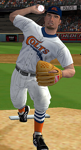
Good God, that Colt .45’s uniform accompanying today’s entry is fantastic!
[quote comment=”123005″]classic baseball uni features I’d love to see come back into use by a team or two: belt loop piping and colored pocket flaps.[/quote]
Rich,
The link and the link use belt loop piping.
[quote comment=”123047″]Good God, that Colt .45’s uniform accompanying today’s entry is fantastic![/quote]
i was more partial to the “mod squad” reference
Interesting auction going on here:
link
First, great post… and I do wish you could do it for “The Show.” But how could you rip the ’99 All-Star jerseys?! They were classic!!
Also, I don’t like the new Pred’s home, er, away jersey (still getting used to the switch)… it would be alright, except the word mark is too far above the main logo… it looks like it’s just floating out there in space.
Can someone help me out here? I’m looking to buy this MVP 2005 for the PC. Is it available easily?
I see this page:
link
And its like $100 ?!?!
That seems insane for a video game?
[quote comment=”123059″]Can someone help me out here? I’m looking to buy this MVP 2005 for the PC. Is it available easily?
I see this page:
link
And its like $100 ?!?!
That seems insane for a video game?[/quote]
You can get it for less on link at the moment.
But, yeah, it’s odd how it’s actually appreciated in value since it came out.
West Ham signs Freddie away from Arsenal and promptly link on his first jersey. A little off-center, no?
[quote comment=”123063″]West Ham signs Freddie away from Arsenal and promptly link on his first jersey. A little off-center, no?[/quote]
jesus, i thought that was david justice as i first glanced at him…
[quote comment=”123061″][quote comment=”123059″]Can someone help me out here? I’m looking to buy this MVP 2005 for the PC. Is it available easily?
I see this page:
link
And its like $100 ?!?!
That seems insane for a video game?[/quote]
You can get it for less on link at the moment.
But, yeah, it’s odd how it’s actually appreciated in value since it came out.[/quote]
I wonder if anyone’s buying it at that price.
Anyone know where I can get an NBA ref’s jersey so I can put a #21 on the back? It’d look great courtside and the next time I’m in a Vegas sportsbook.
[quote comment=”123063″]West Ham signs Freddie away from Arsenal and promptly link on his first jersey. A little off-center, no?[/quote]
Hard to say – He’s not holding the sweater squarelyHis left hand is holding onto the shirt in a lower place than the right hand, and stretching.
If it is off center, I blame the J – the gap between the open spaces of the L and the J make it look awkward.
Wow, excellent stuff on modding! That seems to be seriously tedious work! Way cool.
[quote comment=”123070″]I wonder if anyone’s buying it at that price.[/quote]
I hope to God no one is.
eBay, or try your local computer games shop that sells used stuff. It might be there.
WOW!
And you cap guys think that New Era caps are expensive at $32 a pop?
Those Japanese All-Star game caps are $70!
I would love a Giants ASG cap, but not at that price.
Leaked possible new Pittsburgh Penguin unis home, away, and pants.
link
link
link
This has the Pens wearing white on the road, I thought the NHL was going back to the white a home look.
I love minor league basbeall unis and came across this on Ebay. I am kinda partial to these though growing up in Oklahoma City, but I love these 89ers uniforms!! Look at the collars!!
[IMG]http://i76.photobucket.com/albums/j33/brianpou1/juangone.jpg[/IMG]
Actually, let me try that again. Sorry…crash course in html! HAHA!
link
If that doesn’t work, here is the link. Please accept my appologies again. Thanks.
link
[quote comment=”123091″]Leaked possible new Pittsburgh Penguin unis home, away, and pants.
link
link
link
This has the Pens wearing white on the road, I thought the NHL was going back to the white a home look.[/quote]
The league is sticking with dark-home, and white-away. As for those uni’s, they were posted a while back. Too much gold. Hopefully they don’t ditch the penguin with skates and stick.
[quote comment=”123051″][quote comment=”123005″]classic baseball uni features I’d love to see come back into use by a team or two: belt loop piping and colored pocket flaps.[/quote]
Rich,
The link and the link use belt loop piping.[/quote]
I’ve always liked the belt-loop piping and although you can’t see it link, the Brewers had it in the mid-90s. I figured it was because the Braves had the distinctive look when they played in County Stadium. When the Brewers changed their uniforms to the present version, I was disappointed the piping was dropped.
New Phialdelphia Flyers RBK “Edge” jersey leaked:
link
Scroll down, hanging behind Gagne in the photo.
If the Penguins went with link it would be great. I’m not sure which penguin Pittsburgh has, but link has some gold showing.
Did anyone see the interview with Tim Hudson during last nights Sunday Night Baseball telecast? Had a great background shot of the Braves MLB uniform guidelines posted in the locker room behind Huddie. Wish I had a screengrab—
[quote comment=”123070″]I wonder if anyone’s buying it at that price.[/quote]
Checking the “Completed Items” listing shows stuff going from anywhere between $25 and $68, plus shipping.
I hate piping, but I think it could help that Pens jersey. It doesn’t make sense that their is piping on the bottom, but not on the sleeves.
Something is telling me that isn’t the actual finished product.
Not to beat on the same horse, but excellent post today!
Just wanted to make sure I’m not the only one seeing the Russian/Thai/Greek characters in posts #76 & 78
[quote comment=”123130″]Just wanted to make sure I’m not the only one seeing the Russian/Thai/Greek characters in posts #76 & 78[/quote]
not sure what’s up with that bloke
I think he/she is giving us a recipe..
[quote comment=”123071″]Anyone know where I can get an NBA ref’s jersey so I can put a #21 on the back? It’d look great courtside and the next time I’m in a Vegas sportsbook.[/quote]
Try link. Also Paul did a profile a couple weeks back about an official uniform company so you could look back to that.
[quote comment=”123134″][quote comment=”123130″]Just wanted to make sure I’m not the only one seeing the Russian/Thai/Greek characters in posts #76 & 78[/quote]
not sure what’s up with that bloke[/quote]
A little Hebrew in there too . . . .maybe a comment about the Israel Hockey federation jerseys?
anyone else surprised that todays entry didnt include anything on the uni’s worn in the usa basketball scrimmage yesterday?
especially since they were the exact ones shown in the leibe video.
very classy and understated. a nice look.
link
[quote comment=”123144″]anyone else surprised that todays entry didnt include anything on the uni’s worn in the usa basketball scrimmage yesterday?
especially since they were the exact ones shown in the leibe video.
very classy and understated. a nice look.
link
They do look good. I would do away with the period after each initial, though.
Are those the same ‘System of Dress’ unis that we saw during the NCAA tournament?
I also like that they got two USA #8s in the photo.
I love my MVP 07, I’m about half way into a 162 game series. The modders there do amazing work.
muahahahaha
Nike is looking to get into the yet to be tapped into NASCAR market.
If the Blue Jays want to wear throwbacks at home, though, they will have to wear the whites, not the powder blues, if the precedent set by the Royals’ request is any indication. And that’s a good policy, IMO.
[quote comment=”123153″][quote comment=”123144″]anyone else surprised that todays entry didnt include anything on the uni’s worn in the usa basketball scrimmage yesterday?
especially since they were the exact ones shown in the leibe video.
very classy and understated. a nice look.
link
They do look good. I would do away with the period after each initial, though.
Are those the same ‘System of Dress’ unis that we saw during the NCAA tournament?
I also like that they got two USA #8s in the photo.[/quote]
I like the periods…you never see them used anymore. They really look like the “System of Dress” unis. Other than the shorts being unproportionately baggy compared with the shirt, I like them.
[quote comment=”123026″]Does anyone know the font the Minnesota Twins use for their “TC” logo?[/quote]
It probably stands for “Twin Cities” which is Minneapolis and St. Paul. Hence the Minnesota Twins.
[quote comment=”123171″][quote comment=”123026″]Does anyone know the font the Minnesota Twins use for their “TC” logo?[/quote]
It probably stands for “Twin Cities” which is Minneapolis and St. Paul. Hence the Minnesota Twins.[/quote]
You may want to re-read the original question.
[quote comment=”123171″][quote comment=”123026″]Does anyone know the font the Minnesota Twins use for their “TC” logo?[/quote]
It probably stands for “Twin Cities” which is Minneapolis and St. Paul. Hence the Minnesota Twins.[/quote]
I think he wanted to know what is font name is the “TC” is. Not what “TC” stood for.
Sorry don’t know what the font that is.
never seen a number built into a player’s shinguard
just making sure my tabs are closed
Note to fellow sports logo designers, they are called “logos” for a reason. Like less is more…
link
The above folks is a friggin illustration… minor league look for a minor league team FOR SURE.
Good job by the link replicating the numbers. However, the trim on the Jays’ road blues was link, not white-blue-white.
Good article. I’m a big video game fan and have done my share of modding, but never really got into any sports games since they all just fall short of expectations for me. All in all, good stuff except for all the White Sox stuff. I see too much of that as it is being a south side Cubs fan, hehe.
Very impressive stuff on the MVP 2005 jerseys. Very fitting for the greatest baseball game since RBI.
Not be a wet blanket or anything, but I’m watching the Red Sox and the Indians right now (Manny Ramirez, incidentally, looks like he’s wearing his PJs to the park today) and I’ve never been able to get over the Indians’ logo. Does Uniwatch have an official stance on logos and names like the Indians, Braves and Redskins, or does it basically address those teams on less…inflammatory terms, like colors and stirrups and so forth? I’ve always been, I gotta admit, a little disgusted by the Indians logo, but I’m willing to open my mind to alternate viewpoints…
Thanks!
[quote comment=”123200″]Not be a wet blanket or anything, but I’m watching the Red Sox and the Indians right now (Manny Ramirez, incidentally, looks like he’s wearing his PJs to the park today) and I’ve never been able to get over the Indians’ logo. Does Uniwatch have an official stance on logos and names like the Indians, Braves and Redskins, or does it basically address those teams on less…inflammatory terms, like colors and stirrups and so forth? I’ve always been, I gotta admit, a little disgusted by the Indians logo, but I’m willing to open my mind to alternate viewpoints…
Thanks![/quote]
I liked Chief Wahoo better when he was bigger on the hat. The Braves used to have a bad-ass chief-with-headdress sleeve patch. Chief Nokahoma (say it out loud for the best effect) is the coolest mascot name this side of the Canadian border. Finally, in today’s era of skin-tight Play-Dry undershirts, it is appropriate to call the Washington team the Redskins. Unless of course, the player chooses to wear long white sleeves.
[quote comment=”123055″]Interesting auction going on here:
link
Did they really have poly-cotton blend sweaters in 1949?
I am watching the Brewers/Reds game tonight and again a majority of The Crew are wearing the high socks but I noticed something different today. Prince Fielder is not wearing any batting gloves. Has anyone heard anything why this is? I can’t find anything on it. He is wearing some weird wrist guards… or maybe it is just tape. It just looks weird to have Prince not wearing Batting gloves.
[quote comment=”123102″]New Phialdelphia Flyers RBK “Edge” jersey leaked:
link
Scroll down, hanging behind Gagne in the photo.[/quote]
I’ll find out Sept 16 if that is the case.
They look ugly, and I haven’t seen the whole thing yet!
[quote comment=”123207″][quote comment=”123102″]New Phialdelphia Flyers RBK “Edge” jersey leaked:
link
Scroll down, hanging behind Gagne in the photo.[/quote]
I’ll find out Sept 16 if that is the case.
They look ugly, and I haven’t seen the whole thing yet![/quote]
Gaaa! Where’s the orange?
link was shot at the Los Angeles Kings draft party. Jack Johnson and Mike Cammalleri come out with the new jerseys at the 2:00 mark.
[quote comment=”123217″]link was shot at the Los Angeles Kings draft party. Jack Johnson and Mike Cammalleri come out with the new jerseys at the 2:00 mark.[/quote]
Couldn’t help but notice that neither one would actually put the sweater on.
SB
[quote comment=”123173″][quote comment=”123171″][quote comment=”123026″]Does anyone know the font the Minnesota Twins use for their “TC” logo?[/quote]
It probably stands for “Twin Cities” which is Minneapolis and St. Paul. Hence the Minnesota Twins.[/quote]
You may want to re-read the original question.[/quote]
Whoops.
I’ve looked around before for the types of fonts teams use in logos, and most teams use logos that aren’t made using actual fonts but a unique graphic. If you look around at sites that sell custom fonts, they may have certain fonts that can be used to replicate a logo, but you probably won’t find them at any other free site.
Just in case no one else has reported it yet, there is a cool bit in this blog entry about the Royals’ T-shirt giveaway to commemorate the 24th anniversary of the “Pine Tar Incident”.
link
[quote comment=”123228″]Just in case no one else has reported it yet, there is a cool bit in this blog entry about the Royals’ T-shirt giveaway to commemorate the 24th anniversary of the “Pine Tar Incident”.
link
Doesn’t work. But what’s up with this fad of schmutzed-up shirts? First, the Ryan Freel dirty shirt, now the George Brett pine tar shirt. What’s next? Uniforms with dyed-in dirt patches and grass stains? Oh, somebody wash me of these thoughts…
Sorry maybe this one.
link
Here’s the pic.
link
[quote comment=”123233″]Sorry maybe this one.
link
Here’s the pic.
link
Hopefully the last name on the back is vertically arched ;-)
[quote comment=”122946″]Eriq, How about doing a “Uniwatch” uni?[/quote]
link ;)
[quote comment=”123192″]good stuff except for all the White Sox stuff. I see too much of that as it is being a south side Cubs fan, hehe.[/quote]
Well, being a Sox fan in the northwest suburbs, I feel your pain – if only in that sense, baseball-wise. ;)
The University of North Texas football program (which will surprise you all this season, mark my words…) is being coy with their redesigned uniforms, revealing little-by-little until the official unveiling August 4th:
link
[That’s a lame pic, but I dunno how I feel about that helmet.]
[quote comment=”123239″][quote comment=”122946″]Eriq, How about doing a “Uniwatch” uni?[/quote]
link ;)
[quote comment=”123192″]good stuff except for all the White Sox stuff. I see too much of that as it is being a south side Cubs fan, hehe.[/quote]
Well, being a Sox fan in the northwest suburbs, I feel your pain – if only in that sense, baseball-wise. ;)[/quote]
Perfect!
[quote comment=”123249″][quote comment=”123239″][quote comment=”122946″]Eriq, How about doing a “Uniwatch” uni?[/quote]
link ;)
[quote comment=”123192″]good stuff except for all the White Sox stuff. I see too much of that as it is being a south side Cubs fan, hehe.[/quote]
Well, being a Sox fan in the northwest suburbs, I feel your pain – if only in that sense, baseball-wise. ;)[/quote]
Perfect![/quote]
You gotta make a custom player with a goatee and glasses and a big ol’ “LUKAS” on his back! It’ll be a nice surprise for the man when he gets back from his little vacation.
This is one of the coolest articles I’ve ever read. Thank you uniwatch for bring this to my attention.
I am an avid fan of creating my own ‘university’ in EA’s NCAA Football series but I am always limited to their cheesy selection of logos. Is there a way I could do something like this to import a logo? I am very good with photoshop, btw.
Didn’t the NFL do a green-themed logo for their outreach to the mexican community last fall? Was that the green dot on the backs of the helmets at the Hall of Fame game?
I only remember it because it stuck out on the Colts helmet’s very badly.