Tuesday was a very good day.
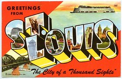
I arrived in St. Louis at about 9:40 a.m. and headed straight for Liebe Athletic Lettering. This was just a “getting acquainted” visit, so I could get the lay of the land in advance of my video shoot the next day. It turned out to be an amazing facility, with patches, insignia, nameplates, and rolls of twill fabric all over the place.
Liebe is a subcontactor: They don’t manufacture jerseys, but the big manufacturers send their garments here to have numbers, letters, patches, and piping sewn onto them. For a long time they did most of MLB’s on-field jerseys; now, sadly, Majestic has taken all of that work in-house, but Liebe still does a lot of MLB’s retail authentics (including most of Mitchell and Ness’s throwback product), along with game-day and retail work for pretty much every big pro and college sports entity other than MLB. With the lovely Marcia Meyer as my tour guide, I was given complete access to the entire place, which means I was pretty much like the proverbial kid in the candy store. A very small sampling of highlights and observations:
- Although a lot of Liebe’s embroidery is now done by computerized machinery, an astonishing amount of the company’s sewing is still done by hand, primarily by women who look like they’ve been doing it forever. For example, although the main insignia on the Cardinals’ jerseys is done by machine (that’s just a sample piece of cloth, not an actual jersey), the finishing details, like the dark outlining, are all done manually.
- Back in the pre-digital days, the main embroidery work used to be done by hand too. Each logo had a pattern like this — basically a sheet of paper or plastic with lots of pinholes. The patterns would be positioned over a jersey and then a worker would smear some pigment over it, which would pass through the pinholes and replicate the pattern on the fabric. That would be the guide for the sewers to follow.
- Nowadays, sleeve patch designs are digitized and fed into a computer. But as recently as 25 years ago, the designs were blown up to six times their normal size to form a pattern. Every line on these diagrams represents a stitch. I can’t say I fully understood the explanation of the process, but the patterns were used to create rolls of paper with punches in them, like player-piano rolls. The punch rolls were then fed into the machine that would stitch the patch. The patterns, which are gorgeous pieces of artwork in their own right, aren’t used anymore, but they’re still floating around in old files, many of them dating back to the ’50s and ’60s.
- Here’s a nice little detail that nobody would normally know about: The Cardinals’ equipment manager arranged to have special patches sewn onto the shirttails of the Cardinals players and coaches attending the All-Star Game. This is a sample run of the patches.
- I spoke with a heat-press operator who griped about how little material there is to work with when pressing numbers onto football jersey sleeves. Check out his high-tech method of getting the sleeves to stay put on the press mount.
- Nowadays, all the letters, numbers, and logo appliqués are cut either by a laser cutter or a water jet. But they used to be die-cut, and Liebe still has drawers and drawers full of stamping dies (additional examples here and here). For some reason I found myself particularly charmed by this one, so the next day one of the plant managers used the die-stamper, three pieces of cloth, and a small heat-press to assemble a little Expos logo for me (look at an enlarged version and you can clearly see the cloth edges).
- The company has loads of old job order files. Here‘s an old Rawlings order form for the 1989 Mets. Among other details, note that Lenny Dykstra wanted his sleeves shortened by half an inch, Keith Hernandez’s captain’s “C” was being removed, and lots of players wanted their pant legs to be a bit tighter.
I could go on, but you get the idea — it was basically a smorgasbord, a feast, an orgy of uni-related arcana. I didn’t want to leave, but I had to head downtown to the Cardinals Hall of Fame and Museum, where assistant curator Brian Finch was waiting for me (along with Jeff Scott, who runs the excellent Birdbats site). After gawking at Brian’s World Series ring — which dwarfed the rest of my hand — I had him lead me to the museum. Here’s a sampling of highlights:
- Pretty much every version of the birds on the bat insignia that you can imagine is represented in the museum, including this one, this one, this one, this one, this one, this one, this one, this one (that’s actually replica that was made for an old-timers’ game, not an original 1927 model), this one (note the royal outline on the birds), and this one.
- This is the Cards’ 1956 road jersey — the only year since 1922 that the team hasn’t worn some version of the birds on the bat. But they made up for it by including the super-cool Slugger Bird sleeve patch.
- I especially dug a lot of the outerwear, especially this jacket, this jacket, this jacket, and, although it was hard to see and even harder to photograph, this sweater.
- It’s easy to forget that St. Louis was once a two-team town, so it was nice to see some Browns uniforms (additional pics here, here, and here.
- Did you know Ozzie Smith wrote “Oz” on his batting gloves? I didn’t.
- How awesome is the “Cardinal Organization” logo on this check?
- As you can imagine, I was particularly enthralled by these number-emblazoned stirrups, worn by Pat Crawford in 1934
- The Bowling Hall of Fame is in this same building, and they had some wicked cool shirts, as you can see here, here, here, here, and here.
After crashing for a bit at my hotel, it was off to the Uni Watch party. Small-ish turnout this time, but some very nice folks:
- Here’s Jeff Baxter, who I’d previously met at the Cards HoF, wearing what I believe is an actual game-worn Cards throwback jersey.
- Several people showed up in Blues jerseys, including Jonathan Karberg, J.R. Gain (here’s a rear view), and Mark Richter (rear view), who then did the striptease routine: Underneath his Blues jersey was a Cards jersey, and underneath that was something special that he wore just for me.
- Best attire of the night: Marty Hick and his old-school St. Louis Cardinals necktie. Marty also brought along some incredible show-and-tell materials, but I’m gonna save that for another day.
- To my surprise, two of the Liebe brothers showed up — a super-nice gesture that really impressed me. Here I am with Bill Liebe, whose grandfather founded the company about 80 years ago in his basement.
By 10:30 or so, I was pretty wrung out, so I scooted hotel-ward for some shut-eye. The video shoot the next day went extremely well, although I’m told that it will be boiled down to only three or four minutes after editing — a shame, since we taped so much great material. (I didn’t expect a half-hour feature, but I was hoping we’d clock in somewhere around the eight- to ten-minute range.) Not sure when it will be posted on ESPN.com — maybe as soon as next week, or more likely two weeks after that. I’ll keep you posted.
Membership Update: Scott’s been turning out some killer work, as you can see in the card gallery. We’re now over 250 members, and counting. Can’t even begin to tell you how happy I am over the way this project is evolving and growing — my thanks to all.
Signal Flare: Yo, Jeremiah McElwain — if you’re reading this, please get in touch. Thanks.
Uni Watch News Ticker: How great is my intern? This great: I got home from St. Louis yesterday afternoon and found a big package waiting for me, with a Cleveland return address. Inside was this old NFL serving tray, circa 1971. Wow. Thanks, Vince. … Some serious logo creep upcoming for the WNBA (with thanks to Matt Edwards). … “Looks like the Argentina women’s soccer team, which is competing in the Pan Am games, is wearing the uniforms of their male counterparts,” writes Jonathon Binet. “Why else would they still have the two stars above the AFA crest? The two stars represent the nation’s two [men’s] World Cup wins in 1978 and 1986.” … JR Boucicaut of ModSquadHockey swears that this rendering of the new Sharks logo is legit. Personally, I think it’s an upgrade, if only because the tape goes all around the stick blade (which, as we’ve discussed before, wasn’t the case with the old logo). … Eli Ganias saw this MasterCard ad on the subway. He doesn’t understand it, and neither do I. What exactly is the point being made here — that you become “more than a fan” when you buy a cap with your credit card? … Several readers noted that Bruce Froemming (known, of course, for his tactful repartee) still had the All-Star Game logo patch on the side of his cap during last night’s Tigers/Mariners game.
Not uni-related at all, but the title of the article says it all: Maria (Sharapova) swaps her tennis whites for a little black leather dress
link
I think the Mastercard ad is saying you become more than a fan when you actually become a member of the team. Still not a great ad though, since the only people who can relate it (New York Met players) are probably not even going to see it on a subway train.
Being a Cardinal fan I have always been amazed by the stitching on the Cardinals jerseys. Seeing them in the Cardinals store I can now understand why they run about 2 bills. A authentic on field Cards jersey is my next big uni related purchase.
Speaking of logo creep in women’s sports, did any one happen to see any of the USA/Venezuela World Cup of Softball game last night? I saw a little of it and noticed that USA had good sized KFC patch on one of their sleeves. While trying to find a picture I noticed that it is being called the KFC World Cup of Softball, so I would imagine all the teams have a similar patch. I could never find a picture and I’m not sure if Venezuela had the patch or not.
The Mets thing is Mastercard is holding a contest that you win a week with your favorite team. So its like your a player hince you wear there hat not your old raggy hat
[quote comment=”118294″]Not uni-related at all, but the title of the article says it all: Maria (Sharapova) swaps her tennis whites for a little black leather dress
link
The kid in the blue shirt in the Maria picture on the right looks like he needs a very cold shower.
“Looks like the Argentina women’s soccer team, which is competing in the Pan Am games, is wearing the uniforms of their male counterparts,†writes Jonathon Binet. “Why else would they still have the two stars above the AFA crest? The two stars represent the nation’s two [men’s] World Cup wins in 1978 and 1986.â€Â
The Argentina link also has 2 stars. Thing is, the U-20 team has 5 world cup wins. Also,link (in red), has a bunch of stars, Why?
At least they used the all-blue Mets hat for that ad.
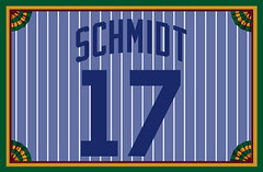
Question for Eric Schmidt (#17): As a native of the Chicago area myself, just curious what team you are playing for in the picture you have linked to your membership card? The uni’s don’t look like any local highschools or colleges that I am familiar with.
Also, Uruguay U-20 (in red), has a bunch of stars, Why?
Uruguay wears four stars for their two World Cup wins (1930 and 1950) and their two Olympic gold medals (1924 and 1928)
[quote comment=”118312″]Question for Eric Schmidt (#17): As a native of the Chicago area myself, just curious what team you are playing for in the picture you have linked to your membership card? The uni’s don’t look like any local highschools or colleges that I am familiar with.[/quote]
Froemming showed what an All Star he is by blowing a call against the Mariners. MLB gave him the All Star Game so they wouldnt have to put him in the post-season.
There is not a game that he works that he does not call attention to himslef, including Tuesday night’s game.
Loved the photos from the St Louis trip, Paul. The Cardinals museum is one of my favorite places to visit when I go there. Also very exciting to see my membership card! Can’t wait to get it in the mail.
link that the MasterCard ad is referring to.
I live in Boston, (even though I’m still a true blue Mets fan to the end), and they have those same Mastercard ads on the T’s up here. It still doesn’t make sense up here, but at least they show two different hats. the old hat is the red cap with the navy brim the Sox used to wear.
and I don’t know about the rest of you, but i prefer the old ratty cap. I bought a new authentic Mets cap and i can’t wear it because the damn thing won’t shrink to my head…lousy polyester. so i still wear the old one…what a waste of $25.
Any news on any more new NHL jerseys? I have heard most teams will be at least tweaking their stripe patterns to get them to fit the new jerseys….anybody have any idea when they will ALL be unveiled?
Paul, I wish I could have made it Tuesday night, but personal life got in the way. I would have been fun to be there in my 1971 orange Astros hat.
Since you didn’t see the All Star Game, you might not have seen Willy Mays give Junior a jacket and Jeter a jersey before the game started. The jersey looked like an older Giants jersey or a Mitchell and Ness throwback. I think there was a World Series patch on the left sleeve, but I could be wrong.
I can’t wait to see the video you shot while at Liebe. You didn’t happen to see anything with the Astros or Louisiana Tech on it while you were there did you?
link, but I just pulled an all-nighter. It’s all I got…
Uni Overload!!!!!
[quote comment=”118322″]I live in Boston, (even though I’m still a true blue Mets fan to the end), and they have those same Mastercard ads on the T’s up here. It still doesn’t make sense up here, but at least they show two different hats. the old hat is the red cap with the navy brim the Sox used to wear.
and I don’t know about the rest of you, but i prefer the old ratty cap. I bought a new authentic Mets cap and i can’t wear it because the damn thing won’t shrink to my head…lousy polyester. so i still wear the old one…what a waste of $25.[/quote]
Not only do they not shrink, but the crowns are huge. I did the “surgery” on mine and the crown still looks ridiculous. I used to think the old ones were crap, but once you figure out how to work them they are extremely comfortable.
The ad with the Mets hat “when you were born” shouldn’t be the hat you can buy now at Babies R’ Us. Being a soon to be dad, I have seen those hats and they are not the type of baseball hat I had when I was a small child. Mine wasn’t denim, but cotton…it was also Astros blue with the link on the front.
[quote comment=”118327″]Paul, I wish I could have made it Tuesday night, but personal life got in the way. I would have been fun to be there in my 1971 orange Astros hat.
Since you didn’t see the All Star Game, you might not have seen Willy Mays give Junior a jacket and Jeter a jersey before the game started. The jersey looked like an older Giants jersey or a Mitchell and Ness throwback. I think there was a World Series patch on the left sleeve, but I could be wrong.
I can’t wait to see the video you shot while at Liebe. You didn’t happen to see anything with the Astros or Louisiana Tech on it while you were there did you?[/quote]
The problem Willie’s jersey was his name was on it. I didn’t think Giants home jersey’s had names on them now or then.
[quote comment=”118307″][quote comment=”118294″]Not uni-related at all, but the title of the article says it all: Maria (Sharapova) swaps her tennis whites for a little black leather dress
link
The kid in the blue shirt in the Maria picture on the right looks like he needs a very cold shower.[/quote]
I prefer her in the tennis dress.
Wait, it really dosen’t matter what she wears.
[quote comment=”118337″][quote comment=”118327″]Paul, I wish I could have made it Tuesday night, but personal life got in the way. I would have been fun to be there in my 1971 orange Astros hat.
Since you didn’t see the All Star Game, you might not have seen Willy Mays give Junior a jacket and Jeter a jersey before the game started. The jersey looked like an older Giants jersey or a Mitchell and Ness throwback. I think there was a World Series patch on the left sleeve, but I could be wrong.
I can’t wait to see the video you shot while at Liebe. You didn’t happen to see anything with the Astros or Louisiana Tech on it while you were there did you?[/quote]
The problem Willie’s jersey was his name was on it. I didn’t think Giants home jersey’s had names on them now or then.[/quote]
I didn’t notice his name on the back…nor can I find pictures of him giving it to Jeter.
I caught a few minutes of that ‘Bronx is Burning’ thing on ESPN last night and noticed that they had the umps in the ’76 World Series wearing the pillbox like caps – black with white horizontal pinstripes (may have just been the NL umps). Thought that was a cool detail in a sea of inaccuracies.
Joe Torre designed this piece for the Red Birds in the 1970’s
[quote comment=”118341″][quote comment=”118337″][quote comment=”118327″]Paul, I wish I could have made it Tuesday night, but personal life got in the way. I would have been fun to be there in my 1971 orange Astros hat.
Since you didn’t see the All Star Game, you might not have seen Willy Mays give Junior a jacket and Jeter a jersey before the game started. The jersey looked like an older Giants jersey or a Mitchell and Ness throwback. I think there was a World Series patch on the left sleeve, but I could be wrong.
I can’t wait to see the video you shot while at Liebe. You didn’t happen to see anything with the Astros or Louisiana Tech on it while you were there did you?[/quote]
The problem Willie’s jersey was his name was on it. I didn’t think Giants home jersey’s had names on them now or then.[/quote]
I didn’t notice his name on the back…nor can I find pictures of him giving it to Jeter.[/quote]
He took off the jacket (which said “Say Hey” on the back), then took off the jersey, handed both to Jeter (I believe), and hopped into the Pink Cadillac.
The Mastercard ad is referring to winning that contest they are having. I’m bitter about that because my family and I were in the running to be in the commercial that promotes that contest. My father has a large collection of baseball books and memorabilia (seen link
and they came and shot us and the collection, but decided not to put us in the final commercial. Which was a shame, because I was wearing my replica 1995 Don Mattingly jersey (with black armband and number 7 on the sleeve for The Mick) when the shot us.
-Steve!
I went to the bowling hall of fame ages ago — apparently the finalists to get the museum were Milwaukee and St Louis. How the latter got the nod boggles the mind. Between that and JoaquÃÂn Andújar, St Louis is dead to me. Nothing personal towards the good people of StL, of course.
PS: Has the IBHOF&M added a Lebowski wing? If not, why?
I wish I could of made it out to the get together the other night too, but as a poor college kid my job owns my soul.
[quote comment=”118338″][quote comment=”118307″][quote comment=”118294″]Not uni-related at all, but the title of the article says it all: Maria (Sharapova) swaps her tennis whites for a little black leather dress
link
The kid in the blue shirt in the Maria picture on the right looks like he needs a very cold shower.[/quote]
I prefer her in the tennis dress.
Wait, it really dosen’t matter what she wears.[/quote]
that is a really nice dress…
it would look great on my floor.
[quote comment=”118350″]I wish I could of made it out to the get together the other night too, but as a poor college kid my job owns my soul.[/quote]
i have a very pregnant wife and a city councle meeting we had to attend…
…and since when do college guys need an excuse to get out of work to go to the bar during the week?
Does anyone else find it ironic that the best sponsor the WNBA could find was Discover? Or am I the only one who sees the MC/VISA vs Discover battle as analagous to the NBA vs WNBA competition.
There’s an NBA vs WNBA competition?
The WNBA is owned by the NBA as a gimmick to fill arenas in the summer. How is that competition?
[quote comment=”118307″][quote comment=”118294″]Not uni-related at all, but the title of the article says it all: Maria (Sharapova) swaps her tennis whites for a little black leather dress
link
The kid in the blue shirt in the Maria picture on the right looks like he needs a very cold shower.[/quote]
Well…after seeing the first pic, so do I….
OK, we get it — lots of guys think Maria is hot. Enough, please.
I agree, the texture of the natural fiber jersey can’t be repllicated. I’m still curious about what players think about it compared to the synthetics. Flannel looks to be more comfortable, lighter than double-knit. Does anybody know?
Paul,
Are there a series of boring field trips in your school days which you’re now excising with fun stuff like this? Did teachers drag you to the bank, the post office, and the link?
I mentioned this last night, but it was pretty late…And I know it isn’t uni-related, but it is bugging me:
I noticed on a Brewers site that they had pictures from the press box or something, Of Verlander’s no hitter vs. the Brewers, and I noticed something weird on the scoreboard. It says the Crew scored a run in the 8th inning. I know for a fact they got shut out during the no-no. Am I reading this wrong? IS it the right game? Was someone at that game? I really want to solve this mystery.
link
Notice on the shirt tail patches for the cardinals, that link is the only person that didn’t have two patches on that sheet, ironic?
I know know what pond scum is after cleaning one of the ponds out at the Arch. It’s a nice way of saying that the Mets are shit, and that’s put lightly. (You should be thankful that my words can’t be scratched and sniffed.)
[quote comment=”118374″]Notice on the shirt tail patches for the cardinals, that link is the only person that didn’t have two patches on that sheet, ironic?[/quote]
Last night I played Number 9 backwards. Toward the end of the track, I could barely make it out, but I swear it said “Albert is dead,” over and over again.
I got an email this morning from the Predators. They will be releasing their new jersey design on July 19th. I’ll try to get over to the Sommett Center and get some pictures if I can. I don’t expect much if any change though.
[quote comment=”118371″]I mentioned this last night, but it was pretty late…And I know it isn’t uni-related, but it is bugging me:
I noticed on a Brewers site that they had pictures from the press box or something, Of Verlander’s no hitter vs. the Brewers, and I noticed something weird on the scoreboard. It says the Crew scored a run in the 8th inning. I know for a fact they got shut out during the no-no. Am I reading this wrong? IS it the right game? Was someone at that game? I really want to solve this mystery.
link[/quote]
Hmmm. Strange. I got nothing.
The play by play:
link
I was thinking there could have been some errors and walks in the 8th, and someone thought someone scored. But:
That’s not true, one walk in the 8th.
The scoreboard was photographed in the 9th, obviously. They’d have fixed that.
I’m looking at the link mentioned by Paul and I noticed something:
The players seem to be in numerical order, except for Mackey Sasser (2) and Rick Aguilera (38). Aguilera did indeed wear 15 for a while, so I can see why he’s listed where he is, but what abour Sasser? He never had any number other than 2 on the Mets. Was he thinking of switching to #6, or something?
[quote comment=”118374″]Notice on the shirt tail patches for the cardinals, that link is the only person that didn’t have two patches on that sheet, ironic?[/quote]
look closely at the patch flipped up on the previous page directly above the la russa one in the upper right corner of the page, it’s definitely another pujols patch
Being a Steelers fan, the first thing I noticed on the NFL serving tray is the logo is on the wrong side of the Steelers helmet. I have an old NFL lunch box from the same era with the logo on the wrong side of the helmet also. Is it so hard to show the AFC teams on the left side?
[quote comment=”118388″][quote comment=”118374″]Notice on the shirt tail patches for the cardinals, that link is the only person that didn’t have two patches on that sheet, ironic?[/quote]
Last night I played Number 9 backwards. Toward the end of the track, I could barely make it out, but I swear it said “Albert is dead,” over and over again.[/quote]
Correction. The track was Revolution 9. Ugh.
[quote comment=”118393″][quote comment=”118374″]Notice on the shirt tail patches for the cardinals, that link is the only person that didn’t have two patches on that sheet, ironic?[/quote]
look closely at the patch flipped up on the previous page directly above the la russa one in the upper right corner of the page, it’s definitely another pujols patch[/quote]
I think that’s just the Pujols patch we already see, because if you look further up on the grey patch “stencil” there’s a Tony La Russa patch below (above) it, which corresponds to the layout of the patches underneath.
link
[quote comment=”118400″][quote comment=”118388″][quote comment=”118374″]Notice on the shirt tail patches for the cardinals, that link is the only person that didn’t have two patches on that sheet, ironic?[/quote]
Last night I played Number 9 backwards. Toward the end of the track, I could barely make it out, but I swear it said “Albert is dead,” over and over again.[/quote]
Correction. The track was Revolution 9. Ugh.[/quote]
Turn me on dead man.
[quote comment=”118296″]I think the Mastercard ad is saying you become more than a fan when you actually become a member of the team. Still not a great ad though, since the only people who can relate it (New York Met players) are probably not even going to see it on a subway train.[/quote]
Using your credit card to pay for training camp… they run about $5,000, right?
Paul,
Do you know what team is depicted in this link you linked to?
I ask because the writing on the side says Forest Green and White and as far as I know Michigan State is the only team using those colors with a Block “S” and the thing in the middle could definitely be an older version of the Spartan helmet. I just had never seen that logo for MSU before…
[quote comment=”118402″]http://winningtheturnoverbattle.blogspot.com/2007/07/brief-history-of-babes-in-jerseys.html[/quote]
Calling Laura Quinn a babe is being very generous!
[quote comment=”118412″]Paul,
Do you know what team is depicted in this link you linked to?
I ask because the writing on the side says Forest Green and White and as far as I know Michigan State is the only team using those colors with a Block “S” and the thing in the middle could definitely be an older version of the Spartan helmet. I just had never seen that logo for MSU before…[/quote]
It definitely looks like an older Michigan State logo to me….
[quote comment=”118411″][quote comment=”118296″]I think the Mastercard ad is saying you become more than a fan when you actually become a member of the team. Still not a great ad though, since the only people who can relate it (New York Met players) are probably not even going to see it on a subway train.[/quote]
Using your credit card to pay for training camp… they run about $5,000, right?[/quote]
Clicked too fast… doi!
[quote comment=”118392″]I’m looking at the link mentioned by Paul and I noticed something:
The players seem to be in numerical order, except for Mackey Sasser (2) and Rick Aguilera (38). Aguilera did indeed wear 15 for a while, so I can see why he’s listed where he is, but what abour Sasser? He never had any number other than 2 on the Mets. Was he thinking of switching to #6, or something?[/quote]
You’re right about Aguilera. He switched numbers from 15 to 38 in 1989. As far as Sasser, my guess is that maybe Wally Backman (#6 – who was traded in Dec 1988) was originally listed there or something (I know, the sheet says its from March 1989), and then Mackey was just filled into that spot? He should’ve just gone after Mookie, and before Dykstra. Sasser was #17 on the Giants in 1987 and #2 on the Pirates in 1987, and then he switched to #2 with the Mets in 1988 (and 1989). Anyone else with a theory?
Delicious ironing on that Mets hat ad. Like the one commenter said, the “old hat” is the kind that came out, when, in the late-90s? A real “old” Mets hat would have a mesh back and only slightly curved brim. Yet the marketers think of that style hat as “new” (“trucker” hats) and the style that’s new-but-made-to-look-old as “old.”
[quote comment=”118412″]Paul,
Do you know what team is depicted in this link you linked to?
I ask because the writing on the side says Forest Green and White and as far as I know Michigan State is the only team using those colors with a Block “S” and the thing in the middle could definitely be an older version of the Spartan helmet. I just had never seen that logo for MSU before…[/quote]
Liebe has lots of old materials (mostly from college and h.s. teams) that don’t have the team name designated on them. This was one of them.
[quote comment=”118305″]The Mets thing is Mastercard is holding a contest that you win a week with your favorite team. So its like your a player hince you wear there hat not your old raggy hat[/quote]
The hat on the right isn’t just a new hat though, it’s a new baby’s hat. Look at the dimensions of the cap size and brim. My first thought about the ad was this:
The hat on the left would have been what you wore when you were a boy. The hat on the right is a new one you’re buying for your newborn son (or daughter I suppose). Now you’re a dad and you have a child to get a cap for, just like your dad did for you when you were born…
And obviously, being a new father is priceless.
[quote comment=”118349″]PS: Has the IBHOF&M added a Lebowski wing? If not, why?[/quote]
Mark it eight, Dude.
[quote comment=”118426″][quote comment=”118305″]The Mets thing is Mastercard is holding a contest that you win a week with your favorite team. So its like your a player hince you wear there hat not your old raggy hat[/quote]
The hat on the right isn’t just a new hat though, it’s a new baby’s hat. Look at the dimensions of the cap size and brim. My first thought about the ad was this:
The hat on the left would have been what you wore when you were a boy. The hat on the right is a new one you’re buying for your newborn son (or daughter I suppose). Now you’re a dad and you have a child to get a cap for, just like your dad did for you when you were born…
And obviously, being a new father is priceless.[/quote]
I think we have a winner.
[quote comment=”118429″][quote comment=”118349″]PS: Has the IBHOF&M added a Lebowski wing? If not, why?[/quote]
Mark it eight, Dude.[/quote]
Am I the only one around here who gives a sh*t about the rules? MARK IT ZERO!
[quote comment=”118348″]The Mastercard ad is referring to winning that contest they are having. I’m bitter about that because my family and I were in the running to be in the commercial that promotes that contest. My father has a large collection of baseball books and memorabilia (seen link
and they came and shot us and the collection, but decided not to put us in the final commercial. Which was a shame, because I was wearing my replica 1995 Don Mattingly jersey (with black armband and number 7 on the sleeve for The Mick) when the shot us.
-Steve![/quote]
Wow… you are not a baseball fan or anything like that are you?!!!!!
Just got a brainstorm…what if New Era brought back the “old” wool 5950’s and called them “cold-weather on-field caps?” Who wouldn’t prefer wool on a chilly October night over polyester? I mean, if the NFL has four hats floating around (training cap/draft cap, coaches’ cap, players’ cap, and “second season” cap), why can’t the popular wool 5950’s get revived? It would make us cap surgeons happy, and Eric Gagne could get his custom-fit hat to work perfectly with his goggles.
link they have their own shoe!
[quote comment=”118438″]link they have their own shoe![/quote]
Where is that little white bag in the seat back pocket when you need one…?
One more problem about the Mets MasterCard ad. The ratty cap on the left has an orange button on top, which was only added around 1995. Sort of hard to buy a new Mets cap with your Mastercard when you’re at most 12 years old.
[quote comment=”118438″]link they have their own shoe![/quote]
Didn’t someone at Nike realize that they named this U of O shoe the “Air Bruin”? Why not just go for the complete slap in the face and name it the “Air Beaver”?
[quote comment=”118432″][quote comment=”118426″][quote comment=”118305″]The Mets thing is Mastercard is holding a contest that you win a week with your favorite team. So its like your a player hince you wear there hat not your old raggy hat[/quote]
The hat on the right isn’t just a new hat though, it’s a new baby’s hat. Look at the dimensions of the cap size and brim. My first thought about the ad was this:
The hat on the left would have been what you wore when you were a boy. The hat on the right is a new one you’re buying for your newborn son (or daughter I suppose). Now you’re a dad and you have a child to get a cap for, just like your dad did for you when you were born…
And obviously, being a new father is priceless.[/quote]
I think we have a winner.
[quote comment=”118429″][quote comment=”118349″]PS: Has the IBHOF&M added a Lebowski wing? If not, why?[/quote]
Mark it eight, Dude.[/quote]
Am I the only one around here who gives a sh*t about the rules? MARK IT ZERO![/quote]
You mark that frame an 8, and you’re entering a world of pain.
[quote comment=”118436″]Just got a brainstorm…what if New Era brought back the “old” wool 5950’s and called them “cold-weather on-field caps?” [/quote]
This qould be a great idea (and would make them a little more money from the completists who want to have both).
In Japan, most teams do something similar — there’s a basic solid-material cap, and then there’s another one of thick mesh that’s better for hot weather. The fans don’t buy them because they cost over $70 a hat, but the players must like them.
Come to think of it, the players get to choose from knit and mesh jerseys each game as well. There’s at least one each of knit and mesh for both home and road, so a player who feels colder can go with the knit while other guys use the mesh. From afar you can’t even tell the difference, and it’s a nice spot of individual choice in a country that usually prides itself on strict conformity.
[quote comment=”118446″][quote comment=”118438″]link they have their own shoe![/quote]
Didn’t someone at Nike realize that they named this U of O shoe the “Air Bruin”? Why not just go for the complete slap in the face and name it the “Air Beaver”?[/quote]
That would be the Air Duck… oh, now that is perfect!
[quote comment=”118455″][quote comment=”118446″][quote comment=”118438″]link they have their own shoe![/quote]
Didn’t someone at Nike realize that they named this U of O shoe the “Air Bruin”? Why not just go for the complete slap in the face and name it the “Air Beaver”?[/quote]
That would be the Air Duck… oh, now that is perfect![/quote]
Oh wait… what is link? No Texas tech games to avoid tortillas… why hard hats?
[quote comment=”118456″][quote comment=”118455″][quote comment=”118446″][quote comment=”118438″]link they have their own shoe![/quote]
Didn’t someone at Nike realize that they named this U of O shoe the “Air Bruin”? Why not just go for the complete slap in the face and name it the “Air Beaver”?[/quote]
That would be the Air Duck… oh, now that is perfect![/quote]
Oh wait… what is link? No Texas tech games to avoid tortillas… why hard hats?[/quote]
And who would buy a second hand band helmet… and at those prices???
[quote comment=”118446″][quote comment=”118438″]link they have their own shoe![/quote]
Didn’t someone at Nike realize that they named this U of O shoe the “Air Bruin”? Why not just go for the complete slap in the face and name it the “Air Beaver”?[/quote]
There was already a shoe called the Air Bruin. They just changed the colors of the shoe then added the Oregon details.
[quote comment=”118412″]Paul,
Do you know what team is depicted in this link you linked to?
I ask because the writing on the side says Forest Green and White and as far as I know Michigan State is the only team using those colors with a Block “S” and the thing in the middle could definitely be an older version of the Spartan helmet. I just had never seen that logo for MSU before…[/quote]
I was trying to find that logo and I came across link…WTF?!? Courtesy of this link
You mark that frame an 8, and you’re entering a world of pain.
Dissing purple makes baby link cry.
The orange Illinois football uniforms being worked on in the pics are new. They are the same style as the (Nike-fied) uniforms Illinois got last year, but they are orange. Illinois did not have orange uniforms last year.
These are the first pictures I have seen of them. The nameplace being stitched is Mark Venegoni, a backup QB at Illinois.
and Mark Richter (rear view), who then did the striptease routine: Underneath his Blues jersey was a Cards jersey, and underneath that was something special that he wore just for me.
what you are missing here PL is that the cards jersey was for you as well. its an adam wainwright jersey…
and of course he did link to carlos beltran with a sick curve last season in in the nlcs, game 7, 2 outs, bases loaded in what was one of the greates lcs’s in recent memory…
This link has some deals on last year’s hats…
One caveat, most of what was still available is for the extremely small-headed 7 1/4 and smaller.
Those of us bordering on Bruce Bochy proportions (I’m a 7 7/8) are likely SOL.
[quote comment=”118308″] “Looks like the Argentina women’s soccer team, which is competing in the Pan Am games, is wearing the uniforms of their male counterparts,†writes Jonathon Binet. “Why else would they still have the two stars above the AFA crest? The two stars represent the nation’s two [men’s] World Cup wins in 1978 and 1986.â€Â
The Argentina link also has 2 stars. Thing is, the U-20 team has 5 world cup wins. Also,link (in red), has a bunch of stars, Why?[/quote]
The two stars are actually PART of the link Since everyone is part of the Asociación del Fútbol Argentino (AFA), they all get the same crest (which happens to put MUCH more emphasis on the “real” World Cup than the others).
[quote comment=”118413″][quote comment=”118402″]http://winningtheturnoverbattle.blogspot.com/2007/07/brief-history-of-babes-in-jerseys.html[/quote]
Calling Laura Quinn a babe is being very generous![/quote]
Serious ups to Mark Kotsay.
oh, and the 4 stars on the link probably for their 2 World Cup titles and 2 Olympic Gold medals.
[quote comment=”118484″]This link has some deals on last year’s hats…
One caveat, most of what was still available is for the extremely small-headed 7 1/4 and smaller.
Those of us bordering on Bruce Bochy proportions (I’m a 7 7/8) are likely SOL.[/quote]
I’m a 7 3/8…could a wet 7 1/4 expand to fit me?
I was lucky enough to go to the All-Star Game. The coolest thing was that there were NO COLORED JERSEYS!! It was great to see all the white NL jerseys (the Giants’ classic cream jerseys really stand out) and the classic grey road jerseys for all the teams, all on the the same field.
[quote comment=”118347″][quote comment=”118341″][quote comment=”118337″][quote comment=”118327″]Paul, I wish I could have made it Tuesday night, but personal life got in the way. I would have been fun to be there in my 1971 orange Astros hat.
Since you didn’t see the All Star Game, you might not have seen Willy Mays give Junior a jacket and Jeter a jersey before the game started. The jersey looked like an older Giants jersey or a Mitchell and Ness throwback. I think there was a World Series patch on the left sleeve, but I could be wrong.
I can’t wait to see the video you shot while at Liebe. You didn’t happen to see anything with the Astros or Louisiana Tech on it while you were there did you?[/quote]
The problem Willie’s jersey was his name was on it. I didn’t think Giants home jersey’s had names on them now or then.[/quote]
I didn’t notice his name on the back…nor can I find pictures of him giving it to Jeter.[/quote]
He took off the jacket (which said “Say Hey” on the back), then took off the jersey, handed both to Jeter (I believe), and hopped into the Pink Cadillac.[/quote]
If I remember he first gave it to Bonds who then gave the jacket to Griffey. I did not see Mays give his jersey though. By the way, before Mays took off his jacket, he stuck his glasses in the pocket. I don’t recall Mr. Mays with his glasses on when got on the car. They are probably in the jacket that Griffey had.
Anyone who TiVo’d it can investigate if the above was correct.
Todd A. (comment #67), you’re right. That’s why I took and submitted the picture. The button on the “old” hat would mean the oldest that person would be now is 12. I don’t think they meant these ads for the 12 and younger crowd.
[quote comment=”118491″]I was lucky enough to go to the All-Star Game. The coolest thing was that there were NO COLORED JERSEYS!! It was great to see all the white NL jerseys (the Giants’ classic cream jerseys really stand out) and the classic grey road jerseys for all the teams, all on the the same field.[/quote]
Too bad the Brewers couldn’t wear their retro homes. Maybe there is a strict “no alternate jersey” rule; technically, the barley whites are the Brewers official home uniform.
[quote comment=”118490″][quote comment=”118484″]This link has some deals on last year’s hats…
One caveat, most of what was still available is for the extremely small-headed 7 1/4 and smaller.
Those of us bordering on Bruce Bochy proportions (I’m a 7 7/8) are likely SOL.[/quote]
I’m a 7 3/8…could a wet 7 1/4 expand to fit me?[/quote]
No. The old hats shrink. You have to get one bigger than you usually wear. I’m normally a 7 1/2 and get a 7 3/4 in the old 59/fifties.
I guess with no underbill, link is where you have to write your messages in cycling…
link was just posted over at Deadspin, check out the unis that the West Michigan Whitecaps will be wearing . . .
More Sharks Leaks from ModSquadHockey:
link
link
Part of me thinks that the old 59/50’s are coming back at some point. Seems to me that the players would probably be attached to them since it is really pretty much impossible to custom fit polyester. I would think there would be no down side to having both versions available. I thing they were only discontinued to make people buy new hats this year.
[quote comment=”118504″]More Sharks Leaks from ModSquadHockey:
link
link[/quote]
love the new logo, and i love block numbering…
looks like the sharks like pontiac too…
[quote comment=”118349″] Has the IBHOF&M added a Lebowski wing? If not, why?[/quote]
One reason that jumps to mind is the fact that The Dude never actually bowls.
St. Louis was very deserving of its selection for the HOF. One of the all-time great bowling towns with a great history, most noteably from the golden age (40s-60s). Great bowlers (link) & great teams (link) have come from St. Louis. It’s centrally located as well. Good choice for the HOF.
I don’t think it’s mentioned enough, but Scott M.X. Turner deserves some major props…those card designs are friggin’ beautiful!
From Peter Gammons’s insider blog on espn.com:
“This is really true: When Manny Ramirez gets custom-made clothing at a chic Boston store, when the tailor embroiders Ramirez’s monogram, instead of his actual initials, Manny has ‘MBM’ sewn into his shirts and jackets. Yup. Manny Being Manny.”
link. Possible that the logo could include Yankee Stadium.
[quote comment=”118503″]link was just posted over at Deadspin, check out the unis that the West Michigan Whitecaps will be wearing . . .[/quote]
Wow. That’s umm. . .well. . .it’s umm. . . err. .
[quote comment=”118530″]link. Possible that the logo could include Yankee Stadium.[/quote]
They’ve been selling All-Star shirts with that graphic at the Stadium since the announcement. The logo for next year’s game will be unveiled on July 31.
ive said it before here and i’ll say it again here.
i HATE the saying “manny being manny”.
anyone else?
i HATE it as much as when people say “you go girl”.
The Florida Panthers will be revealing their new jersey on July 28th according to this blog: (Don’t mind the Carolina Panthers stuff) link
[quote comment=”118537″]ive said it before here and i’ll say it again here.
i HATE the saying “manny being manny”.
anyone else?
i HATE it as much as when people say “you go girl”.[/quote]
I hate it too, but it was still intereseting to see that Manny embraces it so much as to have it monogrammed onto his clothes.
[quote comment=”118537″]ive said it before here and i’ll say it again here.
i HATE the saying “manny being manny”.
anyone else?
i HATE it as much as when people say “you go girl”.[/quote]
I’m with ya!
[quote comment=”118540″][quote comment=”118537″]ive said it before here and i’ll say it again here.
i HATE the saying “manny being manny”.
anyone else?
i HATE it as much as when people say “you go girl”.[/quote]
I’m with ya![/quote]
That’s hot. [/sarcasm]
link about a company that makes mascot outfits.
If UniWatch had a theme song, it should sound like link.
[quote comment=”118508″][quote comment=”118504″]More Sharks Leaks from ModSquadHockey:
link
link[/quote]
love the new logo, and i love block numbering…
looks like the sharks like pontiac too…[/quote]
I dunno, still really not a fan of the new logo, but think just a few adjustments make it better.
link
[quote comment=”118544″]If UniWatch had a theme song, it should sound like link.[/quote]
link
If that is the sharks new logo/word mark, I don’t approve. Why would they incorporate yellow? Their original uniforms, in their inaugural season, were one of the best in sports. They’ve gone downhill since. I’ll withold judgment until I see the full uniform unveiled, but I have my doubts based on the leaked logo.
[quote comment=”118537″]ive said it before here and i’ll say it again here.
i HATE the saying “manny being manny”.
anyone else?
i HATE it as much as when people say “you go girl”.[/quote]
“It is what it is.”
[quote comment=”118545″][quote comment=”118508″][quote comment=”118504″]More Sharks Leaks from ModSquadHockey:
link
link[/quote]
love the new logo, and i love block numbering…
looks like the sharks like pontiac too…[/quote]
I dunno, still really not a fan of the new logo, but think just a few adjustments make it better.
link[/quote]
Someone on a Sharks message board had another link.
[quote comment=”118548″]If that is the sharks new logo/word mark, I don’t approve. Why would they incorporate yellow? Their original uniforms, in their inaugural season, were one of the best in sports. They’ve gone downhill since. I’ll withold judgment until I see the full uniform unveiled, but I have my doubts based on the leaked logo.[/quote]
It’s burnt orange, not yellow.
[quote comment=”118548″]If that is the sharks new logo/word mark, I don’t approve. Why would they incorporate yellow? Their original uniforms, in their inaugural season, were one of the best in sports. They’ve gone downhill since. I’ll withold judgment until I see the full uniform unveiled, but I have my doubts based on the leaked logo.[/quote]
RIP, vertical arched nameplates. Sad to see you go. link
[quote comment=”118553″][quote comment=”118545″][quote comment=”118508″][quote comment=”118504″]More Sharks Leaks from ModSquadHockey:
link
link[/quote]
love the new logo, and i love block numbering…
looks like the sharks like pontiac too…[/quote]
I dunno, still really not a fan of the new logo, but think just a few adjustments make it better.
link[/quote]
Someone on a Sharks message board had another link.[/quote]
One of the few times this year I like a new logo over an old one. Logo is sharp.
[quote comment=”118556″][quote comment=”118553″][quote comment=”118545″][quote comment=”118508″][quote comment=”118504″]More Sharks Leaks from ModSquadHockey:
link
link[/quote]
love the new logo, and i love block numbering…
looks like the sharks like pontiac too…[/quote]
I dunno, still really not a fan of the new logo, but think just a few adjustments make it better.
link[/quote]
Someone on a Sharks message board had another link.[/quote]
One of the few times this year I like a new logo over an old one. Logo is sharp.[/quote]
i think it’ll grow on me, i’m not thrilled at the new logo, but it is sorta kinda better.
now the logo with the wordmark…THAT looks awesome
link
NEW TAMPA BAY LIGHTNING LOGO
from the same site as the sharks logo
personally, i think it deserves a yawn
[quote comment=”118556″][quote comment=”118553″][quote comment=”118545″][quote comment=”118508″][quote comment=”118504″]More Sharks Leaks from ModSquadHockey:
link
link[/quote]
love the new logo, and i love block numbering…
looks like the sharks like pontiac too…[/quote]
I dunno, still really not a fan of the new logo, but think just a few adjustments make it better.
link[/quote]
Someone on a Sharks message board had another link.[/quote]
One of the few times this year I like a new logo over an old one. Logo is sharp.[/quote]
New Sharks logo is really nice, BIG upgrade
New link came today. Now, i don’t watch much soccer, so please forgive if i say something incredibly retarded. Of the maybe four times i have watched soccer, i have never seen long sleeve jerseys. Am i just not paying attention or are they always like this? Because I am somewhat confused at the moment.
[quote comment=”118560″]http://www.modsquadhockey.com/pics/JR/TBMSH_2.jpg
NEW TAMPA BAY LIGHTNING LOGO
from the same site as the sharks logo
personally, i think it deserves a yawn[/quote]
IMHO, the secondary should be the primary.
[quote comment=”118560″]http://www.modsquadhockey.com/pics/JR/TBMSH_2.jpg
NEW TAMPA BAY LIGHTNING LOGO
from the same site as the sharks logo
personally, i think it deserves a yawn[/quote]
Now that is a boring wordmark.
[quote comment=”118575″]New link came today. Now, i don’t watch much soccer, so please forgive if i say something incredibly retarded. Of the maybe four times i have watched soccer, i have never seen long sleeve jerseys. Am i just not paying attention or are they always like this? Because I am somewhat confused at the moment.[/quote]
Long sleeves usually get worn in cooler and/or rainy weather. In this case it was probably done to cover up the acreage of tattoos.
Are you sure the Mets uni order is from 1989? Keith Hernandez was on the Indians that year.
[quote comment=”118581″][quote comment=”118560″]http://www.modsquadhockey.com/pics/JR/TBMSH_2.jpg
NEW TAMPA BAY LIGHTNING LOGO
from the same site as the sharks logo
personally, i think it deserves a yawn[/quote]
Now that is a boring wordmark.[/quote]
Horrid font. One of you typography experts, please ID that one for us. What is that, “Flintstones Italic”? “Speed Racer Neue”?
Ah well… those whining cheap shot artists deserve to look terrible anyway.
[quote comment=”118583″]Are you sure the Mets uni order is from 1989? Keith Hernandez was on the Indians that year.[/quote]
Hernandez was on the team in 1989. He went to the Indians in 1990. He only played in 45 games for the Mets that year
75 games to be exact..
[quote comment=”118546″][quote comment=”118544″]If UniWatch had a theme song, it should sound like link.[/quote]
link[/quote]
I always liked the link of TWIP better.
TWIB, sorry.
[quote comment=”118582″][quote comment=”118575″]New link came today. Now, i don’t watch much soccer, so please forgive if i say something incredibly retarded. Of the maybe four times i have watched soccer, i have never seen long sleeve jerseys. Am i just not paying attention or are they always like this? Because I am somewhat confused at the moment.[/quote]
Long sleeves usually get worn in cooler and/or rainy weather. In this case it was probably done to cover up the acreage of tattoos.[/quote]
In England and Europe, unlike here, it’s not a summer sport — the league seasons run from August through the winter to May, so long sleeves are probably worn as much or more than short, actually.
[quote comment=”118582″][quote comment=”118575″]New link came today. Now, i don’t watch much soccer, so please forgive if i say something incredibly retarded. Of the maybe four times i have watched soccer, i have never seen long sleeve jerseys. Am i just not paying attention or are they always like this? Because I am somewhat confused at the moment.[/quote]
Long sleeves usually get worn in cooler and/or rainy weather. In this case it was probably done to cover up the acreage of tattoos.[/quote]
And Beckham usually wears long sleeves while he plays. Even his press conference jersey was long-sleeved.
[quote comment=”118582″][quote comment=”118575″]New link came today. Now, i don’t watch much soccer, so please forgive if i say something incredibly retarded. Of the maybe four times i have watched soccer, i have never seen long sleeve jerseys. Am i just not paying attention or are they always like this? Because I am somewhat confused at the moment.[/quote]
Long sleeves usually get worn in cooler and/or rainy weather. In this case it was probably done to cover up the acreage of tattoos.[/quote]
Ah. Thank you for covering my lack of soccer knowledge.
As a life long Cardinals fan and Pond Scum hater, I must say that this is the best Uniwatch I have ever read.
Props to Paul!
[quote comment=”118590″][quote comment=”118546″][quote comment=”118544″]If UniWatch had a theme song, it should sound like link.[/quote]
link[/quote]
I always liked the link of TWIB better.[/quote]
Yeah, I think that works better too. If nothing else, I’ll adopt it as my own personal theme music.
[quote comment=”118606″]As a life long Cardinals fan and Pond Scum hater, I must say that this is the best Uniwatch I have ever read.
Props to Paul![/quote]
I’ve never trusted Pujols. And I never will. I’ve never forgiven him for the death of Brad Lidge.
A little UNiWatch NHL update / News
NHL.com has taken down all New York Ranger jerseys from their shop.
Pre-Cursor to new jerseys being unveiled?
Have tried to locate some discussion of the new LA Galaxy shirts but have missed it if there’s been any – how does everyone feel about the switch? (assuming someone at least cares!) I could’ve cried when I saw what they’d done. The gold with the green sash was such a beauty – kinda retro and very distinctive – that I was considering buying one despite the inevitable impression of bandwagon-jumping (I’m in the UK, so hadn’t seen a Galaxy kit till the Beckham news broke some months ago). The new one is so unutterably bland. It looks like something an amateur team ordered from a catalogue. How do the fans feel about having their kit and even their team colours changed mid-season? Just cos they get a new player… as if the Beckham circus wasn’t crass enough already. Is this sort of thing more common in the MLS than other soccer leagues?
I am not going to be a Red Sox fan much longer if this BS keeps up. Paul’s membership campaign is a legit way to get profit from an awesome site. The Sox meanwhile seem to be ridiculously greedy in sucking every dollar from their fan base. $15 to nominate a president of a ficticious nation?
link
[quote comment=”118552″][quote comment=”118537″]ive said it before here and i’ll say it again here.
i HATE the saying “manny being manny”.
anyone else?
i HATE it as much as when people say “you go girl”.[/quote]
“It is what it is.”[/quote]
sorry. it is what is it…. is just an awesome expression and a great way to take things in stride.
[quote comment=”118620″]I am not going to be a Red Sox fan much longer if this BS keeps up. Paul’s membership campaign is a legit way to get profit from an awesome site. The Sox meanwhile seem to be ridiculously greedy in sucking every dollar from their fan base. $15 to nominate a president of a ficticious nation?
link[/quote]
trying to repost the link to this absurd contest
link
[quote comment=”118596″][quote comment=”118582″][quote comment=”118575″]New link came today. Now, i don’t watch much soccer, so please forgive if i say something incredibly retarded. Of the maybe four times i have watched soccer, i have never seen long sleeve jerseys. Am i just not paying attention or are they always like this? Because I am somewhat confused at the moment.[/quote]
Long sleeves usually get worn in cooler and/or rainy weather. In this case it was probably done to cover up the acreage of tattoos.[/quote]
And Beckham usually wears long sleeves while he plays. Even his press conference jersey was long-sleeved.[/quote]
MLS plays in the spring and summer here. In Europe, they play in the winter, so there are always players (especially those from warmer climates like Africa or South America) who wear long sleeves.
First the $110 authentic jerseys at AS Fan Fest, now a specially made Expos logo… yer killin’ me!
[quote comment=”118633″][quote comment=”118596″][quote comment=”118582″][quote comment=”118575″]New link came today. Now, i don’t watch much soccer, so please forgive if i say something incredibly retarded. Of the maybe four times i have watched soccer, i have never seen long sleeve jerseys. Am i just not paying attention or are they always like this? Because I am somewhat confused at the moment.[/quote]
Long sleeves usually get worn in cooler and/or rainy weather. In this case it was probably done to cover up the acreage of tattoos.[/quote]
And Beckham usually wears long sleeves while he plays. Even his press conference jersey was long-sleeved.[/quote]
MLS plays in the spring and summer here. In Europe, they play in the winter, so there are always players (especially those from warmer climates like Africa or South America) who wear long sleeves.[/quote]
Becks wears long sleaves to cover up his tattoo’s
link
[quote comment=”118584″][quote comment=”118581″][quote comment=”118560″]http://www.modsquadhockey.com/pics/JR/TBMSH_2.jpg
NEW TAMPA BAY LIGHTNING LOGO
from the same site as the sharks logo
personally, i think it deserves a yawn[/quote]
Now that is a boring wordmark.[/quote]
Horrid font. One of you typography experts, please ID that one for us. What is that, “Flintstones Italic”? “Speed Racer Neue”?
Ah well… those whining cheap shot artists deserve to look terrible anyway.[/quote]
yea that stanley cup sure looks terrible. let me ask you a question philly bill, when was the last time anybody from Philly won anything? Rocky? Fiction doesnt count.
[quote comment=”118623″][quote comment=”118620″]I am not going to be a Red Sox fan much longer if this BS keeps up. Paul’s membership campaign is a legit way to get profit from an awesome site. The Sox meanwhile seem to be ridiculously greedy in sucking every dollar from their fan base. $15 to nominate a president of a ficticious nation?
link[/quote]
trying to repost the link to this absurd contest
LINK REMOVED[/quote]
Just another reason to hate the Red Sox.
btw…The Reds won the 1975 World Series, not the Red Sox on Fisk’s HR in game 6.
sorry….my above link in the beckham isnt what i thought it was….thats just about what his tattoos are….if i find the story that talks about how he wears long sleaves to cover up his tattoos, ill post the link
Re: sleeves on soccer shirts
Long or short sleeves is usually a matter of personal preference, and you’ll often see both represented in a team at the same time. I read somewhere once though that at Arsenal, there is a tradition that the whole team follows the captain’s preference.
theres the story about beckham covering up his tattoos by wearing a long sleave jersey
[quote comment=”118646″]
theres the story about beckham covering up his tattoos by wearing a long sleave jersey[/quote]
that story is in reference to Beckham wearing long sleeves during the World Cup in Japan/Korea in the middle of the summer when it was very hot & is most likely completely false. In reality he has almost always worn long sleeves. The long sleeves came well before the tatoos.
[quote comment=”118650″][quote comment=”118646″]
theres the story about beckham covering up his tattoos by wearing a long sleave jersey[/quote]
that story is in reference to Beckham wearing long sleeves during the World Cup in Japan/Korea in the middle of the summer when it was very hot & is most likely completely false. In reality he has almost always worn long sleeves. The long sleeves came well before the tatoos.[/quote]
oh, i just read that story not to long ago, and some people were talking about it here….so i thought i would post it
STOP THE LINK!
[quote comment=”118617″]Have tried to locate some discussion of the new LA Galaxy shirts but have missed it if there’s been any – how does everyone feel about the switch? (assuming someone at least cares!) I could’ve cried when I saw what they’d done. The gold with the green sash was such a beauty – kinda retro and very distinctive – that I was considering buying one despite the inevitable impression of bandwagon-jumping (I’m in the UK, so hadn’t seen a Galaxy kit till the Beckham news broke some months ago). The new one is so unutterably bland. It looks like something an amateur team ordered from a catalogue. How do the fans feel about having their kit and even their team colours changed mid-season? Just cos they get a new player… as if the Beckham circus wasn’t crass enough already. Is this sort of thing more common in the MLS than other soccer leagues?[/quote]
I’ll tell you how I feel about the new kit. I just came from a Sports Authority in northern New Jersey, where they have some Beckham shirts for sale (the white ones). Meanwhile there’s not 1 piece of merchandise there for the NY Red Bulls, who play 5 miles down the road at Giants Stadium. WTF? Every so often I go there hoping they would at least have a t-shirt or bumper sticker or something. And today I go in there and see a freaking Galaxy shirt staring back at me. On the same rack as the link jerseys, btw.
And link I wasn’t too impressed with the design. The crest especially. I don’t like the shadow on the LA. It’s a weird light blue.
[quote comment=”118506″]Part of me thinks that the old 59/50’s are coming back at some point. Seems to me that the players would probably be attached to them since it is really pretty much impossible to custom fit polyester. I would think there would be no down side to having both versions available. I thing they were only discontinued to make people buy new hats this year.[/quote]
Wow, is this a great find or what? For a limited time, wool 5950’s (albeit for only 13 teams) are available again. Take link from New Era’s official website.
[quote comment=”118545″][quote comment=”118508″][quote comment=”118504″]More Sharks Leaks from ModSquadHockey:
link
link[/quote]
love the new logo, and i love block numbering…
looks like the sharks like pontiac too…[/quote]
I dunno, still really not a fan of the new logo, but think just a few adjustments make it better.
link[/quote]
Hate the wordmark, but I love the logo.
Rumor has it that the full-body shark (minus wordmark and background triangle) will be the new shoulder patch. Hope so – love the design.
I think the colors work as-is. The fan recolors leave me cold.
[quote comment=”118655″][quote comment=”118506″]Part of me thinks that the old 59/50’s are coming back at some point. Seems to me that the players would probably be attached to them since it is really pretty much impossible to custom fit polyester. I would think there would be no down side to having both versions available. I thing they were only discontinued to make people buy new hats this year.[/quote]
Wow, is this a great find or what? For a limited time, wool 5950’s (albeit for only 13 teams) are available again. Take link from New Era’s official website.[/quote]
Edit: really, only 12 teams. The number 13 is because the Nationals have both the home red W and the alt DC available. But if you’re a fan of the Braves, Cubs, Red Sox, White Sox, Astros, Tigers, Padres, Dodgers, Giants, Yankees, Phillies, and/or Nationals, enjoy. Otherwise, looks like you’re in the dark. Or at the mercy of eBay.
[quote comment=”118654″]
I’ll tell you how I feel about the new kit. I just came from a Sports Authority in northern New Jersey, where they have some Beckham shirts for sale (the white ones). Meanwhile there’s not 1 piece of merchandise there for the NY Red Bulls, who play 5 miles down the road at Giants Stadium. WTF? Every so often I go there hoping they would at least have a t-shirt or bumper sticker or something. And today I go in there and see a freaking Galaxy shirt staring back at me. On the same rack as the link jerseys, btw.
[/quote]
Ouch. Sympathies. Especially galling, I imagine, as the Red Bulls are doing so much better than the Galaxy this year. I suppose it will become necessary for sanity’s sake to disassociate Galaxy merchandise from the sport to some extent – a bit like the huge amount of Yankees merchandise on display in Britain these days – I always have to resist the urge to ask all the people wearing Yankees caps in London if they know what sport the team play (‘Who are the Yankees?’, I imagine some of them replying).
[quote comment=”118660″][quote comment=”118655″][quote comment=”118506″]Part of me thinks that the old 59/50’s are coming back at some point. Seems to me that the players would probably be attached to them since it is really pretty much impossible to custom fit polyester. I would think there would be no down side to having both versions available. I thing they were only discontinued to make people buy new hats this year.[/quote]
Wow, is this a great find or what? For a limited time, wool 5950’s (albeit for only 13 teams) are available again. Take link from New Era’s official website.[/quote]
Edit: really, only 12 teams. The number 13 is because the Nationals have both the home red W and the alt DC available. But if you’re a fan of the Braves, Cubs, Red Sox, White Sox, Astros, Tigers, Padres, Dodgers, Giants, Yankees, Phillies, and/or Nationals, enjoy. Otherwise, looks like you’re in the dark. Or at the mercy of eBay.[/quote]
Or you can go to link and look there. They have all kinds of wool 5950s in both current and throwback varieties.
Many thanks to Paul for organizing the party at McGurk’s Tuesday night! It was great meeting all of you and sharing uni-related stories (and a few non-uni-related stories, too). I even learned something interesting about my Wainwright jersey. By the way, if you really want a striptease for the next STL Uni Watch party, we can always head link to Illinois!
[quote comment=”118608″][quote comment=”118590″][quote comment=”118546″][quote comment=”118544″]If UniWatch had a theme song, it should sound like link.[/quote]
link[/quote]
I always liked the link of TWIB better.[/quote]
Yeah, I think that works better too. If nothing else, I’ll adopt it as my own personal theme music.[/quote]
I like the ending theme. However, it was not originally compossed for the show. It’s a classical piece best suited for a montage, like Freddie Lynn hitting the first grandslam in All Star Game history or the Oz doing his flip thing.
WTF?
Was surfing the New Era site and found link…
And if you don’t like blue, there are several other colours. Swarovski crystals or not…$125 for a ball cap?????
I like the ending theme. However, it was not originally compossed for the show. It’s a classical piece best suited for a montage…
Actually, the two pieces were written by the linky, and the opening theme was originally the theme to a game show. My cousin lobbied to have the closing theme played at his wedding, but was denied.
remember the linkthat you could buy for just $65,000?
Paul, I had that exact same f@#$ing tray Vince sent you when I was a little kid! I used to eat off it while watching Saturday morning cartoons! Talk about a surprise when I clicked on that link … that was so funny and brought back memories
[quote comment=”118453″][quote comment=”118436″]Just got a brainstorm…what if New Era brought back the “old” wool 5950’s and called them “cold-weather on-field caps?” [/quote]
This qould be a great idea (and would make them a little more money from the completists who want to have both).
In Japan, most teams do something similar — there’s a basic solid-material cap, and then there’s another one of thick mesh that’s better for hot weather. The fans don’t buy them because they cost over $70 a hat, but the players must like them.
Come to think of it, the players get to choose from knit and mesh jerseys each game as well. There’s at least one each of knit and mesh for both home and road, so a player who feels colder can go with the knit while other guys use the mesh. From afar you can’t even tell the difference, and it’s a nice spot of individual choice in a country that usually prides itself on strict conformity.[/quote]
My store had a VIP event for the All-Star game (that I was working at) and I started asking one of the attendees about his Ichiro Suzuki Blue Wave jersey, and why it was made of mesh. He definitely had no idea what I was actually asking about, so thanks.
RE: New Sharks logos
The logo is okay, the logo+wordmark is disgusting. This is an NHL team, not a AA ballclub (or Disney cartoon, and yes, I realize the irony). But to look on the bright side, the new designs mean that someone may finally come out with a replica of the Sharks’ original jerseys.
[quote comment=”118548″]If that is the sharks new logo/word mark, I don’t approve. Why would they incorporate yellow? Their original uniforms, in their inaugural season, were one of the best in sports. They’ve gone downhill since. I’ll withold judgment until I see the full uniform unveiled, but I have my doubts based on the leaked logo.[/quote]
You’re a fan of black, gray and teal?
[quote comment=”118606″]As a life long Cardinals fan and Pond Scum hater, I must say that this is the best Uniwatch I have ever read.quote]
I had no idea that there was this strong hatred of the Mets coming from St. Louis. They even bother calling us pond scum? This is very surprising to me. I never really thought to consider the Cardinals worthy competitors. I thought their fan base was pretty indifferent.
Did anybody see the Giants vs. Dodgers game on Fox Sports Bay? In the top of the 4th, the announcers were doing some commentary about Nomar and his superstitions. They thought it was even more hilarious because the game was played on Friday the 13th.
Also, I was watching the game between USA and China in the KFC world cup of softball. The uniforms were all a mess, including the fact that all the jerseys had a KFC patch on the right sleeve. The smiling colonel.
[quote comment=”118736″][quote comment=”118606″]As a life long Cardinals fan and Pond Scum hater, I must say that this is the best Uniwatch I have ever read.quote]
I had no idea that there was this strong hatred of the Mets coming from St. Louis. They even bother calling us pond scum? This is very surprising to me. I never really thought to consider the Cardinals worthy competitors. I thought their fan base was pretty indifferent.[/quote]
Dennis, regarding the Pond Scum phrase I would say that neither assessment of Cardinal Nation is entirely correct — perhaps somewhere in between(?). As a lifelong St. Louisan and Cardinal fan myself, I would certainly bristle at the suggestion that the Cardinal fan base is indifferent — I would argue that nothing could be further from the truth; however, I would agree that we are generally very friendly and certainly more laid back than those, say, on the East Coast (keep in mind that I’m generalizing here). Yes, we are known to applaud good plays by the opposing team.
As for “The Mets are Pond Scum” phrase, this was coined in 1985 by St. Louis radio personality link (a Chicago native, by the way, who has now been in STL radio for well over 20 years now) when the Cards and Mets were battling for first place in the NL East. So it really started out as a joke more than anything, but i think it caught on because that particular Mets team had some players that were not well-liked by the opposition (i.e. Carter, Hernandez, Ho-Jo, Dykstra, etc.). The T-shirt that I was wearing at the party was originally printed in the summer of 1987, but by around 1990 the sentiment of “Mets are Pond Scum” had pretty much died down, once most of those players were no longer with the Mets (not to mention that the two teams were no longer battling for first place! Moving to a different division calmed the rivalry even more). In the fall of 2000, JC revisited the phrase with a new printing of the T-shirt (adding the word “still”) in time for the NLCS, and obviously did another re-print last fall. But I would say that any truly venomous feelings toward the Mets was pretty much left behind in the 80s — the phrase is still around because it’s catchy and sort of funny (in a silly way) but I can’t say that there is any extremely ill will toward the Mets any more, and definitely no disrespect toward their players or fans. It’s all in fun!
And you may take comfort in the fact that no team will ever be “hated” by Cardinals fans more than the Cubs!
Hope this puts some perspective on the issue.
Paul,
Sorry that I missed you at McGurk’s earlier this week, (Business trip!!!???!!!) Looks like yo had a great time in St. Louis nontheless!!!
As a classic uniform purist, I’m certain that you can appreciate the consistancy of the STL Cardinal uniforms through the years, namely the “birds on bat” logo…
Now, if MLB would only get rid of that ridiculous “pajama-bottom” look, and return to the classic look of stirrups and pants below the knee…ah yes, the 1950’s and 60’s were a glorious time, not only in MLB, but also the NFL/AFL and the NHL…
Old school all the way…
Please return to STL in the near future…
Seeing as the spirit of this blog is to nitpick about logos, uniforms, and the like, I had one correction on today’s entry.
That NFL tray you say is from 1971 is probably from 1970, the first year of the AFL-NFL merger.
I say this because the team helmets in each conference are listed in alphabetical order, and the Pats helmet is between Baltimore and Buffalo. This confirms they’re the Boston Patriots. And since they changed their name to New England after their first year in the NFL, the tray must be from 1970.
[quote comment=”118905″]
Also, I was watching the game between USA and China in the KFC world cup of softball. The uniforms were all a mess, including the fact that all the jerseys had a KFC patch on the right sleeve. The smiling colonel.[/quote]
The thing that is killing me about the USA unis is that the serif font for “USA” on the batting helmet does not match the sans-serif font on their jersey. Ugh.
[Beckham] said despite the midsummer heat, the long sleeves will stay, honoring his long-held superstition.
“Without a doubt I’ll be carrying on with the long sleeves,” he said. “I never ever feel comfortable in short sleeves.”
(link)
TIME OUT! i just have to point out that in the photo that is linked from the phrase ‘BY HAND’ she is not actually embroidering by hand but by machine. i know you mean that she is moving the piece through the machine by hand, instead of it being completely automated, but still… i have to call a technical here!
p.s. nice job, paul, and the video is way cool!