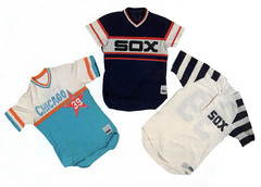
Wednesday’s comments section featured a really great discussion about a 1981 contest sponsored by the White Sox, who invited fans to submit design proposals for the team’s 1982 uniforms. Some of these ideas were produced as prototypes and modeled. That led to further discussion of other MLB prototypes that were produced but never made it onto the field of play, and soon people were saying, “Paul, this would make a great column topic.”
I agree, and now I’m planning to write about this for ESPN. If you know of other prototypes — not just drawings or Photoshop concepts, but actual uniforms that were manufactured with an eye toward potential use — speak up. And don’t limit yourself to baseball, since prototypes have also existed in other sports. For example:
• NFL: The most famous NFL prototype is probably this, which the 49ers introduced at a press conference in 1991. Fan reaction was so intensely negative that the design was withdrawn after one day. There’s a decent roundup of other football helmet prototypes here, but I don’t have any images of full-uniform prototypes. Anyone..?
• NHL: The Blues were ready to roll out this design as an alternate jersey in 1996, until coach Mike Keenan put his foot down. More recently, the Caps were reportedly close to going with this. Anyone got better images of that one, and/or any other team protos?
• NBA: Sigh. As usual, basketball is the least-documented sport here. I can’t think of any NBA prototypes. Little help..?
Should be a great topic — my thanks to everyone who got the ball rolling during the comments thread.
Membership Update: Big arts and crafts day yesterday at Uni Watch HQ, as I trimmed, laminated, and mailed out several dozen membership kits. I’ll do some more today and should be completely caught up by Monday.
Today, incidentally, marks four weeks since the membership program opened for business. In that time, the active roster has swelled to 191 members, and our design gallery is now starting to look like a really cool stamp collection. My continued thanks for all the support — I’m really pleased with how the first month of this project has played out.
Uni Watch News Ticker: Yesterday’s entry about Ted Lilly being AWOL when he was due to bat prompted the following from ballpark historian and longtime Uni Watch pal Todd Radom: “This is DIRECTLY adjacent to the Cubs’ home dugout, literally three steps away. Does it solve the mystery? No, but I needed some rationalization to have taken this photo last year.” … Dubya’s latest jersey: a University of Arizona softball. “Not quite sure why he got the number 7,” writes Chris Falvey. “This is Arizona’s 8th national championship.” … Not uni-related but still plenty interesting. … Roush Racing and the Red Sox ownership group have marked their new partnership with a really pathetic-looking “baseball-themed” car. Look closely and you’ll see that they didn’t even get the 9s right. … Truly insipid 1980s Cabbage Patch Kids commercial viewable here, notable for the fact that the doll has a fairly legit-looking uniform but the players are wearing nausea-inducing knockoffs. … Uni Watch-esque assessment of Wimbledon attire here. … Eric Bangeman reports that Australia’s World Cup unis will look like this (here’s the previous design). “These are made by Canterbury and have grip panels like the new Nike jerseys from England and France, although the Australian jerseys will reportedly have the grip panels in position-specific places,” says Eric.
Kelly Slater seems to be using an interesting link themed surfboard.
Re: the ESPN column…uniform re-designs are one thing (though there are far too many — the strongest franchises don’t change), but changing team colors is another. Plus, I do like the new Blue Jacket uni, but I wish the flag went the other direction, as that’s the way it’s typically presented, even in the column.
Filip Bondy’s column on link is not to be missed.
Not only is that bathroom like 3 steps away from the dugout, the clubhouse is about 6 more, which is more likely where he was… Imagine if this happened to an opposing player, where the visiting clubhouse is much much further.
Silly John…
The idea was to make the flag look like a “C” and if you’re going to do that, that is the way to properly display the flag. It’s swooping in, and that’s the way it would blow if it swooped like that. GREAT UNIS.
Why don’t more teams let fans design their unis? For the love of Mike, I have to imagine that giving the winning fan a full uniform and a season ticket is cheaper than the consulting and design fees they pay. What a great idea!
Good morning! A quick note on a minor league game yesterday between the Pawtucket Red Sox and the Norfolk Tides. The Tides looked particularly natty — nice red and white piping on the cuffs, and EVERY player showed their socks! Boy did that look nice, even with no stirrups. Unfortunately, I have no screen shots (it was on Boston TV since there was no Red Sox game), but I’m sure someone else out there got some pix.
some stuff on espn.com about Wimbledon’s dress issues.
That Cubs bathroom is nasty. It always surprises me to see Major League clubs with such gross facilities.
In 1991 or so, I took a tour of old Arlington Stadium and was shocked by the decrepit locker rooms. Blecch.
[quote comment=”110457″]Kelly Slater seems to be using an interesting link themed surfboard.[/quote]
“iRaq” is the text on the first two images on the board… clever, hahaha
Paul,
I’m sure you’re a busy man, but you promised us some commentary on the new unis – Blue Jackets, Hawks, etc. – and I think it’ll be good reading. I can’t wait to see what you’ve got for us.
That Dolphins helmet on the prototype pages has to be one of the worst I’ve ever seen. Some of the others are pretty good though, and neat to see the expansion teams that never made it in.
Being a Chicagoan I remember when they had that contest for the Sox uniforms. I even remember them on one broadcast where they had guys model them so you knew what each of the top entrants looked like.
[quote comment=”110471″]Paul,
I’m sure you’re a busy man, but you promised us some commentary on the new unis – Blue Jackets, Hawks, etc. – and I think it’ll be good reading. I can’t wait to see what you’ve got for us.[/quote]
He link.
Re: Bush’s #7 Jersey
Maybe it has to do with the year being 2007? Typically, you’d see 07 instead, though…just a thought.
[quote comment=”110471″]Paul,
I’m sure you’re a busy man, but you promised us some commentary on the new unis – Blue Jackets, Hawks, etc. – and I think it’ll be good reading. I can’t wait to see what you’ve got for us.[/quote]
link.
Did anyone notice that the Houston batboy wears “BB” on his back in place of the number? I don’t remember if Paul ever touched on that in his column on bat boys.
No link, but the Houston Dynamo (soccer) were the “Houston 1836” for a week or so. I’m pretty sure I remember prototype jerseys unveiled.
[quote comment=”110479″]No link, but the Houston Dynamo (soccer) were the “Houston 1836” for a week or so. I’m pretty sure I remember prototype jerseys unveiled.[/quote]
Was looking for the jerseys on this, as i do recall them being named that in a contest, and came across this site.
link
some points from yesterdays late comments…
re: keith bullock’s titan’s practice jersey patch.
last season during the titan’s training camp when much focus was on vince young, PL made mention of this, and i think wrote about it on the page 2 article.
re: greg oden and #52.
yesterday someone posted this link to a greg oden blog.
link
he explains his choice of 52
here is one of the first draft photos with non-07 jersey numbers
link
also, interesting on when the espn draft broadcast team showed the new hawks uni, it was adorned with 08 and not 07.
I think Denver raided that last Falcons’ prototype for their post-D helmet . . .
In the 90s, The Spurs started incorporating more and more teal, pink and orange into their color scheme. It made it as far as the team link and IIRC, on the court design and team warm-ups. I would imagine they had a few prototypes done up in anticipation of a full pastel explosion. Anyone have any more insight on this?
Paul, I don’t know how to link but on nhluniforms.com in the 1996-97 there is an the prototype uniforms that were to be worn by the Quebec Nordiques…”Following the 1995 season, the Quebec Nordiques unveiled new uniforms that were to have been worn during the 1995-96 season. However, they ended up applying for a uniform change too late, so they were going to debut them in the 1996-97 season. As everyone knows by now, before these uniforms saw the light of day, the Nordiques were sold and relocated to Denver, Colorado, becoming the Colorado Avalanche. That proved to be very unfortunate for fans in Quebec City, as the Avalanche would go on to win the Stanley Cup in their first season in Denver”
In the “themed cars” department, the Indians have given away a Indians-detailed Mustang the past few years for their “Ultimate Car Giveaway” contest each summer. This is the best picture I could google up, but I’m heading down tonight and can get a pic of this year’s version.
link
link
a uniwatchesque wimbledon column by bonnie desimone. there’s no mention of uniwatch or paul lukas in the column. which seems odd since she’s essentially using his concept.
link
[quote comment=”110478″]Did anyone notice that the Houston batboy wears “BB” on his back in place of the number? I don’t remember if Paul ever touched on that in his column on bat boys.[/quote]
Biggio’s son’s have jerseys that have Biggio and 7 on them when they wear the gray road, and the red Sunday jersey.
I was a kid in the 80s, therefore I somehow had a Cabbage Patch Kid. I did however demand that the one I got was the Cubs one. Unfortunatly the lil guy is at my mom and dad’s house so I can’t get pictures of it. He had some nice stirups, sanies, pinstriped pants, a jersey that was not a pullover, but velcro button up and his hat was actualy a batting helmet. Next time I’m home I’ll try and snap a few pictures. It will be a few months though.
link page from the Society for Sports Uniform Research (link is over there on the right) shows some interesting NFL prototypes, including the design for the expansion St. Louis Stallions, which never happened.
The Stallions were to be owned, in part, by Walter Payton. He was always pissed that the Broncos came in later and stole his uniform design. That helmet is pretty damn close to what they wear now.
Paul,
I remember that old Cabbage Patch Kids commercial. Seeing it again reminds me of something I saw recently while my wife and I were out shopping for our soon to be born daughter.
Build-A Bear has link and they include link! We walked into a Build-A Bear store to see what they had, and an older woman workign there said to me, “You know, kids see me putting the stirrups on the bears and ask me what they are. It’s sad they don’t know what a real baseball uniform should look like.” I decided that my kids would have bears from there in Astros and Yankees uniforms because that nice old lady gets it!
Paul,
Strange as it may seem to us now, but the Green Bay Packers came within one moment of scrapping the famed Lombardi-era uniforms.
In 1993 (after decades of on-field futility), Ron Wolf had a new uniform designed, with metallic gold replacing the athletic gold.
There’s a summary of the change, quote from Wolf on why he decided at the last minute not to make the change, and mockup on my Packer uniform site:
link
[quote comment=”110494″]Paul, I don’t know how to link but on nhluniforms.com in the 1996-97 there is an the prototype uniforms that were to be worn by the Quebec Nordiques…”Following the 1995 season, the Quebec Nordiques unveiled new uniforms that were to have been worn during the 1995-96 season. However, they ended up applying for a uniform change too late, so they were going to debut them in the 1996-97 season. As everyone knows by now, before these uniforms saw the light of day, the Nordiques were sold and relocated to Denver, Colorado, becoming the Colorado Avalanche. That proved to be very unfortunate for fans in Quebec City, as the Avalanche would go on to win the Stanley Cup in their first season in Denver”[/quote]
Heres the link:
Oops, try again:
Sorry can’t get it to work, just cut and paste this to your browser:
link
[quote comment=”110516″]Sorry can’t get it to work, just cut and paste this to your browser: link
Wow…that’s what I owuld imagine is the Timberwolves had a NHL night…
[quote comment=”110479″]No link, but the Houston Dynamo (soccer) were the “Houston 1836” for a week or so. I’m pretty sure I remember prototype jerseys unveiled.[/quote]
I found some articles with link of the logo, but can’t find a jersey. link also has the logo but no other pics. Apparently the 1836 name offended Mexicans (Texas gained independence from Mexico in 1836) Houston didn’t want to piss off their fan base so they changed the name.
Wow, that proposed Blues alternate is horrifying. Just the knowledge that multiple people thought that was a good idea is giving me convulsions.
The design gallery of UniWatch membership cards is a thing of beauty. Almost makes me wish I had a longer last name, to get a proper arch.
On the Red Sox Web page, there is a great picture of Carl Edwards’s (race car driver)new helmet with the Red Sox logo on it. I love it!! But being a huge Red Sox fan I might be a little partical. Paul, I saw the stuff you did on military sports uni’s but have you ever thought of just military uni’s? I would love to hear your opinion on our uniforms. Let me know and I can get you pictures and maybe a uniform.
[quote comment=”110494″]Paul, I don’t know how to link but on nhluniforms.com in the 1996-97 there is an the prototype uniforms that were to be worn by the Quebec Nordiques…”Following the 1995 season, the Quebec Nordiques unveiled new uniforms that were to have been worn during the 1995-96 season. However, they ended up applying for a uniform change too late, so they were going to debut them in the 1996-97 season. As everyone knows by now, before these uniforms saw the light of day, the Nordiques were sold and relocated to Denver, Colorado, becoming the Colorado Avalanche. That proved to be very unfortunate for fans in Quebec City, as the Avalanche would go on to win the Stanley Cup in their first season in Denver”[/quote]
I actually have seen link that CCM designed as a prototype in case the move to Colorado didn’t happen.
Honestly, they look much better in person, but they are not even close to being as good as link.
As I sit here trying to be productive at work on a Friday my mind drifts to grade school when I’d pass time in class sketching up possible hockey and baseball jerseys. Sadley I no longer have any of those note books. It does however make me wonder how many of you have doodled your thoughts for ficticious or real teams. If so care to share?
I can attest to all these logo prototypes…
link
NBA Creative Services in NJ has over two full file drawers of uni prototypes (i mean HUGE).
I need to get my Nike developed Dallas Mavericks prototypes developed for Ross Perot Jr. scanned and posted…
The NBA folks can greatly contribute to the missing 18 minutes of uni tape on NBA prototypes… let’s just say paul if you saw the New Jersey Swamp Dragons unis… well, you might not be here today…Whoa… The Fish that Saved Pisttsburghesque…
link
Yeah, that outrageous…
The Mets also have a bathroom that looks sorta similar to that. Its about 3 feet away from the dugout, on the right, as soon as the players start walking down the tunnel to the locker room.
Fenway Roush Racing didn’t get the nines right on the race car. They are a lot thicker on the car than it is on the uniform. Also, the Angels wore this number style a while ago, (they’re in “The Naked Gun”) does anyone know from where this style originated?
[quote comment=”110512″]Paul,
Strange as it may seem to us now, but the Green Bay Packers came within one moment of scrapping the famed Lombardi-era uniforms.
In 1993 (after decades of on-field futility), Ron Wolf had a new uniform designed, with metallic gold replacing the athletic gold.
There’s a summary of the change, quote from Wolf on why he decided at the last minute not to make the change, and mockup on my Packer uniform site:
link
wow! talk about a comprehensive study!
that forest green and gold actually looks like a solid combination.
i just cant see it ever happening due to the sartorial history of the current packer uni.
the pack drastically changing uni’s would be like if coca cola would ever change its formula and make like new coke or something.
Paul,
Thanks for the link to the ESPN column. Since ESPN.com is blocked at work, I’ll have to read it at home. Sheesh.
damn, i had been looking for those 76ers logo redesign, i remember seeing it on the graphic company’s website…but i couldn’t remember the company to find it again
[quote comment=”110504″]I was a kid in the 80s, therefore I somehow had a Cabbage Patch Kid. I did however demand that the one I got was the Cubs one. Unfortunatly the lil guy is at my mom and dad’s house so I can’t get pictures of it. He had some nice stirups, sanies, pinstriped pants, a jersey that was not a pullover, but velcro button up and his hat was actualy a batting helmet. Next time I’m home I’ll try and snap a few pictures. It will be a few months though.[/quote]
Here are 2 auctions on Ebay for baseball Cabbage Patch Kids, including one with 2 White Sox and a Cubs kids in the same auction.
link
link
[quote comment=”110509″]Paul,
I remember that old Cabbage Patch Kids commercial. Seeing it again reminds me of something I saw recently while my wife and I were out shopping for our soon to be born daughter.
Build-A Bear has link and they include link! We walked into a Build-A Bear store to see what they had, and an older woman workign there said to me, “You know, kids see me putting the stirrups on the bears and ask me what they are. It’s sad they don’t know what a real baseball uniform should look like.” I decided that my kids would have bears from there in Astros and Yankees uniforms because that nice old lady gets it![/quote]
Check out the Cardinals stirrups! The Phillies stirrups (on page 2) have the liberty bell.
link
[quote comment=”110549″][quote comment=”110509″]Paul,
I remember that old Cabbage Patch Kids commercial. Seeing it again reminds me of something I saw recently while my wife and I were out shopping for our soon to be born daughter.
Build-A Bear has link and they include link! We walked into a Build-A Bear store to see what they had, and an older woman workign there said to me, “You know, kids see me putting the stirrups on the bears and ask me what they are. It’s sad they don’t know what a real baseball uniform should look like.” I decided that my kids would have bears from there in Astros and Yankees uniforms because that nice old lady gets it![/quote]
Check out the Cardinals stirrups! The Phillies stirrups (on page 2) have the liberty bell.
link
Red Sox Too
[quote comment=”110549″][quote comment=”110509″]Paul,
I remember that old Cabbage Patch Kids commercial. Seeing it again reminds me of something I saw recently while my wife and I were out shopping for our soon to be born daughter.
Build-A Bear has link and they include link! We walked into a Build-A Bear store to see what they had, and an older woman workign there said to me, “You know, kids see me putting the stirrups on the bears and ask me what they are. It’s sad they don’t know what a real baseball uniform should look like.” I decided that my kids would have bears from there in Astros and Yankees uniforms because that nice old lady gets it![/quote]
Check out the Cardinals stirrups! The Phillies stirrups (on page 2) have the liberty bell.
link
Paul, Build A Bear doesn’t get it. Look at this awful Mets warm up jacket they have. At least they have the Mets bear in pinstripes, a blue hat, and blue stirrups though.
link
[quote comment=”110533″]I can attest to all these logo prototypes…
link
NBA Creative Services in NJ has over two full file drawers of uni prototypes (i mean HUGE).
I need to get my Nike developed Dallas Mavericks prototypes developed for Ross Perot Jr. scanned and posted…
The NBA folks can greatly contribute to the missing 18 minutes of uni tape on NBA prototypes… let’s just say paul if you saw the New Jersey Swamp Dragons unis… well, you might not be here today…Whoa… The Fish that Saved Pisttsburghesque…
link
Yeah, that outrageous…[/quote]
That’s good stuff. The Hawks’ logo on the right looks a lot like an ever-evolving Aerosmith logo.
link
[quote comment=”110506″]link page from the Society for Sports Uniform Research (link is over there on the right) shows some interesting NFL prototypes, including the design for the expansion St. Louis Stallions, which never happened.
The Stallions were to be owned, in part, by Walter Payton. He was always pissed that the Broncos came in later and stole his uniform design. That helmet is pretty damn close to what they wear now.[/quote]
Wow. That Jaguars prototype is hideous with the mismatched shoulders.
Mike Keenan may have done one thing right during his “reign of error” with the St. Louis Blues, in ash-canning that gawd-awful “third” jersey… but managing to run off Wayne Freakin’ Gretzky (!) in a manner of two months and sending the Blues onto the ice in link still gives me the shudders.
Fortunately, the Blues switched to the “third” jersey shown in the link… here’s hoping they follow the Bruins’ lead and make as few changes to those classic sweaters as possible!
It’s also a hoot to check out the membership gallery and see just how many different teams I can instantly identify by the “name and number” style!
I seem to remember when the Oilers switched over to the Titans, there was a prototype made of another helmet when they were trying to decide on the teams new look. The only differences between the two were that the helmet and stripe colors were reversed to make a dark blue helmet with white stripes. I couldn’t find any pics of it, but I am almost 100% it existed and is not just a figment of my imagination.
[quote comment=”110495″]In the “themed cars” department, the Indians have given away a Indians-detailed Mustang the past few years for their “Ultimate Car Giveaway” contest each summer. This is the best picture I could google up, but I’m heading down tonight and can get a pic of this year’s version.
link
This car below was for sale at a few Ford dealers in NY and NJ. I still haven’t seen one on the road, so either they didn’t sell many, or they’re kept in garages.
link
Here’s a Yankees Rolls Royce:
link
I think there are like 150 player signatures on the hood.
link
This photo of link, the manager of the Seattle Pilots, shows him in a version of the link hat that was never worn. The fact that he’s drinking a martini (not his usual Bud), makes me think he was at some Seattle meet-and-greet. Always thought it was odd…
I wonder how Paul reacted when he read this quote from James Blake in the tennis article:
“I wear what Nike tells me to wear.”
Here’s the Red Sox NASCAR racing helmet picture:
link
For anyone that doesn’t know, the guy driving the Red Sox car this weekend is the guy that does backflips off his car if he wins a race. Good luck this weekend Carl Edwards!
link
[quote comment=”110569″]This photo of link, the manager of the Seattle Pilots, shows him in a version of the link hat that was never worn. The fact that he’s drinking a martini (not his usual Bud), makes me think he was at some Seattle meet-and-greet. Always thought it was odd…[/quote]
Wow. That is odd – I’ve never seen that one. Good catch!
And for the record, he appears to be drinking champagne out of a coupe glass, not a martini…. ;)
[quote comment=”110493″]In the 90s, The Spurs started incorporating more and more teal, pink and orange into their color scheme. It made it as far as the team link and IIRC, on the court design and team warm-ups. I would imagine they had a few prototypes done up in anticipation of a full pastel explosion. Anyone have any more insight on this?[/quote]
link. Note the warm-up shirt.
[quote comment=”110512″]Paul,
Strange as it may seem to us now, but the Green Bay Packers came within one moment of scrapping the famed Lombardi-era uniforms.
In 1993 (after decades of on-field futility), Ron Wolf had a new uniform designed, with metallic gold replacing the athletic gold.
There’s a summary of the change, quote from Wolf on why he decided at the last minute not to make the change, and mockup on my Packer uniform site:
link
I have a great story relating to this: Back in 1993, long before I came up with the idea for Uni Watch, I heard the news about the Packers possibly changing their uniforms. I was so upset that I actually wrote a letter to the Packers — and was astonished when Pack prexy Bob Harlan called me on the phone to respond. I said, “Don’t you have, um, more important things to be doing?” To which he responded, “Well, I like to stay in touch with the fans when I can.”
Anyway, he reassured me that the team had decided to stick with their classic look. I asked if he could send me a letter summarizing our conversation, because it would be fun to have a written souvenir of our exchange, and sure enough, a letter arrived a few days later. Not sure I still have the original letter, but I reproduced it on the back cover of the next issue of the zine I was publishing at the time (the previous issue of which had included a little rant about the uni situation), as you can see link.
I would be another five and a half years before I came up with the full concept for Uni Watch, but this incident clearly shows that it was in my blood for a long time.
Allow me to be the only one. I like the White Sox uni in pale blue and orange, and I like the Dolphins helmet from the other site.
So there.
[quote comment=”110465″]Silly John…
The idea was to make the flag look like a “C” and if you’re going to do that, that is the way to properly display the flag. It’s swooping in, and that’s the way it would blow if it swooped like that. GREAT UNIS.
Why don’t more teams let fans design their unis? For the love of Mike, I have to imagine that giving the winning fan a full uniform and a season ticket is cheaper than the consulting and design fees they pay. What a great idea![/quote]
It just looks backwards, its like having a tattoo with its head point backward, it just looks wrong.
[quote comment=”110530″]As I sit here trying to be productive at work on a Friday my mind drifts to grade school when I’d pass time in class sketching up possible hockey and baseball jerseys. Sadley I no longer have any of those note books. It does however make me wonder how many of you have doodled your thoughts for ficticious or real teams. If so care to share?[/quote]
I did the same. I especially remember a set of logos for MLB expansion teams (Denver, Miami, DC, Vancouver, Phoenix and Buffalo). I think some of them might be in my basement. Have to take a look over the weekend.
The AP made a uni-related blunder.
link on last night’s USA-ARG game claims that Maradona was wearing an Argentina jersey. He wasn’t. Instead he wore link. The real deal (ca 1986) link.
The difference is the crest. The real McCoy is squarish and reads “AFA” while the impostor is heart-shaped and just “86.” Diego thinks we can’t remember which year he won the cup?
[quote comment=”110552″][quote comment=”110549″][quote comment=”110509″]Paul,
I remember that old Cabbage Patch Kids commercial. Seeing it again reminds me of something I saw recently while my wife and I were out shopping for our soon to be born daughter.
Build-A Bear has link and they include link! We walked into a Build-A Bear store to see what they had, and an older woman workign there said to me, “You know, kids see me putting the stirrups on the bears and ask me what they are. It’s sad they don’t know what a real baseball uniform should look like.” I decided that my kids would have bears from there in Astros and Yankees uniforms because that nice old lady gets it![/quote]
Check out the Cardinals stirrups! The Phillies stirrups (on page 2) have the liberty bell.
link
Paul, Build A Bear doesn’t get it.
Look at this awful Mets warm up jacket they have.
At least they have the Mets bear in pinstripes, a blue hat, and blue stirrups though.
link
They get it enough to not have the black home jersey and cap! And they have my favorite link of all time…even if it doesn’t have the cartoon bird on it.
if they had a line of throwback unis, i think i would cry…
[quote comment=”110576″][quote comment=”110512″]Paul,
Strange as it may seem to us now, but the Green Bay Packers came within one moment of scrapping the famed Lombardi-era uniforms.
In 1993 (after decades of on-field futility), Ron Wolf had a new uniform designed, with metallic gold replacing the athletic gold.
There’s a summary of the change, quote from Wolf on why he decided at the last minute not to make the change, and mockup on my Packer uniform site:
link
I have a great story relating to this: Back in 1993, long before I came up with the idea for Uni Watch, I heard the news about the Packers possibly changing their uniforms. I was so upset that I actually wrote a letter to the Packers — and was astonished when Pack prexy Bob Harlan called me on the phone to respond. I said, “Don’t you have, um, more important things to be doing?” To which he responded, “Well, I like to stay in touch with the fans when I can.”
Anyway, he reassured me that the team had decided to stick with their classic look. I asked if he could send me a letter summarizing our conversation, because it would be fun to have a written document of our exchange, and sure enough, a letter arrived a few days later. Not sure I still have the original letter, but I reproduced it on the back cover of the next issue of the zine I was publishing at the time (the previous issue of which had included a little rant about the uni situation), as you can see link.
I would be another five and a half years before I came up with the full concept for Uni Watch, but this incident clearly shows that it was in my blood for a long time.[/quote]
stories like this are classic… id love to read the letter you sent.
PL, we know that often you write other pieces unrelated to this genre (food, commercial products, minutae, etc). I know you dont like to toot your own horn really, but how bout a link to other pieces you publish so those of us who enjoy your work can read that too.
[quote comment=”110584″]The AP made a uni-related blunder.
link on last night’s USA-ARG game claims that Maradona was wearing an Argentina jersey. He wasn’t. Instead he wore link. The real deal (ca 1986) link.
The difference is the crest. The real McCoy is squarish and reads “AFA” while the impostor is heart-shaped and just “86.” Diego thinks we can’t remember which year he won the cup?[/quote]
Maybe he doesn’t want anyone to remember how the link helped that ’86 Argentinian team?
Somebody is going to ask for a legible blow-up of this, so I’ll do my best with the transcription. (The hardest part is the numbers.)
September 15, 1993
Mr. Paul Lukas
550(?) St. Johns Place
Brooklyn, NY 11217(?)
Dear Mr. Lukas:
As a followup to our telephone conversation today, I am sending you a brief description of the uniform changes planned by the Packers.
We will retain the current dark green, but will switch the pants and helmets from the present mustard yellow to a metallic gold. The stripes that now appear on the Packers’ helmet, jersey, and pants also will be removed.
The helmet will have a large green “G†on each side and the jersey will have a smaller green “G†on each sleeve. The white numbers on the green home jerseys and the green numbers on the white away jerseys also will have a gold “G†on the front left side. The socks will not change—green and white with no stripes.
The Packers had gold helmets and pants many years ago, and both Ron Wolf and Mike Holmgren have tremendous respect for the Green Bay tradition, prefer a uniform with a cleaner design and want the proposed changes.
I can guarantee you that the Packers will have a class(?) uniform.
We greatly appreciate your interest in the Packers.
Best wishes.
Sincerely,
Robert K. Harlan
President & CEO
damn, i had been looking for those 76ers logo redesign, i remember seeing it on the graphic company’s website…but i couldn’t remember the company to find it again
Phoenix Design Works did the initial changes and then Rickabaugh and NBA Creative Services did the current 76ers mark..which has held up well over time…
[quote comment=”110528″][quote comment=”110494″]Paul, I don’t know how to link but on nhluniforms.com in the 1996-97 there is an the prototype uniforms that were to be worn by the Quebec Nordiques…”Following the 1995 season, the Quebec Nordiques unveiled new uniforms that were to have been worn during the 1995-96 season. However, they ended up applying for a uniform change too late, so they were going to debut them in the 1996-97 season. As everyone knows by now, before these uniforms saw the light of day, the Nordiques were sold and relocated to Denver, Colorado, becoming the Colorado Avalanche. That proved to be very unfortunate for fans in Quebec City, as the Avalanche would go on to win the Stanley Cup in their first season in Denver”[/quote]
I actually have seen link that CCM designed as a prototype in case the move to Colorado didn’t happen.
Honestly, they look much better in person, but they are not even close to being as good as link.[/quote]
Teebz – I had seen them in the past – and NEVER NOTICED the fleur-de-lis on the shoulders – I have to have one of those now!!
[quote comment=”110573″]Here’s the Red Sox NASCAR racing helmet picture:
link
For anyone that doesn’t know, the guy driving the Red Sox car this weekend is the guy that does backflips off his car if he wins a race.
Good luck this weekend Carl Edwards!
link
the seam looks amazing, for a second I actually thought the helmet was molded with the seam line in it.
[quote comment=”110591″]Somebody is going to ask for a legible blow-up of this, so I’ll do my best with the transcription. (The hardest part is the numbers.)
September 15, 1993
Mr. Paul Lukas
550(?) St. Johns Place
Brooklyn, NY 11217(?)
Dear Mr. Lukas:
As a followup to our telephone conversation today, I am sending you a brief description of the uniform changes planned by the Packers.
We will retain the current dark green, but will switch the pants and helmets from the present mustard yellow to a metallic gold. The stripes that now appear on the Packers’ helmet, jersey, and pants also will be removed.
The helmet will have a large green “G†on each side and the jersey will have a smaller green “G†on each sleeve. The white numbers on the green home jerseys and the green numbers on the white away jerseys also will have a gold “G†on the front left side. The socks will not change—green and white with no stripes.
The Packers had gold helmets and pants many years ago, and both Ron Wolf and Mike Holmgren have tremendous respect for the Green Bay tradition, prefer a uniform with a cleaner design and want the proposed changes.
I can guarantee you that the Packers will have a class(?) uniform.
We greatly appreciate your interest in the Packers.
Best wishes.
Sincerely,
Robert K. Harlan
President & CEO[/quote]
Mike, you’re too kind. You’re right too, someone would’ve definitely asked for it to be typed out….
Here it is:
link
Fun and weirdly wacky…and speaking of weird and wacky… check out the grunge warm-ups of the Sonics…
link
Wacky
[quote comment=”110587″]PL, we know that often you write other pieces unrelated to this genre (food, commercial products, minutae, etc). I know you dont like to toot your own horn really, but how bout a link to other pieces you publish so those of us who enjoy your work can read that too.[/quote]
Some of my food-related stories are available at the following links (the first of which also includes a link to a story about the recent No Mas event):
link
link
link
link
link
Some of my business writing is available here:
link
And here’s a travel article:
link
[quote comment=”110533″]I can attest to all these logo prototypes…
link
NBA Creative Services in NJ has over two full file drawers of uni prototypes (i mean HUGE).
I need to get my Nike developed Dallas Mavericks prototypes developed for Ross Perot Jr. scanned and posted…
The NBA folks can greatly contribute to the missing 18 minutes of uni tape on NBA prototypes… let’s just say paul if you saw the New Jersey Swamp Dragons unis… well, you might not be here today…Whoa… The Fish that Saved Pisttsburghesque…
link
Yeah, that outrageous…[/quote]
Wow… did anyone else notice how close the link looks to this link? Nothing about the Titans is original…
Check out the almost approved Atlanta Hawks jersey on the Stacey Augmon figurine?
link
Yellow pinstripes down the left side of the uni…
[quote comment=”110596″][quote comment=”110528″][quote comment=”110494″]Paul, I don’t know how to link but on nhluniforms.com in the 1996-97 there is an the prototype uniforms that were to be worn by the Quebec Nordiques…”Following the 1995 season, the Quebec Nordiques unveiled new uniforms that were to have been worn during the 1995-96 season. However, they ended up applying for a uniform change too late, so they were going to debut them in the 1996-97 season. As everyone knows by now, before these uniforms saw the light of day, the Nordiques were sold and relocated to Denver, Colorado, becoming the Colorado Avalanche. That proved to be very unfortunate for fans in Quebec City, as the Avalanche would go on to win the Stanley Cup in their first season in Denver”[/quote]
I actually have seen link that CCM designed as a prototype in case the move to Colorado didn’t happen.
Honestly, they look much better in person, but they are not even close to being as good as link.[/quote]
Teebz – I had seen them in the past – and NEVER NOTICED the fleur-de-lis on the shoulders – I have to have one of those now!![/quote]
I can honestly say that you’ll never find one. I offered the guy $300 for just the jersey, and he flat-out said he wouldn’t take less than $2000.
Sonuva… damned collectors. ;o)
Paul,
Not to be picky (which is funny, you know, because I am being picky)….
I didn’t mention the George Bush #7 thing. Not sure who did? If it even matters that much… just FYI!
I did send you some of that White Sox stuff, and absolutely cannot wait for this ESPN article.
[quote comment=”110604″][quote comment=”110587″]PL, we know that often you write other pieces unrelated to this genre (food, commercial products, minutae, etc). I know you dont like to toot your own horn really, but how bout a link to other pieces you publish so those of us who enjoy your work can read that too.[/quote]
Some of my food-related stories are available at the following links (the first of which also includes a link to a story about the recent No Mas event):
link
link
link
link
link
Some of my business writing is available here:
link
And here’s a travel article:
link
No way… you write for AmericanWay? Anything in the latest issue? I’ll be on a flight tomorrow…
A few things from the Copa America:
1) Did anyone notice Paraguay’s new jerseys? Apparently they’ve switched from Puma to Adidas, and they’re using a new template I’ve never seen before. Additionally, (and hideously) they are using Adidas’ modified-Bauhaus numbers but not completing the package by going with the Bauhaus names. And there is really weird spacing in the names among all of the players–Lopez has like 3 inches between each letter but long names look smushed together.
2)Nice striped socks from Argentina.
3)I noticed (at least I think I did) that the USA had some printing discrepancies: It looked like some players had a red border around their white numbers and some didn’t. Did anyone else see this?
[quote comment=”110608″]Check out the almost approved Atlanta Hawks jersey on the Stacey Augmon figurine?
link
Yellow pinstripes down the left side of the uni…[/quote]
Was that a REAL proposed uni? Or just the toy maker fooling around?
[quote comment=”110601″][quote comment=”110591″]Somebody is going to ask for a legible blow-up of this, so I’ll do my best with the transcription. (The hardest part is the numbers.)
September 15, 1993
Mr. Paul Lukas
550(?) St. Johns Place
Brooklyn, NY 11217(?)
Dear Mr. Lukas:
As a followup to our telephone conversation today, I am sending you a brief description of the uniform changes planned by the Packers.
We will retain the current dark green, but will switch the pants and helmets from the present mustard yellow to a metallic gold. The stripes that now appear on the Packers’ helmet, jersey, and pants also will be removed.
The helmet will have a large green “G†on each side and the jersey will have a smaller green “G†on each sleeve. The white numbers on the green home jerseys and the green numbers on the white away jerseys also will have a gold “G†on the front left side. The socks will not change—green and white with no stripes.
The Packers had gold helmets and pants many years ago, and both Ron Wolf and Mike Holmgren have tremendous respect for the Green Bay tradition, prefer a uniform with a cleaner design and want the proposed changes.
I can guarantee you that the Packers will have a class(?) uniform.
We greatly appreciate your interest in the Packers.
Best wishes.
Sincerely,
Robert K. Harlan
President & CEO[/quote]
Mike, you’re too kind.
You’re right too, someone would’ve definitely asked for it to be typed out….[/quote]
Mike – Thanks.
Joey – It wouldn’ve been me.
Oh, and this was going to be the Denver Nuggets primary logo back in 1998-99…until a certain Commissioner killed it because of a process matter.
link
Hate when that happens…
Last night he U.S. played like a team that wears pinstriped jerseys.
Wow, that Tampa Bay solid Pewter would have redefined how awful the monochrome NFL uniforms already are.
whats up with this bucs jersey? has this been talked about before?
link
You know how certain things just get emblazoned in your head forever? This topic of “could’ve been” unis and teams reminded me of an article I read years ago about potential new NFL teams. I remember 2 of the team names – Baltimore Bombers and St. Louis Stallions – and a simple Google search yielded a good site that many of you may have been to before.
link
I think these prototype teams were finalists in the expansion that brought the Panthers and Jaguars to the NFL.
Maybe he doesn’t want anyone to remember how the “Hand of God†helped that ‘86 Argentinian team?
Hell, no! He wants us to remember that (and the Goal of the Century in the same match) and forget his expulsion from the 1994 cup.
Was reading Bill Simmons NBA draft diary and he had a good idea that would make for a good UniWatch topic.
“4:58: Boston picks Jeff Green for Seattle at No. 5, but Green has to go through the charade of wearing a Celtics hat for the next few minutes because the trade hasn’t been officially announced yet. Topps needs to release a special series: ‘Trading cards of NBA draft picks who had to wear the wrong caps for 15 minutes.’”
BTW: How good of a Monday Night Football broadcast team would Bill Simmons, Paul Lukas and Brett Favre make?
That would be friggin awesome.
[quote comment=”110608″]Check out the almost approved Atlanta Hawks jersey on the Stacey Augmon figurine?
link
Yellow pinstripes down the left side of the uni…[/quote]
Wow, so I guess Stacey Augmon really is Plastic Man!
[quote comment=”110609″][quote comment=”110596″][quote comment=”110528″][quote comment=”110494″]Paul, I don’t know how to link but on nhluniforms.com in the 1996-97 there is an the prototype uniforms that were to be worn by the Quebec Nordiques…”Following the 1995 season, the Quebec Nordiques unveiled new uniforms that were to have been worn during the 1995-96 season. However, they ended up applying for a uniform change too late, so they were going to debut them in the 1996-97 season. As everyone knows by now, before these uniforms saw the light of day, the Nordiques were sold and relocated to Denver, Colorado, becoming the Colorado Avalanche. That proved to be very unfortunate for fans in Quebec City, as the Avalanche would go on to win the Stanley Cup in their first season in Denver”[/quote]
I actually have seen link that CCM designed as a prototype in case the move to Colorado didn’t happen.
Honestly, they look much better in person, but they are not even close to being as good as link.[/quote]
Teebz – I had seen them in the past – and NEVER NOTICED the fleur-de-lis on the shoulders – I have to have one of those now!![/quote]
I can honestly say that you’ll never find one. I offered the guy $300 for just the jersey, and he flat-out said he wouldn’t take less than $2000.
Sonuva… damned collectors. ;o)[/quote]
linkyou go Teebz. Now you can have your Nordiques jersey.
[quote comment=”110625″]whats up with this bucs jersey? has this been talked about before?
link
A few hundred times. Its the practice jersey that has been around a couple years.
Joakim Noah is a crazy man
link
[quote comment=”110622″]Wow, that Tampa Bay solid Pewter would have redefined how awful the monochrome NFL uniforms already are.[/quote]
Where’s the link to the Tampa Bay solid pewter uniforms?
[quote comment=”110625″]whats up with this bucs jersey? has this been talked about before?
link
It’s their link.
[quote comment=”110636″]
linkyou go Teebz. Now you can have your Nordiques jersey.[/quote]
I used to work there. That’s where I saw the prototype Nords jersey.
To be honest, I know way too much about their business to ever shop there again. “Highway robbery” is the only term that can describe their business.
On the other hand, some of their sales are ok. All I know is that I learned more there than I’ve ever needed to know about sports apparel. And hockey was always the topic of the day.
Paul – A little off topic but this story shows prototypes of uni’s when Indianpolis was trying to land an MLB team in the 1980’s.
link
Not uni related at all, just some Friday humor. So I was at the rain delayed, then played, then rain shortened Mets game on Wednesday, and I was strolling around the stadium, and I came across this funny season ticket holder name plate:
link
I guess the Mets didn’t know what the joke was, or haven’t seen “There’s Something About Mary” either…..
[quote comment=”110643″][quote comment=”110636″]
linkyou go Teebz. Now you can have your Nordiques jersey.[/quote]
I used to work there. That’s where I saw the prototype Nords jersey.
To be honest, I know way too much about their business to ever shop there again. “Highway robbery” is the only term that can describe their business.
On the other hand, some of their sales are ok. All I know is that I learned more there than I’ve ever needed to know about sports apparel. And hockey was always the topic of the day.[/quote]
So you know where to get a sweet Nordiques jersey yet choose not too? I know of other places you can find them thanks to the Vintage collection reproducing them. I’d be interested to know what went on behind the scenes, but also understand if you chose not to share.
[quote comment=”110641″][quote comment=”110622″]Wow, that Tampa Bay solid Pewter would have redefined how awful the monochrome NFL uniforms already are.[/quote]
Where’s the link to the Tampa Bay solid pewter uniforms?[/quote]
See post #28
[quote comment=”110652″][quote comment=”110641″][quote comment=”110622″]Wow, that Tampa Bay solid Pewter would have redefined how awful the monochrome NFL uniforms already are.[/quote]
Where’s the link to the Tampa Bay solid pewter uniforms?[/quote]
See post #28[/quote]
Ew…I’d like to have seen it worn for one game, just to see it in action. The Jacksonville proposed expansion uniform is awful, except for the IDEA of a silver helmet.
with ‘zonas visit to the white house, i notice pitcher taryne mowatt (as i did for the entire wcwc)
but i prefer to see these pics of her found on this lsu message board
link
[quote comment=”110644″]Paul – A little off topic but this story shows prototypes of uni’s when Indianpolis was trying to land an MLB team in the 1980’s.
[/quote]
Large version:
link
[quote comment=”110645″]http://www.ssur.org/articles/items/20050708_IndianapolisArrows.htm[/quote]
What’s the deal with the blue-on-white uni on the back? An alternate? The blue is different than the other ones. Hmmmm…
[quote comment=”110651″][quote comment=”110643″][quote comment=”110636″]
linkyou go Teebz. Now you can have your Nordiques jersey.[/quote]
I used to work there. That’s where I saw the prototype Nords jersey.
To be honest, I know way too much about their business to ever shop there again. “Highway robbery” is the only term that can describe their business.
On the other hand, some of their sales are ok. All I know is that I learned more there than I’ve ever needed to know about sports apparel. And hockey was always the topic of the day.[/quote]
So you know where to get a sweet Nordiques jersey yet choose not too? I know of other places you can find them thanks to the Vintage collection reproducing them. I’d be interested to know what went on behind the scenes, but also understand if you chose not to share.[/quote]
I chose not to buy one there for a number of reasons – most notably due to their ridiculius prices. I also choose not to buy a “vintage” jersey because they are not the real thing.
As for telling what goes on behind the scenes, I’m not one to “kiss and tell” so to speak.
[quote comment=”110665″]
I chose not to buy one there for a number of reasons – most notably due to their ridiculius prices. I also choose not to buy a “vintage” jersey because they are not the real thing.
As for telling what goes on behind the scenes, I’m not one to “kiss and tell” so to speak.[/quote]
“Ridiculous” – I can spell on anything but Fridays. :o)
I remember when the SF Giants were threatening to move to St. Pete, there were some boring “SP” hats for sale that looked like the “SF” hats. I couldn’t find a link.
[quote comment=”110608″]Check out the almost approved Atlanta Hawks jersey on the Stacey Augmon figurine?
link
Yellow pinstripes down the left side of the uni…[/quote]
There’s a McFarlane action figure showing Michael Redd in a green alternate that the Bucks apparently considered but didn’t actually ever wear:
link
[quote comment=”110576″]
I have a great story relating to this: Back in 1993, long before I came up with the idea for Uni Watch, I heard the news about the Packers possibly changing their uniforms. I was so upset that I actually wrote a letter to the Packers — and was astonished when Pack prexy Bob Harlan called me on the phone to respond. I said, “Don’t you have, um, more important things to be doing?” To which he responded, “Well, I like to stay in touch with the fans when I can.”
Anyway, he reassured me that the team had decided to stick with their classic look. I asked if he could send me a letter summarizing our conversation, because it would be fun to have a written souvenir of our exchange, and sure enough, a letter arrived a few days later. Not sure I still have the original letter, but I reproduced it on the back cover of the next issue of the zine I was publishing at the time (the previous issue of which had included a little rant about the uni situation), as you can see link.
[/quote]
Paul,
Could I summarize the exchange (or even better, reproduce the letter) on my site? I’d love to be able to add your experience.
FWIW, I’m one of the few rabid Packer fans who would have welcomed the change.
[quote comment=”110470″][quote comment=”110457″]Kelly Slater seems to be using an interesting link themed surfboard.[/quote]
“iRaq” is the text on the first two images on the board… clever, hahaha[/quote]
link
[quote comment=”110670″]I remember when the SF Giants were threatening to move to St. Pete, there were some boring “SP” hats for sale that looked like the “SF” hats. I couldn’t find a link.[/quote]
I went looking for some Tampa Bay Giants jersey prototypes. Didn’t find any jerseys, but found link pretty funny site.
[quote comment=”110679″][quote comment=”110576″]
I have a great story relating to this: Back in 1993, long before I came up with the idea for Uni Watch, I heard the news about the Packers possibly changing their uniforms. I was so upset that I actually wrote a letter to the Packers — and was astonished when Pack prexy Bob Harlan called me on the phone to respond. I said, “Don’t you have, um, more important things to be doing?” To which he responded, “Well, I like to stay in touch with the fans when I can.”
Anyway, he reassured me that the team had decided to stick with their classic look. I asked if he could send me a letter summarizing our conversation, because it would be fun to have a written souvenir of our exchange, and sure enough, a letter arrived a few days later. Not sure I still have the original letter, but I reproduced it on the back cover of the next issue of the zine I was publishing at the time (the previous issue of which had included a little rant about the uni situation), as you can see link.
[/quote]
Paul,
Could I summarize the exchange (or even better, reproduce the letter) on my site? I’d love to be able to add your experience.
FWIW, I’m one of the few rabid Packer fans who would have welcomed the change.[/quote]
Mike Engle transcribed it on link.
I heard on KNBR, the SF Giants flagship station, that they are going to honor Rod Beck with a patch of some kind on their jersey.
I am for honoring Rod Beck, but they already have their All-Star patch and regular logo path on each sleeve. I’d be curious to find out which side it will be on.
They said they will wear them beginning tonight.
I remember reading in the Boston Globe several years back that the Patriots introduced a proposed new design for their helmet during a 1979 preseason game — nope, not Elvis Patriot, but a sleek “P” — to see what the fan reaction would be. When the logo was unveiled (on a billboard-sized sheet, I guess? it wasn’t on an actual helmet), the reaction from the crowd supposedly hinted of armed insurrection, and the idea was scrapped.
I wonder if anyone here recalls that event, and have always been curious as to whether any images of the ill-fated redesign survive.
i was looking for something on google when this picture turned up.
link
the pic isn’t new but i don’t remember seeing it on here. i nearly fell out of my chair when i saw this. this dude is hard core.
Man, those guys in that commercial were seriously marking out over Oliver when got to ballpark. I remember him being quite the acquisition, what with having the smallest strike zone in the majors and all. But I believe he hit his slump in early-August of that year, and never did pull the Vets from the rut that kept them from playoff contention. I hear that after this particular season, Oliver had begun drinking heavily between innings and was consistently getting in fights on and off the field, even with his own teammates. He was eventually released from his contract the next Spring. Last I heard, Oliver is a gate greeter at a West Texas outdoor flea market. It’s really sad to see some of these great ball players as mere shells of their former selves. Like that Air Bud fellow.
Anyone watching the Mets-Phillies game. I’m listening online and apparently there’s something on El Duque’s cap. He had to fork it over to the umpire.
not really a prototype but the new york giants only wore these helmets in 1975
link
link
link
[quote comment=”110469″]That Cubs bathroom is nasty. It always surprises me to see Major League clubs with such gross facilities.
In 1991 or so, I took a tour of old Arlington Stadium and was shocked by the decrepit locker rooms. Blecch.[/quote]
Arlington Stadium wasn’t much because it had been originally built as a minor league stadium for the Double A Texas Spurs. It was also originally named, rather ungloriously, Turnpike Stadium.
Stadium history: link
With a name like Turnpike Stadium and a pedigree as a minor league stadium, players had to know they weren’t getting the nicest digs in the league.
Heres an interseting basketball jersey from Austrailia. The jersey has lights that shows the players points, fouls and other game info. I would never want this jersey.
link
[quote comment=”110689″]i was looking for something on google when this picture turned up.
link
the pic isn’t new but i don’t remember seeing it on here. i nearly fell out of my chair when i saw this. this dude is hard core.[/quote]
Eh, looks like a jock-sniffer to me. JK
Those rugby jerseys even make fit professional ruggers look like they have man boobs (moobs). I’d look like Dolly Parton in them. Booo awful world cup jerseys. Horray beer!
Fenway Park’s link has a urinal IN it. (seventh pic down the page). On the home side, I’ve seen an old pic of Jim Rice, I think, taking a leak at a urinal in the hallway between dugout and clubhouse.
With the comment about players in the draft wearing hats for teams, even though they have been traded. Made me wonder about Brandan Wright. Because the Warriors traded J-Rich before the draft for the pick but didnt announce it until after there second pick in the draft because it was part of the trade also, so for the those few hours that wright was talking to everyone about being a bobcat, did he really know he was a warrior.
Also with logo’s why on every site for the NBA they always show the Warriors logo with thunder in it as the main logo. But two or three years ago the warriors completely scrapped that logo in all publications and uniform realated stuff. They just use the W logo for everything now.
In the Cabbage Patch Kids “Roger Oliver” ad (is that Candlestick Park?), what’s the guy saying at the beginning? “…slider, I figure I’ve got 20 [something something].”
And on their unis: Looks like they’ve got very think blue armbands. Hard to tell with the button up long-sleeve undershirts being almost the same color blue. But do some pausing and squinting.
I’ve never seen that Jays jersey that was talked about yestereday, but I have seen another one that was all charcoal and can be found on Chris Creamer’s site… actually saw it on a clearance rack at the Dome but didn’t buy it because I’d never seen it worn and thought it was just some kind of knock off thing.
[quote comment=”110698″]
Arlington Stadium wasn’t much because it had been originally built as a minor league stadium for the Double A Texas Spurs. It was also originally named, rather ungloriously, Turnpike Stadium.
Stadium history: link
With a name like Turnpike Stadium and a pedigree as a minor league stadium, players had to know they weren’t getting the nicest digs in the league.[/quote]
Somebody (named me) wrote a nice little link about that park…
WFL/NFL Europa had link.
Time for a Uni-Retrospective.
My nominee for link.
[quote comment=”110726″]WFL/NFL Europa had link.
Time for a Uni-Retrospective.
My nominee for link.[/quote]
198/1999 Jersey is the link.
some updated draft picks with numbers
detroit pistons
rodney stuckey
link
aaron afflalo
link
usually when i watch the draft and i see the foreign players go, i shrug my shoulders.
but from the tape i saw last night of many of these overseas players, i was impressed with the talent.
[quote comment=”110726″]WFL/NFL Europa had link.
Time for a Uni-Retrospective.
My nominee for link.[/quote]
Other nominees:
link
link
I like the Rhein Fire personally. However Barcelona is a probably a close second.
i can’t find the photos anywhere, i wish i would’ve saved the one that was online, maybe you guys will know where to look.
there was an ebay auction for the dallas stars’ never worn link that was an actual jersey. he wanted like $300 or i would’ve bought it. He had an elaborate story that a few jerseys had made it into stores before the jersey idea was scrapped, and when the team said they weren’t going to use the jersey, the stores had to punch a hole in the NHL logo on the back hem.
the other was an article in the Pittsburgh Post Gazette that the Steelers had designed and approved a gold third jersey for use against southern teams who wear their white jersey at home. (black jerseys in the hot sun are a bad mix). i never heard anything about it since, but the article had a black and white photo of it, didn’t look that bad…
anybody else hear/see these?
[quote comment=”110659″]with ‘zonas visit to the white house, i notice pitcher taryne mowatt (as i did for the entire wcwc)
but i prefer to see these pics of her found on this lsu message board
link
She looked better in those photos and in person than she did on the HDTV I watched the WCWS Finals on, where you could see her acne. I couldn’t see the blemishes from my seat in the fifth row behind home plate at OKC during the first four days of the WCWS.
[quote comment=”110557″]Mike Keenan may have done one thing right during his “reign of error” with the St. Louis Blues, in ash-canning that gawd-awful “third” jersey… but managing to run off Wayne Freakin’ Gretzky (!) in a manner of two months and sending the Blues onto the ice in link still gives me the shudders.
Fortunately, the Blues switched to the “third” jersey shown in the link… here’s hoping they follow the Bruins’ lead and make as few changes to those classic sweaters as possible!
It’s also a hoot to check out the membership gallery and see just how many different teams I can instantly identify by the “name and number” style![/quote]
I asked a Blues VP at the draft party about the Blues new unis. He said they are going to include some vertical stripes from the armpit to the bottom of the jersey. But he also said other than that they look similar to what they currently wear. He said he likes the current look and thinks the new ones look good too.
Don’t worry, I don’t think we will be seeing red or trumpets on Blues unis anytime soon.
[quote comment=”110714″]Fenway Park’s link has a urinal IN it. (seventh pic down the page). On the home side, I’ve seen an old pic of Jim Rice, I think, taking a leak at a urinal in the hallway between dugout and clubhouse.[/quote]
The Metrodome also has crappers just behind the dugouts (sorry, no pics), but I think that’s more of a necessity than convenience, because there are about 50,000 steps that go up to the lockerrooms from the dugouts – it’s a hell of a climb. It would take days to resume the game if somebody had to go all the way up there just to “drop a Jeter” (deuce).
I’ve had the misfortune of playing in that dump (pardon the pun) a few times, and while the restroom doesn’t seem to be in the state of decay as the one at Wrigley, I don’t believe it’s high on the list of priorities of the cleaning crew. There was always quite a bit of chaw spit on the floor in there.
[quote comment=”110530″]As I sit here trying to be productive at work on a Friday my mind drifts to grade school when I’d pass time in class sketching up possible hockey and baseball jerseys. Sadley I no longer have any of those note books. It does however make me wonder how many of you have doodled your thoughts for ficticious or real teams. If so care to share?[/quote]
I was doodling in a meeting at work just this morning.
[quote comment=”110741″]i can’t find the photos anywhere, i wish i would’ve saved the one that was online, maybe you guys will know where to look.
there was an ebay auction for the dallas stars’ never worn link that was an actual jersey. he wanted like $300 or i would’ve bought it. He had an elaborate story that a few jerseys had made it into stores before the jersey idea was scrapped, and when the team said they weren’t going to use the jersey, the stores had to punch a hole in the NHL logo on the back hem.
the other was an article in the Pittsburgh Post Gazette that the Steelers had designed and approved a gold third jersey for use against southern teams who wear their white jersey at home. (black jerseys in the hot sun are a bad mix). i never heard anything about it since, but the article had a black and white photo of it, didn’t look that bad…
anybody else hear/see these?[/quote]
A few months ago on eBay, I found a gold Kordell Stewart Steelers jersey. It was gold with black numbers and looked really nice. It was only like $50 or $60 I think. I wished I’d had bought it now.
[quote comment=”110723″][quote comment=”110698″]
Arlington Stadium wasn’t much because it had been originally built as a minor league stadium for the Double A Texas Spurs. It was also originally named, rather ungloriously, Turnpike Stadium.
Stadium history: link
With a name like Turnpike Stadium and a pedigree as a minor league stadium, players had to know they weren’t getting the nicest digs in the league.[/quote]
Somebody (named me) wrote a nice little link about that park…[/quote]
Jere, you forgot to mention that the upper deck behind home plate was used as a backdrop for the ‘on field interview’ of Tim Robbins’s character after he was called up to the majors in the movie Bull Durham.
[quote comment=”110756″][quote comment=”110723″][quote comment=”110698″]
Arlington Stadium wasn’t much because it had been originally built as a minor league stadium for the Double A Texas Spurs. It was also originally named, rather ungloriously, Turnpike Stadium.
Stadium history: link
With a name like Turnpike Stadium and a pedigree as a minor league stadium, players had to know they weren’t getting the nicest digs in the league.[/quote]
Somebody (named me) wrote a nice little link about that park…[/quote]
Jere, you forgot to mention that the upper deck behind home plate was used as a backdrop for the ‘on field interview’ of Tim Robbins’s character after he was called up to the majors in the movie Bull Durham.[/quote]
I always wondered where that scene was shot. As I recall, Nuke was wearing a cool Fishbone T-shirt during the interview. Great band to see live.
Just a hunch, but maybe W. got the number 7 since this is currently the 7th year of his amazing leadership.
[quote comment=”110758″][quote comment=”110756″][quote comment=”110723″][quote comment=”110698″]
Arlington Stadium wasn’t much because it had been originally built as a minor league stadium for the Double A Texas Spurs. It was also originally named, rather ungloriously, Turnpike Stadium.
Stadium history: link
With a name like Turnpike Stadium and a pedigree as a minor league stadium, players had to know they weren’t getting the nicest digs in the league.[/quote]
Somebody (named me) wrote a nice little link about that park…[/quote]
Jere, you forgot to mention that the upper deck behind home plate was used as a backdrop for the ‘on field interview’ of Tim Robbins’s character after he was called up to the majors in the movie Bull Durham.[/quote]
I always wondered where that scene was shot. As I recall, Nuke was wearing a cool Fishbone T-shirt during the interview. Great band to see live.[/quote]
I thought he was wearing a Motley Crue shirt, or was that in the bus scene from earlier in the movie?
[quote comment=”110760″][quote comment=”110758″][quote comment=”110756″][quote comment=”110723″][quote comment=”110698″]
Arlington Stadium wasn’t much because it had been originally built as a minor league stadium for the Double A Texas Spurs. It was also originally named, rather ungloriously, Turnpike Stadium.
Stadium history: link
With a name like Turnpike Stadium and a pedigree as a minor league stadium, players had to know they weren’t getting the nicest digs in the league.[/quote]
Somebody (named me) wrote a nice little link about that park…[/quote]
Jere, you forgot to mention that the upper deck behind home plate was used as a backdrop for the ‘on field interview’ of Tim Robbins’s character after he was called up to the majors in the movie Bull Durham.[/quote]
I always wondered where that scene was shot. As I recall, Nuke was wearing a cool Fishbone T-shirt during the interview. Great band to see live.[/quote]
I thought he was wearing a Motley Crue shirt, or was that in the bus scene from earlier in the movie?[/quote]
I think we need a ruling on this one…Anybody?
The nines on Carl Edwards’ car are “wrong” because NASCAR has rules on minimum height and thickness of numbers. A truly accurate nine would have been too thin.
[quote comment=”110714″]Fenway Park’s link has a urinal IN it. (seventh pic down the page). On the home side, I’ve seen an old pic of Jim Rice, I think, taking a leak at a urinal in the hallway between dugout and clubhouse.[/quote]
On the home side at Fenway there was once a urinal in the tunnel from the dugout to the clubhouse. Either last season or the season before, there was a renovation project to the clubhouse. The open unrinal in the tunnel was replaced with a bathroom with a door.
link is a shot of Nuke LaLoosh during the interview scene, but you can’t see the T-shirt. Looks like he has his headphones on backwards, though.
Dang it.
link
Copy and paste, etc.
link
[quote comment=”110762″][quote comment=”110760″][quote comment=”110758″][quote comment=”110756″][quote comment=”110723″][quote comment=”110698″]
Arlington Stadium wasn’t much because it had been originally built as a minor league stadium for the Double A Texas Spurs. It was also originally named, rather ungloriously, Turnpike Stadium.
Stadium history: link
With a name like Turnpike Stadium and a pedigree as a minor league stadium, players had to know they weren’t getting the nicest digs in the league.[/quote]
Somebody (named me) wrote a nice little link about that park…[/quote]
Jere, you forgot to mention that the upper deck behind home plate was used as a backdrop for the ‘on field interview’ of Tim Robbins’s character after he was called up to the majors in the movie Bull Durham.[/quote]
I always wondered where that scene was shot. As I recall, Nuke was wearing a cool Fishbone T-shirt during the interview. Great band to see live.[/quote]
I thought he was wearing a Motley Crue shirt, or was that in the bus scene from earlier in the movie?[/quote]
I think we need a ruling on this one…Anybody?[/quote]
I scoured the internet for a still of the interview scene and couldn’t fine one (thankfully it’s a slow day at work). Guess I ‘ll have to watch the movie tonight and pay close attention.
Here is the article explaining the clubhouse renovation. Sorry should have found it to put in my post above.
Fishbone was incredible to see live.
[quote comment=”110770″]Copy and paste, etc.
link
After looking at that, I think you might be right. I was thinking it was Motley Crue shirt because he referred to a Motley Crue song in the interview.
[quote comment=”110763″]The nines on Carl Edwards’ car are “wrong” because NASCAR has rules on minimum height and thickness of numbers. A truly accurate nine would have been too thin.[/quote]
Besides the numbers being too thick link
[quote comment=”110698″][quote comment=”110469″]That Cubs bathroom is nasty. It always surprises me to see Major League clubs with such gross facilities.
In 1991 or so, I took a tour of old Arlington Stadium and was shocked by the decrepit locker rooms. Blecch.[/quote]
Arlington Stadium wasn’t much because it had been originally built as a minor league stadium for the Double A Texas Spurs. It was also originally named, rather ungloriously, Turnpike Stadium.
Stadium history: link
With a name like Turnpike Stadium and a pedigree as a minor league stadium, players had to know they weren’t getting the nicest digs in the league.[/quote]
That’s all true, but just because a stadium is old or began life as a minor league park doesn’t mean that it has to be gross. Just look at a lot of college football teams. They play in 90-year old stadiums, but the locker rooms are finished out like palaces.
[quote comment=”110723″][quote comment=”110698″]
Arlington Stadium wasn’t much because it had been originally built as a minor league stadium for the Double A Texas Spurs. It was also originally named, rather ungloriously, Turnpike Stadium.
Stadium history: link
With a name like Turnpike Stadium and a pedigree as a minor league stadium, players had to know they weren’t getting the nicest digs in the league.[/quote]
Somebody (named me) wrote a nice little link about that park…[/quote]
Nice piece. For anyone with firsthand knowledge of Arlington Stadium, it is tough to look back with much fondness, however. I saw around 60 games there, and it was a dump. And keep in mind that I generally like dumps.
During one game, a huge rainstorm hit the stadium. The ramps leading down from the stands, into the bowels of hell and then back up and out of the ballpark filled with garbage and residue-filled water. Now there was some stench.
The new Ballpark is a very family-oriented place, but the outfield in old Arlington Stadium was not. The bleachers out there were huge and tickets were cheap, so a lot of . . . um, let’s call them undesirables . . . would sit out there and get wasted. It got to be a tad scary to be there at 10:00 p.m. on a weekend.
[quote comment=”110777″][quote comment=”110698″][quote comment=”110469″]That Cubs bathroom is nasty. It always surprises me to see Major League clubs with such gross facilities.
In 1991 or so, I took a tour of old Arlington Stadium and was shocked by the decrepit locker rooms. Blecch.[/quote]
Arlington Stadium wasn’t much because it had been originally built as a minor league stadium for the Double A Texas Spurs. It was also originally named, rather ungloriously, Turnpike Stadium.
Stadium history: link
With a name like Turnpike Stadium and a pedigree as a minor league stadium, players had to know they weren’t getting the nicest digs in the league.[/quote]
That’s all true, but just because a stadium is old or began life as a minor league park doesn’t mean that it has to be gross. Just look at a lot of college football teams. They play in 90-year old stadiums, but the locker rooms are finished out like palaces.[/quote]
I don’t disagree with you, but Arlington Stadium was a fine example of what a cheap owner and no booster money will allow a team to play in. That being said, one of the most memorable baseball games I ever went to was at old Arlington. The Rangers were playing the A’s and Nolan Ryan plunked Jose Canseco and Mark McGwire. My dad and I were sitting in the nosebleeds behind homeplate.
[quote comment=”110530″]As I sit here trying to be productive at work on a Friday my mind drifts to grade school when I’d pass time in class sketching up possible hockey and baseball jerseys. Sadley I no longer have any of those note books. It does however make me wonder how many of you have doodled your thoughts for ficticious or real teams. If so care to share?[/quote]
I swear I wasn’t gonna pimp my blog anymore today. But since you asked–I recently put up some linkof non-existent team logos. (I’ve passed a LIFE’s worth of time doing this…) Anyway, you have to scroll down past the other pics and the part where I talk about, ironically, UniWatch.
Turnpike Stadium would be a great name for the new Devils arena.
Kelly Slater is an asshole.
[quote comment=”110790″][quote comment=”110530″]As I sit here trying to be productive at work on a Friday my mind drifts to grade school when I’d pass time in class sketching up possible hockey and baseball jerseys. Sadley I no longer have any of those note books. It does however make me wonder how many of you have doodled your thoughts for ficticious or real teams. If so care to share?[/quote]
I swear I wasn’t gonna pimp my blog anymore today. But since you asked–I recently put up some linkof non-existent team logos. (I’ve passed a LIFE’s worth of time doing this…) Anyway, you have to scroll down past the other pics and the part where I talk about, ironically, UniWatch.[/quote]
That’s awesome! The best I ever came up with in my doodling was the Denver Dalmatians for an expansion baseball team – imagine the possibilities!
[quote comment=”110796″][quote comment=”110790″][quote comment=”110530″]As I sit here trying to be productive at work on a Friday my mind drifts to grade school when I’d pass time in class sketching up possible hockey and baseball jerseys. Sadley I no longer have any of those note books. It does however make me wonder how many of you have doodled your thoughts for ficticious or real teams. If so care to share?[/quote]
I swear I wasn’t gonna pimp my blog anymore today. But since you asked–I recently put up some linkof non-existent team logos. (I’ve passed a LIFE’s worth of time doing this…) Anyway, you have to scroll down past the other pics and the part where I talk about, ironically, UniWatch.[/quote]
That’s awesome! The best I ever came up with in my doodling was the Denver Dalmatians for an expansion baseball team – imagine the possibilities![/quote]
I’m guessing Paul and the entire Uni-Nation would have hated your uniforms.
[quote comment=”110741″]there was an ebay auction for the dallas stars’ never worn link that was an actual jersey. he wanted like $300 or i would’ve bought it. He had an elaborate story that a few jerseys had made it into stores before the jersey idea was scrapped, and when the team said they weren’t going to use the jersey, the stores had to punch a hole in the NHL logo on the back hem.
anybody else hear/see these?[/quote]
The bit about the Stars is all correct from what I’ve read on the game worn jersey forum. The only thing I don’t recall seeing previously is the hole in the hem logo. But they definitely produced those and sold a few. I think they’re sharp.
does anyone know what number ted ginn jr is gonna be , because i saw a picture of him in the new madden game wearing number seven but i know the nfl wont allow it
[quote comment=”110802″][quote comment=”110796″][quote comment=”110790″][quote comment=”110530″]As I sit here trying to be productive at work on a Friday my mind drifts to grade school when I’d pass time in class sketching up possible hockey and baseball jerseys. Sadley I no longer have any of those note books. It does however make me wonder how many of you have doodled your thoughts for ficticious or real teams. If so care to share?[/quote]
I swear I wasn’t gonna pimp my blog anymore today. But since you asked–I recently put up some linkof non-existent team logos. (I’ve passed a LIFE’s worth of time doing this…) Anyway, you have to scroll down past the other pics and the part where I talk about, ironically, UniWatch.[/quote]
That’s awesome! The best I ever came up with in my doodling was the Denver Dalmatians for an expansion baseball team – imagine the possibilities![/quote]
I’m guessing Paul and the entire Uni-Nation would have hated your uniforms.[/quote]
C’mon, I think I was 9 or 10 at the time and it was the 70s. They would have fit in just fine.
[quote comment=”110807″]does anyone know what number ted ginn jr is gonna be , because i saw a picture of him in the new madden game wearing number seven but i know the nfl wont allow it[/quote]
I think he’s going to wear #11. Very boring.
link
hi
Its a shame canterbury have decided to go the way of other suppliers with these anti-grab collers ,Its a shame we may never see the traditional loop neckline that canterbury are famous for that has lasted almost 100 years at the highest level of rugby again.
Les
Go the All Blacks
KA MATE
Sorry to be way off topic of everything today, but has anyone noticed that the Columbus Blue Jackets link is incorrect? If you count the number of stars on the Ohio flag rapped around the star, actually it is a link and not a flag, there are 12 stars. The number of stars on the link is 17. This is due to Ohio being the 17th state. I am not at all a graphics expert but I wonder if the lack of stars is due to a lack of space, or is it just a Uni-blunder?
[quote comment=”110815″][quote comment=”110807″]does anyone know what number ted ginn jr is gonna be , because i saw a picture of him in the new madden game wearing number seven but i know the nfl wont allow it[/quote]
I think he’s going to wear #11. Very boring.[/quote]
NFL shop says link for Ginn.
[quote comment=”110817″]link[/quote]
The replicas that are popping up around Columbus say link.
Ginn originally chose #11 and wore it during the Dolphins’ first minicamp, but a press release was put on their website shortly after stating that he had switched to #19. No reason was given for the switch.
[quote comment=”110795″]Kelly Slater is an asshole.[/quote]
I agree with you wholeheartely!
Maybe he’ll be eaten by a shark.
link
Great catch. The Milwaukee script is identical to the Milwaukke Brewers mid 80 script…How do I know that? While at te NBA, we sought out a Mitchell and Ness jersey, scanned it and tried to match the Lew Alcindor.
link
Des Moines, Iowa NBA D league team logo. link
Number 19 (Pauley?)on the Phili Soul of the AFL on espn right now is missing most of the 9 on the back of his jersey.
[quote comment=”110679″][quote comment=”110576″]
I have a great story relating to this: Back in 1993, long before I came up with the idea for Uni Watch, I heard the news about the Packers possibly changing their uniforms. I was so upset that I actually wrote a letter to the Packers — and was astonished when Pack prexy Bob Harlan called me on the phone to respond. I said, “Don’t you have, um, more important things to be doing?” To which he responded, “Well, I like to stay in touch with the fans when I can.”
Anyway, he reassured me that the team had decided to stick with their classic look. I asked if he could send me a letter summarizing our conversation, because it would be fun to have a written souvenir of our exchange, and sure enough, a letter arrived a few days later. Not sure I still have the original letter, but I reproduced it on the back cover of the next issue of the zine I was publishing at the time (the previous issue of which had included a little rant about the uni situation), as you can see link.
[/quote]
Paul,
Could I summarize the exchange (or even better, reproduce the letter) on my site?[/quote]
Feel free to reproduce as much of it as you like.
[quote comment=”110697″]not really a prototype but the new york giants only wore these helmets in 1975
link
link
link
They look very link link.
[quote comment=”110659″]with ‘zonas visit to the white house, i notice pitcher taryne mowatt (as i did for the entire wcwc)
but i prefer to see these pics of her found on this lsu message board
link
Who’s the brunette with her in the first pic?
Interesting article about corporate and collegiate logo design.
link
And Paul, any more deatils about the St. Louis party?
[quote comment=”110686″]I heard on KNBR, the SF Giants flagship station, that they are going to honor Rod Beck with a patch of some kind on their jersey.
I am for honoring Rod Beck, but they already have their All-Star patch and regular logo path on each sleeve. I’d be curious to find out which side it will be on.
They said they will wear them beginning tonight.[/quote]
Left sleeve, above the SFGiants patch.
[quote comment=”110927″]Interesting article about corporate and collegiate logo design.
link
And Paul, any more deatils about the St. Louis party?[/quote]
I’ll announce the St. Looie details on Monday.
Not really uni related (ok, not at all uni related), but the new minor league baseball team in my town, the York Revolution, has a new promotion- the K-man. The K-man is a designated player on the other team. If the K-man strikes out, the fans get free breadsticks from Pizza Hut. This has apparently led to the fans chanting “breadsticks!, breadsticks!, breadsticks!” That’s gotta be a rare thing to be heard at a baseball game…
[quote comment=”110937″]Not really uni related (ok, not at all uni related), but the new minor league baseball team in my town, the York Revolution, has a new promotion- the K-man. The K-man is a designated player on the other team. If the K-man strikes out, the fans get free breadsticks from Pizza Hut. This has apparently led to the fans chanting “breadsticks!, breadsticks!, breadsticks!” That’s gotta be a rare thing to be heard at a baseball game…[/quote]
fish > bread
[quote comment=”110935″][quote comment=”110686″]I heard on KNBR, the SF Giants flagship station, that they are going to honor Rod Beck with a patch of some kind on their jersey.
I am for honoring Rod Beck, but they already have their All-Star patch and regular logo path on each sleeve. I’d be curious to find out which side it will be on.
They said they will wear them beginning tonight.[/quote]
Left sleeve, above the SFGiants patch.[/quote]
Did they ever honor Jose Uribe?
[quote comment=”110937″]Not really uni related (ok, not at all uni related), but the new minor league baseball team in my town, the York Revolution, has a new promotion- the K-man. The K-man is a designated player on the other team. If the K-man strikes out, the fans get free breadsticks from Pizza Hut. This has apparently led to the fans chanting “breadsticks!, breadsticks!, breadsticks!” That’s gotta be a rare thing to be heard at a baseball game…[/quote]
To make my last post a little more uni-relevant, link the revolution’s jerseys- love the home one, but did they blindfold themselves when designing the alternate link jersey?
[quote comment=”110937″]Not really uni related (ok, not at all uni related), but the new minor league baseball team in my town, the York Revolution, has a new promotion- the K-man. The K-man is a designated player on the other team. If the K-man strikes out, the fans get free breadsticks from Pizza Hut. This has apparently led to the fans chanting “breadsticks!, breadsticks!, breadsticks!” That’s gotta be a rare thing to be heard at a baseball game…[/quote]
That’s funny. A few basketball teams used to have “if we score 100 points, the fans get….” promotions. Sometimes it causes issues though. This past year, the Bulls were trying to score 100 points (even though the other team had 65 or so) and the team felt like it was bush league……
[quote comment=”110693″]Anyone watching the Mets-Phillies game. I’m listening online and apparently there’s something on El Duque’s cap. He had to fork it over to the umpire.[/quote]
I watched the game on tv. I instantly saw the excessive rosin on the back of his hat, and moments later, he was letting the umpires inspect it, which they did, and then they gave it back to him.
A few months late, but whatever.
I bought one of the new 59FIFTY caps yesterday and I must say, I really like them. The new material is a lot lighter and it’s pretty nice to have on while the sun is beating down on you even though the cap is navy blue. The brim is pretty nice, it might have something to do with the fact that there is absolutely no glare or anything coming back at you (a rare case of the marketing claim being true). The cotton also cleans off a lot easier than the wool would for me, I work soft serve at a minor league park (Dutchess County Stadium, home of the Hudson Valley Renegades and this years All-Star game for the NY Penn League) and somehow got a few sprinkles on there that left a few colorful spots. They cleaned off with ease which was nice. I guess you can look at this as beating a dead horse, but I just felt like letting people know how happy I was to have spent $31 on a freakin’ hat.
[quote comment=”110588″][quote comment=”110584″]The AP made a uni-related blunder.
link on last night’s USA-ARG game claims that Maradona was wearing an Argentina jersey. He wasn’t. Instead he wore link. The real deal (ca 1986) link.
The difference is the crest. The real McCoy is squarish and reads “AFA” while the impostor is heart-shaped and just “86.” Diego thinks we can’t remember which year he won the cup?[/quote]
Maybe he doesn’t want anyone to remember how the link helped that ’86 Argentinian team?[/quote]
I’m a big Maradona fan, but recently read that he was hospitalized by his ‘private doctor” for (I’m quoting an actual news story) “Smoking too many cigars, drinking, and dancing too much” (!)
[quote comment=”110727″][quote comment=”110726″]WFL/NFL Europa had link.
Time for a Uni-Retrospective.
My nominee for link.[/quote]
198/1999 Jersey is the link.[/quote]
You are alnost right
I dig the early 1990’s uniforms with the laege logos on the chests. I have a few of them and they sre pretty boss. The idea worked for that tyope of league – the same idea would probable look horrendous for the NFL, as it dis for the CFL teams that tried it.
But the Dragons, Monarchs and Admirals had pretty cool unisbavck then.
Someone needs to start each days comments with:
THOSE TAMPA BAY BUCCANEERS JERSEYS ARE JUST PRACTICE JERSEYS NOT NEW GAME JERSEYS. THEY’VE WORN THEM FOR A FEW YEARS NOW AND WE’VE DISCUSSED THEM HUNDREDS OF TIMES HERE.
THE END
[quote comment=”110937″]Not really uni related (ok, not at all uni related), but the new minor league baseball team in my town, the York Revolution, has a new promotion- the K-man. The K-man is a designated player on the other team. If the K-man strikes out, the fans get free breadsticks from Pizza Hut. This has apparently led to the fans chanting “breadsticks!, breadsticks!, breadsticks!” That’s gotta be a rare thing to be heard at a baseball game…[/quote]
The K-man is not unique – we have the K-man at Dutchess Stadium for the Hudson Valley Renegades – but he has to strike out 4 times in the game for whatever they give away.
[quote comment=”111010″]A few months late, but whatever.
I bought one of the new 59FIFTY caps yesterday and I must say, I really like them. The new material is a lot lighter and it’s pretty nice to have on while the sun is beating down on you even though the cap is navy blue. The brim is pretty nice, it might have something to do with the fact that there is absolutely no glare or anything coming back at you (a rare case of the marketing claim being true). The cotton also cleans off a lot easier than the wool would for me, I work soft serve at a minor league park (Dutchess County Stadium, home of the Hudson Valley Renegades and this years All-Star game for the NY Penn League) and somehow got a few sprinkles on there that left a few colorful spots. They cleaned off with ease which was nice. I guess you can look at this as beating a dead horse, but I just felt like letting people know how happy I was to have spent $31 on a freakin’ hat.[/quote]
Renegades Baseball – FUN IS GOOD!!
A few years ago SI had 2 made up teams for NFL expansion on the cover. I dont have a pic but I think the teams were from Houston and LA. dont know if the logos were part of the applying process for an expansion team.
Paul,
Here is a link to an article from SSUR.org about a failed attempt to bring a Major League baseball team to Indianapolis. If I remember the rumor back then was that it was going to be the Mariners.
Anyway, the picture isn’t great but you can get an idea of what the uniforms would have looked like.
I will look for some better pics in the coming days.
Sly
Indianapolis, IN
Watching the Red Sox game tonight, I saw quite a bit of Kyle Snyder’s back (#39). And the lower horizontal bar on his “9” (the one in the middle of the number) meets the right-hand vertical bar at a right angle (like on the Edwards 99) and not at a 45 degree angle (like on your uni cards and on the MLB uni shop web site). Still looking for a photo on this one, anyone have a photo of a sox game-worn jersey from the last couple of years with a “9” on it? Probably Tim Wakefield is the best bet. I think the font is different on the actual jersey than on the digital logos.
This should count:
link
Think they only wore them once. Would have loved to have been involved with the post-mortems at Nike or whoever made them.