I just learned about netball yesterday. Apparently “GA” and “GS” and whatever are positions in the game, and players wear their designation on their uniforms. —Vince
Tired of seeing annoying ads (like this one!) on Uni Watch? There’s a simple solution: Join Uni Watch Plus. You’ll get an ad-free site experience, plus exclusive access to our UW+ discussion forums, push notifications whenever a new blog post has been published, a special UW+ badge accompanying all your comments on the blog, and a 20% discount on our Teespring merchandise.
Already a member? Sign in here.
I just learned about netball yesterday. Apparently “GA” and “GS” and whatever are positions in the game, and players wear their designation on their uniforms. —Vince
you gotta have “wa.”
If you think netball is strange, look up korfball.
Got my membership style guide disc yesterday. Pretty sweet stuff. One thing I noticed, though, on the Phillies’ “Turn Ahead the Clock” unis they have a sleeve patch that’s an American flag with, like, 60 stars on it. Where did they think we were going to get all these extra states by 2021, Canada? Also doesn’t wearing something like that (an incorrect replication) on a designated uniform constitute poor flag etiquette?
[quote comment=”103246″]Got my membership style guide disc yesterday. Pretty sweet stuff. One thing I noticed, though, on the Phillies’ “Turn Ahead the Clock” unis they have a sleeve patch that’s an American flag with, like, 60 stars on it. Where did they think we were going to get all these extra states by 2021, Canada? Also doesn’t wearing something like that (an incorrect replication) on a designated uniform constitute poor flag etiquette?[/quote]
That’s awesome!
I was watching the Yankees/Mets game last night and realized Clemens was wearing a patch on his mitt. I think it was there during his other start but does anyone know what it is?
I read an article a few months back that said that Netball may be changing uniform styles in the future, because pundits are worried about the body image issues that girls that aren’t so skinny have putting on those tight dress like things.
[quote comment=”103245″]If you think netball is strange, look up korfball.[/quote]
I played Korfball in high school PE like 15 years ago. Loved it!!
[quote comment=”103246″]Got my membership style guide disc yesterday. Pretty sweet stuff. One thing I noticed, though, on the Phillies’ “Turn Ahead the Clock” unis they have a sleeve patch that’s an American flag with, like, 60 stars on it.[/quote]
link, actually. At the time, I wrote that the Phillies “were anticipating the return of Manifest Destiny (or maybe just the balkanization of Pennsylvania).” The patch remains my single favorite thing about the futuristic uni project (which isn’t really saying much, but still…).
[quote comment=”103241″]you gotta have “wa.”[/quote]
Say “wa”?
[quote comment=”103257″][quote comment=”103246″]Got my membership style guide disc yesterday. Pretty sweet stuff. One thing I noticed, though, on the Phillies’ “Turn Ahead the Clock” unis they have a sleeve patch that’s an American flag with, like, 60 stars on it.[/quote]
link, actually. At the time, I wrote that the Phillies “were anticipating the return of Manifest Destiny (or maybe just the balkanization of Pennsylvania).” The patch remains my single favorite thing about the futuristic uni project (which isn’t really saying much, but still…).[/quote]
How times have changed. Can you imagine the political uproar if they tried that stunt today?
interesting tidbit of info (from wikipedia):
Real Madrid recently signed a three-year deal with betting company Bwin.com in June, announcing a shirt deal at the same time that saw BenQ Siemens replaced by Bwin.com on the front.
[quote comment=”103269″][quote comment=”103241″]you gotta have “wa.”[/quote]
Say “wa”?[/quote]
It’s the title of a book about Japanese baseball by Bob Whiting.
[quote comment=”103252″]I was watching the Yankees/Mets game last night and realized Clemens was wearing a patch on his mitt. I think it was there during his other start but does anyone know what it is?[/quote]
His custom glove has a goofy “Rocket Man” link. As much as I like seeing him rack up K’s in those glorious pinstripes, he is a total cornball.
[quote comment=”103288″][quote comment=”103252″]I was watching the Yankees/Mets game last night and realized Clemens was wearing a patch on his mitt. I think it was there during his other start but does anyone know what it is?[/quote]
His custom glove has a goofy “Rocket Man” link. As much as I like seeing him rack up K’s in those glorious pinstripes, he is a total cornball.[/quote]
And completely self-obesessed…
I don’t know if anyone’s posted this yet, but Sports Illustrated has an online poll to rank the best looking college football uniforms. I’m going to try to link it here. Forgive me if I mess up.
I don’t know what I’m doing with this link, and I can’t figure it out, but if you click on my name, it’ll take you to the SI page.
link
OK, looks like I got it. If you check out the SI link, they thankfully avoid placing any of those ugly new designs in the Top 10, except Oregon, who is ranked #1.
Just kidding.
What do you all think about the rankings?
Those rankings are pure crap. How in the hell does a team like Penn State get left off for Auburn and their 25 Under Armour logos. I want to become president of the NCAA and get rid of all the damn logo creeps. The CWS is driving me nuts with all the Nike crap.
[quote comment=”103270″][quote comment=”103257″][quote comment=”103246″]Got my membership style guide disc yesterday. Pretty sweet stuff. One thing I noticed, though, on the Phillies’ “Turn Ahead the Clock” unis they have a sleeve patch that’s an American flag with, like, 60 stars on it.[/quote]
link, actually. At the time, I wrote that the Phillies “were anticipating the return of Manifest Destiny (or maybe just the balkanization of Pennsylvania).” The patch remains my single favorite thing about the futuristic uni project (which isn’t really saying much, but still…).[/quote]
How times have changed. Can you imagine the political uproar if they tried that stunt today?[/quote]
Actually, no, I can’t imagine. Exactly what sort of uproar do you think would ensue?
[quote comment=”103293″][quote comment=”103288″][quote comment=”103252″]I was watching the Yankees/Mets game last night and realized Clemens was wearing a patch on his mitt. I think it was there during his other start but does anyone know what it is?[/quote]
His custom glove has a goofy “Rocket Man” link. As much as I like seeing him rack up K’s in those glorious pinstripes, he is a total cornball.[/quote]
And completely self-obesessed…[/quote]
Too bad his glove doesn’t have ‘Rocket Man’ with a likeness of Elton John. That would be cool.
[quote comment=”103324″][quote comment=”103293″][quote comment=”103288″][quote comment=”103252″]I was watching the Yankees/Mets game last night and realized Clemens was wearing a patch on his mitt. I think it was there during his other start but does anyone know what it is?[/quote]
His custom glove has a goofy “Rocket Man” link. As much as I like seeing him rack up K’s in those glorious pinstripes, he is a total cornball.[/quote]
And completely self-obesessed…[/quote]
Too bad his glove doesn’t have ‘Rocket Man’ with a likeness of Elton John. That would be cool.[/quote]
[quote comment=”103288″][quote comment=”103252″]I was watching the Yankees/Mets game last night and realized Clemens was wearing a patch on his mitt. I think it was there during his other start but does anyone know what it is?[/quote]
His custom glove has a goofy “Rocket Man” link. As much as I like seeing him rack up K’s in those glorious pinstripes, he is a total cornball.[/quote]
Cornball… that’s one adjective that could be used to describe Roger Clemens, yes.
I’m not sure if that fully describes a man of great athletic talent and minimal integrity who throws at players he can’t strike out and sits out until teams are desperate enough to cater to his every need.
Roger Clemens has made a joke out of the New York Yankees and the fact that they haven’t figured it out is a testiment to their ignorance.
Are they still booing the greatest third baseman they’ve ever had?
Here’s another description of Roger Clemens: 2-0.
Lets go Mets.
(Whew!… I think the Ghost of Seasons Past just possessed me… what just happened?)
Those SI rankings are a bit off in my opinion. It seems they like the simple and traditional combos. Which would make you think Penn State would be on the list. Also I’m biased but I believe my Wolverines have the best uni’s, and how can Notre Dame have one of the worst 10 with their green jesery, and one of the best with their home? I like the green jersey better as it is.
From yesterday:
[quote comment=”103147″]wow, this is an link
speaking of the dodgers, has any one seen the dodgers wear their apparent link?[/quote]
Couldn’t find a picture of in-game action, but I know I’ve seen it. They wear the silver brimmed hat with these jerseys link
B. Dortmund of Germany released their link. The team colors are link, just like someone else who has a similar looking link.
Re: Netball – if a positional or tactical substitution occurs, then the incoming player has to have the correct designation on their uni, hence a lot of teams use velcro to attach the position indicator to the front and back of the uniform.
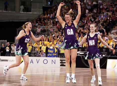
This image
link just about shows it.
Sorry about the double post, I pressed the wrong button.
[quote comment=”103353″]B. Dortmund of Germany released their link. The team colors are link, just like someone else who has a similar looking link.[/quote]
their away kit represents the colors of the city.
and at least last year, dortmund wore yellow and white.
Netball is so strange….as a general observation of the game.
Two notes from today’s uni action… first I am wondering if there was something going on today at the US Open, too many guys wearing shades of blue, most of them in the later groups..Tiger, Vijay, Angel, Bubba, etc. I know golfers really do not have a uniform outside of wearing collared shirts and long pants (PGA Tour sanctioned events) but it was interesting to note. Secondly, interesting script on UC Irvine’s tops today at the College World Series. Capital E on eaters, a moniker that is a contraction of their mascots name of Anteaters!
[quote comment=”103407″]Two notes from today’s uni action… first I am wondering if there was something going on today at the US Open, too many guys wearing shades of blue, most of them in the later groups..Tiger, Vijay, Angel, Bubba, etc. I know golfers really do not have a uniform outside of wearing collared shirts and long pants (PGA Tour sanctioned events) but it was interesting to note. Secondly, interesting script on UC Irvine’s tops today at the College World Series. Capital E on eaters, a moniker that is a contraction of their mascots name of Anteaters![/quote]
Here’s my guess on the heavy amount of blue….
link
[quote comment=”103257″][quote comment=”103246″]Got my membership style guide disc yesterday. Pretty sweet stuff. One thing I noticed, though, on the Phillies’ “Turn Ahead the Clock” unis they have a sleeve patch that’s an American flag with, like, 60 stars on it.[/quote]
link, actually. At the time, I wrote that the Phillies “were anticipating the return of Manifest Destiny (or maybe just the balkanization of Pennsylvania).” The patch remains my single favorite thing about the futuristic uni project (which isn’t really saying much, but still…).[/quote]
I was trying to figure out where the 77 stars could come from, and I figured it doesn’t mean the US, Canada, and Mexico – that would require 93 stars (96 not counting Puerto Rico, DC, and the Distrito Federal of Mexico). Any other ideas?
Which reminds me of another future flag I’ve seen – an episode of Star Trek: The Next Generation depicted a 52-star flag in an episode – assuming they added PR and DC.
I think the political uproar that would result from a 77-star flag (assuming, of course, that any politician actually noticed it) would be because there are 32 Mexican territories and 13 in Canada, so the implication is that the US and Canada have federated together (and added some new states; statehood for DC, Puerto Rico, and each of the Mariana Islands, maybe?
I always wondered exactly how they got 77. Was there some reason they chose that number?
Ryan, you’re too quick for me! (I had to look up the number of Mexican states/territories while posting.)
What year is that ‘Turn Ahead The Clock’ supposed to be again? If the Mets have moved to Mercury, ti must be pretty far in the future.
[quote comment=”103407″]Two notes from today’s uni action… first I am wondering if there was something going on today at the US Open, too many guys wearing shades of blue, most of them in the later groups..Tiger, Vijay, Angel, Bubba, etc. I know golfers really do not have a uniform outside of wearing collared shirts and long pants (PGA Tour sanctioned events) but it was interesting to note. Secondly, interesting script on UC Irvine’s tops today at the College World Series. Capital E on eaters, a moniker that is a contraction of their mascots name of Anteaters![/quote]
Actually, Pro Golfers are allowed to wear mock style shirts as well or sweaters.
Netball and korfball may be “strange,” as is cricket, for most American eyes. However, they are sports with an international following — and that’s all to the good. The same for hurling and Gaelic football (herewith a disclimer: I like both of the latter).
In high school PE classes, I remember playing an outdoor field game called speedball, a sport that that could possibly be seen as an American version of Gaelic football. Whatever it was [is], it was enjoyable ….
How are stirrups supposed to be worn? With the higher loop in front or in back?
[quote comment=”103309″]Those rankings are pure crap. How in the hell does a team like Penn State get left off for Auburn and their 25 Under Armour logos. I want to become president of the NCAA and get rid of all the damn logo creeps. The CWS is driving me nuts with all the Nike crap.[/quote]
ALABAMA!! When I got past #3, I was thinking, “ok, Michigan and Alabama are left. . .”
And Wofford? Are you kidding me. . .WOFFORD?? Pick a black and gold team people have seen (and heard of), say, Colorado? I think BYU could have been in there, too.
[quote comment=”103445″]How are stirrups supposed to be worn? With the higher loop in front or in back?[/quote]
Higher loop in back.
[quote comment=”103316″][quote comment=”103270″][quote comment=”103257″][quote comment=”103246″]Got my membership style guide disc yesterday. Pretty sweet stuff. One thing I noticed, though, on the Phillies’ “Turn Ahead the Clock” unis they have a sleeve patch that’s an American flag with, like, 60 stars on it.[/quote]
link, actually. At the time, I wrote that the Phillies “were anticipating the return of Manifest Destiny (or maybe just the balkanization of Pennsylvania).” The patch remains my single favorite thing about the futuristic uni project (which isn’t really saying much, but still…).[/quote]
How times have changed. Can you imagine the political uproar if they tried that stunt today?[/quote]
Actually, no, I can’t imagine. Exactly what sort of uproar do you think would ensue?[/quote]
I’d imagine it be a “uproar” of all of five minutes, until another shiney disaster distracts the media.
in the gold cup quarterfinal today between US and Panama, a bunch of players had their gold cup patches partially coming off throughout the game and Panamas Blas Perez who was number 7 also has his number shaved into the back of his head, although i can’t find any pictures yet
I’m officially jumping on the bandwagon of UC-Irvine for two reasons. Stirrups and the Eaters script on the jersey. Ya gotta love it!
Terrible look for Oregon State in the CWS. Why in the hell would you have “OS” on your hat and “OSU” on your jersey??!! The white OSU looks like crap too. ASU/UCI was a thing of beauty in the uniform department.
Korfball is more than simply strange or different, it is an awkward game to play for what I imagine would be most Americans, more so than would some other sports played around the world. The lack of dribbling, the fact that a soccer ball is used but not feet, and the lack of contact are difficult to overcome for those of us versed in the typical American sport.
The Dodgers wore those blue jerseys and silver brimmed hats at home for THINK BLUE WEEK a couple years ago. I’m not sure what year it was but it was for that year only. For some reason they still pop up once in a while as alternates though.
[quote comment=”103469″]Terrible look for Oregon State in the CWS. Why in the hell would you have “OS” on your hat and “OSU” on your jersey??!! The white OSU looks like crap too. ASU/UCI was a thing of beauty in the uniform department.[/quote]
Ugh, OSU does look horrible. Wonder why they’d put OSU in white on a gray jersey with brown trim and (HUGE) orange numbers? Fullerton’s classic look is much preferred.
Looks like Manny Ramirez had an extra wrist band on his left arm today as seen here:
link
It’s number 99, and has something above it, __montro?? Anyone have any ideas? Underneath on the other side it does have the Red Sox “B” on it:
link
Silly question, but the $28 New Era fitted hats available at Distant Replays…are they 5950’s? Could I successfully perform surgery on them?
By the way, I’d like to add that last night, I put my teal Marlins cap under the knife. It works beautifully. It looks like a hat now, not a wool box. I used to look like a blockhead. No longer.
In the lead picture, it looks like the WA girl has a prosthetic left leg, but I’m guessing it’s just the lighting.
[quote comment=”103469″]Terrible look for Oregon State in the CWS. Why in the hell would you have “OS” on your hat and “OSU” on your jersey??!! The white OSU looks like crap too. ASU/UCI was a thing of beauty in the uniform department.[/quote]
Additionally, [quote comment=”103491″][quote comment=”103469″]Terrible look for Oregon State in the CWS. Why in the hell would you have “OS” on your hat and “OSU” on your jersey??!! The white OSU looks like crap too. ASU/UCI was a thing of beauty in the uniform department.[/quote]
Ugh, OSU does look horrible. Wonder why they’d put OSU in white on a gray jersey with brown trim and (HUGE) orange numbers? Fullerton’s classic look is much preferred.[/quote]
Additionally, it looks like OSU is trying to out do their cross state rivals with the new link. I just threw up in my mouth a little.
Some uni-related comments regarding the Kansas City Royals:
1. The Royals were trying to get MLB to allow them to wear the old powder blue unis at home – but no dice.
From the KC Star article:
“We looked into it but the rules are very specific,†said Mark Tilson, Royals vice president of marketing. “The only other option is if we happened to be part of someone else’s retro night on the road. But that’s kind of the luck of the draw.â€Â
2. The Royals had Military Appreciation Night, but unlike the Padres, they didn’t wear any hideous camo unis. (Would anyone DARE to make blue camo?) They did hand out these hats to the fans though…
link
3. In the ninth inning, pitcher Kevin Gregg did his Corey Hart impersonation again – he wore his sunglasses at night.
I noticed that Manny has returned to low-cuffs in today’s (Saturday’s) game vs. San Fran. I was at Friday’s game at Fenway, and noticed he was having major problems keeping the cuffs of those big baggy pants above his socks. On two occasions, once on the basepaths and another running for a fly ball, he was rocking some serious asymmetry (i.e. assclownery) in the pants department. Sadly, I have no pictorial evidence of the tragic fall of the cuffs, nor was I sitting close enough to tell if he was listening to an iPod while his pant cuffs were falling all around him. I am sure that Manny was fed up after all of the extra time and attention that he was giving his pants, so he assuredly went back today to letting gravity do what gravity does best. Sag on, Manny! Sag on!
Mike N.
[quote comment=”103500″]
2. The Royals had Military Appreciation Night, but unlike the Padres, they didn’t wear any hideous camo unis. (Would anyone DARE to make blue camo?) [/quote]
link
[quote comment=”103316″][quote comment=”103270″][quote comment=”103257″][quote comment=”103246″]Got my membership style guide disc yesterday. Pretty sweet stuff. One thing I noticed, though, on the Phillies’ “Turn Ahead the Clock” unis they have a sleeve patch that’s an American flag with, like, 60 stars on it.[/quote]
link, actually. At the time, I wrote that the Phillies “were anticipating the return of Manifest Destiny (or maybe just the balkanization of Pennsylvania).” The patch remains my single favorite thing about the futuristic uni project (which isn’t really saying much, but still…).[/quote]
How times have changed. Can you imagine the political uproar if they tried that stunt today?[/quote]
Actually, no, I can’t imagine. Exactly what sort of uproar do you think would ensue?[/quote]
My impression of the “uproar” Christopher speaks of is :
“How dare they put an incorrect American Flag on a baseball team. This is the USA and we have 50 states, if you want to live in a world where the USA has 70 states, then you can just take your liberal hippie ass off to Canada.”
Just a thought of what someone might say, not me mind you, but someone.
[quote comment=”103500″]2. The Royals had Military Appreciation Night, but unlike the Padres, they didn’t wear any hideous camo unis. (Would anyone DARE to make blue camo?) They did hand out these hats to the fans though…
link
[/quote]
Just got back from that. The military appreciation night is definitely a nice gesture, but I think this year’s caps are kinda “meh.” Something tells me I might be in the minority here, but I actually prefer the camo ones they handed out last year (the players actually wore them too).
[quote comment=”103509″][quote comment=”103500″]
2. The Royals had Military Appreciation Night, but unlike the Padres, they didn’t wear any hideous camo unis. (Would anyone DARE to make blue camo?) [/quote]
link[/quote]
The ECHL South Carolina Stingrays have been wearing link for years.
[quote comment=”103428″]What year is that ‘Turn Ahead The Clock’ supposed to be again?[/quote]
2021 (because it was a Century 21 promotion). The Twins took the opportunity to wear a “60th Anniversary” sleeve patch on their futuristic jersey, since they moved to the Twin Cities from DC in 1961.
Any best college uni poll that doesn’t have Alabama #1 or #2 is a bogus poll.
[quote comment=”103495″][quote comment=”103469″]Terrible look for Oregon State in the CWS. Why in the hell would you have “OS” on your hat and “OSU” on your jersey??!! The white OSU looks like crap too. ASU/UCI was a thing of beauty in the uniform department.[/quote]
Additionally, [quote comment=”103491″][quote comment=”103469″]Terrible look for Oregon State in the CWS. Why in the hell would you have “OS” on your hat and “OSU” on your jersey??!! The white OSU looks like crap too. ASU/UCI was a thing of beauty in the uniform department.[/quote]
Ugh, OSU does look horrible. Wonder why they’d put OSU in white on a gray jersey with brown trim and (HUGE) orange numbers? Fullerton’s classic look is much preferred.[/quote]
Additionally, it looks like OSU is trying to out do their cross state rivals with the new link. I just threw up in my mouth a little.[/quote]
Pretty old link
[quote comment=”103515″][quote comment=”103509″][quote comment=”103500″]
2. The Royals had Military Appreciation Night, but unlike the Padres, they didn’t wear any hideous camo unis. (Would anyone DARE to make blue camo?) [/quote]
link[/quote]
The ECHL South Carolina Stingrays have been wearing link for years.[/quote]
Looks like link is way link on this one.
link
and there’s a list of FAMOUS Netball players. Famous Netball players-isn’t that a little like if a tree falls in the woods…
[quote comment=”103482″]Korfball is more than simply strange or different, it is an awkward game to play for what I imagine would be most Americans, more so than would some other sports played around the world. The lack of dribbling, the fact that a soccer ball is used but not feet, and the lack of contact are difficult to overcome for those of us versed in the typical American sport.[/quote]
although it looks like a soccer ball, it is actually much heavier.
[quote comment=”103344″]From yesterday:
[quote comment=”103147″]wow, this is an link
speaking of the dodgers, has any one seen the dodgers wear their apparent link?[/quote]
Couldn’t find a picture of in-game action, but I know I’ve seen it. They wear the silver brimmed hat with these jerseys link
They probably only wear those once or twice a year, just to make New Era and Majestic happy.
The Orioles just called up to the majors Cory Doyne from Norfolk, who should be dubbed “The Human UniWatch Thread:”
link
PS on best college unis: Penn State blue-and-white home must be #1. I remember when I had my SI subscription in the 80s in one of their College Football preview issues they deigned them the best, calling them “breathtakingly basic.” In a different issue they called the white-on-white road unis the worst. And of course, the “breathtakingly basic” comment came before PSU signed the deal with Nike and the logo creep set in…
[quote comment=”103344″]From yesterday:
[quote comment=”103147″]wow, this is an link
speaking of the dodgers, has any one seen the dodgers wear their apparent link?[/quote]
Couldn’t find a picture of in-game action, but I know I’ve seen it. They wear the silver brimmed hat with these jerseys link
I think that hat is just a “style” hat as there is no “Performance 59/50″ design in the Dodgers online shop.
[quote comment=”103582”]The Orioles just called up to the majors Cory Doyne from Norfolk, who should be dubbed “The Human UniWatch Thread:”
link
[/quote]
I hope someone comes to their senses and takes the orange out of the away hat. The Tides are red, white, and blue…doesn’t matter who their affiliated with. I can only imagine how stupid the black and orange road caps look without black and orange anywhere else on the actual uniforms. Also, ditch the black socks. Attrocious.
[quote comment=”103525″][quote comment=”103495″][quote comment=”103469″]Terrible look for Oregon State in the CWS. Why in the hell would you have “OS” on your hat and “OSU” on your jersey??!! The white OSU looks like crap too. ASU/UCI was a thing of beauty in the uniform department.[/quote]
Additionally, [quote comment=”103491″][quote comment=”103469″]Terrible look for Oregon State in the CWS. Why in the hell would you have “OS” on your hat and “OSU” on your jersey??!! The white OSU looks like crap too. ASU/UCI was a thing of beauty in the uniform department.[/quote]
Ugh, OSU does look horrible. Wonder why they’d put OSU in white on a gray jersey with brown trim and (HUGE) orange numbers? Fullerton’s classic look is much preferred.[/quote]
Additionally, it looks like OSU is trying to out do their cross state rivals with the new link. I just threw up in my mouth a little.[/quote]
Pretty old link[/quote]
Thanks. I’m a pretty new user and your post really contributed.
link
link
some netball off of youtube
[quote comment=”103257″][quote comment=”103246″]Got my membership style guide disc yesterday. Pretty sweet stuff. One thing I noticed, though, on the Phillies’ “Turn Ahead the Clock” unis they have a sleeve patch that’s an American flag with, like, 60 stars on it.[/quote]
link, actually. At the time, I wrote that the Phillies “were anticipating the return of Manifest Destiny (or maybe just the balkanization of Pennsylvania).” The patch remains my single favorite thing about the futuristic uni project (which isn’t really saying much, but still…).[/quote]
My favorite has to be the return of the Brewers’ Beer Barrel Man, even if only for one day….
[quote comment=”103492″]Looks like Manny Ramirez had an extra wrist band on his left arm today as seen here:
link
It’s number 99, and has something above it, __montro?? Anyone have any ideas? Underneath on the other side it does have the Red Sox “B” on it:
link
It’s a shout out to his personal barber LMonstro. NESN did a piece on him the last road trip. Apparently he comes along and every three days or so cleans Manny up. He also does Ortiz’s beard. I’m sure there’s a video online of the segment but I didn’t look
[quote comment=”103344″]From yesterday:
[quote comment=”103147″]wow, this is an link
speaking of the dodgers, has any one seen the dodgers wear their apparent link?[/quote]
Couldn’t find a picture of in-game action, but I know I’ve seen it. They wear the silver brimmed hat with these jerseys link
I think that hat is just a “style” hat as there is no “Performance 59/50” design in the Dodgers online shop.
[/quote]
It was just taken off and put into the Fashion section this week. It used to be an Authentic, on field cap.
Syracuse University currently have the best college football unis. It isn’t even close.