Paul might think soccer is silly because of photos like this, but we all know that the sport is worthy of in-depth coverage (or at least a weekend open thread).
At the very least we can chat about the Manny of European soccer and David Beckham’s excellent choice in bandage color. —Vince
speaking of soccer.
Inter unveiled their away kits.
link
[quote comment=”92990″]speaking of soccer.
Inter unveiled their away kits.
link
Yuck, not a fan. They either look like crusaders or the English national team. Inter Milan is supposed to be blue and black. Is this supposed to be some sort of throwback? If so, then I suppose it would be a nice jersey for the centennial.
On a positive note, I like how the cross forces the Pirelli mark to be of a lower profile, smaller and under the team crest, as opposed to sprawled across the chest.
Furthermore, note the Italian flag patch. Apparently Inter is the defending Serie A champion.
Inter is the defending Serie A champion… next year.
link
Michigan State unveils their new unis. Not bad, I like that they are going to an older style.
link
its the 100 years kit.
its a throwback to a kit that was worn during the time of mussolini i believe. this also may be the reason behing the smaller pirelli logo, that or the fact that the owner of pirelli is also part owner of inter and a huge interista.
also the cross of st. george is also on the crest of milan. its not just for england. the cross of st george is also in the crest of fc barcelona. so this kit is abasically saying we are milan (or milano siamo noi as the chant goes.) if you look at alot of the coreography from the curve this year you will see alot of the cross. its a celebration not only of inter but also for milan,
[quote comment=”93009″]Michigan State unveils their new unis. Not bad, I like that they are going to an older style.
link[/quote]
NICE. Another case of “less sh*t=better jerseys.” File this under the classics along with U Michigan, Penn State, Nebraska, and the other schools who get it right. Oregon, please take heed.
How awesome would a white helmet with a green spartan look with this?
[quote comment=”93010″]its the 100 years kit.
its a throwback to a kit that was worn during the time of mussolini i believe. this also may be the reason behing the smaller pirelli logo, that or the fact that the owner of pirelli is also part owner of inter and a huge interista.
also the cross of st. george is also on the crest of milan. its not just for england. the cross of st george is also in the crest of fc barcelona. so this kit is abasically saying we are milan (or milano siamo noi as the chant goes.) if you look at alot of the coreography from the curve this year you will see alot of the cross. its a celebration not only of inter but also for milan,[/quote]
OK, so it has some nice symbolism, but I still say it’s a mindf*ck. Wouldn’t you expect the Nerazzurri to be black and blue?
[quote comment=”93009″]Michigan State unveils their new unis. Not bad, I like that they are going to an older style.
link[/quote]
This is probably the best looking uni in NCAAF today. It would be a major mistake to change the helmet.
[quote comment=”93015″][quote comment=”93010″]its the 100 years kit.
its a throwback to a kit that was worn during the time of mussolini i believe. this also may be the reason behing the smaller pirelli logo, that or the fact that the owner of pirelli is also part owner of inter and a huge interista.
also the cross of st. george is also on the crest of milan. its not just for england. the cross of st george is also in the crest of fc barcelona. so this kit is abasically saying we are milan (or milano siamo noi as the chant goes.) if you look at alot of the coreography from the curve this year you will see alot of the cross. its a celebration not only of inter but also for milan,[/quote]
OK, so it has some nice symbolism, but I still say it’s a mindf*ck. Wouldn’t you expect the Nerazzurri to be black and blue?[/quote]
for the home kit yes. but this isnt that kit. this is the away strip.
for the away kit, i expect white. inters away kits this year are white, and historically, most away kits have been white with a blue and black stripe. so its not that much different, and this kits has historical and symbolic reference.
Well, I can’t write about MSU’s new unis without mentioning the classic Michigan unis. Biased, I know. Anyways, I saw this recently and thought I might pass it along…
link
Keep in mind that they are simply Cal’s uniforms with a Michigan winged helmet photoshopped on but thought it was worth a look. Check out the comments at the bottom as well, didn’t go over too well. Personally, I wouldn’t mind a maize colored uni for a big game.
[quote comment=”93009″]Michigan State unveils their new unis. Not bad, I like that they are going to an older style.
link[/quote]
I like the unis. But since we pick things apart on this site, the ‘MICHIGAN STATE’ on the jersey is way too low and too close to the numerals. I guess they didn’t want anything too close to the swoosh.
My original comment about the MSU jerseys seems to have been swallowed up, so I’ll just put the cliff notes here: MSU always wears a great uniform and has a beautiful stadium. Kudos to the Spartans.
Going off of a comment yesterday… rookie Ryan Braun of the Brewers was wearing that special arm band again just on his right arm last night. Why would he just wear it on one arm? Is it a special warming arm band, or is it just like to help with elbow pain?
Also, the Brewers announcers yesterday chatted about Cruz Jr’s classic old school stirrups. They basically said some players wear their socks high, but they are solid colored, and that almost no one wears em like Cruz does and that they wish everyone would go old school again.
My 2 cents on the MI St. uni’s…. I think they are classic and simple. I am a Bucky fan of course, and I love Sconnie’s home uni’s, but HATE their road white on white.
[quote comment=”93011″][quote comment=”93009″]Michigan State unveils their new unis. Not bad, I like that they are going to an older style.
link[/quote]
NICE. Another case of “less sh*t=better jerseys.” File this under the classics along with U Michigan, Penn State, Nebraska, and the other schools who get it right. Oregon, please take heed.
How awesome would a white helmet with a green spartan look with this?[/quote]
You forgot the classiest uniform of all…….the Alabama Crimson Tide.
inter… well they just suck over all.
michigan state… i don’t care for cause i got friends at michigan (but that jersey is REALLY good)
and becks got more tattoos all over his arm?! when is that wash up coming to LA again?
[quote comment=”93011″][quote comment=”93009″]Michigan State unveils their new unis. Not bad, I like that they are going to an older style.
link[/quote]
NICE. Another case of “less sh*t=better jerseys.” File this under the classics along with U Michigan, Penn State, Nebraska, and the other schools who get it right. Oregon, please take heed.
How awesome would a white helmet with a green spartan look with this?[/quote]
I don’t see a big change from what they wore in link aside from a stripe on the helmet, smaller lettering, and losing the green border around the neck. Do those changes really need a press conference?
Wow, im surprised this many ppl like the MSU jerseys, i showed them to a few of my friends and we all hated them…way to boring, simpler does not always = better.
Do you guys remember the civil rights game with the indians and cardinals terribly boring uniforms, well this is the football version and they get to wear it every game.
I am usually a fan of nike but they have ruined 2 perfectly good uniforms this year in miami and oregon state.
[quote comment=”93009″]Michigan State unveils their new unis. Not bad, I like that they are going to an older style.
link[/quote]
—————
Those are definitely in the class of PSU, ND, Michigan, USC and the rest of the teams who “Get Itâ„¢”
I am happy to see they find no need for all the excess junk that has turned most unis into what would be the *astard child of an Arena Football / World Wrestling Federation marriage.
Very nice, MSU!
[quote comment=”93047″]Wow, im surprised this many ppl like the MSU jerseys, i showed them to a few of my friends and we all hated them…way to boring, simpler does not always = better.
Do you guys remember the civil rights game with the indians and cardinals terribly boring uniforms, well this is the football version and they get to wear it every game.
I am usually a fan of nike but they have ruined 2 perfectly good uniforms this year in miami and oregon state.[/quote]
The flaw in the Civil Rights jerseys was that the teams’ fonts became exactly the same. They basically became template jerseys, like what happens with the Pro Bowl jerseys and jerseys from the other All-Star exhibition games.
I think the Cleveland jersey got messed up less for the Civil Rights game than the St. Louis jersey. The birds on the bat is simply too timeless. It is almost as iconic as the Yankees pinstripes and the NY insignia. (No offense Mets fans, but you have only existed since 1962. You’re a young franchise, unlike the Yankees and the Cardinals. Not enough time for your jerseys to become iconic classics. Ditch the black and we’ll talk.)
[quote comment=”93029″][quote comment=”93009″]Michigan State unveils their new unis. Not bad, I like that they are going to an older style.
link[/quote]
I like the unis. But since we pick things apart on this site, the ‘MICHIGAN STATE’ on the jersey is way too low and too close to the numerals. I guess they didn’t want anything too close to the swoosh.[/quote]
I agree with this; the swoosh really ruins the balance.
Also, according to the article, they’re going to put a little Spartan logo above the player name on the back, which they claim is a “nice touch”. What is with all these teams doing this now? It’s ugly and it shoves the important stuff (player name and number) downward. This trend needs to be nipped in the bud before it spreads even further!
Ronni’s headband actually caused a whole fuss in that game. He was fouled pretty hard, and that thing was pulled off his head. He retaliates by kicking the offending player in the nuts, and was sent off for it. He’ll likely be suspended for the last two league matches in the tight La Liga title race.
That “Italian Flag Patch” is the “Scudetto,” btw, the little shield.
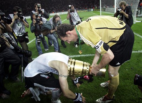
That trophy, btw, is the DFB-Pokal, or the German FA Cup. What a cool looking trophy!
[quote comment=”93040″][quote comment=”93011″][quote comment=”93009″]Michigan State unveils their new unis. Not bad, I like that they are going to an older style.
link[/quote]
NICE. Another case of “less sh*t=better jerseys.” File this under the classics along with U Michigan, Penn State, Nebraska, and the other schools who get it right. Oregon, please take heed.
How awesome would a white helmet with a green spartan look with this?[/quote]
You forgot the classiest uniform of all…….the Alabama Crimson Tide.[/quote]
Hey! Alabama! We just beat the hell outta you! Ramma jamma yellow hammer, go to hell Alabama! See you Nov. 24th…
As for MSU, I really like them alot, no crap all over them, and my favorite part is the small ‘Michigan State’ text above the numbers.
[quote comment=”93059″]Ronni’s headband actually caused a whole fuss in that game. He was fouled pretty hard, and that thing was pulled off his head. He retaliates by kicking the offending player in the nuts, and was sent off for it. He’ll likely be suspended for the last two league matches in the tight La Liga title race.
That “Italian Flag Patch” is the “Scudetto,” btw, the little shield.[/quote]
Isn’t the point of soccer to kick balls?
Looking at the picture of Beckham I got to wondering if I am the only one who hates visible tattoos on athletes?
That arm sleeve tattoo cannot look good in any uniform.
I’d like to see pro sports ban visible tattoos.
Lotta swooshes on those MSU unis. Even the socks were positioned ‘just so’ for the photo.
As fas as classic college unis—you won’t top ND or PSU.
Like the MSU minimalist style, but I hate the growing trend of lowering the front template – the MICHIGAN STATE is really low – a good 4 inches off the collar, and the result is a number set mostly beneath the shoulder pads on the abdomen that distorts in action. The NFL Giants have that problem, and just about anyone who adds the logo/wordmark below the collar (new Chargers, etc.) has it as well.
Shouldn’t the Braves have a special “BC 131” patch? LOL
link
[quote comment=”93027″]Well, I can’t write about MSU’s new unis without mentioning the classic Michigan unis. Biased, I know. Anyways, I saw this recently and thought I might pass it along…
link
Keep in mind that they are simply Cal’s uniforms with a Michigan winged helmet photoshopped on but thought it was worth a look. Check out the comments at the bottom as well, didn’t go over too well. Personally, I wouldn’t mind a maize colored uni for a big game.[/quote]
I would really like to see Michigan get some blue pants for the road. Never liked the yellow’s for road games.
[quote comment=”93011″][quote comment=”93009″]Michigan State unveils their new unis. Not bad, I like that they are going to an older style.
link[/quote]
NICE. Another case of “less sh*t=better jerseys.” File this under the classics along with U Michigan, Penn State, Nebraska, and the other schools who get it right. Oregon, please take heed.
How awesome would a white helmet with a green spartan look with this?[/quote]
Those look spectacular. Less is more. That’s how a football jersey should look. I am so sick of all the stupid piping, side panels, cutouts, retarded fonts.
Football uniforms, like MSU or Michigan, should NOT have matching pants and jerseys. White-on-white or yellow-on-yellow just looks dumb. Football uniforms need different color pants and jerseys and that’s the way it is.
Inter’s away kit isn’t terrible. I kinda like it. That might change in a few weeks and, on the whole, I don’t like Inter at all but for now I’m going to say it could’ve been worse.
The Braves are looking “good” today. (Watch your eyes…) GO PHILS!!
has anyone seen any of the women’s college softball on espn/espn2?
Some good unis, lots of teams wear the mid-high stirups….
[quote comment=”93061″]That trophy, btw, is the DFB-Pokal, or the German FA Cup. What a cool looking trophy![/quote]
it looks like its made out of cardboard. or should be at a ren. fair
Miguel Cabrera looking good in high socks…and white huraches…i like..
No pics yet.
[quote comment=”93027″]Well, I can’t write about MSU’s new unis without mentioning the classic Michigan unis. Biased, I know. Anyways, I saw this recently and thought I might pass it along…
link
Keep in mind that they are simply Cal’s uniforms with a Michigan winged helmet photoshopped on but thought it was worth a look. Check out the comments at the bottom as well, didn’t go over too well. Personally, I wouldn’t mind a maize colored uni for a big game.[/quote]
This cannot be real. We would never do this.
[quote comment=”93104″]Football uniforms, like MSU or Michigan, should NOT have matching pants and jerseys. White-on-white or yellow-on-yellow just looks dumb. Football uniforms need different color pants and jerseys and that’s the way it is.
Inter’s away kit isn’t terrible. I kinda like it. That might change in a few weeks and, on the whole, I don’t like Inter at all but for now I’m going to say it could’ve been worse.[/quote]
Football all-whites are awesome! (Caveat: need white helmets too.) Think of the NY Jets, Indy Colts, and Miami Dolphins. Are those all-white combos not amazing? By the way, all-white uniforms have a high Super bowl winning percentage.
plain and simple. those MSU uni’s SUCK I mean come on, the coach came from OSU with the great UNI’s we have, and he got to see PSU all the time, and their’s look good. Those MSU ones suck. The white stripe on the helmet doesn’t look that good, they looked better with the all green helemt with that little spartan logo. as for the jerseys, the font is too small, I think they should have satyed with the same size as last year and just put STATE on them. In that area, when you say state, MSU is what everyone thinks of. even their warm ups/track looking gear just reads STATE. and as for the pants, the whites look ok, but they should have busted out some green pants too, the white on white with green helmets looks dumb. then for the scUM/MSU game they could go all green or all white, just a once a year thing to mark the big game, or even like my high school did, color on color only for homecoming, color on white the rest of the time.
sorry, just my .02
after two straight games of actually dressing like a manager, joe torre has gone back to the smock…
wouldn’t it be nice to see the yanks try and change their luck by the team wearing their pants appropriately?? I know it might not make a difference, but shit it would look great for a day!!
did anyone else see the pride stickers on the back the oklahoma softball players batting helmets alla Ohio States’ buckeye stickers
Can anybody tell what the green is on the shoulders of the white uni in link photo? It doesn’t much look like a number to me, but that’s what it should be, I guess.
I really think these are improvements over the recent MSU uniforms. Simpler is better, they got rid of the weird MICHIGAN STATE font from last year, and helmet stripes are a must. And please, don’t go back to the all-green look ever again.
i hate the lettering on the state unis…it’s way too low on the jersey and looks too small for how much space it takes up horizontally across the chest…i would really like to see them bring back the old spartan head they used in the 60’s and in their throwback game from last year…very classy looking…
More soccer jersey stuff: The California Victory, an expansion USL-1 team (think AAA-level, just below MLS), has been wearing their brother team’s jerseys at home, but they have their own shorts: link
You can see the Spanish league’s patch on the right sleeve, as well as the Deportivo Alaves logo above the California Victory logo on the chest.
[quote comment=”93017″][quote comment=”93015″][quote comment=”93010″]its the 100 years kit.
its a throwback to a kit that was worn during the time of mussolini i believe. this also may be the reason behing the smaller pirelli logo, that or the fact that the owner of pirelli is also part owner of inter and a huge interista.
also the cross of st. george is also on the crest of milan. its not just for england. the cross of st george is also in the crest of fc barcelona. so this kit is abasically saying we are milan (or milano siamo noi as the chant goes.) if you look at alot of the coreography from the curve this year you will see alot of the cross. its a celebration not only of inter but also for milan,[/quote]
OK, so it has some nice symbolism, but I still say it’s a mindf*ck. Wouldn’t you expect the Nerazzurri to be black and blue?[/quote]
for the home kit yes. but this isnt that kit. this is the away strip.
for the away kit, i expect white. inters away kits this year are white, and historically, most away kits have been white with a blue and black stripe. so its not that much different, and this kits has historical and symbolic reference.[/quote]
I just think they’re trying to steal some of that good look from the city rivals and overall superior club AC Milan.
Inter can try and look like my boys, but I’ll take comfort in knowing that this past season will go down as the only year they could ever play as well as them in Italy and that they’ll never be half the club Milan is in the Champions League.
[quote comment=”93074″]Looking at the picture of Beckham I got to wondering if I am the only one who hates visible tattoos on athletes?
That arm sleeve tattoo cannot look good in any uniform.
I’d like to see pro sports ban visible tattoos.[/quote]
It’s personal expression and a sign of the times. As long as they are somewhat tasteful and don’t display anything offensive such as naked people or foul language, you’d better get used to it. Tattoos aren’t taboo anymore.
FYI – Beckham’s “bandage” is actually a muscle warming tape. Not sure exactly how it works, but when I had an upper rib that was cracked, my physical therapist used this exact tape on me in that area and miraculously my pain went away.
Going right back to an earlier comment, Inter ARE the defending champions of Serie A, they were awarded the title in the wake of the match-fixing scandal.
[quote comment=”93134″]Can anybody tell what the green is on the shoulders of the white uni in link photo? It doesn’t much look like a number to me, but that’s what it should be, I guess.
[/quote]
Looks to me like both unis have the white S on a green background on the shoulder, except the road whites have a green square for the background.
Don’t get me wrong guys, I’m loving on the Spartan Spartan jerseys too, but I really dislike the thought of “Plain Jerseys are the Best” that is going on here. Stripes and experimentation on jerseys can be a GOOD thing, folks, especially when they link That, and I am a bit of a dork for a certain link
[quote comment=”93168″][quote comment=”93134″]Can anybody tell what the green is on the shoulders of the white uni in link photo? It doesn’t much look like a number to me, but that’s what it should be, I guess.
[/quote]
Looks to me like both unis have the white S on a green background on the shoulder, except the road whites have a green square for the background.[/quote]
Ok, I’m hallucinating. Pretty sure its just the link.
[quote comment=”93169″]Don’t get me wrong guys, I’m loving on the Spartan Spartan jerseys too, but I really dislike the thought of “Plain Jerseys are the Best” that is going on here. Stripes and experimentation on jerseys can be a GOOD thing, folks, especially when they link That, and I am a bit of a dork for a certain link[/quote]
I agree, but the Bengals have got to drop that terrible white stripe under the arm and should never wear white pants with any uniform combo. I love the all dark and the white jersey, dark pants combo.
I appreciate Michigan State’s minimalist style, especially as a counterbalance to the many unnecessary stripes, swooshes and panels on so many other college football uniforms. Kudos to MSU for resisting the temptation to add black and other superfluous flourishes.
Could any Michigan State fans illuminate us as to the “Michigan State” wordmark on the jerseys? Every other Spartan team wears the “State” wordmark, from what I’ve seen.
[quote comment=”93009″]Michigan State unveils their new unis. Not bad, I like that they are going to an older style.
link[/quote]
Let’s give Nike credit when it’s due. They got this one right. They are simple, classy and good looking uniforms.
[quote comment=”93074″]Looking at the picture of Beckham I got to wondering if I am the only one who hates visible tattoos on athletes?
That arm sleeve tattoo cannot look good in any uniform.
I’d like to see pro sports ban visible tattoos.[/quote]
Actually, Beckham has stated that he only wears long sleeve jerseys to cover his tattoos so he doesn’t offend people who don’t like it.
That picture is from the end of a recent game, where he took his jersey off and threw it to the fans after he had a very good game. Most of the times no one will see his tattoos.
[quote comment=”93111″]has anyone seen any of the women’s college softball on espn/espn2?
Some good unis, lots of teams wear the mid-high stirups….[/quote]
I saw CS Fullerton playing in Navy pants, Navy high socks (no stirrup) and Orange jerseys. A complete sartorial disaster.
Two race-related items from today’s Indy 500…
(1) One of the track’s safety crew members was wearing a black #3 Dale Earnhardt baseball cap, for a little IRL/NASCAR cross-contamination.
(2) Why must the sideline/pit road/ancillary reporters be dressed up in race suits also? It seems a little silly. Pam Oliver doesn’t wear a b-ball jersey. Adrian Karsten never wore pads and a helmet. Peter Gammons doesn’t wear stirrups (as far as we know).
[quote comment=”93040″][quote comment=”93011″][quote comment=”93009″]Michigan State unveils their new unis. Not bad, I like that they are going to an older style.
link[/quote]
NICE. Another case of “less sh*t=better jerseys.” File this under the classics along with U Michigan, Penn State, Nebraska, and the other schools who get it right. Oregon, please take heed.
How awesome would a white helmet with a green spartan look with this?[/quote]
You forgot the classiest uniform of all…….the Alabama Crimson Tide.[/quote]
Or, really, the entire SEC, with the possible exception of Kentucky, or Auburn before the UnderArmour typeface.
Just a few notes.
As a PSU alumni, I must say, I dislike the new MSU jerseys. The font of them is WAY too small! Plus, it’s WAY too close to the numbers. Just wait until a few big linemen wear those jerseys, and it’ll look even worse!
Miguel Cabrera looked like the WWE’s Road Warrior today with his eye black. This picture doesn’t do it justice:
link
Alfredo Amezaga had some serious eye black too, but there are no pics.
Here’s a pic of the wrestlers, the Road Warriors, in case anyone forgot about them:
link
Former Road Warrior Joseph Laurinaitis has a son who’s a stub linebacker at Ohio State…..
I agree with no matching of colored shirts and pants in football except when it comes to the white on white look. I like the look of colleges like Texas, SMU (Pony Express era), Oklahoma (Greg Pruitt, Joe Washington, Selmon brothers, Billy Sims era), Florida Gators (Spurrier era) Tennesse Vols and speaking of white on white college unis does anybody remember the University of Michigan Wolverines white jerseys on white pants look from the late 60’s and early 70’s ? (I think I saw it on a ESPN Classic game, Michigan vs. Ohio State 1969.)
As for the pros and white on white, I like the Cleveland Browns (pre orange pants), Cinncinati Bengals (pre striped helmet era),Tampa Bay Bucs (Bucco Bruce/orange sherbert era), New England Patriots (hiking Patriot era), L.A. Rams (Deacon Jones era) Minnesota Vikings (more white equals less purple, whats not to like), Kansas City Chiefs (I know they lost the Super Bowl in the white on white look but Lamar Hunt trumps Hank Stram), Buffalo Bills (rookie season for OJ / standing Buffalo era) and St. Louis (Arizona) Cardinals white on white. Heck, I even like Washington Redskins white on white look.
[quote comment=”93195″][quote comment=”93009″]Michigan State unveils their new unis. Not bad, I like that they are going to an older style.
link[/quote]
Let’s give Nike credit when it’s due. They got this one right. They are simple, classy and good looking uniforms.[/quote]
When did Nike start designing uniforms for the school. I can see them doing this for Oregon, but why would a school allow an outside party to determine the face of the school? Also, who gets the say of “These suck, we’re not wearing those?”
ok ive got a few things. i have been watching the texas 4-a state baseball playoffs here in my town and i have got to say the jerseys are horrible. one team has yellow jerseys (think bright yellow) with blue type, and funny arm cutouts that are totally awful. the other team is black, blue and gray and has more panels than any team i have ever seen, its awful on the eyes. i think they just take the alt jerseys because they play three game series and alternate between home and away and they just dont want to take both sets. another thing i noticed the other day while flippin channels was one of the kawasaki sponsored motocross riders had a white kawasaki logo on the underbrim of his hat. seemed kind of weird, but good advertising i guess
[quote comment=”93009″]Michigan State unveils their new unis. Not bad, I like that they are going to an older style.
link[/quote]
Kudos to MSU for going with a classy look. The only thing that I would do to improve them would be to put a stripe down the sides of the pants.
[quote comment=”93206″][quote comment=”93111″]has anyone seen any of the women’s college softball on espn/espn2?
Some good unis, lots of teams wear the mid-high stirups….[/quote]
I saw CS Fullerton playing in Navy pants, Navy high socks (no stirrup) and Orange jerseys. A complete sartorial disaster.[/quote]
My boys couldn’t stop talking about the cage helmets they were wearing and the fact that females don’t have to wear caps. They then started talking about what kind of caps the women should wear if they were required. The favored the white unis of the Arizona team.
Michigan State got it right!
Despite having Nike!
Now they can stop thinking about the uni’s and figure out how to stop ND from blowing right through them in the 4th quarter.
Why do people think that link was such a bad logo? This just maybe one of the best logos of all-time, and I’m not even a Buc fan.
[quote comment=”93074″]Looking at the picture of Beckham I got to wondering if I am the only one who hates visible tattoos on athletes?
That arm sleeve tattoo cannot look good in any uniform.
I’d like to see pro sports ban visible tattoos.[/quote]
I like tattoos, and I like seeing what different tattoos the athletes are wearing. As long as the tats aren’t distracting to the opposition, I say go for it.
That said, I have two notes on the Twins’ game today about neck tattoos. For the Blue Jays, Ryan Roberts had a side neck tattoo, and the pitcher, A.J. Burnett had a back of the neck tattoo. That was jolting, to say the least. I read an article that said Roberts has thirty tats. That’s a lot of ink.
Their catcher, Jason Phillips, wears link while playing, prompting Bert Blyleven to say that he looked like he just got off his Harley. Dick Bremer chimed in with, “Or the sidecar.”
Finally, it was the armed forces game for the Twins. Do they keep the hats from the other armed forces games, or are they new every time? The pitcher for the Twins, Carlos Silva, already had his hat smudged up and broken in before the first pitch.
Let me preface by saying, I support the troops and am not taking anything away from them. That said, I don’t like the hodgepodge of hats used during the game. The players don’t look as if they are on the same team. Also, I think it would have been nice to have a Canadian armed forces hat for the Blue Jays (and for Justin Morneau, who had a stellar day).
Is anyone upset with Michigan States new uniforms?
As an MSU fan I am really happy they are fixing up the helmets with the Spartan decal and single stripe but I think they got the jerseys all wrong.
First of all, they got rid of the green pants with the white jerseys and secondly they took off the sleeve stripe from last year. I think that stripe gave the uniform balance, but now it just looks like a video game jersey! Plus the lettering tends to ride down.
On another note, i have a serious problem with the skin tight jerseys. Yeah they look good on Herron and Hoyer, but how will they look on the 300 pound lineman?
Anyone see the Blue Jays-Twins game?
They wore military hats:
link
link
link
Padres getting the jump on Memorial Day with an link on the left side of their caps today…
Trevor Hoffman link as he nears save #500…
not a BoSox fan so maybe this has been well-covered, but i had never noticed Hideki Okajima’s link until today. pretty unique.
[quote comment=”93293″]Is anyone upset with Michigan States new uniforms?
As an MSU fan I am really happy they are fixing up the helmets with the Spartan decal and single stripe but I think they got the jerseys all wrong.
First of all, they got rid of the green pants with the white jerseys and secondly they took off the sleeve stripe from last year. I think that stripe gave the uniform balance, but now it just looks like a video game jersey! Plus the lettering tends to ride down.
On another note, i have a serious problem with the skin tight jerseys. Yeah they look good on Herron and Hoyer, but how will they look on the 300 pound lineman?[/quote]
They’re a disappointment. You’re right, they should have a 300 pound lineman model them! I guarantee the jersey number and “MICHIGAN STATE” will be un-readable!
[quote comment=”93287″][quote comment=”93074″]Looking at the picture of Beckham I got to wondering if I am the only one who hates visible tattoos on athletes?
That arm sleeve tattoo cannot look good in any uniform.
I’d like to see pro sports ban visible tattoos.[/quote]
I like tattoos, and I like seeing what different tattoos the athletes are wearing. As long as the tats aren’t distracting to the opposition, I say go for it.
That said, I have two notes on the Twins’ game today about neck tattoos. For the Blue Jays, Ryan Roberts had a side neck tattoo, and the pitcher, A.J. Burnett had a back of the neck tattoo. That was jolting, to say the least. I read an article that said Roberts has thirty tats. That’s a lot of ink.
Their catcher, Jason Phillips, wears link while playing, prompting Bert Blyleven to say that he looked like he just got off his Harley. Dick Bremer chimed in with, “Or the sidecar.”
Finally, it was the armed forces game for the Twins. Do they keep the hats from the other armed forces games, or are they new every time? The pitcher for the Twins, Carlos Silva, already had his hat smudged up and broken in before the first pitch.
Let me preface by saying, I support the troops and am not taking anything away from them. That said, I don’t like the hodgepodge of hats used during the game. The players don’t look as if they are on the same team. Also, I think it would have been nice to have a Canadian armed forces hat for the Blue Jays (and for Justin Morneau, who had a stellar day).[/quote]
That’s strange. I remember reading that the Blue Jays would have Canadian forces hats. I was at the game, but I couldn’t read any caps. I am pretty sure that no Blue Jays had the red hats (for the US Marines). So maybe they did have Canadian hats? I’m not sure, I just remember reading somewhere a couple days ago that the Jays would sport country specific hats…
Anybody else think the new Michigan State football unis look like Ohio State basketball system of dress?
Maybe I’m way off here but with the smaller, lowered school name it reminded me of the Buckeyes.
Villanova may wear some sort of patch or remembrance on their basketball jerseys this coming season. One of the players that has had their number retired just died.
link
With a picture like this, it’s too easy……
link
[quote comment=”93308″]That’s strange. I remember reading that the Blue Jays would have Canadian forces hats. I was at the game, but I couldn’t read any caps. I am pretty sure that no Blue Jays had the red hats (for the US Marines). So maybe they did have Canadian hats? I’m not sure, I just remember reading somewhere a couple days ago that the Jays would sport country specific hats…[/quote]
The Jays’ hats looked similar to the Twins’ hats except they had a Canadian flag instead of an American one.
Uni watch favorite, Jarrod Saltalamacchia, hit his first major league HR today.
[quote comment=”93287″][quote comment=”93074″]Looking at the picture of Beckham I got to wondering if I am the only one who hates visible tattoos on athletes?
That arm sleeve tattoo cannot look good in any uniform.
I’d like to see pro sports ban visible tattoos.[/quote]
I like tattoos, and I like seeing what different tattoos the athletes are wearing. As long as the tats aren’t distracting to the opposition, I say go for it.
That said, I have two notes on the Twins’ game today about neck tattoos. For the Blue Jays, Ryan Roberts had a side neck tattoo, and the pitcher, A.J. Burnett had a back of the neck tattoo. That was jolting, to say the least. I read an article that said Roberts has thirty tats. That’s a lot of ink.
Their catcher, Jason Phillips, wears link while playing, prompting Bert Blyleven to say that he looked like he just got off his Harley. Dick Bremer chimed in with, “Or the sidecar.”
Finally, it was the armed forces game for the Twins. Do they keep the hats from the other armed forces games, or are they new every time? The pitcher for the Twins, Carlos Silva, already had his hat smudged up and broken in before the first pitch.
Let me preface by saying, I support the troops and am not taking anything away from them. That said, I don’t like the hodgepodge of hats used during the game. The players don’t look as if they are on the same team. Also, I think it would have been nice to have a Canadian armed forces hat for the Blue Jays (and for Justin Morneau, who had a stellar day).[/quote]
Minna, this article is for you. I was watching the Mets/Marlins game today and I saw this guy with tons of tattoos, Justin Miller, and I just came across this article from a few days ago:
link
It’s a very humorous article!
My favorite part from the article: Of all the tattoos, the one that is talked about most is one of the few he can’t see: an “I [Heart shape] Billy Koch” tattoo on one of his buttocks. It was put there after Koch, then the closer for the Blue Jays, told Miller he would pay him $2,000 he if he would put that tattoo on is rear end. Miller didn’t even blink, stamping one into place and collecting the four-figure sum.
[quote comment=”93314″]With a picture like this, it’s too easy……
link
think firestone was thinking that someone was gonna take this exact picture when they put their logo underneath the bill of the hat?
[quote comment=”93052″][quote comment=”93009″]Michigan State unveils their new unis. Not bad, I like that they are going to an older style.
link[/quote]
—————
Those are definitely in the class of PSU, ND, Michigan, USC and the rest of the teams who “Get Itâ„¢”
I am happy to see they find no need for all the excess junk that has turned most unis into what would be the *astard child of an Arena Football / World Wrestling Federation marriage.
Very nice, MSU![/quote]
t wasn’t too long ago when USC was wearing this….link
There really isn’t much of a “change” in MSU’s uniforms. I would call it more of a “polishing”. The school name is too small and too low.
Compare MSU’s to Texas A&M’s (link) and there really isn’t too much of a difference. I would consider this the “classic” style by Nike. BTW, Texas A&M is moving to Adidas, we’ll see how much their unis change soon.
A uni-example of why some politicians like the idea of a link…
It’s like a dare, really.
So… what the hell is link?
And it looks like link of the cap. I saw a better view earlier but couldn’t get a shot of it in time.
Texas A&M – link
USC 1999 – link
[quote comment=”93104″]Football uniforms, like MSU or Michigan, should NOT have matching pants and jerseys. White-on-white or yellow-on-yellow just looks dumb. Football uniforms need different color pants and jerseys and that’s the way it is.
Inter’s away kit isn’t terrible. I kinda like it. That might change in a few weeks and, on the whole, I don’t like Inter at all but for now I’m going to say it could’ve been worse.[/quote]
MSU used to always wear white on white on the road
link
but then they switched to green
link
except for big games
link
personally, im glad to see them return to the white on whites full time
I like the smaller MSU font – it’s a bit of an homage to the link of MSU unis.
If its good for link, it’s good for me.
[quote comment=”93177″]I appreciate Michigan State’s minimalist style, especially as a counterbalance to the many unnecessary stripes, swooshes and panels on so many other college football uniforms. Kudos to MSU for resisting the temptation to add black and other superfluous flourishes.
Could any Michigan State fans illuminate us as to the “Michigan State” wordmark on the jerseys? Every other Spartan team wears the “State” wordmark, from what I’ve seen.[/quote]
MSU Football used to have just STATE on the front of the jerseys, visible here
link
but i believe MICHIGAN STATE looks a lot better on the football jerseys.
The basketball team has also worn both styles,
link
link
and have featured both styles equally
link
link
the hockey team wears MICHIGAN STATE
link
overall, MSU uses both styles, and there appears to be no reason as to why they often switch
sorry about that statenews link. here’s another STATE format
link
Twins IF Nick Punto, a switch-hitter, was link why he switched from a double-flap helmet early in his career to single-flaps. He explains why he wore it in the first place (to protect his opposite ear from throws while baserunning) but doesn’t explain why he switched to singles.
Still, excellent question.
David Beckham is one of a number of soccer players who play with long sleeves. Whether for link, link, link. Even as a link. I have read in a couple different places that he wears long sleeves to cover up his tatoos. Thus, the sight of Beckham in link is rather rare. Even in the extreme heat of the 2006 World Cup in Germany, Beckham was on of the very few wearing long sleeves. 6 foot 7 striker link is another one of Beckhams english teaamates who always seems to wear link although I do not think Crouch has any ink on his body. Maybe he is like me and think lonh sleeves just plain look better.
I’m probably the only person on here watching the Coca Cola 600 NASCAR race…..
Dale Jr. has a very cool paint sceme on his car.
link
[quote comment=”93338″]So… what the hell is link?
And it looks like link of the cap. I saw a better view earlier but couldn’t get a shot of it in time.[/quote]
I saw the same thing. I’m pretty sure the one on his left side is the hologram sticker. Cleveland’s shortstop Peralta appears to have his under his brim too. As for Carmona, I can’t tell what is on the opposite side. It seems to be bigger than the hologram sticker. I’ll keep watching it.
Those State uniforms are perfect and I agree with the grey face mask idea but Nike did this one perfectly.
[quote comment=”93129″]after two straight games of actually dressing like a manager, joe torre has gone back to the smock…
wouldn’t it be nice to see the yanks try and change their luck by the team wearing their pants appropriately?? I know it might not make a difference, but shit it would look great for a day!![/quote]
How about Cotton pants?
[quote comment=”93339″]Texas A&M – link
USC 1999 – link
I was glad when USC dropped the red facemasks, but I wish they would go back to the ’99 shoulder stripes.
also the cross of st. george is also on the crest of milan. its not just for england. the cross of st george is also in the crest of fc barcelona. so this kit is abasically saying we are milan (or milano siamo noi as the chant goes.) if you look at alot of the coreography from the curve this year you will see alot of the cross. its a celebration not only of inter but also for milan,
This past season, Inter had a tiny shield with the St. George Cross on the back of their jersey, just below the collar.
[quote comment=”93328″]
Minna, this article is for you.
I was watching the Mets/Marlins game today and I saw this guy with tons of tattoos, Justin Miller, and I just came across this article from a few days ago:
link
It’s a very humorous article!
My favorite part from the article: Of all the tattoos, the one that is talked about most is one of the few he can’t see: an “I [Heart shape] Billy Koch” tattoo on one of his buttocks. It was put there after Koch, then the closer for the Blue Jays, told Miller he would pay him $2,000 he if he would put that tattoo on is rear end. Miller didn’t even blink, stamping one into place and collecting the four-figure sum.[/quote]
Joey G., I knew this guy was tattooed, but I didn’t know how hard-core he was. Inside of the lip? I don’t think so. As for getting Koch’s name tattooed on his ass, I would have held out for more money.
ChrisS, the Jays were wearing US Armed Forces caps with Canadian flags as Anthony M. stated.
Oh, I forgot to throw in on the “MSU new unis, thumbs down” side for all the reasons already stated. Not to mention they are just blah. You can be classic without being boring, but these unis are the equivalent of Kenny G. for saxophonists.
[quote comment=”93373″]I’m probably the only person on here watching the Coca Cola 600 NASCAR race…..
Dale Jr. has a very cool paint sceme on his car.
link
Nope… I watched the whole race as well……
[quote comment=”93390″][quote comment=”93129″]after two straight games of actually dressing like a manager, joe torre has gone back to the smock…
wouldn’t it be nice to see the yanks try and change their luck by the team wearing their pants appropriately?? I know it might not make a difference, but shit it would look great for a day!![/quote]
How about Cotton pants?[/quote]
Let’s see what Danny Tartabull thinks…;)
Attended the Rockies-Giants game today and was forced to endure ten innings of those hideous purple alternates. I remember reading a Todd Jones column a few years ago which said that the starting pitcher got to choose the uniform top on his day to pitch–does anyone know if this is still true? I need to know who to blame for the scars on my eyeballs!
Colt
link
[quote comment=”93450″]Attended the Rockies-Giants game today and was forced to endure ten innings of those hideous purple alternates. I remember reading a Todd Jones column a few years ago which said that the starting pitcher got to choose the uniform top on his day to pitch–does anyone know if this is still true? I need to know who to blame for the scars on my eyeballs!
Colt
link
I think your main (and ongoing) culprit is a five game winning streak. The Rocks are notorious for riding the ‘hot’ jersey, so to speak, despite the fact that ‘hot’ in Rockies land is ‘warm’ elsewhere.
[quote comment=”93153″][quote comment=”93017″][quote comment=”93015″][quote comment=”93010″]its the 100 years kit.
its a throwback to a kit that was worn during the time of mussolini i believe. this also may be the reason behing the smaller pirelli logo, that or the fact that the owner of pirelli is also part owner of inter and a huge interista.
also the cross of st. george is also on the crest of milan. its not just for england. the cross of st george is also in the crest of fc barcelona. so this kit is abasically saying we are milan (or milano siamo noi as the chant goes.) if you look at alot of the coreography from the curve this year you will see alot of the cross. its a celebration not only of inter but also for milan,[/quote]
OK, so it has some nice symbolism, but I still say it’s a mindf*ck. Wouldn’t you expect the Nerazzurri to be black and blue?[/quote]
for the home kit yes. but this isnt that kit. this is the away strip.
for the away kit, i expect white. inters away kits this year are white, and historically, most away kits have been white with a blue and black stripe. so its not that much different, and this kits has historical and symbolic reference.[/quote]
I just think they’re trying to steal some of that good look from the city rivals and overall superior club AC Milan.
Inter can try and look like my boys, but I’ll take comfort in knowing that this past season will go down as the only year they could ever play as well as them in Italy and that they’ll never be half the club Milan is in the Champions League.[/quote]
superior? i mean if you like cheating and being demoted yes. but if you like class and always playing in serie a than inter is your team.
ps- play as well as inter in italy? youre 30+ points behind and we beat you in both derbies. MILANO SIAMO NOI!!
Concerning the green/white pants for away games for MSU, and I have noticed with other schools that have two colored pants (i.e. Wisc.) on grass they will wear the color and on turf they will wear the white pants (no worries about grass stains, etc). I don’t know if this decision is made by the equipment staff or coaches, but it is logical, allows for a different uni combination, as well as the least amount of work cleaning.
I would love to drink champagne out of link.
I simulated a final on NHL’07 (PS-3) Anaheim took the first game 2-0. We’ll see what comes tonight though..
[quote comment=”93210″]Two race-related items from today’s Indy 500…
(1) One of the track’s safety crew members was wearing a black #3 Dale Earnhardt baseball cap, for a little IRL/NASCAR cross-contamination.
(2) Why must the sideline/pit road/ancillary reporters be dressed up in race suits also? It seems a little silly. Pam Oliver doesn’t wear a b-ball jersey. Adrian Karsten never wore pads and a helmet. Peter Gammons doesn’t wear stirrups (as far as we know).[/quote]
The pit reporters wear fire suits because there is always the risk of a fuel fire in pit lane. it isn’t a fashion statement, as I’m sure most of them would prefer not to wear Nomex in summer heat, but a safety measure. If you notice, the officials and safety teams for each of the series do the same.
[quote comment=”93373″]I’m probably the only person on here watching the Coca Cola 600 NASCAR race…..
Dale Jr. has a very cool paint sceme on his car.
link
car? i don’t see any car…
[quote comment=”93611″][quote comment=”93373″]I’m probably the only person on here watching the Coca Cola 600 NASCAR race…..
Dale Jr. has a very cool paint sceme on his car.
link
car? i don’t see any car…[/quote]
Kinda like the time I thought I saw an empty parking space, only to hit the Dodge Stealth as I tried to back into the space.
[quote comment=”93602″]
The pit reporters wear fire suits because there is always the risk of a fuel fire in pit lane. it isn’t a fashion statement, as I’m sure most of them would prefer not to wear Nomex in summer heat, but a safety measure. If you notice, the officials and safety teams for each of the series do the same.[/quote]
The folks on ESPN/ABC do it, and I believe NBC does it for NASCAR, but I can’t ever recall seeing the FOX reporters wear fire suits.
[quote comment=”93061″]That trophy, btw, is the DFB-Pokal, or the German FA Cup. What a cool looking trophy![/quote]
And it’s ours, ours, ours. *g*
The guy inside the cup is Javier Pinola, btw, anyone interested in soccer should keep an eye out for him, he received his first national-team call-cup for Argentina’s game next Saturday against Switzerland and is (one of) the strongest left-backs in the Bundesliga and one hell of a fighter.
[quote comment=”93056″][quote comment=”93047″]Wow, im surprised this many ppl like the MSU jerseys, i showed them to a few of my friends and we all hated them…way to boring, simpler does not always = better.
Do you guys remember the civil rights game with the indians and cardinals terribly boring uniforms, well this is the football version and they get to wear it every game.
I am usually a fan of nike but they have ruined 2 perfectly good uniforms this year in miami and oregon state.[/quote]
The flaw in the Civil Rights jerseys was that the teams’ fonts became exactly the same. They basically became template jerseys, like what happens with the Pro Bowl jerseys and jerseys from the other All-Star exhibition games.
I think the Cleveland jersey got messed up less for the Civil Rights game than the St. Louis jersey. The birds on the bat is simply too timeless. It is almost as iconic as the Yankees pinstripes and the NY insignia. (No offense Mets fans, but you have only existed since 1962. You’re a young franchise, unlike the Yankees and the Cardinals. Not enough time for your jerseys to become iconic classics. Ditch the black and we’ll talk.)[/quote]
Au contraire – the NY insignia sported by the link is as equally iconic as the link