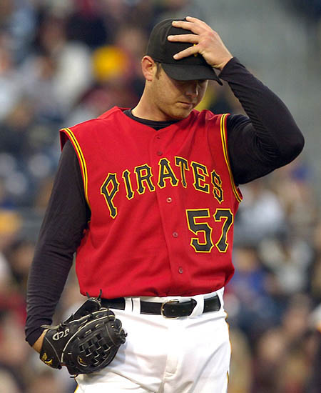
Bottom of the 6th during last night’s Mets/Nationals game. A bit of stunned silence in the WFAN radio booth, and then this from Mets broadcaster Tom McCarthy: “They’re just showing on SNY one of Barry Bonds’s two home runs in Pittsburgh tonight, and it’s the first time I’ve gotten a glance at the Pirates’ alternate uniforms. Holy cow, those are ugly.” His broadcast partner Howie Rose chimes in: “That might be the worst-looking baseball uniform I’ve ever seen.” Interestingly, the Pirates wore their usual caps, instead of the alt cap that was supposed to be paired with the red vest.
Burn those jerseys… today!
The Pirates would have been much better sticking to that Black alternate than that garbage.
les
Maybe they’re going to cover a shift at McDonald’s after the game.
The only positive note is that their caps didnt have red either, but while they’re at it they might as well have red pants and cleats, too. And Dice-K style gloves, you know, to blend in.
The Pirates alts would definately look better with that alt cap…but my retinas still are burning!
I caught a glimpse of the Pirates catcher with his multi-colored chest protector on SportsCenter and I got dizzy.
[quote comment=”70239″]Maybe they’re going to cover a shift at McDonald’s after the game.[/quote]
Hah!
I threw up a little in my mouth when I saw those attrocities. Why, dear god, why? Mr. Selig we need you to step in on this, please ban the alt’s.
How about a new campaign, Remove the Red!
I’ve been a pirate fan my whole life, and have always loved their uniforms. Even the vests in the 80’s, even the old gold monstrocities.
But these are just too much. You didn’t even show the pants, the white pants, the white, white pants. My god, they were… just… too much. It’s so painful.
Add on top of that Ronny Paulino’s black and YELLOW cingular chest protector – it was the worst I have EVER seen my beloved buccos.
Red is the new Black. One just has to look to Houston and Arizona for confirmation. How long before the White Sox go back to link? (Not sure if the link worked there – should have been the 1971 unis)
But maybe they will wear it less because they lost in it. Superstition?
I has hoping these Pirate unis would look better in action than in the promo pix. (Sorta like the US men’s soccer team blue alts.) I almost puked because that was certainly not the case.
But maybe they will wear it less because they lost in it. Superstition?
Going by that logic, the Pirates will be playing their games naked by May.
[quote comment=”70254″]Red is the new Black.[/quote]
Yes, you’re right, teamS in basbeball and basketball are all switching to red alts…AND IT HAS TO STOP!!!
The Pirates have one of the nicest looking jerseys in the game. That fact is canceled out by those hideous things.
Ive always hated the vest then under armour look. It gives off the sleeveless t-shirt impression on the baseball field. Put some sleeves on.
Not only are the Pirates bad, they now look bad.
I saw the red vest in game action for the first time on Friday, April 13 — it was appropriate.
The beating the Giants gave the Bucs was also appropriate.
Before the game, the Pirates announced that they would be retiring the number 11 in honor of Paul “Big Poison” Waner. Appropriately, four former Pittsburgh batting champions, link, were part of the ceremony.
I couldn’t help but think that Madlock and Parker, who wore some of those lovely “bumble bee” Pirates uniforms of the 70’s and 80’s, were probably chuckling to themselves about how ridiculous the red vest truly looks.
My God, they’re repulsive.
[quote comment=”70259″][quote comment=”70254″]Red is the new Black.[/quote]
Yes, you’re right, teamS in basbeball and basketball are all switching to red alts…AND IT HAS TO STOP!!![/quote]
I link. Disgusting.
Don’t Stop Living In the Red
Worse than I thought it would be — and that was pretty bad.
BTW, does anyone know why the Dressed to the Nines database switched templates in ’95? It’s not as good and fails to show piping details as well as the other. Also, as was noted yesterday, in recent years the stirrups have disappeared.
I flicked on FSN last night before the game started and saw an overhead view of the diamond. I saw the red from a distance and thought to myself “Those don’t look too bad.” I was actually one of the few people who seemed to like the things when they were unveiled because they reminded me of the Calgary Flames’ unis.
Then I saw them in action. Just awful. The black lettering was a horrible idea–you can barely tell who the pitcher is when he’s standing at the mound. I’m not against red in our color scheme, but not like that. Maybe a white vest with red numbers and sleeves? Anything but that.
I think the Succos organization is trying to drive us away.
[quote comment=”70269″]BTW, does anyone know why the Dressed to the Nines database switched templates in ’95? It’s not as good and fails to show piping details as well as the other. Also, as was noted yesterday, in recent years the stirrups have disappeared.[/quote]
The thing you need to understand is that none of the Dressed to the Nines uni-database templates were prepared by the Hall of Fame staff. Up thru 1994, Dressed to the Nines uses the templates from Mark Okkonen’s book, Baseball Uniforms of the 20th Century. Okkonen didn’t create any post-1994 templates, so after that point Dressed to the Nines uses the templates from the annual MLB Style Guide. The Style Guide images are, I agree, not as good as the Okkonen images.
Those jerseys are so ugly, and so WRONG, that it provides further evidence that my Pirates are the worst franchise in sports. What colors are associated with Pittsburgh? Black and Gold. All our teams wear Black and Gold. They go well together. We wear those colors proudly.
And so the Pirates think that the best way to get some sartorial attention is…to introduce another color! And one that in NO WAY compliments our traditional scheme! Brilliant!
I mean, how hard would it be to come up with a sleek, stylish all-black alternate jersey? One that had our logo “P” letter on the breast with the number on the other side? Wouldn’t that look GREAT? Wouldn’t that sell like the hotcakes? Or, maybe an all-gold alternate, perhaps not the banana-yellow of the Fam-A-Lee years, but something a bit more muted, yet still yellowish.
Everyone here in the ‘Burgh has expressed horror and digsust when confronted with these ketchupy jerseys. And it isn’t like that’s the reason for using that ghastly color–Heinz doesn’t even make ketchup here anymore, plus their name is on the Steeler stadium. There’s no explanation for it, other than blinkered stupidity. Which, sadly, is de rigeur for the Bucs.
I was looking for this pic yesterday in response to a comment about Curtis Strange being the first to wear red on Sundays. No, he wasn’t link did it, but not as a matter of habit like Tiger does every week. Bonus style points I’m sure from Paul for the glove and socks.
Those new Pirates uniforms aren’t even functional. From the stands, it is almost impossible to read the black numbers on the red jerseys (despite that fabulous Bucco number font!).
I like them ;)
I watched that Pirates game for about a half hour last night, until my head began to hurt from those uniforms. The best choice would be never to wear them again, but since this is the money making world of MLB, at least wear different pants. I think that black pants would hurt the eyes a little less than those WHITE THINGS.
My girlfriend just saw the pic and her only response was EWWW…. so there you go.
[quote comment=”70265″][quote comment=”70259″][quote comment=”70254″]Red is the new Black.[/quote]
Yes, you’re right, teamS in basbeball and basketball are all switching to red alts…AND IT HAS TO STOP!!![/quote]
I link. Disgusting.[/quote]
That’s not red!
[quote comment=”70287″][quote comment=”70265″][quote comment=”70259″][quote comment=”70254″]Red is the new Black.[/quote]
Yes, you’re right, teamS in basbeball and basketball are all switching to red alts…AND IT HAS TO STOP!!![/quote]
I link. Disgusting.[/quote]
That’s not red![/quote]
What the hell is it, then?
[quote comment=”70276″]
I mean, how hard would it be to come up with a sleek, stylish all-black alternate jersey? One that had our logo “P” letter on the breast with the number on the other side? Wouldn’t that look GREAT? Wouldn’t that sell like the hotcakes? Or, maybe an all-gold alternate, perhaps not the banana-yellow of the Fam-A-Lee years, but something a bit more muted, yet still yellowish.[/quote]
Are you serious? If so, check out these all-black jerseys and think a little bit longer about that…
link
[quote comment=”70290″][quote comment=”70287″][quote comment=”70265″][quote comment=”70259″][quote comment=”70254″]Red is the new Black.[/quote]
Yes, you’re right, teamS in basbeball and basketball are all switching to red alts…AND IT HAS TO STOP!!![/quote]
I link. Disgusting.[/quote]
That’s not red![/quote]
What the hell is it, then?[/quote]
Looks like that orange crap they’ve been wearing. If it is red, it’s not a very good picture of the red, it looks orange.
[quote comment=”70279″]I like them ;)[/quote]
Am I the only other one that thinks they’re actually ok? I mean, they aren’t great or anything, but there’s a lot worse out there.
Yup, here in SF we’ll get to see the whole Pirate series! (If I can only find which channel FSN+ is..).
The worst part is indeed the yellow chest protector. (say like William Shatner) I just…..can’t….describe….it.
That has to be the worst red jersey in the history of time. Unfortunately it’s also cursed and evil.
[quote comment=”70293″][That’s not red![/quote]
What the hell is it, then?[/quote]
Looks like that orange crap they’ve been wearing. If it is red, it’s not a very good picture of the red, it looks orange.[/quote]
Every few years we get crazy with color. Powder blue was cool until every team decked itself out in it. (Only the Royals should have powder blue road duds). I liked the Pirates when they switched to the double-knit stuff, but then hated it when all teams went that way. The Pirates’ “bumblebee” look was a nice diversion, but it failed to wear well. Pittsburgh at least recognized a classic when it went back to the vest style. The organization should say, OK, let somebody else do the experimenting.
I’m not fond of San Diego’s “sand” road uniforms, but at least it’s different. I wish cream would come back as a standard road color.
i dont think they look too bad… its just stupid that its the PIRATES wearing red
paul, thank you for referrencing the best radio play by play team in the majors when dissing the pirates unis. i figured i’d direct the following things to do. first off, no blue yet for the mets. majorly dissapointing. secondly, i was watching the yankees game late last night and i always notice joe torre and some of his staff (don mattingly, for instance) wear a more satin-like jacket which looks like the authentic collection jackets back when starter made them in 1998-1999. but i also noticed another member of his staff wearing a jacket from majestic’s line the premiered in the ’01 playoffs (american flag on the sleeve) and was the design until the recent ones debuted in ’04-’05. do we know how many types of jackets are floating around the yankees’ dugout? and does anyone wear the current majestic model?
linkis a pic of Paulino’s chest protector. Luckily for us all, I couldn’t find a picture of it in combination with the red alts.
[quote comment=”70292″][quote comment=”70276″]
I mean, how hard would it be to come up with a sleek, stylish all-black alternate jersey? One that had our logo “P” letter on the breast with the number on the other side? Wouldn’t that look GREAT? Wouldn’t that sell like the hotcakes? Or, maybe an all-gold alternate, perhaps not the banana-yellow of the Fam-A-Lee years, but something a bit more muted, yet still yellowish.[/quote]
Are you serious? If so, check out these all-black jerseys and think a little bit longer about that…
link
*Drool*. Thanks, C.N., for giving me my all-black fix for the day. Those look great. I find it amusing that the Pirates’ alternates are making people ask for all-black alts instead.
Just for the record, I still like the Pirate alts, but I think they would look better paired with black pants. It combines my two favorite colors, both of which seem to be loathed here. Still, I like ’em. Red stripe on cap optional.
Not really uni-related, but did anybody else watch the Ducks/Wild game last night? I saw a shot of the Wild’s coach – Jacques Lemaire – and it looked to me like he was wearing his Stanley Cup ring on the bench. I asked my friend, though, and he didn’t see him wearing anything.
Did anybody else notice this?
The Pirates’ unis would be awesome if they were actually a good team. They would be awesome in that “wow, those are so bad, but the team is so good, that makes them sweet” way.
Mets in black again…..Let the Pirates bitching end, and the Mets bitching begin!
[quote comment=”70311″]The Pirates’ unis would be awesome if they were actually a good team. They would be awesome in that “wow, those are so bad, but the team is so good, that makes them sweet” way.[/quote]
Like the ‘We are Family’ years. Ugly but Great.
Watching NFLE on NFL Network – Amsterdam vs Frankfort
I dont see any NFL team logos on the jerseys/helemts for allocated players. have they done away with them, or am I just missing them?
Mets wearing all black for the 2nd day in a row. All 3 games vs the Phillies they wore the black undersleeves and the black topped cap. And of course the first 6 away games they had the same thing. Disgusting.
As much as I agree with how hideous the Pirates’ vests are, we forget the the worst vests in the league were also worn link. If the Rockies and Pirates both decide to wear these in the same game when they play each other, we’ll all go blind!
[quote comment=”70320″]Mets wearing all black for the 2nd day in a row. All 3 games vs the Phillies they wore the black undersleeves and the black topped cap. And of course the first 6 away games they had the same thing. Disgusting.[/quote]
Yep 2 weeks in and we still havnt seen our serposed primary home blue cap or pinstripe jersey ,hell at this point id settle for snow white jersey with blue undershirts/cap.
Les
Fitzie’s on fahkin’- fire today.
link
Like the “A-Rod wears lip-stick” shirt.
[quote comment=”70324″]As much as I agree with how hideous the Pirates’ vests are, we forget the the worst vests in the league were also worn link. If the Rockies and Pirates both decide to wear these in the same game when they play each other, we’ll all go blind![/quote]
Amen
Everynody seems to have it in for those Rockies black vests; I like them. The only problem is the excessive outlining on the numbers. If they could do something about that — and I admit that there isn’t much they can do, because if they made the border purple it would blend in with the shirt and if they made the main number purple it would look just like their BP jerseys — it would be an improvement.
BTW, my posts keep getting devoured and one of my earlier messages won’t show up.
* Pirates need to fix the 7 in their otherwise-great number font.
* How about if the Pirates kept these red shirts and wore black pants like Vandy in CN’s post?
* I’d rather see red vests than see yet another team retired number, as the Pirates did for Paul Waner’s 11. Retire too many numbers and you get lots of guys wearing numbers like link, which look bad in any color.
(Paul must have his “no defending the Pirate vests” filter on. That’s the ticket.)
want some more Pirates shots? Sure you do!
link
link
[quote comment=”70312″]Mets in black again…..[/quote]
I called a friend of mine last night who moved from Nor Cal back home to upstate New York. He was at the Mets game. The first thing I asked him was ” what color Uni’s are they weraing?” he said dark, like black. I hate this obsession. No I don’t, I love you all!
A school in Iowa is so fed up with black alternates that it is proposing a link prohibiting uniforms other than its traditional blue.
I’m from Pittsburgh, it’s one thing to have a team that throws to wrong bases and somehow manages to spend money in ridiculous ways. But we can at least look classy. Those jerseys…humiliating
I believe the pirates jerseys would be better if it wasn’t a vest. The Black sleeves with the vest make it look ridiculous. I think it would look a bit better if they eliminated the vest and went with the normal style. Maybe a change of lettering color would help as well. Change it from black to yellow with a black outline. That could possibly help. That shade of red mixed with black looks disgraceful.
Other teams can pull off the Red uni. So why can’t the Pirates? (link,link,link,link.)
All Pittsburgh needs is a bit of tweaking on their design and they could have a decent alt uni.
Ooh… I’m watching Tigers/Jays.
First, to whomever commented about the metallic looking shiny batting helmet, I agree – it might be the indoor lights, but it is damn near impossible to see the orange “D” on the Tig’s CoolFlos.
Also, yipes to the silver numbers on the back of the Jay’s alts. They almost look like sequins.
Im not too crazy about the red bucco alts either. I would much rather have them wearing an alternate link
[quote comment=”70318″]Watching NFLE on NFL Network – Amsterdam vs Frankfort
I dont see any NFL team logos on the jerseys/helemts for allocated players. have they done away with them, or am I just missing them?[/quote]
I’m not seeing them, either, but they do seem to have a logo right above the team name on the jerseys, at the collar, where the allocating team’s logo used to be. My TV is so small, I can’t tell if that’s the NFLEL team logo or the allocating team’s logo. I’m not seeing anything from an NFL team on the helmets.
[quote comment=”70357″][quote comment=”70318″]Watching NFLE on NFL Network – Amsterdam vs Frankfort
I dont see any NFL team logos on the jerseys/helemts for allocated players. have they done away with them, or am I just missing them?[/quote]
I’m not seeing them, either, but they do seem to have a logo right above the team name on the jerseys, at the collar, where the allocating team’s logo used to be. My TV is so small, I can’t tell if that’s the NFLEL team logo or the allocating team’s logo. I’m not seeing anything from an NFL team on the helmets.[/quote]
Never mind, it’s an NFL E logo.
Wait… if he’s Zach Duke then why is there a JCD on his link
The Pirates white vest on black sleeves is nice. I think it is the red-orange that creates the problem.
link
Here is my second try at using a link:link
Pirates white vest.
Do the Indians always wear the link on their hats? I thought it was link
[quote comment=”70370″]Do the Indians always wear the link on their hats? I thought it was link[/quote]
They wear the script I with the alternate sleeveless jersey.
I actually kind of like the Pirates Red sleeveless jersey. My favorite Pirate jersey though is the sleeveless pinstripe one though.
I’m surprised that nobody made a Heinz 57 joke with reagards to Zach Duke yet
The USOC has just voted to nominate Chicago to host the 2016 Olympic games.
[quote comment=”70313″][quote comment=”70311″]The Pirates’ unis would be awesome if they were actually a good team. They would be awesome in that “wow, those are so bad, but the team is so good, that makes them sweet” way.[/quote]
Like the ‘We are Family’ years. Ugly but Great.[/quote]
Ugly is still ugly IMO, in awfulness or greatness. Just because the Buccaneers won a Super Bowl in pewter to me still doesn’t mean they look good.
[quote comment=”70320″]Mets wearing all black for the 2nd day in a row. All 3 games vs the Phillies they wore the black undersleeves and the black topped cap. And of course the first 6 away games they had the same thing. Disgusting.[/quote]
On Sundays before they leave for road trips, the Mets always wear the blue caps because the black ones have been packed. (I heard this on a Met radio broadcast two seasons ago). So with the Mets headed to Philly this week, we’ll finally see the blue caps tomorrow.
Weather permitting.
My top 10 worst alternate unis (current only):
1. Pirates red vest
2. Chicago Bears orange jerseys
3. (tie) Rockies purple/Rockies black vest with purple undershirt
4. Sacramento Kings ‘Vegas Gold’ unis
5. Braves red sunday jersey
6. Warriors red/orange getup
7. Wizards gold jersey/black shorts
8. Patriots silver jerseys
9. Dolphins orange jerseys
10. PHX Suns orange/grey unis
I’m sure this will spark some debate on the matter.
when i saw the pirates unis and especially Paulino and his chest protector, i thought: “Legos”
[quote comment=”70379″]My top 10 worst alternate unis (current only):
1. Pirates red vest
2. Chicago Bears orange jerseys
3. (tie) Rockies purple/Rockies black vest with purple undershirt
4. Sacramento Kings ‘Vegas Gold’ unis
5. Braves red sunday jersey
6. Warriors red/orange getup
7. Wizards gold jersey/black shorts
8. Patriots silver jerseys
9. Dolphins orange jerseys
10. PHX Suns orange/grey unis
I’m sure this will spark some debate on the matter.[/quote]
wow, the kings’ is only the fourth worst!!! that’s some improvement,lol.
Al Davis needs to draft a nose hair trimmer:
link
I read in the comments where someone thought that a black Pirates uni would sell well. That got me to thinking, during the whole time Cincinnati had Vests I think I may have seen 30 people wearing them outside of a game. Since they switched to jerseys with sleeves I probably see 5 people per day wearing them. I would love to know the numbers on teams with vests selling jerseys and teams with sleeves selling jerseys.
That makes me wonder whether the Pirates should have tried a sleeved alternate… and not Ketchup red and mustard yellow trimmed in black.
[quote comment=”70379″]My top 10 worst alternate unis (current only):
1. Pirates red vest
2. Chicago Bears orange jerseys
3. (tie) Rockies purple/Rockies black vest with purple undershirt
4. Sacramento Kings ‘Vegas Gold’ unis
5. Braves red sunday jersey
6. Warriors red/orange getup
7. Wizards gold jersey/black shorts
8. Patriots silver jerseys
9. Dolphins orange jerseys
10. PHX Suns orange/grey unis
I’m sure this will spark some debate on the matter.[/quote]
Good list, I would give the Pats a pass simply because it’s hard to tell the silver from the white. it’s not garish like most of the rest of your list. I would substitute the Eagles black because it’s just a lame attempt to cash in on “black jersey sales”.
link
Now this is a (steve) Heinz(e) joke, Mr. Cipollone.
[quote comment=”70381″][quote comment=”70379″]My top 10 worst alternate unis (current only):
1. Pirates red vest
2. Chicago Bears orange jerseys
3. (tie) Rockies purple/Rockies black vest with purple undershirt
4. Sacramento Kings ‘Vegas Gold’ unis
5. Braves red sunday jersey
6. Warriors red/orange getup
7. Wizards gold jersey/black shorts
8. Patriots silver jerseys
9. Dolphins orange jerseys
10. PHX Suns orange/grey unis
I’m sure this will spark some debate on the matter.[/quote]
wow, the kings’ is only the fourth worst!!! that’s some improvement,lol.[/quote]
Yeah, they could have been higher I guess. They are pretty fugly.
Speaking of Chicago being chosen as the US city for the 2016 Olympic Games, I think that the linkthey’ve chosen is a wonderful design. Simplistic, elegant and clearly evoking the city’s defining icon, the Sears Tower.
Don’t know if it’s been mentioned yet, but FC Toronto (the new MLS team) link on March 23. The press release is available on the link . Also, here’s the link and the link .
Previous versions of the Toronto jerseys looked like link and had the city name instead of having the team sponsor, which is BMO Financial Group (BMO).
[quote comment=”70389″]Speaking of Chicago being chosen as the US city for the 2016 Olympic Games, I think that the linkthey’ve chosen is a wonderful design. Simplistic, elegant and clearly evoking the city’s defining icon, the Sears Tower.[/quote]
That is awesome how they did that with the Sears tower being the flame. Kudos to those design guys/gals
The Pirates are a disgrace. I have the alt. hat, and now it seems that they might not wear it. The alt. hat looked good in the late 90s when it was paired with the black alternate with a touch of red.
Sorry, the Toronto FC goalie jersey looks like link .
Also noticed that the Toronto FC site has a picture of link , to protect against getting link I think. And apparently he’s changed from number 11 (at DC United) to number 10 at Toronto.
Those two homers Bar-roid hit last night? Karma, undoubtedly. Although it’s a small miracle Barry could even see the ball.
[quote comment=”70379″]My top 10 worst alternate unis (current only):
1. Pirates red vest
2. Chicago Bears orange jerseys
3. (tie) Rockies purple/Rockies black vest with purple undershirt
4. Sacramento Kings ‘Vegas Gold’ unis
5. Braves red sunday jersey
6. Warriors red/orange getup
7. Wizards gold jersey/black shorts
8. Patriots silver jerseys
9. Dolphins orange jerseys
10. PHX Suns orange/grey unis
I’m sure this will spark some debate on the matter.[/quote]
No hockey? I submit the Predators mustard yellow and the Islanders orange thirds
[quote comment=”70397″][quote comment=”70379″]My top 10 worst alternate unis (current only):
1. Pirates red vest
2. Chicago Bears orange jerseys
3. (tie) Rockies purple/Rockies black vest with purple undershirt
4. Sacramento Kings ‘Vegas Gold’ unis
5. Braves red sunday jersey
6. Warriors red/orange getup
7. Wizards gold jersey/black shorts
8. Patriots silver jerseys
9. Dolphins orange jerseys
10. PHX Suns orange/grey unis
I’m sure this will spark some debate on the matter.[/quote]
No hockey? I submit the Predators mustard yellow and the Islanders orange thirds[/quote]
Admittedly, I’m a little hockey uni illiterate as far as alternates go. For example, I couldn’t tell you if the Bruins are wearing that stupid yellow Bear-head jersey any longer. If so, it should probably be on the list.
[quote comment=”70398″][quote comment=”70397″][quote comment=”70379″]My top 10 worst alternate unis (current only):
1. Pirates red vest
2. Chicago Bears orange jerseys
3. (tie) Rockies purple/Rockies black vest with purple undershirt
4. Sacramento Kings ‘Vegas Gold’ unis
5. Braves red sunday jersey
6. Warriors red/orange getup
7. Wizards gold jersey/black shorts
8. Patriots silver jerseys
9. Dolphins orange jerseys
10. PHX Suns orange/grey unis
I’m sure this will spark some debate on the matter.[/quote]
No hockey? I submit the Predators mustard yellow and the Islanders orange thirds[/quote]
Admittedly, I’m a little hockey uni illiterate as far as alternates go. For example, I couldn’t tell you if the Bruins are wearing that stupid yellow Bear-head jersey any longer. If so, it should probably be on the list.[/quote]
Thank goodness they dumped it after last season.
Look at that loser with the Steelers’ Chidi Iwuoma…
Need some help. I’ve seen guys on here talk about buying New Era hats and “shrinking” them to fit. I’ve never done that, sadly.
Can someone tell this novice how that’s done?
Apologies if the frustration shows here…
The Mets have got to be not only the only team in any sport, anywhere, ever, to wear what is officially designated an “alternate” uniform about 25 times more often than what is supposed to be its standard uniform, but also the only team in MLB that wears its road cap at home at all, let alone 25 times as often as its home cap.
I could even deal with the black/blue cap being the standard road cap, which it did not actually become until 2001 even though they never wore the blue cap with the road greys after 1997 (or maybe early 1998), and even though the blue cap/grey jersey combo is the best-looking uniform they (potentially) have, if they would just wear the standard home cap most of the time.
As it is, the combo the Mets wear substantially most often at home is not only the least-attractive out of all the various possibilities, but is actually an alternate uniform worn with the road cap.
What other team does this? Seriously?
Why do the Mets keep putting the pinstripes/blue cap combo up as the home uniform in the MLB style guide when it’s clear that the actual standard home uniform is the snow whites with the black/blue cap? It’s bad enough that the uniform is hideous, but the team can’t even be honest about what its uniform is. WHY??!?!
And you know what, Charlie Samuels? I think the blue caps look good with the black dugout jackets. So there.
—
[Phew.] Allright, I’ll take a chill pill now. That felt good. Sorry for the uni outrage in the wake of an ugly loss.
Is it so wrong to want your favorite team to look good?
I’ve been noticing, BTW, that more and more fans are showing up at Shea sporting the blue caps. The fans are trying to tell you something, Charlie. Listen.
Those Pirate unis are horrible. They look like Hot Dog vendors! And is it me or does Ronny Paulino look like he’s wearing a Hahn’s (sp) Device?
[quote comment=”70405″]Apologies if the frustration shows here…
The Mets have got to be not only the only team in any sport, anywhere, ever, to wear what is officially designated an “alternate” uniform about 25 times more often than what is supposed to be its standard uniform, but also the only team in MLB that wears its road cap at home at all, let alone 25 times as often as its home cap.
I could even deal with the black/blue cap being the standard road cap, which it did not actually become until 2001 even though they never wore the blue cap with the road greys after 1997 (or maybe early 1998), and even though the blue cap/grey jersey combo is the best-looking uniform they (potentially) have, if they would just wear the standard home cap most of the time.
As it is, the combo the Mets wear substantially most often at home is not only the least-attractive out of all the various possibilities, but is actually an alternate uniform worn with the road cap.
What other team does this? Seriously?
Why do the Mets keep putting the pinstripes/blue cap combo up as the home uniform in the MLB style guide when it’s clear that the actual standard home uniform is the snow whites with the black/blue cap? It’s bad enough that the uniform is hideous, but the team can’t even be honest about what its uniform is. WHY??!?!
And you know what, Charlie Samuels? I think the blue caps look good with the black dugout jackets. So there.
—
[Phew.] Allright, I’ll take a chill pill now. That felt good. Sorry for the uni outrage in the wake of an ugly loss.
Is it so wrong to want your favorite team to look good?
I’ve been noticing, BTW, that more and more fans are showing up at Shea sporting the blue caps. The fans are trying to tell you something, Charlie. Listen.[/quote]
I second that.
[quote comment=”70346″]
Other teams can pull off the Red uni. So why can’t the Pirates? (link,link,link,link.)
All Pittsburgh needs is a bit of tweaking on their design and they could have a decent alt uni.[/quote]
Well, let’s start with red not being one of their colors! That’s why some of the teams you linked to look good in red (I mean, the Reds? It’s their name!). Tangent: I wish the Braves COULD pull off their red jerseys — literally, pull them off, throw them in a big metal drum and have a bonfire.
This is like when other teams (see: “Mets” and “Royals”) try to wear black. It looks god-awful because it isn’t one of their colors. Black, however, looks awesome on the Pirates because it’s always been in their color scheme.
[quote comment=”70383″]I read in the comments where someone thought that a black Pirates uni would sell well. That got me to thinking, during the whole time Cincinnati had Vests I think I may have seen 30 people wearing them outside of a game. Since they switched to jerseys with sleeves I probably see 5 people per day wearing them. I would love to know the numbers on teams with vests selling jerseys and teams with sleeves selling jerseys.
That makes me wonder whether the Pirates should have tried a sleeved alternate… and not Ketchup red and mustard yellow trimmed in black.[/quote]
I don’t mean to dismiss your query, but who the fuck cares whether it sells? The only question I care about is whether it looks good on the field. I don’t expect people to wear stirrups all day long (well, I can dream…), but they still look good on the field, and that’s really all that matters, at least to me. Once you let merchandising concerns drive what appears on the field, instead of the other way around, you’ve conceded the whole aesthetic battle.
[quote comment=”70405″]Apologies if the frustration shows here…
The Mets have got to be not only the only team in any sport, anywhere, ever, to wear what is officially designated an “alternate” uniform about 25 times more often than what is supposed to be its standard uniform, but also the only team in MLB that wears its road cap at home at all, let alone 25 times as often as its home cap.
I could even deal with the black/blue cap being the standard road cap, which it did not actually become until 2001 even though they never wore the blue cap with the road greys after 1997 (or maybe early 1998), and even though the blue cap/grey jersey combo is the best-looking uniform they (potentially) have, if they would just wear the standard home cap most of the time.
As it is, the combo the Mets wear substantially most often at home is not only the least-attractive out of all the various possibilities, but is actually an alternate uniform worn with the road cap.
What other team does this? Seriously?
Why do the Mets keep putting the pinstripes/blue cap combo up as the home uniform in the MLB style guide when it’s clear that the actual standard home uniform is the snow whites with the black/blue cap? It’s bad enough that the uniform is hideous, but the team can’t even be honest about what its uniform is. WHY??!?!
And you know what, Charlie Samuels? I think the blue caps look good with the black dugout jackets. So there.[/quote]
Uh, yeah — what he said.
When I say these on some highlights last night, I literally said “Dear god!”. I was praying that this was a one-time uni game, where they were wearing these things as some sort of tribute or recognition or aniversary or throwback or SOMETHING. Those things are just absolutely horrid.
And, has anyone noted the excess of RED in the MLB uni-scape? I could list 5 teams right off the bat [hehe pun] that have red as their primary and even more that have a splash of red. It’s a huge number of teams, eh?
Watch that “Ditch the Black” campaign for the Mets.
The Rev. Al may get wind of it …
Anyhow … if red is the new black … can orange be far behind?
The Mutts in orange jerseys?
They’ll look like those Fishsticks out in the Nassau Coliseum!
Howie Rose then might not be able to tell the difference on a cold April day ….
Speaking of Chicago being chosen as the US city for the 2016 Olympic Games, I think that the symbol they’ve chosen is a wonderful design. Simplistic, elegant and clearly evoking the city’s defining icon, the Sears Tower.
That’s the Bid Logo. If Chicago gets the 2016 Olympics, they’d be required to come up with a whole new logo for that. Maybe based on Calatrava’s Chicago Spire, which should be completed by 2010-2011…
[quote comment=”70418″]When I say these on some highlights last night, I literally said “Dear god!”. I was praying that this was a one-time uni game, where they were wearing these things as some sort of tribute or recognition or aniversary or throwback or SOMETHING. Those things are just absolutely horrid.
And, has anyone noted the excess of RED in the MLB uni-scape? I could list 5 teams right off the bat [hehe pun] that have red as their primary and even more that have a splash of red. It’s a huge number of teams, eh?[/quote]
There have always been the Reds, Phillies, Cards with red as a primary.
Just in the last few years we’ve had: Angels, Nationals, Astros and D-Bags go to red as a primary, along with Braves red alt., Red Sox red alt. and now that Pirates thing.
On the bright side, the Texas Rangers went back to blue as their primary.
The Twins had a red alt for roughly 4 hours. They learned.
15 out of 30 MLB teams have red somewhere in their color scheme. I exhaustively researched this for 3 minutes.
[quote comment=”70421″][quote comment=”70418″]When I say these on some highlights last night, I literally said “Dear god!”. I was praying that this was a one-time uni game, where they were wearing these things as some sort of tribute or recognition or aniversary or throwback or SOMETHING. Those things are just absolutely horrid.
And, has anyone noted the excess of RED in the MLB uni-scape? I could list 5 teams right off the bat [hehe pun] that have red as their primary and even more that have a splash of red. It’s a huge number of teams, eh?[/quote]
There have always been the Reds, Phillies, Cards with red as a primary.
Just in the last few years we’ve had: Angels, Nationals, Astros and D-Bags go to red as a primary, along with Braves red alt., Red Sox red alt. and now that Pirates thing.
On the bright side, the Texas Rangers went back to blue as their primary.[/quote]
Since we like to nitpick here, i think you spelled it wrong. Way to go, real original, oldest joke ever, D-bags, HA, come up with something new and/or funny.
Why did the Mets wear there blue caps and pinstripes in there 2 biggest games of last year games 6 and 7 of the NLCS and not wear them at all this year.
Les
[quote comment=”70424″][quote comment=”70421″][quote comment=”70418″]When I say these on some highlights last night, I literally said “Dear god!”. I was praying that this was a one-time uni game, where they were wearing these things as some sort of tribute or recognition or aniversary or throwback or SOMETHING. Those things are just absolutely horrid.
And, has anyone noted the excess of RED in the MLB uni-scape? I could list 5 teams right off the bat [hehe pun] that have red as their primary and even more that have a splash of red. It’s a huge number of teams, eh?[/quote]
There have always been the Reds, Phillies, Cards with red as a primary.
Just in the last few years we’ve had: Angels, Nationals, Astros and D-Bags go to red as a primary, along with Braves red alt., Red Sox red alt. and now that Pirates thing.
On the bright side, the Texas Rangers went back to blue as their primary.[/quote]
Since we like to nitpick here, i think you spelled it wrong. Way to go, real original, oldest joke ever, D-bags, HA, come up with something new and/or funny.[/quote]
Dude, who cares? They’re a stupid team, with a stupid name and a stupid, unoriginal color scheme. ‘Oh, you say teal and purple aren’t hip anymore, well why don’t we just find a team that we like and steal their color scheme. Brilliant!.
Sorry, but I’ll be the only one who says the red vests are not too bad. They need the alternate cap and I agree that the bleach white pants aren’t a good pairing. Black pants with the vests, anyone?
In response to the vest vs. shirt-with-sleeves jersey sales:
I am also interested in this. I am a Pirates fan, but I just can’t bring myself to buy a vest. I mean, anywhere I wear that, I’d look rediculous. I longingly look at my pals with their brilliant new Reds jerseys with the glorious Mr. Red Legs and wonder why the Pirates can’t have a third jersey that just white with PIRATES written accross the chest and the old school non-bandana pirate logo on the sleeve. I’d wear that every day.
[quote comment=”70437″]In response to the vest vs. shirt-with-sleeves jersey sales:
I am also interested in this. I am a Pirates fan, but I just can’t bring myself to buy a vest. I mean, anywhere I wear that, I’d look rediculous. I longingly look at my pals with their brilliant new Reds jerseys with the glorious Mr. Red Legs and wonder why the Pirates can’t have a third jersey that just white with PIRATES written accross the chest and the old school non-bandana pirate logo on the sleeve. I’d wear that every day.[/quote]
I just wrote about a 30 minute reply to Paul explaining my point, but it seems to have been viewed as spam by the board filter.
I don’t know if I’m late to the party or something but when did Ottawa go from link to link
Would the red Pirate jersey look better with a white shirt underneath, to match the pants?
Speaking of the NFLE, did anybody else notice that most of the teams wore the same uni template?
[quote comment=”70427″][quote comment=”70424″][quote comment=”70421″][quote comment=”70418″]When I say these on some highlights last night, I literally said “Dear god!”. I was praying that this was a one-time uni game, where they were wearing these things as some sort of tribute or recognition or aniversary or throwback or SOMETHING. Those things are just absolutely horrid.
And, has anyone noted the excess of RED in the MLB uni-scape? I could list 5 teams right off the bat [hehe pun] that have red as their primary and even more that have a splash of red. It’s a huge number of teams, eh?[/quote]
There have always been the Reds, Phillies, Cards with red as a primary.
Just in the last few years we’ve had: Angels, Nationals, Astros and D-Bags go to red as a primary, along with Braves red alt., Red Sox red alt. and now that Pirates thing.
On the bright side, the Texas Rangers went back to blue as their primary.[/quote]
Since we like to nitpick here, i think you spelled it wrong. Way to go, real original, oldest joke ever, D-bags, HA, come up with something new and/or funny.[/quote]
Dude, who cares? They’re a stupid team, with a stupid name and a stupid, unoriginal color scheme. ‘Oh, you say teal and purple aren’t hip anymore, well why don’t we just find a team that we like and steal their color scheme. Brilliant!.[/quote]
The D-Backs are the stupid kid in school that got caught cheating. They went into the final exam with a solid F and copied an A students essay question… and yet still managed to screw it up… apparently they had bad eyesight or couldn’t read the handwriting or something.
[quote comment=”70437″]In response to the vest vs. shirt-with-sleeves jersey sales:
I am also interested in this. I am a Pirates fan, but I just can’t bring myself to buy a vest. I mean, anywhere I wear that, I’d look rediculous. I longingly look at my pals with their brilliant new Reds jerseys with the glorious Mr. Red Legs and wonder why the Pirates can’t have a third jersey that just white with PIRATES written accross the chest and the old school non-bandana pirate logo on the sleeve. I’d wear that every day.[/quote]
It shouldn’t look to bad as long as you have the matching shirt underneath. I’m a fan of the sleeveless jerseys, but everyone has different tastes.
On a side note, I think I heard a few years ago that most baseball players actually preferred the sleeveless jerseys to the ones with sleeves, saying it gives them more freedom around the arms or something.
[quote comment=”70379″]My top 10 worst alternate unis (current only):
1. Pirates red vest
2. Chicago Bears orange jerseys
3. (tie) Rockies purple/Rockies black vest with purple undershirt
4. Sacramento Kings ‘Vegas Gold’ unis
5. Braves red sunday jersey
6. Warriors red/orange getup
7. Wizards gold jersey/black shorts
8. Patriots silver jerseys
9. Dolphins orange jerseys
10. PHX Suns orange/grey unis
I’m sure this will spark some debate on the matter.[/quote]
Personally, the Wizards alt is starting to grow on me (can partly be credited to playing NBA 2K7 and having a knack for using alt jerseys a lot). It’s got this sort of modern meets retro look and the black shorts really take away from the harsh on the eyes effect, like the Kings alt. As for the Suns’ alt, I like those as well for some reason. However, the Dolphins, Bears and Warriors orange (yes, those jerseys are orange, not red or red-orange) alts are hideous. Silver jerseys I don’t mind too much, you can’t always tell them apart from normal white ones anyway so it’s kind of nice.
As for red jerseys, in certain situations I kind of like them. The Braves and Nets alts are pretty nice every now and then. The Nets jersey has to be used in the right situation though, and by that I mean against a team that doesn’t really have much red in their uniforms and in an arena that has next to no red. The Pirates jersey is just flat out hideous, no if’s an’s or but’s.
[quote comment=”70427″][quote comment=”70424″][quote comment=”70421″][quote comment=”70418″]When I say these on some highlights last night, I literally said “Dear god!”. I was praying that this was a one-time uni game, where they were wearing these things as some sort of tribute or recognition or aniversary or throwback or SOMETHING. Those things are just absolutely horrid.
And, has anyone noted the excess of RED in the MLB uni-scape? I could list 5 teams right off the bat [hehe pun] that have red as their primary and even more that have a splash of red. It’s a huge number of teams, eh?[/quote]
There have always been the Reds, Phillies, Cards with red as a primary.
Just in the last few years we’ve had: Angels, Nationals, Astros and D-Bags go to red as a primary, along with Braves red alt., Red Sox red alt. and now that Pirates thing.
On the bright side, the Texas Rangers went back to blue as their primary.[/quote]
Since we like to nitpick here, i think you spelled it wrong. Way to go, real original, oldest joke ever, D-bags, HA, come up with something new and/or funny.[/quote]
Dude, who cares? They’re a stupid team, with a stupid name and a stupid, unoriginal color scheme. ‘Oh, you say teal and purple aren’t hip anymore, well why don’t we just find a team that we like and steal their color scheme. Brilliant!.[/quote]
Yes, but what does the color red have to do with D-bags? Absolutely nothing.
[quote comment=”70265″][quote comment=”70259″][quote comment=”70254″]Red is the new Black.[/quote]
Yes, you’re right, teamS in basbeball and basketball are all switching to red alts…AND IT HAS TO STOP!!![/quote]
I link. Disgusting.[/quote]
Those Warrior alts that you linked to are not red, they are orange. Red isn’t even one of the warriors colors.
Please remember that I am a Mets fan when you watch this. That said, I think link, although totally not uniform related, is one of the funniest things I’ve seen in a long while.
From yesterday.
Not surprising University of Michigan supporters “borrowed” the idea of a uniform discussion website since they “borrowed” the helmet design for which they are famous from Princeton.
Yes, I know Crisler was at Princeton before he went to UM and brought the design with him.
Not being mean spirited, just a friendly little jab.
In the Nebraska spring game, the Red team still has the Cotton Bowl patches on from last year. They could at least get it together and remove them, its been over 3 months.
Does anyone wear link style of undershirt any more? I remember wearing them back in my ylittle league days…
About the link to the school that was coordinating all of their sports teams colors. My high school does that already, your jerseys have to be predominantly royal blue, vegas gold, or white. Nothing else will get approved by the AD.
Hopefully this hasn’t already been gone over in “Kenny-Rogers-BP-hat” detail, but how long have the Islanders been wearing these link on their shoulders? I’m guessing, like … a long time, since my quick Google search turned up a bunch of examples, but still … I think they’re sharp.
Check out the war withing the game during the WV-Cincinnati game Friday night.
link
I’m not real sure who’s winning though…
what mlb team has the best hats including alternates?
[quote comment=”70466″]Hopefully this hasn’t already been gone over in “Kenny-Rogers-BP-hat” detail, but how long have the Islanders been wearing these link on their shoulders? I’m guessing, like … a long time, since my quick Google search turned up a bunch of examples, but still … I think they’re sharp.[/quote]
It’s a symbol for the Islanders’ 4 Stanley Cups (1980-3). Refer to Mr. Lukas’s FAQ page to read about other commonly asked uniform questions (by the way, no offense, this question and answer is one of those discussed on that page).
[quote comment=”70468″]what mlb team has the best hats including alternates?[/quote]
I’ll take the Yankees alternate game caps (which, coincidentally, also serve as the Yankees home caps and the Yankees road caps at the same time). Not the BP’s.
what mlb team has the best hats including alternates?
I mean home, road, and alternates
[quote comment=”70471″]what mlb team has the best hats including alternates?
I mean home, road, and alternates[/quote]
D-backs
Watching the Dodgers game tonight, and they showed a shot of Derek Lowe in the dugout with a captain’s “C” on his chest…which wasnt there last night.
I don’t remember any Dodgers player being named captain.
[quote comment=”70468″]what mlb team has the best hats including alternates?[/quote]
Brewers hands down
[quote comment=”70472″][quote comment=”70471″]what mlb team has the best hats including alternates?
I mean home, road, and alternates[/quote]
D-backs[/quote]
but seriously i think the Nationals have the best caps. Simple, and very classy.
[quote comment=”70442″]I don’t know if I’m late to the party or something but when did Ottawa go from link to link[/quote]
1997-98: the red uniform was introduced as an alternate jersey.
1999-2000: the black jersey that resembled the white jersey you posted was eliminated, leaving the alternate as their home jersey due to increased sales of the red jersey.
2000-01: Ottawa introduces a link.
The red has been the home jersey since 2000.
Man, those vests are fugly.
Pittsburgh should stick to Black, Gold , and white.
If they want and alternate look, how about bringing back the awesome layer cake hats!
(as a Red Sox fan who was a kid in the 70’s, I wish my own team would lose the crummy red alt jerseys and bring back the 70’s red crown cap.)
[quote comment=”70468″]what mlb team has the best hats including alternates?[/quote]
St. Louis
So the black sweater with the old logo used to be the home jersey until they switched?
[quote comment=”70476″][quote comment=”70468″]what mlb team has the best hats including alternates?[/quote]
Brewers hands down[/quote]
I second that. I mean their regular hat is a cool “M” with a barley leaf underlining it. How cool is that? And it goes without saying how awesome the sheer brilliance of the “Ball in glove” logo is when it is used for “Retro Fridays”
Check it out, a double-whammy for those who link
I dont think the Pirates red unis are all that bad. However, they do need to be paired with the red billed caps. I think the pirates should use the old link on the road though. I hate when teams wear colored link at home. But the black uni would look awesome on the road with “link” across the chest instead of “Pirates”.
[quote comment=”70487″]So the black sweater with the old logo used to be the home jersey until they switched?[/quote]
No, the black sweater with the old logo used to be the road jersey. The NHL switched to dark jerseys at home in 2003-04.
[quote comment=”70303″]i dont think they look too bad… its just stupid that its the PIRATES wearing red[/quote]
Agreed. The Pirates should not be wearing red, but I truly like the jerseys.
[quote comment=”70469″][quote comment=”70466″]Hopefully this hasn’t already been gone over in “Kenny-Rogers-BP-hat” detail, but how long have the Islanders been wearing these link on their shoulders? I’m guessing, like … a long time, since my quick Google search turned up a bunch of examples, but still … I think they’re sharp.[/quote]
It’s a symbol for the Islanders’ 4 Stanley Cups (1980-3). Refer to Mr. Lukas’s FAQ page to read about other commonly asked uniform questions (by the way, no offense, this question and answer is one of those discussed on that page).[/quote]
Thank you. No offense taken. I figured there was an obvious answer I’d missed.
I don’t know if anyone has commented on this yet, but I saw a commercial for some athlete’s foot lotion recently, featuring some nice red w/ yellow and white stripes stirrups. I’ve only seen it once. Does anybody else know what I’m talking about?
[quote comment=”70468″]what mlb team has the best hats including alternates?[/quote]
I know they’re my hometown team, but I really like the Tigers. The old English D is classic, and the simple difference between the home and road (white vs. orange D) match the scheme well. Unfortunately, we all know about the D inconsistency. I like the cap D better.
[quote comment=”70346″]I believe the pirates jerseys would be better if it wasn’t a vest. The Black sleeves with the vest make it look ridiculous. I think it would look a bit better if they eliminated the vest and went with the normal style. Maybe a change of lettering color would help as well. Change it from black to yellow with a black outline. That could possibly help. That shade of red mixed with black looks disgraceful.
Other teams can pull off the Red uni. So why can’t the Pirates? (link,link,link,link.)
All Pittsburgh needs is a bit of tweaking on their design and they could have a decent alt uni.[/quote]
I disagree on one Nate, Braves don’t pull it off man.
[quote comment=”70459″]In the Nebraska spring game, the Red team still has the Cotton Bowl patches on from last year. They could at least get it together and remove them, its been over 3 months.[/quote]
The QBs in the game wore non-contact green jerseys. Strangely, QB Joe Ganz had his name on the back of his jersey, while fellow QB Sam Keller did not. Odd.
[quote comment=”70462″]Does anyone wear link style of undershirt any more? I remember wearing them back in my ylittle league days…[/quote]
I love those shirts. In fact, I have two Uni Watch shirts in that style. Long live Uni Watch.
[quote comment=”70462″]Does anyone wear link style of undershirt any more? I remember wearing them back in my ylittle league days…[/quote]
Several Reds players are wearing them this season, mainly on the road (gray with red sleeves).
Mario: I’d put the Predators’ Mustard Kitty jersey in the Suns’ spot. Otherwise, I’d say your list is top-notch.
Friday nites Ducks-Wild game they had trouble with the ice being slushy, what do you expect though-hockey in SoCal in mid April-ish
[quote comment=”70519″][quote comment=”70462″]Does anyone wear link style of undershirt any more? I remember wearing them back in my ylittle league days…[/quote]
I love those shirts. In fact, I have two Uni Watch shirts in that style. Long live Uni Watch.[/quote]
I, too, have a Uni Watch long-sleeved shirt (black, natch) in this style. It’s a bit tight because the women’s sizes run a bit small, so I might have to go one size up. I like the way it looks, though.
Hey, remember link? OK, well … he’s link.
[quote comment=”70524″]Friday nites Ducks-Wild game they had trouble with the ice being slushy, what do you expect though-hockey in SoCal in mid April-ish[/quote]
Um, proper freezing technique? Didn’t look that mushy to me. Then again, I was too busy crying about my Wild! losing. They better break out the red alt unis tomorrow. Can they do that?
[quote comment=”70529″]Hey, remember link? OK, well … he’s link.[/quote]
R.I.P. Bubble Man, R.I.P.
does anybody know whether the New York Islanders are the only team to have a lower case dotted ‘i’ for DiPietro-by the way what the hell is link
[quote comment=”70516″][quote comment=”70459″]In the Nebraska spring game, the Red team still has the Cotton Bowl patches on from last year. They could at least get it together and remove them, its been over 3 months.[/quote]
The QBs in the game wore non-contact green jerseys. Strangely, QB Joe Ganz had his name on the back of his jersey, while fellow QB Sam Keller did not. Odd.[/quote]
I also noticed the patch thingy. I guess they’re lazy. And I guess the red pants for the white jerseys aren’t avaliable.
Was South Carolina wearing their new unis, or were they just black and white with large UA logos? And their QBs didn’t wear non-contact jerseys.
As a man who loves baseball hats, here are my favorites:
Boston Red Sox, The royal blue Mets hat, and the Cincinnati Reds home hat (the all red former alternate)
Honorable mentions: Cleveland Indians alternate, any Washington hat, and any Milwaukee hat.
From yesterday , Not surprising University of Michigan supporters “borrowed†the idea of a uniform discussion website since they “borrowed†the helmet design for which they are famous from Princeton.
Yes, I know Crisler was at Princeton before he went to UM and brought the design with him.
Not being mean spirited, just a friendly little jab.
Yeah, that was Fielding Yost, who the ice arena is named after and who ran Michigan’s point-a-minute offense that brought over the helmet design.
[quote comment=”70548″]From yesterday , Not surprising University of Michigan supporters “borrowed†the idea of a uniform discussion website since they “borrowed†the helmet design for which they are famous from Princeton.
Yes, I know Crisler was at Princeton before he went to UM and brought the design with him.
Not being mean spirited, just a friendly little jab.
Yeah, that was Fielding Yost, who the ice arena is named after and who ran Michigan’s point-a-minute offense that brought over the helmet design.[/quote]
Couldn’t have been Yost. Yost didn’t coach at Princeton.
Proof:
link
FWIW, the GS Warriors alternate is based on “International Orange”, which is the color of Golden Gate Bridge. I realize this does not defend the team from working outside their color scheme, but it also isn’t a complete reach.
[quote comment=”70566″]FWIW, the GS Warriors alternate is based on “International Orange”, which is the color of Golden Gate Bridge. I realize this does not defend the team from working outside their color scheme, but it also isn’t a complete reach.[/quote]
Interesting, because the GG Bridge doesn’t go near Oakland. They should wear the illustrious grey of the Bay Bridge.
I’d say that I hate the Cubs’ alternate blue home uniforms (the ones that Zambrano liked so much), but McDonough banned them from ever being used. Home’s exclusively the white pinstripes, and road’s exclusively the unimaginative, useless grays.
[quote comment=”70658″]I’d say that I hate the Cubs’ alternate blue home uniforms (the ones that Zambrano liked so much), but McDonough banned them from ever being used. Home’s exclusively the white pinstripes, and road’s exclusively the unimaginative, useless grays.[/quote]
I agree about the pinstripes at home and about the grays being dull. They look OK on the high-socked guys because you can still see a little blue, but most of the time they’re just boring. What was McDonough thinking? If he thought gray represented tradition, why did he also force the team to put the names on the home uniforms? Hopefully when the Tribune sells the team they’ll bring in someone with a better sense of aesthetics and history.
Away with the Gray? Put Away the Gray?
[quote comment=”70458″]From yesterday.
Not surprising University of Michigan supporters “borrowed” the idea of a uniform discussion website since they “borrowed” the helmet design for which they are famous from Princeton.
Yes, I know Crisler was at Princeton before he went to UM and brought the design with him.
Not being mean spirited, just a friendly little jab.[/quote]
Actually he didn’t “bring the design with him”. The design comes from the type of helmet that was used that actually had seams outlining the contrasting color. Some teams painted the entire helmet one color, some did the UofM/Princeton/UofDeleware thing (Ohio State even did it briefly) and some just left it unpainted.
I actually kind of like the reds. It could be better, but its actually kinda cool.
But I am so fucking glad that I’m a Tigers fan and don’t have to worry about my team wearing a different uniform every day.
[quote comment=”70652″][quote comment=”70566″]FWIW, the GS Warriors alternate is based on “International Orange”, which is the color of Golden Gate Bridge. I realize this does not defend the team from working outside their color scheme, but it also isn’t a complete reach.[/quote]
Interesting, because the GG Bridge doesn’t go near Oakland. They should wear the illustrious grey of the Bay Bridge.[/quote]
Yes! As long as they’re in Oakland, No SF tributes on GSW unis please!
It’s official: Red is NOT a color to be used for an alt jersey. The Red Sox, Angels, Braves, D-backs, Astros, Reds, and now Pirates have tried it, and every one looks hideous.
Blue is fine (Padres, Rangers). Black is acceptable (Mets, Rockies, White Sox). Green (Devil Rays, A’s) is okay. I can even handle the Rockies’ purple ones. But red always looks bad.
Just say no, owners. Just say no.
[quote comment=”70385″][quote comment=”70379″]My top 10 worst alternate unis (current only):
1. Pirates red vest
2. Chicago Bears orange jerseys
3. (tie) Rockies purple/Rockies black vest with purple undershirt
4. Sacramento Kings ‘Vegas Gold’ unis
5. Braves red sunday jersey
6. Warriors red/orange getup
7. Wizards gold jersey/black shorts
8. Patriots silver jerseys
9. Dolphins orange jerseys
10. PHX Suns orange/grey unis
I’m sure this will spark some debate on the matter.[/quote]
Good list, I would give the Pats a pass simply because it’s hard to tell the silver from the white. it’s not garish like most of the rest of your list. I would substitute the Eagles black because it’s just a lame attempt to cash in on “black jersey sales”.[/quote]
I’d keep the Pats on there simply for the retardedness of not having a Red alternate. I know, I know, everybody has a red alt, but it would look much better in my opinion, a la Pat the Patriot retro look they wore on Thanksgiving a few years ago, and need to bring back(Drool).