For the most part I don’t get too bent out of shape about Adidas’s three stripes. I mean, I like stripes.
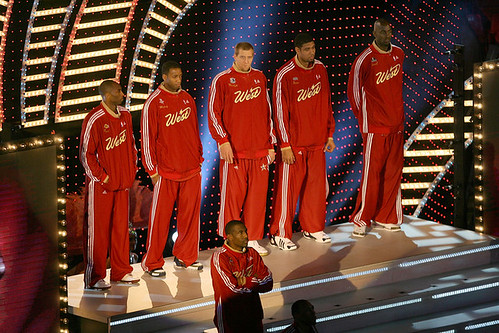
But last night’s NBA All-Star game was too much. From the warm-up suits to the side piping on the uniforms to the refs, the whole thing felt like an Adidas commercial. The biggest surprise was that they somehow forgot to add stripes to the cheerleaders’ outfits.
Other notes from All-Star Weekend:
• Gerald Green won the Slam Dunk competition while wearing a Red Auerbach memorial headband, essentially the road version of the one Paul Pierce wore at the beginning of the season.
• As noted in our weekend comments, only the defending champions got to wear home uniforms for each of the skills competition: the San Antonio team in the Shooting Stars competition; Dwyane Wade in the Skills Challenge; Dirk Nowitzki in the Three-Point Shootout; and Nate Robinson in the Slam Dunk.
• Putting the conference names on the headbands is one thing. But putting them on the socks is a bit much, no?
• I hate that little triangular patch of fabric that keeps showing up at the base of the collar on so many jersey designs these days. Utterly pointless. A classic example of failing the “Is it good or is it stupid?” test.
• The two-tone rear design didn’t look so bad when the dominant tone was white, but it bothered me a lot more when the dominant tone was dark.
• Despite all of the above, a pretty good-looking game, no?
Uni Watch News Ticker: Reprinted from Friday’s comments: Great piece here about how former A’s feel about the team’s white cleats. ”¦ Charles Sliter came across this cool photo of the 1907 English Lacrosse League champions, Old Hulmeians from Manchester. ”¦ Very condensed history of the UK soccer jersey here (with thanks to Mike Munch). ”¦ “Here is a great resource for looking up old football uniforms,” writes Jeff Barak. “The great thing is, you can look at all the teams from a set or scroll down to the list of teams and look at just cards from a particular team. My favorite is the 1951 Bowman set, since each card has a classic logo on it.” ”¦ Reprinted from Saturday’s comments: I didn’t know that when Eric Davis made his MLB debut with the Reds, he didn’t have a uni number for his first plate appearance. ”¦ UCLA and Arizona went color-vs.-color on Saturday. ”¦ It’s not often that you see a manager doing the inside-out pocket thing, but check out new Nats skipper Manny Acta. ”¦ Ramon Castro appears to have changed equipment sponsors, from Louisville/TPX to Rawlings. … Interesting volleyball typeface here (as spotted by Jeremy Brahm, who also points out the odd slogan on this jersey, although I’m more interested in the collar design). … We should have another Distant Replays gift card to raffle off later this week — stay tuned.
Went to a minor league (ECHL) hockey game over the weekend. Cincinnati Cyclones vs. Toledo storm (affiliate of the redwings). Quite nice to see the storm followed the “vertical arching” tradition of the parent team.
Maybe it’s just me, but it seems like Adidas went hog wild with tri-stripes back in the 1970s and early 1980s, and then they were thrust into the background for a while.
Now, however, they are back with a vengeance. Is Adidas going through a branding phase, or was I just not paying attention back in the ’90s?
(Oh, and I rather like the Adidas stripes, so long as they don’t get out of control with it.)
FYI: Volleyball link needs to be fixed.
[quote comment=”56664″]FYI: Volleyball link needs to be fixed.[/quote]
Done. Thanks.
Perhaps a column on volleyball players’ pantyline issues is in order, because the ladies in that photo are definitely having a problem with them.
Can anyone explain why the Reebok sales tag on officially licensed NFL merchandise has a photograph of old Cleveland Stadium on it (saw Browns, Bengals, and Steelers gear with same tagging that had photo of goalpost/lightowers that appeared to be taken from corner of end-zone near the Dawg Pound)
Nowitzki’s misspelled.
Potential for another color on color game tonight between KU and KState. Kstate has been advertising a “Black Out” tonight so will probably where those hideous black uniforms. Only question is whether KU will wear the standard blue or pull out the red alternate.
I really don’t like the black on the Celtics unis. But I loved when Green ripped off his jersey to show the Dee Brown jersey underneath, even though it looked funny with the black trimmed shorts.
I for one thought the cheeleader’s outfits should be more “Vegas-esque.” And by “Vegas-esque,” I mean like strippers.
Speaking of ECHL, Phoenix has a team called the road runners which is an affiliate of the Coyotes. The sported a uniform this past weekend that looks like a Phoenix Suns road jersey turned into a hockey sweater. (Both Teams have the same owners)
Oops I forgot the link
Photo on the Homepage of Phoenix Roadrunners
That picture of Acta’s Nats BP jersey doesn’t have gold accents on the numbers, unlike the game jerseys, or the BP jersey for the past two years. Do you think they plan on phasing out the gold trim? I’ve noticed they’re scaling back the use of the interlocking “DC.”
After much ‘research’ at work this morning, this is my nomination for the link of the new BP getups.
This was a close link.
what happened to having the past all star appearances on the sleeves of the warmups instead of the stripes?
“only the defending champions got to wear home uniforms for each of the skills competition: the San Antonio team in the Shooting Stars competition”
Not true. The Los Angeles team is wearing yellow, which is the home uniform for both the Lakers and the Sparks.
I personally don’t think the BP tops are terrible (I hate the hats) but they look really bad when the sides have white on them and the team is wearing their road grey pants.
Are all of the teams wearing the link with the soft ears?
All of the Pirates stuff is absolutely brutal to look at. I think the BP hat is actually worse than the red jersey.
the bp gear is heat pressed so that is why there are no gold accents for the nats and CB4 had the old raptor logo on the back of his jersey last night instead of the claw
Isn’t the real revelation of the Ramon Castro pic the introduction of baby blue to the Mets’ color scheme?
The Cubs BP cap is strange to look at. The white “C” just doesn’t look right.
link
Also, the white stripe doesn’t go with the gray pants. The Braves are wearing white pants during their workouts, so it matches up a little better.
The white “C” doesn’t make you think Cubs.
This is my new favorite cycling uni. link. I love the fact that they put it on the helmet and the bike too.
[quote comment=”56688″]After much ‘research’ at work this morning, this is my nomination for the link of the new BP getups.
This was a close link.[/quote]
o wow…those Pirates jerseys are terrible….its hard to believe that anyone would approve those
I never watch or follow NASCAR, but I found myself interested in watching the race this past weekend, I was entertained.!! Lots of things to look at.
Also, I’m always in limbo with the NBA, now I know for fact that this league doesn’t do too much for me, or its fans. Every article I’ve read so far, be it from ESPN, FOX, TNT, they all cut up this past weekends all star game, very few watched on TV, and a lot of the players did not enjoy their time in Vegas, whoa, players have actually quoted themselves too, watch out NBA, times look tough in the future for your league…
Despite all of the above, a pretty good-looking game, no?
Actually the uni’s did look sharp, thumbs up to that!
If memory serves me, the adidas logo on the shoulder of the jersey in the ads and other promo pictures was NOT on the All-Star jerseys during the game.
Correct me if I’m wrong.
[quote comment=”56717″]This is my new favorite cycling uni. link. I love the fact that they put it on the helmet and the bike too.[/quote]
“Powered by Chipotle”, huh?
He must be racing to the restroom…
Story about the designs of the Carolina Hurricane link on the Hurricanes home page. I did a quick search and didn’t see it linked here previously.
These new spring training jerseys are hard to even look at.
First off, many teams, such as the link, Royals, Dodgers, etc., have taken the numbers off the fronts of the jerseys, so it’s almost impossible to attach numbers to faces for some of the new guys.
Despite him being the new franchise player, link is badly made. It has the number almost in his pants, as if it were designed for someone six inches taller, and angling slightly upward.
And San Francisco has removed the gold trim from the practice jerseys, making the player names link.
The link are eschewing the ugly side panels and look fairly decent. The link, on the other hand, look like clowns. Same for link. And why have all these teams removes the button-up fronts in favor of pullovers?
[quote comment=”56728″]Story about the designs of the Carolina Hurricane link on the Hurricanes home page. I did a quick search and didn’t see it linked here previously.[/quote]
Wow… I’m truly amazed that the NHL hasn’t forced Grahame to ditch that mask with the buxom babe paint job. While it’s certainly, um, different, I can see where the league wouldn’t want to have that image visible to young fans.
Great find, Bob.
Weekend observations-
The NBA All-Starjerseys looked more like WNBA unis. Ugly.Suck.
The Cubs have ditched all their ridiculuos navy blue apparel and shifted back to royal. Love that.
The San Jose Sharks jersey numbers are practically illegible.Too condensed a font NHL Hell again.
NASCAR has lapped the NBA as USA’s third most popular sport…
Chief Illiniwik is toast after his last insulting war dance at this Wednesday’s v. Spartans. Go away.
[quote comment=”56730″][quote comment=”56728″]Story about the designs of the Carolina Hurricane link on the Hurricanes home page. I did a quick search and didn’t see it linked here previously.[/quote]
Wow… I’m truly amazed that the NHL hasn’t forced Grahame to ditch that mask with the buxom babe paint job. While it’s certainly, um, different, I can see where the league wouldn’t want to have that image visible to young fans.
Great find, Bob.[/quote]
Ummm… I’m much more concerned that a self-respecting athlete would choose to plaster his equipment with the faces of the dudes from Nickleback.
Cubs white “C” aside, I don’t hate the new BP hats. Really, I don’t.
But those BP jerseys are hideous.
With really, really bad jerseys, you wonder who in marketing thought they were a good idea.
More adidas branding news, but from baseball… looks like they’re shooting for some brand exposure in baseball, too. For the first time that I can remember, there is now adidas catcher’s gear… link.
[quote comment=”56734″]Cubs white “C” aside, I don’t hate the new BP hats. Really, I don’t.
But those BP jerseys are hideous.
With really, really bad jerseys, you wonder who in marketing thought they were a good idea.[/quote]
The Cubs didn’t design them themselves, did they? I think the silly side panels are an MLB-wide thing.
The MISL Milwaukee Wave (indoor soccer) wore a new uniform yesterday.
For all previous home games this season, they wore link, and for road games they wore link
Yesterday, they wore link.
Greetings from the front of the Yankees/Red Sox war. Now the reason I’m posting is I live in Central Connecticut(specifically Bristol) and as you might be aware we have a rich history of minor league participation. I was born in the fine city of Waterbury which has played host to numerous minor league affiliates that left when the city refused to pony up money to fix the stadium they played in(the decrepit Municipal Stadium can be seen here, link They still haven’t fixed it) Now you might have heard of Waterbury before, not only the home of Ryan Gomes, but also the home of 3 disgraced mayors and a disgraced governor, but I digress. Unfortunatly I’m the perfect age to remember snapshots of games I attended but little else and unlike other teams in CT, the teams from WTBY are just starving for attention. I have been unable to find anything other than pics of famous players who drifted through. Anything you guys can help me with would be greatly appreciated.
P.S. Sorry about the Yanks/Sox thing, but it’s been on my mind recently. I understand there are Met fans(my father for instance) but Waterbury is such a Yanks town and I just moved 20 mins up the road to Bristol and it’s so different, complete Sox town. Just really odd.
You got a tattoo.
What’s it say?
Dude.
You got one too
What’s it say?
Sweet.
what’s mine say?
Dude.
What about mine?
Sweet…
[quote comment=”56742″]
P.S. Sorry about the Yanks/Sox thing, but it’s been on my mind recently. I understand there are Met fans(my father for instance) but Waterbury is such a Yanks town and I just moved 20 mins up the road to Bristol and it’s so different, complete Sox town. Just really odd.[/quote]
Stay out of the Boston Market there mallrat.
I’ll say this about the new BP jerseys. And I know Paul doesn’t like them, b/c something along the line of “this shit is only for BP, not games”. I know it’s not right, but eh, whatcha gonna do? Remeber, unless MLB changed it, Teams can wear BP uni’s in games, so it’s something we need to think about.
Now, the O’s, I kind of like. I Like Orannge and am glad they didn’t put it all black. Not a Huge fane of tyhe reds, but they’ll do. And as much as i’ll die for this one, not from a fan’s stand point, just from the looks, I LIKE the mets bp get up, even with the black. That being said, there shouldn’t bew any black. I’m just saying I like the combo of how it was done, and if a new team was to start with that set, they would have some nice uniforms.
David Weathers made linkto his new BP hat.
Don’t joke about the cheerleader uniforms; I am sure addidas will cover those next year.
Take a look at the link.
A week or so ago, there was a discussion regarding the NBA ASG’s that had the players wear their own team uniform, instead of East and West. I saw the 1998 NBA ASG on the NBA Network this weekend, and that game was one example. Did anyone ever confirm if there were other years also?
After much ‘research’ at work this morning, this is my nomination for the worst of the new BP getups.
Ironic that Van Benschoten is also a link moniker.
(altogether)…..weil es ein zwei drei Schläge ist, sind Sie am alten Ballspiel aus!
That photo at the top of the All-Stars reminds me of an early 70’s Olympic medal stand shot, where everyone wore the shiny Adidas Keyrolan type look. Ah, had two of those and loved em.
[quote comment=”56730″][quote comment=”56728″]Story about the designs of the Carolina Hurricane link on the Hurricanes home page. I did a quick search and didn’t see it linked here previously.[/quote]
Wow… I’m truly amazed that the NHL hasn’t forced Grahame to ditch that mask with the buxom babe paint job. While it’s certainly, um, different, I can see where the league wouldn’t want to have that image visible to young fans.
Great find, Bob.[/quote]
That looks terrible. Like mudflaps on a ROADWAY 18-wheeler on the highway.
I looked again at the pics to make sure I was paying attention, and the game balls looked like the old one, but the ones in the skills contests looked like the “new” one. What’s the deal?
[quote comment=”56733″][quote comment=”56730″][quote comment=”56728″]Story about the designs of the Carolina Hurricane link on the Hurricanes home page. I did a quick search and didn’t see it linked here previously.[/quote]
Wow… I’m truly amazed that the NHL hasn’t forced Grahame to ditch that mask with the buxom babe paint job. While it’s certainly, um, different, I can see where the league wouldn’t want to have that image visible to young fans.
Great find, Bob.[/quote]
Ummm… I’m much more concerned that a self-respecting athlete would choose to plaster his equipment with the faces of the dudes from Nickleback.[/quote]
You, sir, are correct. Nickleback has the least talent, presence, and creativity of any band in history. Horrible choice for mask art.
On Cold Pizza this morning, Steve Phillips suggested the best move the Devil Rays could make would be to move to San Antonio and rename themselves the Saints. They even mocked up a logo and cap – black with a gold halo.
Everybody wants to design uniforms, huh?
[quote comment=”56735″]More adidas branding news, but from baseball… looks like they’re shooting for some brand exposure in baseball, too. For the first time that I can remember, there is now adidas catcher’s gear… link.[/quote]
Well, to be fair, Adidas has been shooting for some brand exposure in baseball for quite some time now. They have a mega-sponsorship deal with the Yankees that has their logo plastered all over Yankee Stadium and all manner of Yankees apparel. Love ’em or hate ’em (I love ’em), the Yankees are the most (arguably over-) exposed baseball team the world over. Granted, though, the branded catchers gear appears to be a new addition. I wonder if Posada will get any pressure from Yankees/Adidas brass to switch over from his current Nike gear.
More to the main point of today’s post, I absolutely abhor what Adidas does with their once sneaky and clever, but now overdone and tiresome, use of the three stripes branding on uniforms. Of course, I’m a fan of stripe-age in general (I’m a Yankees fan for chrissakes – my classically-clad boys are practically synonymous with uniform stripes), but what Adidas gets away with is inexcusable. Trimming a uni with three stripes is not a design element. It is corporate branding pure and simple, and to call it anything else is disingenuous. A uniform similarly trimmed with a chain of interlocking swooshes could likewise be spun as an aesthetic design element – there purely for looks and not advertising – but nobody would buy it, and fans would be appalled by the naked corporate hijacking of their team’s visual identity. Why does Adidas get a pass just because they were sneaky enough to develop a brand identity that hijacks an element (the stripe) that has elsewhere appeared innocuously on uniforms throughout the ages?
Three stripes running the length of a uniform is a logo, and it’s a hell of a lot bigger than anything Nike or Reebok slaps on their teams. Adidas is the biggest logo creeper out there, and their transgressions really strike at the heart of why we should find logo creep (and excessive template-ization) objectionable in the first place – corporations expropriating teams’ visual identities for their own self-promotion.
I say enough with the Nike bashing; Adidas is the real enemy here.
[quote comment=”56778″]I looked again at the pics to make sure I was paying attention, and the game balls looked like the old one, but the ones in the skills contests looked like the “new” one. What’s the deal?[/quote]
It seems like only the “money ball” from the 3 pt contest was the synthetic ball. link obviously with the fake leather. link. Obviously the Leather ball. And, here’s link with leather.
[quote comment=”56772″]After much ‘research’ at work this morning, this is my nomination for the worst of the new BP getups.
Ironic that Van Benschoten is also a link moniker.
(altogether)…..weil es ein zwei drei Schläge ist, sind Sie am alten Ballspiel aus![/quote]
Are you sure his ancestors aren’t Dutch, with the “van”?
Auf deutsch sagt man “von”, nicht wahr?
Is it just me, or do the Braves current BP unis remind you of the uniforms from when Hank Aaron broke the Babe’s record?
[quote comment=”56735″]More adidas branding news, but from baseball… looks like they’re shooting for some brand exposure in baseball, too. For the first time that I can remember, there is now adidas catcher’s gear… link.[/quote]
reebok has also gotten into the catchers gear mix(sorry i cant find a pic) but i saw a catcher wearing reebok gear i think it was an arizona cather
I loved the UCLA-Arizona game with both being in color—especially since both unis are classy. Arizona’s side stripe was too wide, but I can deal with that. I want more color-and-color games!
Burrill, maybe we could have black-and-black if the unis were different enough. Baseball would be the right game (with the least reliance on uni color to know your teammates from your opponents). I can dream, can’t I?
Ek, I am now going to read your NASCAR post. I’m sure you did a fab job, and post more often. We miss you.
[quote comment=”56789″][quote comment=”56735″]More adidas branding news, but from baseball… looks like they’re shooting for some brand exposure in baseball, too. For the first time that I can remember, there is now adidas catcher’s gear… link.[/quote]
reebok has also gotten into the catchers gear mix(sorry i cant find a pic) but i saw a catcher wearing reebok gear i think it was an arizona cather[/quote]
You beat me to it! I was just going to mention that it appears that longtime Mizuno-wearer Doug Mirabelli has switched to Reebok. link.
Here is a great page with vintage goalie masks to buy:
link
I know someone mentioned over the weekend their love for the green Phillies hat, the NHL has come out with an entire St. Pats day line:
link
Whoever Kally is should be banned from the website permanently
I’m with the assessment of the Mets jerseys–it’s essential to have numbers during spring training.
above post about jordan is NSFW
Paul please delete..
disgusting Kally!
Anyways. this is one of the link looking uni’s in the NHL.
I believe that article on the Hurricanes’ masks ran a few days ago (maybe a week?) on here. But good artistry on both.
I wrote a piece on my blog about hockey masks the other day after reviewing a few sites on goalie mask artistry. You can read it link, along with a second posting about masks.
I’m actually all for John Grahame’s “girl” since the mask artistry is one of the few things the NHL hasn’t put rules on. It’s freedom of expression, and I appreciate the freedom of the designs. There have been some very good mask designs over the years that have stood out.
link.[/quote]
You gotta love the new BP jerseys. That pitcher in the background with his arm raised looks like he has a huge pit stain. Nice look.
To go along with Adidas releasing catchers equipment, they have also just unveiled new uniforms for the link Said one Adidas spokesman, “The Yankees have a rich tradition, and an extremely traditional uniform. We have have successfully combined traditional styling with today’s branded world.”
NC State Photo Archives link. About 175 photos going back 100 years.
[quote comment=”56803″]To go along with Adidas releasing catchers equipment, they have also just unveiled new uniforms for the link Said one Adidas spokesman, “The Yankees have a rich tradition, and an extremely traditional uniform. We have have successfully combined traditional styling with today’s branded world.”[/quote]
The Yankees new B.P. Hat is a crime against humanity. They should try its designers, as well as those who approved the design, at The Hague, then hang them all. Afterwards, they should collect all of the offending hats and use them to fuel a funeral pyre for the offending (and recently hanged) designers and executives incinerating all evidence of this crime. At that point, no one should ever talk about these hats again.
I don’t like the new Yankee hat.
That NC State link doesn’t work. Try link and scroll down to “Athletics”
[quote comment=”56787″][quote comment=”56772″]After much ‘research’ at work this morning, this is my nomination for the worst of the new BP getups.
Ironic that Van Benschoten is also a link moniker.
(altogether)…..weil es ein zwei drei Schläge ist, sind Sie am alten Ballspiel aus![/quote]
Are you sure his ancestors aren’t Dutch, with the “van”?
Auf deutsch sagt man “von”, nicht wahr?[/quote]
Stimmt.
But if ever traded to the Mets, or Giants, and found playing long toss in one of link….
Mike and the Mad Dog (Two idiots) have been talking at length about uniforms and how the mets have way too many uniforms. Their expert opinion: the mets should just ditch the black. Thank you Mike and the Mad Dog! You two are by far the smartest men in sports. How is this show still on the air?
Does anyone have a link to an article on Shaq’s “Slot Machine” shoes?
I am watching mike and the mad dog and a caller brought up the mets and the black and it sounded as if it might have been a talking point on the show for the day….the mad dog does not like the black
[quote comment=”56757″]A week or so ago, there was a discussion regarding the NBA ASG’s that had the players wear their own team uniform, instead of East and West.
I saw the 1998 NBA ASG on the NBA Network this weekend, and that game was one example. Did anyone ever confirm if there were other years also?[/quote]
Players wore their own jerseys from 1997 through 2002.
Of note, I was surprised Paul had no mention of the fact that despite the fact that the players were issued warm-up jackets with patches on the sleeves designating past all-star appearances, and the fact that those are the jackets being sold to fans, the players wore Adidas stiped jackets down the sleeves for the actual game.
Posted Today on link:
USA TODAY’s Mel Antonen witnessed this father-son exchange in Baltimore Orioles camp:
Respect the uniform
Orioles reliever Jamie Walker gave his son, Ross, a lesson in respect for the baseball uniform Sunday. Ross, who is in camp with his dad, accidently dropped his Orioles uniform on the clubhouse floor. Dad, who signed a three-year, $12 million contract with the Orioles in the offseason, told him to pick it up, and to “Always respect the uniform. A big-league uniform never goes on the floor.”
[quote comment=”56803″]To go along with Adidas releasing catchers equipment, they have also just unveiled new uniforms for the link Said one Adidas spokesman, “The Yankees have a rich tradition, and an extremely traditional uniform. We have have successfully combined traditional styling with today’s branded world.”[/quote]
I just threw up in my mouth a little bit.
Nice work on the photoshop, though. Very impressive.
[quote comment=”56781″]On Cold Pizza this morning, Steve Phillips suggested the best move the Devil Rays could make would be to move to San Antonio and rename themselves the Saints. They even mocked up a logo and cap – black with a gold halo.
Everybody wants to design uniforms, huh?[/quote]
Anyone got pictures? I’d sort of like to see them. Sort of.
And, gotta love link Especially the Buffaslug hats.
[quote comment=”56803″]To go along with Adidas releasing catchers equipment, they have also just unveiled new uniforms for the link Said one Adidas spokesman, “The Yankees have a rich tradition, and an extremely traditional uniform. We have have successfully combined traditional styling with today’s branded world.”[/quote]
Not bad work, but it’s a good thing that look will never happen. Remember, the Yankees are the only team in baseball not to have the uniform manufacturer logo on the game jersey sleeves. They feel it makes the uniforms have a more traditional look with no logo on either sleeve. BP jerseys are a different story, since there is no special tradition there… unless you look at the Pirates BP… they look kinda “special” don’t they??
Aww, c’mon Paul. No credit for the White jersey note on Saturday night?
[quote comment=”56751″]David Weathers made linkto his new BP hat.[/quote]
If you look closely at the pants the players are wearing in these photos, you’ll notice that they are the previous design; one black stripe and one red.
I believe the new design has just one red piping down both home whites and away grays.
I know Paul noted the hand-me-downs between parent clubs and minor league clubs in a previous entry, but this leaves one to believe if all teams recycle pants between year to year. Or, perhaps the Reds haven’t gotten their shipments of new unis. Does anyone have any knowledge???
Britney logo creep.
link,,2007080148,00.html
[quote comment=”56857″]Britney logo creep.
link,,2007080148,00.html[/quote]
(second photo down)
[quote comment=”56828″]Aww, c’mon Paul. No credit for the White jersey note on Saturday night?[/quote]
I realize this may astonish you, but I noticed that oe all by myself. And so did a bunch of other readers who e-mailed me about it.
[quote comment=”56859″][quote comment=”56828″]Aww, c’mon Paul. No credit for the White jersey note on Saturday night?[/quote]
I realize this may astonish you, but I noticed that oe all by myself. And so did a bunch of other readers who e-mailed me about it.[/quote]
What, no way! That’s crazy. Haha, i kinda figured that someone else had pointed it out before me, if you hadn’t noticed it.
[quote comment=”56859″][quote comment=”56828″]Aww, c’mon Paul. No credit for the White jersey note on Saturday night?[/quote]
I realize this may astonish you, but I noticed that oe all by myself. And so did a bunch of other readers who e-mailed me about it.[/quote]
Yet your conclusion that “only the defending champions got to wear home uniforms” was incorrect (See my earlier comment – #15). Josh was technically correct in his observation that only the defending champs wore white, but the non-defending Los Angeles team did wear non-white home uniforms.
And, gotta love NHL St. Patrick’s day gear. Especially the Buffaslug hats.
No actually hate the NNL blatant rip-off of MLB’s St. Patrick’s Day jerseys and caps idea…Listen you can throw the NHL and NBA in the same urn…they have long since expired and will never return from the dead….Blame it on Bettman and Stern…old dudes who are more interested in tennis than their individual sports…
Blah, blah, blah, blah.., boring fucks…
link
link
Retire.
[quote comment=”56709″]Are all of the teams wearing the link with the
soft ears?[/quote]
Interstingly, no. The link appear to be the only team that have switched to the new hat but rejected to ‘soft ears’
Paul, I’m watching the K-State game and i have to know, which would be worse for you- the black out or the purple out?
Body paint should no longer be sold in Eugene, Oregon. Because it leads to mismatched “sleeves”.
link
forget the crowd have you seen bob huggins….please paul don’t look not even out of curiosity you will never be the same…..
The MLB BP jerseys are designed by Majestic. And majestic is the equivalent of Champion…nice materials and zero design, fashion nor detail integrity…
These BP jerseys things are brutal.
Speaking of the A’s white cleats, this ran on the A’s website today…
The A’s are the only team in the big leagues that wears white spikes, and veteran infielder Lou Merloni hasn’t quite warmed up to them. “I can’t wait to get ’em dirty,” he said. Outfielder Nick Swisher, whose locker is near Merloni’s said, “Don’t worry, bro. They’ll grow on you fast. You’ll love ’em in a week.” … At least Merloni signed with the team in time to get white spikes. Lefty Lenny DiNardo was claimed off waivers right before camp opened and had to work out Sunday with black spikes.
Also, the A’s BP now sports the A’s logo rather than the elephant wearing sunglasses, a little disappointing. The new hat looks likes like something you’d buy for $5, not something you’d expect the players to wear.
[quote comment=”56883″]Body paint should no longer be sold in Eugene, Oregon. Because it leads to mismatched “sleeves”.
link[/quote]
Man, Allison. That is just brutal. Thanks for sharing.
I wish I could see the black-out….
What does the personalization say on link?
[quote comment=”56923″]What does the personalization say on link?[/quote]
Looks kinda like “#7 MVP”
[quote comment=”56920″][quote comment=”56883″]Body paint should no longer be sold in Eugene, Oregon. Because it leads to mismatched “sleeves”.
link[/quote]
Man, Allison. That is just brutal. Thanks for sharing.
I wish I could see the black-out….[/quote]
Minna, it’s not a black-out, but gives you something black to look at. link
[quote comment=”56930″][quote comment=”56923″]What does the personalization say on link?[/quote]
Looks kinda like “#7 MVP”[/quote]
Either “#7 MVP” or “99 MVP” since he was the MVP back in 1999. It also oddly looks like “07 MVP”. Wishful thinking Pudge?
Some logo creep from Charles Barkley from Saturday’s race. Charles had Nike pants on, and what appears to be Adidas shorts on under the pants.
link
When Charles fell, you can see the Adidas shorts that he was also wearing (very briefly on tv and the youtube clip)
(ESPN votes voted this as the 2nd most exciting sporting event from the weekend, just behind the Daytona 500. The ASG was a distant third, followed by the slam dunk contest, and lastly, the Nissan Open)
[quote comment=”56931″]
Minna, it’s not a black-out, but gives you something black to look at. link[/quote]
Thanks, Allison. You can always post pics of black unis for me.
Ek! Nice job on the NASCAR cars, but I have to admit that I laughed at the Tony the Tiger skin. Nothing says fierce like a cereal cartoon.
[quote comment=”56874″]And, gotta love NHL St. Patrick’s day gear. Especially the Buffaslug hats.
No actually hate the NNL blatant rip-off of MLB’s St. Patrick’s Day jerseys and caps idea…Listen you can throw the NHL and NBA in the same urn…they have long since expired and will never return from the dead….Blame it on Bettman and Stern…old dudes who are more interested in tennis than their individual sports…
[/quote]
And, of course, hockey is SO popular in Ireland!
Just to note that Illinois and Northwestern both sported colored jerseys on Sunday…
link
[quote comment=”56792″]I loved the UCLA-Arizona game with both being in color—especially since both unis are classy. Arizona’s side stripe was too wide, but I can deal with that. I want more color-and-color games!
The UCLA/Arizona game was actually the fifth time this season that my Bruins have had a Color vs. Color game. We have had match ups versus link, link, link, link and of course link.
Now if only the powers that be will allow the UCLA/USC Football games to be our traditional link without teams being docked a time out.
[quote comment=”56732″]Weekend observations-
The NBA All-Starjerseys looked more like WNBA unis. Ugly.Suck.
The Cubs have ditched all their ridiculuos navy blue apparel and shifted back to royal. Love that.
The San Jose Sharks jersey numbers are practically illegible.Too condensed a font NHL Hell again.
NASCAR has lapped the NBA as USA’s third most popular sport…
Chief Illiniwik is toast after his last insulting war dance at this Wednesday’s v. Spartans. Go away.[/quote]
That’s laughable. The NBA has fans all over the world buddy and in all the major cities. NASCAR is still a regional sport – in the southern US.
[quote comment=”56711″]All of the Pirates stuff is absolutely brutal to look at. I think the BP hat is actually worse than the red jersey.[/quote]
I don’t know about that, it’s hard to be worse than the red jersey. It’s a close tie.