For a couple of years now, this 1968 SI cover has been a bit of a holy grail for me, because the players shown behind Pistol Pete are wearing the rarest of all uni accessories: vertically striped socks.
The problem, of course, is that the opposing players are small and barely visible in the background. Although you can’t tell from the photos, I knew that the other team was Tulane, because a few years back I’d seen a magazine photo (which I foolishly neglected to save) that showed the jersey fronts as well as the socks. I’ve tried several times to find that photo, or any other good photos of that Tulane uniform — no dice. When I called the Tulane athletic department a year or two ago, they claimed not to have any photos from 1968 (although I still suspect they were just too embarrassed by the socks to share any pics they might have).
But now, thanks to a Maravich photo gallery that went up on SI.com on Tuesday, we finally have a much better view of these north/south hosiery stripes: Behold!
Man, are those tough to look at or what? Obviously, I love stripes in general and striped socks in particular, but I draw the line at vertically striped hose, which inevitably look clownish (well, except maybe when deployed as shown at the top of this page). Still, it’s great to have a better look at this rare design.
That would have been enough to make my week, or maybe my month, but it turns out it was just the beginning. In yesterday’s Comments section, there was a bit of chatter about the Maravich gallery, including this note from Steve Stern: “I believe the Maravich pictures were taken by Rich Clarkson, a former SI photographer who has an amazing collection.” I hadn’t thought to search on the photographer’s name (stupid, stupid, stupid), so I tried that and ended up at Clarkson’s site. That in turn led me to this NCAA photo archive, which I’d somehow never known about before (stupid, stupid, stupid). And that, my friends, is where I hit the mother lode.
Dig it — nearly a dozen photos, all taken at the LSU/Tulane game on January 6th, 1968. Click through the thumbnails to get the full effect, but I warn you, it’s pretty brutal.
How rare are vertically striped socks? So rare that these are the only other instances I’m aware of:
• The 1960-61 Denver Broncos, whose infamous socks (visible to varying degrees here, here, here, and here) were eventually burned by the team at a public bonfire. Fortunately, one pair survives at the Pro Football Hall of Fame.
• The mid-1960s Pearl High School basketball team in Nashville, which upon closer inspection actually wore conventionally striped socks over the vertical stripes. (Further info on this historically important team is available here.) Of course, if one high school team was wearing the longitudinally striped hose, others probably were too.
• The Harlem Magicians — presumably a Globetrotters-esque team — whose uniform is shown on here (as showcased on the excellent Dick’s Courtroom site). Again, if this team was doing it, they probably weren’t alone.
Then there are some borderline cases. The stripes worn by the 1914 Victoria Bees, for example, didn’t run the full length of the sock. And Nike’s “Swift” hockey template only has stripes on the front of the shin, not the whole way around. If anyone knows of other examples, fill me in.
That Maravich gallery, incidentally, has lots of other good stuff, including a short-sleeved jacket, a great LSU logo illustration, and, of course, Pistol’s signature droopy socks.
Finally: First person who can post a comment explaining the headline of today’s post without help from a search engine (honor system) gets a Uni Watch T-shirt. Again, post your answer as a comment, not as an e-mail to me.
Motown Tribute: The hockey world is abuzz over the very uni-centric ceremony that the Red Wings arranged for the retirement of Steve Yzerman’s number on Tuesday night. Instead of doing the usual lookalike jersey routine, they were more creative, as David Main explains:
All the former players serving as honored guests had their names and numbers affixed to the current style Red Wings jersey, along with the commemorative “19” patch. Current Red Wings then lined the red carpet for Yzerman’s entrance, wearing various jerseys from Yzerman’s career: Red Wings from 2002 Cup finals (two patches — one for the finals, and the “19” patch), Team Canada from his gold medal-winning team, old-fashioned Campbell Conference All-Star jersey, and Peterborough Petes home and road jerseys (with disgusting manufacturer’s logo apparent — I doubt it was that way in Yzerman’s playing days).
In addition, the team’s previous retired numbers were rededicated, complete with vertically arched nameplates, and the current team wore a jersey patch for the occasion. Nice job all around.
Christmas Bonus: When I wrote about the great Xmas presents given to me by Uni Watch hedge fund analyst Jenny Strasburg, I left out one gift: a cool vintage bowling shirt, which turned out to be a smidge too small. We exchanged it a few days ago, and I like the new shirt even better than the first one, in large part because of this spectacular chain-stitched design on the back. Bowling, football, team logos, old-school uni designs, animal mascots, the Midwest — all (well, most) of my favorite food groups!
Uni Watch News Ticker: On Tuesday I jokingly mentioned the possibility of NHL cheerleaders. Turns out they’re no joke, at least not for the Hurricanes, Islanders, Coyotes, and Flyers, among others. Okay, so some of those are actually ice clean-up crews, not cheerleaders, but that’s close enough for our purposes. Thanks to everyone who clued me in on this one. ”¦ Minnesota-Duluth has cheerleaders, too. ”¦ Ever wonder if there’s a web site devoted to the uniforms of the Japanese national volleyball team? There is (with thanks, of course, to Jeremy Brahm). ”¦ And there’s a good history of Mexican soccer kits here (courtesy of Janssen McCormick). ”¦ Michael Rich notes that the Gator Bowl patch was coming loose from several Georgia Tech jerseys the other day. ”¦ Vacation report from Michael Rich, who writes: “I was in Tombstone, Arizona, last week and discovered an interesting photo on the wall at the OK Coral Museum (famous, of course, for the gunfight involving Wyatt Earp, Doc Holiday, et al. on Oct. 26, 1881). The photo depicts the Tombstone Football team in 1904. I also saw a fantastic logo for what I’m pretty sure is the local high school. It would have been easy for the Tombstone Fighting Yellow Jackets to steal their logo from Georgia Tech (and, sadly, another sign around town confirms that they have), but this unique logo was both fantastic (love the bow tie and the growl) and bizarre (does it have 3 wings? why are the arm and leg thicknesses so different?). It even appears to have a sailor hat.” ”¦ We all know minor league hockey teams tend to have advertising on their jerseys these days. But wearing an ad on your ass is particularly pathetic (as spotted by Dave Sizer). ”¦ Remember Joe Pavelski’s upside-down Reebok logo? Here’s an update from Dave Shucosky: “Pavelski switched from No. 53 to No. 8 after the Calgary game on the last Sharks homestand (I guess because he’s staying put), and his road 8 jersey now has the correct Reebok logo. I guess they dug that 53 out of the closet because they didn’t know how long he’d stay up.” ”¦ Several readers have noted the USC center Ryan Kalil has a “10” decal on the back of his helmet, presumably so QB John David Booty (who wears No. 10) doesn’t accidentally set up under the wrong lineman. Here’s a screen shot, courtesy of Don Schafer. ”¦ Not uni-related, but I contributed to Page 2’s “List of Lists” rundown the other day. ”¦ Good article here about Ohio State’s merit decals (credit a buckeye to Matt McLaughlin). ”¦ Uni Watch design director Scott M.X. Turner found this on eBay. “The 1964 World’s Fair was so Mets-oriented [as seen by the sleeve patch that the Mets wore that year],” he writes, “so I’m surprised to see a Yankees program with a World’s Fair tie-in.” ”¦ Loads of great contributions from Montreal-based reader Jonathan Goupil: 1) “Montreal’s French newspaper, La Presse, had a story where they recalled how the Canadiens franchise was born in 1909. Here’s a scan of the uniforms the Habs wore in 1909-10 through 1916-17. The caption said that after the 1915-16 Stanley Cup, the owners decided to keep the jersey pretty much as it was, to bring a winning tradition to the team.” 2) “La Presse also ran a contest for readers to send in new logo designs for the Habs.I’m sending you the two that were worth looking at. The others were sent by 8- to 10-years-old boys and were all basically the ‘CH’ logo with flames around it.” 3) “I found this photo of former Canadian Prime Minister Jean Chrétien and Russia’s Valdimir Putin trading hockey jerseys in 2002. Note that the Russian jersey says (I guess) ‘J. Chrétien’ in Russian, while the Canadian jersey says ‘Putin.’ ” [Also note the back-collar logo creep on Putin’s jersey. — PL] 4) In response to our recent survey of Presidents in uniform, Goupil came up with two shots of JFK: one of his prep school football team (he’s second from the right) and one from his days on the Harvard swimming team.
Johnny B. Goode sez ‘Hi!”
I posted late last night that I spotted the Motion W on a helmet in Friday Night Lights. Here’s a link.
Two follow-ups from yesterday’s BCS discussion:
1. The Rose Bowl teams did not have the Bowl Bash logo because that game was broadcast by ABC, not Fox. The Rose Bowl is still part of the BCS, but that game’s TV contract is separate from the rest of the package.
2. Joe Buck will not be calling the BCS Championship on Monday because he will be working the Jersey/A-Philly playoff on Sunday. We can’t escape him forever.
The title of the article is from the song Tulane (sock reference from Pistol Pete photos) but I cant for the life of me remember who sings it.
[quote comment=”37853″]Two follow-ups from yesterday’s BCS discussion:
1. The Rose Bowl teams did not have the Bowl Bash logo because that game was broadcast by ABC, not Fox. The Rose Bowl is still part of the BCS, but that game’s TV contract is separate from the rest of the package.
2. Joe Buck will not be calling the BCS Championship on Monday because he will be working the Jersey/A-Philly playoff on Sunday. We can’t escape him forever.[/quote]
Sorry to keep this “non-uni” thread alive and I promise to keep all future comments limited to Uniform-only observations – but I can’t contain myself – Fox is killing college football! I thought last night’s coverage was just horrible. Was that a game (well not really actually) or just three amateur comedians in a booth who just happened to have a game going on in the background. Will you guys just shut up!!! Makes me long for Brent Musberger… We’ve fallen so far in one year since Keith Jackson called the Texas/USC game last year…
Agreed that the commentary was awful and NFLized. Anyone know why so many Notre Dame players left one chin strap buckle hanging? Samardzija and the punter were both shown several times, during play, with one end hanging down. Also, is it a facemask penalty if a player is pulled down by the chinstrap? Has this ever happened in a college or NFL game?
Paul, as you may know, that bowling shirt’s logo belongs to the 22-time state champion Massillon (Ohio) High School, the second most winningest high school football team of all time.
The playful tiger is nicknamed link (originally O.B. for Orange and Black, the colors of the school). The Tigers even have a link (also nicknamed Obie) on the sidelines during home games at link.
The football crazy town also had an award winning documentary about them entitled “link.”
Interestingly (or disgustingly) enough, the Tigers went to a link this season for the first time.
Also, as Massillon changes unis and helmets every few years, supporters have set up the link just to categorize them.
Sorry for the long-winded response, I’m just a big Ohio high school football fan and Massillon’s Obie is my favorite logo of them all. And yes, there is a link.
The name has to do with a line in the Chuck Berry song “Tulane”
Lyrics from the song “Tulane”.
link
Cool info on the Broncos infamous brown and gold vertically striped socks. However, in the first photo (shown at this link):
link
the player probably isn’t wearing the vertically striped socks; it’s probably a reflection. The brown and gold Broncos uniforms didn’t have sleeve stripes; the player in this photo has the 3-stripe pattern of the Broncos 1962-64 uniforms, which were orange and used solid orange socks.
Interesting discussion on the vertical stripe socks. Now link socks have hoops on them and are some fine looking socks from Harlequins rugby union club.
[quote comment=”37874″]Cool info on the Broncos infamous brown and gold vertically striped socks. However, in the first photo (shown at this link):
link
the player probably isn’t wearing the vertically striped socks; it’s probably a reflection. The brown and gold Broncos uniforms didn’t have sleeve stripes; the player in this photo has the 3-stripe pattern of the Broncos 1962-64 uniforms, which were orange and used solid orange socks.[/quote]
Good catch! I’ll take down that link.
That link seemed wierd to me for some reason other than the obvious sizing issues the bee has with his arms and legs and the possible third wing. So i went to check out other bee logos and figured out what it was.
The old link and also the link both show a bee with legs like the logo for the high school in AZ. As does this link (anybody know a team there?). link of the Georgia Tech logo shows the yellow jackets’s legs. The Georgia Tech link too. And this link (which looks very similar to the unknown logo from before… a connection?) does the same. The thing I found wierd about Unknown AZ high school’s logo is that the legs seem to me coming out of the bee’s butt (for lack of a better term, I suppose stinger may work, though) much lower than the others and the original bee. Usually the legs are coming out of the bottom of the torso as seen in the Charlotte and NO Hornets logo, which is what I am used to looking at when it comes to sports logos involving insects. Or, the legs are coming out closer to the top of the butt or stinger as seen in the alternate GT logo and mascot and the other two bees.
The original logo in question shows the legs coming out towards the bottom of the butt/stinger which looks wierd to me. Just seems to be putting bee literally off balance like he could fall over at any time. Anybody else?
Two hockey-related things. This year, Nike seems to have moved away from the vertical stripes on the front of the hockey socks. The teams at the World Junior Championships have old-school, horizontal stripes and when I saw North Dakota at the Dartmouth Christmas tourney (and obviously DU in the above photo), they had horizontal stripes too, so at least that’s still right.
As far as changing the Canadiens logo, I hate that idea. Actually, the only thing in hockey I hate more than the idea of changing that jersey is that team. As much as that logo represents soulless, life-sucking, whining, diving evil, it should stay absolutely the same.
Actually, I hate BC more in hockey, but that’s something different altogether.
Two other points on those Tulane uniforms:
1. the multiple stripes down the jersey side made for a cool look. I remember that SMU had the same style in its late ’60s jerseys and I think these may have been from the great Southland company of Terrell, Texas (makers of the early Dallas Cowboys unis with the cool number font) because…
2. the white number on white jersey look was used by several Dallas high school teams (supplied by Southland) in the early ’70s. They were nightmares to follow from the stands and were even worse on TV.
Great work putting the Pearl High School link on there. I played against Pearl-Cohn (Pearl and Cohn high schools merged in 1983) in football in the early 1990s, and I enjoyed seeing that pic of their old-school uniforms…
Concerning the Gator Bowl logo coming loose: in the link, is there something under the logo? It looks like there was something that was covered by the bowl logo.
Gotta say, of those two fan submitted Canadiens logos, I do like the top one. I like the hint of the Canadian maple leaf in the flame, the wings and how the white part makes an ‘H’.
I kinda dig that. Of course, I’m one for history and all that and don’t think they should change at all. But it’d be a cool alternate.
Loved the belt on the Tulane unis. Also loved the number 6 1/2 on the Harlam Magicians uni. how many instances of fractions have appeared on professional teams unis?
The Russian jersey does say the cyrillic spelling of ‘J. Chrétien’. The way it looks like it is spelled it would sound something like Zheh K-r-yeh-t-yeh-n in Russian
I knew those Russian lessons would pay off.
By the way, anybody else thing that Charlie Weis needs to stop link into his pants? Looks like he’s got a link. Same goes for link and link. They all need to go to the link at least wearing a sweater vest, or the link with the longer coat (I don’t care how hot it is in Texas). Or course Mangini has his own link sometimes (other than coaching the Jets of course).
One more hockey note – the Shark with the upside down Reebok logo is Joe Pavelski, not Jim.
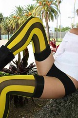
Forget Pistol Pete, whose legs are those featured at the top of the page?! rowr!
Paul,
Let’s not forget the vertical socks featured in the US’s 2006 World Cup uniform provided by our friends at Nike.
link
link
You can see the vertical strips are only featured on one side of the player’s left leg, but the damage has been done. Compare the white socks to the navy and red; the navy is a much better look.
[quote comment=”37888″]Loved the belt on the Tulane unis. Also loved the number 6 1/2 on the Harlam Magicians uni. how many instances of fractions have appeared on professional teams unis?[/quote]
Eddie Gaedel, Bill Veeck’s dwarf pinch hitter wore 1/8 in his only at-bat for the St Louis Browns. Story and a few pictures link
I think a lot of college hockey teams have cheerleaders. U of Minnesota for sure has cheerleaders.
[quote comment=”37878″]That link seemed wierd to me for some reason other than the obvious sizing issues the bee has with his arms and legs and the possible third wing. So i went to check out other bee logos and figured out what it was.
Anybody else?[/quote]
Most bees have four wings but often aren’t uncoupled until just before they die.
[quote comment=”37906″]Paul,
Let’s not forget the vertical socks featured in the US’s 2006 World Cup uniform provided by our friends at Nike.
link
link
You can see the vertical strips are only featured on one side of the player’s left leg, but the damage has been done. Compare the white socks to the navy and red; the navy is a much better look.[/quote]
How could I forget those socks, nice find! Also let’s not forget link from the 2004 Olympics.
As for Paul’s list of lists, amen to left-handedness!
My favorite insect logo.
[quote comment=”37904″]Forget Pistol Pete, whose legs are those featured at the top of the page?! rowr![/quote]
Please let it be a girl….Please let it be a girl….Please let it be a girl.
As for Paul’s list of lists, amen to left-handedness!
link.
The National Hockey League and the National Hockey League Players’ Association will work together to help kids in need through the 2007 Garth Brooks Teammates for Kids patch program.
During one select home game from January 4 through January13, all players on each of the 30 NHL team rosters will wear a team jersey featuring a special Garth Brooks Teammates for Kids Foundation commemorative patch.
After the game, each player will donate his jersey to the 2007 Teammates for Kids On-Line Auction, with proceeds benefiting the Garth Brooks Teammates for Kids Foundation.
Teammates for kids
So yesterday the Orioles held a press conference for their new left fielder/1st baseman/DH/Savior link, and a couple of things struck my as odd.
A) The manager, Sam Perlozzo, was not there. The manager is always there!!!!
B) There was no “HUFF 07” jersey or hat. Press conference mainstays!
C) Not a single Oriole logo on the link. It actually just says Camden Yards…and for good measure (and also the first time I have ever seen this) they type is in Ravens’ colors instead of O’s colors or the official link logo (sorry for the quality)!
Is the marketing department over there that frustrated with the team and envious of the gridiron neighbors that they are sending subliminal backdrop signals???
So why is the NFL HOF Bronco vertically stiped sock brown and white while the others are brown and yellow?
The original owners had next to no money, so they bought unis from the Copper Bowl – a defunct college all-star game, but they only got one set. The yellow jersey, brown pants combo could be worn against any opponent. There wouldn’t be any reason for brown/white socks in addition to the brown/yellows.
Not at all uni-related, but for a variety of obscure geographic reasons, nearly all Canadian “boro” and “burg” place names haven’t been shortened like their US counterparts. As such, the town is spelled Peterborough, not Peterboro.
Oh, and since I may as well leave a uni-related comment, the Petes didn’t wear those disgusting yellow cartoon skating dude shoulder patches in Yzerman’s day either.
link
[quote comment=”37878″]That link seemed wierd to me for some reason other than the obvious sizing issues the bee has with his arms and legs and the possible third wing. So i went to check out other bee logos and figured out what it was.
The old link and also the link both show a bee with legs like the logo for the high school in AZ. As does this link (anybody know a team there?). link of the Georgia Tech logo shows the yellow jackets’s legs. The Georgia Tech link too. And this link (which looks very similar to the unknown logo from before… a connection?) does the same. The thing I found wierd about Unknown AZ high school’s logo is that the legs seem to me coming out of the bee’s butt (for lack of a better term, I suppose stinger may work, though) much lower than the others and the original bee. Usually the legs are coming out of the bottom of the torso as seen in the Charlotte and NO Hornets logo, which is what I am used to looking at when it comes to sports logos involving insects. Or, the legs are coming out closer to the top of the butt or stinger as seen in the alternate GT logo and mascot and the other two bees.
The original logo in question shows the legs coming out towards the bottom of the butt/stinger which looks wierd to me. Just seems to be putting bee literally off balance like he could fall over at any time. Anybody else?[/quote]
Well if we’re going to get technical about it, then all of the logos need to include another set of appendages (legs or arms – take your pick) since insects, by definition, have six appendages.
Also, the bottom-part of the body would be called link with the legs stemming from the creatures mid-section or thorax. So, to be accurate, the legs should come from the mid-section.
As for the wings, you can see link that the yellow jacket does in-fact have 4 wings. Therefore, I believe that you just can’t see the 4th wing on the other side of the mascot due to the perspective and positioning of the creature with respect to the viewer.
The Fighting Yellowjackets logo is sort-of cool looking, but I gotta nit-pick. I hate superfluous usage of quotation marks. And this one takes the cake- using single quotes. Ugh!
Go ‘Yellowjackets!’
OK, there is a lot I need to comment on from last night…
[quote comment=”37818″]I typically love when football players spat their cleats up, but link. Are those adidas socks cut-up and taped over his cleats?
For all I know, he could’ve done this before, but regardless… it’s a bowl game. Why look like an amateur?[/quote]
Agreed, it is Busch(TM) League to link that for a bowl game…practice, yes we’re talking about practice, is OK, but bring out some tape for the spat job Brady
[quote comment=”37800″]Two notes from The LSU-ND game. One, JaMarcus Russell put his (yellow) mouthguard on his noseguard between plays, which looked really cute—like a pig’s snout. I like pigs, so that’s not an insult.
Two, I really detest that bands on the elbows, biceps, knees, calves look—and it can’t be good for circulation.
That’s all I got. More props to Vince for another exemplary entry to the UniWatch Blog.[/quote]
I can see why players wear them on there elbows/knees cuz there is a reason, however, everywhere else is just for looks…players wear them on there elbows/knees to protect from rug burn from the turf…even though it is field turf it still hurts…i didn’t get why link and Russell from LSU were wearing those white bands on their knees until last night (eliminate link)
I opted for the link
And one last thing:
What if Syracuse played in the Orange Bowl? What would happen if they link link?
[quote comment=”37922″]The National Hockey League and the National Hockey League Players’ Association will work together to help kids in need through the 2007 Garth Brooks Teammates for Kids patch program.
During one select home game from January 4 through January13, all players on each of the 30 NHL team rosters will wear a team jersey featuring a special Garth Brooks Teammates for Kids Foundation commemorative patch.
After the game, each player will donate his jersey to the 2007 Teammates for Kids On-Line Auction, with proceeds benefiting the Garth Brooks Teammates for Kids Foundation.
Teammates for kids[/quote]
Nice gesture by Garth and the NHL.
As long we don’t have to see link again to make the kids a few bucks, I’ll be happy.
[quote comment=”37884″]Concerning the Gator Bowl logo coming loose: in the link, is there something under the logo? It looks like there was something that was covered by the bowl logo.[/quote]
If I’m looking at the same thing you’re looking at, it’s the football on the top of the Gator Bowl logo. Hope that helps!
[quote comment=”37930″][quote comment=”37922″]The National Hockey League and the National Hockey League Players’ Association will work together to help kids in need through the 2007 Garth Brooks Teammates for Kids patch program.
During one select home game from January 4 through January13, all players on each of the 30 NHL team rosters will wear a team jersey featuring a special Garth Brooks Teammates for Kids Foundation commemorative patch.
After the game, each player will donate his jersey to the 2007 Teammates for Kids On-Line Auction, with proceeds benefiting the Garth Brooks Teammates for Kids Foundation.
Teammates for kids[/quote]
Nice gesture by Garth and the NHL.
As long we don’t have to see link again to make the kids a few bucks, I’ll be happy.[/quote]
Whoops… as long as we don’t have to see link again… sorry gang.
[quote comment=”37888″]Loved the belt on the Tulane unis. Also loved the number 6 1/2 on the Harlam Magicians uni. how many instances of fractions have appeared on professional teams unis?[/quote]
Let’s see . . .off the top of my head, Eddie Gaedel, the midget who Bill Veeck snt up to pinch hit wore #1/8 and Robert Merrill, the late Metropolitan Opera baritone would wear 1/2 on Old-Timers Day at Yankee Stadium when he would sing the National Anthem and coach 1st Base (sorry, no pics for either . . .) Speaking as a Yankees fan, Ronan Tynan makes me REALLY miss Robert Merrill.
[quote comment=”37932″][quote comment=”37930″][quote comment=”37922″]The National Hockey League and the National Hockey League Players’ Association will work together to help kids in need through the 2007 Garth Brooks Teammates for Kids patch program.
During one select home game from January 4 through January13, all players on each of the 30 NHL team rosters will wear a team jersey featuring a special Garth Brooks Teammates for Kids Foundation commemorative patch.
After the game, each player will donate his jersey to the 2007 Teammates for Kids On-Line Auction, with proceeds benefiting the Garth Brooks Teammates for Kids Foundation.
Teammates for kids[/quote]
Nice gesture by Garth and the NHL.
As long we don’t have to see link again to make the kids a few bucks, I’ll be happy.[/quote]
Whoops… as long as we don’t have to see link again… sorry gang.[/quote]
I think link might actually be worse
[quote comment=”37925″]Not at all uni-related, but for a variety of obscure geographic reasons, nearly all Canadian “boro” and “burg” place names haven’t been shortened like their US counterparts. As such, the town is spelled Peterborough, not Peterboro.[/quote]
Yet, too many people type “Pittsburg” when referring to Pittsburgh, PA.
I hate superfluous usage of quotation marks. And this one takes the cake- using single quotes. Ugh! Go ‘Yellowjackets!’
They’re being postmodern and calling attention to the fact that they’re not actual flying insects. “This is not a pipe,” and all that.
[quote]Speaking as a Yankees fan, Ronan Tynan makes me REALLY miss Robert Merrill.[/quote]
Speaking as a Red Sox fan, Ronan Tynan makes me physically ill.
With regards to vertical socks, Adidas produced a line of them about two years ago for soccer called the Adidas Elite Sock. A number of top-level soccer teams used them including Major League Soccer as shown in this photo in a 2004 contest between the New England Revolution (white) and the San José Earthquakes (Blue).
link
As far as vertical stripes go, I thought these were well implemented, especially given Adidas’s famous 3 stripe motif.
Not athletic, but perhaps the world’s most recognizable vertically striped socks. link.
My first instinct when I saw the headline was Throw the Cat out of the room to get down and dirty without it clawing at your package..haha..
I haven’t read any of the other comments yet..so this may have been brought up already..or I could be way off…haha..it kinda reminded me of the Robin William’s viagra skit where the cat is clawing at him..
Oh well..oh and..did last night prove to anyone that ND didn’t belong in a BSC bowl..and maybe Rutgers did?
[quote comment=”37937″][quote]Speaking as a Yankees fan, Ronan Tynan makes me REALLY miss Robert Merrill.[/quote]
Speaking as a Red Sox fan, Ronan Tynan makes me physically ill.[/quote]
Hey, at least the Yankees have enough common sense not to try and fit Dr. Tynan’s fat @$$ into a full uniform. At least Robert Merrill was trim (he was also 90 years-old, but that’s neither here nor there)
In listing other NHL teams with cheer/ice crews, Paul forgot the link
[quote comment=”37936″]I hate superfluous usage of quotation marks. And this one takes the cake- using single quotes. Ugh! Go ‘Yellowjackets!’
They’re being postmodern and calling attention to the fact that they’re not actual flying insects. “This is not a pipe,” and all that.[/quote]
Rene and Georgette Magritte with their dog after the war?
“Yet, too many people type “Pittsburg” when referring to Pittsburgh, PA.”
There’s precedent. In 1891, the U.S. Board on Geographic Names issued a directive for all cities ending in “gh” to lose the “h” — the thinking being it would streamline all sorts of things and end confusion, letters being sent to wrong places, et cetera.
Pittsburgh was officially “Pittsburg” for 20 years, ’til the directive was rescinded in 1911.
Not that people today who leave the “h” off Pittsburgh are citing the USBoGN.
[quote comment=”37945″]In listing other NHL teams with cheer/ice crews, Paul forgot the link[/quote]
I mentioned them the other day, gotta get to the pcs in the skirts, major goodness.
[quote comment=”37947″]“Yet, too many people type “Pittsburg” when referring to Pittsburgh, PA.”
There’s precedent. In 1891, the U.S. Board on Geographic Names issued a directive for all cities ending in “gh” to lose the “h” — the thinking being it would streamline all sorts of things and end confusion, letters being sent to wrong places, et cetera.
Pittsburgh was officially “Pittsburg” for 20 years, ’til the directive was rescinded in 1911.
Not that people today who leave the “h” off Pittsburgh are citing the USBoGN.[/quote]
Or were around in 1911!
in regards to the Pearl High School socks…
If you look at #44 (front row, far right), it appears as though the vertically striped socks are actually stirrups. Maybe they were borrowed from the baseball team and then the team decided to cover the ankle region of the stirrup with another pair of socks. as common as horizontally striped socks were in that day, the team may have had no choice but to go with the contrasting stripes and thus creating a very unique design.
[quote comment=”37934″][quote comment=”37932″][quote comment=”37930″][quote comment=”37922″
After the game, each player will donate his jersey to the 2007 Teammates for Kids On-Line Auction, with proceeds benefiting the Garth Brooks Teammates for Kids Foundation.
Teammates for kids[/quote]
Nice gesture by Garth and the NHL.
As long we don’t have to see link again to make the kids a few bucks, I’ll be happy.[/quote]
Whoops… as long as we don’t have to see link again… sorry gang.[/quote]
I think link might actually be worse[/quote]
Or, He could always go back to link I really can’t decide which is worse.
[quote comment=”37944″][quote comment=”37937″][quote]Speaking as a Yankees fan, Ronan Tynan makes me REALLY miss Robert Merrill.[/quote]
Speaking as a Red Sox fan, Ronan Tynan makes me physically ill.[/quote]
Hey, at least the Yankees have enough common sense not to try and fit Dr. Tynan’s fat @$$ into a full uniform. At least Robert Merrill was trim (he was also 90 years-old, but that’s neither here nor there)[/quote]
Be nice, Ronen Tynan has disabilities
[quote comment=”37942″]My first instinct when I saw the headline was Throw the Cat out of the room to get down and dirty without it clawing at your package..haha..
I haven’t read any of the other comments yet..so this may have been brought up already..or I could be way off…haha..it kinda reminded me of the Robin William’s viagra skit where the cat is clawing at him..
Oh well..oh and..did last night prove to anyone that ND didn’t belong in a BSC bowl..and maybe Rutgers did?[/quote]
If anyone deserved to be in a BCS game it was Wisconsin…ranked #6 and left out only because Ohio St. and Michigan were playing in a BCS game…oh and they beat a solid Arkansas team in their bowl game to prove they can beat good teams
[quote comment=”37938″]With regards to vertical socks, Adidas produced a line of them about two years ago for soccer called the Adidas Elite Sock. A number of top-level soccer teams used them including Major League Soccer as shown in this photo in a 2004 contest between the New England Revolution (white) and the San José Earthquakes (Blue).
link
As far as vertical stripes go, I thought these were well implemented, especially given Adidas’s famous 3 stripe motif.[/quote]
Have to disagree with you. As much as everyone bags on Nike on this board, Adidas plasters the three stripes on their unis way worse than anything Nike does, and that picture is proof. If there was a big swoosh running down both sleeves, both pant legs, and both inside and outside of both socks, everyone would throw a fit. But since it’s not Nike, it ok. The three stripe “design feature” is just a big logo.
[quote comment=”37957″][quote comment=”37938″]With regards to vertical socks, Adidas produced a line of them about two years ago for soccer called the Adidas Elite Sock. A number of top-level soccer teams used them including Major League Soccer as shown in this photo in a 2004 contest between the New England Revolution (white) and the San José Earthquakes (Blue).
link
As far as vertical stripes go, I thought these were well implemented, especially given Adidas’s famous 3 stripe motif.[/quote]
Have to disagree with you. As much as everyone bags on Nike on this board, Adidas plasters the three stripes on their unis way worse than anything Nike does, and that picture is proof. If there was a big swoosh running down both sleeves, both pant legs, and both inside and outside of both socks, everyone would throw a fit. But since it’s not Nike, it ok. The three stripe “design feature” is just a big logo.[/quote]
As a student at an Adidas-sponsored school (Indiana), I have to say that i like the way Adidas implements the three stripes, for the most part. A lot of products have three modestly-sized stripes running from the collar, down the shoulder, and down the sleeve, or they have three simple stripes running across the chest — stuff along those lines. The reason we’d all freak out if nike did a similar thing with their logo is that it would be unbearably horrible to look at (see: denver broncos pants — not a nike design, but it’s a similar idea).
[quote comment=”37923″]So yesterday the Orioles held a press conference for their new left fielder/1st baseman/DH/Savior link, and a couple of things struck my as odd.
A) The manager, Sam Perlozzo, was not there. The manager is always there!!!!
B) There was no “HUFF 07” jersey or hat. Press conference mainstays!
C) Not a single Oriole logo on the link. It actually just says Camden Yards…and for good measure (and also the first time I have ever seen this) they type is in Ravens’ colors instead of O’s colors or the official link logo (sorry for the quality)!
Is the marketing department over there that frustrated with the team and envious of the gridiron neighbors that they are sending subliminal backdrop signals???[/quote]
I thought the same thing when I saw the presser on the news. No O’s logos and the Camden Yards logo is RAVENS purple. I wonder if Huff will have to shave that flavor saver in order to comply with O’s gromming standards?
[quote comment=”37942″]
Oh well..oh and..did last night prove to anyone that ND didn’t belong in a BSC bowl..and maybe Rutgers did?[/quote]
This may be common knowledge to many here, but since it is relative to your comment…
Under the currnet BCS agreement, Notre Dame receives an automatic BCS invitation if they finish in the top 8 BCS rankings; they also get an automatic entry if they are in the top 12 and one of the automatic conference champions are ranked lower than ND, or if an at-large team gets an automatic bid due to a top 6 finish.
(I think–this is off the top of my head, but I definately remembering reading this somewhere. If anyone can correct my numbers here, please do so).
Personally, I like Notre Dame–but I fail to see why they should have their own “clause” in the BCS selection process.
[quote comment=”37878″]That link seemed wierd to me for some reason other than the obvious sizing issues the bee has with his arms and legs and the possible third wing. So i went to check out other bee logos and figured out what it was.
The old link and also the link both show a bee with legs like the logo for the high school in AZ. As does this link (anybody know a team there?). link of the Georgia Tech logo shows the yellow jackets’s legs. The Georgia Tech link too. And this link (which looks very similar to the unknown logo from before… a connection?) does the same. The thing I found wierd about Unknown AZ high school’s logo is that the legs seem to me coming out of the bee’s butt (for lack of a better term, I suppose stinger may work, though) much lower than the others and the original bee. Usually the legs are coming out of the bottom of the torso as seen in the Charlotte and NO Hornets logo, which is what I am used to looking at when it comes to sports logos involving insects. Or, the legs are coming out closer to the top of the butt or stinger as seen in the alternate GT logo and mascot and the other two bees.
The original logo in question shows the legs coming out towards the bottom of the butt/stinger which looks wierd to me. Just seems to be putting bee literally off balance like he could fall over at any time. Anybody else?[/quote]
The unknown logo is actually the old logo for Randolph Macon College in Ashland, VA. However, about 4 years ago they switched to this one.
It’d help if i added the link…
link
[quote comment=”37956″][quote comment=”37942″]My first instinct when I saw the headline was Throw the Cat out of the room to get down and dirty without it clawing at your package..haha..
I haven’t read any of the other comments yet..so this may have been brought up already..or I could be way off…haha..it kinda reminded me of the Robin William’s viagra skit where the cat is clawing at him..
Oh well..oh and..did last night prove to anyone that ND didn’t belong in a BSC bowl..and maybe Rutgers did?[/quote]
If anyone deserved to be in a BCS game it was Wisconsin…ranked #6 and left out only because Ohio St. and Michigan were playing in a BCS game…oh and they beat a solid Arkansas team in their bowl game to prove they can beat good teams[/quote]
I agree completely. That 3-stripe thing has a lot of annoying occurences in sports. I would go find example pictures but I don’t have that kind of time right now. There are numerous Addidas schools whose coaches wear the addidas polos with the three stripes down the side of the sleeves. The three stripes are about 3 inches long just on the middle of the short sleeves. NBA warmups have the stripes down the bottom of the warmup pants and up the back of the neck. They put their stripes down the length of legs of a number of college basketball schools, down the length of the arms on the shooting shirts as well. I could go on an on. It would be fine if they just put their addidas three stripes logo on the chest, maybe on the back or on the hip of pants. But they go and emblazon the entire article with their corporate seal. You don’t see Nike turning their pants into one giant Swoosh.
[quote comment=”37960″]… I wonder if Huff will have to shave that flavor saver in order to comply with O’s gromming standards?[/quote]
Do the O’s have grooming standards? I am aware of the Yankee’s policies, but was not aware of any in “Bal-mer”. Raffy used to always sport a ‘stache.
I did find it odd that Perlozzo wasn’t there. It seems that if the team had decided not to bring him back we would all know about it by now, perhaps he was just unavailable(?)
I doubt Huff brings any magic to this lineup, and I certainly don’t see any reason why this season should be any different from one of recent past, but…”GO O’s! — Orioles Magic…Feel it Happen!”
[quote comment=”37941″]Not athletic, but perhaps the world’s most recognizable vertically striped socks. link.[/quote]
Those aren’t socks, they’re link
Personally, I like Notre Dame–but I fail to see why they should have their own “clause†in the BCS selection process.
$$$$$
Personally, I like Notre Dame–but I fail to see why they should have their own “clause†in the BCS selection process.
and they dont have a conference
Those aren’t socks, they’re gaiters
I stand corrected. They’re still wacky, though!
[quote comment=”37956″]
If anyone deserved to be in a BCS game it was Wisconsin…ranked #6 and left out only because Ohio St. and Michigan were playing in a BCS game…oh and they beat a solid Arkansas team in their bowl game to prove they can beat good teams[/quote]
Arkansas was a “solid” team? Are we talking about the same Arkansas team that came in on a two-game losing streak?
I’m gonna have to say that Wisconsin was right where they belonged – in a second-tier bowl.
[quote comment=”37969″]Personally, I like Notre Dame–but I fail to see why they should have their own “clause†in the BCS selection process.
and they dont have a conference[/quote]
I understand that, and many times they ARE the right team to go to a BCS game–but I still think they should have to do what everyone else does: win the games necessary to get you there.
Plus, why aren’t they in a conference? Isn’t that their choice?
NOT REMOTELY UNI RELATED but entertaining nonetheless… link
Plus, why aren’t they in a conference? Isn’t that their choice?
They’re not in a conference because they can still play teams, recruit, and play in good bowl games and not have to share any of the money with a conference. Their other teams notably mens basketball couldn’t do those things and so they joined the Big East.
Does anyone have any update on which USC Song Girl belongs to that great BUTT???
I say it’s Alli, based on the side profile the noses seem to match.
Someone with HD and TIVO has to be able to figure it out.
[quote comment=”37975″]Plus, why aren’t they in a conference? Isn’t that their choice?
They’re not in a conference because they can still play teams, recruit, and play in good bowl games and not have to share any of the money with a conference. Their other teams notably mens basketball couldn’t do those things and so they joined the Big East.[/quote]
EXACTLY! So they shouldn’t moan if the BCS selection process works against them for being independent. It’s ND’s choice.
Conference teams may have an advantage in that each one gets an automatic BCS game, but every year there are a few VERY good teams that finsish 2nd or even 3rd in their conference and don’t have the “clauses” built in to get them to a BCS game.
[quote comment=”37818″]I typically love when football players spat their cleats up, but link. Are those adidas socks cut-up and taped over his cleats?
For all I know, he could’ve done this before, but regardless… it’s a bowl game. Why look like an amateur?[/quote]
Quinn has some kind of fascination with the adidas logo. He wears the logoed chin shield thingie (which I can’t even find online), the adidas logo towel, and he even circles the logo on link.
[quote comment=”37977″]Does anyone have any update on which USC Song Girl belongs to that great BUTT???
I say it’s Alli, based on the side profile the noses seem to match.
Someone with HD and TIVO has to be able to figure it out.[/quote]
OK, this whole thing has just officially reached creepy….
EXACTLY! So they shouldn’t moan if the BCS selection process works against them for being independent. It’s ND’s choice.
Conference teams may have an advantage in that each one gets an automatic BCS game, but every year there are a few VERY good teams that finsish 2nd or even 3rd in their conference and don’t have the “clauses†built in to get them to a BCS game.
Yes. But far more people will sit down and watch ND vs anyone than Rutgers or LSU. Bottom line is ad dollars.
Looking at link of a member of the Blackhawks’ ice crew, is that a Bud Light logo I see on the skirt?
Did any of the other ice crews feature a sponsor logo on an outfit?
[quote comment=”37984″]EXACTLY! So they shouldn’t moan if the BCS selection process works against them for being independent. It’s ND’s choice.
Conference teams may have an advantage in that each one gets an automatic BCS game, but every year there are a few VERY good teams that finsish 2nd or even 3rd in their conference and don’t have the “clauses†built in to get them to a BCS game.
Yes. But far more people will sit down and watch ND vs anyone than Rutgers or LSU. Bottom line is ad dollars.[/quote]
Hey, I’m not trying to argue with you, but rather play devil’s advocate. I actually would have watched Rutgers, but you’re right, I’m sure ND has a much bigger mainstream following–so I’ll just put this whole thing to rest, especially since we’ve wandered off the uni-related subject matter path!
[quote comment=”37982″][quote comment=”37977″]Does anyone have any update on which USC Song Girl belongs to that great BUTT???
I say it’s Alli, based on the side profile the noses seem to match.
Someone with HD and TIVO has to be able to figure it out.[/quote]
OK, this whole thing has just officially reached creepy….[/quote]
link Deadspin did a 3 part special report yesterday.
[quote comment=”37988″][quote comment=”37982″][quote comment=”37977″]Does anyone have any update on which USC Song Girl belongs to that great BUTT???
I say it’s Alli, based on the side profile the noses seem to match.
Someone with HD and TIVO has to be able to figure it out.[/quote]
OK, this whole thing has just officially reached creepy….[/quote]
link Deadspin did a 3 part special report yesterday.[/quote]
I was right, cool. I just went by the facial profile, it was easy to tell.
[quote comment=”37971″][quote comment=”37956″]
If anyone deserved to be in a BCS game it was Wisconsin…ranked #6 and left out only because Ohio St. and Michigan were playing in a BCS game…oh and they beat a solid Arkansas team in their bowl game to prove they can beat good teams[/quote]
Arkansas was a “solid” team? Are we talking about the same Arkansas team that came in on a two-game losing streak?
I’m gonna have to say that Wisconsin was right where they belonged – in a second-tier bowl.[/quote]
Just cuz a team loses 2 in a row doesn’t make them a bad team…they still won 10 games on the year after winning 4 the year before…plus they beat Auburn & South Carolina on the road, beat Tennessee by 17 at home, and only lost to LSU by 5…they played Florida tough until the end of the game
[quote comment=”37979″][quote comment=”37975″]Plus, why aren’t they in a conference? Isn’t that their choice?
They’re not in a conference because they can still play teams, recruit, and play in good bowl games and not have to share any of the money with a conference. Their other teams notably mens basketball couldn’t do those things and so they joined the Big East.[/quote]
EXACTLY! So they shouldn’t moan if the BCS selection process works against them for being independent. It’s ND’s choice.
Conference teams may have an advantage in that each one gets an automatic BCS game, but every year there are a few VERY good teams that finsish 2nd or even 3rd in their conference and don’t have the “clauses” built in to get them to a BCS game.[/quote]
Creepy…HUH Pat???
Anyway, I have always hated the fact that ND can keep all of the BCS payout. But we know and ND knows that any BCS bowl will always take the Irish over any other team if they have a choice (because of their fan following). So like someone said before they can get away with murder without joining a conference, so theyre not gonna do it.
[quote comment=”37990″][quote comment=”37988″][quote comment=”37982″][quote comment=”37977″]Does anyone have any update on which USC Song Girl belongs to that great BUTT???
I say it’s Alli, based on the side profile the noses seem to match.
Someone with HD and TIVO has to be able to figure it out.[/quote]
OK, this whole thing has just officially reached creepy….[/quote]
link Deadspin did a 3 part special report yesterday.[/quote]
I was right, cool. I just went by the facial profile, it was easy to tell.[/quote]
Frankly, the best report ever on Deadspin was link about former Eagle Freddie Mitchell.
[quote comment=”37986″]Looking at link of a member of the Blackhawks’ ice crew, is that a Bud Light logo I see on the skirt?
Did any of the other ice crews feature a sponsor logo on an outfit?[/quote]
Islanders Ice Girls sponsored by Pepsi.
Why do I have to defend Nike Soccer’s work so much? The first choice kit (white shirt, blue shorts, white socks) is exceedingly sharp!!! Soccer socks are rarely striped like tube socks. You want them to be like the shit my link wear (They say SPURS and have a Puma logo plastered across the front, how creative :/)? It’s a clean design, and mirrors an element in the shirt that’s not the team name or sponsor logo.
More on the Islanders Ice girls… They were the first Ice Girl crew. They’re all accomplished figure skaters, and sometimes they’ll do routines at intermissions (though this is seemingly rare). Apart from those on ice-cleaning duty, many will roam the stands, or shoot stuff off the Zamboni. Not cheerleaders in the sense of leading cheers, but they do more than just clean the ice.
Actually, I agree. The white U.S. Soccer uniforms are sharp. I know the red stripe might not line up, but I like it.
[quote comment=”37998″]
Why do I have to defend Nike Soccer’s work so much? The first choice kit (white shirt, blue shorts, white socks) is exceedingly sharp!!! Soccer socks are rarely striped like tube socks. You want them to be like the shit my link wear (They say SPURS and have a Puma logo plastered across the front, how creative :/)? It’s a clean design, and mirrors an element in the shirt that’s not the team name or sponsor logo.[/quote]
[quote comment=”37999″]More on the Islanders Ice girls… They were the first Ice Girl crew. They’re all accomplished figure skaters, and sometimes they’ll do routines at intermissions (though this is seemingly rare). Apart from those on ice-cleaning duty, many will roam the stands, or shoot stuff off the Zamboni. Not cheerleaders in the sense of leading cheers, but they do more than just clean the ice.[/quote]
A few were doing routines during “cleaning” at a pause in play on Tuesday night.
The stripe not lining up is really sad but USA’s outfit is otherwise very nice. Nike did a good job across the board in 2006.
What’s with the numerals on the Spurs socks? Player uniform numbers or sock size? The former would be pretty excellent.
[quote comment=”37965″][quote comment=”37960″]… I wonder if Huff will have to shave that flavor saver in order to comply with O’s gromming standards?[/quote]
Do the O’s have grooming standards? I am aware of the Yankee’s policies, but was not aware of any in “Bal-mer”. Raffy used to always sport a ‘stache.
I did find it odd that Perlozzo wasn’t there. It seems that if the team had decided not to bring him back we would all know about it by now, perhaps he was just unavailable(?)
I doubt Huff brings any magic to this lineup, and I certainly don’t see any reason why this season should be any different from one of recent past, but…”GO O’s! — Orioles Magic…Feel it Happen!”[/quote]
No goatees, 5’o clock shadow or beards, just porn-star staches. I didn’t even realize Perlozzo wasn’t there (shows what a powerhouse manager he is). I was hoping they would give Huff a throwback cap with the Cartoon Bird and a Baltimore road jersey. Instead, they are just too cheap to present anything. ORIOLE MAGIC Protecting 4th place from the Devil Rays for 9 years
[quote comment=”38000″]Actually, I agree. The white U.S. Soccer uniforms are sharp. I know the red stripe might not line up, but I like it.
[quote comment=”37998″]
Why do I have to defend Nike Soccer’s work so much? The first choice kit (white shirt, blue shorts, white socks) is exceedingly sharp!!! Soccer socks are rarely striped like tube socks. You want them to be like the shit my link wear (They say SPURS and have a Puma logo plastered across the front, how creative :/)? It’s a clean design, and mirrors an element in the shirt that’s not the team name or sponsor logo.[/quote][/quote]
Don’t get my original comment about the US men’s soccer (futbol) socks wrong. I actually like the World Cup kits. It was a classy move to harken back to the 1950 US kits.
link
link
I just think that the vertical stripes on the socks were not a smart move.
Nike generally does a nice job on soccer uniforms. Although, I think that a purist of the sport will chose adidas over nike or any other manufacturer any day.
Without Adi Dassler, where would that sport, or sports in general be?
link
That second Canadiens logo is already used by the link. I’ve always rooted against that team because the logo looks too much like the hated Canadiens…
Overall I loved the Red Wings ceremony, and I thought the new banners looked great. However, there were a few things about the ceremony that bothered me.
1. When the old Wings came out in their white jerseys, Danny Gare had a C, because he was Steve Yzerman’s captain (during Stevie’s first couple of seasons). However, Ted Lindsay, Alex Delvecchio, Gordie Howe, and Sid Abel’s son were wearing jerseys without Cs, despite the fact that all of them were captain of the Red Wings at one point or another. In fact, Delvecchio wore the C nearly as long as Yzerman did, and was considered “The Captain” before “The Captain” earned the name “The Captain.” Heck, for the first half of Yzerman’s career, he was known as “Stevie Y” and “Silk” (as in, smooth as). Lindsay when he was captain invented the tradition of skating the Stanley Cup around on the ice.
2. Hand in hand with point #1, Yzerman’s banner has a little C in the corner, which is appropriate, but Delvecchio, Howe, Lindsay, and Abel do not have a little C, and they should.
3. The ceremony continuously referred to the Red Wings having retired 5 numbers prior to Yzerman. This is incorrect. The correct answer is six, which brings me to a question. When is the last time you saw anyone wear #6 for the Detroit Red Wings? The answer….1959. It was worn by Cummy Burton. Cummy Burton did not have a remarkable career, and is only a footnote in this tale. He is, however, the nephew of Detroit Red Wings great Larry Aurie, who played for the Red Wings and wore #6 from 1927 until 1939. When Aurie retired in 1939, owner James Norris declared that no future Red Wing would ever wear #6 – which means that #6 was retired in honor of Aurie. When Burton, Aurie’s nephew, made it to the Red Wings in 1957, he asked and was granted permission to wear his uncle’s number.
Banners were not hung from rafters in 1939, but there was a plaque on the wall in the concourse in Olympia Stadium in honor of Aurie and stating that his number #6 was retired by the team. In the 1970s, when Howe’s #9 and Delvecchio’s #10 were retired by the team, no one remembered to add a banner for Aurie — he seems to have been forgotten. When the Olympia was torn down, the old Howe and Delvecchio banners moved to Joe Louis Arena, but no one seems to know the location of the Aurie plaque. It seems that any trace of him left when Olympia was torn down.
Despite efforts by the Aurie family to get a banner hung in Joe Louis Arena, current Wings owner Mike Illitch stands firm in his refusal, stating that only members of the Hall of Fame will get their numbers retired. Which is funny, because Yzerman isn’t in the Hall yet, although he is a lock in his first year of eligibility which is many years away. In addition, Illitch retired the number of Willie Horton, the Tiger ballplayer, and despite being very deserving of the honor, isn’t a member of the Baseball Hall of Fame.
Aurie’s No. 6 had been listed as retired in the Official NHL Guide and Record Book since 1975, when retired sweater numbers began being featured in the book. At the time, three numbers were listed as being retired by Detroit: Aurie’s No. 6, Gordie Howe’s No. 9 and Alex Delvecchio’s No. 10. Before the 2000-01 season, Ilitch ordered the number removed from the book, without explanation. His refusal to honor Aurie properly remains a mystery to the hockey world.
I spent most of the ceremony not reflecting on the accomplishments of Yzerman but on the puzzling fact that an owner exists who can put together such a beautiful ceremony for one player, and yet completely ignore the accomplishments of another once great player long forgotten. As a team and a city that honors its past, the whole matter over Aurie is baffling.
4. While I enjoyed the players wearing different Yzerman jerseys, I felt the idea could have been expanded. While he has only played for one team in his NHL career, Yzerman has worn over 25 different jerseys in his playing life, from youth hockey right up until the day he retired. Each player could have worn a different jersey. And the inaccuracies with the Petes jersey don’t stop with the manufacturer’s logo — they did not wear the shoulder patches with the generally displeasing alternate “Pete” Petes logo back in the 1980s.
Besides all that, great ceremony.
[quote comment=”38007″][quote comment=”37965″][quote comment=”37960″]… I wonder if Huff will have to shave that flavor saver in order to comply with O’s gromming standards?[/quote]
Do the O’s have grooming standards? I am aware of the Yankee’s policies, but was not aware of any in “Bal-mer”. Raffy used to always sport a ‘stache.
I did find it odd that Perlozzo wasn’t there. It seems that if the team had decided not to bring him back we would all know about it by now, perhaps he was just unavailable(?)
I doubt Huff brings any magic to this lineup, and I certainly don’t see any reason why this season should be any different from one of recent past, but…”GO O’s! — Orioles Magic…Feel it Happen!”[/quote]
No goatees, 5’o clock shadow or beards, just porn-star staches. I didn’t even realize Perlozzo wasn’t there (shows what a powerhouse manager he is). I was hoping they would give Huff a throwback cap with the Cartoon Bird and a Baltimore road jersey. Instead, they are just too cheap to present anything. ORIOLE MAGIC Protecting 4th place from the Devil Rays for 9 years[/quote]
This was the norm for baseball clubs barely a decade ago. The Dodgers had a “no hair below the upper lip” clause for a long time but it was relaxed when the O’Malleys sold the team and they signed Gary Sheffield, who couldn’t live without his facial hair (and later decided to comply with Steinbrenner when he became a Yankee).
The Reds used to have a clean-shaven policy. Didn’t famously bearded Jeff Reardon have to shave it off when he became a Red late in his career? That policy has also been removed, I think due to Greg Vaughn’s insistence.
[quote comment=”38021″]The Reds used to have a clean-shaven policy. Didn’t famously bearded Jeff Reardon have to shave it off when he became a Red late in his career? That policy has also been removed, I think due to Greg Vaughn’s insistence.[/quote]
Correct. When Vaughn joined the Reds, he said something like, “My kids have never seen their daddy without a goatee. Please don’t make me shave it off — they won’t recognize me!” Management relented, and that was the end of the policy.
[quote comment=”38021″][quote comment=”38007″][quote comment=”37965″][quote comment=”37960″]… I wonder if Huff will have to shave that flavor saver in order to comply with O’s gromming standards?[/quote]
Do the O’s have grooming standards? I am aware of the Yankee’s policies, but was not aware of any in “Bal-mer”. Raffy used to always sport a ‘stache.
I did find it odd that Perlozzo wasn’t there. It seems that if the team had decided not to bring him back we would all know about it by now, perhaps he was just unavailable(?)
I doubt Huff brings any magic to this lineup, and I certainly don’t see any reason why this season should be any different from one of recent past, but…”GO O’s! — Orioles Magic…Feel it Happen!”[/quote]
No goatees, 5’o clock shadow or beards, just porn-star staches. I didn’t even realize Perlozzo wasn’t there (shows what a powerhouse manager he is). I was hoping they would give Huff a throwback cap with the Cartoon Bird and a Baltimore road jersey. Instead, they are just too cheap to present anything. ORIOLE MAGIC Protecting 4th place from the Devil Rays for 9 years[/quote]
This was the norm for baseball clubs barely a decade ago. The Dodgers had a “no hair below the upper lip” clause for a long time but it was relaxed when the O’Malleys sold the team and they signed Gary Sheffield, who couldn’t live without his facial hair (and later decided to comply with Steinbrenner when he became a Yankee).
The Reds used to have a clean-shaven policy. Didn’t famously bearded Jeff Reardon have to shave it off when he became a Red late in his career? That policy has also been removed, I think due to Greg Vaughn’s insistence.[/quote]
During Steve Kline’s miserable year with the O’s he would often come out to the mound sporting a 5 o’clock shadow (to put it lightly)–I guess the rules aren’t always heavily enforced.
The Dallas Stars Ice Girls are sponsored by Planet Tan…no actual logo though.
Just for kicks: link
(I still think Katy is the hottest).
I agree that the most recent U.S. Soccer kits were great. The last three World Cup kits have been excellent examples of tasteful restraint (except for the single horizontal stripe on the shinguards of the 2006 cup…that just bugged me for reasons I can’t explain).
For comparison’s sake, does anyone remember the blue monstrosities the U.S. team wore during the 94 Cup? This should stir up some memories: link
[quote comment=”38026″][quote comment=”38021″]The Reds used to have a clean-shaven policy. Didn’t famously bearded Jeff Reardon have to shave it off when he became a Red late in his career? That policy has also been removed, I think due to Greg Vaughn’s insistence.[/quote]
Correct. When he joined the Reds, he said something like, “My kids have never seen their daddy without a goatee. Please don’t make me shave it off — they won’t recognize me!” Management relented, and that was the end of the policy.[/quote]
That Marge Schott, when she came into power she was good. Everybody knows she was good at the beginning but she just went too far.
a quick link in reference to comment 102.
Also, I seem to remember that the German National team wore, for at least one match in 1990 World Cup, green uniforms. I can’t find a picture though for the life of me.
Am I being delusional, or did these uniforms actually exist? Someone help.
Another Canadiens rip-off (sort of) is St. Cloud State University.
link
I just hate the link link
GJP…no team is going to ever get it 100% right, well unless they hire all of us to coordinate it!
That withstanding, I think in their heart of hearts they were trying to do something very special and unique, and therefore should be commended. Hopefully this will become tradition and with each future player they can fix the mistakes of the previous years.
On the link is it just me, or is the jersey on the right end mis-spelled? It appears the “Y” is missing from the name and that it says “ZERMAN”.
(Gotta love that vertically arched lettering).
Millar attempts to push the envelope as well, it would be weird to see O’s players looking like Eddie and Don Stanhouse.
It seems St. Cloud State uses the Habs logo for all sports.
link
link (not impressive,IMO)
And take a look at the mascot
link
link
Well…
[quote comment=”38037″]Another Canadiens rip-off (sort of) is St. Cloud State University.
link
I just hate the link link[/quote]
You know, I know there are Canadiens haters out there. Someone above talked about them being joyless and soulless, like the Yankees. I must admit, though, that I never thought of the Canadiens like that.
[quote comment=”38036″]Also, I seem to remember that the German National team wore, for at least one match in 1990 World Cup, green uniforms. I can’t find a picture though for the life of me.
Am I being delusional, or did these uniforms actually exist? Someone help.[/quote]
They did indeed wear an almost dark turquoise colored uniform in the early 1990s. I used to own a replica jersey in this color.
[quote comment=”38032″][quote comment=”38026″][quote comment=”38021″]The Reds used to have a clean-shaven policy. Didn’t famously bearded Jeff Reardon have to shave it off when he became a Red late in his career? That policy has also been removed, I think due to Greg Vaughn’s insistence.[/quote]
Correct. When he joined the Reds, he said something like, “My kids have never seen their daddy without a goatee. Please don’t make me shave it off — they won’t recognize me!” Management relented, and that was the end of the policy.[/quote]
That Marge Schott, when she came into power she was good. Everybody knows she was good at the beginning but she just went too far.[/quote]
ah yes, the infamous Hitler reference!
Here’s a funny looking insect
link
scroll down 2nd row on the right
[quote comment=”38039″]On the link is it just me, or is the jersey on the right end mis-spelled? It appears the “Y” is missing from the name and that it says “ZERMAN”.
(Gotta love that vertically arched lettering).[/quote]
I’m pretty sure it’s just folded under . . .and I may be in the minority on this, but I actually LIKE the drop shadows on those uniforms!
Also, I seem to remember that the German National team wore, for at least one match in 1990 World Cup, green uniforms. I can’t find a picture though for the life of me.
Germany’s linkfrom ’90 World Cup
WOW!!!!
Paul, you can add the Calgary Flames to the list of teams that have link
For the record, the Vancouver Giants of the WHL have cheerleaders too (real cheerleaders, not an ice crew) but I can’t find any photo proof.
[quote comment=”38036″]Also, I seem to remember that the German National team wore, for at least one match in 1990 World Cup, green uniforms. I can’t find a picture though for the life of me.
Am I being delusional, or did these uniforms actually exist? Someone help.[/quote]
link Scroll down to the middle of the page. HORRIBLE! (and adidas, for you anything-but-nike lovers.)
Really? i know this isnt the best place to ask but…
Why?
Is there a reason that the wings do this? Or dont do this until death?
Very surprised that the lead photo today was not Zito. Also surprised that this is the second post on the Zito press conference in as many days.
[quote comment=”38042″][quote comment=”38037″]Another Canadiens rip-off (sort of) is St. Cloud State University.
link
I just hate the link link[/quote]
You know, I know there are Canadiens haters out there. Someone above talked about them being joyless and soulless, like the Yankees. I must admit, though, that I never thought of the Canadiens like that.[/quote]
So everyone knows, I’m not one of those Canadiens haters. One of the greatest franchises in sports as far as tradition goes. I guess it’s hard to have tradition and be “joyful”. Same for the Yankees and the Maple Leafs. They are teams people love to hate ’cause they have had so much succes, IMO.
I have only been to Baltimore once so this may not be true but my uderstanding was…
The Orioles play in Oriole Park AT Camden Yards.
I believe Camden Yards is the name of the area/neighborhood. The Ravens play right next door, so I would assume that the stadium is still geographically located in Camden Yards.
Having a sponsor name on the football stadium probably prevents it being called Ravens Stadium at Camden Yards.
The area itself might have a central office/press conference room. That might explain it.
Like I said, this is mostly speculation.
Any concrete info?
[quote comment=”38046″][quote comment=”38039″]On the link is it just me, or is the jersey on the right end mis-spelled? It appears the “Y” is missing from the name and that it says “ZERMAN”.
(Gotta love that vertically arched lettering).[/quote]
I’m pretty sure it’s just folded under . . .and I may be in the minority on this, but I actually LIKE the drop shadows on those uniforms![/quote]
that’s what I thought at first too, but link you can clearly see that the white stripe above the name appears to be continuous, and I don’t really see any folds that could hide a letter(?)
Anyway, I’m not a big hockey fan, but I just thought it looked strange to me.
about the link…pay attention O’s brass:
See the Manager, GM, Jersey, Hat, Team and Stadium logos???? Standard stuff.
[quote comment=”38051″][quote comment=”38036″]Also, I seem to remember that the German National team wore, for at least one match in 1990 World Cup, green uniforms. I can’t find a picture though for the life of me.
Am I being delusional, or did these uniforms actually exist? Someone help.[/quote]
link Scroll down to the middle of the page. HORRIBLE! (and adidas, for you anything-but-nike lovers.)[/quote]
Aha, I knew they existed. Thanks Jonas and Patrick. I think they’re actually so bad that they’re actually good (not unlike the Astros uniforms from the early 1980s. Ex: link)
Those green kits do beg a question: how is green associated with Germany? It just seems like a random choice for a country who’s flag is black, gold, and red.
[quote comment=”38056″]I have only been to Baltimore once so this may not be true but my uderstanding was…
The Orioles play in Oriole Park AT Camden Yards.
I believe Camden Yards is the name of the area/neighborhood. The Ravens play right next door, so I would assume that the stadium is still geographically located in Camden Yards.
Having a sponsor name on the football stadium probably prevents it being called Ravens Stadium at Camden Yards.
The area itself might have a central office/press conference room. That might explain it.
Like I said, this is mostly speculation.
Any concrete info?[/quote]
The O’s and Ravens operate as 2 completely separate entities…they share nothing except a parking lot. Camden Yards is named after the rail station that used to be on the site of the baseball stadium, not the neighborhood, so technically the Ravens’ stadium is not a part of Camden Yards. Although they have been referred to as the “Camden Yard Complex” before when referring to both.
[quote comment=”38056″]I have only been to Baltimore once so this may not be true but my uderstanding was…
The Orioles play in Oriole Park AT Camden Yards.
I believe Camden Yards is the name of the area/neighborhood. The Ravens play right next door, so I would assume that the stadium is still geographically located in Camden Yards.
Having a sponsor name on the football stadium probably prevents it being called Ravens Stadium at Camden Yards.
The area itself might have a central office/press conference room. That might explain it.
Like I said, this is mostly speculation.
Any concrete info?[/quote]
Most of Oriole’s offices are located in the brick warehouse building that is clearly visible along the right field edge of the park. I would assume that press confrences are held there, but I don’t know for sure. As far as the Ravens’ stadium, it is built right next door (they share a parking lot), but they are completely differnt and do not share any of the “Camden Yards” names with Oriole park, nor associate with it (regardless of how geographically correct it may be).
Oriole park and the name “Camden Yards” are pretty much used only by the O’s.
Okay, so I’ve checked the comments since Monday but couldn’t find anything… were the Michigan-USC jerseys special for the Rose Bowl only? I mean, obviously the patches were, but it looked like both teams had “classier” mesh-less jerseys, unlike the regular season jerseys that often have solid fabric only on the shoulder/yoke area.
link
[quote comment=”37929]
[quote comment=”37800″]Two notes from The LSU-ND game. One, JaMarcus Russell put his (yellow) mouthguard on his noseguard between plays, which looked really cute—like a pig’s snout. I like pigs, so that’s not an insult.
Two, I really detest that bands on the elbows, biceps, knees, calves look—and it can’t be good for circulation.
That’s all I got. More props to Vince for another exemplary entry to the UniWatch Blog.[/quote]
I can see why players wear them on there elbows/knees cuz there is a reason, however, everywhere else is just for looks…players wear them on there elbows/knees to protect from rug burn from the turf…even though it is field turf it still hurts…i didn’t get why link and Russell from LSU were wearing those white bands on their knees until last night (eliminate link)
I opted for the link
[/quote]
Kenny, those are necessity, and not what I was talking about. I mean link which offer no protection at all, no matter where they are worn. I probably should have said something like ‘fabric strings’ instead of bands. I couldn’t think of the right word.
Will comment more when I finish reading the other comments.
[quote comment=”38069″][quote comment=”37929]
[quote comment=”37800″]Two notes from The LSU-ND game. One, JaMarcus Russell put his (yellow) mouthguard on his noseguard between plays, which looked really cute—like a pig’s snout. I like pigs, so that’s not an insult.
Two, I really detest that bands on the elbows, biceps, knees, calves look—and it can’t be good for circulation.
That’s all I got. More props to Vince for another exemplary entry to the UniWatch Blog.[/quote]
I can see why players wear them on there elbows/knees cuz there is a reason, however, everywhere else is just for looks…players wear them on there elbows/knees to protect from rug burn from the turf…even though it is field turf it still hurts…i didn’t get why link and Russell from LSU were wearing those white bands on their knees until last night (eliminate link)
I opted for the link
[/quote]
Kenny, those are necessity, and not what I was talking about. I mean link which offer no protection at all, no matter where they are worn. I probably should have said something like ‘fabric strings’ instead of bands. I couldn’t think of the right word.
Will comment more when I finish reading the other comments.[/quote]
That’s what I was trying to say, but I guess it didn’t come out that way…but I agree with you Minna
I love when b’ball uni’s had belts and I just came across this picture of link from when he used to run and gun with Dave Bing at Syracuse in the mid 60’s.
[quote comment=”38078″]I love when b’ball uni’s had belts and I just came across this picture of link from when he used to run and gun with Dave Bing at Syracuse in the mid 60’s.[/quote]
Buddy Holly played baksetball!?
[quote comment=”38061″][quote comment=”38051″][quote comment=”38036″]Also, I seem to remember that the German National team wore, for at least one match in 1990 World Cup, green uniforms. I can’t find a picture though for the life of me.
Am I being delusional, or did these uniforms actually exist? Someone help.[/quote]
link Scroll down to the middle of the page. HORRIBLE! (and adidas, for you anything-but-nike lovers.)[/quote]
Aha, I knew they existed. Thanks Jonas and Patrick. I think they’re actually so bad that they’re actually good (not unlike the Astros uniforms from the early 1980s. Ex: link)
Those green kits do beg a question: how is green associated with Germany? It just seems like a random choice for a country who’s flag is black, gold, and red.[/quote]
The green aways they used to wear was due to the Republic of Ireland (iirc – might have been the North, the national football teams of Ireland were a minefield until the fifties) being the first side to play the new West Germany after World War 2. The finally dropped it for a Red, White and Black effort, reminiscent of the pre-Weimar Republic flag.
Still quite nice of them to stick wtih tradition, but the Italia ’90 kits were the best that any of the three German national sides (well, techincally there have been four, but I’ve never seen the Saarland kit) ever did.
[quote comment=”38077″][quote comment=”38069″][quote comment=”37929]
[quote comment=”37800″]Two notes from The LSU-ND game. One, JaMarcus Russell put his (yellow) mouthguard on his noseguard between plays, which looked really cute—like a pig’s snout. I like pigs, so that’s not an insult.
Two, I really detest that bands on the elbows, biceps, knees, calves look—and it can’t be good for circulation.
That’s all I got. More props to Vince for another exemplary entry to the UniWatch Blog.[/quote]
I can see why players wear them on there elbows/knees cuz there is a reason, however, everywhere else is just for looks…players wear them on there elbows/knees to protect from rug burn from the turf…even though it is field turf it still hurts…i didn’t get why link and Russell from LSU were wearing those white bands on their knees until last night (eliminate link)
I opted for the link
[/quote]
Kenny, those are necessity, and not what I was talking about. I mean link which offer no protection at all, no matter where they are worn. I probably should have said something like ‘fabric strings’ instead of bands. I couldn’t think of the right word.
Will comment more when I finish reading the other comments.[/quote]
That’s what I was trying to say, but I guess it didn’t come out that way…but I agree with you Minna[/quote]
You did say, Kenny. I was trying to clarify(poorly) that I saw players wearing those string things (TM) on their elbows and knees, too. Stupid, and bad for cirulation. I’m a bit foggy today, so I apologize that I cannot eloquently express myself as I usually do.
p.s. Paul, silver is definitely better than gold. Like Wake Forest. The black jerseys (good) were somewhat lessened by the huge gold (bad) numbers. Blech.
I think these players are trying to look tough… like the guy who made them famous… link. Yeech!
[quote comment=”38060″]about the link…pay attention O’s brass:
See the Manager, GM, Jersey, Hat, Team and Stadium logos???? Standard stuff.[/quote]
Yes, “standard stuff” — which is exactly why it’s so refreshing to see a press conference that didn’t feature all those elements. I’m not against having the player try on his new jerseys, but everything is so rote and predictable these days, it’s all a big snooze. I give the Orioles credit for not following the standard script.
Bruins are hosting the Maple Leafs tonight but are NOT wearing their Original 6 Vintage jerseys.
The Leafs are
link
Great Broncos Uniform History site.
[quote comment=”38057″][quote comment=”38046″][quote comment=”38039″]On the link is it just me, or is the jersey on the right end mis-spelled? It appears the “Y” is missing from the name and that it says “ZERMAN”.
[/quote]
The Yzerman jersey on Niklas Lidstrom is folded over. link. Mathieu Schneider is standing across from Lidstrom, and Henrik Zetterberg is standing beside him. That’s the end of the line, as you can see that the players on both photos are standing in the same order, especially on Schneider’s side.
Rangers sporting a patch on the left side of the chest on their jerseys tonite, but I can’t tell what it says yet. Any ideas?
[quote comment=”37884″]Concerning the Gator Bowl logo coming loose: in the link, is there something under the logo? It looks like there was something that was covered by the bowl logo.[/quote]
Don’t think there was anything under there. I also snapped a pic of TE George Cooper (#80) in the second half and the patch was completely gone. Looked to be an epidemic since Philip Wheeler was having issues too. Probably because the patch was right over the shoulder joint, causing much more stress on it than necessary (not to mention that it looked hideous there).
[quote comment=”38088″]http://endzone.pscoggin.com/history.htm
Great Broncos Uniform History site.[/quote]
I *love* you, JimmyMac. That is incredible.
[quote comment=”37971″][quote comment=”37956″]
If anyone deserved to be in a BCS game it was Wisconsin…ranked #6 and left out only because Ohio St. and Michigan were playing in a BCS game…oh and they beat a solid Arkansas team in their bowl game to prove they can beat good teams[/quote]
Arkansas was a “solid” team? Are we talking about the same Arkansas team that came in on a two-game losing streak?
I’m gonna have to say that Wisconsin was right where they belonged – in a second-tier bowl.[/quote]
Yeah. Oh, by the way, they also won nine in a row in a conference most everyone agrees is the toughest in the country.
[quote comment=”37971″][quote comment=”37956″]
If anyone deserved to be in a BCS game it was Wisconsin…ranked #6 and left out only because Ohio St. and Michigan were playing in a BCS game…oh and they beat a solid Arkansas team in their bowl game to prove they can beat good teams[/quote]
Arkansas was a “solid” team? Are we talking about the same Arkansas team that came in on a two-game losing streak?
I’m gonna have to say that Wisconsin was right where they belonged – in a second-tier bowl.[/quote]
Make it ten in a row.
[quote comment=”38099″][quote comment=”37884″]Concerning the Gator Bowl logo coming loose: in the link, is there something under the logo? It looks like there was something that was covered by the bowl logo.[/quote]
Don’t think there was anything under there. I also snapped a pic of TE George Cooper (#80) in the second half and the patch was completely gone. Looked to be an epidemic since Philip Wheeler was having issues too. Probably because the patch was right over the shoulder joint, causing much more stress on it than necessary (not to mention that it looked hideous there).[/quote]
Ok, my link coding didn’t work for some reason:
link
link
[quote comment=”37981″][quote comment=”37818″]I typically love when football players spat their cleats up, but link. Are those adidas socks cut-up and taped over his cleats?
For all I know, he could’ve done this before, but regardless… it’s a bowl game. Why look like an amateur?[/quote]
Quinn has some kind of fascination with the adidas logo. He wears the logoed chin shield thingie (which I can’t even find online), the adidas logo towel, and he even circles the logo on link.[/quote]
He doesn’t circle the logo. He draws the “ichthus”, or “Jesus fish”, on his wrist coach. The logo is just in the way.
[quote comment=”38055″][quote comment=”38042″][quote comment=”38037″]Another Canadiens rip-off (sort of) is St. Cloud State University.
link
I just hate the link link[/quote]
You know, I know there are Canadiens haters out there. Someone above talked about them being joyless and soulless, like the Yankees. I must admit, though, that I never thought of the Canadiens like that.[/quote]
So everyone knows, I’m not one of those Canadiens haters. One of the greatest franchises in sports as far as tradition goes. I guess it’s hard to have tradition and be “joyful”. Same for the Yankees and the Maple Leafs. They are teams people love to hate ’cause they have had so much succes, IMO.[/quote]
Oh yeah, I’m the one who said that.
I’m a Bruins fan and the only teams I hate more than the Canadiens are the BC Eagles and the Yankees.
So my words may have had a pinch of bias in them.
Anyone watching the Hornets/Pistons game on TNT? Desmond Mason of the Hornets, who are in their home whites, is wearing two royal blue calf sleeves. It’s a bizarre look, especially considering the color of the Pistons’ road uniforms.
Gosh, I am sorry I didn’t post this earlier. I meant to, but just forgot…
Speaking of Wisconsin beating Arkansas in the Capital One Bowl, did anybody get a load of Jacob Skinner lining up his punts? I know, I know… if you are an SEC fan or Arkansas fan you have seen this and probably talked about. But for myself, and being from Wiscosnin, this was my first look at this hipster dufus doing his best impression of being a zen master. It is so stupid, idiotic and without purpose, that some guy on the website turend it into a photoshop contest. It is hilarious!
GO BUCKY! Hopefully the basketball team can keep it together and go all the way this year!
Hipster Dufus from Arkansas
About the German National Team’s green jerseys.. Back when they were West Germany (There was also a DDR squad) they wore green, also.
See link.
Also look here for a nice video of Jacob Skinner
Skinner
[quote comment=”38097″]Rangers sporting a patch on the left side of the chest on their jerseys tonite, but I can’t tell what it says yet. Any ideas?[/quote]
Those are the Garth Brooks Teammates for Kids charity sweater patches mentioned somewhere in the comments above. The sweaters will be auctioned off.
See what happens when you don’t wear the throwbacks, Boston? DO YOU SEE WHAT HAPPENS?
I can’t believe I’m a fan of this team. =/
Back when the Anaheim (not Mighty anymore) Ducks came out with the new uniforms, Paul commented on them by saying that a wordmark looks boring, and it was suggested on Chris Creamer’s boards that it would be better if maybe just the link was used as the logo. It now seems as if ESPN is using just the D on its link. Maybe an indication that that will be a part of the uniform in the future?
Fortunately for my Red Wings, but unfortunately for Uni Watchers, goalie Evegeni Nabokov just got pulled from the Sharks game tonight. In the 12 minutes he was in, I think I noticed that the letters at the bottom of his mask seem to have some kind of mirror effect. Any SoCal hockey fans who have noticed this before? link picture can give you some idea of what it looks like.
“Several readers have noted the USC center Ryan Kalil has a “10″ decal on the back of his helmet, presumably so QB John David Booty (who wears No. 10) doesn’t accidentally set up under the wrong lineman.”
He needs a STICKER to make sure he doesn’t line up behind a guard?
PS:
“That Maravich gallery, incidentally, has lots of other good stuff, including a short-sleeved jacket, a great LSU logo illustration, and, of course, Pistol’s signature droopy socks.”
ACK! great droopy socks! never seen those on anyone before- (besides me!) I always wore them like that when playing- people always told me to pull em up but they were always rolled down and hangin’ above my shoetops. adidas americana’s (or puma clyde’s) back in the day, natch.
[quote comment=”38108″]Gosh, I am sorry I didn’t post this earlier. I meant to, but just forgot…
Speaking of Wisconsin beating Arkansas in the Capital One Bowl, did anybody get a load of Jacob Skinner lining up his punts? I know, I know… if you are an SEC fan or Arkansas fan you have seen this and probably talked about. But for myself, and being from Wiscosnin, this was my first look at this hipster dufus doing his best impression of being a zen master. It is so stupid, idiotic and without purpose, that some guy on the website turend it into a photoshop contest. It is hilarious!
GO BUCKY! Hopefully the basketball team can keep it together and go all the way this year!
Hipster Dufus from Arkansas[/quote]
BUCKY ALL THE WAY!!!!!! It was great to see Ben Strickland Block that douche bag’s punt!
[quote comment=”38083″]I think these players are trying to look tough… like the guy who made them famous… link. Yeech![/quote]
Thanks, ML, for a visual now burned into my brain cells. I just know I’m going to have nightmares tonight.
[quote comment=”38121″]”Several readers have noted the USC center Ryan Kalil has a “10″ decal on the back of his helmet, presumably so QB John David Booty (who wears No. 10) doesn’t accidentally set up under the wrong lineman.”
He needs a STICKER to make sure he doesn’t line up behind a guard?[/quote]
bg, one big ass looks pretty much the same as another. Never mind the number on the back of the jersey, just look for your own number in tiny font on the back of your center’s helmet. Makes perfect sense to me.
[quote comment=”38121″]”Several readers have noted the USC center Ryan Kalil has a “10″ decal on the back of his helmet, presumably so QB John David Booty (who wears No. 10) doesn’t accidentally set up under the wrong lineman.”
He needs a STICKER to make sure he doesn’t line up behind a guard?[/quote]
Or a tackle! :)
When I was in in high school in the late 80″s at Whitewater High School in Wisconsin, we wore red and white vertical stripped stirrups under our socks and matching stipped shorts. I will look through a yearbook and see if I can find a picture to send.
[quote comment=”38088″]http://endzone.pscoggin.com/history.htm
Great Broncos Uniform History site.[/quote]
Very nice catch. Especially since it corrects my misunderstanding.
I’m not sure if anyone mentioned this, but it seems Nike’s vertically striped hockey socks have gone the way of the dodo. TSN (ESPN Canada) is showing the World Junior Championships, and the US team is wearing traditionally striped socks.
[quote comment=”38065″]Okay, so I’ve checked the comments since Monday but couldn’t find anything… were the Michigan-USC jerseys special for the Rose Bowl only? I mean, obviously the patches were, but it looked like both teams had “classier” mesh-less jerseys, unlike the regular season jerseys that often have solid fabric only on the shoulder/yoke area.
link[/quote]
Michigan is in their second season wearing the Nike “bib” jerseys which use that smooth material that is supposed to dissipate water/sweat/moisture better on the front; it appeared that they were wearing their normal game jerseys. You can really only see the Miami-style “bib” on a close-up of the road jerseys since they have maize piping around that fabric.
I’ve only seen a couple of USC games this year, but it appeared to me that they switched to that fabric as well – although it is harder to tell if they have the bib or if the entire front is that smooth fabric.