The other day I was telling Uni Watch botanist (and serious Dallas Cowboys fan) Jill Conley about this new Australian-themed pub that opened around the corner from my place, and she asked the best question I’d heard in ages: “Is it good, or is it stupid?”
Good vs. stupid — that’s really the fundamental question of our age, no? “Bad” has almost fallen out of the equation, because bad implies a failed attempt at doing something good, while most bad things in today’s world never tried to be good in the first place — they’re just pointless, insipid, stupid. Case in point: the new Reds uniforms, which were unveiled yesterday (to the strains of “Bad to the Bone” — that was the first bit of stupid right there, with this and this following close behind). Let’s take a look at how the new duds stack up on the good-vs.-stupid spectrum:
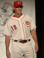
• Home uniform. The good: Finally — a solid red cap! About damn time. Admirably straightforward jersey design, too, and of course I’m totally on board with the Mr. Redlegs sleeve patch. Plus a red belt, red undersleeves, red background inside the wishbone “C” — nice. The stupid: The black drop-shadows have got to go. This is the very definition of stupid, because it’s so pointless, so “just because we can.” In addition to cutting down on legibility (especially from the back), it undermines everything else about the design — like, why have an old-timey sleeve patch and an old-timey typeface if you’re gonna have a modern drop-shadow? And speaking of the typeface, someone over on Chris Creamer’s board had a very astute comment. The type is waaaaay too busy. Also: I’m usually a fan of placket piping, but it really clutters things up here. Compare the new design to the late-’60s version — why bother with the piping? Oh, and speaking of stupid, can someone please explain why the Majestic sleeve and pocket logos are both black, instead of red?
• Road uniform. The good: Once again, gotta dig the red accessories, and vertically arched lettering is always a good thing. The stupid: First, get rid of that black-brimmed cap already. And again with the black drop-shadow — and a white border to boot! Why clutter up a lengthy word like “Cincinnati” with all that? Again, compare the new version to the similar but much cleaner late-’60s version — it’s no contest. And you can already tell that lengthy nameplates are gonna be tough to read.
• Alternate uniform. The good: Um, I like that they used red buttons (insert vaudville joke here). The stupid: Has any baseball team ever looked good in a red jersey? Just askin’.
Overall: Could’ve been worse, and a slight upgrade over the previous design. But the flaws are glaringly flawed. So is it good or is it stupid? As with so many things, it’s a bit of both.
Uni Watch News Ticker: Fun story about double uni numbers from Doug Brei: “When I attended the University of Toledo years ago, we had 120+ players on our football team, so it necessitated some numbers being used twice. We had a backup quarterback wear the same uniform number as our starting punter. So when we wanted to fake a punt, we would send in the quarterback instead of our punter, and no one on the opposing return team would ever notice, since he was wearing the same number! It worked several times and no one ever caught on.” ”¦ Now that‘s a cool new logo. ”¦ Speaking of new logos, there’s a great article here about the crummy new civil defense symbol. ”¦ Check out the headscarves and leggings worn by some member of the Jordanian women’s soccer team. Further info here. (Nice contribution from Jeremy Brahm.) ”¦ Decent article here about the looming specter of uni-borne advertising. ”¦ SI.com’s latest Uni Watch wannabe photo gallery has two serious treats: the best Cooperalls photo ever (looks a lot like those NFL officials’ pants we’re expecting to see tomorrow, right?), and a White Sox in shorts shot I’d never seen before. … Serious throwback action last night between the Hawks and Cavs. … From yesterday’s Comments section: the Maple Leafs will soon be revising their logo. Will it be good, or will it be stupid? You can probably guess which option my money’s on.
The placket piping has actually grown on me, if they were wearing Jerseys that actually fit them I think it would look much nice. Though I agree, the drop shadowed numbers and letters need to change, but I think the Reds ownership understand tweaks will need to be made after reading stories on the new unis.
I think these unis are a good starting point. Very few uniforms come out “perfect” tweaks need to be made to most of them to get them just right, you just have to make sure they are the correct tweaks. The old uniforms couldn’t be tweaked to make them look right in my opinion, these on the other hand could look really good if they are just simplified a bit.
Ga Tech is wearing blue today.
Wow I hate that lettering.
Any get a screen grab of Marko Jaric’s jersey on backwards as he entered the game last night (Fri Dec 1 Den @ Min NBA)?
Is it just me or does that old civil defense logo remind you of a magic eight ball?.. How did that possibly pass muster?.. Now the vision in my head is of the people who are protecting me sitting around making decisions based on what the eight ball says when you shake it..
‘not bloody likely’
Of course, this doesn’t mean I like the new one – it’s poorly done from any perspective.
As far as the Red’s jersey’s go, I like them a lot.. untill I saw the back. They look like the Diamondbacks or the Astros from the rear view.. and that is NOT a good thing. Those drop shadows are a joke, and that font gives me a headache.
I wish they wouldn’t have tried to update that classic look from the sixties.
On a related note, I like the trend that many MLB teams are taking with historically-based minimalism.. The Dodgers and Reds are the latest in this line, and I really hope it continues to catch on. I know these aren’t the greatest uniforms ever, but they’re a heck of a lot better than any of the newer designs (read: ‘db’acks, rockies, marlins, devil rays, astros)
Maybe enough teams going back to their minimalistic roots will counteract all those ugly togs we have to look at..
I’m a Colorado Rockies fan. I was looking around at old uniforms yesterday and thought it would be cool if the Rockies had some sort of old school throwbacks to go to, even though they are only 14 years old. I remembered the old link of the NHL, and thought it would be cool to come up with some baseball uniforms based on the NHL team’s link. Here’s what I came up with.
link, link, link, link
I just thought it’d be a cool concept. What do you all think?
I’ve gotta ask:
How do you modernize a maple leaf?
Did I miss the memo sent out by the forest?
The Reds’ jerseys are OK – I don’t like the piping on the home unis, though. Too busy. And it also makes me sad there is one less jersey vest combo now.
[quote comment=”26182″]I’m a Colorado Rockies fan. I was looking around at old uniforms yesterday and thought it would be cool if the Rockies had some sort of old school throwbacks to go to, even though they are only 14 years old. I remembered the old link of the NHL, and thought it would be cool to come up with some baseball uniforms based on the NHL team’s link. Here’s what I came up with.
link, link, link, link
I just thought it’d be a cool concept. What do you all think?[/quote]
I actually like those that you designed. For the most part, with some touch-ups, they would look better than the current ones.
As for the Pelicans, I used to live in Myrtle Beach (went to Coastal Carolina for a semester) and the second I saw their home hat I said I had to get one. I love those things.
Those Rockies jerseys are infinitely better than what they’ve got. I like them.
The Maple Leafs might just shift to something closer to their alternate logo…which, of course, would be stupid.
Yeah, that font on the Cincy unis is wayyyy too busy. Too much serif.
And what the heck are the Leafs thinking modifying that classy, classic logo?
Sheesh. It’s as bad as when the Rangers tried to update the shield when they put it on the shoulder of their Liberty head jerseys.
i’m kind of stoked to see what the Leafs come up with. They have been around for a million years and i don’t think they’ve F’d up too many times on their unis…i trust ’em.
until i hate them, of course.
the Reds uni’s, i think, are amazing. i love them.
i like the shadow. i like the piping.
the Rockies jerseys were rad! i LOVED getting their hockey cards cos i liked their jerseys so much…
I look at that Reds typeface and I have the same thought I share with some of my graphics-clients: When you have a logo or company ID that is a typeface, using that same typeface on EVERYTHING just points out that YOUR LOGO IS A TYPEFACE. Argh! They should’ve gone sans-serif with the numerals and nameplates, because it would have made the lettering for the team name more distinctive.
Also, in the pic of the alternate uniform, it looks like the red of the shirt and the red in the Reds logo are different by a couple of shades.
[quote comment=”26180″]Any get a screen grab of Marko Jaric’s jersey on backwards as he entered the game last night (Fri Dec 1 Den @ Min NBA)?[/quote]
here’s jaric’s link
This is link, and I hate the Leafs with a passion.
I like the throwbacks even better as they look linkthan just a leaf image.
Are they going to have to update their AHL affiliate, link, with the new Maple Leaf? If they don’t, it will look stupid without doubt.
Personally, I’m already behind the “stupid idea” wave as the Maple Leafs logo was timeless as it is.
[quote comment=”26188″][quote comment=”26182″]I’m a Colorado Rockies fan. I was looking around at old uniforms yesterday and thought it would be cool if the Rockies had some sort of old school throwbacks to go to, even though they are only 14 years old. I remembered the old link of the NHL, and thought it would be cool to come up with some baseball uniforms based on the NHL team’s link. Here’s what I came up with.
link, link, link, link
I just thought it’d be a cool concept. What do you all think?[/quote]
Nice looking designs. What about adding some old school Nuggets (the denver skyline) to the jersey. It could combine more of Colorado pro sports history. But also make the jersey about as busy as it could get.
The Reds now look like they’re trying to emulate the 49ers of the past decade with a twist of the Ravens’ over-wrought numbers added for stupid measure.
I work in the Frontier League, a midwest independant baseball league. They just added a team, the link. I think the logo is pretty sharp.
Just stopped by to see today’s uni news. What kind of shoes was Lebron wearing with that orange Cleveland throwback uni?
I think the Leafs are changing to link. It represents the management for fielding crappy teams for 40 years and continue to thank its fans by increasing the ticket and merchandise prices. It also represents the fans who have been saying they’ll win the cup for the last 40 years every year (with a straight face to boot), and also to continue to pay the price increases. Of course it’ll be blue and not green.
LeBron is wearing his own shoes, just in a different color than these…
link
I think the new Reds’ unis are a slight improvement. I agree with most that the font is too busy with the drop shadow. Comparisons to the Astros and D-backs are spot on.
But the whole point of the drop shadow is an excuse to add black into the color scheme. This allows teams to sell black jackets, alternate caps and other merchandise (black = $$$).
As a Mets fan, I know this all too well.
Something to watch out for:
link
For all of you who think the Reds unis are too busy – omg, what do you want? – a blank jersey? If anything , they are maybe boring, but not too busy. All you guys do is complain.
As stupid as you may think the Reds’ new unis are, you have to agree they are immensely better than the stuff they had been wearing. The black hats vests drove me crazy. The re alternate jerseys are just updates of the red alternate jersey they have been wearing the last few years. I was always glad to see them instead of the vests.
Also, there had been talk in Cincinnati that Castellini was going to bring back blue as an accent color. I guess being the owner isn’t enough clout to over come stupid.
I’m just grateful the Reds have de-emphasized the back.
I like the font for the numerals and nameplates. It’s the black drop shadow that makes it unreadable. I think red with a thin black trim would have been the way to go.
I have no problem with the placket striping.
As for the Rockies, I wish they would employ silver more. Black and silver with a hint of purple would have the Rox styling.
I remember thinking before the Rockies were named how cool it would be if they went old school and chose “Denver Bears.” Any Colorado fans out there know why they didn’t? Did they want to cut ties with their Triple-A past? That name would have opened up a lot of cool logo possibilities. The current one is pretty lame, I think.
Question: We had a bit of chatter yesterday about Chad Johnson’s orange chinstrap. Am I correct in thinking this is the NFL’s first colored chinstrap ever?
[quote comment=”26213″]Question: We had a bit of chatter yesterday about Chad Johnson’s orange chinstrap. Am I correct in thinking this is the NFL’s first colored chinstrap ever?[/quote]
I was listening to a local radio show yesterday here in Cincy and one of the guests was former Bengal David Fulcher. He is an ‘equipment inspector’ for the Bengals now. He said that he told Chad to change his chinstrap before the game started but Chad wouldn’t do it. Fulcher also said that he looked in his notes to find a rule about the chinstrap color but couldn’t find anything because it had never been done before.
The placket piping has got to go. As far as I can tell, the Reds have not had that look for their uniforms in more than 70 years. I’d have much preferred that they retained the pinstripes. What’s with teams abandoning pinstripes this offseason?
link
The Rockies alternates are cool, but why not incorporate link with or without the Denver Nuggets link
[quote comment=”26182″]I’m a Colorado Rockies fan. I was looking around at old uniforms yesterday and thought it would be cool if the Rockies had some sort of old school throwbacks to go to, even though they are only 14 years old. I remembered the old link of the NHL, and thought it would be cool to come up with some baseball uniforms based on the NHL team’s link. Here’s what I came up with.
link, link, link, link
I just thought it’d be a cool concept. What do you all think?[/quote]
Well done. As a nervous NHL fan (due to the new jerseys), I like the idea… You take what you can get, right?
Count me as a lifelong Reds fans that overall likes the new uniforms. I like the simplicity of the home whites, the piping will grow on you. They are better than the pinstripe vests in my opinion. I especially like the old style Mr. Red on the left sleeve.
The black outline on the letters is not needed. Considering the comments the owner Mr. Castellini said about removing black, it surprises me. (He made a comment along the lines of, “we are the Reds, not the Reds and Blacks”)
I also understand the font to be some sort of reference to the riverboat theme, which is a big part of the new ballpark and local history. I agree it can be used to much and lose its’ effect. Going without names on the home uniforms would have been a nice way to be historic.
Overall I think it is an inprovement. Especially the home whites. There is also so much than can be done with a grey road. Which is fine and exactly what a road uni, historically speaking should be.
link on the FIU makeshift jerseys.
[quote comment=”26212″]I remember thinking before the Rockies were named how cool it would be if they went old school and chose “Denver Bears.” Any Colorado fans out there know why they didn’t? Did they want to cut ties with their Triple-A past? That name would have opened up a lot of cool logo possibilities. The current one is pretty lame, I think.[/quote]
I’ve long agreed that the team should have been the Bears, or maybe even the Grizzlies. The reason they gave at the time was that they had to avoid sounding similar to the Cubs because it would confuse the international market. I also remember that Mickey Monus of the original ownership group was big on having purple (as in mountain majesties) included, which is easier to do with the Rox name than with one more ursine.
And now for something completely different. I quit following basketball years ago, but link is so fitting, given Paul’s theme of the day.
Looks like the NYTimes has link. Seeing as that’s basically the same article PL ran in link on 21 Nov.
Chris Fowler made a good point on this morning’s College Gameday. Miami, in all their dark green and bright orange glory, will be playing in the MPC Computers bowl on the blue turf.
In other words, a wonderful visual feast/anyeurism for all watching the MPC bowl.
[quote comment=”26210″]For all of you who think the Reds unis are too busy – omg, what do you want? – a blank jersey? If anything , they are maybe boring, but not too busy. All you guys do is complain.[/quote]
Took the words right out of my mouth! See yesterday’s posts for my complete thoughts on the matter.
link and link are wearing some ridiculously large ACC Championship patches today. I’m curious if the Big-12 and SEC will follow suit.
[quote comment=”26228″]link and link are wearing some ridiculously large ACC Championship patches today. I’m curious if the Big-12 and SEC will follow suit.[/quote]
Speaking of the big conference championships:
Does Dr. Pepper sponsor the ACC, Big 12 and SEC Championships? I’ll answer my own question with an unfortunately resounding yes.
Caps off to Dr. Pepper for cornering that market though (I like Dr. Pepper).
little quick touch-up on the new Reds uniforms I did last night:
link
link
link
Ok, I haven’t had time to read any comments this morning, but I just turned on the Army/Navy game and I noticed that many of the players on the Navy team have different patches. Some of them have two patches and some don’t have any. Do any of ya’ll know what the patches are for?
href=”http://img157.imageshack.us/img157/3492/cincy2tl6.gif”>
href=”http://img88.imageshack.us/img88/3779/cincynq7.gif”>
href=”http://img166.imageshack.us/img166/8850/cincy3yx4.gif”>
link
link
link
mmkay.
Someone’s probably mentioned this before, but on the double-number thread I found it interesting that USC has a special teams linebacker (Brian Cushing) sharing #10 with the starting QB John David Booty – he downed the punt inside the 10 yard line early on.
USC has link on the roster, and yet several gaps. I wonder what their system is with retires or service gaps considering that 3 (Palmer), 5 (Bush), 11 (Leinart), 12, 20, 32, 33, 61, 65, 72, 92, and 98 are unused…
[quote comment=”26231″][quote comment=”26228″]link and link are wearing some ridiculously large ACC Championship patches today. I’m curious if the Big-12 and SEC will follow suit.[/quote]
Speaking of the big conference championships:
Does Dr. Pepper sponsor the ACC, Big 12 and SEC Championships? I’ll answer my own question with an unfortunately resounding yes.
Caps off to Dr. Pepper for cornering that market though (I like Dr. Pepper).[/quote]
Maybe, and maybe not. The Big 12 and ACC have been constantly referred to as the “Dr. Pepper XXX Conference Championship.” While it appears that Dr. Pepper is sponsoring some of the pregame fan festivities at the SEC Championship, I have yet to see their name tacked to the game.
thank you paul,
you summed up basically everything i thought
about those new Cincy Uni’s.
i even looked at the pictures for a good while,
trying to think of everything that i found unappealing
before reading your opinions, and its nice to know you
(and as a result of this blog, so many other people) have the
same thoughts as i do about such things.
One area where i do disagree with you however, is on the alternate jersey. While the Braves looked foolish, and the Red Sox silly, these are the Cincinatti REDS we are talking about here, it is only proper that they have une uniforme rouge at some point.
New York Times JERÉ LONGMAN looks like he must be a UniWatch reader. A painfully familiar link.
[quote comment=”26233″]Ok, I haven’t had time to read any comments this morning, but I just turned on the Army/Navy game and I noticed that many of the players on the Navy team have different patches. Some of them have two patches and some don’t have any. Do any of ya’ll know what the patches are for?[/quote]
This is my first time posting, but I know the answer to this one:
Both teams, actually, wear patches of active duty units. You probably recognize the 1st Cavalry patch worn by many of Army’s players. (I don’t know how to do the link, but google 1st Cavalry).
This is how a patch should be worn and a reason for it to be worn, compared to say the ACC patches worn by WF & GT.
GO NAVY!
also, on the SI wannabe gallery
im more interested in what it says on carson palmers
bracelets and why??
im more interested in what it says on carson palmers
bracelets and why??
[quote comment=”26243″][quote comment=”26233″]Ok, I haven’t had time to read any comments this morning, but I just turned on the Army/Navy game and I noticed that many of the players on the Navy team have different patches. Some of them have two patches and some don’t have any. Do any of ya’ll know what the patches are for?[/quote]
This is my first time posting, but I know the answer to this one:
Both teams, actually, wear patches of active duty units. You probably recognize the 1st Cavalry patch worn by many of Army’s players. (I don’t know how to do the link, but google 1st Cavalry).
This is how a patch should be worn and a reason for it to be worn, compared to say the ACC patches worn by WF & GT.
GO NAVY![/quote]
Thanks for your help. I thought that would be the reason.
[quote comment=”26237″]link
link
link
mmkay.[/quote]
I have no problems with the Reds new uni’s, but these look so much better.
It wouldn’t surprise me if the new logo for the Maple Leafs has a more “cartoonish” look to it, i.e., heavily accented, rounded lines. This seems to be a little bit of a trend recently.
The most recent change that comes to my mind is the old Arizona Cardinals logo versus the new one. Also, the Dolphins logo looks more cartoonish than their original one.
I really like the Maple Leafs uniforms, though the interlocking TML on the shoulders look like they belong on the front of a baseball cap.
[quote comment=”26245″]also, on the SI wannabe gallery
im more interested in what it says on carson palmers
bracelets and why??
im more interested in what it says on carson palmers
bracelets and why??[/quote]
link Lots of golfers wear these but I didn’t realize that Carson wore one as well.
[quote comment=”26176″]Ga Tech is wearing blue today.[/quote]
Blue?? Georgia Tech’s colors are Gold/yellow and Black…not blue! Have you ever seen a yellow and blue Yellow Jacket?
No, Georgia Tech’s colors are white, old gold and navy blue, actually.
Found this link about Stephon Marbury’s new shoes and clothing line. The shoes only cost $15, and he actually plays in an off-the-rack pair every game.
Also, the author totally forgets about little bro link who played at Rhode Island.
Anyone else heading to the Packers game tomorrow? It’s going to be cold, I’ll try to take some pictures of the refs if they wear their black pants. I’m dreading it.
After all these weeks, I still can’t stand the new shirts, and I still think they are hand-me-downs from Ed Hochuli.
RE:Comment #45, Brian Cushing ins’t only a special teams linebacker–he played at linebacker last year but was moved to a stand-up devensive end position this year.
GO BERGEN CATHOLIC
[quote comment=”26254″]No, Georgia Tech’s colors are white, old gold and navy blue, actually.[/quote]
As I recall — no matter what color combinations their teams may wear — Tech’s
official colors are gold and white. Navy [black?] may be added for contrast.
I’m mildly surprised that the Reds have no vest combo. Junior is a big fan of that look, and he supposedly pushed hard for the M’s to adopt a variant (which they did). Alas, I’ve come up empty for attribution.
And am I blind, or are there no pix, not even a mention of the Red Legs part of the new uni? What’s up with that?
With all this talk about conference championships sponsored by Dr Pepper, I have to make one critique. I’m from Texas, as is Dr Pepper, and there is no period after ‘Dr’ – little nit picky, but Dr. Pepper would be a completely different thing from Dr Pepper.
[quote comment=”26264″]With all this talk about conference championships sponsored by Dr Pepper, I have to make one critique. I’m from Texas, as is Dr Pepper, and there is no period after ‘Dr’ – little nit picky, but Dr. Pepper would be a completely different thing from Dr Pepper.[/quote]
I too am from Texas, and believe “Dr Pepper” looks stupid, whether it is correct that way or not, which is why I continue to refer to it as “Dr. Pepper”. Not being ugly, just saying.
UCLA just won.
Why?
link
link
I dunno Paul, I think we should be more concerned with how great that Japanese player’s afro is instead of the headscarves and leggings.
No patch in the Big 12 game or SEC game
[quote comment=”26262″][quote comment=”26254″]No, Georgia Tech’s colors are white, old gold and navy blue, actually.[/quote]
As I recall — no matter what color combinations their teams may wear — Tech’s
official colors are gold and white. Navy [black?] may be added for contrast.[/quote]
Well, I don’t know what their official colors are but I do know that they use black as their compliment color for sports. I realize that there are some teams that have a very dark navy blue (Bears, Michigan) but GT’s is clearly black.
[quote comment=”26182″]I’m a Colorado Rockies fan. I was looking around at old uniforms yesterday and thought it would be cool if the Rockies had some sort of old school throwbacks to go to, even though they are only 14 years old. I remembered the old link of the NHL, and thought it would be cool to come up with some baseball uniforms based on the NHL team’s link. Here’s what I came up with.
link, link, link, link
I just thought it’d be a cool concept. What do you all think?[/quote]
You’re obviously very talented – excellent job on this.
…but ditch the link.
[quote comment=”26270″][quote comment=”26262″][quote comment=”26254″]No, Georgia Tech’s colors are white, old gold and navy blue, actually.[/quote]
As I recall — no matter what color combinations their teams may wear — Tech’s
official colors are gold and white. Navy [black?] may be added for contrast.[/quote]
Well, I don’t know what their official colors are but I do know that they use black as their compliment color for sports. I realize that there are some teams that have a very dark navy blue (Bears, Michigan) but GT’s is clearly black.[/quote]
linksays Georgia Tech’s official colors are gold and white, and they were black and navy as secondary colors.
UCLA just won.
Why?
Powder Blue
Agreed. And props to the Chargers and the Nuggets for going to the powder blue. Now if we could just get an MLB team with enough balls to go from drab grey to light blue on the road…
Lance Alworth
[quote comment=”26186″]The Reds’ jerseys are OK – I don’t like the piping on the home unis, though. Too busy. And it also makes me sad there is one less jersey vest combo now.[/quote]
I agree wholeheartedly on both counts.
My first response to a new uniform is to ask how a great player of the past would look in the new unis. For example, how would Joe Namath look wearing the Jets’ unis with the green pants (the mind boggles). I don’t even want to thin about Tom Seaver in the current Mets’ unis.
In the case of the new uniforms that the Reds are wearing, how would Frank Robinson or Johnny Bench look in them? Pretty good in the home and road unis, really weird in the alternates.
[quote comment=”26275″][quote comment=”26186″]The Reds’ jerseys are OK – I don’t like the piping on the home unis, though. Too busy. And it also makes me sad there is one less jersey vest combo now.[/quote]
I agree wholeheartedly on both counts.[/quote]
I don’t. Vests are ugly. Also, many props to the Rockies uniforms, but the black one, in addition to the ‘ditch the black’ push, looks kinda bad anyway. Try a red one, maybe?
Good vs. stupid — that’s really the fundamental question of our age, no? “Bad†has almost fallen out of the equation, because bad implies a failed attempt at doing something good, while most bad things in today’s world never tried to be good in the first place — they’re just pointless, insipid, stupid.
The reason for stupid design in sports recently is simple:
Top design firms (with sports backgrounds) are not being regularly commissioned to do pro teams work. Period.
There are a handful of top design firms you could drop in a hat, into a hat, pick one of the companies, and get a “good/great” identity without question including:
-Todd Radom Design/NY
-Rickabaugh Graphics/OH
-Tom Nikosey Design/LA
-Michael Doret Design/LA
-Gameplan Creative/CHI
-Verlander Design/SF
-Osaka Design/SF
-Rhonda Kim Design/NY
-Dick Sakahara/LA
These firms have been responsible for the top work in the sports design industry since the early ’90’s (check their sites) but these firms are not getting design projects because either their fees are considered too high (unfortunate because of the money made in the sports licensing industry) or Reebok/Nike/Leagues/Teams are not aware or smart enough to put there ego’s aside and pay the going rate for the work.
Thus you end up with some real (as Paul points out so well) “stupid” work…and you’ve seen no shortage of that recently…
Sabers
Ducks
DBacks
Reds
Blue Jays hat
Nike (you name it)
Reebok (the worse is yet to come)
[quote comment=”26274″]UCLA just won.
Why?
Powder Blue
Agreed. And props to the Chargers and the Nuggets for going to the powder blue. Now if we could just get an MLB team with enough balls to go from drab grey to light blue on the road…
Lance Alworth[/quote]
i nominate the phillies to return to their old ways. those road unis were top choice.
Go Gators!
it was a bad day for the color Maroon. Doesn’t bode well for OU…
John B. said:
UCLA just won.
Why?
Powder Blue
Agreed. And props to the Chargers and the Nuggets for going to the powder blue. Now if we could just get an MLB team with enough balls to go from drab grey to light blue on the road…
Lance Alworth
i nominate the phillies to return to their old ways. those road unis were top choice.
So true. But you won’t see a light blue jersey anytime soon in the majors because that would mean Majestic would have to order thousands of yards of polyester light blue fabric for just one team instead of using the white or road grey for over 75% of MLB teams jersey fabrics…and with manufacturers these days it’s all about optimizing your material buy… welcome to the world of sports licensing…Rip On (Ripon) those fans baby…
[quote comment=”26182″]I’m a Colorado Rockies fan. I was looking around at old uniforms yesterday and thought it would be cool if the Rockies had some sort of old school throwbacks to go to, even though they are only 14 years old. I remembered the old link of the NHL, and thought it would be cool to come up with some baseball uniforms based on the NHL team’s link. Here’s what I came up with.
link, link, link, link
I just thought it’d be a cool concept. What do you all think?[/quote]
I think these look awesome. I don’t know if MLB would acknowledge another sport (does anyone know if a major league team from one sport has ever paid homage to a major league team in another sport?), but those jerseys would definately sell better than the regular ones.
Someone else mentioned the option for the Rockies to wear the unis of the old Denver AAA team. The Devil Rays regularly wear link uniforms for their Turn Back the Clock Nights.
Much better than their real retro link!
[quote comment=”26220″]link on the FIU makeshift jerseys.[/quote]
Interesting that the makeshift jerseys have an adidas logo on them, since Wisconsin is an adidas school for basketball. Is FIU an adidas school, or was this a way to get a little more advertising for adidas.
Reds unis – I don’t mind the dropshadow on the numbers, the front name or the logo, but it does junk up the nameplate. Those letters are too small for the shadow.
Hawks throwbacks – I still love those things, that should be their permanent uniform.
I have to say, that having spent much of my life working with companies to modernize their branding, that I think the Reds got it exactly right. They had no reason to completely break with recent history (the black) but their past is one of their most marketable commodities, so the mix of historic and modern makes perfect sense. I love them, except for the stupid red alternate. It’s A LOT better than what Arizona did with their uniforms, took a perfect brand and color scheme for Arizona and turned it into something that looks just like the hockey and football teams in the area. And those are brands I would not want my team associated with.
I’m still trying to figure out why the new “T” Blue Jays cap is so bad. A lot of baseball teams wear caps in which the type-face on the cap doesn’t match the type-face on the uniform… both the Dodgers and Tigers come to mind.
Two interesting things I just saw in the Rutgers game.
1. Mike Teel’s play-calling armband has RIP GRANDMA on it.
2. ESPN cameras were scanning the crowd after regulation ended and pretty much stuck on a guy who’s hoodie read ‘West Fuckin Virginia’.
I’m still trying to figure out why the new “T†Blue Jays cap is so bad. A lot of baseball teams wear caps in which the type-face on the cap doesn’t match the type-face on the uniform… both the Dodgers and Tigers come to mind.
The Blue jays hat suffers from the dreaded three B’s
too BIG (the letter form is HUGE//see Anaheim Angels old A)
too BLACK (not another friggin black cap in sports, no…)
too BUSY (the stithc count on one letter is like 30,000? yipes)
Damn. The Wild! looked better than the Stars, even with the weird-ass logo the Wild! have, but they couldn’t catch a break with the refs. From the one goal (a clear goal) not being called to the numerous penalties Dallas got away with—just poorly officiated over all.
During the Sooner/Nebraska game, the announcers gushed over the classic unis and how turning on this game really made you want to watch. Though I like neither team, I must admit they both looked sharp.
matt, not everybody is complaining about the new Reds’ unis. In fact, Paul comes up with several good things about it. It’s just that with so many people reading this board, there is bound to be disagreement. The only uni change I can remember garnering a nearly unanimous (negative) vote was (sigh) the Vikings to the current eye-sore. Even then, there were one or two people defending it. As far as I can tell, it’s pretty much fifty-fifty with the Reds’ change.
Me, I wish the piping wasn’t there, which is strange as I wish the Dodgers had retained their piping. I don’t like the drop shadow, but I really like the red alternate.
Burrill, I may be able to give you your gift for Christmas, but it’s up to the BCS now. I hope you snuck in your good lens to get better pics of the Flying Wheels.
LunchBox, I’m not crazy about the home and away jerseys, but I like the alternates—especially the black one. We should all come up with alternates to the unis we find most disagreeable. That would be fun.
One area where i do disagree with you however, is on the alternate jersey. While the Braves looked foolish, and the Red Sox silly, these are the Cincinatti REDS we are talking about here, it is only proper that they have une uniforme rouge at some point.
Agree. Red jersey for the Reds…hello, this actually is not “stupid”… :) What else could they use? Black?
Ray Rice’s cushy Nike chin protector is on upside-down.
link
Reds new uniform player lettering is completely impossible to read, the black dropshadows are for what purpose, and the Cincinnati lettering looks like it was dug out of a typefont book from the ’40’s. What a huge missed opportunity. Redfaced.
[quote comment=”26198″]This is link, and I hate the Leafs with a passion.
I like the throwbacks even better as they look linkthan just a leaf image.
Are they going to have to update their AHL affiliate, link, with the new Maple Leaf? If they don’t, it will look stupid without doubt.
Personally, I’m already behind the “stupid idea” wave as the Maple Leafs logo was timeless as it is.[/quote] Interesting that the Marlies’ logo incorporates the “old-fashioned” maple leaf design the Leafs use in their alternate logo AND the “modern” leaf design that is in the Leaf’s primary logo.
Hawaii Quarterback Colt Brennan was warming up with a flower in his facemask.
[quote comment=”26298″]LunchBox, I’m not crazy about the home and away jerseys, but I like the alternates—especially the black one. We should all come up with alternates to the unis we find most disagreeable. That would be fun.[/quote]
Great idea! I did those pretty quickly, but after all the positive response, maybe I’ll spend some extra time improving them (perhaps when all the weekend’s shenanigans are over). Thanks to everyone who gave their input!
I don’t find the current Rockies uniforms disagreeable (maybe cuz they’re my team?), but I just liked the thought of some sort of throwbacks.
[quote comment=”26306″][quote comment=”26298″]LunchBox, I’m not crazy about the home and away jerseys, but I like the alternates—especially the black one. We should all come up with alternates to the unis we find most disagreeable. That would be fun.[/quote]
Great idea! I did those pretty quickly, but after all the positive response, maybe I’ll spend some extra time improving them (perhaps when all the weekend’s shenanigans are over). Thanks to everyone who gave their input!
I don’t find the current Rockies uniforms disagreeable (maybe cuz they’re my team?), but I just liked the thought of some sort of throwbacks.[/quote]
LB, then we could all mock-up whatever unis we want. For example, I would do a Vikings all-black. Or a Wild! all-black. The T’wolves get a pass because they already have an all-black uni. The Twins get a pass because, well, all-black would just look silly for them.
Come to think of it, I am probably not the best person to design unis because I think everything can be improved by slapping a little (or a lot) of black on it.
If I was FIU’s coach I would never let my team walk out there in that shity of jerseys, They are worse than any high school or even middle school jerseys I have ever seen. It was nice of Wisconsin to do that, but if they had time to make the jerseys why couldn’t the real jerseys get to the game on time.
Amazing, an topic devoted to the Cincinnati Reds uniforms and not one mention of the ultimate vest dude… the Klu..
Ted Kluscewski… bet he’s pissed about dumping the vests…
Another reason to give this update two thunbs down… swing and a miss…
link
link
[quote comment=”26270″][quote comment=”26262″][quote comment=”26254″]No, Georgia Tech’s colors are white, old gold and navy blue, actually.[/quote]
As I recall — no matter what color combinations their teams may wear — Tech’s
official colors are gold and white. Navy [black?] may be added for contrast.[/quote]
Well, I don’t know what their official colors are but I do know that they use black as their compliment color for sports. I realize that there are some teams that have a very dark navy blue (Bears, Michigan) but GT’s is clearly black.[/quote]
Tech’s colors are old gold, white, and NAVY. Black is only to be used on the mascot Buzz. Here’s a link to an article about it (halfway down the page)
sorry about that…. here’s the link
link
link
[quote comment=”26262″][quote comment=”26254″]No, Georgia Tech’s colors are white, old gold and navy blue, actually.[/quote]
As I recall — no matter what color combinations their teams may wear — Tech’s
official colors are gold and white. Navy [black?] may be added for contrast.[/quote]
Actually, Georgia Tech’s colors are “white, old gold, and navy blue.” Scroll down to the “Origins of Georgia Tech’s Colors” section link.
[quote comment=”26271″][quote comment=”26182″]I’m a Colorado Rockies fan. I was looking around at old uniforms yesterday and thought it would be cool if the Rockies had some sort of old school throwbacks to go to, even though they are only 14 years old. I remembered the old link of the NHL, and thought it would be cool to come up with some baseball uniforms based on the NHL team’s link. Here’s what I came up with.
link, link, link, link
I just thought it’d be a cool concept. What do you all think?[/quote]
You’re obviously very talented – excellent job on this.
…but ditch the link.[/quote]
Agreed.
Also, I was upset by the Reds’ black-brimmed hats and black dropshadows on both the numbers and letters. Other than that they seem fine. And they can’t possibly be considering using link for 2007, right? I think I’d throw myself from the roof of Great American Ball Park if they sunk to the level of the NFL.
I’ve done enough bitchin’ about the Reds redesign… check out the link and I think you’ll have plenty of evidence how much better this could have been…
MLB 0 for 2 in upgrades this off-season…
link
[quote comment=”26317″][quote comment=”26271″][quote comment=”26182″]I’m a Colorado Rockies fan. I was looking around at old uniforms yesterday and thought it would be cool if the Rockies had some sort of old school throwbacks to go to, even though they are only 14 years old. I remembered the old link of the NHL, and thought it would be cool to come up with some baseball uniforms based on the NHL team’s link. Here’s what I came up with.
link, link, link, link
I just thought it’d be a cool concept. What do you all think?[/quote]
You’re obviously very talented – excellent job on this.
…but ditch the link.[/quote]
Agreed.
Also, I was upset by the Reds’ black-brimmed hats and black dropshadows on both the numbers and letters. Other than that they seem fine. And they can’t possibly be considering using link for 2007, right? I think I’d throw myself from the roof of Great American Ball Park if they sunk to the level of the NFL.[/quote]
Where have you been? Obviously not GABP. They had cheerleaders all of last year as well.
I’d like to see the Hawks in link throwbacks. Either that jersey or its solid black counterpart which I can’t seem to find a picture of.
just an interesting factoid, not sure if anyone else notices this, but the EPL (english preimiere league) with all its jersy sponsors, has very few stadium sponsors, the stadiums are all know by older names (ie old trafford) as opposed to bank of america. just interesting that we differ so much in jersey advertising and stadium name rights, but each the opposite
If Chris Denorfia tucks link in even a little, the bottom part of the number won’t be visible anymore! The Reds need to shrink the white space between the collar and the name, and between the name and the number, so that it doesn’t look so silly. (This is my biggest pet peeve in baseball jerseys these days. Bigger than black.)
[quote comment=”26190″]Yeah, that font on the Cincy unis is wayyyy too busy. Too much serif.
And what the heck are the Leafs thinking modifying that classy, classic logo?
Sheesh. It’s as bad as when the Rangers tried to update the shield when they put it on the shoulder of their Liberty head jerseys.[/quote][quote comment=”26322″]just an interesting factoid, not sure if anyone else notices this, but the EPL (english preimiere league) with all its jersy sponsors, has very few stadium sponsors, the stadiums are all know by older names (ie old trafford) as opposed to bank of america. just interesting that we differ so much in jersey advertising and stadium name rights, but each the opposite[/quote]
As new grounds are built, they tend to have corporate names (Arse-nal Stadium/Highbury->Emirates Stadium, Reebok, JJB, etc.) They won’t sell rights on an old stadium, which I think is for the better. However, with the tradition of naming grounds after neighborhoods and/or streets, Emirates becomes Ashburton Grove, etc.
BTW, Screw Arsenal.
[quote comment=”26319″][quote comment=”26317″][quote comment=”26271″][quote comment=”26182″]I’m a Colorado Rockies fan. I was looking around at old uniforms yesterday and thought it would be cool if the Rockies had some sort of old school throwbacks to go to, even though they are only 14 years old. I remembered the old link of the NHL, and thought it would be cool to come up with some baseball uniforms based on the NHL team’s link. Here’s what I came up with.
link, link, link, link
I just thought it’d be a cool concept. What do you all think?[/quote]
You’re obviously very talented – excellent job on this.
…but ditch the link.[/quote]
Agreed.
Also, I was upset by the Reds’ black-brimmed hats and black dropshadows on both the numbers and letters. Other than that they seem fine. And they can’t possibly be considering using link for 2007, right? I think I’d throw myself from the roof of Great American Ball Park if they sunk to the level of the NFL.[/quote]
Where have you been? Obviously not GABP. They had cheerleaders all of last year as well.[/quote]plus the cheerleaders have stirrup socks on
[quote comment=”26309″]If I was FIU’s coach I would never let my team walk out there in that shity of jerseys, They are worse than any high school or even middle school jerseys I have ever seen. It was nice of Wisconsin to do that, but if they had time to make the jerseys why couldn’t the real jerseys get to the game on time.[/quote]
Right. Forfeit the game after sitting in an airport for 18 hours and taking a red eye to Wisconsin because the uniform is “shity” (sic).
Something tells me it takes a teeny weeny bit longer to print up game-quality uniforms with embroidered team name and numbers (say, a week or two at least) than to take the scrimmage jerseys they had on hand and print numbers on them (an hour or two, tops).
[quote comment=”26322″]just an interesting factoid, not sure if anyone else notices this, but the EPL (english preimiere league) with all its jersy sponsors, has very few stadium sponsors, the stadiums are all know by older names (ie old trafford) as opposed to bank of america. just interesting that we differ so much in jersey advertising and stadium name rights, but each the opposite[/quote]
They’re getting there. I know there’s a Reebok Stadium and Arsenal’s new stadium has a corporate name. Old Trafford will always be Old Trafford, but when the day comes that it needs to be replaced, I think we’ll see Man Utd’s new home come with a less tradional, more money grubbing name.
British Football has mirrored American sports, they’re just a decade or so behind.
[quote comment=”26274″]UCLA just won.
Why?
Powder Blue
Agreed. And props to the Chargers and the Nuggets for going to the powder blue. Now if we could just get an MLB team with enough balls to go from drab grey to light blue on the road…
Lance Alworth[/quote]
You mean, like link?
[quote comment=”26290″] I don’t know if MLB would acknowledge another sport (does anyone know if a major league team from one sport has ever paid homage to a major league team in another sport?), but those jerseys would definately sell better than the regular ones.[/quote]
Well, the late, lamented Montreal Expos wore a black “9” on their sleeves following the death of Montreal Canadiens legend Maurice “Rocket” Richard, (sorry, no link,) but that’s the closest example I can think of…
#109 by The Ol Goaler on 12.03.06 12:28 pm | Quote This Comment
John B. said:
UCLA just won.
Why?
Powder Blue
Agreed. And props to the Chargers and the Nuggets for going to the powder blue. Now if we could just get an MLB team with enough balls to go from drab grey to light blue on the road…
Lance Alworth
You mean, like this?
Ummm…yes…triumphantly so Ol’ Goaler (is this a pen name for Gump Worsley?).
Oh them birds…the Cardinals grey road, except for the wonderful lettering (birds and bats) is really drabsville…
Imagine the Cardinals having the balls (and imagination) to develop an alternate red (yes red…can you say Red Birds???) with St. Louis in script just like the Cardinals design…outstanding…yeah no chance…creativity has its limits you know…This Bud’s not for you.
link
I have to commend the bloggers tonight…some of the most articulate (non subjective banter) I’ve seen on any sports uni blog site…well done…
[quote comment=”26182″]I’m a Colorado Rockies fan. I was looking around at old uniforms yesterday and thought it would be cool if the Rockies had some sort of old school throwbacks to go to, even though they are only 14 years old. I remembered the old link of the NHL, and thought it would be cool to come up with some baseball uniforms based on the NHL team’s link. Here’s what I came up with.
link, link, link, link
I just thought it’d be a cool concept. What do you all think?[/quote]
I sincerely respect your p-shop skills and time spent but wow those are atrocious – they ooze 70’s/early 80’s dayglo madness. Ronald McDonald Rockies? Colorado Pac-men?
The Rox current uni’s are already classics, infinitely better than the SD and Arizona uni’s and proof that new design can look timeless. People who hate purple need to get over it (looking at you, Paul).
I know I’m a bit late here, but I’ll throw in my two cents: I like them. A lot. I think the piping is actually a nice touch, and I actually think that the typeface works, strangely enough. Also, for the alt. jersey, would you prefer black? I mean, they are the Cincinnati REDS. The Red jersey isnt nearly as obnoxious as the Red Sox or Braves one. Maybe that’s because it’s not bright bright red like the other two. Aisde from this, I’m dissapointed that the jerseys aren’t sleeveless. I’m a sucker for sleeveless jerseys, and I know that the Reds have a tradiaion of them. I also kinda liked the red pinstripes they wore on the home jerseys back in the day, a la link. I still hold that those are some of the best jerseys of the 90s, especially with the white pinstriped hat (which I used to own…I wonder if I can dig that back out again).
[quote comment=”26330″][quote comment=”26309″]If I was FIU’s coach I would never let my team walk out there in that shity of jerseys, They are worse than any high school or even middle school jerseys I have ever seen. It was nice of Wisconsin to do that, but if they had time to make the jerseys why couldn’t the real jerseys get to the game on time.[/quote]
Right. Forfeit the game after sitting in an airport for 18 hours and taking a red eye to Wisconsin because the uniform is “shity” (sic).
Something tells me it takes a teeny weeny bit longer to print up game-quality uniforms with embroidered team name and numbers (say, a week or two at least) than to take the scrimmage jerseys they had on hand and print numbers on them (an hour or two, tops).[/quote]
Props to Wisconsin for lending a hand. Rather than punish the team that gets stuck at the airport and loses its luggage, the Badgers step up to find a resolution to the unfrtunate situation, providing uniforms AND sneakers.
Big deal if the team looks rec-league…as long as the refs can tell the difference, game on!
[quote comment=”26379″]The Rox current uni’s are already classics, infinitely better than the SD and Arizona uni’s and proof that new design can look timeless. People who hate purple need to get over it (looking at you, Paul).[/quote]
I concur. Hornets, Rockies, and Diamondbacks all had good use of purple in their jerseys, two have left it behind and are far far worse for it. I’ll rally around any save the purple cause there is for the Rockies (even though I’m not a fan), it fits the team and city so well and is timeless.
For the Leafs logo change I figure it might just be slight change from the leaf they have link
to a leaf more like the one on the Canadian link, although clearly still in blue.
Closest thing I have to a theory
The Milwaukee Admirals of the American Hockey League wore a Milwaukee Brewers patch on the front of their jerseys.
I cant seem to find a picture, but I know Paul has linked one on the blog before.
anybody else think the South Fla. logo resembles this
[quote comment=”26734″]anybody else think the South Fla. logo resembles this [/quote]
sorry, this is the first time i tried to use links in a post…
[quote comment=”26210″]For all of you who think the Reds unis are too busy – omg, what do you want? – a blank jersey? If anything , they are maybe boring, but not too busy. All you guys do is complain.[/quote]
You said it. I am stunned to see how I can find a uniform completely fine and someone will have a list of complaints.
I’m just pleased as punch that there are sleeves and the pinstrips are gone.
Where’s Amanda?
thelittlegrayman
Mr. Redlegs looks eerily similar to Mr. Met. Does that mean they’re realted?! Even more important: Should I break the news to my girlfriend? She’s a Red fan, I’m a Met fan. Um, does this mean… we’re related? Noooooooooo!
I’m in total agreement regarding the drop shadow and the legibility of the typeface. I don’t mind the classic type face, but I agree that the throwback look is undercut by the drop shadow and outlining.
I don’t mind the piping on the home jersey. What I would have liked to see is just a red, wishbone “C” instead of the logo with “REDS” inside. I think that would be cleaner, more distinctive, and a bit more cohesive with the piping. Long live the old-timey, mustached, Mr. Red.
The black bill on the roadies has to go.
Finally, to answer your question, the Reds are the only team ever that has looked go in a Red Jersey. : )
I think the Number and the logo should have been reversed. I did like the pinstripes though. They went 13 years with it so. I guess it was time fro a change. I still think the new unis are too plain, the sunday alts are fine. I think only the Reds and Red Sox are the only teams that should ever be allowed to wear red as an alternate uni. I’ve never like the prison gray roadies, some think that the pinstripes are too bussy, but I disagree. Oh well, I’ll never see the road unis live.