A few years ago I went to a ballgame at Shea Stadium and, by fairly amazing coincidence, ended up sitting next to the guy who does all of the Mets’ stitching and embroidery (you should’ve seen my face when he told me what he did for a living). He turned out to be a swell guy, but on some level I was just a teeny bit disappointed, because I had hoped that the team’s stitching was done by some ancient little-old-lady seamstress who’d been on the job for decades. Every team should have one of those, right?
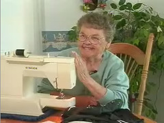
The Iowa Hawkeyes have one, and she’s straight out of central casting. Her name is Betty Madden (perfect, right?), she’s 82 years old, and she’s been sewing repairs on Iowa’s unis for 46 years.
I learned about Betty when reader Matt Nelson pointed me toward a short video about her. It shows her stitching here, snipping there, and pinning all over the place. Smart lady, too, at least judging by this quote: “The uniforms aren’t made of the same material as they was when I started 46 years ago. The material then was fabulous, but now it’s cheap.”
You can check out Betty for yourself here (the audio will start before the video starts streaming, but don’t worry about that — just give it a few seconds). And as long as we’re talking about behind-the-scenes videos, Jose Frontanes has discovered a decent five-minute clip featuring Maryland’s equipment manager, who’s got a serious collection of game-used helmets and jerseys (the latter of which show off today’s ridiculously truncated “sleeves”). The clip has lots of really stupid editing effects — must’ve been produced by a sophomore film student — but it’s still worth checking out. Look here.

So much for the soft sell: Due to overwhelmingly underwhelming demand for the Uni Watch temporary tattoos, I’ve changed the pricing structure. Instead of $5 for the first tat and $1 for each additional one, it’s now a buck apiece for the first five, and 50 cents for each one thereafter, with a five-tat minimum.
The basic point is the same: Gimme five bucks. Not into temporary tats? Gimme five bucks anyway. Why? Because webmaster Johnny Ek and I work really, really hard on this site. It’s usually the first thing we deal with when we wake up, the last thing we deal with before going to bed, and a whole lot of what we deal with in between, often at the expense of our “real” jobs (the ones that pay us, y’know, “real” money). We’re not complaining, mind you — nobody put a gun to our heads and told us to create this site, and we love doing it — but we don’t think we’re out of line asking for a measly $5 contribution to help keep the furnace lit. And if you don’t think our tireless efforts are worth five bucks, well, we respectfully suggest that you think a bit harder.
Am I trying to guilt-trip you? Definitely. But unlike all those family-, girlfriend-, and boss-induced guilt trips, this one can be cured quickly and painlessly: Just PayPal five whole dollars — or more, if you’re feeling particularly holiday-spirited — to paul_lukas at earthlink dot net (or if you don’t do PayPal, mail the dough to Paul Lukas, 671 DeGraw St., Brooklyn, NY 11217). We’ll both feel better afterward.
Uni Watch News Ticker: Several readers report that the scuttlebutt in Ohio is that the Buckeyes will wear white in the BCS Championship Game, just like they did last time around in the Fiesta Bowl. … Latest chapter in the ongoing soap opera of Wisconsin’s “motion W” logo, courtesy of Matt Brukman: “Under Armour is running an ad with a pee-wee football team sporting Wisconsin’s ‘Motion W’ helmets. Of course Wiconsin has a deal with Adidas, so I doubt UA got clearance to use the logo. There’s a quick video here — it’s very compressed and blurry, but I captured one frame that clearly shows the W. … Mark Bolding, whose excellent site is a Uni Watch favorite, is campaigning for Rice’s Todd Graham to be named Collegiate Coach of the Year. The uni-related connection? Rice has been wearing a “39” helmet decal this season, in memory of freshman Dale Lloyd, who died earlier this year. … In case you missed it in yesterday’s Comments section: Chris Cooley had some XYZ issues on Sunday (and unlike Marcus McNeill, Cooley doesn’t have the excuse of having two broken hands). … Logo Creep Alert from Andy Ingram, who notes that Fabio Cannavaro was wearing a swooshstika lapel pin while accepting the Golden Ball award. … Good info in the “New Threads” section of this article regarding the Redskins’ return to burgundy pants (with thanks to Mark Fightmaster). … Some Rockies uniform chatter — including a horrifying suggestion that they use more purple — can be found in the middle of this Q&A article. … Wanna see some serious hockey stripes? Look here. (Full details here, courtesy of Adam Strohm.) … Sleeve-centric note from Ryan Barto: “In Jason Campbell’s first start against Tampa Bay last weekend, his sleeves were the classic cut. It seemed like everytime the TV camera zoomed in on him after a throw, he was either rolling them up or just messing with them. This past weekend against Carolina, he came out of the tunnel with the cropped sleeves.” … Speaking of QB sleeves, Matt Hasselbeck went bare-armed in last night’s snow bowl. According to a quote buried in this article (but alertly spotted by reader Nick Collecchi), “If it hadn’t been the Packers, I would have worn [long] sleeves” (as his former teammate did). … Amateurs.
Ohio State isn’t playing in the Fiesta Bowl this year. They’re playing in the BCS Championship. They’re two different bowl games: link
Is the K on the back of Hawk’s jersey from the Fiesta bowl backwards?
Paul, do you get a decent cut from the sale of t-shirts and other trinkets? I’m trying to decide whether to send a cash contribution (I’m not a tattoo type of guy, fake or otherwise) or make some purchases.
[quote comment=”25105″]Is the K on the back of Hawk’s jersey from the Fiesta bowl backwards?[/quote]
It def looks that way…weird
[quote comment=”25104″]Ohio State isn’t playing in the Fiesta Bowl this year. They’re playing in the BCS Championship. They’re two different bowl games: link
Good catch… what’s up with that? Time to go dig into last year’s Fiesta Bowl archives
[quote comment=”25108″][quote comment=”25104″]Ohio State isn’t playing in the Fiesta Bowl this year. They’re playing in the BCS Championship. They’re two different bowl games: link
Good catch… what’s up with that? Time to go dig into last year’s Fiesta Bowl archives[/quote]
They decided if they added a couple more bowl games they can make that much money… so they added the BCS Championship game (BCS #1 vs BCS #2) and the International Bowl (MAC #3 vs Big East #4 or #5)… the more bowl games, the more schools get in the more money the schools make…. im just waiting for the Moen Toilet Bowl with Duke vs Florida International
link
Fox’s Top 10 Worst Unis
[quote comment=”25107″][quote comment=”25105″]Is the K on the back of Hawk’s jersey from the Fiesta bowl backwards?[/quote]
It def looks that way…weird[/quote]
It does look that way, but it didn’t look that way link. Weird.
Hey, Paul.
I’m sure there’s link out there who would be willing to sponsor your uni-centric blog.
Couldn’t be worse than begging grown men to buy temporary tattoos, could it?
I’ve been advocating for the past few years that the Rockies swap the purple in their team colors for forest green. It makes sense on a couple of different fronts:
a) The Colorado State Tree is the blue spruce, so you can claim a regional color connection. (Hey, it’s better than purple mountain majesties.)
b) Coors Field is largely this color anyway.
c) It would look pretty sharp with the existing black and silver.
And by “advocating” I mean annoying any friend who would listen.
[quote comment=”25106″]Paul, do you get a decent cut from the sale of t-shirts and other trinkets?[/quote]
I get up to 17% of Zazzle sales. That means I keep about $2.50 for a $15 t-shirt.
I appreciate your support, however you choose to express it!
[quote comment=”25110″]http://msn.foxsports.com/other/story/6214496
Fox’s Top 10 Worst Unis[/quote]
Nice job, Fox.
Maybe you could even work up a link or two so we can see what you’re talking about.
That’s why we love link.
i thought woodson for sure would have been included today.
i have to say that last night was the first game i saw the packers play this season, and charles woodson certainly stood out. his sock-statement last night was the most bold one since the portis-taylor sock-statement of last season.
you have to actually go back to his rookie year to find white that extends up to his calf on getty searches.
I’m sure no offense was meant by it (and none taken here), but I’m wondering if “swooshsticka” isn’t just a little too harsh, even for favorite logo-creeping brand. It may just be me, but comparing anything to the WWII nazis should only be done to those who truly deserve the comparison, and I don’t really think Nike fits in that category…not even close…at least not yet.
(removing myself from soapbox–sorry)
Paul – great site, not much of a tat or merch guy, but expect a “paypal” from me soon! Keep up the good work.
I always thought that Purple was an appropriate color for the Rockies… come on you guys know the lyrics
“O beautiful for spacious skies,
For amber waves of grain,
For purple mountain majesties
Above the fruited plain!
America! America!
God shed his grace on thee
And crown thy good with brotherhood
From sea to shining sea!”
I say don’t overdo the Purple but what better colors are better for Rockies than Black, Purple and Silver?
That fox article is horrible. Newcastle United has some of the classiest kits in all of Euro Soccer. It took me awhile to get used to them, but now find them one of the top 5 kits in soccer.
Besides, the Fox article also put the Golden State classic on the list of worst uniforms… you can’t have any credibility if that uniform is included in a “worst uniform” article.
Imagine if the 1970s Astros had ‘capitalized on its colors’ as that Rockies hack suggests teams do.
link
[quote comment=”25117″]I’m sure no offense was meant by it (and none taken here), but I’m wondering if “swooshsticka” isn’t just a little too harsh, even for favorite logo-creeping brand. It may just be me, but comparing anything to the WWII nazis should only be done to those who truly deserve the comparison, and I don’t really think Nike fits in that category…not even close…at least not yet.[/quote]
I agree to a degree, but when you look back at WWII, can you even remember the logos of the other teams?
[quote comment=”25115″][quote comment=”25110″]http://msn.foxsports.com/other/story/6214496
Fox’s Top 10 Worst Unis[/quote]
Nice job, Fox.
Maybe you could even work up a link or two so we can see what you’re talking about.
That’s why we love link.[/quote]
That is just horrible–some of the unis mentioned were one time gimmicks and rarely worn alternates. Including San Diego’s camos is distastful IMO as well, since I believe the Padres sport these in support of american troops, not to motivate sales of merchandise. Have to wonder who (if anyone) was consulted for that column.
[quote comment=”25110″]http://msn.foxsports.com/other/story/6214496
Fox’s Top 10 Worst Unis[/quote]
Hey reading the article, the #1 worst uni was the 1979 Alternate Tampa Bay Buccaneers uni. Yet, it doesn’t get into any detail at all about the uniform. Does anyone have any visual evidence of this uniform?
[quote comment=”25123″][quote comment=”25117″]I’m sure no offense was meant by it (and none taken here), but I’m wondering if “swooshsticka” isn’t just a little too harsh, even for favorite logo-creeping brand. It may just be me, but comparing anything to the WWII nazis should only be done to those who truly deserve the comparison, and I don’t really think Nike fits in that category…not even close…at least not yet.[/quote]
I agree to a degree, but when you look back at WWII, can you even remember the logos of the other teams?[/quote]
I totally understand the analogy, from a logo branding perspective, but I would just fear that others may not — again, it was just my opinion.
1. Tampa Bay Buccaneers (alternate)
Jersey lifespan: 1979
The key to this horrendous outfit was not the burnt orange jersey or the white pants.
egads! how dare he call the Bucs burnt orange. Obv never heard of Texas.
[quote comment=”25126″][quote comment=”25123″][quote comment=”25117″]I’m sure no offense was meant by it (and none taken here), but I’m wondering if “swooshsticka” isn’t just a little too harsh, even for favorite logo-creeping brand. It may just be me, but comparing anything to the WWII nazis should only be done to those who truly deserve the comparison, and I don’t really think Nike fits in that category…not even close…at least not yet.[/quote]
I agree to a degree, but when you look back at WWII, can you even remember the logos of the other teams?[/quote]
I totally understand the analogy, from a logo branding perspective, but I would just fear that others may not — again, it was just my opinion.[/quote]
Tom,
The swastika is a long standing symbol that means lots of different things in different cultures. I know that here in the West it is most often associated with the German Nazi’s of the 1930’s and 1940’s, but that was one of the most recent uses of the symbol. I couldn’t do justice with telling the history of the swastika, but I do know the German symbol is different from what the swastika has meant before. Here is a good overview of the link.
Well, the Fox article was hamstrung by the utter lack of pictures of the “bad” unis… although how those classic Warrior duds (with the cable cars on the back!) could be considered “bad” is beyond me…
link sweaters were pretty bad, though. (Of course, I thought my retinas were about to become permanently scarred when I happened across the Oregon-Oregon State game last week… Beyond a doubt, the two ugliest sets of unis I’ve ever seen in a single game!)
[quote comment=”25122″]link[/quote]
I am a big fan of the uniform, except for the adidas stripes down the shoulders. Hmmmm, these are “classic” uniforms right? meaning they have been around longer than corporate sponsopships? Do you think that Adidas purposely got the rights to the Newcastle kit because of the 3 stripes that go down the chest? Imagine if Nike had outbid them for the rights to this jersey and the chaos that would have ensued.
I was amused to see a reference to the Nike logo as a ‘swooshtika’. I first remember hearing that word come from the mouth of ex-Dead Kennedys singer Jello Biafra in one of his spoken word bits more than a decade ago.
Pfft, haven’t fox sports seen link or link old kits?
More here: link
[quote comment=”25132″]I was amused to see a reference to the Nike logo as a ‘swooshtika’. I first remember hearing that word come from the mouth of ex-Dead Kennedys singer Jello Biafra in one of his spoken word bits more than a decade ago.[/quote]
It’s been used for years and years — hardly my idea. I was just using it as received vernacular, like any other slang term.
[quote comment=”25128″][quote comment=”25126″][quote comment=”25123″][quote comment=”25117″]I’m sure no offense was meant by it (and none taken here), but I’m wondering if “swooshsticka” isn’t just a little too harsh, even for favorite logo-creeping brand. It may just be me, but comparing anything to the WWII nazis should only be done to those who truly deserve the comparison, and I don’t really think Nike fits in that category…not even close…at least not yet.[/quote]
I agree to a degree, but when you look back at WWII, can you even remember the logos of the other teams?[/quote]
I totally understand the analogy, from a logo branding perspective, but I would just fear that others may not — again, it was just my opinion.[/quote]
Tom,
The swastika is a long standing symbol that means lots of different things in different cultures. I know that here in the West it is most often associated with the German Nazi’s of the 1930’s and 1940’s, but that was one of the most recent uses of the symbol. I couldn’t do justice with telling the history of the swastika, but I do know the German symbol is different from what the swastika has meant before. Here is a good overview of the link.[/quote]
Even without the history of the swastika I think you have to admit that the intention of the “swooshstika” was to imply a Nazi reference. Seems to me the Nazis were trying to unify everyone by killing off people that didn’t fit into the mold that they saw as perfect.
Seems link link link link. link link link? But still may be a bit insensitive if fallen upon the wrong ears.
[quote comment=”25128″][quote comment=”25126″][quote comment=”25123″][quote comment=”25117″]I’m sure no offense was meant by it (and none taken here), but I’m wondering if “swooshsticka” isn’t just a little too harsh, even for favorite logo-creeping brand. It may just be me, but comparing anything to the WWII nazis should only be done to those who truly deserve the comparison, and I don’t really think Nike fits in that category…not even close…at least not yet.[/quote]
I agree to a degree, but when you look back at WWII, can you even remember the logos of the other teams?[/quote]
I totally understand the analogy, from a logo branding perspective, but I would just fear that others may not — again, it was just my opinion.[/quote]
Tom,
The swastika is a long standing symbol that means lots of different things in different cultures. I know that here in the West it is most often associated with the German Nazi’s of the 1930’s and 1940’s, but that was one of the most recent uses of the symbol. I couldn’t do justice with telling the history of the swastika, but I do know the German symbol is different from what the swastika has meant before. Here is a good overview of the link.[/quote]
I went against my better judgement making my initial post, since this site is about light-hearted uni related discussions. The link provided was very informative, making me think I was too quick to judge–but it doesn’t change my initial gut reaction to that symbol.
The fox article was awful, why talk about how bad the uniforms are and not give us a picture. I guess they never heard of a picture being worth a thousand words, they could have used 10 pictures and been done with it.
Purple rules.
Not only did those idiots at Fox criticize my Newcastle United’s amazing uni’s, they got the date wrong. We wore red stripes until 1904.
[quote comment=”25113″]I’ve been advocating for the past few years that the Rockies swap the purple in their team colors for forest green.[/quote]
Too bad neither you nor I have the cash to buy out the Monforts and make this happen.
That Fox article is awful. It even sounds like the “alternate” Bucs jersey he’s describing isn’t even an alternate. It sounds like an awful misinterpretation of their home jerseys at the time. It’s not like alternates were even used often in the late 70’s.
And Newcastle?! It’s not like I’m a huge fan of the barcodes, but they’re hardly the only ones. Notts County, Juventus, Charleroi, Udinese – and their execution of the black bars is certainly not any better than Newcastle’s.
And while we’re on the subject of ugly kits:
link
It’s the Charleroi away kit – Pink, zebra striped accents, an absurd number of logos, and “Nature’s Best” across the junk. Worst kit ever?
interested to hear your thoughts on this small link Viking logo(Portland State U)
Sort of uni-related, but not really. There’s a kid in that UA commercial who plays a leading role — a pre-teen Click Clack, if you will. He’s pretty cut up, and looks like he might actually play football / aspire to play in high school. Let’s say three years go by and he does come out for his high school team. Does he have an eligiblity problem because of the paid endorsement of UA? What about when/if he tries to play in college? I mean, there’s no way the NCAA wouldn’t have a fit about that if he had done that ad while he was in high school. So I’m wondering.
Has anyone filled out the NCAA eligibility clearinghouse form who could shed some light on whether Little Click Clack would have to report this, and if so whether it would keep him out of an NCAA program?
link of Woodson in last nights game.
[quote comment=”25141″]That Fox article is awful. It even sounds like the “alternate” Bucs jersey he’s describing isn’t even an alternate. It sounds like an awful misinterpretation of their home jerseys at the time. It’s not like alternates were even used often in the late 70’s.
And Newcastle?! It’s not like I’m a huge fan of the barcodes, but they’re hardly the only ones. Notts County, Juventus, Charleroi, Udinese – and their execution of the black bars is certainly not any better than Newcastle’s.
And while we’re on the subject of ugly kits:
link
It’s the Charleroi away kit – Pink, zebra striped accents, an absurd number of logos, and “Nature’s Best” across the junk. Worst kit ever?[/quote]
Without a doubt those are hideous. These people really are amateurs.
Happen to love link
Paul,
I don’t have the game recorded, so I have no visual evidence, but during the USC-ND game I’m pretty sure that USC center Ryan Kalil #67 had an additional sticker on the back of his helmet…a #10. Is this so QB John David Booty (#10) knows who to stand behind to get the snap?
Anyone still have the game for visual evidence?
[quote comment=”25131″][quote comment=”25122″]link[/quote]
I am a big fan of the uniform, except for the adidas stripes down the shoulders. Hmmmm, these are “classic” uniforms right? meaning they have been around longer than corporate sponsopships? Do you think that Adidas purposely got the rights to the Newcastle kit because of the 3 stripes that go down the chest? Imagine if Nike had outbid them for the rights to this jersey and the chaos that would have ensued.[/quote]
There weren’t always link stripes. And I would hate to see what Nike would do to those classics.
Rockies talk.. I love it!!!
[quote comment=”25113″]I’ve been advocating for the past few years that the Rockies swap the purple in their team colors for forest green. It makes sense on a couple of different fronts:
a) The Colorado State Tree is the blue spruce, so you can claim a regional color connection. (Hey, it’s better than purple mountain majesties.)
b) Coors Field is largely this color anyway.
c) It would look pretty sharp with the existing black and silver.
And by “advocating” I mean annoying any friend who would listen.[/quote]
The Rockies have experimented a little with green (because of Coors Field) in the link.
But I gotta agree with Matt one this one…
[quote comment=”25118″]I always thought that Purple was an appropriate color for the Rockies… come on you guys know the lyrics
For purple mountain majesties
I say don’t overdo the Purple but what better colors are better for Rockies than Black, Purple and Silver?[/quote]
I love the way they use the purple sparingly on the uniforms in the link and link. I wasn’t really a fan of the link or the link.
And I absoutely have to disagree with Thomas Harding’s opinion about leaving the pinstripes to the older franchise’s (it doesn’t say it in the article now, but it was originally in there last night before Paul corrected him). Pinstripes are primarily a baseball tradition (excluding link, if you even count that as pinstripes), not necessarily an older franchise tradition. I’d like to see even more teams with them.
I’m not in love with their link two link alternate uniforms as much as their link, but I’ll take what I can get.
And that’s all I have to say about that.
[quote comment=”25145″]Sort of uni-related, but not really. There’s a kid in that UA commercial who plays a leading role — a pre-teen Click Clack, if you will. He’s pretty cut up, and looks like he might actually play football / aspire to play in high school. Let’s say three years go by and he does come out for his high school team. Does he have an eligiblity problem because of the paid endorsement of UA? What about when/if he tries to play in college? I mean, there’s no way the NCAA wouldn’t have a fit about that if he had done that ad while he was in high school. So I’m wondering.
Has anyone filled out the NCAA eligibility clearinghouse form who could shed some light on whether Little Click Clack would have to report this, and if so whether it would keep him out of an NCAA program?[/quote]
Good point. The NCAA would probably have a fit if they found out a kid had been a bell ringer for the Salvation Army donation buckets.
[quote comment=”25143″]interested to hear your thoughts on this small link Viking logo(Portland State U)[/quote]
I’m assuming you’re talking about the one that looks kind of like the Sabres’ new logo on the top left? Very generic looking.
I don’t know what’s up with that. link guy is a lot better and seems to be used just as much as the other one.
[quote comment=”25150″][quote comment=”25131″][quote comment=”25122″]link[/quote]
I am a big fan of the uniform, except for the adidas stripes down the shoulders. Hmmmm, these are “classic” uniforms right? meaning they have been around longer than corporate sponsopships? Do you think that Adidas purposely got the rights to the Newcastle kit because of the 3 stripes that go down the chest? Imagine if Nike had outbid them for the rights to this jersey and the chaos that would have ensued.[/quote]
There weren’t always link stripes. And I would hate to see what Nike would do to those classics.[/quote]
Ah ha, so it could very well be the most absurd logo-creep I have ever seen.
Hey, can I have a “measly” $5 too?
[quote comment=”25150″][quote comment=”25131″][quote comment=”25122″]link[/quote]
I am a big fan of the uniform, except for the adidas stripes down the shoulders. Hmmmm, these are “classic” uniforms right? meaning they have been around longer than corporate sponsopships? Do you think that Adidas purposely got the rights to the Newcastle kit because of the 3 stripes that go down the chest? Imagine if Nike had outbid them for the rights to this jersey and the chaos that would have ensued.[/quote]
There weren’t always link stripes. And I would hate to see what Nike would do to those classics.[/quote]
I think Nike does a bang up job with their own version of link. (Gotta love that collar)
RE: What Nike would do to a kit like Newcastle’s
Believe it or not, Nike normally keeps things pretty traditional in the realm of club soccer kits. Granted, they dropped the ball with Atletico Madrid’s current home kit, but they’ve had some pretty sharp, traditional kits with a minimum of typical Nike branding elements of late. Examples: link, link, link, and even more obscure clubs like link.
Yea, it’s a bad fox article, but those Dolphins orange alts were hideous. Also any NBA uni from the 90’s when teams felt they needed to put the entire logo on the front would be right up there. Toronto and Vancouver come to mind. I’m link illiterate, so no pics, sorry.
What’s this about some $$ being thrown around in here. Hammertime needs some Benjamins too bebe.
gimme gimme.
That Thomas Harding guy who wrote the Rockies’ mailbag column doesn’t seem to know anything about baseball.
“The majority of teams have more than two jerseys. According to Paul Lukas, who devotes an ESPN column and his own blog to the study of all things uniform in sports, the Cardinals, Dodgers, Giants, Phillies, Tigers and Yankees are the only teams that go with only two uniforms, home and away. Obviously, the fact all of them except the Phillies are wearing uniforms that are similar to what they wore at least a half-century ago has something to do with them not following suit with the rest of baseball.”
huh. that’s funny, because to me, their current uniforms look just like the ones they were wearing link, with the extremely small difference of blue stars now vs. red stars then dotting the “I”s in “Phillies”.
that took me all of about .0000000000001 seconds to recognize.
it’s not even like they wore them for like 3 years and moved on back then, either. they debuted in 1950 and lasted through 1969 (20 seasons).
additionally, I seem to recall a fair amount of razzle and dazzle in the early 90s when the Phillies went back to those uniforms. it’s not like this was a big secret, that they wore those uniforms before.
what a moron.
Amateurs is way too kind for the persons who assembled that god-awful Fox story… Hack is far more accurate.
Besides completely missing on two great jerseys in Newcastle and the Warriors and getting the wrong bad SOX jersey…that would be what we called INDUSTRIAL-SIZE Sox, the Bucs have never had an alternative jersey. What the hack meant was to criticize the oft-maligned creamsicle jersey topped with Bucco Bruce.
[quote comment=”25159″]Yea, it’s a bad fox article, but those Dolphins orange alts were hideous. Also any NBA uni from the 90’s when teams felt they needed to put the entire logo on the front would be right up there. Toronto and Vancouver come to mind. I’m link illiterate, so no pics, sorry.[/quote]
If I remember correctly, Vancouver had a massive type treatment, but they left the logo off the jersey and instead put it (massively) on the shorts. The worst offenders of the big-logo-on-jersey were Toronto, Atlanta (who also incorporated a black-to-red gradient, and Houston. Followed closely by Cleveland, who may not have had a logo on the jersey, but they had a sweeping blue wave instead. What a dark time in Uniform history.
The Blue Jays are unveiling a new hat today at the Thomas Press Conference. It is black with a scripted T and it will be the first time that Toronto is represented on the hat since their ulgy T with the muscled bird. This hat will most probably replace the grey hat that the players felt was unlucky last season. As soon as there’s more info we’ll post it at link.
[quote comment=”25161″]huh. that’s funny, because to me, their current uniforms look just like the ones they were wearing link, with the extremely small difference of blue stars now vs. red stars then dotting the “I”s in “Phillies”.
that took me all of about .0000000000001 seconds to recognize.
it’s not even like they wore them for like 3 years and moved on back then, either. they debuted in 1950 and lasted through 1969 (20 seasons).
additionally, I seem to recall a fair amount of razzle and dazzle in the early 90s when the Phillies went back to those uniforms. it’s not like this was a big secret, that they wore those uniforms before.
what a moron.[/quote]
The problem is, despite the fact that the current Phillies uniforms are closely related to their bygone unis, I think they have branded themselves in people’s minds as the maroon and light blue team from the 80’s. Even if those uniforms were worn only for a fraction of the history, they were distinct enough to resonate in the minds of less uniform-savvy people.
I think the Ben Wallace thing is stupid and petty. This is not college, and these are not little boys. It is professional entertainment with stars make tens of millions of dollars. Therefore, I do not deem it necessary to arbitrarily deny Wallace the option of wearing a headband. These aren’t robots, nor the faceless drones of the NFL. The NBA sets up useless edicts that the players cannot publicly challenge, but for a coach to impose a meaningless rule, with no reason, is useless. The sweat argument is most definitely valid, especially for someone with a lot of hair (with grease or other chemicals in it). Though both sides are at fault, I side with Wallace.
send wallace to the yankees and the hair disappears
[quote comment=”25146″]link of Woodson in last nights game.[/quote]
Isn’t it odd that NFL “pants” are shorter than NBA “shorts”.
[quote comment=”25163″][quote comment=”25159″]Yea, it’s a bad fox article, but those Dolphins orange alts were hideous. Also any NBA uni from the 90’s when teams felt they needed to put the entire logo on the front would be right up there. Toronto and Vancouver come to mind. I’m link illiterate, so no pics, sorry.[/quote]
If I remember correctly, Vancouver had a massive type treatment, but they left the logo off the jersey and instead put it (massively) on the shorts. The worst offenders of the big-logo-on-jersey were Toronto, Atlanta (who also incorporated a black-to-red gradient, and Houston. Followed closely by Cleveland, who may not have had a logo on the jersey, but they had a sweeping blue wave instead. What a dark time in Uniform history.[/quote]
Aside from the odd pin striping I didn’t mind link. I mean, obviously the use of purple disturbs me greatly in the away uniforms (I always thought they would have worked much better in a dark green) but I like the overall concept of having the logo on the jersey.
I know it’s ugly but I liked it.
[quote comment=”25110″]http://msn.foxsports.com/other/story/6214496
Fox’s Top 10 Worst Unis[/quote]
That should go on a Top 10 Worst Sports Related Articles list.
Absolutely horrid piece, no pictures, and just idiotic.
[quote comment=”25165″]The Blue Jays are unveiling a new hat today at the Thomas Press Conference. It is black with a scripted T and it will be the first time that Toronto is represented on the hat since their ulgy T with the muscled bird. This hat will most probably replace the grey hat that the players felt was unlucky last season. As soon as there’s more info we’ll post it at link.[/quote]
Scripted “T” eh, sounds cool.
the NCAA problem occurs when you use your celebrity status gained as an athlete to make money off of it. Noone knows who that kid is. Can anyone outside of his family and teammates name him? Probably not. If that was Brady Quinn out there, you’d know who he was, and associate him with football. That’s where the problem is.
As I was watching the Seahawks-Packers game last night I noticed some uni-related chatter between the announcers (not sure who brought it up) but they discussed Deion Branch’s neon green gloves for a little while and mentioned that his coach didn’t like the gloves because it would be easier for the refs to spot a hold or something like that.
Got a pic of the new Jays hat! You’re welcome to use it Paul
link
[quote comment=”25168″]send wallace to the yankees and the hair disappears[/quote]
A little off topic, but exactly when did the Yankees go to this ‘neat and clean’ look? I seem to recall several shaggy Yankees earlier on in the Steinbrenner era like Thurman Munson, Sparky Lyle and Goose Gossage.
Even Mattingly had a good porno ‘stache goin’.
[quote comment=”25175″]Got a pic of the new Jays hat! You’re welcome to use it Paul
link[/quote]
That “T” looks like two leeches mid-coitus.
I WAS excited, but another link. yawn
[quote comment=”25175″]Got a pic of the new Jays hat! You’re welcome to use it Paul
link[/quote]
YIKES!!!!
I was messing with the Mets hat awhile ago and came up with link
I don’t know I was bored oone day and this is all I could come up with in paint
[quote comment=”25175″]Got a pic of the new Jays hat! You’re welcome to use it Paul
link[/quote]
Ugh, that hat…………..
Couldn’t they have gotten a little more original with it. Or hey, go totally unoriginal and go back to a classic like link. Or you could have gone with link. Either one would have been a better choice than black and silver, yet again…. blah.
Why is the “T” on an angle? There is too much empty black space on the one side. sheesh, looks like I’ll still be bugging.
You rather see the muscled bird? I hate that one, even tho one of the hats is on my wall. They gotta stick with their current color scheme…just too blah…
I think a lot of the empty space may be the angle…
[quote comment=”25172″][quote comment=”25165″]The Blue Jays are unveiling a new hat today at the Thomas Press Conference. It is black with a scripted T and it will be the first time that Toronto is represented on the hat since their ulgy T with the muscled bird. This hat will most probably replace the grey hat that the players felt was unlucky last season. As soon as there’s more info we’ll post it at link.[/quote]
Scripted “T” eh, sounds cool.[/quote]
It seems way too big. Also off center? I say bring back the blue jay on the solid blue hat from the mid 90s.
[quote comment=”25175″]Got a pic of the new Jays hat! You’re welcome to use it Paul
link[/quote]
This the new Blue Jays alternate cap. Officially, their 2007 home cap is gray (with the old logo) and the road cap is black (ditto).
They weren’t supposed to reveal the new cap until January, but I guess they just couldn’t resist…
[quote comment=”25133″]Pfft, haven’t fox sports seen link or link old kits?
More here: link[/quote]
link. link. link.
The Indiana high school football state championships were this past weekend, and Warren Central was decked out in some major logo creep. (even their shoes) Literally from head to toe, Underarmor was their logo of choice. Also notice in picture #2, #27 for Warren Cental is losing a letter on his nameplate.
link
link
link
They stopped wearing the gray cap at mid-season last year, apparently it was an issue with the players…
I just noticed also in picture 2, there is an underarmor logo ON THE BACK OF THE HELMET!
[quote comment=”25189″]They stopped wearing the gray cap at mid-season last year, apparently it was an issue with the players…[/quote]
I know — I’m just saying that it’s still listed as their official home cap.
link…
Fox’s Top 10 Worst Unis
Nice job, Fox.
Maybe you could even work up a link or two so we can see what you’re talking about.
That’s why we love ESPN.
While I enjoy the links provided by Paul in the ESPN articles, if you have to ask for pictures of the uniforms in question… you’re probably not really a uniform fanatic.
you guys gotta lay off of warren central,
they were only “protecting this house!”.
This is a good time of year to be a Detroit fan… the Pistons are usually winning a string of games, the Wings haven’t blown it yet, and we get to make fun of our general manager on Thanksgiving.
link
And apparently, the Tigers won the series, according to the guy on the right.
link
this should solve any problems as to who the kid/team is in the UA commercials…
link
link
Apparently, links are beyond me today.
While I hate the fact that the Jays are sticking with the black (is it too late to launch a “Ditch The Black” for the Jays?), I kinda dig the scripted T. Though it would look much better on a dark blue cap.
But what do I know…I like the graphite hat.
Also noted that Thomas will wear number 35, which Lyle Overbay wore last year. Any guesses on what Frank might have had to pay to get the number?
No guesses…but it looks like Overbay may go back to number 11
[quote comment=”25108″][quote comment=”25104″]Ohio State isn’t playing in the Fiesta Bowl this year. They’re playing in the BCS Championship. They’re two different bowl games: link
Good catch… what’s up with that? Time to go dig into last year’s Fiesta Bowl archives[/quote]
Tressel is superstitious. The Buckeyes wore whites when he won the national championship in 2002, so they wore white in the Fiesta Bowl last year, as I’m sure they will in this years championship game.
[quote comment=”25188″]The Indiana high school football state championships were this past weekend, and Warren Central was decked out in some major logo creep. (even their shoes) Literally from head to toe, Underarmor was their logo of choice. Also notice in picture #2, #27 for Warren Cental is losing a letter on his nameplate.
link
link
link
That’s a high school team?
Logo creep aside, those are some VERY quality uniforms. Probably cost a pretty penny too. I doubt they’re sponsored by UA, but they must have connections since you can’t just order UA uniforms online(like Nike).
[quote comment=”25175″]Got a pic of the new Jays hat! You’re welcome to use it Paul
link[/quote]
I like it!!!
[quote comment=”25185″][quote comment=”25175″]Got a pic of the new Jays hat! You’re welcome to use it Paul
link[/quote]
This the new Blue Jays alternate cap. Officially, their 2007 home cap is gray (with the old logo) and the road cap is black (ditto).
They weren’t supposed to reveal the new cap until January, but I guess they just couldn’t resist…[/quote]
Paul.. is that new? I thought for 2006 they got rid of the grey hat entirely.
My Babe Ruth Rec league baseball team was called the Blue Jays and we wore this link. It’s probably my favorite hat design of all time, the bird just looks so badass, and you can’t top that maple leaf “tattoo”.
[quote comment=”25198″]this should solve any problems as to who the kid/team is in the UA commercials…
link
Now that we know he does compete in amateur athletics, I’m even more curious whether this creates issues for him with the NCAA or a similar governing body on the high school level.
[quote comment=”25193″]you guys gotta lay off of warren central,
they were only “protecting this house!”.[/quote]
…but it’s not their house. They’re only subletting it from the Colts.
:)
[quote comment=”25203″][quote comment=”25188″]The Indiana high school football state championships were this past weekend, and Warren Central was decked out in some major logo creep. (even their shoes) Literally from head to toe, Underarmor was their logo of choice. Also notice in picture #2, #27 for Warren Cental is losing a letter on his nameplate.
link
link
link
That’s a high school team?
Logo creep aside, those are some VERY quality uniforms. Probably cost a pretty penny too. I doubt they’re sponsored by UA, but they must have connections since you can’t just order UA uniforms online(like Nike).[/quote]
As a matter of fact, they are sponsored by UA. One of the original members of UA is a graduate of Warren Central. There are now a few high schools sponsored by UA around the country.
[quote comment=”25207″][quote comment=”25198″]this should solve any problems as to who the kid/team is in the UA commercials…
link
Now that we know he does compete in amateur athletics, I’m even more curious whether this creates issues for him with the NCAA or a similar governing body on the high school level.[/quote]
But if the said player is not endorsing the product but is merely an actor in the commercial how is that making him loose his rights as an amateur athlete? He was paid by UA for acting in the commercial not for playing football and wearing their product and doing some commercials.
Like the Peyton Manning commercials the said company’s (phone or credit card) are using Peyton’s name and his football abilities to help sell their product. The kid in the UA commercial is not his name or football playing abilities to sell their product.
[quote comment=”25188″]The Indiana high school football state championships were this past weekend, and Warren Central was decked out in some major logo creep. (even their shoes) Literally from head to toe, Underarmor was their logo of choice. Also notice in picture #2, #27 for Warren Cental is losing a letter on his nameplate.
link
link
link
Anyone else notice that the W on their helmets resembles Wisconsin’s Motion W? Let’s hope the university doesn’t read this…
[quote comment=”25165″]The Blue Jays are unveiling a new hat today at the Thomas Press Conference. It is black with a scripted T and it will be the first time that Toronto is represented on the hat since their ulgy T with the muscled bird. This hat will most probably replace the grey hat that the players felt was unlucky last season. As soon as there’s more info we’ll post it at link.[/quote]
The Blue Jays have screwed up their look more than any other team in baseball. The unis they wore when they won back-to-back Championships needed nothing more than a few tweaks to make them perfect. They were unique to the team, they honored Canada with the maple leaf, and their main color was blue (DUH). If any team should Ditch The Black it is the Toronto BLUE Jays.
Did anyone else think that the Redskins’ red pants appeared to have more of a metallic shine to them? Maybe it was just me?
[quote comment=”25218″]Did anyone else think that the Redskins’ red pants appeared to have more of a metallic shine to them? Maybe it was just me?[/quote]
I think that its just that we haven’t seen them in a long time.
pics of the old bucs unis. how are orange jerseys and white pants considered “alternates?” is it because they rarely wore them, prefering to play in all white (or later, white jerseys and orange pants)?
link
If any team should Ditch The Black it is the Toronto BLUE Jays.
The current Blue Jay colors are a nice combination, in and of themselves. It’d be better if the primary color was that “electric blue” as opposed to the black. Better still, as said above, go back to the 92-93 look; they will anyway when they go through their retro phase.
[quote comment=”25220″]pics of the old bucs unis. how are orange jerseys and white pants considered “alternates?” is it because they rarely wore them, prefering to play in all white (or later, white jerseys and orange pants)?
link
Not even Steve Young can make those jerseys look good. Makes you wonder what they were thinking, if it all. I like their current look loads better, but they look too much like Frisco (and Steve Young made their jerseys look even better).
I was watching the Michigan/NC State basketball game last night and I noticed Brent Petway of Michigan appeared to have something shaved into his head.
Petway’s link.
[quote comment=”25224″]I was watching the Michigan/NC State basketball game last night and I noticed Brent Petway of Michigan appeared to have something shaved into his head.
Petway’s link.[/quote]
Looks like a 23
[quote comment=”25217″][quote comment=”25165″]The Blue Jays are unveiling a new hat today at the Thomas Press Conference. It is black with a scripted T and it will be the first time that Toronto is represented on the hat since their ulgy T with the muscled bird. This hat will most probably replace the grey hat that the players felt was unlucky last season. As soon as there’s more info we’ll post it at link.[/quote]
The Blue Jays have screwed up their look more than any other team in baseball. The unis they wore when they won back-to-back Championships needed nothing more than a few tweaks to make them perfect. They were unique to the team, they honored Canada with the maple leaf, and their main color was blue (DUH). If any team should Ditch The Black it is the Toronto BLUE Jays.[/quote]
This is how baseball is viewed from the north? man, how embarrassing! nice try BLACK Jays!
[quote comment=”25165″]The Blue Jays are unveiling a new hat today at the Thomas Press Conference. It is black with a scripted T and it will be the first time that Toronto is represented on the hat since their ulgy T with the muscled bird. This hat will most probably replace the grey hat that the players felt was unlucky last season. As soon as there’s more info we’ll post it at link.[/quote]
That hat is seriously ugly. I didn’t think that the Jays could do even worse, but they somehow managed to do so.
[quote comment=”25170″][quote comment=”25163″][quote comment=”25159″]Yea, it’s a bad fox article, but those Dolphins orange alts were hideous. Also any NBA uni from the 90’s when teams felt they needed to put the entire logo on the front would be right up there. Toronto and Vancouver come to mind. I’m link illiterate, so no pics, sorry.[/quote]
If I remember correctly, Vancouver had a massive type treatment, but they left the logo off the jersey and instead put it (massively) on the shorts. The worst offenders of the big-logo-on-jersey were Toronto, Atlanta (who also incorporated a black-to-red gradient, and Houston. Followed closely by Cleveland, who may not have had a logo on the jersey, but they had a sweeping blue wave instead. What a dark time in Uniform history.[/quote]
Aside from the odd pin striping I didn’t mind link. I mean, obviously the use of purple disturbs me greatly in the away uniforms (I always thought they would have worked much better in a dark green) but I like the overall concept of having the logo on the jersey.
I know it’s ugly but I liked it.[/quote]
Remember this link from the Sixers? Though I always did like link jerseys from the 90s.
What was the purpose of this trim in the Nuggets v. Warriors NBA exhibition game in Mexico City?
link
link
I assume it was meant to capture the colorful culture of our Mexican neighbors…but not sure why so much effort for so little effect? Hmmm…
Betty Madden rocks! I hope she’s still going strong for another couple of decades.
[quote comment=”25219″][quote comment=”25218″]Did anyone else think that the Redskins’ red pants appeared to have more of a metallic shine to them? Maybe it was just me?[/quote]
I think that its just that we haven’t seen them in a long time.[/quote]No, they were definitely shinier. link is from Sunday link is from, uh, before Sunday.
Minna H,
After reading link I guess you won’t be watching football this weekend.
I hope surgary is not needed. He is one hell of a football athlete. That is fun to watch.
[quote comment=”25230″]What was the purpose of this trim in the Nuggets v. Warriors NBA exhibition game in Mexico City?
link
link
I assume it was meant to capture the colorful culture of our Mexican neighbors…but not sure why so much effort for so little effect? Hmmm…[/quote]Eh. I can’t imagine it took that much more effort than coming up with a patch.
Anyway, the Spurs did something similar for their link and the Clippers for their link.
[quote comment=”25234″]Minna H,
After reading link I guess you won’t be watching football this weekend.
I hope surgary is not needed. He is one hell of a football athlete. That is fun to watch.[/quote]
Matt! Ahhhh! I didn’t know he got hurt. I wasn’t able to watch as much football this past weekend, and I don’t have cable.
Poor, poor Troy….I will light a candle for him.
[quote comment=”25237″][quote comment=”25234″]Minna H,
After reading link I guess you won’t be watching football this weekend.
I hope surgary is not needed. He is one hell of a football athlete. That is fun to watch.[/quote]
Matt! Ahhhh! I didn’t know he got hurt. I wasn’t able to watch as much football this past weekend, and I don’t have cable.
Poor, poor Troy….I will light a candle for him.[/quote]
Was just about to say this…maybe you’ll wanna watch to see what kind of sideline gear he decides to wear, cuz I’m sure they will show him a lot
[quote comment=”25239″][quote comment=”25237″][quote comment=”25234″]Minna H,
After reading link I guess you won’t be watching football this weekend.
I hope surgary is not needed. He is one hell of a football athlete. That is fun to watch.[/quote]
Matt! Ahhhh! I didn’t know he got hurt. I wasn’t able to watch as much football this past weekend, and I don’t have cable.
Poor, poor Troy….I will light a candle for him.[/quote]
Was just about to say this…maybe you’ll wanna watch to see what kind of sideline gear he decides to wear, cuz I’m sure they will show him a lot[/quote]
Ooh, good point, Kenny. All-Polamalu all the time….Damn. They are not on my schedule this week. My only hope is updates on him. I need to move east….
Going back to yesterday’s thread, could Budaj be wearing Ned Flanders on his helmet because he is Flemish (from Flanders)?
[quote comment=”25242″]Going back to yesterday’s thread, could Budaj be wearing Ned Flanders on his helmet because he is Flemish (from Flanders)?[/quote]He’s Slovakian. Flanders is in Belgium.
Though I always did like Phoenix Suns jerseys from the 90s.
Agreed on the Suns jerseys. The Bucks had a green alt with a full deer torso on it. They didn’t wear it often, though. And let’s not forget the Pistons Grant Hill-era teal atrocities, as well as the Rockets unis someone already mentioned. When I get home I may have to pull out my basketball cards and relive the carnage.
[quote comment=”25163″][quote comment=”25159″]Yea, it’s a bad fox article, but those Dolphins orange alts were hideous. Also any NBA uni from the 90’s when teams felt they needed to put the entire logo on the front would be right up there. Toronto and Vancouver come to mind. I’m link illiterate, so no pics, sorry.[/quote]
If I remember correctly, Vancouver had a massive type treatment, but they left the logo off the jersey and instead put it (massively) on the shorts. The worst offenders of the big-logo-on-jersey were Toronto, Atlanta (who also incorporated a black-to-red gradient, and Houston. Followed closely by Cleveland, who may not have had a logo on the jersey, but they had a sweeping blue wave instead. What a dark time in Uniform history.[/quote]
Another plague was the needlessly assymetrical jersey or shorts.
NBA unis have improved ten-fold in the last decade.
Oh and one last thing about the new Blue Jays hat. The script of the ‘T’ on the hat does not match the one on the gray jays jersey with ‘Toronto’. In other words, the T’s are different…so obviously (or hopefully) the two will never be worn together. Here’s the pics…
link
If you use the pics Paul, that second pic is not mine, so make sure you have a pic you have permission to use.
I hate to admit liking something Nike does, but the yellow George Mason jerseys are pretty cool.
link
Sorry. Messed up the yellow GMU link from post 123.
[quote comment=”25223″][quote comment=”25220″]pics of the old bucs unis. how are orange jerseys and white pants considered “alternates?” is it because they rarely wore them, prefering to play in all white (or later, white jerseys and orange pants)?
link
Not even Steve Young can make those jerseys look good. Makes you wonder what they were thinking, if it all. I like their current look loads better, but they look too much like Frisco (and Steve Young made their jerseys look even better).[/quote]
I don’t understand why most people seem to hate the original Bucs unis/colors. I loved (and still love) them. their new threads are so… boring.
their moron owner and the owner of the Carolina Hurricanes should meet up for lunch. they’d probably get along great. plus it would give someone an easy opportunity to assassinate both of them at once.
[quote comment=”25252″][quote comment=”25223″][quote comment=”25220″]pics of the old bucs unis. how are orange jerseys and white pants considered “alternates?” is it because they rarely wore them, prefering to play in all white (or later, white jerseys and orange pants)?
link
Not even Steve Young can make those jerseys look good. Makes you wonder what they were thinking, if it all. I like their current look loads better, but they look too much like Frisco (and Steve Young made their jerseys look even better).[/quote]
I don’t understand why most people seem to hate the original Bucs unis/colors. I loved (and still love) them. their new threads are so… boring.
their moron owner and the owner of the Carolina Hurricanes should meet up for lunch. they’d probably get along great. plus it would give someone an easy opportunity to assassinate both of them at once.[/quote]
Assassinating figureheads aside, I agree about the old Bucs jerseys. I was always a big fan. The color scheme reminded me of Florida. Just like the Dolphins color scheme has that “tropical” kind of feel to it with the teal blue and the orange, the old bucs had that bright sunny feel to it that a team from Florida should have.
Of course, if they still wore that creamsicle orange they would probably screw it up by wearing them with creamsicle orange pants or making a black alt jersey. Maybe it’s just as well they didn’t screw up what I think is a classic.
[quote comment=”25229″]Remember this link from the Sixers?[/quote]
Wait – Barkley wore #32 with the Sixers? I don’t remember that…
[quote comment=”25259″][quote comment=”25229″]Remember this link from the Sixers?[/quote]
Wait – Barkley wore #32 with the Sixers? I don’t remember that…[/quote]
philly bill, dependent on your age, you might not.
on 11/7/91 magic made his announcement that he was hiv positive.
here is an article from the following week.
link
What was the purpose of this trim in the Nuggets v. Warriors NBA exhibition game in Mexico City?
link…
link…
I assume it was meant to capture the colorful culture of our Mexican neighbors…but not sure why so much effort for so little effect? Hmmm…
Eh. I can’t imagine it took that much more effort than coming up with a patch.
Anyway, the Spurs did something similar for their tour of France and the Clippers for their trip to Russia.
Lame Spurs and Clippers uniforms. If you’re going to preach this global brand bullcrap, and then your teams show you up in a modified uniform, then your a horseshit brand. Nice job again, Stern.
Brand Rule #1: If it ain’t broke don’t fix it.
I believe that Barkley wore 32 that year to honor Magic Johnson.
[quote comment=”25202″][quote comment=”25108″][quote comment=”25104″]Ohio State isn’t playing in the Fiesta Bowl this year. They’re playing in the BCS Championship. They’re two different bowl games: link
Good catch… what’s up with that? Time to go dig into last year’s Fiesta Bowl archives[/quote]
Tressel is superstitious. The Buckeyes wore whites when he won the national championship in 2002, so they wore white in the Fiesta Bowl last year, as I’m sure they will in this years championship game.[/quote]
When he was at Youngstown State, Tressel made a habit of wearing whites in I-AA National Championship games, even if Youngstown was the higher seed. I think it’s a motivational thing – he likes his team to feel like they’re the underdog in big games, even if they’re favored.
[quote comment=”25248″]Oh and one last thing about the new Blue Jays hat. The script of the ‘T’ on the hat does not match the one on the gray jays jersey with ‘Toronto’. In other words, the T’s are different…so obviously (or hopefully) the two will never be worn together. Here’s the pics…
link
That’s crazy, do they not have people to check these things out before showing the new..ugh design on national television? You’re right, the T’s don’t even match, wow. So if they can’t wear the hat with the leaches with the grey uni, then with the white, ok so then black hat, white jersey, hmm, but aren’t they the BLUE Jays?
What an embarassement to the marketing team as well as the organization, AND to the actual bird’s reputation.
As many of you are noticing, we now have display ads at the top of the page (one of them is a “Ditch the Black” house ad, but that’s just a placeholder — a “real” ad will be in there shortly, maybe by the time you read this). There will be a few more of these in the days to come.
No, we’re not “selling out” (although I realize it may look that way, esp. given my $$$-grubbing appeal today). We’ve always had ads, but they were just Google ads — now we’ve got display ads, which are the next step in terms of tryng to make this site as self-sustaining as possible. And with the holidays coming, we had some folks who wanted to buy some space, so this seemed like a good time to take that next step.
For now, I can personally vouch for all of our advertisers. I’ve either done business with them, used their products, or know them personally. This may not always be possible (i.e., we may get an inquiry from an advertiser I’m not familiar with), but for now I’m very comfortable with who we’re doing business with. You should be, too.
We will also be raffling off a $200 gift card for one of the advertisers — more info on this either tomorrow or Thursday.
There is no way the Jays are going to be wearing the grey caps next season. When I was at the home closer they had a “garage sale” where they sold off a bunch of giveaways from throughout the years and well as some stuff like old line up cards, a few old bats. All stuff that has likely been kept in a closet somewhere for the past 5-10+ years. The only recent thing they were selling were those grey caps, and they were I think $5 or $10 (the official ones that are usually $40ish)
…Also, why don’t they make a Blue hat. A while ago they had a seasons ticket holder open meeting, where season tickets holders could come and ask questions. According to two separate newpaper articles I read (from different papers), bring back blue was the biggest issue raised.
[quote comment=”25210″][quote comment=”25203″][quote comment=”25188″]The Indiana high school football state championships were this past weekend, and Warren Central was decked out in some major logo creep. (even their shoes) Literally from head to toe, Underarmor was their logo of choice. Also notice in picture #2, #27 for Warren Cental is losing a letter on his nameplate.
link
link
link
That’s a high school team?
Logo creep aside, those are some VERY quality uniforms. Probably cost a pretty penny too. I doubt they’re sponsored by UA, but they must have connections since you can’t just order UA uniforms online(like Nike).[/quote]
As a matter of fact, they are sponsored by UA. One of the original members of UA is a graduate of Warren Central. There are now a few high schools sponsored by UA around the country.[/quote]
On top of that, Warren Central just won thier 4th straight state title. They are one of the nations elite football programs, and would be sponsered whether they had an alum with UA or not.
PS – I LOVE NIKE!!! Their uniforms, designs, and ideas always set the standard for others to follow!!
[quote comment=”25272″]
On top of that, Warren Central just won thier 4th straight state title. They are one of the nations elite football programs, and would be sponsered whether they had an alum with UA or not.
PS – I LOVE NIKE!!! Their uniforms, designs, and ideas always set the standard for others to follow!![/quote]
matt, Nike is the standard if you mean a standard for link, link, link link—not to mention world-wide hegemony. Sure, then they set the standard. Otherwise, not so much.
i would love to see the old time blue B-Jay’s hat. maybe even a Dave STeib Throwback lol.
Doesn’t he hold the record for no hitters lost in the 9th inning ?
[quote comment=”25187″][quote comment=”25133″]Pfft, haven’t fox sports seen link or link old kits?
More here: link[/quote]
link. link. link.[/quote]
Someone brough this webpage to Uni Watch nation attention over the summer (and if someone has already posted this link today, then I apologize for the repetition), but here is another collection of some of the absolute worst soccer uniforms of ALL time:
link
The Jays went to black because Rogers (the company that owns them) wanted to have them just called the Jays. They were the Blue Jays because the original owners/sponsors? (Labatt) wanted to originally call them the Blues – like the beer.
Why they changed them the last couple of times is beyond me, since they both suck.
Regarding Budaj’s mask and Ned Flanders, apparently that’s what one of the trainers call him. Since he’s from Slovakia, not from the Netherlands/Belgium
Yeh the Jays went away from Blue because they were pretty much just advertising Labatt(the original owner of the team)
this really needs to be addressed
link
[quote comment=”25283″]
im doing this this way. just look at that.[/quote]
I’m not a big fan of the all black or the tribal leg band, but otherwise the uniform is cool and kinda unique, unlike Oregon which is just weird. They went to silver helmets this year which kinda suck though.
[quote comment=”25285″][quote comment=”25283″]
im doing this this way. just look at that.[/quote]
I’m not a big fan of the all black or the tribal leg band, but otherwise the uniform is cool and kinda unique, unlike Oregon which is just weird. They went to silver helmets this year which kinda suck though.[/quote]
Damnit, please close tags
This isn’t the first time Under Armour has taken a shot at its competitors. Remember that ad a couple years ago when the UA football team played “Goliath?†The Goliath team was dressed in garish green and gold outfits (just like the Nike-clad Oregon team). Reebok, watch out.
And another thing: If Tony Siragusa were still playing, he would wear “SXE BAK†on his eye black. Because you KNOW the Goose is bringing sexy back!
One thing you may notice about the old Bucs white jerseys . . . in 1976, the numerals on the white jerseys were light orange, outlined in dark orange (which matched the striping on the rest of the uniform). The next year (or it may have been 1978), the numbers switched (dark orange outlined in light orange), but the rest of the stripes remained light orange in the middle, dark orange on the outside.
[quote comment=”25271″]…Also, why don’t they make a Blue hat.[/quote]
I had really hoped a blue alternate with the main logo was the rumored “alternate hat”. The silver T on black adds no real variety, and is awkward for a host of reasons, some of them already mentioned. (Though inconsistency with the away jersey T doesn’t bug me that much… it’s not like it’s currently ruining Detroit’s jersey, and an exact transplant from the jersey would look even weirder!)
I have no problem with incorporating black & silver in the Jays unis, the way they have. I just don’t think it should overshadow the blue quite so much. And unlike many of the other people who like to bash around here whenever the Jays unis come up, I do like the main logo/wordmark. To me, the identity would work a whole lot better with some extremely simple refinement:
1) Drop the ridiculous player name & number fonts on the back. Not only do they look like they’re trying way too hard to be cool, but they’re the least space-efficient fonts I’ve ever seen, which result in majorly-arched names, and tiny numbers. Just use the traditional name and number typefaces that 75% of the league uses!
2) Come up with a proper round/diamond/square logo based on the hat “J-bird”, that can stand alone and be the primary identity. The word mark is much too wide to be useful in many of the places people traditionally put logos, often resulting in it being scaled down inappropriately small, or being replaced with the current J-bird anyway.
3) Scale back the amount of black & silver, and add more blue.*
(*An even better solution would be to replace the double-silver altogether and make it just double-blue & black. I’ve been working on a link using the current black & blue plus a very pale powder blue & it looks pretty sweet in my opinion… combines traditional and modern Blue Jay elements, while adding some fun stuff I’ve always liked, such as cap brims in an accent colour. Plus who here doesn’t dream of powder blues, right?)
The thing that depresses me is that I’m a graphic designer who works for Rogers, the Jays’ parent company, but in an entirely distant and unrelated division. So close but so far away…
I like how Fox just don’t bother to specify link Magpies strip they mean. Probably 1990-’93.
Speaking of ’93, I have decided to rate the article itself as “Houston Oilers, AFC Wildcard Round, 1993, Second Half”
Il live in Puerto Rico and they are selling Magic and Heat jerseys with little puertorican flags all over it. did they use this on their exibition game here a couple of months ago
Just like the Dolphins color scheme has that “tropical†kind of feel to it with the teal blue
The Dolphins’ color is Aqua green. Not teal blue.
[quote comment=”25171″][quote comment=”25110″]http://msn.foxsports.com/other/story/6214496
Fox’s Top 10 Worst Unis[/quote]
That should go on a Top 10 Worst Sports Related Articles list.
Absolutely horrid piece, no pictures, and just idiotic.[/quote]
Say what you will about the article, but look a little harder before you say there are no pictures… because there were.
[quote comment=”25141″]And while we’re on the subject of ugly kits:
link
It’s the Charleroi away kit – Pink, zebra striped accents, an absurd number of logos, and “Nature’s Best” across the junk. Worst kit ever?[/quote]
Not that there’s anything wrong with that.
[quote comment=”25180″][quote comment=”25175″]Got a pic of the new Jays hat! You’re welcome to use it Paul
link[/quote]
Ugh, that hat…………..
Couldn’t they have gotten a little more original with it. Or hey, go totally unoriginal and go back to a classic like link. Or you could have gone with link. Either one would have been a better choice than black and silver, yet again…. blah.[/quote]
Hey, it’s not perfect, but it beats the heck out of that muscle bird crap.
[quote comment=”25169″][quote comment=”25146″]link of Woodson in last nights game.[/quote]
Isn’t it odd that NFL “pants” are shorter than NBA “shorts”.[/quote]
I’m just glad that NFL players haven’t figured out how to make their pants looks like link yet.
I can’t stand the Rockies uniforms. Blah.
More specifically, what’s the point of wearing a black sleeveless jersey with a black undershirt? Can someone explain that to me.
[quote comment=”25294″][quote comment=”25271″]…Also, why don’t they make a Blue hat.[/quote]
I had really hoped a blue alternate with the main logo was the rumored “alternate hat”. The silver T on black adds no real variety, and is awkward for a host of reasons, some of them already mentioned. (Though inconsistency with the away jersey T doesn’t bug me that much… it’s not like it’s currently ruining Detroit’s jersey, and an exact transplant from the jersey would look even weirder!)
I have no problem with incorporating black & silver in the Jays unis, the way they have. I just don’t think it should overshadow the blue quite so much. And unlike many of the other people who like to bash around here whenever the Jays unis come up, I do like the main logo/wordmark. To me, the identity would work a whole lot better with some extremely simple refinement:
1) Drop the ridiculous player name & number fonts on the back. Not only do they look like they’re trying way too hard to be cool, but they’re the least space-efficient fonts I’ve ever seen, which result in majorly-arched names, and tiny numbers. Just use the traditional name and number typefaces that 75% of the league uses!
2) Come up with a proper round/diamond/square logo based on the hat “J-bird”, that can stand alone and be the primary identity. The word mark is much too wide to be useful in many of the places people traditionally put logos, often resulting in it being scaled down inappropriately small, or being replaced with the current J-bird anyway.
3) Scale back the amount of black & silver, and add more blue.*
(*An even better solution would be to replace the double-silver altogether and make it just double-blue & black. I’ve been working on a link using the current black & blue plus a very pale powder blue & it looks pretty sweet in my opinion… combines traditional and modern Blue Jay elements, while adding some fun stuff I’ve always liked, such as cap brims in an accent colour. Plus who here doesn’t dream of powder blues, right?)
The thing that depresses me is that I’m a graphic designer who works for Rogers, the Jays’ parent company, but in an entirely distant and unrelated division. So close but so far away…[/quote]
I LOVE THOSE UNIS!
One thing you may notice about the old Bucs white jerseys . . . in 1976, the numerals on the white jerseys were light orange, outlined in dark orange (which matched the striping on the rest of the uniform). The next year (or it may have been 1978), the numbers switched (dark orange outlined in light orange), but the rest of the stripes remained light orange in the middle, dark orange on the outside.
That’s because with the limited stadium lighting in the 70’s the press box could not make out the numbers on the uniforms. The numbers changed in the Bucs 2nd year of 1977.
[quote comment=”25307″]I can’t stand the Rockies uniforms. Blah.
More specifically, what’s the point of wearing a black sleeveless jersey with a black undershirt? Can someone explain that to me.[/quote]
Seriously, have sleeveless baseball jerseys ever once looked good? Ever? (I figure some people might point to link, but I disagree. Though he did have some nice guns.)
Jeff… I agree with you on pretty much every point you make. I really like your jersey concepts. My only suggestions for them would be use the “Jays” instead of Toronto on the black uniforms, if they are going to have a throwback, might as well make it just like the old ones, old logo, everything, and the baby blue Brim just doesn’t work for me.
I feel like that sounds really harsh, but I do really like you concept overall. Do you have a larger version of that double blue logo on its own.. it looks awesome!
[quote comment=”25311″][quote comment=”25307″]I can’t stand the Rockies uniforms. Blah.
More specifically, what’s the point of wearing a black sleeveless jersey with a black undershirt? Can someone explain that to me.[/quote]
Seriously, have sleeveless baseball jerseys ever once looked good? Ever? (I figure some people might point to link, but I disagree. Though he did have some nice guns.)[/quote]
Yes… before Nike’s dot-matrix-sleeved undershirts. Now it hurts (the eyes) to be a Reds fan.
[quote comment=”25188″]The Indiana high school football state championships were this past weekend, and Warren Central was decked out in some major logo creep. (even their shoes) Literally from head to toe, Underarmor was their logo of choice. Also notice in picture #2, #27 for Warren Cental is losing a letter on his nameplate.
link
link
link
boy, what a far cry from the mid 70’s. My Mariemont Warriors (Cincinnati) wore solid gold helmets, plain navy jerseys, gold pants, and black shoes. The ND look—with -0- logos.
[quote comment=”25268″]As many of you are noticing, we now have display ads at the top of the page (one of them is a “Ditch the Black” house ad, but that’s just a placeholder — a “real” ad will be in there shortly, maybe by the time you read this). There will be a few more of these in the days to come.
No, we’re not “selling out” (although I realize it may look that way, esp. given my $$$-grubbing appeal today). We’ve always had ads, but they were just Google ads — now we’ve got display ads, which are the next step in terms of tryng to make this site as self-sustaining as possible. And with the holidays coming, we had some folks who wanted to buy some space, so this seemed like a good time to take that next step.
For now, I can personally vouch for all of our advertisers. I’ve either done business with them, used their products, or know them personally. This may not always be possible (i.e., we may get an inquiry from an advertiser I’m not familiar with), but for now I’m very comfortable with who we’re doing business with. You should be, too.
We will also be raffling off a $200 gift card for one of the advertisers — more info on this either tomorrow or Thursday.[/quote]
Paul,
We know your not selling out because then the ads would be a purple swoosh. But they are kinda taking over our uniform. Is there a way you and EK can make them so the don’t cover the logo.
Off topic here, but there’s a nice photo essay on the SI site on “best dressed teams.” They lean toward the old school which is nice.
sorry…not used to the link thing. Here’s the SI link (I hope).
maybe now it will work :b
[quote comment=”25316″]Off topic here, but there’s a nice photo essay on the SI site on “best dressed teams.” They lean toward the old school which is nice.[/quote]
kelly, your name links to it just fine. So does the actual link, but please remember to close the link in the future.
SI did a much better job with this photo essay than they did with the ‘Worst Dressed Teams’; don’t you agree, Mr. Teebz Cratchit?
One quibble: I don’t like the Red Wings’ logo—it just looks odd.
Picture #11 shows how the yankees use their jersey’s as tissue to cry in. or at least wipe their nosees.
[quote comment=”25315″]We know your not selling out because then the ads would be a purple swoosh. But they are kinda taking over our uniform. Is there a way you and EK can make them so the don’t cover the logo.[/quote]
If the ads are overlapping the logo, refresh your browser window — that should take care of it. If you’re still having problems, let me know.
[quote comment=”25321″][quote comment=”25315″]We know your not selling out because then the ads would be a purple swoosh. But they are kinda taking over our uniform. Is there a way you and EK can make them so the don’t cover the logo.[/quote]
If the ads are overlapping the logo, refresh your browser window — that should take care of it. If you’re still having problems, let me know.[/quote]
Talk about quick service.
Your the man paul
[quote comment=”25312″]Jeff… I agree with you on pretty much every point you make. I really like your jersey concepts. My only suggestions for them would be use the “Jays” instead of Toronto on the black uniforms, if they are going to have a throwback, might as well make it just like the old ones, old logo, everything, and the baby blue Brim just doesn’t work for me.
I feel like that sounds really harsh, but I do really like you concept overall. Do you have a larger version of that double blue logo on its own.. it looks awesome![/quote]
The Jays in double-blue is link. And your comments are not too harsh at all; I can see where you’re coming from on all points.
“Jays” on black is probably one of their current best sellers, so they’d probably never switch anyway… but it does feel a little inconsistent to me, and most teams have their cities on their away jerseys (the two reasons I switched it in my mockup). I can see both sides.
For the throwbacks, I wanted to allude to, rather than emulate the 70’s/80’s (unlike Milwaukee’s current approach) but would be thrilled to see the Jays try either. The only bummer would be us Toronto fans only seeing the powder blues on TV, rather than in person!
And as far as the light blue brim goes, I kept second-guessing it on the black away hats, so you’re probably right. (It was an attempt to keep as much blue as possible in the aways while still featuring black, but ultimately perhaps just too weird.) But I will always love it on the home blue hats! (As I said, I’m a sucker for accented brims, and I think this would be a pretty unique variation on that.)
Thanks for the constructive criticism!
What the Blue Jays absolutely have to do is bring back that link that they used until about 1993. That was the pinnacle of cool.
[quote comment=”25316″]Off topic here, but there’s a nice photo essay on the SI site on “best dressed teams.” They lean toward the old school which is nice.[/quote]
Totally off subject but when i viewed that SI gallery there was an inpage popup for RL Polo and the first slide had a guy wearing the same pajama pants im wearing right now…
Toronto’s hat looks absolutely retarded, i dont mind the regular black hat though.
I am so america, football kits to me does not equate soccer uniforms… oh well
Im wondering since Illinois was on natl tv tonight what everyone thought of our jerseys? Im a student here and i like the tribal trim, but the nike template and those awkward shorts dont touch the last uniforms
[quote comment=”25143″]interested to hear your thoughts on this small link Viking logo(Portland State U)[/quote]
Not sure which logo you meant but the link reminds me of this: link
Did the Buffaslug designer do that one as well? LMAO!
[quote comment=”25175″]Got a pic of the new Jays hat! You’re welcome to use it Paul
link[/quote]
Hideous! I know Canada has some fantastic graphic designers…try using one instead of the cleaning lady to design your uniforms, T-Dot! Your uniforms are H.I.D.E.O.U.S. Go back to the originals and you would be light years ahead of the apparel your players are in now which would be better served as PJ’s for kiddies.
[quote comment=”25187″][quote comment=”25133″]Pfft, haven’t fox sports seen link or link old kits?
More here: link[/quote]
link. link. link.[/quote]
Halloween 2007 comes early, LMAO!
I wonder if all those jerseys are from the disco era???
[quote comment=”25194″]This is a good time of year to be a Detroit fan… the Pistons are usually winning a string of games, the Wings haven’t blown it yet, and we get to make fun of our general manager on Thanksgiving.
link
And apparently, the Tigers won the series, according to the guy on the right.[/quote]
I guess the Lions moved to Tokyo and became the Rions? Buwhahaha, okay, sorry. You forgot that the Wolverines are doing much better too but realize there are probably STATE fans there as well which doesn’t bring any joy…
[quote comment=”25311″][quote comment=”25307″]I can’t stand the Rockies uniforms. Blah.
More specifically, what’s the point of wearing a black sleeveless jersey with a black undershirt? Can someone explain that to me.[/quote]
Seriously, have sleeveless baseball jerseys ever once looked good? Ever? (I figure some people might point to link, but I disagree. Though he did have some nice guns.)[/quote]
Only one example ever needed as a basis why it looks very good, if done right. BTW, as someone who has played baseball for over 37 years now, sleeveless jerseys feel incredibly better when throwing, you don’t feel any seams or extra material restricting movement, even with an undershirt (short- or long-sleeved): link
[quote comment=”25294″][quote comment=”25271″]…Also, why don’t they make a Blue hat.[/quote]
I had really hoped a blue alternate with the main logo was the rumored “alternate hat”. The silver T on black adds no real variety, and is awkward for a host of reasons, some of them already mentioned. (Though inconsistency with the away jersey T doesn’t bug me that much… it’s not like it’s currently ruining Detroit’s jersey, and an exact transplant from the jersey would look even weirder!)
I have no problem with incorporating black & silver in the Jays unis, the way they have. I just don’t think it should overshadow the blue quite so much. And unlike many of the other people who like to bash around here whenever the Jays unis come up, I do like the main logo/wordmark. To me, the identity would work a whole lot better with some extremely simple refinement:
1) Drop the ridiculous player name & number fonts on the back. Not only do they look like they’re trying way too hard to be cool, but they’re the least space-efficient fonts I’ve ever seen, which result in majorly-arched names, and tiny numbers. Just use the traditional name and number typefaces that 75% of the league uses!
2) Come up with a proper round/diamond/square logo based on the hat “J-bird”, that can stand alone and be the primary identity. The word mark is much too wide to be useful in many of the places people traditionally put logos, often resulting in it being scaled down inappropriately small, or being replaced with the current J-bird anyway.
3) Scale back the amount of black & silver, and add more blue.*
(*An even better solution would be to replace the double-silver altogether and make it just double-blue & black. I’ve been working on a link using the current black & blue plus a very pale powder blue & it looks pretty sweet in my opinion… combines traditional and modern Blue Jay elements, while adding some fun stuff I’ve always liked, such as cap brims in an accent colour. Plus who here doesn’t dream of powder blues, right?)
The thing that depresses me is that I’m a graphic designer who works for Rogers, the Jays’ parent company, but in an entirely distant and unrelated division. So close but so far away…[/quote]
Those are VERY nice! I would prefer the old “royal” blue than the blue you used. What would make your uni’s a bit more classy is a bit of red, a maple leaf hidden somewhere would be perfect, e.g. a small one that sticks out just a bit in the A in Jays and O in the away uniforms.
I think the throwback needs more excitement, but do like the powder blues. How about the thin stripes the Bosox have on their home uniforms, what is that called, piping, going around the neck and down the front packet? I’m not a big fan of hats w/ white front panels, even though I am old Expos fan (no, I am not Canadian, LOL).
And how about a tail under “Toronto”, say a bat?
One thing I just noticed, the bird sticks out of the shirt, when I studied graphic design you’re never supposed to do that..so that’s another argument to go back to “Bluejays” so that could be reworked. = )
Anyway, again, nice job, I’d hire you and fire the person who has done the recent stuff…..terrible!
The Wisconsin W and many of the college helmet logos can readily be seen in most high school and pop warner football games in various colors and as they are made available to local teams by many of the decal manufacturers who produce helmet striping, numbering and logos. You can even find many pro designs as well.
I guess my question is, are these logos licensed?