Got an intriguing note yesterday from reader Cliff Corcoran. Check it out:
I’ve stumbled upon a fantastic site called Vintage Card Traders, which has scanned in some complete sets of baseball, football, and basketball cards, even a few hockey stickers. These are endlessly entertaining for numerous reasons — some uni-related, some not.
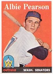
What prompted this e-mail was something from the 1958 Topps set. No, it’s not the tasty stirups sported by some of the Reds (or Braves, or Red Sox, or White Sox, or Orioles, or KC A’s, for that matter). Nor is it Topps’ misguided guess as to what the Giants’ new “SF” insigna would look like, or the fact that the Cubs’ road unis sported the full team name. It’s the uniform number on card No. 317 — it appears to be a solid navy “7” with a red outline of a boxy “3-D” drop shadow. I’ve never seen anything like it, particularly not from the 1950s. Did the Senators really have uni numbers like that?
Corcoran’s question, which I’ll get to in a second, raises a larger issue: We often think we know what an old uniform looked like, because of templates like this or this. These resources don’t often show us the back of the uniform, however. There are some exceptions — NHLUniforms.com features full front and back coverage, and the Dressed to the Nines” database occasionally shows notable posterior views — but for the most part our rear-view uni knowledge is woefully inadequate.
Which brings us to Corcoran’s question regarding the Senators’ uni numbers. I’d never seen anything like them either, and my initial gut reaction was that this had to be a Topps blunder. But then I noticed that the Sens’ front-jersey “W” logo from this period featured that same kind of boxy red outlining. Hmmmmm. So then I queried a few people, including longtime Uni Watch comrade-in-arms Todd Radom, who quickly provided this shot of a game-worn 1958 Senators jersey — as he put it, ” 3-D all the way!” Mystery solved.
Incidentally, that Vintage Card Traders site is a major find. I wasted the better part of an hour just looking at the 1958 Topps set, thanks in part to the following:
†¢ This was the time period when the Pirates wore flocked helmets — not just while batting, but in the field. Even the pitchers!
†¢ Remember our recent discussions of pointed collars and windbreakers worn underneath jerseys? Look at this.
†¢ Does this dude look scary or what?
Big thanks to Cliff for bringing this great site to our attention (and my apologies to everyone who wastes the entire day clicking through it — it’s pretty addictive).
Uni Watch News Ticker: Is Tracy McGrady “cheating” by continuing to wear the now-banned tights? This page thinks so. (Thanks to Justin Kadis for the tip.) … Dominic J. Litten reports that the University of North Carolina at Pembroke will have a football team next season — their first gridiron presence in over 50 years. Info and uniform pics here. … In case you missed it from yesterday’s Comments section: Seattle Matt did a great job providing a better view of the U. of Memphis logo on DeAngelo Williams’s mouthguard. … And do these uni numbers (a throwback rugby design being worn by the South Africa Springboks) look completely amazing or what? … Uni Watch is rather amusingly referenced in this eBay listing. … Cinematic commentary from Jake Keys: “Here’s a screen capture from the new movie We Are Marshall. You’ll notice Nike shoes on the fella on the left — looks like they tried to black out the logo. Other than that, the uniforms are very accurate for the ’71 team. The helmet looks great, too — this is the exact logo the team used that year.” … Admirably minutiae-obsessive observation by Chaz Noerenberg, who writes: “For a while now I’ve noticed that the Pittsburgh Penguins have two different styles of lettering for the the alternate captain’s ‘A’ — one worn by Sergei Gonchar, and one worn by Crosby, Recchi, and everyone else. Gonchar’s ‘A’ is thicker with a smaller opening; the other style, which is thinner with thicker trim and a bigger opening, better matches the sleeve numbers. I’m also pretty sure Gonchar has a slightly different nameplate font, so I’m thinking he gets his jerseys lettered at a different place than the rest of the team. I’m looking for more pics to back this up.” … Astute analysis from Bryan Redemske: “Nice use of authentic lettering here, but doesn’t it look a little 5th grade arts-and-crafts? ‘Hey, you’re the MVP! Here’s a … ummm … this base that we had custom-made for you.’ That’s like rummaging through your own closet in search of something cool to give someone.” … Another collared ballplayer, courtesy of Scott M.X. Turner: “This is German Barranca (who played a few years in the U.S. major leagues), during his stint with the Hermillos Naranjeros. Plus side: it’s completely wacky, and Northwestern-striped stirrups. Downside: vinyl iron-on numbers.” … Back when we were discussing poppies for Remembrance Day, several readers mentioned that lots of Canadian minor league hockey teams were wearing poppy patches, but we didn’t have any photos. Now, thanks to Chris Creamer, we do: Check out his shot of the Toronto Marlies (and try to ignore that other jersey patch). … Any style points for this are more than canceled out by this. … Anyone else think Ernest Wilford’s white gloves and white socks made him look like a mime? … Did anyone get a clear look at Del Rio’s lapel pin? I couldn’t figure out what it was.
Paul Great page. I will have to look at the new website this evening. the Coaches in Suits look great.
Looks like Del Rio’s pin is of the link.
Brian from Short Island:
Barça has white in its crest.
Right. The cross of St. George is part of the crest, but it’s non-negotiable because St. Jordi is the patron saint of Catalunya.
Jason:
Given that Barca had the Unicef logo, I’m assuming this was a Champions League game and not a regular league fixture.
It’s already been pointed out that this was in fact a Liga game. But as I recall, the UNICEF branding was originally supposed to be used in Champs League plus other special games. It seems the logo has crept, so to speak, into regular Liga matches.
All the talk about Williams’ mouthpiece, I tried to find a pic of Jevon Kearse, early in his career (atleast) with the Titans he wore an half orange half blue mouthpiece for his gators, maybe he felt bad he left early. Great links to the old trading cards in the post.
the suits were great. Jack looked very sharp last night — and suits went 2-0 this week! a new trend?
what college team will be the first to gain a win by stripping off the swoosh? now THAT would be a trend to see!
Man, esoteric today or what?
Del Rio’s lapel pin is obviously the Jags’ logo. Just the shape gives it away.
QUESTION: What is the Spingbok rugby player pictured on the left wearing just above his knees?
I love the Jags in black, definitely better than the Ravens or Bengals in black. And at least they have some Uni consistency, unlike the Giants and their shoulder stripes.
I dunno if anyone posted actual photos of the new Ohio State bball unis, or just the template images from a few weeks ago. They’ve worn them their past two games, and they look pretty sharp to me! I hated them at first, and I’d certainly prefer more traditional striping on the back of the jersey and on the shorts, but they’re way better than the pewter ones the Bucks wore in 92 or 93.
Heres a gallery link:
[quote comment=”24020″]Looks like Del Rio’s pin is of the link.[/quote]
that’s what I thought too
Maybe I missed out on this long ago, but it’s the first I’ve ever seen this. In the links to Brooks Robinson (and the other Orioles), and the game worn Senators’ jersey. I noticed that the jerseys were a full zipper from top to bottom. I’ve never seen a baseball jersey with a zipper. How long did that last? I couldn’t imagine sliding head-first and having that zipper rammed into my chest.
Oops
link
[quote comment=”24020″]Looks like Del Rio’s pin is of the link.[/quote]
Definitely a Jaguars’ logo pin.
That suit was fantastic!
I never get tired of looking at NHLuniforms.com. That has to be one of the best sites out there. So comprehensive.
Uh-oh, UNC Penbroke better watch out. The NCAA PC police will make them take down their feathers…
You’ll notice Nike shoes on the fella on the left — looks like they tried to black out the logo.
But it looks like the other two guys are just wearing regular Puma soccer cleats.
This site ROCKS like Motley Crue on the ‘Dr. Feelgood’ tour in 89!!!!! I have a question for all of you out there…. YOU READY TO ROCK????? Kidding….. I have noticed that there are two sections of seats in the upper level of Alltel stadium that they cover with a tarp, similar to what they do to the whole upper level where the Oakland A’s play. Are they having problems selling those seats??? Can you say “Iowa Jaquars”????? They’ll be out of Jacksonville in the next five years……
UNC-P was originally founded as a training school for Lumbee Indians and its student population is about a quarter Indian.
[quote comment=”24028″]QUESTION: What is the Spingbok rugby player pictured on the left wearing just above his knees?[/quote]
In rugby, when the ball goes into touch (out of bounds), the non-offending team throws the ball back into play in what is called link. In international play, players are allowed to lift a player at the thighs to receive the ball being thrown back into play. To aid the lift, players wear what’s called link or lifting aids.
This is banned at the high school level, however, players just lift linkinstead.
[quote comment=”24042″]
UNC-P was originally founded as a training school for Lumbee Indians and its student population is about a quarter Indian.[/quote]
The article deals with the issue – this is one school that the NCAA gave its blessing to and the school made a special effort to highlight their nickname and logo.
This is the first I’ve seen of Del Rio’s sideline suit, and I’ll have to say I’m disappointed. It doesn’t look like a football coach’s suit; he looks like he’s headed for a sales pitch or maybe an announcing gig alongside the WWF’s Vince McMahon. I’ll have to look up shots of Mike Nolan’s suit and see if he did any better. I also need to look back at the suits and sports coats I remember from my youth to see if my disappointment over Del Rio’s suit is justified.
[quote comment=”24028″]QUESTION: What is the Spingbok rugby player pictured on the left wearing just above his knees?[/quote]
It’s just some tape and pre-wrap, sometimes referred to as a “sausage,” that the player wears to allow his teammates to get a better grip when lifting him in a link.
[quote comment=”24030″]I love the Jags in black, definitely better than the Ravens or Bengals in black. And at least they have some Uni consistency, unlike the Giants and their shoulder stripes.[/quote]
Right on, peteagus. I think the Jags look sharp in all-black, but I also like the Ravens as well. Don’t remember the Bengals in all-black, so I reserve judgment. In general, I am more for all-black than against it.
As for Del Rio, he looks great in his suit, but he looked great in his other gear as well. I noticed him waaaay back in his Vikings’ days because he was damn good-looking. If you can promise me that all the other coaches will look that fine in their suits, then have at it.
[quote comment=”24041″]This site ROCKS like Motley Crue on the ‘Dr. Feelgood’ tour in 89!!!!! I have a question for all of you out there…. YOU READY TO ROCK????? Kidding….. I have noticed that there are two sections of seats in the upper level of Alltel stadium that they cover with a tarp, similar to what they do to the whole upper level where the Oakland A’s play. Are they having problems selling those seats??? Can you say “Iowa Jaquars”????? They’ll be out of Jacksonville in the next five years……[/quote]
Jags’ owner Wayne Weaver covered those seats b/c the stadium is too big when compared to the size of the Jacksonville market. Alltel (i.e., the Gator Bowl) seats over 80,000. That’s because it hosts the Florida/Georgia game and the Toyota Gator Bowl. The Jags are probably the smallest market in the NFL not named Green Bay, yet play in one of the NFL’s biggest stadiums. Jax could never sell out the games, and this lead to near constant local TV blackouts. Weaver covered those seats to drop the offical size of the stadium to allow for “sell-outs” and to lift the TV blackouts. Call it stadium “right-sizing.” For the record, Jax sold out all season tickets for 2006, so I don’t think they’ll be moving any time soon.
I give up on commenting on other people’s post as I’ve had trouble with it lately. All I wanted to say was that both the Jags and their head coach looked sharp last night.
Paul, since you almost always have the new entry posted by nine EST or EDT, I have to post my ‘I want new material’ post when I can.
Scary dude from the ’58 Topps set is definitely scary for a uni-related reason. It’s just that his scary uni is not his uniform, but his unibrow.
The ‘numbers in a box’ on the Springbocks jersey is not uncommon at all in rugby.
While I love the suits, its funny to me that Del Rio buttoned the bottom button- a major suit jacket no-no.
While I do think black is way over done in sports, the Jags looked sharp last night. Much better than teal.
France also wore 1906 replica jersey for their match against New Zealand this past saturday. Please check out this link that also includes the vintage warm-up tops, red, white and blue stripes around the waist and the All-Blacks sporting poppies on their right sleeve.
Suits by Nolan and Del Rio = TWO THUMBS UP!
I agree that I thought while watching it appeared the lapel pin was a Jags logo, but cant find a close up of it.
I liked Del Rio’s suit, hated the Jags uniforms.
Frank Zupo is pretty scary looking, but he still pales in comparison to link…
[quote comment=”24054″]While I love the suits, its funny to me that Del Rio buttoned the bottom button- a major suit jacket no-no.[/quote]
Damn, I totally meant to mention that, and then I forgot. Thanks for having my back!
Suit-buttoning rules can be found link and link, among many other places.
[quote comment=”24036″][quote comment=”24020″]Looks like Del Rio’s pin is of the link.[/quote]
Definitely a Jaguars’ logo pin.
That suit was fantastic![/quote]
Yeah, it did look pretty sharp. But didn’t his headset look a little out of place? He could of worn a Tom Landry-style hat to balance that out.
Watched the Grey Cup last night and noticed the following Uni related tidbit:
British Colombia has the link on the neck that stands for, obviously, Canadian Football League.
However, Montreal has a link on the neck that stands for Ligue Canadienne de Football.
I thought this was an interesting bit of language related Uni Watching.
Del Rio’s suit was not buttoned it was held together with snaps. Did Reebok also make a clip on tie?
[quote comment=”24046″][quote comment=”24042″]
UNC-P was originally founded as a training school for Lumbee Indians and its student population is about a quarter Indian.[/quote]
The article deals with the issue – this is one school that the NCAA gave its blessing to and the school made a special effort to highlight their nickname and logo.[/quote]
ah! good to know, that’ll teach me to actually READ instead of lookin’ at the pictures :)
I think the cleats from that Marshall screen grab are the infamous Nike Air Zoom Boss Shark 3/4 (nice name!). A bunch of guys that I played with used them on the O-Line cause they are the molded soles instead of the screw-ins. Supposedly gave better traction…
Nike Air Zoom Boss Shark 3/4
Del Rio looked pretty good in the suit. not as good as Nolan, who looked really sharp in the suit, but still, he was wearing a suit.
his team, however… everytime I think I’ve seen the worst possible uniform combination, some team comes along and makes it even worse. the Jags’ all-black atrocity has marked a new uni low for professional sports.
why can’t they just wear their teal jerseys? I used to bash on teal, but now I’m starting to realize that the Jags’ official home teals look really good. all it takes is a horribly one black uni to make that obvious.
Check that….
It’s the Nike Men’s Open Field 3/4 Black/White. You can see in the screen grab an in the linked photo the the fabric-type insert that looks like a fat backwards “L”.
Nike Men’s Open Field 3/4 Black/White
I believe that Sergei Gonchar is using the old font for his “A”. The equipment manager may have been trying to use up his old stock of lettering before using the new ones. That “A” was used when the Penguins first switched back to the “skating penguin” jersey.
As for the CFL/LCF thing, it is the same with hockey. If you punch in LNH, or “Ligue Nationelle de Hockey”, in Google, the first hit returned is the NHL.com website. Since Canada’s official languages are english and french, the team from Quebec uses the french neck logo to pay respect to their french heritage.
[quote comment=”24061″]Watched the Grey Cup last night and noticed the following Uni related tidbit:
British Colombia has the link on the neck that stands for, obviously, Canadian Football League.
However, Montreal has a link on the neck that stands for Ligue Canadienne de Football.
I thought this was an interesting bit of language related Uni Watching.[/quote]
A couple of years back the CFL made a big deal about having French content in the league. Montreal home games also have the french CFL logo (LCF) on the football as well.
Going back to the rugby talk, you can also check out a nice slideshow of old France national rugby pics on this link.
a huge pet peeve of mine in football period films are the use of facemasks. in this screen grab the players are using a facemask which didnt appear until the mid to late 80’s. you can tell by the way it fastens to the side of the helmet by the earpiece. that facemask formation was not available then. in “invincable” there were minimal facemask errors, same as in “remember the titans”.
Of course Nolan and Del Rio are going to look different in suits – they have different body types. Nolan has the typical young coach style, all fit and trim. Del Rio has former player body, where his body was so built following his playing days that his frame is larger.
No, these are not scientific terms, but they allow for better clarification on why the suits look different on the two coaches.
I think Reebok deserves some credit too–it was thier strangle-hold on sideline attire that wouldn’t allow Nolan to wear a suit in the first place. Kudos for being flexible and providing a sharp-looking alternative to usuall NFL licensed merch we see the coaches wearing (with, I might add, no logo creep…at least as far as I could see from my TV).
As far as the all black, I’m not sure where I stand; it looks a little “high school”. Being a Ravens fan, I don’t mind when they bust it out from time to time, but I prefer their standard unis. I have always wanted to see what the Ravens would look like with the Black Jersey and white pants though, eliminating the unitard look–may look even better than the purple, but I’m sure Paul would disagree!
[quote comment=”24044″][quote comment=”24028″]QUESTION: What is the Spingbok rugby player pictured on the left wearing just above his knees?[/quote]
In rugby, when the ball goes into touch (out of bounds), the non-offending team throws the ball back into play in what is called link. In international play, players are allowed to lift a player at the thighs to receive the ball being thrown back into play. To aid the lift, players wear what’s called link or lifting aids.
This is banned at the high school level, however, players just lift linkinstead.[/quote]
So in High school they can’t lift by the thighs? So they lift by the crotch?? Glad I never played rugby…
[quote comment=”24073″][quote comment=”24044″][quote comment=”24028″]QUESTION: What is the Spingbok rugby player pictured on the left wearing just above his knees?[/quote]
In rugby, when the ball goes into touch (out of bounds), the non-offending team throws the ball back into play in what is called link. In international play, players are allowed to lift a player at the thighs to receive the ball being thrown back into play. To aid the lift, players wear what’s called link or lifting aids.
This is banned at the high school level, however, players just lift linkinstead.[/quote]
So in High school they can’t lift by the thighs? So they lift by the crotch?? Glad I never played rugby…[/quote]
Uh, no. They lift by the outside of the shorts, near the hips.
Today will be only the second time in UEFA Champion’s League history that a team has to have changed their kit sponsor logo. When Hamburg visit London to face Arsenal in this CL Fixture, they will be wearing a kit sponsor logo other than the traditional “Fly Emirates†since UEFA calls that both teams can’t have the same kit sponsor. When Arsenal went to Hamburg earlier in the year (the first instance of the sponsor logo change), they sported Dubai in the “Fly Emirates†font on their yellow/anthracite kits. The game is 7:45 GMT/2:45 EST, and can be seen on Setanta Sports in the US. I’m thinking that Hamburg will sport the “Dubai†as well, since the city is home to Emirates, but I’m also thinking Arsenal will win the game!
Any word yet on whether the REFS would go old-school with their uniforms for any of the NFL games on Thursday?
so i was reading my copy of GQ yesterday when i stumbled upon an article: abhoring purple, pointing out the Celtics new rear shamrock, the red Net’s unis and Washington’s new color theme (which i think would be more appropriate for a Vegas franchise btw), as well as celebrating the return of Golden States “The City” design.
needless to say i didnt even need to look for the name of the
author. a nice surprise, well done Paul.
i do have a uni question however, well, equipment/uni. nevertheless, this little detail has always vexed me, since
i watched games as a young child…. ok enough buildup
why in the world do kickers wear mismatched cleats?
i mean i understand they wear the special cleat on their kicking foot, whichever cleat is most comfortable to that particular kicker, and on the other foot, the ‘off’ foot, is usually some generic black Nike cleat.
WHY OH WHY do they not just wear a full pair of their special “kicking cleat” or even lace up with a pair of soccer (futbol) boots.
i cannnnnot stand the mismatched cleat thing with kickers.
please does any have a theory or THE explanation for this.
please.
also i figure every decent post has a link to some picture, so
in an attempt to certify the decency of my post i will say there is
one uniform done in black that i have found
link
RE: Arsenal/Hamburg changing sponsors
Last year, Real Madrid was in the same group as Greek side Olympiakos. Both clubs were sponsored by Siemens mobile, so the away team in each fixture was forced to change for the reasons you mentioned. Each away team opted instead to play with logo-less shirts instead of getting altogether different logos.
[quote comment=”24077″]
why in the world do kickers wear mismatched cleats?
i mean i understand they wear the special cleat on their kicking foot, whichever cleat is most comfortable to that particular kicker, and on the other foot, the ‘off’ foot, is usually some generic black Nike cleat.
WHY OH WHY do they not just wear a full pair of their special “kicking cleat” or even lace up with a pair of soccer (futbol) boots.
i cannnnnot stand the mismatched cleat thing with kickers.
please does any have a theory or THE explanation for this.
please.
also i figure every decent post has a link to some picture, so
in an attempt to certify the decency of my post i will say there is
one uniform done in black that i have found
link[/quote]
I should let the footballers answer this but i’m pretty sure the kicking boot is quite a bit smaller and thus very uncomfortable. But that raises a question of why not just two sizes of the same shoe? ALso, what happened to barefoot kickers a la Tony Franklin from Texas A&M and Philadlelphia Eagles? Even in nasty weather at the Vet.
[quote comment=”24077″]
i do have a uni question however, well, equipment/uni. nevertheless, this little detail has always vexed me, since
i watched games as a young child…. ok enough buildup
why in the world do kickers wear mismatched cleats?
i mean i understand they wear the special cleat on their kicking foot, whichever cleat is most comfortable to that particular kicker, and on the other foot, the ‘off’ foot, is usually some generic black Nike cleat.
WHY OH WHY do they not just wear a full pair of their special “kicking cleat” or even lace up with a pair of soccer (futbol) boots.
i cannnnnot stand the mismatched cleat thing with kickers.
please does any have a theory or THE explanation for this.
please.
[/quote]
Being a former placekicker, I HATE the use of two different cleats. The reason that it is done is usually because the teams’ shoe color is a certain color (i.e. black) and the kicker is comfortable in his other color “kicking” link or vice-versa. Also, many kickers want their plant foot cleats long and newer while having a little wear on their kicking shoe for less turf resistance.
link link link get the job done in two of the same cleats.
[quote comment=”24077″]
why in the world do kickers wear mismatched cleats?
i mean i understand they wear the special cleat on their kicking foot, whichever cleat is most comfortable to that particular kicker, and on the other foot, the ‘off’ foot, is usually some generic black Nike cleat.
WHY OH WHY do they not just wear a full pair of their special “kicking cleat” or even lace up with a pair of soccer (futbol) boots.
i cannnnnot stand the mismatched cleat thing with kickers.
please does any have a theory or THE explanation for this.
please.
also i figure every decent post has a link to some picture, so
in an attempt to certify the decency of my post i will say there is
one uniform done in black that i have found
link[/quote]
The mismatched cleat/boot thing always got me, too. I thought some of it may come from colleges having shoe contracts and the kicker was obligated to wear at least one. Maybe that habit carries over to the pro career?
I always thought of the black Kings jersey as what ruined black. It was a direct ripoff of the Raiders, and I always hated the Chevrolet like symbol. That jersey took off in sales, prompting every owner to realize that there’s money to be made in jersey sales, and you can get more sales by changing the design.
Mis-matched kicking shoes may be obnoxious, but they are nothing compared to the asinine trend in the 90’s of barefooted kickers.
[quote comment=”24080″]…Also, many kickers want their plant foot cleats long and newer while having a little wear on their kicking shoe for less turf resistance…
[/quote]
This was always my take on it. Each foot has a unique and totally unrelated role, so it makes sense the cleats would be totally different (even though it looks ridiculous).
[quote comment=”24080″][quote comment=”24077″]
get the job done in two of the same cleats.[/quote]
[quote comment=”24080″][quote comment=”24077″]
Can we really refer to “VanderJerk” as a good kicker anymore?
MLB.com is auctioning link from Carlos Beltran. Since it’s the blue helmet, we’re talking about Games Six and/or Seven. Could it be that Beltran is trying to unload some bad karma?
[quote comment=”24082″]Mis-matched kicking shoes may be obnoxious, but they are nothing compared to the asinine trend in the 90’s of barefooted kickers.[/quote]
A classic link. Two different color shoes (not to mention different brands) and a wispy thin face
maskbar.Regarding posts 46 and 49, what is UEFA’s reason(s) for not permitting both sides to wear the same kit sponsor?
Yes, it is the “link” set, but I still think it’s funny that each player has a floating pack of hot dogs next to his head.
[quote comment=”24082″]Mis-matched kicking shoes may be obnoxious, but they are nothing compared to the asinine trend in the 90’s of barefooted kickers.[/quote]
I’ve never noticed barefoot kickers, but when I was at TCU, we had a barefoot punter. That seems more comfortable when you think about it.
Regarding Vanderjagt, you guys should listen to 1310 The Ticket out of Dallas, who often has the “fake Mike Vanderjagt” call in, who is all about “chicks and kicks” and marvels at the awesomeness of his extra points. “And if I get cut I’ll just go back to the CFL and be the greatest kicker in the history of the world.”
[quote comment=”24087″]Regarding posts 46 and 49, what is UEFA’s reason(s) for not permitting both sides to wear the same kit sponsor?[/quote]
Dude, come on,
$$$$$$$$$$$$$
[quote comment=”24085″]MLB.com is auctioning link from Carlos Beltran. Since it’s the blue helmet, we’re talking about Games Six and/or Seven. Could it be that Beltran is trying to unload some bad karma?[/quote]
If he wants to unload some bad karma he should leave the joke of an organization that is the Mets
[quote comment=”24080″][quote comment=”24077″]
i do have a uni question however, well, equipment/uni. nevertheless, this little detail has always vexed me, since
i watched games as a young child…. ok enough buildup
why in the world do kickers wear mismatched cleats?
i mean i understand they wear the special cleat on their kicking foot, whichever cleat is most comfortable to that particular kicker, and on the other foot, the ‘off’ foot, is usually some generic black Nike cleat.
WHY OH WHY do they not just wear a full pair of their special “kicking cleat” or even lace up with a pair of soccer (futbol) boots.
i cannnnnot stand the mismatched cleat thing with kickers.
please does any have a theory or THE explanation for this.
please.
[/quote]
Being a former placekicker, I HATE the use of two different cleats. The reason that it is done is usually because the teams’ shoe color is a certain color (i.e. black) and the kicker is comfortable in his other color “kicking” link or vice-versa. Also, many kickers want their plant foot cleats long and newer while having a little wear on their kicking shoe for less turf resistance.
link link link get the job done in two of the same cleats.[/quote]
Those kicking shoes have to be some of the ugliest I have ever seen. That square-toed horror especially. Where are those shoes legal?
I agree on the matching shoes. There is no reason why they shouldn’t match. At least get the colors coordinated.
[quote comment=”24093″][quote comment=”24085″]MLB.com is auctioning link from Carlos Beltran. Since it’s the blue helmet, we’re talking about Games Six and/or Seven. Could it be that Beltran is trying to unload some bad karma?[/quote]
If he wants to unload some bad karma he should leave the joke of an organization that is the Mets[/quote]
you know, as someone who hates the mets (i’m from boston), even i think that’s just wrong. especially knowing paul loves ’em
[quote comment=”24086″][quote comment=”24082″]Mis-matched kicking shoes may be obnoxious, but they are nothing compared to the asinine trend in the 90’s of barefooted kickers.[/quote]
A classic link. Two different color shoes (not to mention different brands) and a wispy thin face
maskbar.[/quote]Even the holder, I would assume the punter, has the single bar.
[quote comment=”24093″][quote comment=”24085″]MLB.com is auctioning link from Carlos Beltran. Since it’s the blue helmet, we’re talking about Games Six and/or Seven. Could it be that Beltran is trying to unload some bad karma?[/quote]
If he wants to unload some bad karma he should leave the joke of an organization that is the Mets[/quote]
Must be a Cardinals or Tigers fan since there are 27 other teams that would like to be as pathetic as the Mets were this year.
Ref Post #59-
In several cards- Enos Slaughter, Stan Hack and Paul Richards especailly, the players appear to be interacting with the dogs…
[quote comment=”24091″][quote comment=”24087″]Regarding posts 46 and 49, what is UEFA’s reason(s) for not permitting both sides to wear the same kit sponsor?[/quote]
Dude, come on,
$$$$$$$$$$$$$[/quote]
I’m not doubting that UEFA is trying to make more money, but can you explain how having one team wear blank shirts and the other team wearing their regular sponsors makes anyone more money? I’m not trying to be a jerk or anything, but if you know how this makes someone more money, can you elaborate?
Regarding posts 46 and 49, what is UEFA’s reason(s) for not permitting both sides to wear the same kit sponsor?
I would speculate that it’s not money. For one thing I can’t see how this would actually increase the amount of sponsorship dough. Presumably, a team that has to drop a sponsor for a game would have to refund some share of the money, so at best it would be a wash. I would guess that the value of being associated with a major club brand is greater than the sum of advertising during however many individual games. Consequently the club would have to charge discounted rates for one-off sponsorship deals. I hope that made sense.
I would venture that the reason for prohibiting shared sponsorship is to avoid the appearance of match-fixing. If teams A and B both play for Brand X, the viewer might worry that Brand X will be able to pick the winner.
[quote comment=”24088″]Yes, it is the “link” set, but I still think it’s funny that each player has a floating pack of hot dogs next to his head.[/quote]
Some of the guys look like they’re dreaming of hot dogs and some look like they are getting ready to bat them away.
Whenever I think of Roy Campanella, I’m going to think of Wilson Franks.
[quote comment=”24086″][quote comment=”24082″]Mis-matched kicking shoes may be obnoxious, but they are nothing compared to the asinine trend in the 90’s of barefooted kickers.[/quote]
A classic link. Two different color shoes (not to mention different brands) and a wispy thin face
maskbar.[/quote]I think the Nike plant foot is due to color matching and in the left hand picture astroturf.
And his kicking boot is just a standard adidas soccer cleat (likely a Beckenbauer)
My favorite thing about the whole suit phenomenon: you can link
I think the fact that they sell the jackets online (and they are officially lisenced products) means that every coach should play dress up at least once. Maybe have a dress up/throwback weekend for the NFL or something. Not only will everyone look amazing, but we’ll get a few cheap laughs from seeing Andy Reid and Denny Green in suits.
[quote comment=”24094″]Those kicking shoes have to be some of the ugliest I have ever seen. That square-toed horror especially. Where are those shoes legal?[/quote]I’m sure they’re legal everywhere, but no one wears them because no one kicks straight-on any more (at least in NCAA and NFL). And sponsorship deals mean you don’t see anything other than Nike or adidas/Reebok in televised games.
As for why no one kicks barefoot, it’s probably because there’s very little advantage. Today’s soccer shoes have a larger kicking surface (laces are often off-center) and fit better, so you don’t gain that much by going barefoot while putting yourself at risk of injury.
Let’s go Giants! Horrible loss :( What’s worse? How “our” link looks out of whack.
Nothing wrong with what link Coach Coughlin was wearing. That’s just as respectable as Nolan, or Del Rio (although, Del Rio looked link in a suit)
Damn Giants, grr
linklooking feisty and good.
I’m too lazy to look for it, but didn’t Gregg Easterbrook do a Tuesday Morning QB (also on ESPN.com’ Page 2)article about the now extinct barefoot kicker a few weeks back?
[quote comment=”24100″][quote comment=”24091″][quote comment=”24087″]Regarding posts 46 and 49, what is UEFA’s reason(s) for not permitting both sides to wear the same kit sponsor?[/quote]
Dude, come on,
$$$$$$$$$$$$$[/quote]
I’m not doubting that UEFA is trying to make more money, but can you explain how having one team wear blank shirts and the other team wearing their regular sponsors makes anyone more money? I’m not trying to be a jerk or anything, but if you know how this makes someone more money, can you elaborate?[/quote]
My take; UEFA mandates this so that any company that wants to increase its exposure in the Champions League has to become a “Official Partner”, thus paying UEFA directly. It’s a way for UEFA to make more money, not the clubs. I agree no club wins with this decision. It used to be no kit sponsors for the clubs playing the Champions League. It’s the old centralist approach for making money. UEFA controlled most of the income from the Champions League, clubs have made their points heard and have increased their revenue share. UEFA still has some of the old tactics.
Cheers enjoy the match!
[quote comment=”24112″]I’m too lazy to look for it, but didn’t Gregg Easterbrook do a Tuesday Morning QB (also on ESPN.com’ Page 2)article about the now extinct barefoot kicker a few weeks back?[/quote]
It was Klosterman, not Easterbook — look link.
[quote comment=”24115″][quote comment=”24112″]I’m too lazy to look for it, but didn’t Gregg Easterbrook do a Tuesday Morning QB (also on ESPN.com’ Page 2)article about the now extinct barefoot kicker a few weeks back?[/quote]
It was Klosterman, not Easterbook — look link.[/quote]
Thanks. At least I knew it was one of your Page 2 brethren…..
Has anyone noticed these little bootie things link? The black thing from the ankle and covering the top part of the shoe. The Giants player in the background is merely wearing socks (no black bootie things).
I was watching the Broncos DVD set that came out a few weeks back, and they showed Rich Karlis and the barefoot kicking game in the ’87 Drive game. I really liked the way they have the socks, with the stripes on them, but then cut and nothing below them. I could get screengrabs if people would like.
[quote comment=”24101″]Regarding posts 46 and 49, what is UEFA’s reason(s) for not permitting both sides to wear the same kit sponsor?
I would speculate that it’s not money. For one thing I can’t see how this would actually increase the amount of sponsorship dough. Presumably, a team that has to drop a sponsor for a game would have to refund some share of the money, so at best it would be a wash. I would guess that the value of being associated with a major club brand is greater than the sum of advertising during however many individual games. Consequently the club would have to charge discounted rates for one-off sponsorship deals. I hope that made sense.
I would venture that the reason for prohibiting shared sponsorship is to avoid the appearance of match-fixing. If teams A and B both play for Brand X, the viewer might worry that Brand X will be able to pick the winner.[/quote]
If that’s so, then English Premier LEague fans must be very worried, now that its referees have Fly Emirates on shoulder patches on their kit.
If that’s so, then English Premier League fans must be very worried, now that its referees have Fly Emirates on shoulder patches on their kit.
No doubt. Refs should appear as clean as Caesar’s wife.
[quote comment=”24119″][quote comment=”24101″]Regarding posts 46 and 49, what is UEFA’s reason(s) for not permitting both sides to wear the same kit sponsor?
I would speculate that it’s not money. For one thing I can’t see how this would actually increase the amount of sponsorship dough. Presumably, a team that has to drop a sponsor for a game would have to refund some share of the money, so at best it would be a wash. I would guess that the value of being associated with a major club brand is greater than the sum of advertising during however many individual games. Consequently the club would have to charge discounted rates for one-off sponsorship deals. I hope that made sense.
I would venture that the reason for prohibiting shared sponsorship is to avoid the appearance of match-fixing. If teams A and B both play for Brand X, the viewer might worry that Brand X will be able to pick the winner.[/quote]
If that’s so, then English Premier LEague fans must be very worried, now that its referees have Fly Emirates on shoulder patches on their kit.[/quote]
EPL Refs have had Fly Emirates badges for several seasons now, even when Chelsea had them as the kit sponsor.
As for the reasoning of UEFA: on Page 25 of the Champions League Regulations, Item 16.08, has the definition. Section IX, article 16 is all the Kit related items. link
Those booties you are talking about are Spats… Paul has mentioned them numerous times. They are normally white but obviously are also black
[quote comment=”24117″][quote comment=”24115″][quote comment=”24112″]I’m too lazy to look for it, but didn’t Gregg Easterbrook do a Tuesday Morning QB (also on ESPN.com’ Page 2)article about the now extinct barefoot kicker a few weeks back?[/quote]
It was Klosterman, not Easterbook — look link.[/quote]
Thanks. At least I knew it was one of your Page 2 brethren…..
Has anyone noticed these little bootie things link? The black thing from the ankle and covering the top part of the shoe. The Giants player in the background is merely wearing socks (no black bootie things).[/quote]
I’m pretty sure that is black athletic tape. Lots of players do it. Paul actually ran a post about it a while back. You’re probably more familiar with the same thing with white tape. They’re known as “spats”. Shoe companies have even come up with sleeves to go over the tape so their logo is still seen.
[quote comment=”24054″]The ‘numbers in a box’ on the Springbocks jersey is not uncommon at all in rugby.[/quote]
Japanese high school baseball link — the jerseys don’t actually have numbers, just pieces of velcro to which the numbers for that day’s game are stuck on in an ad-hoc kind of way. Usually they assign the numbers based on the player’s starting position, so having experiences wearing a single digit in one’s high school career is seen as an honor (which in turn surpasses the honor of having worn a number at all, which non-regulars might never get to do).
Can’t say I’m in favor, but it looks kind of spiffy on the link. On the link, not so much.
link you can almost see the pinned-on number 1 on Daisuke Matsuzaka’s back in the famous 17-inning game he pitched in the high school tournament back in 1998. Every school wears the same thing; black numbers on a white background. Same font, too.
Suit Ettiquette – Sometimes (top button), Always (middle button), Never (bottom button) for a three button
always never for a two button
[quote comment=”24130″]Suit Ettiquette – Sometimes (top button), Always (middle button), Never (bottom button) for a three button
always never for a two button[/quote]
Is it the same rules for a tuxedo jacket?
It seems I’m in a lot of weddings these days, and I’m the jackass who calls out my friends for their fashion faux pas of buttoning the bottom button on a tux jacket. But am I right?
[quote comment=”24076″]Any word yet on whether the REFS would go old-school with their uniforms for any of the NFL games on Thursday?[/quote]
…and speaking of REFS, we’ve already seen some cold weather, but I have yet to notice any officiating crews in the black pants that were supposed be part of the new official ref uni this year. Did they scrap it, or is it just not cold enough yet? (I hope the former).
I’ll be honest though, I haven’t seen EVERY game this season either, I may have missed them.
CNN/SI has given their $0.02 on worst uniforms:
link
[quote comment=”24032″]Maybe I missed out on this long ago, but it’s the first I’ve ever seen this. In the links to Brooks Robinson (and the other Orioles), and the game worn Senators’ jersey. I noticed that the jerseys were a full zipper from top to bottom. I’ve never seen a baseball jersey with a zipper. How long did that last? I couldn’t imagine sliding head-first and having that zipper rammed into my chest.[/quote]
Leigh, you need to get acquainted with the Baseball Hall of Fame’s ‘Dressed to the Nines’ uniform database. You can access it through Paul’s links on the right hand side of the page.
Zipper front jerseys were fairly common from the late 1930s to the 1950s or 60s.
Examples:
1939 White Sox: link
1939 Browns: link
1939 Senators: link
1939 Cubs: link
1940 Giants: link
And these are just a few early examples.
This whole suit thing is fascinating to me. Why is there a button just for decoration? Seems kind of…odd. So this ban is on all suitcoats? Weird.
[quote comment=”24133″]CNN/SI has given their $0.02 on worst uniforms:
link
They really seem to dislike the color red….the problem is that I’m sure some of their choices will be agreeable to uni watch readers, but for different reasons. For example, they seem to be saying that the Mets jerseys are plain, but it ignores the fact that the reason their black jerseys suck is because, well, they’re black (and for those of you new to the show, black is not a Mets color and therefore has no business making up one of the Mets jerseys).
Speaking of black, I liked the black jerseys the Jags were wearing last night, but if they had just worn white pants with them and provided a small amount of teal trim on the jerseys, I think they would have looked much better.
[quote comment=”24133″]CNN/SI has given their $0.02 on worst uniforms:
link
Wow. They put both the Timberwolves and the Wild! on their list. That ain’t right….Plus, no Buffaslug? Now, that’s really messed up! I don’t think their list is very good.
Paul, did you notice they put the black Mets’ jersey on their list? That should make you happy.
Like the Jags uniforms, and LOVE the new Ohio State basketball uniforms!! All 3 versions are sweet, and those silver ones are the best. Reminds me of the ones the Buckeyes wore in the NCAAs when Jimmy Jackson was there.
well, as far as those suit jackets go. the one for sale in the redskins shop is not the same sport coat worn by nolan and del rio.
remember, reebok was behind the formal wear.
plus the suit coats were outfitted with snaps and not buttons. so an entire new genre of suit etiquette may have been hatched this past football weekend…
i think they just grabbed an arbitrary number of teams and said have fun. many of those selections i whole heartedly disagreed with.
but at least they didnt use the words “monstrosity” or “abomination”. usage of those words has turned into one of my biggest pet peeves…
[quote comment=”24133″]CNN/SI has given their $0.02 on worst uniforms:
link
Have to disagree with the inclusion of Jacksonville (and possibly a few others), unless they were refering to the all black “unitard” they wore last night.
While they may not have been specifically protesting the black color of the Mets’ jersey in question, at least they recognized that there is just something not right about it for whatever reason!
Baltimore Colts running back Lenny Moore taped his ankles outside
Baltimore Colts running back Lenny Moore taped his ankles OUTSIDE his socks and shoes, thus earning the nickname of “Spats.” (Please forgive my screw-up above.)
[quote comment=”24030″]I love the Jags in black, definitely better than the Ravens or Bengals in black. And at least they have some Uni consistency, unlike the Giants and their shoulder stripes.
I dunno if anyone posted actual photos of the new Ohio State bball unis, or just the template images from a few weeks ago. They’ve worn them their past two games, and they look pretty sharp to me! I hated them at first, and I’d certainly prefer more traditional striping on the back of the jersey and on the shorts, but they’re way better than the pewter ones the Bucks wore in 92 or 93.
Heres a gallery link:
[/quote]
I much prefer Ravens all-blacks.
I suggest Jags go with gold pants to match the Jaguar on the sleeve.
[quote comment=”24144″]Baltimore Colts running back Lenny Moore taped his ankles OUTSIDE his socks and shoes, thus earning the nickname of “Spats.” (Please forgive my screw-up above.)[/quote]
I think that is the preferred way of doing it now, even that picture that brought this up. Was L. Moore the first to do it?
[quote comment=”24133″]CNN/SI has given their $0.02 on worst uniforms:
link
Three things about this whole article bothered me.
1. The Columbus Blue Jackets jerseys aren’t that bad, and the Wild certainly shouldn’t be on there. I can name a dozen other teams from the NBA that should be in there over Columbus and Minnesota.
2. The comments on the upper right were more ridiculous than the jerseys themselves. How many bad rhymes can we pack into an article?
3. Mr. Blackwell made his name by making comments about celebrities on the red carpet. Mr. Blackwell is not an authority on sports uniforms. Sports Illustrated should be embarrassed about this article. Personally, I’d like to see what Mr. Blackwell wears while walking the dog or vacuuming the house. I’m sure I could make a few comments on that attire.
[quote comment=”24142″][quote comment=”24133″]CNN/SI has given their $0.02 on worst uniforms:
link
Have to disagree with the inclusion of Jacksonville (and possibly a few others), unless they were refering to the all black “unitard” they wore last night.
While they may not have been specifically protesting the black color of the Mets’ jersey in question, at least they recognized that there is just something not right about it for whatever reason![/quote]
CNN is lame, lame, lame. All the uniforms are relatively new and thus somewhat easier targets.
They’re 0 for 16. I mean what’s the problem with the Titans unis? Hurricanes unis? Devil Rays unis?
What a joke.
I couldn’t disagree more with most of the SI List on worst dressed teams. Of that list, The Isles orange, the Bengals, and Fla Panthers are by far the worst (along, of course, with the Mets Black). But some of those uniforms are a few of my favorites, including the Wild jerseys, which are my favorite in the NHL.
[quote comment=”24149″][quote comment=”24133″]CNN/SI has given their $0.02 on worst uniforms:
link
Three things about this whole article bothered me.
1. The Columbus Blue Jackets jerseys aren’t that bad, and the Wild certainly shouldn’t be on there. I can name a dozen other teams from the NBA that should be in there over Columbus and Minnesota.
2. The comments on the upper right were more ridiculous than the jerseys themselves. How many bad rhymes can we pack into an article?
3. Mr. Blackwell made his name by making comments about celebrities on the red carpet. Mr. Blackwell is not an authority on sports uniforms. Sports Illustrated should be embarrassed about this article. Personally, I’d like to see what Mr. Blackwell wears while walking the dog or vacuuming the house. I’m sure I could make a few comments on that attire.[/quote]
To add my two cents to this critique…
For someone involved in the fashion industry which routinely celebrates some of the most outrageous things to ever be worn by human beings, I doubt he is qualified to judge fashion in pro sports. “A diabolical miscue by a fashion ‘know-it-all”.
A few of the teams, Columbus, Phoenix, Carolina and Minnesota are more victims of bad logos than anything else. Their color schemes work well but that doesn’t matter all that much when the logo adds an insurmountable ridiculous effect to the uniform. Especially when your team is named for a concept or state of being, Minnesota, just stick with a name.
Also, Mr. Blackwell doesn’t seem to offer any real critique on the uniforms, one line “zingers” do not qualify as expert opinion. If SI really wants to have a commentary about uniforms talk to someone with a little bit of experience dealing with the subject or have Mr. Cowell, sorry, meant Blackwell, put more thought into his opinions than finding a word that rhymes with folly.
[quote comment=”24149″][quote comment=”24133″]CNN/SI has given their $0.02 on worst uniforms:
link
Three things about this whole article bothered me.
1. The Columbus Blue Jackets jerseys aren’t that bad, and the Wild certainly shouldn’t be on there. I can name a dozen other teams from the NBA that should be in there over Columbus and Minnesota.
2. The comments on the upper right were more ridiculous than the jerseys themselves. How many bad rhymes can we pack into an article?
3. Mr. Blackwell made his name by making comments about celebrities on the red carpet. Mr. Blackwell is not an authority on sports uniforms. Sports Illustrated should be embarrassed about this article. Personally, I’d like to see what Mr. Blackwell wears while walking the dog or vacuuming the house. I’m sure I could make a few comments on that attire.[/quote]
mr blackwell had nothing to do with this piece. whatever writer was in charge of this just used his name. SI took his remarks about celebrities and just used them as captions… im sure he hasnt seen the article or even knows its been published. no one should be embarrased about their opinion though…
[quote comment=”24058″]Frank Zupo is pretty scary looking, but he still pales in comparison to link…[/quote]
No! Not Don Mossi! AAAAAHH!!!
[quote comment=”24147″][quote comment=”24144″]Baltimore Colts running back Lenny Moore taped his ankles OUTSIDE his socks and shoes, thus earning the nickname of “Spats.” (Please forgive my screw-up above.)[/quote]
I think that is the preferred way of doing it now, even that picture that brought this up. Was L. Moore the first to do it?[/quote]
I don’t know if Moore was the “first” to do this, but back when the Colts lived in Bal’mer (and the word “Irsay” looked like a typographical error), when NFL games were worth watching, I don’t remember any other player doing what Moore did.
[CAVEAT: I’m old enough to be seen as a geezer or an old fart … thus my memory may not be up to speed.]
[quote comment=”24154″]
mr blackwell had nothing to do with this piece. whatever writer was in charge of this just used his name. SI took his remarks about celebrities and just used them as captions… im sure he hasnt seen the article or even knows its been published. no one should be embarrased about their opinion though…[/quote]
Todd, by all means, you’re right. If that is Sports Illustrated’s opinion on uniforms, they are entitled to it. However, Sports Illustrated has long been the pinnacle of sporting news magazines in North America. This article, loaded with innaccurate comments and very-obvious blatent disrespect towards the teams and what they represent, misrepresents all that is/was Sports Illustrated.
This should be an editorial piece open to comments, not a photo gallery with the title “Worst-Dressed Teams in Sports”. The writer of this piece, who doesn’t even include his/her name on the article, includes 7 NHL teams, of which 6 are expansion teams or teams that have moved markets. There isn’t much in the way of a traditional colour scheme for these markets given that they’re new. In fact, 9 of the 16 teams (s)he has commented on are new to their respective leagues in the last 10 or so years if you include the Devil Rays and Jaguars.
I am still thoroughly disgusted with this highly subjective piece when there are far better things that the SI photo gallery can focus on.
[quote comment=”24158″]
I am still thoroughly disgusted with this highly subjective piece when there are far better things that the SI photo gallery can focus on.[/quote]
Teebz, most of their galleries are op-ed pieces. Greatest defensivemen of all time, biggest turkeys, cheerleaders, cheerleaders, cheerleaders. I agree that this particular gallery was useless, but it’s pretty much standard for SI galleries.
Still, the Wild! and the ‘Wolves? That is just plain wrong.
[quote comment=”24159″]
Teebz, most of their galleries are op-ed pieces. Greatest defensivemen of all time, biggest turkeys, cheerleaders, cheerleaders, cheerleaders. I agree that this particular gallery was useless, but it’s pretty much standard for SI galleries.
[/quote]
As true as that may be, Minna, most of them have some merit, and open the door for some debate. “Revolutionary Defensive Players”, “Gretzky Moments”, and “NBA’s Top Stoppers” are good examples. Others are there just as photo galleries… like the cheerleader galleries, for example.
This piece reminds me of the kid who throws together a class project in 20 minutes just to get it done. No thought, no consideration, no effort. All three of those things are what Sport Illustrated is known for.
[quote comment=”24160″]
As true as that may be, Minna, most of them have some merit, and open the door for some debate. “Revolutionary Defensive Players”, “Gretzky Moments”, and “NBA’s Top Stoppers” are good examples. Others are there just as photo galleries… like the cheerleader galleries, for example.
This piece reminds me of the kid who throws together a class project in 20 minutes just to get it done. No thought, no consideration, no effort. All three of those things are what Sport Illustrated is known for.[/quote]
Really, Teebz? Huh. Maybe up in the Great White North, SI is so revered. Not sure it’s true down here. I will concur that this is probably the worst SI gallery I’ve seen in quite some time.
[quote comment=”24085″]MLB.com is auctioning link from Carlos Beltran. Since it’s the blue helmet, we’re talking about Games Six and/or Seven. Could it be that Beltran is trying to unload some bad karma?[/quote]
I assume you are referring to his game ending strikeout. Beltran was batting lefty when he stood like a statue and watched the ball go by. This is a righty helmet, as it has the ear protection on the left side.
[quote comment=”24161″]
Really, Teebz? Huh. Maybe up in the Great White North, SI is so revered. Not sure it’s true down here. I will concur that this is probably the worst SI gallery I’ve seen in quite some time.[/quote]
I wouldn’t say “revered”, but when people talk about sports magazines, SI is a common mention. And athletes are always “honoured” to appear on the cover of SI, or so they say.
Are they lying? Maybe so. All I know is that I have less respect for the anonymous writer of this piece and for SI as an organization due to their decision to run this piece when it is the most half-assed crock of poop to ever have the SI logo slapped on it.
By the way, I feel quite strongly about this. :o)
[quote comment=”24163″]
I wouldn’t say “revered”, but when people talk about sports magazines, SI is a common mention. And athletes are always “honoured” to appear on the cover of SI, or so they say.
Are they lying? Maybe so. All I know is that I have less respect for the anonymous writer of this piece and for SI as an organization due to their decision to run this piece when it is the most half-assed crock of poop to ever have the SI logo slapped on it.
By the way, I feel quite strongly about this. :o)[/quote]
Really? Couldn’t tell. I guess since I don’t read the magazine and only access the free section of the on-line site, I can’t really comment on the overall quality of the mag. However, I think the site takes second place to ESPN these days.
With this specific piece, I don’t understand why so many hockey unis, so few baseball and basketball, and how both the Timberwolves and the Wild! made the list. I’m with todd k. I think it’s totally random. That makes more sense than thinking someone actually put thought into the list.
At any rate, they should leave the uni-critiquing to the pros like Paul.
Gonchar is the Penguins longest tenured alternate captain (which, at just over a year, is pretty pathetic), since he was signed at the beginning of last season. It is simply possible that he has an older version of the A.
what bothers me most about the suits worn by del rio and nolan are not the amount of effort they had to put into getting to wear them, but the fact that they put all that effort into it, and they look like they were bought off the rack at a department store. del rio’s jacket looks about a size to big, the shoulders are too big, the sleeves are too long, and, as already mentioned, the bottom button is buttoned. i think it was the nfl plan to say, yeah you can wear a suit, but you have to look like you have no idea how to wear one. reebok, which is now owned by adidas who has shoe lines by fashion designers, should be able to put out a decent looking suit. im not going to talk about the tie choice for del rio but come on, for a teal and black team, why wear a light blue tie?
end rant.
KU has busted out their link against Tennessee State tonight. I don’t know … I guess I don’t hate them, but I sure don’t love them. I just don’t think red looks any better (as a primary color) on their basketball team than it does on their link team. I’m not really complaining, though, because it can always be link …
Not sports related, and this might be old news (I’m fairly new to this place), but Under Armour has gone to link.
I don’t know what’s worse, that UA makes the sweater vest or that the Superintendent wears a UA sweater vest.
Please excuse me while I attempt to find my sanity.
Oh, and 2 thumbs up for the suits.
I’m sure I speak for most of the Uni Watch readership when I say I NEVER want to see the words “Antonio Bryant” mentioned in this space again, but I just stumbled upon link item on ESPN.com. Seems Antonio was pulled over for drunk driving. (No word on whether his ass was hanging out of his pants — thankfully, no photos accompanied the article.)
[quote comment=”24055″]France also wore 1906 replica jersey for their match against New Zealand this past saturday. Please check out this link that also includes the vintage warm-up tops, red, white and blue stripes around the waist and the All-Blacks sporting poppies on their right sleeve.[/quote]
The Frogs look so odd in all white, they look as if they should be playing cricket, not rugby. :)
[quote comment=”24105″][quote comment=”24086″][quote comment=”24082″]Mis-matched kicking shoes may be obnoxious, but they are nothing compared to the asinine trend in the 90’s of barefooted kickers.[/quote]
A classic link. Two different color shoes (not to mention different brands) and a wispy thin face
maskbar.[/quote]I think the Nike plant foot is due to color matching and in the left hand picture astroturf.
And his kicking boot is just a standard adidas soccer cleat (likely a Beckenbauer)[/quote]
Not a Beckenbauer as those are for astroturf and featured the black rubber souls w/ nubs, I think you are thinking of the Copa Mundiales.
[quote comment=”24157″][quote comment=”24147″][quote comment=”24144″]Baltimore Colts running back Lenny Moore taped his ankles OUTSIDE his socks and shoes, thus earning the nickname of “Spats.” (Please forgive my screw-up above.)[/quote]
I think that is the preferred way of doing it now, even that picture that brought this up. Was L. Moore the first to do it?[/quote]
I don’t know if Moore was the “first” to do this, but back when the Colts lived in Bal’mer (and the word “Irsay” looked like a typographical error), when NFL games were worth watching, I don’t remember any other player doing what Moore did.
[CAVEAT: I’m old enough to be seen as a geezer or an old fart … thus my memory may not be up to speed.][/quote]
Hey WT, I’m not calling you an ol’ fart… I ‘m 40 and I agree with you that the NFL is no longer watchable to me. I’d watch old ‘This week in the NFL’ shows w/ Brookshiser and Summerall instead. The NFL i grew up with was played by men, not preening/prancing peacocks.
link from today’s Arsenal/Hamburg game. It was the Dubai in the Fly Emirates font like Arsenal wore in their first fixture of the CL.
[quote comment=”24162″][quote comment=”24085″]MLB.com is auctioning link from Carlos Beltran. Since it’s the blue helmet, we’re talking about Games Six and/or Seven. Could it be that Beltran is trying to unload some bad karma?[/quote]
I assume you are referring to his game ending strikeout. Beltran was batting lefty when he stood like a statue and watched the ball go by. This is a righty helmet, as it has the ear protection on the left side.[/quote]
Good point. Honestly, I think I blocked the image that I saw from my seat in the left-field bleachers from my mind.
[quote comment=”24164″]
I don’t understand why so many hockey unis, so few baseball and basketball, and how both the Timberwolves and the Wild! made the list.[/quote]
Minna, at least you guys picked up the MVP today! That makes a good day. I always love when a smaller market sticks it to a big one.
[quote comment=”24182″][quote comment=”24164″]
I don’t understand why so many hockey unis, so few baseball and basketball, and how both the Timberwolves and the Wild! made the list.[/quote]
Minna, at least you guys picked up the MVP today! That makes a good day. I always love when a smaller market sticks it to a big one.[/quote]
Jon from SLC, this is true and much more important. Cy Young, MVP and batting champ. Now, if we could just win the WS—but we’d have to clone Santana four times first.
[quote comment=”24170″]KU has busted out their link against Tennessee State tonight. I don’t know … I guess I don’t hate them, but I sure don’t love them. I just don’t think red looks any better (as a primary color) on their basketball team than it does on their link team. I’m not really complaining, though, because it can always be link …[/quote]
Those were there old Nike red alt. uni’s you posted, here are the new adidas red ones
Speaking of teams changing jersey sponsors in soccer. Remembered during the Man U/Celtic game yesterday that during their US tour last summer Celtic wore link on their shirts instead of link because Carling isn’t sold in the US
Oh no! Just checked metafilter and saw you got a link. Fellow stripey-socks enthusiasts, prepare for a not-so-hostile, well-meaning and generally polite invasion. Kudos, Paul.
[quote comment=”24178″][quote comment=”24157″][quote comment=”24147″][quote comment=”24144″]Baltimore Colts running back Lenny Moore taped his ankles OUTSIDE his socks and shoes, thus earning the nickname of “Spats.” (Please forgive my screw-up above.)[/quote]
I think that is the preferred way of doing it now, even that picture that brought this up. Was L. Moore the first to do it?[/quote]
I don’t know if Moore was the “first” to do this, but back when the Colts lived in Bal’mer (and the word “Irsay” looked like a typographical error), when NFL games were worth watching, I don’t remember any other player doing what Moore did.
[CAVEAT: I’m old enough to be seen as a geezer or an old fart … thus my memory may not be up to speed.][/quote]
Hey WT, I’m not calling you an ol’ fart… I ‘m 40 and I agree with you that the NFL is no longer watchable to me. I’d watch old ‘This week in the NFL’ shows w/ Brookshiser and Summerall instead.
The NFL i grew up with was played by men, not preening/prancing peacocks.[/quote]
Unfortunately, I am an old fart … and a geezer, to boot>
[quote comment=”24193″]Speaking of teams changing jersey sponsors in soccer. Remembered during the Man U/Celtic game yesterday that during their US tour last summer Celtic wore link on their shirts instead of link because Carling isn’t sold in the US[/quote]
quitevery odd that the shorts aren’t numbered in that pic.Going back to the baseball cards, anyone catch that Card #52 is for Bob Clemente instead of Roberto?
Re: Tracy McGrady “cheating”
Oh please.
Precisely how is McGrady’s wearing shorts or pantyhose or whatever the frig it is under his uni shorts giving him or the Rockets an unfair advantage over their opponents. By keeping the surface temperature of his legs warmer?
Oooooh, that’s worth at least 15 extra points a game.
Cheating my ass.
The morons who have that blog need to get their ‘tard heads out of their asses and go to some remedial vocabulary courses.
Is McGrady breaking a league rule involving uniforms/dress?
Yes.
Does that mean that he is cheating?
Fuck no.
The aforementioned ‘tards who run that website never got the lesson that the rest of us learned back when we were in 2nd grade, which is that you can break athe rules and not cheat.
To call them morons is an insult to morons.