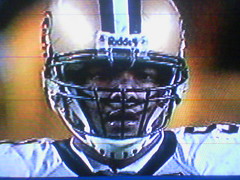
Uni Watch readers continue to impress, as Chad Morris has come through with screen shots of the collared undershirt worn last Sunday by Will Smith (not by Charles Grant, as I had originally been led to believe). Judging from the pics — additional views are here, here, here, here, and here — I’d say it looks like Smith was actually wearing a mock turtle collar with a slit cut down the center, not an actual dress shirt. But the effect is visually similar.
Rugby shirts traditionally have pointed collars, natch. Pointed collars are rarer in American sports, but they’re not unheard of. The World team wore a striped Johnny collar in the 2000 and 2001 NHL All-Star Games (additional views here, here, here, and here). And remember our recent discussion of MLB players wearing windbreakers under their jerseys? One hallmark of that look is that the windbreaker’s pointed collar usually peaks out above the jersey collar, as you can see here, here, here, here, here, and here.
Go back to baseball’s early days and you’ll see lots of pointed collars. Virtually every MLB team was wearing them in 1907, for example. The last team to have worn them on a regular basis appears to be the 1913 Tigers, although modern teams have occasionally gone the collared route for throwback games. (Update: As several readers immediately pointed out, my original text inexplicably neglected to mention the late-’70s White Sox, with their floppy poet collars.)
Got any additional collar examples? You know what to do.
(Doubleplusthanks to Chad Morris for coming up with the screen shots.)
Uni Watch News Ticker: “One of my coworkers is from Liverpool, and he was talking about how there’s a league in England that plays American-style football,” writes BJ Lanier. “Notice that the Kent Exiles and East Midlands Saxons wear their team names on their nameplates, and the Saxons appear to have a web URL listed underneath the numbers.” … Several readers have noted that the latest iteration of Col. Sanders, unveiled earlier this week, appears to be sponsored by Adidas. … Danny Fortson of the Sonics did some game-day sneaker shopping the other day. The amusing details are in the middle of this page (with thanks to Jason Cruz). … Bryan Redemske notes that Dan Werner — No. 21 in the background of this photo — appears to have been dancing the twist.
First,
Maybe I’ll try it, I just might be professional when I play for once.
link is ALL wrong. Stupid arm bands, belt undone, gloves undone. AND he’s a brown….
I didn’t realize Matsuzaka was one of the link.
The George Washington men’s and women’s teams are wearing link to commemmorate the life of alumnus Red Auerbach (BS ’40, MA ’41).
Northeastern State University (Division II athletics) link its mascot will change from link to link, ending an 80-year tradition.
speaking of the Colonel and logo creep. KFC made a 87,500 square feet picture of him in the middle of the Nevada Desert. Here is a link to a blog with some pics and the full story. It looks like their trying to expand to the extraterrestrial market.
Also, pics of Pitt’s new hoops gear, link, link, link, link, link (Paul, please make note that the face-wiping-on-the-shirt-technique has reached college basketball, link, and link where you can see the blue collar on the back.
I’m stunned that you bring up collars in baseball without noting the late link. The sported their lapeled shirts from 1976 to 1981. I do believe that was link first uniform in Chicago. Poor guy. I wouldn’t mind seeing collars make a comeback, but not like that.
what about the 1976-1981 White Sox?
link
[quote comment=”22907″]Northeastern State University (Division II athletics) link its mascot will change from link to link, ending an 80-year tradition.[/quote]
love how the ‘Redman’ is green….unless it’s a St Patty’s Day stunt
[quote comment=”22907″]Northeastern State University (Division II athletics) link its mascot will change from link to link, ending an 80-year tradition.[/quote]
With that ridiculous capital letter in the middle of the word, it looks like they’ve traded political incorrectness for orthographical incorrectness. Thumbs down!
Many soccer uniforms have had collars. In this linkjersey history (which is slightly inaccurate) you’ll see the white vertical stripe jersey (still likely the best MLS jersey to date).
And link one of the more notorious Manchester United players sporting his collar flipped up.
[quote comment=”22910″]I’m stunned that you bring up collars in baseball without noting the late link.[/quote]
So am I! Man, what a total brain-lock!! Gonna add that to the text right now.
Love the BAFL link, surfing through the teams, I decided to visit the website of the Ipswich Cardinals. I wanted to see if they butchered their unis in much the same way the Arizona Cardinals did. Much to my surprise, link is their team logo. Very cool in my opinion, kind of a shoutout to the Patriot’s old logo.
It may have been mentioned before, but I noticed at last night’s game that the Devils’ Jamie Langenbrunner’s 13 character name runs all the way from shoulder seam to shoulder seam. In fact, in this photo, which is not from last night’s game, his name has folded over his jersey and has started to swallow his number. link
Isn’t the photo (photos) pictured for “Charles Grant” actually Will Smith? Smith’s #91 and Grant’s #94.
[quote comment=”22910″]I’m stunned that you bring up collars in baseball without noting the late link. The sported their lapeled shirts from 1976 to 1981. I do believe that was link first uniform in Chicago. Poor guy. I wouldn’t mind seeing collars make a comeback, but not like that.[/quote]
Dang it, you beat me to it. I may be the only guy in the room with this opinion, but I loved those ChiSox uniforms, particularly the white jerseys with white pants and white jerseys with black pants.
Three thoughts on the BAFL teams:
1. Interesting names (the London Blitz? That seems a little touchy…)
2. Vast range of quality in logos (Bristol, however, took the easy route and lifted from San Diego State)
3. Corporate sponsorship? (The Personal Assurance Knights??)
[quote comment=”22905″]link is ALL wrong. Stupid arm bands, belt undone, gloves undone. AND he’s a brown….
[/quote]
I’ve often wondered why so many football players leave the velcro strap on their gloves undone. I thought maybe it would have been addressed here in the past, but I don’t see any “Gloves” category on the right. I think I remember Paul writing about batters who wear extra padding on their gloves after breaking a hand, but has there been anything about un-velcroed gloves in football? or maybe soccer goalie gloves?
[quote comment=”22918″]Isn’t the photo (photos) pictured for “Charles Grant” actually Will Smith? Smith’s #91 and Grant’s #94.[/quote]
Yes it is Will Smith. It’s hard to make out the number exactly and by looking at the spacing it is definately a “1” on that jersey and not a “4” but I will give more visual proof. The player in the screen shot is wearing a link. link uses the link, while link uses the 3-bar running back bull style.
you can see Smith’s jersey number pretty clearly in the last photo posted. also, Grant’s hair would be visible spilling out the back.
[quote comment=”22917″]It may have been mentioned before, but I noticed at last night’s game that the Devils’ Jamie Langenbrunner’s 13 character name runs all the way from shoulder seam to shoulder seam. In fact, in this photo, which is not from last night’s game, his name has folded over his jersey and has started to swallow his number. link
I love what I call “Elbow-to-Elbow” names in hockey. It’s likely why my Washington Capitals Steve Konowalchuk jersey is among my favorites in my collection.
One thing I noticed this summer was the Reds Todd Hollandsworth in the sleeveless. You can kind of see it link. I can’t find a live ‘full back’ shot. But it comes as close to full circle as I think I’ll see.
[quote comment=”22924″][quote comment=”22905″]link is ALL wrong. Stupid arm bands, belt undone, gloves undone. AND he’s a brown….
[/quote]
I’ve often wondered why so many football players leave the velcro strap on their gloves undone. I thought maybe it would have been addressed here in the past, but I don’t see any “Gloves” category on the right. I think I remember Paul writing about batters who wear extra padding on their gloves after breaking a hand, but has there been anything about un-velcroed gloves in football? or maybe soccer goalie gloves?[/quote]
I know I’ve seen it and it had to be here. If I remember the post right Deion Sanders was given credit for starting it and it eventually came to where they started making them without velcro at all.
The Personal Assurance Knights are now my favorite football team. What a name…
neat website with some throwback logos.
link
About the BAFL Teams, check out the Saxons’ number typology. Don’t know if I like it, but it’s definitely different.
sox wore those jerseys against the braves. atlanta wore throwback boston braves unis that had a high nehru-style collar. trying to find pics.
link
[quote comment=”22907″]Northeastern State University (Division II athletics) link its mascot will change from link to link, ending an 80-year tradition.[/quote]
Love the new link logo. Wow, some originality there in the font.
[quote comment=”22928″][quote comment=”22917″]It may have been mentioned before, but I noticed at last night’s game that the Devils’ Jamie Langenbrunner’s 13 character name runs all the way from shoulder seam to shoulder seam. In fact, in this photo, which is not from last night’s game, his name has folded over his jersey and has started to swallow his number. link
I love what I call “Elbow-to-Elbow” names in hockey. It’s likely why my Washington Capitals Steve Konowalchuk jersey is among my favorites in my collection.
One thing I noticed this summer was the Reds Todd Hollandsworth in the sleeveless. You can kind of see it link. I can’t find a live ‘full back’ shot. But it comes as close to full circle as I think I’ll see.[/quote]
link link but you can get the link. He will have the full arch thing with almost any team (exception with those with verticly arched lettering).
[quote comment=”22928″]
One thing I noticed this summer was the Reds Todd Hollandsworth in the sleeveless. You can kind of see it link. I can’t find a live ‘full back’ shot. But it comes as close to full circle as I think I’ll see.[/quote]
That ought to be Exhibit A in the case against names on jerseys! Here’s a photo I found of link.
Mike Lieberthal’s name has almost pushed his number link, and here is the link. This 14-letter name could have been squeezed across his shoulders if not for those.
Red Sox wore 1908 home unis, while Braves wore 1912 road unis. Nehru-style collar.
link
It’s rare to see teams go this far back for throwback unis. Most teams stick with the 60s, 70s and 80s these days. I love the really old stuff with 3/4 sleeves, crazy stirrups and old-style hats.
[quote comment=”22934″][quote comment=”22907″]Northeastern State University (Division II athletics) link its mascot will change from link to link, ending an 80-year tradition.[/quote]
Love the new link logo. Wow, some originality there in the font.[/quote]
careful your tongue doesn’t push right through your cheek
Okay, so I just really like the link or emblem or whatever it would be called (I can’t keep that straight). I don’t know why, but I like it a lot.
Jonathon, what kinds of numbers did they put on the backs of those? Plain block, or something more exotic?
Since Paul did the long name combos in baseball a while back (example: Grudzielanek-Hollandsworth) for players making outs, I thought I’d take it a step further to hockey.
Since there can be two people who assist on an NHL goal, the longest name combo I can find includes Jamie Langenbrunner. It would be:
Langenbrunner-Nieuwendyk-Niedermayer for a total of 34 letters in the scoring play.
Anyone know of a longer combo between NHL teammates? I can’t think of one. And yes, I’ve already looked at Konowalchuk. :o)
As I mentioned yesterday, the Boise Hawks are unveiling their new logo this afternoon, but you can already link, site unseen.
For ND fans, the Hawks were the minor league home of WR link.
Some baseball collars and then topic drift:
link on an early baseball team
Nap Lajoie wears the link, or Dracula collar
We shall refrain from mentions of link
Having nothing to do with collars, but in light of those recent D-Backs unis, on which the split letter in the team name doesn’t match up, I’m fascinated by the approach of these link
Like that split letter on the new D-Backs uniform, link
[quote comment=”22925″][quote comment=”22918″]Isn’t the photo (photos) pictured for “Charles Grant” actually Will Smith? Smith’s #91 and Grant’s #94.[/quote]
Yes it is Will Smith.[/quote]
Good catch, guys. I had been told that the player in question was Grant, and that’s why I put out the call for shots of Grant. When Chad Morris provided the jpgs, I assumed they were of Grant and didn’t notice the uni number discrepancy. I’ll update the text right now.
Robert,
The 76-81 Sox wore navy blue, not black.
[quote comment=”22941″]Jonathon, what kinds of numbers did they put on the backs of those? Plain block, or something more exotic?[/quote]
i’m pretty sure they wore plain block numbers, in red. i don’t think the red sox used their unique numbering style for those throwbacks.
this almost looks like a “popped” collar. a little tall to be a proto-nehru.
link
i guess if your name is “nap,” then you’re predisposed to popping. hope he didn’t have any pink or yellow polo shirts back in the day.
[quote comment=”22944″]Some baseball collars and then topic drift:
Having nothing to do with collars, but in light of those recent D-Backs unis, on which the split letter in the team name doesn’t match up, I’m fascinated by the approach of these link
[/quote]
I love the suits and the baseball sweater that Paul mentioned some time ago. Something a couple of coaches/managers in Boston should look into.
Ok.. I knew this would be the place to come with my issue. Hope all you other thread-heads can help me out especially with all the talk of tattoos the other day. As a memorial I’m getting a #11 tattoo.. but i was looking for input as to a nice sports team number typeface to use. Anyone have links or suggestions with pics?
i LOVE the old red sox throwbacks.
the tie up, the collars, the sock…really perfect.
i loved that the braves wore BOSTON jerseys, too.
there’s still a little bit of love up here for the Braves. Redskins, too.
weird that both teams are from boston and both are in fairly bad taste (DC much more than atlanta, but still…)
i think it’d be cool if all teams that moved had to wear their old uni’s from their last city once a year…
sweet, found some additional photos from that 1997 interleague series between the braves and red sox. the teams played a 3-game set, and wore the throwbacks for all of the games. i think it was the braves first trip to boston since the franchise left for milwaukee in the 50s. anyway, the photos show that boston wore plain block numbers. the photos also show the nehru collars on the braves unis, the white hats the red sox wore, and kenny lofton’s ruthless baggy pants. atlanta wore solid gray hats that matched their jersey. unfortunately, both teams wore their regular batting helmets, which mucked up the look a little bit.
link
[quote comment=”22946″]Robert,
The 76-81 Sox wore navy blue, not black.[/quote]
You are correct, of course, but the uniform and the pants in particular looked black in most photos.
On long scoring lines: Here’s one from baseball. Had Hollandsworth not been hurt in the second half of 2004, the Cubs could have had Ramirez at third, Garciaparra at short, Grudzielanek at second and Hollandsworth at first.
Ton of Logo Creep in link:
Reebok logo on pants.
Reebok and NFL Equipment logos on jersey.
Riddell logo on helmet.
NFL Equipment logo on wristband.
NFL Equipment and Wilson logos on towel.
Thats 7 logos on five pieces of the uniform.
Going along with the discussion of collars on uniforms:
You can see in link picture my buddy wearing an old Boston Beaneaters jersey that we wore for one of our vintage base ball games. Also check the official Essex Base Ball Club uniforms with the “E” shield.
Then in link picture you can see me wearing an old Baltimore Orioles jersey (unfortunate logo creep on the cleats though). I was supposed to be link, although unfortunately I couldn’t learn to bat and throw lefty in time for the game.
[quote comment=”22914″]Many soccer uniforms have had collars. In this linkjersey history (which is slightly inaccurate) you’ll see the white vertical stripe jersey (still likely the best MLS jersey to date).
And link one of the more notorious Manchester United players sporting his collar flipped up.[/quote]
ooh ahh! cantona!
[quote comment=”22931″]neat website with some throwback logos.
link
wow! that is a neat site… suprisingly they had a marshfield high school set. i thought nike had marshfield high school merch on lock down… nike’s most important athlete ever, steve prefontaine, was a marshfield alum. plus they started making some marshfield merch already… the higher end stuff under their white label brand. basically they are reproductions of his high school uniforms for track and cross country… really nice stuff…
[quote comment=”22953″]sweet, found some additional photos from that 1997 interleague series between the braves and red sox. the teams played a 3-game set, and wore the throwbacks for all of the games. i think it was the braves first trip to boston since the franchise left for milwaukee in the 50s. anyway, the photos show that boston wore plain block numbers. the photos also show the nehru collars on the braves unis, the white hats the red sox wore, and kenny lofton’s ruthless baggy pants. atlanta wore solid gray hats that matched their jersey. unfortunately, both teams wore their regular batting helmets, which mucked up the look a little bit.
link
You know, I was at the first game of that series and don’t remember, whatsoever, them wearing throwbacks. I know they did, I just don’t remember it. And those are my favorite Sox uniforms so it’s even more unfortunate for me.
[quote comment=”22942″]Since Paul did the long name combos in baseball a while back (example: Grudzielanek-Hollandsworth) for players making outs, I thought I’d take it a step further to hockey.
Since there can be two people who assist on an NHL goal, the longest name combo I can find includes Jamie Langenbrunner. It would be:
Langenbrunner-Nieuwendyk-Niedermayer for a total of 34 letters in the scoring play.
Anyone know of a longer combo between NHL teammates? I can’t think of one. And yes, I’ve already looked at Konowalchuk. :o)[/quote]
If we stay with players on the same team and having played at least one game this year, we get 33 letters with Langenbrunner, Clemmensen and Tallackson (New Jersey Devils) and if we go with a “fantasy roster” we have 36 with Langenbrunner (NJ), Ponikarovsky (Tor) and Niedermayer (Anh).
And since the two Niedermayer brothers are in Anaheim, we could see 36 characters in Anaheim if we add “S.” & “R.” but right now, Anaheim don’t use them. :D
[quote comment=”22950″]Ok.. I knew this would be the place to come with my issue. Hope all you other thread-heads can help me out especially with all the talk of tattoos the other day. As a memorial I’m getting a #11 tattoo.. but i was looking for input as to a nice sports team number typeface to use. Anyone have links or suggestions with pics?[/quote]
I’d recommend the Chicago Cubs’ 1 style for something beyond the ordinary. It’s by far the most distinctive 1 in the majors.
Guys and Girls, I am glad you found pics of the whole collar thing from Sunday. But I would just like to let everyone know that it must be a Saints thing. I promise you that if you keep watching that game there is a sideline exchange between #94 Charles Grant and Head Coach Sean Payton. Grant has his helmet off and Payton is hitting his shoulder pads, Grants dreads are in full affect. Thats the same exchage that Troy Aikmen and Buck talked about when Buck said he thought it was an Izod. It was much more apperant on Grant than it was on Smith. Just thought you would like to know Paul, it might be a new trend out of NOLA.
[quote comment=”22966″][quote comment=”22950″]Ok.. I knew this would be the place to come with my issue. Hope all you other thread-heads can help me out especially with all the talk of tattoos the other day. As a memorial I’m getting a #11 tattoo.. but i was looking for input as to a nice sports team number typeface to use. Anyone have links or suggestions with pics?[/quote]
I’d recommend the Chicago Cubs’ 1 style for something beyond the ordinary. It’s by far the most distinctive 1 in the majors.[/quote]
It’s unfortunate that your #11 contains only ones, because 1 typically doesn’t have much distinction. While the Cubs’ 1 looks nice with its horizontal hook on the top, I suggest avoiding the Bears’ 1 which is a plain vertical bar. (Trivia: the Cubs also had this “1” in the 1930s before they stuck the hook on top. Anybody know what year the change was made? Too bad ‘Dressed to the Nines’ and Marc Okkonen’s book don’t show the backs of uniforms.)
[quote comment=”22958″]Ton of Logo Creep in link:
Reebok logo on pants.
Reebok and NFL Equipment logos on jersey.
Riddell logo on helmet.
NFL Equipment logo on wristband.
NFL Equipment and Wilson logos on towel.
Thats 7 logos on five pieces of the uniform.[/quote]
Did you expect this to seem un-ordinary?
All NFL uniforms have that many NFL/Rebok logogs on them.
[quote comment=”22968″][quote comment=”22966″][quote comment=”22950″]Ok.. I knew this would be the place to come with my issue. Hope all you other thread-heads can help me out especially with all the talk of tattoos the other day. As a memorial I’m getting a #11 tattoo.. but i was looking for input as to a nice sports team number typeface to use. Anyone have links or suggestions with pics?[/quote]
I’d recommend the Chicago Cubs’ 1 style for something beyond the ordinary. It’s by far the most distinctive 1 in the majors.[/quote]
It’s unfortunate that your #11 contains only ones, because 1 typically doesn’t have much distinction. While the Cubs’ 1 looks nice with its horizontal hook on the top, I suggest avoiding the Bears’ 1 which is a plain vertical bar. (Trivia: the Cubs also had this “1” in the 1930s before they stuck the hook on top. Anybody know what year the change was made? Too bad ‘Dressed to the Nines’ and Marc Okkonen’s book don’t show the backs of uniforms.)[/quote]
Showing my bias here, but my Providence College Friars use a distinctive font for all their uniforms, which I happen to love
link
link
lacrosse
[quote comment=”22942″]Since Paul did the long name combos in baseball a while back (example: Grudzielanek-Hollandsworth) for players making outs, I thought I’d take it a step further to hockey.
Since there can be two people who assist on an NHL goal, the longest name combo I can find includes Jamie Langenbrunner. It would be:
Langenbrunner-Nieuwendyk-Niedermayer for a total of 34 letters in the scoring play.
Anyone know of a longer combo between NHL teammates? I can’t think of one. And yes, I’ve already looked at Konowalchuk. :o)[/quote]
Do you mean players on the same team? I assume not. But if Langenbrunner were to be traded to Anaheim you could get a Langenbrunner-Niedermayer-Niedermayer (Rob and Scott) for 35 letters in the scoring play. And I just see that Vincent has trumped me with 36 letters.
Also, in rugby news, most teams I find are moving away from the more blatant collars that Paul showed to a more link. Also, if you go back far enough, the old jerseys were link as well. This is probably because collar tackles were fairly common, and players were tucking their collars in anyway (sorry can’t find a picture of a pro player doing this.)
And finally, here’s the link jersey for Paris-Stade Francais. Interesting look for a rugby team.
[quote comment=”22965″]
If we stay with players on the same team and having played at least one game this year, we get 33 letters with Langenbrunner, Clemmensen and Tallackson (New Jersey Devils) and if we go with a “fantasy roster” we have 36 with Langenbrunner (NJ), Ponikarovsky (Tor) and Niedermayer (Anh).
And since the two Niedermayer brothers are in Anaheim, we could see 36 characters in Anaheim if we add “S.” & “R.” but right now, Anaheim don’t use them. :D[/quote]
Anaheim could combine for 32 letters, though.
Niedermayer-Niedermayer-Beauchemin = 32.
The Maple Leafs have a 33 letter combo.
Ponikarovsky-Colaiacovo-Wozniewski = 33.
Paul, the NFL channel is replaying the Steelers Saints game tonight at 10:30. I will DVR it and get you a pic of Charles Grant.
[quote comment=”22975″]The Maple Leafs have a 33 letter combo.
Ponikarovsky-Colaiacovo-Wozniewski = 33.[/quote]
Sorry but that’s 32 :D
I gonna put this up right now. Here’s each team with the bigger boxscore line they could have get as of now (at least 1 game played).
Anaheim Ducks (32)
Atlanta Thrashers (29)
Boston Bruins (25)
Buffalo Sabres (29)
Calgary Flames (25)
Carolina Hurricanes (30)
Chicago Blackhawks (31)
Colorado Avalanche (29)
Columbus Blue Jackets (24) *min*
Dallas Stars (25)
Detroit Red Wings (29)
Edmonton Oilers (27)
Florida Panthers (32)
Los Angeles Kings (31)
Minnesota Wild (29)
Montreal Canadiens (31)
Nashville Predators (25)
New Jersey Devils (33) *max*
New York Islanders (27)
New York Rangers (28)
Ottawa Senators (30)
Philadelphia Flyers (31)
Phoenix Coyotes (30)
Pittsburgh Penguins (25)
San Jose Sharks (26)
St. Louis Blues (26)
Tampa Bay Lightning (31)
Toronto Maple Leafs (32)
Vancouver Canucks (28)
Washington Capitals (29)
Sorry if I’m late to the party (and I’m a west coaster so I have a natural disadvantage in commenting in a timely fashion), but I just got a chance to get through Paul’s ESPN college article. The thing that stood out most to me and I haven’t seen commented on (correct me if I’m wrong), is the fact the the link feature the jumpman logo in place of the swoosh.
I get the tie-in, but is there more to the story. And Paul, how do you feel about this logo creep?
[quote comment=”22979″]Sorry if I’m late to the party (and I’m a west coaster so I have a natural disadvantage in commenting in a timely fashion), but I just got a chance to get through Paul’s ESPN college article. The thing that stood out most to me and I haven’t seen commented on (correct me if I’m wrong), is the fact the the link feature the jumpman logo in place of the swoosh.
I get the tie-in, but is there more to the story. And Paul, how do you feel about this logo creep?[/quote]
On the the actual game worn jerseys there is no jumpman, there is only one on the shorts. UNC has been wearing the jordan branded nike Unis for a few years now.
[quote comment=”22978″][quote comment=”22975″]The Maple Leafs have a 33 letter combo.
Ponikarovsky-Colaiacovo-Wozniewski = 33.[/quote]
Sorry but that’s 32 :D
I gonna put this up right now. Here’s each team with the bigger boxscore line they could have get as of now (at least 1 game played).
Anaheim Ducks (32)
Atlanta Thrashers (29)
Boston Bruins (25)
Buffalo Sabres (29)
Calgary Flames (25)
Carolina Hurricanes (30)
Chicago Blackhawks (31)
Colorado Avalanche (29)
Columbus Blue Jackets (24) *min*
Dallas Stars (25)
Detroit Red Wings (29)
Edmonton Oilers (27)
Florida Panthers (32)
Los Angeles Kings (31)
Minnesota Wild (29)
Montreal Canadiens (31)
Nashville Predators (25)
New Jersey Devils (33) *max*
New York Islanders (27)
New York Rangers (28)
Ottawa Senators (30)
Philadelphia Flyers (31)
Phoenix Coyotes (30)
Pittsburgh Penguins (25)
San Jose Sharks (26)
St. Louis Blues (26)
Tampa Bay Lightning (31)
Toronto Maple Leafs (32)
Vancouver Canucks (28)
Washington Capitals (29)[/quote]
someone has some free time?
[quote comment=”22981″][quote comment=”22979″]Sorry if I’m late to the party (and I’m a west coaster so I have a natural disadvantage in commenting in a timely fashion), but I just got a chance to get through Paul’s ESPN college article. The thing that stood out most to me and I haven’t seen commented on (correct me if I’m wrong), is the fact the the link feature the jumpman logo in place of the swoosh.
I get the tie-in, but is there more to the story. And Paul, how do you feel about this logo creep?[/quote]
On the the actual game worn jerseys there is no jumpman, there is only one on the shorts. UNC has been wearing the jordan branded nike Unis for a few years now.[/quote]
Cal and Georgetown have also been wearing the Jordan logo for several years, and Cincinnati did too but have now switched to adidas…
What’s up with link?
More pics link and link.
I found it weird that there isn’t a team name or an individual name anyway on the uni’s…and that the link is a straight rip of the link only in different colors and smaller.
Of course, the link team wasn’t looking link either.
Ahh…sorry bout those links. Guess you’ll have to go through the pics, didn’t realize it would do that. Sorry guys!
Oh and forgot to mention…the uni’s for Harding (in black) look to be part of the Nike trend of wearing the mismatched undershirt sleeves, but they just dont wear them.
[quote comment=”22958″]Ton of Logo Creep in link:
Reebok logo on pants.
Reebok and NFL Equipment logos on jersey.
Riddell logo on helmet.
NFL Equipment logo on wristband.
NFL Equipment and Wilson logos on towel.
Thats 7 logos on five pieces of the uniform.[/quote]
Yeah, but it’s still the best looking kit in the NFL!
[quote comment=”22923″]Three thoughts on the BAFL teams:
3. Corporate sponsorship? (The Personal Assurance Knights??)[/quote]
Well the corporate sponsorship thing is nothing new, as the Pertemps Bees (a temporary staff recruitment agency who sponsor a rugby) testifies. Also its sort of a nod to how most of soccer teams started. Arsenal were the works team of the Royal Arsenal in Woolwich, Manchester United started life as a team of railway workers. Even know we have Vauxhall Motors, Prescott Cables, Total Network Solutions (Welsh league), Airbus UK (Welsh League)
I can’t decide if I like these mismatched sleeves worn by Concord High School (Elkhart, Ind.). I do know that the team is 13-0 as of this writing.
[quote comment=”22982″][quote comment=”22978″][quote comment=”22975″]The Maple Leafs have a 33 letter combo.
Ponikarovsky-Colaiacovo-Wozniewski = 33.[/quote]
Sorry but that’s 32 :D
I gonna put this up right now. Here’s each team with the biggest boxscore line they could have get as of now (at least 1 game played).
…[/quote]
someone has some free time?[/quote]
héhéhéhé… i already had it done.
But during my lunch hour, i search out of a 2004 file i have and i found the longest surname in the NHL history has 14 letters (2 players).
So this play would be one of the longest combination possible (if they were teammates obviously) :)
John Vanbiesbrouck give the puck this his defenseman Phil Von Stefenelli who does a bomb pass to John Brackenborough who score.
That’s 41 letters :D
Interesting link in the Baltimore Sun about football uni numbers.
[quote comment=”22984″][quote comment=”22981″][quote comment=”22979″]Sorry if I’m late to the party (and I’m a west coaster so I have a natural disadvantage in commenting in a timely fashion), but I just got a chance to get through Paul’s ESPN college article. The thing that stood out most to me and I haven’t seen commented on (correct me if I’m wrong), is the fact the the link feature the jumpman logo in place of the swoosh.
I get the tie-in, but is there more to the story. And Paul, how do you feel about this logo creep?[/quote]
On the the actual game worn jerseys there is no jumpman, there is only one on the shorts. UNC has been wearing the jordan branded nike Unis for a few years now.[/quote]
Cal and Georgetown have also been wearing the Jordan logo for several years, and Cincinnati did too but have now switched to adidas…[/quote]
How long has Gtown been with Jordan? I always remembered them being Nike? I just thought UNC, NC A&T and Cinn. are/were Jordan teams.
Did any one see the warm up pants the Indiana wore last night at their game….They were red and white horizontal stripes…but not little stripes HUGE 3 to 4 inch stripes….crazy…sorry no picture
[quote comment=”22993″]Did any one see the warm up pants the Indiana wore last night at their game….They were red and white horizontal stripes…but not little stripes HUGE 3 to 4 inch stripes….crazy…sorry no picture[/quote]
They have worn those for years. I think they are great.
This is my first try at posting a link, hope it works.link
[quote comment=”22994″][quote comment=”22993″]Did any one see the warm up pants the Indiana wore last night at their game….They were red and white horizontal stripes…but not little stripes HUGE 3 to 4 inch stripes….crazy…sorry no picture[/quote]
They have worn those for years. I think they are great.[/quote]
Yea, I don’t ever remember seeing Indiana warm up without those.
[quote comment=”22997″][quote comment=”22994″][quote comment=”22993″]Did any one see the warm up pants the Indiana wore last night at their game….They were red and white horizontal stripes…but not little stripes HUGE 3 to 4 inch stripes….crazy…sorry no picture[/quote]
They have worn those for years. I think they are great.[/quote]
Yea, I don’t ever remember seeing Indiana warm up without those.[/quote]
Bobby Knight has them at Texas Tech too in Black and Red. Does anyone know if IU had them before Coach Knight got there? If not we can officially call it a Bobby Knight thing.
The NBA bores me, but link was a topic that seems to be a big deal in that ugh..league.
No offense NBA’ers.
[quote comment=”23000″]The NBA bores me, but link was a topic that seems to be a big deal in that ugh..league.
No offense NBA’ers.[/quote]
And it’s an Insider article, arrgh! But did you see the brick that fell in for V. Carter? I think they can dispense with the term “shooter’s roll”.
link we know and link???
[quote comment=”22997″][quote comment=”22994″][quote comment=”22993″]Did any one see the warm up pants the Indiana wore last night at their game….They were red and white horizontal stripes…but not little stripes HUGE 3 to 4 inch stripes….crazy…sorry no picture[/quote]
They have worn those for years. I think they are great.[/quote]
Yea, I don’t ever remember seeing Indiana warm up without those.[/quote]
Here are the link being talked about.
MetsFan:
you getting season’s tickets for the new stadium?
I know that it has been discussed before, but the entire line of ’92 Dream Team gear is out
link
[quote comment=”22958″]Ton of Logo Creep in link:
Reebok logo on pants.
Reebok and NFL Equipment logos on jersey.
Riddell logo on helmet.
NFL Equipment logo on wristband.
NFL Equipment and Wilson logos on towel.
Thats 7 logos on five pieces of the uniform.[/quote]
Why is it logo creep when companies put THEIR logo on THEIR product? Quit complaining about nothing!
PS – I love NIKE. They make the best uniforms and have the best quality. From shoes to shorts, and everything else, NIKE products are great, and the SWOOSH makes uniforms look better!!
[quote comment=”23005″]MetsFan:
you getting season’s tickets for the new stadium?[/quote]
Being that I live in Tucson, no. I make it to Phoenix to see them play the D-Backs and road trip to LA and SD. But i will make every effort to make it out for opening day ’09. How about you?
I found a few more pictures of the old Rutgers uniform. I like the uni’s but as a fan for all 20 years of my life, but I’ll take the 9-0 record
link
link
[quote comment=”22993″]Did any one see the warm up pants the Indiana wore last night at their game….They were red and white horizontal stripes…but not little stripes HUGE 3 to 4 inch stripes….crazy…sorry no picture[/quote]
I was gonna comment on this earlier and say that Indiana has worn these for decades too, but then I though maybe he just meant that Indiana was wearing stripes that were thicker than their usual ones…Ian, let us know.
PTI just announced that the NFL will allow Mike Nolan where a suit during the 49ers game.
[quote comment=”23007″][quote comment=”22958″]Ton of Logo Creep in link:
Reebok logo on pants.
Reebok and NFL Equipment logos on jersey.
Riddell logo on helmet.
NFL Equipment logo on wristband.
NFL Equipment and Wilson logos on towel.
Thats 7 logos on five pieces of the uniform.[/quote]
Why is it logo creep when companies put THEIR logo on THEIR product? Quit complaining about nothing!
PS – I love NIKE. They make the best uniforms and have the best quality. From shoes to shorts, and everything else, NIKE products are great, and the SWOOSH makes uniforms look better!![/quote]
Beaverton, Oregon making an appearance? I guess we can start that Nike counter again.
[quote comment=”22985″]What’s up with link?
More pics link and link.
I found it weird that there isn’t a team name or an individual name anyway on the uni’s…and that the link is a straight rip of the link only in different colors and smaller.
Of course, the link team wasn’t looking link either.[/quote]
Going name-less isn’t exactly odd. Notre Dame and Penn State have been doing it for a while.
Re #88-
Indiana typically wears VERTICALLY striped pants for warm ups.
The original post said they wore HORIZONTAL. Either someone wasn’t listening on geometry, or that’s a pretty significant change.
[quote comment=”23011″]PTI just announced that the NFL will allow Mike Nolan where a suit during the 49ers game.[/quote]
Finally, a good decision by the NoFunLeague. Many soccer managers in England wear suits and it’s a classy look.
Hopefully he’ll have a 49er patch on his jacket as well.
[quote comment=”23017″][quote comment=”23011″]PTI just announced that the NFL will allow Mike Nolan where a suit during the 49ers game.[/quote]
Finally, a good decision by the NoFunLeague. Many soccer managers in England wear suits and it’s a classy look.
Hopefully he’ll have a 49er patch on his jacket as well.[/quote]
I can see it now…Nike swoosh on the jacket pockets of Hugo Boss suits for Nike…Three strips on the Adidas line from Armani!…
[quote comment=”23009″]I found a few more pictures of the old Rutgers uniform. I like the uni’s but as a fan for all 20 years of my life, but I’ll take the 9-0 record
link
link[/quote]
Thanks; great find! Irishsports.com; I never would have found that.
Any luck on the curved numbers from the seasons before that? I’m telling you guys, those are the greatest uniforms in college football. And it’s like the whole world (or at least the leaving-photos-on-the-internet part of the world) wants to forget them. Forget the team that wore them, fine, but don’t forget the jerseys!
link Wonder where the logos are gonna be. Could it be reminiscent of Sylvia Hatchell’s Nike Lapel pin? That would be at least somewhat classy.
link
Was Jim Brown the only one to wear one?
Would like some help from one of you if you know anything about it. (chances are numerous people know)
I am at a college and am looking for a company that makes helmet decals and visors for batting helmets. Anyone with any ideas?
Thanks so much.
Why would you wear a colored shirt under your jersey? Did his wife need him to go to church after the game without changing? lol
One of the ads on this page was very interesting and cool about prep sports clothing. link They have all the sports shirts you would want for almost every high school in the U.S. They have all the regular sports and then they have lots of weird ones like link
I hope my links worked.
I love how the mud is eliminating the logo creepage in the Miami(OH)-BGSU game on ESPN2:-)
So now I assume that the powers that be at Bowling Green will cry foul over this “debacle” and switch to FieldTurf, ala the Patriots?;-)
[quote comment=”22969″][quote comment=”22958″]Ton of Logo Creep in link:
Reebok logo on pants.
Reebok and NFL Equipment logos on jersey.
Riddell logo on helmet.
NFL Equipment logo on wristband.
NFL Equipment and Wilson logos on towel.
Thats 7 logos on five pieces of the uniform.[/quote]
Did you expect this to seem un-ordinary?
All NFL uniforms have that many NFL/Rebok logogs on them.[/quote]
That may be…but that’s one great look.
[quote comment=”23023″]link
Was Jim Brown the only one to wear one?[/quote]
No, you see pics from time to time.
link
[quote comment=”23028″]I love how the mud is eliminating the logo creepage in the Miami(OH)-BGSU game on ESPN2:-)
So now I assume that the powers that be at Bowling Green will cry foul over this “debacle” and switch to FieldTurf, ala the Patriots?;-)[/quote]
I’m watching the game as I type this…my sympathies go out to the equipment managers, but no sympathy for the companies who have logos caked in mud. Hopefully someone will be able to find pictures of this mudbath. Even the punter is muddy.
better look link
What’s with the handle on the side of his helmet?
[quote comment=”23027″]Why would you wear a colored shirt under your jersey? Did his wife need him to go to church after the game without changing? lol
One of the ads on this page was very interesting and cool about prep sports clothing. link They have all the sports shirts you would want for almost every high school in the U.S. They have all the regular sports and then they have lots of weird ones like link
I hope my links worked.[/quote]
Hmmmm, it seems my HS changed its mascot from a jungle cat (Panthers) to a semi-radical civil-rights group (Black Panthers) when I wasn’t looking…
[quote comment=”23007″][quote comment=”22958″]Ton of Logo Creep in link:
Reebok logo on pants.
Reebok and NFL Equipment logos on jersey.
Riddell logo on helmet.
NFL Equipment logo on wristband.
NFL Equipment and Wilson logos on towel.
Thats 7 logos on five pieces of the uniform.[/quote]
Why is it logo creep when companies put THEIR logo on THEIR product? Quit complaining about nothing!
PS – I love NIKE. They make the best uniforms and have the best quality. From shoes to shorts, and everything else, NIKE products are great, and the SWOOSH makes uniforms look better!![/quote]
I’ve bitten my tongue so far, but I agree with you–I don’t understand the fuss about a company putting its logo on a product it makes. To me, a manufacturer’s logo on a piece of sporting equipment is NOT logo creep; it’s free enterprise. I also agree with your comments on Nike making quality products. Big companies are usually big for a reason.
I’m a Drexel student, and tonight at the basketball game I noticed that the refs had the American Flag patch at different hights on their sleeves. Sorry I dont have pics but i was wondering if this is a common occurance or just refs with bad taylors.
thanks – Kyle
[quote comment=”23033″]better look link
What’s with the handle on the side of his helmet?[/quote]
According to Helmet Hut: In 1954 the trainer for the Forty Niners was counted on to keep Y. A. Tittle in the lineup after the legendary quarterback suffered a severely broken jaw against the Pittsburg Steelers. The trainer modified Tittle’s standard Riddell “RK” helmet by adding interior padding, a custom fabricated handle type stabilizer bracket and the Riddell clear Lucite face mask.
[quote comment=”23023″]link
Was Jim Brown the only one to wear one?[/quote]
No way! Many players wore those, mostly circa 1957 I believe.. aside from Jim Brown, I remember seeing pictures of Bobby Lane and Otto Graham wearing the clear plastic facemask. check out Helmethut.com. They’re pretty comprehensive about the subject.
To go along with the purple tie discussion of last week, I would like to bring up a sports, but not uni-related phenomenon: Digger Phelps’ “tie-liter.” His tie always matches the color of the tie he is wearing. I’m working on pictures, but for a better explanation, google or wikipedia him.
Don’t know if this has ever been posted (i just stubmled on it!), but its a great website featuring patches that you can purchases. Check out the “defunct†teams link!
link
…and on a separate note, here is the funniest (and most painful) headline ever!
link
Paul,
I have read your articles for a while now so they all run together. I am pretty sure you have done a NBA update but I don’t remember reading about The Kings Uniforms that they wore tonight they were black. They had a crown on the back were the celtics have a shamrock. I know that you have mentioned the shamrock before but I don’t remember the link being mentioned.
[quote comment=”23047″]Paul,
I have read your articles for a while now so they all run together. I am pretty sure you have done a NBA update but I don’t remember reading about The Kings Uniforms that they wore tonight they were black. They had a crown on the back were the celtics have a shamrock. I know that you have mentioned the shamrock before but I don’t remember the link being mentioned.[/quote]yeah i think they added this last year, or at least made it crooked last year.
Nap Lajoie wears the link, or Dracula collar
—-
No – Lajoie’s collar is just a regular dead ball era collar turned up, a common practice on cold days.
On the subject of MLB jersey collars, note that the Cubs have never won a WS unless they were wearing collars.
[quote comment=”23035″][quote comment=”23007″][quote comment=”22958″]Ton of Logo Creep in link:
Reebok logo on pants.
Reebok and NFL Equipment logos on jersey.
Riddell logo on helmet.
NFL Equipment logo on wristband.
NFL Equipment and Wilson logos on towel.
Thats 7 logos on five pieces of the uniform.[/quote]
Why is it logo creep when companies put THEIR logo on THEIR product? Quit complaining about nothing!
PS – I love NIKE. They make the best uniforms and have the best quality. From shoes to shorts, and everything else, NIKE products are great, and the SWOOSH makes uniforms look better!![/quote]
I’ve bitten my tongue so far, but I agree with you–I don’t understand the fuss about a company putting its logo on a product it makes. To me, a manufacturer’s logo on a piece of sporting equipment is NOT logo creep; it’s free enterprise. I also agree with your comments on Nike making quality products. Big companies are usually big for a reason.[/quote]
Since Paul hasn’t said anything and I seem to be the only one with insomnia tonight, here’s what the Uni Watch response to that would be: There is absolutely nothing wrong with a company putting it’s logo on one of it’s products. The problem people here have with Nike (and increasingly Reebok, Adidas, and Underarmour) is HOW they put they’re logo on the product. All of those companies make fine products (well the verdict is still out on UA baseball cleats, but I digress), but when they flood all of the teams they supply with EXACTLY the same uniform template it destroys any notion of originality and uniqueness (that’s a word, right?) that a uniform posseses. And were not uniforms invented so that spectators could tell teams apart?
Furthermore, putting a small ‘swoosh’ on a uniform is one thing, but fitting it everywhere possible so that any viewer is deluged with your company logo is quite another. A great example of this would be the bicep and leg sweatbands that Nike makes: while I’m sure they do their job, the sweatbands have been widened in one section for no other reason but to show the Nike ‘swoosh’. I believe Paul would call this an example of fashion dictating form (which is not always practical in the sports world).
Finally, I think Paul would say that uniforms and team logos are how fans connect with their team. And because of this, there should be as little non team graphics on the uniform as is possible. A small manufacturer logo is fine, but lines have to be drawn or else your team will end up looking like this: link
I rest my case and my head.
Ok, that link didn’t work, but this one will make my point all the same: link
Another good (well, better) example of logo creep gone crazy: link
My point probably would have been clearer if the first link worked, but the second one does and this one should too.
Georgetown has been with Jordan Brand for two years now, going back to lat year. As mentioned Cincy is now with adidas, and UNC, Cal, and NC A&T are the other teams with JB. St. John’s used to be, but after Mike Jarvis left, they are now Nike.
So I went to the London Olympians website, and it looks like they wear old link, some even have the link.
I emailed the team to ask them about it but have yet to get any response from them.
[quote comment=”23086″]So I went to the London Olympians website, and it looks like they wear old link, some even have the link.
I emailed the team to ask them about it but have yet to get any response from them.[/quote]
They purchase their equipment from collegejersey.com – pre owned kits from NCAA teams
its not really anything new – the PA knights are now the Farnham MH Knights (MH is a football equipment supplier) and Coventry are the Coventry Cassidy Jets.
BAFL introduced a rule this year that each team must have a place name at the start of their name not just a sponsor.
Yeah the London Olympians do wear the old Mississippi state uniforms, there are a few teams in the UK that use ex college gear, they are supplied by link (the UK version of a US site).
Note that link the Olympians have mis-matched helmets despite their perfectly mathcing uniforms. As compared to the Blitz linkwho have fully matched uniforms head to toe.
The BAFL instituted a new rule for the 2006 playoffs whereby all playoff teams must be in fully matching uniforms. So come the National Final between the same teams, the helmet irregularities had been removed – link. Also – the BAFL said that all non-BAFL logos/names must be removed which explains link