Ever wish you could play ball in a vintage uniform? A bunch of college and high school players will get to do that today at the Oldtime Baseball Game, an annual event event staged to benefit charity, with the players dressing in period garb.
There seems to be a bit of confusion regarding the unis’ authenticity. This article refers to one player wearing “[Robin] Roberts’ woolens,” implying that the guy is wearing an authentic uni that Roberts actually wore. The article then adds: “The keeper of the flame, or uniform at least, is 70-year-old Dave Leibovitz, who owns Royal White Laundry in Somerville. … [He] keeps a sharp eye on all the duds, delicately placing each uniform in its rightful storage spot.” Again, this suggests that the unis are vintage authentics. But they’re actually throwback repros, as you can tell from all the bogus patches. The good news is that they’re clearly made from natural fibers (unlike the wretched polyester used in MLB throwback games), so they drape right. You can see additional photos from past games here and here.
One amusing detail: Kids today are so stirrup-clueless that some of them have worn sanitaries that are dangerously low.
Pin-Up Follow-Up: Yesterday’s entry on World Series press pins prompted an interesting response from graphic designer and longtime Uni Watch correspondent Ross Yoshida, who used to work for the Dodgers. He writes:
Cool feature on press pins. I didn’t know much about them myself until 2004, when I was asked to design one for the Dodgers. Unfortunately, the Dodgers were eliminated in the Division Series by the Cards that year, so I think only a few production samples exist. One of the directives I was given was to make the design non-year-specific, in case a large run was produced and the team failed to make the Series. Because of this, there is still a slim chance that the design could resurface if and when the Dodgers make it to the World Series again.
Underbill Update: Got a really interesting note yesterday from Everett Duke. Check it out: “One of my professors made note of how popular it is to write on the underbrims of hats these days. He instituted a rule that on test days, we could wear no hats or must turn them backwards, since they could be used to aid in cheating.” How long can it be before Prof Daddy-O bans inside-out pocket flappage too?
Meanwhile, back on the diamond, reader Karl Anderson checks in with the following: “Matt Garza, the Twins’ new call-up from the minor leagues, has something written under the bill of his cap. Before each start he stands behind the mound and reads something on his bill. No pictures yet.”
War on Purple Gains Ground: As you probably know by now, the Raptors will have new, purple-free unis this season. This came up in an interview that a blogger named Lil Dice recently conducted with newly acquired Raptor Kris Humphries. Here’s the key portion of the interview:
Lil Dice [pointing to Humphries’ Raptors T-shirt]: You excited to be playing with the Raptors?
Kris Humphries: Yes.
LD: Have you seen the new uniforms?
KH: They have new uniforms?
LD: Yep. They look pretty sharp and much cooler than the Wolves uniforms [Humphries is from Minnesota].
KH: Do they still have purple in them?
LD: It doesn’t look like it.
KH [in a tone of exasperation and with some hand gesturing]: You can’t do anything with purple…
This Humphries fella, he sounds like a smart guy.
(Special purple-free thanks to Anfernee Lam for the tip on this one.)
“Now pinch-hitting…”: By the time most of you read this, I’ll be on my way to Wisconsin (remember, Uni Watch meet-and-greet tonight, 7pm, at the completely wonderful Art Altenburg’s Concertina Bar), and I’m going to be busy with other stuff on Friday. So tomorrow’s entry will be handled by longtime Uni Watch contributor Todd Krevanchi, co-founder and administrator of the NikeTalk message board, and a swell guy besides. Everyone treat him nice, OK? OK.
I’ll start off today’s posts with this little tidbit from an SI.com article
“I miss those tall “pill box” baseball caps with the horizontal stripes that the Pirates used to wear. OK, I don’t really miss them; those hats need to stay buried deeper than the Red Sox are in the AL East. But I do miss seeing people walking down the street wearing team caps that are actually the team colors. I don’t know who at New Era had the idea to make Yankees caps in assorted fruit flavors, but I’m not impressed. Between the home caps, the road caps, the alternate caps and the batting-practice caps, it’s really not that hard to find a cap that matches your outfit.”
seems like Adam Hofstetter is a uniwatch reader as well
Here’s the link in it’s entirety…that quote is from the 2nd page
Was at the Cubs-Phillies game last night. Made sure to note to all twho would listen that the only player of the starting 18 with high socks was Juan Pierre.
My alma mater, Baylor, plays TCU to open the season. One of the players was interviewed on the local news saying he really wants to beat TCU because he doesn’t like purple, referring to it as a “girl color.” I emailed the newsguy about your site and said he would pass a clip along to you…
[quote comment=”6425″]I’ll start off today’s posts with this little tidbit from an SI.com article
“I miss those tall “pill box” baseball caps with the horizontal stripes that the Pirates used to wear. OK, I don’t really miss them; those hats need to stay buried deeper than the Red Sox are in the AL East. But I do miss seeing people walking down the street wearing team caps that are actually the team colors. I don’t know who at New Era had the idea to make Yankees caps in assorted fruit flavors, but I’m not impressed. Between the home caps, the road caps, the alternate caps and the batting-practice caps, it’s really not that hard to find a cap that matches your outfit.”
seems like Adam Hofstetter is a uniwatch reader as well
Here’s the link in it’s entirety…that quote is from the 2nd page[/quote]
WOW – I started something that actually made it to SI – I’m going to be IMPOSSIBLE to live with now!!
I graduated from UW-Madison in 1997 and I remember many professors disallowing caps on test days. I guess I thought that was the norm.
Here are some pics of the new Raptors Uni’s, as posted on Morris Peterson’s Myspace page.
link
Kris Humphries (along with Shaun Livingston) also goes in the pantheon of great Americans for committing to play basketball for Duke, then realizing he wasn’t evil and backing out and leaving Duke screwed.
In order to keep my Duke-bashing uni-related, I’ll point out that the Dukies are one of the all-time great cases screwing up a good thing, first with the black road unis (I’d have no beef with them as an occasional third uni, but not as the primary away uni they became), then adding the black to their previously sweet white and blue unis, making the Dukies even more unwatchable (if you have a soul).
I had a lot of college professors that made u wear ur hat backwards during an exam…
[quote comment=”6435″]I had a lot of college professors that made u wear ur hat backwards during an exam…[/quote]
Dude, is it really that difficult to type out the words “you” and “your?”
My professors made us take the hats off for exams and some even just for class. I guess underbrim writing was their fear.
If they only kept up with this blog, they’d probably know what we were writing.
Matt Garza’s underbill message likely has to do with his toddler son. There was a big article about how the birth of his son while he was in high school changed his life. Apparently having kids will do that.
Two weeks ago I saw some REALLY old time base ball, when I attended the National Silver Ball Tournament at the link outside of Rochester, NY. 16 teams playing pre-1900 baseball, with all of the rules (catching a ball on one bounce is an out) and uniforms as authentic as possible.
They play a regular season there as well, all summer long.
Question involving the press pins. The Yankees offer “Cooperstown” hats which feature a patch for each World Series they were in. I was under the impression that my link was actually worn by the Yankees during the series but its identical to the press pin of that year [id make a link but i cant link directly so: link. There is a deviation from the press pin and cap patch that starts during the Yankees ’77 world series appearance. Since the ’77 cap features a “nuetral” patch [no Yankee iconography] this leads me to believe that this is when MLB introduced World Series cap patches.
All this makes me think that my ’61 version may not have actually be worn in the game [I was decieved]. Can anyone find any photographic evidence either way?
Totally off topic, but I remember a few years ago, maybe 10 or 15, that the Green Bay Packers unveiled a new helmet logo ala the 49ers. I have located the proposed 49ers “new” design, but I cannot find the “new” Packers design. Can anyone provide a link? Both teams withdrew the designs within a few days if I remember correctly.
Disaster in my e-mail box this morning, when I got the new virtual Softball Sales catalog. It included items such as link and link, but still neitehr was topped by
link!!!!
What’s the deal with these “oldtime” Red Sox uniforms? The lettering is awful and where are the classic red, white, and blue stirrups? Black tube socks don’t cut it!
link
Here is a 1957 Ted Williams jersey for comparison.
link
I just came across this on SI.com, and figured that this might be a reason that the Vikings decided to change their uniforms to the previously ridiculed and insulted new duds. If only Troy Williamson could learn to tie tighter or wear bigger waisted pants.
link
[quote comment=”6442″]Disaster in my e-mail box this morning, when I got the new virtual Softball Sales catalog. It included items such as link and link, but still neitehr was topped by
link!!!![/quote]
Ok yeah, I can type…. what I meant to say was “neither could top these!!!”
[quote comment=”6437″]My professors made us take the hats off for exams and some even just for class. I guess underbrim writing was their fear.
If they only kept up with this blog, they’d probably know what we were writing.[/quote]
Almost all of my profs won’t let us wear hats in school as a general rule, becuase of college policy. So consider yourselves lucky.
nike has added another retro college basketball series named “ncaa greats and glory” to their arsenal.
shirts
link
the shorts link has been temporarily pulled from the site and are more detailed than the jerseys.
i’d love to have that illinois jersey in a #13 kendall gill.
[quote comment=”6437″]My professors made us take the hats off for exams and some even just for class. I guess underbrim writing was their fear.
If they only kept up with this blog, they’d probably know what we were writing.[/quote]
There used to be a time when it was considered rude for men to wear hats indoors. My guess is that the professors that asked you to remove them during class were of this mindset.
My father certainly taught me that hats indoors were not acceptable for men. I didn’t always comply, but I was not allowed to eat if I dared wear a hat at the dinner table.
How quickly these things are forgotten.
What’s the deal with the “Knights” uniforms in the throwback game? They look like Redford’s team in “The Natural.” Was that a real franchise?
If not, which I suspect is likely, that definitely debunks the idea that the uniforms are authentics.
What is going on here? Why is the link wearing a “Cubans” jersey (NY Cubans, maybe? I actually can’t find any team that matches that jersey) with a link? Don’t they match up the correct caps with the correct uniforms in this game?
[quote comment=”6449″]nike has added another retro college basketball series named “ncaa greats and glory” to their arsenal.
shirts
link
the shorts link has been temporarily pulled from the site and are more detailed than the jerseys.
i’d love to have that illinois jersey in a #13 kendall gill.[/quote]
What era is that Jordan jersey supposed to be from? When he played at North Carolina, the letters were vertically arched.
link
link
link
Agree to disagree. Great purple unis-
LA Lakers.
Sacramento Kings.
Phoenix Suns.
Minnesota Vikings (google Joe Kapp images).
Northwestern Wildcats.
LSU Tigers.
Purple can be a great sports color.
T.
Another Auburn hat rule… While it is allowed to wear hats in every other dining hall on campus, it is disallowed in the athletics dining hall. I live in that building and if you step foot in that room with a hat on, they will tap you immediatly so that you take it off.
I think I have an answer to my own question. That looks a bit like a mid-60s jersey:
link
The retro college uniforms are in some cases a mismatch of older styles. The Syracuse one, for example, features 1980s era cursive lettering and logos, and early 1970s era checkered piping. The player, Hakim Warrick, is obviously a 2000s era player.
Such is the case with some of the other unis featured. Some of these teams could do worse than to wear these unis today on a full time basis.
Not sure if anyone saw this, but a Blue Jay fan rushed the field after the game against the A’s last night. No big deal… except the fact that he wore a Blue Jays uniform (jersey, pants, cleats, and high socks) to try to link
Fortunately,the fan was scooped up immediately when the Mounties noticed he was wearing a link. I am sure glad the Canadian Mounted Police are UniWatch fans.
[quote comment=”6453″][quote comment=”6449″]nike has added another retro college basketball series named “ncaa greats and glory” to their arsenal.
shirts
link
the shorts link has been temporarily pulled from the site and are more detailed than the jerseys.
i’d love to have that illinois jersey in a #13 kendall gill.[/quote]
What era is that Jordan jersey supposed to be from? When he played at North Carolina, the letters were vertically arched.
link
link
link
the shorts (link is back up)
link
actually are what distinguished the uniform from what year. this is a uniform from the mid to late 60’s. how do i know?
this player
link
he is from my hometown in catasauqua, pa.
Larry Miller, North Carolina (1966-1968)
One of only two players to win MVP of the ACC Tournament on two occasions … He is the only Tar Heel and one of nine players to be named ACC Player of the Year twice … Scored in double figures a school-record 64 consecutive games and is still UNC’s sixth-leading scorer and 12th-leading rebounder … Scored 21.8 points and pulled down 9.2 rebounds per game … Led UNC to ACC titles and Final Four berths in 1967 and 1968 … First-team All-American and ACC Player of the Year in 1967 and 1968 … ACC Athlete of the Year in 1968 … Scored 32 points on 13 of 14 field goals vs. Duke in 1967 ACC championship game … ACC Tournament MVP in 1967 and 1968.
[quote comment=”6453″][quote comment=”6449″]nike has added another retro college basketball series named “ncaa greats and glory” to their arsenal.
shirts
link
the shorts link has been temporarily pulled from the site and are more detailed than the jerseys.
i’d love to have that illinois jersey in a #13 kendall gill.[/quote]
What era is that Jordan jersey supposed to be from? When he played at North Carolina, the letters were vertically arched.
link
link
link
Well, when Jordan played at North Carolina, they didn’t have his logo on the jerseys.
this has nothing to do with anything…but apparently last night at the Toronto/Oakland game, some guy thought he could sneak onto the field and into the Blue Jays dugout after the game…by wearing a Blue Jays jersey. see picture link
gotta give the guy some love for showing some socks…but his jersey looks outdated. if only Toronto still wore those.
[quote comment=”6462″]this has nothing to do with anything…but apparently last night at the Toronto/Oakland game, some guy thought he could sneak onto the field and into the Blue Jays dugout after the game…by wearing a Blue Jays jersey. see picture link
gotta give the guy some love for showing some socks…but his jersey looks outdated. if only Toronto still wore those.[/quote]
Maybe he couldn’t see spending $100 on one of the Jays’ new attrcocities.
[quote comment=”6451″]What’s the deal with the “Knights” uniforms in the throwback game? They look like Redford’s team in “The Natural.”
Was that a real franchise?
If not, which I suspect is likely, that definitely debunks the idea that the uniforms are authentics.[/quote]
Due to the popularity of the movie, which took place in 1939, Knights uniforms are included in period pieces, such as this olde-time baseball game.
The Knights did not exist, but the film’s researchers did a pretty good job of fitting the team into the era as if they did.
[quote comment=”6440″]Question involving the press pins. The Yankees offer “Cooperstown” hats which feature a patch for each World Series they were in. I was under the impression that my link was actually worn by the Yankees during the series but its identical to the press pin of that year [id make a link but i cant link directly so: link. There is a deviation from the press pin and cap patch that starts during the Yankees ’77 world series appearance. Since the ’77 cap features a “nuetral” patch [no Yankee iconography] this leads me to believe that this is when MLB introduced World Series cap patches.
All this makes me think that my ’61 version may not have actually be worn in the game [I was decieved]. Can anyone find any photographic evidence either way?[/quote]
I don’t think World Series teams wore patches on their caps until around 1995-1997.
EDIT: Looks like 1996 was the year the patches arrived on World Series teams caps. As an aside, I don’t like it. The jersey patch is enough.
link
link
link
in regards to the first post, amen to someone….ANYONE really giving those New Era caps their just desserts. I find that most people I see wearing them most likely aren’t even fans of the teams they are advertising. I’m a Cincinnati Reds fan who lives in New York City, and I can spot a real Reds fan from a mile away. Down with New Era!!
[quote comment=”6467″]EDIT: Looks like 1996 was the year the patches arrived on World Series teams caps. As an aside, I don’t like it. The jersey patch is enough.
link
link
link[/quote]
Yep. There are clear views of the sleeve (Girardi) and cap (Wetteland) patches on the link as well.
[quote comment=”6459″]Not sure if anyone saw this, but a Blue Jay fan rushed the field after the game against the A’s last night. No big deal… except the fact that he wore a Blue Jays uniform (jersey, pants, cleats, and high socks) to try to link
Fortunately,the fan was scooped up immediately when the Mounties noticed he was wearing a link. I am sure glad the Canadian Mounted Police are UniWatch fans.[/quote]
That’s actually the Toronto police…I am sure the Mounties have more important issues to take care of than security at a Jays game.
I was noticing last night that Grady little link much. Looks like he did during link, but not much since.
During USA’s win over Italy, Dwayne Wade wore a link instead of his usual link. Carmelo Anthony wore the link.
[quote comment=”6469″][quote comment=”6467″]EDIT: Looks like 1996 was the year the patches arrived on World Series teams caps. As an aside, I don’t like it. The jersey patch is enough.
link
link
link[/quote]
Yep. There are clear views of the sleeve (Girardi) and cap (Wetteland) patches on the link as well.[/quote]
Wetteland had some kick ass stirrups back in the day….
[quote comment=”6473″] instead of his usual link.
quote]
That picture alone should make Paul reconsider not including one-off and promotional gimmick uni’s in his worst of the worst poll.
[quote comment=”6429″]My alma mater, Baylor, plays TCU to open the season. One of the players was interviewed on the local news saying he really wants to beat TCU because he doesn’t like purple, referring to it as a “girl color.” I emailed the newsguy about your site and said he would pass a clip along to you…[/quote]
Be prepared for TCU to roll over Baylor next weekend. Normally TCU wears its white jerseys with purple numbers for road games. The home unis are purple with white numbers, with black pants. I think they look pretty sharp, but as a TCU alum, perhaps I’m biased.
link (scroll down, several good examples on this site)
But purple as a girl color?? The purple is for royalty! Maybe Baylor green should be considered a girl color since only the girls’ teams have any success.
But in all fairness, Mark, I’m glad to see the old TCU-Baylor rivalry restored. May it flourish in its new renaissance.
Go Frogs!
I sure hope it was a cool night in MA for that Oldtime Baseball Game. It’s nearly 90 here in Iowa and I’m sweating and scratching just looking at the photos.
don’t remember if this has already been mentioned, but you can add link to the double flap helmet all-stars. he was wearing it the entire series against the giants, the three game sweep by the good guys might i add.
I was at the Mets game last night. Person next to me asks,
“Do you consider yourself a serious Mets fan?”
“Yes”
“Alright, why does Peterson always wear the jacket?”
:-D
The fear about hats during tests is not under-brim writing. If you look down, your eyes are shielded from the proctor, who doesn’t know whose paper you’re looking at. Same goes for curling your non-writing arm on the desk on the far side of your paper and putting your head down like you’re thinking or writing intently.
[quote comment=”6478″][quote comment=”6429″]My alma mater, Baylor, plays TCU to open the season. One of the players was interviewed on the local news saying he really wants to beat TCU because he doesn’t like purple, referring to it as a “girl color.” I emailed the newsguy about your site and said he would pass a clip along to you…[/quote]
Be prepared for TCU to roll over Baylor next weekend. Normally TCU wears its white jerseys with purple numbers for road games. The home unis are purple with white numbers, with black pants. I think they look pretty sharp, but as a TCU alum, perhaps I’m biased.
link (scroll down, several good examples on this site)
But purple as a girl color?? The purple is for royalty! Maybe Baylor green should be considered a girl color since only the girls’ teams have any success.
But in all fairness, Mark, I’m glad to see the old TCU-Baylor rivalry restored. May it flourish in its new renaissance.
Go Frogs![/quote]
Not to stoke a rivalry in the comment section, but as an SMU alum I’d like to remind you that the Mustangs slapped your Frogs around 21-10 last year.
And while SMU’s uniforms are nothing special (they have the dreaded side panel), the red home jerseys with blue helmets and white pants are infinitely better than anything with purple in it.
link
That all being said, TCU should be good again this year while we Mustangs are still trying to recover from the Death Penalty. TCU was also the proving ground for LaDanian Tomlinson, so I give you credit there as well.
Mustangs still cooler mascot than Horned Frogs any day though.
[quote comment=”6454″]Agree to disagree. Great purple unis-
LA Lakers.
Sacramento Kings.
Phoenix Suns.
Minnesota Vikings (google Joe Kapp images).
Northwestern Wildcats.
LSU Tigers.
Purple can be a great sports color.
T.[/quote]
Thank you Tom! This whole “hating purple for the sake of hating purple” thing is getting out of hand!
[quote comment=”6482″]The fear about hats during tests is not under-brim writing. If you look down, your eyes are shielded from the proctor, who doesn’t know whose paper you’re looking at. Same goes for curling your non-writing arm on the desk on the far side of your paper and putting your head down like you’re thinking or writing intently.[/quote]
That may be, but when you see the guy next to you get escorted out of class because he told the teacher he would not give him the hat to examine, and you find out there’s writing on the inside closely resembling your notes, you wonder…
I give him credit though – it was nice and neat underbrim writing.
[quote comment=”6442″]Disaster in my e-mail box this morning, when I got the new virtual Softball Sales catalog. It included items such as link and link, but still neitehr was topped by
link!!!![/quote]
Maybe they’re designed for rude boys? link
oh, well
link
yes, that’s a duck foot for the D.
I don’t know if anybody has checked out the link
for Invincible, but it has tons of video clips and hi-res pics/wallpapers from the movie. They’re mostly under “downloads” and “interactive playbook.”
Someone more familiar with Philly uniforms could probably verify how close to reality the filmmakers were on this one.
[quote comment=”6483″]
Not to stoke a rivalry in the comment section, but as an SMU alum I’d like to remind you that the Mustangs slapped your Frogs around 21-10 last year.
And while SMU’s uniforms are nothing special (they have the dreaded side panel), the red home jerseys with blue helmets and white pants are infinitely better than anything with purple in it.
link
That all being said, TCU should be good again this year while we Mustangs are still trying to recover from the Death Penalty. TCU was also the proving ground for LaDanian Tomlinson, so I give you credit there as well.
Mustangs still cooler mascot than Horned Frogs any day though.[/quote]
The SMU [Ford] Mustang may be cooler, but not as original as the Horned Frog. Purple=also original.
Thanks for bringing up last year’s only loss. The best day to be a TCU fan (beating top-ranked Oklahoma in Norman) followed by next Saturday losing to SMU…heartbreaking.
And on the subject of purple, I of course like it, but prefer the purple-and-white combos, like TCU, Northwestern, and the Kings. The purple-and-yellow – not as appealing.
[quote comment=”6461″][quote comment=”6453″][quote comment=”6449″]nike has added another retro college basketball series named “ncaa greats and glory” to their arsenal.
shirts
link
the shorts link has been temporarily pulled from the site and are more detailed than the jerseys.
i’d love to have that illinois jersey in a #13 kendall gill.[/quote]
What era is that Jordan jersey supposed to be from? When he played at North Carolina, the letters were vertically arched.
link
link
link
Well, when Jordan played at North Carolina, they didn’t have his logo on the jerseys.[/quote]
Fantastic point. I don’t know if I llove the Jordan logo on his college jersey for its dramatically ironic prescience, or hate it for its historical inaccuracy.
[quote comment=”6489″]link
yes, that’s a duck foot for the D.[/quote]
They unveiled them months ago. link There’s the Uni Watch article.
Troy Polamalu was sporting some link at Steelers practice on Wednesday…
[quote comment=”6492″][quote comment=”6483″]
Not to stoke a rivalry in the comment section, but as an SMU alum I’d like to remind you that the Mustangs slapped your Frogs around 21-10 last year.
And while SMU’s uniforms are nothing special (they have the dreaded side panel), the red home jerseys with blue helmets and white pants are infinitely better than anything with purple in it.
link
That all being said, TCU should be good again this year while we Mustangs are still trying to recover from the Death Penalty. TCU was also the proving ground for LaDanian Tomlinson, so I give you credit there as well.
Mustangs still cooler mascot than Horned Frogs any day though.[/quote]
The SMU [Ford] Mustang may be cooler, but not as original as the Horned Frog. Purple=also original.
Thanks for bringing up last year’s only loss. The best day to be a TCU fan (beating top-ranked Oklahoma in Norman) followed by next Saturday losing to SMU…heartbreaking.
And on the subject of purple, I of course like it, but prefer the purple-and-white combos, like TCU, Northwestern, and the Kings. The purple-and-yellow – not as appealing.[/quote]
Incidentally the Ford Mustang’s symbol came from an SMU grad who was one of the original designers (which is why it looks exactly the same as the SMU Mustang, just runnining in the other direction). Horned Frogs did have the distinction of gracing the bottle of Shiner Summer Stock–a good Texas beer. So you’ve got that going for you.
Of course I brought up the SMU-TCU game from last year. It was only our first win over TCU since 1998 and our first win over a ranked opponent since 1986, just before the Death Penalty. That was a great day to be a Mustangs alum and to be in the Park Cities of Dallas.
I can accept, I suppose, the purple and white TCU uniforms (having seen them in person a few times, they’re not too bad), but I draw the line at the purple and black uniforms you guys have….simply atrocious.
I am glad that SMU’s football team is getting better, so that the SMU-TCU rivalry can heat up again.
my bad andrew – i came across the jersey again and forgot we discussed it before.
[quote comment=”6449″]nike has added another retro college basketball series named “ncaa greats and glory” to their arsenal.
shirts
link
the shorts link has been temporarily pulled from the site and are more detailed than the jerseys.
i’d love to have that illinois jersey in a #13 kendall gill.[/quote]
Those are alright, the Manley Fieldhouse era SU jersey w/ Hakim’s number is Sweeet.
[quote comment=”6454″]Agree to disagree. Great purple unis-
LA Lakers.
Sacramento Kings.
Phoenix Suns.
Minnesota Vikings (google Joe Kapp images).
Northwestern Wildcats.
LSU Tigers.
Purple can be a great sports color.
T.[/quote]
Though I agree that purple can be a great sports color, I love the way link were done, I don’t know if I can blame the anti-purple brigade. When things like link, link, link, link, and link show up, things just get very ugly very quickly.
We all love those classic unis from back in the day, but can anyone really tell me what’s so classic about link or link? Am I alone in wanting to see a little more originality? For the Giants, not only are they branded with one of the weakest names in sports (anytime there are three teams with the same name that come into your head [New York, San Francisco, and even Yomiuri], it’s weak), they also have some of the “safest” uniforms out there. For someone’s sake, put a stripe or two on that thing. Change your logo more than once every 50 years.
I guess my point is that while those purple unis are hideous, at least someone was thinking outside the box. Is that respected in this little group Paul has brought together here? Or, are all uniform ideas supposed to be uniform? (Pun fully intended.)
[quote comment=”6458″]The retro college uniforms are in some cases a mismatch of older styles. The Syracuse one, for example, features 1980s era cursive lettering and logos, and early 1970s era checkered piping. The player, Hakim Warrick, is obviously a 2000s era player.
Such is the case with some of the other unis featured. Some of these teams could do worse than to wear these unis today on a full time basis.[/quote]
Moten21, the checkered sides is not an early 70’s thing as I remember Roosey Bowie & Louie Orr in those in say: 79/80?
[quote comment=”6478″][quote comment=”6429″]My alma mater, Baylor, plays TCU to open the season. One of the players was interviewed on the local news saying he really wants to beat TCU because he doesn’t like purple, referring to it as a “girl color.” I emailed the newsguy about your site and said he would pass a clip along to you…[/quote]
Be prepared for TCU to roll over Baylor next weekend. Normally TCU wears its white jerseys with purple numbers for road games. The home unis are purple with white numbers, with black pants. I think they look pretty sharp, but as a TCU alum, perhaps I’m biased.
link (scroll down, several good examples on this site)
But purple as a girl color?? The purple is for royalty! Maybe Baylor green should be considered a girl color since only the girls’ teams have any success.
But in all fairness, Mark, I’m glad to see the old TCU-Baylor rivalry restored. May it flourish in its new renaissance.
Go Frogs![/quote]
I’m with you… I’m an SU alum that still bleeds purple for the Frogs! Go Frogs.
[quote comment=”6483″][quote comment=”6478″][quote comment=”6429″]My alma mater, Baylor, plays TCU to open the season. One of the players was interviewed on the local news saying he really wants to beat TCU because he doesn’t like purple, referring to it as a “girl color.” I emailed the newsguy about your site and said he would pass a clip along to you…[/quote]
Be prepared for TCU to roll over Baylor next weekend. Normally TCU wears its white jerseys with purple numbers for road games. The home unis are purple with white numbers, with black pants. I think they look pretty sharp, but as a TCU alum, perhaps I’m biased.
link (scroll down, several good examples on this site)
But purple as a girl color?? The purple is for royalty! Maybe Baylor green should be considered a girl color since only the girls’ teams have any success.
But in all fairness, Mark, I’m glad to see the old TCU-Baylor rivalry restored. May it flourish in its new renaissance.
Go Frogs![/quote]
Not to stoke a rivalry in the comment section, but as an SMU alum I’d like to remind you that the Mustangs slapped your Frogs around 21-10 last year.
And while SMU’s uniforms are nothing special (they have the dreaded side panel), the red home jerseys with blue helmets and white pants are infinitely better than anything with purple in it.
link
That all being said, TCU should be good again this year while we Mustangs are still trying to recover from the Death Penalty. TCU was also the proving ground for LaDanian Tomlinson, so I give you credit there as well.
Mustangs still cooler mascot than Horned Frogs any day though.[/quote]
Ian, when I was in high school, I was a huge fan of the Ponies. it was back in the days of James & Dickerson & I loved their white helmets and blue/red trim. Those unis were so sweet. I also remember how the entire time wore short jerseys and ankle socks…. they were ahead of their time. Too bad the death penalty has wiped out the Ponies.
Newcastle are playing in europe at the minute and they have black and white (vertical) striped shirt. The problem is on this Europe shirt the names on the back are ALL white (no outline) so you literally _can not_ see the names. There is a black square on the back for the numbers so you can see them. These are definatly a different number from what they wear in the premiership. No photos but there maybe after the game..
[quote comment=”6491″]
Someone more familiar with Philly uniforms could probably verify how close to reality the filmmakers were on this one.[/quote]
As far as I can tell, they hit the nail on the head with the uniforms, even down to the Bi-Centennial patch on the sleeve.
Orlando Hudson is swings both ways! Haha, coming back from the third grade however, while Hudson does wear a double earflap helmet, he cannot be added to the UniWatch list because he is a switch hitter, and the list is for non-switch hitting players wearing double ear flap helmets.
[quote comment=”6509″][quote comment=”6483″][quote comment=”6478″][quote comment=”6429″]My alma mater, Baylor, plays TCU to open the season. One of the players was interviewed on the local news saying he really wants to beat TCU because he doesn’t like purple, referring to it as a “girl color.” I emailed the newsguy about your site and said he would pass a clip along to you…[/quote]
Be prepared for TCU to roll over Baylor next weekend. Normally TCU wears its white jerseys with purple numbers for road games. The home unis are purple with white numbers, with black pants. I think they look pretty sharp, but as a TCU alum, perhaps I’m biased.
link (scroll down, several good examples on this site)
But purple as a girl color?? The purple is for royalty! Maybe Baylor green should be considered a girl color since only the girls’ teams have any success.
But in all fairness, Mark, I’m glad to see the old TCU-Baylor rivalry restored. May it flourish in its new renaissance.
Go Frogs![/quote]
Not to stoke a rivalry in the comment section, but as an SMU alum I’d like to remind you that the Mustangs slapped your Frogs around 21-10 last year.
And while SMU’s uniforms are nothing special (they have the dreaded side panel), the red home jerseys with blue helmets and white pants are infinitely better than anything with purple in it.
link
That all being said, TCU should be good again this year while we Mustangs are still trying to recover from the Death Penalty. TCU was also the proving ground for LaDanian Tomlinson, so I give you credit there as well.
Mustangs still cooler mascot than Horned Frogs any day though.[/quote]
Ian, when I was in high school, I was a huge fan of the Ponies. it was back in the days of James & Dickerson & I loved their white helmets and blue/red trim. Those unis were so sweet. I also remember how the entire time wore short jerseys and ankle socks…. they were ahead of their time. Too bad the death penalty has wiped out the Ponies.[/quote]
Hey the Ponies are coming back. 5 wins last year and maybe a bowl game this year.
I agree with you on the uniforms from the Dickerson-James days from the early 80s. Those were great uniforms. These uniforms were worn again (though with a darker shade of blue) in 2000 when the Mustangs opened Gerald J. Ford Stadium on campus.
In February of 2003 (my sophomore year), they changed the uniforms to this: link
I immediately hated them. They have made some changes since then though. The Mustang on the helmet is now outlines in white, the home uniforms are red, and the stripe on the pants has been replaced with a side panel that starts on the jersey and flares down the pants (the only change I don’t like).
Can’t beat the original though: link
[quote comment=”6509″]
Ian, when I was in high school, I was a huge fan of the Ponies. it was back in the days of James & Dickerson & I loved their white helmets and blue/red trim. Those unis were so sweet. I also remember how the entire time wore short jerseys and ankle socks…. they were ahead of their time. Too bad the death penalty has wiped out the Ponies.[/quote]
Ah yes, the Mustangs from the early 80s, the best college football team that booster money could buy. Any improvement SMU makes is equally good for TCU. Disbanding the SWC will probably end up being beneficial for both programs.
And I knew the Ford Mustang logo had a connection with SMU, I just thought it was the other way around, with SMU copying Ford. But what’s the explanation for Grapevine (TX) High School?
[quote comment=”6499″]Troy Polamalu was sporting some link at Steelers practice on Wednesday…[/quote]
This is a great picture of Polamalu too…even though Paul is on the road he may have some inside information on these socks…and with all the talk of Texas teams, Paul should plan his next trip here.
[quote comment=”6516″][quote comment=”6509″]
Ian, when I was in high school, I was a huge fan of the Ponies. it was back in the days of James & Dickerson & I loved their white helmets and blue/red trim. Those unis were so sweet. I also remember how the entire time wore short jerseys and ankle socks…. they were ahead of their time. Too bad the death penalty has wiped out the Ponies.[/quote]
Ah yes, the Mustangs from the early 80s, the best college football team that booster money could buy. Any improvement SMU makes is equally good for TCU. Disbanding the SWC will probably end up being beneficial for both programs.
And I knew the Ford Mustang logo had a connection with SMU, I just thought it was the other way around, with SMU copying Ford. But what’s the explanation for Grapevine (TX) High School?
[quote comment=”6499″]Troy Polamalu was sporting some link at Steelers practice on Wednesday…[/quote]
This is a great picture of Polamalu too…even though Paul is on the road he may have some inside information on these socks…and with all the talk of Texas teams, Paul should plan his next trip here.[/quote]
Can’t explain Grapevine HS, but the Mustang has been SMU’s mascot since 1915 (if memory serves).
[quote comment=”6511″][quote comment=”6491″]
Someone more familiar with Philly uniforms could probably verify how close to reality the filmmakers were on this one.[/quote]
As far as I can tell, they hit the nail on the head with the uniforms, even down to the Bi-Centennial patch on the sleeve.[/quote]
What I’m curious about are the numbers on the front of the jerseys. They appear to be the style with the raised stitching around the outside of the numbers (don’t know if there is a technical term), and I thought those were a much more recent change. Back in 76 I would have thought they were still using screen printed numbers. Anybody?
Another issue with hats during exams is that you can’t see where people’s eyes are looking. That is the primary reason I tell my students to take off their hats or at least wear them so that they are not low over the eyes. Underbrim crib sheets would probably be too obvious. :P
And here’s the connection between the SMU Mustangs and the Ford Mustang. It’s in the first paragraph.
link
SMU got it’s first horse as a live mascot in 1933, but as I said before I believe the school adopted the Mustang as the nickname in 1915.
[quote comment=”6471″][quote comment=”6459″]Not sure if anyone saw this, but a Blue Jay fan rushed the field after the game against the A’s last night. No big deal… except the fact that he wore a Blue Jays uniform (jersey, pants, cleats, and high socks) to try to link
Fortunately,the fan was scooped up immediately when the Mounties noticed he was wearing a link. I am sure glad the Canadian Mounted Police are UniWatch fans.[/quote]
That’s actually the Toronto police…I am sure the Mounties have more important issues to take care of than security at a Jays game.[/quote]
You mean like an equestrian event of some sort? At least the unis are sharp:
link
Sorry man, no offense meant. I just couldn’t help it. Good-natured rivalry with our neighbors to the east here in Alaska.
Sorry this is a little late, I actually had work this afternoon instead of reading this blog like I normally do.
In blog #14 Marc M said “Totally off topic, but I remember a few years ago, maybe 10 or 15, that the Green Bay Packers unveiled a new helmet logo ala the 49ers. I have located the proposed 49ers “new” design, but I cannot find the “new” Packers design. Can anyone provide a link? Both teams withdrew the designs within a few days if I remember correctly.”
Marc, can you post a link to the 49er design? I may have missed that back in the day. Good hunting on the Packer logo.
Love all the SMU-TCU talk. I used to work at SMU and now work for C-USA.
As an Illinois fan though the new Nike thorwback line on Eastbay is sweet, but wish it was some ’89 guys on the jerseys. I’ll prolly still get a D Will.
Along that same line, I read that they are modifying the shorts with no chief on the side panel like the original :(
U of I DIA is dis-associating itself from the chief logo on almost all apparel but hats.
I don’t know if it was a new logo, but I remember reading somewhere that the Packers were going to switch to forest green and old gold, with metallic gold helmets and pants. The logo was going to be the traditional “G”, but would be metallic gold instead of white.
[quote comment=”6523″]Love all the SMU-TCU talk. I used to work at SMU and now work for C-USA.
As an Illinois fan though the new Nike thorwback line on Eastbay is sweet, but wish it was some ’89 guys on the jerseys. I’ll prolly still get a D Will.
Along that same line, I read that they are modifying the shorts with no chief on the side panel like the original :(
U of I DIA is dis-associating itself from the chief logo on almost all apparel but hats.[/quote]
Unfortunately SMU-TCU aren’t playing this year (we get to hold the Iron Skillet for one more year without playing for it). Ian K. made a good point though, Paul you should come to the Dallas/Ft. Worth area, great bars, great women, great football.
link
Scroll down to 1993, there’s pics of the proposed new Packers unis and helmets.
link
Here’s a pic of the proposed 49er helmet.
[quote comment=”6527″]http://www.packersuniforms.com/
Scroll down to 1993, there’s pics of the proposed new Packers unis and helmets.[/quote]
They need to put these into development ASAP. Vast improvement over that “maize” yellow.
[quote comment=”6518″][quote comment=”6511″][quote comment=”6491″]
Someone more familiar with Philly uniforms could probably verify how close to reality the filmmakers were on this one.[/quote]
As far as I can tell, they hit the nail on the head with the uniforms, even down to the Bi-Centennial patch on the sleeve.[/quote]
What I’m curious about are the numbers on the front of the jerseys. They appear to be the style with the raised stitching around the outside of the numbers (don’t know if there is a technical term), and I thought those were a much more recent change. Back in 76 I would have thought they were still using screen printed numbers. Anybody?[/quote]
I think the term is tackle-twill, but not positive.
link
If you thumb through the photo gallery, there are nice shots of him in the uniform. The numbers do not look screen printed.
that didn’t work…
link is the address.
Niketalk? ISS rules! Just kidding. Both boards are equally good.
So I went on a google search for the old proposed 49er logo and I found link on a Tampa Bay Bucs board. Can this garbage be true? I mean Arena teams have better logo’s
Jan Vannegor of Hesselink has just signed for Celtic and shown off his shirt number (like they do in football) and its link
I’m not even sure they’re normally curled, just link
Jason Marquis is sporting some sweet socks for the Cards against the Mets tonight.
[quote comment=”6535″]So I went on a google search for the old proposed 49er logo and I found link on a Tampa Bay Bucs board. Can this garbage be true? I mean Arena teams have better logo’s[/quote]
what did you search? imageshack is blocked for me
So the Dolphins are wearing the all-white unis tonight on the road. Have they discontinued the teal road pants? They didn’t wear them once last year, and it doesnt look like Nick Saban is to partial to them.
In fact, he doesn’t seem like he’s too partial to the teal jerseys either, at least given his choice. I understand the whole “wear white at home because of the hot weather” bit, but had they not played at Tampa Bay last year and the Bucs decided to use white at home, the Fins would have gone the entire year wearing the all-whites; that was the only game that they wore teal jerseys the entire year.
[quote comment=”6531″][quote comment=”6527″]http://www.packersuniforms.com/
Scroll down to 1993, there’s pics of the proposed new Packers unis and helmets.[/quote]
They need to put these into development ASAP. Vast improvement over that “maize” yellow.[/quote]
DON’T YOU DARE TOUCH THE PACKERS JERSEYS UNLESS YOU’RE PUTTING THE ADDITIONAL STRIPES BACK ON!!!
[quote comment=”6435″]I had a lot of college professors that made u wear ur hat backwards during an exam…[/quote]
I’ve had several that require you to take your hat off completely, won’t even let you wear it backwards during an exam. I’ve even had one who won’t let students wear shorts because he had a guy write crib notes on his upper thigh and pulled his shorts up during the exam. Not that that’s uniform related, just kind of odd.
You can see it here too Josh. About three quarters of the way down.
Sorry –
link
[quote comment=”6541″][quote comment=”6535″]So I went on a google search for the old proposed 49er logo and I found link on a Tampa Bay Bucs board. Can this garbage be true? I mean Arena teams have better logo’s[/quote]
Yup, that was to be the deal. It lasted all of a week or so, as the public outrage was so loud.
I like those forest green/gold Packers..but don’t they look like the Fighting Irish?
[quote comment=”6540″]Jason Marquis is sporting some sweet socks for the Cards against the Mets tonight.[/quote]
Those are actual stirrups, unlike the faux-stirrup socks worn by most Cardinals who wear the high-striped socks.
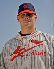
I can’t believe that no one has said anything about Mike Pagliarulo link in the picture accompanying that Old Time Baseball article.
I knew I liked Pags for some other reason than his heroics with the ’91 Twins…
#80/85- Yep, that’s the one the 49ers proposed. I remember also seeing a differnet photo of it on the table at a press conference, like a center piece, so I gotta think its legit.
I was watching the Mets game with my friend, and I pointed out Marquis’ stirrups and told him, “Someone’s going to post about that on the Uni Watch Blog.”
And you did.
Like it.
[quote comment=”6527″]http://www.packersuniforms.com/
Scroll down to 1993, there’s pics of the proposed new Packers unis and helmets.[/quote]
Can you say “San Jose link?”
[quote comment=”6540″]Jason Marquis is sporting some sweet socks for the Cards against the Mets tonight.[/quote]
Yes…. these are his other gopher ball inducing socks !
[quote comment=”6542″]So the Dolphins are wearing the all-white unis tonight on the road. Have they discontinued the teal road pants? They didn’t wear them once last year, and it doesnt look like Nick Saban is to partial to them.
In fact, he doesn’t seem like he’s too partial to the teal jerseys either, at least given his choice. I understand the whole “wear white at home because of the hot weather” bit, but had they not played at Tampa Bay last year and the Bucs decided to use white at home, the Fins would have gone the entire year wearing the all-whites; that was the only game that they wore teal jerseys the entire year.[/quote]
Technically aqua as opposed to Jacksonville teal but I agree the coach seems to like white.
Didn’t J. Johnson demand they add navy blue as a trim color when he coached there?
All whites look a bit like pajamas…should be for Colts and Cardinals only.
[quote comment=”6555″]#80/85- Yep, that’s the one the 49ers proposed. I remember also seeing a differnet photo of it on the table at a press conference, like a center piece, so I gotta think its legit.[/quote]
Yep I recall it made front page of Contra Costa Times around the spring time of that year – Eddie D sitting at a table with that God foresaken new helmet…only a year removed from a Super Bowl no less. Thankfully fans chimed in.
The uniforms in that Oldtime Baseball Game are not vintage – they are replicas made by Mitchell & Ness. You can see more photos of them at link
Jersey is from 1960’s Tar Heels. See picture of UNCs Larry Miller (44) going up against UKs Pat Riley (42) at link
These Nike jerseys aren’t as “shiny” as the originals.
Nike already came out with a 70s/80s Jordan jersey several years ago.
[quote comment=”6453″][quote comment=”6449″]nike has added another retro college basketball series named “ncaa greats and glory” to their arsenal.
shirts
link
the shorts link has been temporarily pulled from the site and are more detailed than the jerseys.
i’d love to have that illinois jersey in a #13 kendall gill.[/quote]
What era is that Jordan jersey supposed to be from? When he played at North Carolina, the letters were vertically arched.
link
link
link