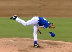
Royals closer Mike MacDougal had an interesting problem on Saturday night: His cap kept falling off, again and again — on six of the nine pitches he threw in his one inning of work. On one occasion he actually caught the cap in midair, but the other times he had to pick it up (including once when the ball was in play and he really should’ve been paying attention to that, not to his cap).
I looked at the video of MacDougal’s three other appearances this season (he’d been on the DL until the All-Star break). In those games, he threw a total of 26 pitches, and his cap came off only once. So what happened on Saturday — wrong-sized cap? Too much Brylcreem? In any case, the Royals were apparently so disgusted by MacDougal’s antics that they traded him to the White Sox yesterday, so now he’ll have a new cap to keep on his head.
MacDougal’s case of cap dropsy, whatever its cause, is hardly unique. Before Jim Bouton was famous for writing Ball Four, he was famous for losing his cap with every pitch. He even joked about it in the book — check out the caption. And during the late 1970s or early ’80s, the Mets had a pitcher whose cap always fell off, although I can’t recall who it was — Ed Glynn, maybe? Neil Allen..? Someone help me out here. Whoever it was, I remember reading an article that discussed how fans were always sending the player suggestions for keeping his cap on — hair gel, various glues and stickums, bobby pins — but none of them ever worked.
Speaking of wayward caps: I’m a little late getting to this, but Dodgers coach Mariano Duncan’s cap had quite an odyssey on July 17th. It started when Duncan got tossed from the game for chirping from the dugout and then came out to argue and had to be restrained from reaching umpire Angel Hernandez, who had ejected him. During the course of the argument, Duncan removed his cap and threw it at Hernandez, who caught it and immediately trotted over to the edge of the grandstand, where he tossed the cap into the crowd. A lucky fan stowed the cap under his seat, while Hernandez went back to his post, looking rather smug. The cap, meanwhile, probably set some sort of single-game record for being handled by the most people in the least amount of time.
And caps aren’t the only things that have been flying. In Sunday’s Giants/Padres game, gloves were taking flight. It began in the bottom of the 8th, when Ray Durham slid hard into catcher Rob Bowen. Bowen’s glove was knocked off by the collision (you can barely see it next to the on-deck hitter’s foot here — sorry for the crummy image quality), and the ball skipped to the backstop. As the pitcher retrieved the ball, baserunner Steve Finley got caught in a rundown between third base and home — with Bowen still without his glove. Bowen took the rundown’s final throw barehanded and then put a gloveless tag on Finley.
In the very next half-inning, Armando Benitez gave up a game-tying home run. Nothing new there, except that this time Benitez flipped his glove in the air and then swatted at it as it came down (which “several teammates privately called unprofessional,” according to this article).
Uni Watch News Ticker: As if Brett Myers didn’t already have enough problems, check out this note from Jean Lefebvre: “After the first pitch of Sunday’s Braves/Phillies game, home plate umpire Jerry Meals called time, took a few steps towards the mound, and called out to Myers. Meals and Myers exhanged a few words, and Myers then rubbed his right hand over his left to demonstrate something to the ump. Myers has a tattoo there, and I assume Meals thought it was a watch or bracelet and wanted him to remove it.” … Doug Donahoo took this photo at a Kansas City T-Bones minor league game — note the MLB logo on the base. The weird thing is, the T-Bones play in the Northern League, which isn’t MLB-affiliated. “Are the T-Bones stealing the bases out of the dumpsters of Kauffman stadium?” asks Donahoo. … Angel Pagan is still having problems with his batting helmet logo. … Brilliant catch by Eric Ritschdorff, who notes that Jaret Wright wore a lefty batting helmet when he pinch-ran on Saturday, even though he bats right-handed. … Yesterday’s comments section had a mention of Mike Pelfrey’s blue mouthguard. Good photos here, here, here, and here. … Update on Dontrelle Willis’s underbrim: The inscription on Sunday read, “KEEP ME SAFE” (maybe he saw what’s been happening to Mike MacDougal’s and Mariano Duncan’s caps). … Soccer news, courtesy of Brandon Vogel: “Tottenham Hotspur released their alternate kits and, in a REAL throwback (to the 19th century), they’ll be wearing chocolate and gold.” … Jay Sandora notes that the CoolFlo helmet appears to have been patterned after Shane Battier’s head.
Liverpool released their link as well – the home reds look good with the collar, but what’s the deal with the road-hazard-yellow away kit, and the un-balanced international kit? One step forward and two steps back…
Did anyone else catch last night on SNY where Keith Hernandez, Ron Darling, and Gary Cohen were talking about stirrups and socks for half an inning. It was in reaction to Juan Pierre wearing real stirrups over his sanis and not just colored socks.
with NFL camps opening this week something popped into my mind…. just stopped by nfl.com and noticed a shot of michael huff from the raiders at a rookie mini camp, wearing a logo-less helmet..
I know this is a somewhat common practice during mini and training camps… my question is what teams sport different helmet looks (or looks in general) during camp?
there was a time when “my” football giants would go logo-less (the terrible GIANTS logo, not the glorious ny logo) during training camp and look a little browns-esque… again, this has not happened since the mid-90’s
I believe the dolphins go blank and I know the steelers don’t add their front helmet numerals until the season begins….
the jets wear an obtrusive name decal on the front, where most teams still resort to the old-style athletic tape and sharpie marker to ID players…
two years ago the cowboys actually wore their white/blue star throwback helmets during camp (probably heat related??)
anyhow…..
any others??
[quote comment=”3269″]Liverpool released their link as well – the home reds look good with the collar, but what’s the deal with the road-hazard-yellow away kit, and the un-balanced international kit? One step forward and two steps back…[/quote]
Does England have a website called ‘Kitwatchblog.uk”???
Sportscenter made a mention of Cardinal pitcher Anthony Reyes’ cool-looking pulled up socks last night; Uniwatch is leaking into the commentary now!
It looks like Jaret Wright might get a call from the MLB concerning his pants; aren’t players afraid that they are gonna trip over themselves???
Jay Sandora, great catch on the uncanny resemblance between Battier’s head and the Coolflow helmets!!
Does England have a website called ‘Kitwatchblog.uk”???[/quote]
Cannot find a link right now, but the club I support, Newcastle, unveiled their European kit last friday…very nice…better than the Spur’s change kit.
Slainte’
Mike
[quote comment=”3270″]Did anyone else catch last night on SNY where Keith Hernandez, Ron Darling, and Gary Cohen were talking about stirrups and socks for half an inning. It was in reaction to Juan Pierre wearing real stirrups over his sanis and not just colored socks.[/quote]
Matt, I caught that too. When they went off on the stirrups tangent, I was thinking, “Paul, it’s like they’re speaking to you!”
Also, you didn’t post the best part of the Mariano Duncan-cap story. I was watching Sports Center, and caught a shot of another player (or coach) tying on Mariano’s hat with a blue elastic. I don’t know if it was the same game or the next day or what have you. It was a pretty hilarious shot, though.
I believe the Mets pitcher was John Pacella, his hat would fall off nearly after every pitch.
I see that Liverpool uses one font (the “Adidas” Blue Jays-esque one seen in the World Cup) for their white uniforms, and another one (the Champions League style) for the others.
It looks bizarre and certainly doesn’t give you the impression that it’s the same team you’re watching.
I’m trying to think of the last time a US sports team did this, and I’m coming up empty. In baseball, maybe the Red Sox with their distinctive lettering at home but plain block on the road in the ’80s?
Link Name“>Pacella’s Hat
All of the European Soccer (or Football depending on where you’re from, but in America we call it soccer) teams are unveiling their new kits in anticipation for the new seasons. Many, like the ones mentioned already, are unveiling all at once. Manchester United, however, has decided that their Home kit, a nice 1950’s throwback, is the first to be unveiled with their Away kit being unveiled late next month.
link
Pacella is right. Here’s your proof right here:
link
There was a story when Mike MacDougal was still in AAA, that the wife of one of his teammates sewed him a cap with an elastic chinstrap on it to keep his cap on his head. If I am remembering the story correctly, once word got out in the next spring training, the rest of the bullpen made him wear the chinstrapped cap during practice(s). This was probably 2000/2001, and unfortunately I can’t find the article anywhere.
article about Duaner Sanchez of the Mets stretching his pants…
link
In regards to teams who wear different number styles on different jerseys, the Seattle Mariners are on the list. They wear standard block link on their home and away jerseys, but they wear a number font similar to their “Mariners” logotype on their link jerseys.
Between John Pacella picking up his hat after every pitch and the damn plane at LaGuardia…it’s a wonder I survived.
John Pacella
[quote comment=”3270″]Did anyone else catch last night on SNY where Keith Hernandez, Ron Darling, and Gary Cohen were talking about stirrups and socks for half an inning. It was in reaction to Juan Pierre wearing real stirrups over his sanis and not just colored socks.[/quote]
Meanwhile, Cubs play-by-play man Len Kasper was commenting that he feels the Mets have too many uniforms and he prefers the pinstripes (no mention of which undershirt color he prefers, but I’m sure it’s blue).
He went on to say he likes the Cubs’ white/gray home/away unis better than the blue alternate, a preference apparently shared by Greg Maddux who never seems to select the blue jerseys for his starts (as opposed to Carlos Zambrano, who always does).
Len even managed to use the word “sartorial” – he’s a good guy.
Try that again…
link
Pacella is also mentioned link-read down a few lines to see that someone else remembered him for losing his cap.
A little more info about John–He is currently running a successful baseball school in Worthington (Columbus area) Ohio with former big leaguer Dan Briggs (try link).
His son, Jay is currently pitching in the MAC (not sure for which team, but he had a pretty good season). John and Dan have been very good for the local baseball community, glad to see that John is getting his due for his place in UniWatch History.
Interesting story on the Bergen Record Web site about Duaner Sanchez comitting the cardinal baseball uni sin- pant stretching:
link
[quote comment=”3271″]with NFL camps opening this week something popped into my mind…. just stopped by nfl.com and noticed a shot of michael huff from the raiders at a rookie mini camp, wearing a logo-less helmet..
I know this is a somewhat common practice during mini and training camps… my question is what teams sport different helmet looks (or looks in general) during camp?
there was a time when “my” football giants would go logo-less (the terrible GIANTS logo, not the glorious ny logo) during training camp and look a little browns-esque… again, this has not happened since the mid-90’s
I believe the dolphins go blank and I know the steelers don’t add their front helmet numerals until the season begins….
the jets wear an obtrusive name decal on the front, where most teams still resort to the old-style athletic tape and sharpie marker to ID players…
two years ago the cowboys actually wore their white/blue star throwback helmets during camp (probably heat related??)
anyhow…..
any others??[/quote]
Several teams don’t put the logo’s on for mini-camps.
The Cowboys-per The Giant Tuna don’t put stars on the rookie’s helmets until they “earn” them…a little High School for my taste.
Also, Dallas wore their throwback helmets a few times to get any potential bugs worked out before they wore them in a real game. The heat isn’t an issue for one more year as they have camp in Oxnard,CA. Nice weather there.
I have yet to see Spurs away kit, but I’m expecting all blue. I enjoy the simplicity of the new design, their great cockerel and ball logo gets most of the attention (behind the sponsor of course.) Speaking of which, a major upgrade there as well. The Mansion logo actually looks nice compared to that half-smiley they had last year, which looked particularly pathetic on the yellow third kits in the past. Ditching Kappa for Puma was also a welcome move.
Personally, I’m convinced Mike MacDougal’s hat escape is somehow related to the fact that his body knew he was getting traded to the White Sox. His head was having a reaction and was violently trying to rid its self of all Kansas City related gear.
On Jaret Wright wearing a lefty helmet while running the bases, I wonder if he just grabbed whatever he could find, or actually has a helmet on hand for pinch running. As a runner, you’d get more protection from an errant pickoff throw with a lefty batting helmet than a righty one.
[quote comment=”3295″]I have yet to see Spurs away kit, but I’m expecting all blue. I enjoy the simplicity of the new design, their great cockerel and ball logo gets most of the attention (behind the sponsor of course.) Speaking of which, a major upgrade there as well. The Mansion logo actually looks nice compared to that half-smiley they had last year, which looked particularly pathetic on the yellow third kits in the past. Ditching Kappa for Puma was also a welcome move.[/quote]
I’m not sure of that, I’m a Blackburn Rovers supporter and I’ve had this discussion w/ the Message Board denizens often. I love the Kappa kits & miss them quite a bit, (althou I understand the Thomson logo & yellow kits were a combustible match). Prepare to see Spuds finish 8th this term !!!
[quote comment=”3279″]
It looks bizarre and certainly doesn’t give you the impression that it’s the same team you’re watching.
quote]
In the Premiership, all teams are required to use the same typeface for letters and numbers. In the Champion’s League, no such requirement exists – so teams often change fonts for their international uniforms
link that any uniform is better with striped socks/stirrups. Granted Soriano’s socks are not actually striped but one gets a good idea of how it would look because of his straps from his shin guard.
With all the ads on those jerseys, Nike just had to get in on it(twice).
link
matt and wanda…
do you recall when in the met game that juan pierre stirrup discussion occurred??? I’m watching the replay on mlb tv and haven’t found it yet.. was it an at bat?? or out in the field?? an inning would be even better!!! thanks fellas…
ps. if anyone wants to hear the rockies announcers discussing reyes’ cardinal stirrups it was at the beginning of the bottom of the 1st inning…
The Pierre/stirrups discussion took place during the top of the 4th. I’ll have a full rundown of it (along with coverage of Anthony Reyes discussion that took place during the Rockies/Cardinals game) in tomorrow’s blog.
— Paul
MAC, looks like I got the Premiership and the Champions League backwards.
Do all the teams have to use the exact same style, or is the rule just that each club has to be consistent and use the same style on all its uniforms?
And Dave, I thought of the Mariners, but if you include alternates, then we’ve got all the throwbacks and interleague-only and Sunday-only stuff to deal with. (Japan’s Rakuten Eagles have a different font for their interleague uniforms, as do the Hanshin Tigers.)
The Yomiuri Giants had a different font at link and on the link in 2002 before switching to link on the road the next year. It looked really unbalanced and people were happy to see the rounded-letter road jerseys disappear.
[quote comment=”3304″]With all the ads on those jerseys, Nike just had to get in on it(twice).
link
Yup, Nike supplies the leader jerseys at the tour. The swoosh is all over them.
Also, they sponer the Discovery Channel. They have the swoosh quota filled. But check out this link
of course the real reason that Armando Benitez blew that save is because his pant legs were pulled all the way down below the heels of his cleats. (couldn’t find a picture).
thanks paul…
just watched the discussion from the met game last night…
something I noticed is that I don’t think juan pierre actually wears full sanitaries… it looks like he wears ankle socks and the stirrups…
I’m not going to complain…
darling and hernandez made the same mistake many do regarding the red sox still wearing the old navy/white stripes on their socks… an unfortunate retirement…
anyhow.. it was a great discussion with great old photos of darling and hernandez from their playing days…
hernandez brought up the point I always heard growing up about why we wore our pants knee length.. and that was to designate the bottom of our strike zone for the umpire.. brilliant to hear that again after all these years!!!
While we’re on the topic of Premiership kits, here’s a nice site with the complete history of Chelsea’s kit.
Chelsea FC Classic Kits
Here’s what I’m wondering: what happens if Brett Myers or link gets told to cover up some tattoos, then puts on those dot-matrix sleeves?
He could wind up looking like link.
Anthony Reyes was sporting some sweet sockage last night against the Rockies. As I’m sure you know, many Cardinals have worn these socks…
link
But Reyes was rocking socks that were red with four white stripes. Unfortunately, I wasn’t able to find a picture.
[quote comment=”3313″]He could wind up looking like link.[/quote]
Is Shinjo wearing one of those link belt buckles in that picture??
We all know that logo creep is out of control, but I saw a new high (low?) yesterday. I apologize for not remembering which game I was watching, but a closeup of the pitcher showed that there were no less that four Nike swooshes on his glove (and a possible fifth that was partially covered). Is this really necessary?
[quote comment=”3287″]In regards to teams who wear different number styles on different jerseys, the Seattle Mariners are on the list. They wear standard block link on their home and away jerseys, but they wear a number font similar to their “Mariners” logotype on their link jerseys.[/quote]
Add the Ottawa Senators…regular block on the away whites, “Senator” font on the home red and alternate blacks
link
link
link
The real question isn’t why Jaret Wright is wearing the wrong helmet while pinch-running, but more why is Jaret Wright pinch-running in the first place? I mean, this is the anyone-can-manage American League, it’s not like the bench should be depleted from using alot of pinch-hitters…
I am sure this has been noted long ago, but Robert Fick, the National’s some-time catcher wears his helmet forward under his mask.
link
Also, last night I noticed the figures on the signs designating the ladies’ and men’s restrooms at Citizens Bank Park in Philadelphia are wearing baseball caps and stirrups!!
Though not officially released, Manchester United has put out some very revealing pictures of their new kits:
link
link
link
link
link
link
link
Interesting to not see Ruud van Nistelrooy not on this list… Will he be traded (transfered)?
Actually Matt, there’s link. (One on each sleeve, plus the chest) And how freakin’ sick were those link?! Beautiful…
I said, “Interesting to not see Ruud van Nistelrooy not on this list… Will he be traded (transfered)?”
Sorry about that lame gramatical slip up. However you say it, he’s not there. ;)
[quote comment=”3307″]
Do all the teams have to use the exact same style, or is the rule just that each club has to be consistent and use the same style on all its uniforms?
[/quote]
Im pretty sure all teams have the exact same typeface – small picture link – but if you just google any EPL jerseys you will ntoice they are all the same – i read somewhere that it was a rule, but cant find it right now – they also have the Premiership logo in the bottom of every number
[quote comment=”3313″]Here’s what I’m wondering: what happens if Brett Myers or link gets told to cover up some tattoos, then puts on those dot-matrix sleeves?
He could wind up looking like link.[/quote]
Forget Shinjo, what about his teammate?
link
link
From this site link
I believe in last night’s Mets game, Hernandez also pointed out that Greg Maddux wears the socks with the fake stirrups (i.e. the “stirrups” you can buy at most sporting goods stores) and not REAL stirrups like th good ol’ days.
[quote comment=”3289″]Meanwhile, Cubs play-by-play man Len Kasper was commenting that he feels the Mets have too many uniforms and he prefers the pinstripes (no mention of which undershirt color he prefers, but I’m sure it’s blue).
He went on to say he likes the Cubs’ white/gray home/away unis better than the blue alternate, a preference apparently shared by Greg Maddux who never seems to select the blue jerseys for his starts (as opposed to Carlos Zambrano, who always does).
Len even managed to use the word “sartorial” – he’s a good guy.[/quote]
I agree to some extent; I don’t actually mind the black alternate unis. What I [i]do[/i] wish the Mets would do is follow their own media guide, which states that the pinstripes, blue caps and blue undershirts are the official home uniform, while the greys, black & blue caps and black undershirts are the official road uniform. I believe the Royals (prior to this year, where they dropped black from the teams’ color scheme altogether) did it that way: They wore royal blue caps and undershirts at home, and black & blue caps and black undershirts on the road. Making blue the exclusive home color/trim would make me and I would guess more than a few Mets’ fans a happy camper.
Re: Mariana Duncan’s cap. He was spotted later in the dugout with a new cap that was taped to his head. link
The Pierre/stirrups disussion on SNY was okay. They did show pictures of Ron Darling when he played on the Mets with stirrups. They made a point of saying that it makes it easier for the ump to call balls and strikes because you can see where the knees are. Someone, not sure who, asked why they don’t wear them up to their thighs – but then it was said it would get some people in the stands might get excited.
Apparently, Jaret Wright is faster than Giambi and that’s why they used him. Giambi was hitting in the pitchers spot, so they would lose him anyway after the bottom of the inning was over. I guess Torre didn’t want to double-switch. Giambi discusses it here : link
Robert, there is a lot of players wearing Nike gloves and yes, there is 4 Swooshes on the Pro Gold ones, the model you probably saw, along with one etched into the pocket. However, check out Josh Beckett’s glove:
Reebok put as many logos as well.
Add the Padres to the list of teams that have been wearing dark alternates for the last couple weeks.
Chelsea FC
link
link
[quote comment=”3325″]Forget Shinjo, what about his teammate?
link
link
From this site link
Forget all that talk about hispanic players taking over the sport; we’re going to start getting shiploads from other planets now!
[quote comment=”3332″]Apparently, Jaret Wright is faster than Giambi and that’s why they used him. Giambi was hitting in the pitchers spot, so they would lose him anyway after the bottom of the inning was over. I guess Torre didn’t want to double-switch.
Giambi discusses it here : link
There is no pitchers spot in the AL, DH takes care of that
[quote comment=”3269″]but what’s the deal with the road-hazard-yellow away kit, and the un-balanced international kit? One step forward and two steps back…[/quote]
Yellow’s a traditional away color for Liverpool.
Even as a Man United fan, I have to say that the Spurs kit looks fantastic.
[quote comment=”3338″][quote comment=”3332″]Apparently, Jaret Wright is faster than Giambi and that’s why they used him. Giambi was hitting in the pitchers spot, so they would lose him anyway after the bottom of the inning was over. I guess Torre didn’t want to double-switch.
Giambi discusses it here : link
There is no pitchers spot in the AL, DH takes care of that[/quote]
You’re completely right and thanks for catching my wording, but…In this case, Arod was the DH and he was brought in to play 3B. Once you substitute the DH spot to a position player, the pitcher must bat and you forfeit the DH spot for the remainder of the game. This happens every once and a while, but not too often. So yeah, Giambi wasn’t technically hitting in the pitchers spot at that time, but his spot did become the pitchers spot because of the substitution. I should have said “he was hitting in the place of 3B Green. But that spot went to the pitcher because of the DH to 3B switch”. If the game became tied and went into extra innings, there would be a pitcher batting (or pinch hitter). But I think you knew what I meant…
Torre knew he was going to lose the DH spot because of moving Arod to 3B, so rather than wasting a back-up position player on a pinch-runner that he knew he would lose because of losing the DH already, he just sent a pitcher in. That way, if he needed a pinch hitter later-on to hit in the pitchers spot, he would have more men available on the bench.
In the top of the 4th inning of the Jays broadcast of their game against the Mariners, they told a story of Johjima and Arod. Apparently Arod came to the plate, Johjima said hello, then something that Arod couldn’t understand (Johjima is still learning english). Arod asked the umpire what Johjima had said and the ump told him that Johjima was trying to point out to Arod that his fly was open. (Insert joke regarding Arod’s sloppy play and dress habits here)
Don’t know what game this occurred in, but it was presumably in there last series.
[quote comment=”3341″]
Torre knew he was going to lose the DH spot because of moving Arod to 3B, so rather than wasting a back-up position player on a pinch-runner that he knew he would lose because of losing the DH already, he just sent a pitcher in. That way, if he needed a pinch hitter later-on to hit in the pitchers spot, he would have more men available on the bench.[/quote]
Not quite. A-Rod came in to play 3rd in the bottom of the 9th so the losing the DH thing was never really an issue. Giambi pinch-hit for Green in the 7th. In the bottom of the 7th Giambi went to 1B, Andy Phillips went to 3B and A-Rod is still the DH. Giambi got another at bat in the top of the 9th, where he walked. Then Wright came in to run for him. Bottom of the 9th A-Rod went to 3B, Phillips went back to 1B, and Mo technically took Wright’s spot in the lineup when he came in to pitch.
jesse said:
He could wind up looking like Shinjo.
Is Shinjo wearing one of those LED belt buckles in that picture??
check this out:
link
or under title
-2006 SANYO ALLSTAR GAMES- The first turn at SHINJO,Tsuyoshi
A little off topic, but the Cincy Reds wear red socks with black sleeves on the road. I had always thought that the color of the socks, belt, and sleeves should match. But it would be strange for the Reds to not to wear red socks (ala the redstockings and redlegs days). What does everyone else think?
Sorry I couldn’t find a photo.
the angel hernandez catching the hat thing reminds me of the dane cook bit in which he talks about a nascar tire flying into the stands. He says something to the effect of “I’d try to palm it *puh* ‘There can only be one highlander, tires cannot defeat me'”
Attended tonight’s Brewers/Pirates game, which was sadly sockless. Until Brewers pitcher Dave Bush came in relief (we won’t discuss why a starting pitcher came in for relief) and happily, there were the socks, high atop the mound. I pointed this out to my boyfriend. He pointed out that it didn’t help Bush out of a 5 run inning.
Who cares! He looked so good, proudly rocking the socks!
And also, a few days late, but I caught a few minutes on TV this weekend of a Nationals/Cubs game and the Nats were rocking red uniforms and red socks with white pants. Loved it!
Soc
link
link
That’s supposed to say “Socktastic Photo Here”
Wow, that Japan All Star clip was great. Could you immagine if baseball games were like that in the MLB? If I’m not mistaken there was a marching band playing the the background. Pretty cool… Nice belt too.
[quote comment=”3344″][quote comment=”3341″]
Torre knew he was going to lose the DH spot because of moving Arod to 3B, so rather than wasting a back-up position player on a pinch-runner that he knew he would lose because of losing the DH already, he just sent a pitcher in. That way, if he needed a pinch hitter later-on to hit in the pitchers spot, he would have more men available on the bench.[/quote]
Not quite. A-Rod came in to play 3rd in the bottom of the 9th so the losing the DH thing was never really an issue. Giambi pinch-hit for Green in the 7th. In the bottom of the 7th Giambi went to 1B, Andy Phillips went to 3B and A-Rod is still the DH. Giambi got another at bat in the top of the 9th, where he walked. Then Wright came in to run for him. Bottom of the 9th A-Rod went to 3B, Phillips went back to 1B, and Mo technically took Wright’s spot in the lineup when he came in to pitch.[/quote]
Bah! you win. I didn’t realize Giambi actually played 1st that night. good call. I’m an idiot.
Regarding the MLB-logoed base at the Kansas City T-Bones game. Note to Paul, the T-Bones play in the Northern League as you said and are not a “minor league” team. They are an independent league team. There’s a big difference. You, who seem to be very specific and detail-oriented, should know the difference.
Re: pitchers who’s caps come off frequently,
Britt Burns had this problem until he started using bobby pins to keep the cap on.
Re: The MLB logo on the KC T-Bones’ bases:
What’s really curious is that the logo is rendered in the (gasp!) purple and black of the Colorado Rockies (per Paul’s blog of link. Any ideas? Are they buying these things used on eBay or something?