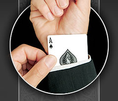
Uni-driven pandemonium at Shea Stadium yesterday, as Baltimore outfielder Ed Rogers’s jersey figured prominently in a key play. The follies began when David Wright hit a line drive to left, which Rogers short-hopped. But the ball, instead of bouncing off of Rogers’s glove or his chest, went up his left sleeve and then briefly lodged in the back of his jersey (you can see the bulge behind his neck here), where he pawed at it until it popped loose. Completely bizarre play.
Meanwhile, Major League Baseball was doing its annual Father’s Day routine to boost awareness of prostate cancer, with most players wearing blue wristbands, blue chest ribbons, or both. Umpires got into the act, too. But Uni Watch didn’t spot anyone wearing blue eye-“black,” like in some years past. Also, after all the fuss about the pink bats that MLB rolled out to promote breast cancer awareness on Mother’s Day, Uni Watch is surprised there were no blue bats yesterday.
Uni Watch News Ticker: One of the nicest things about interleague play: the annual appearance of the Phillies’ blue-brimmed caps. … Nice cap prank pulled on Fernando Rodney yesterday. … Used to be that a catcher had just one mask, which he wore for all games. But more and more catchers now have separate masks for home games and road games. And nobody’s masks are more highly differentiated than Victor Martinez’s. Check it out: home vs. road. … Eagle-eyed Bill Blevins reports that A-Rod appears to be wearing vanity-branded batting gloves. … Blevins also notes that the jersey-as-Kleenex phenomenon has been taken to new, uh, heights by T.J. Beam, who struck this pose after striking out in his first MLB at-bat on Saturday. … A-Rod isn’t the only one with personalized gloves: Check out World Cup goalkeepers Kasey Keller of the U.S. and Jens Lehmann of Germany (with thanks to Jeremy Brahm). … Good to see Mark Prior wearing his usual stirrups during his return to MLB action yesterday. … Most of the College World Series teams are wearing the CWS logo patch on the right sleeve, but Georgia Tech has it on the left chest area. Either way, it’s way too big. … Auburn’s new football unis, produced by UnderArmour, will look like this (with thanks to Shane Maddox). … More Japanese baseball observations from Jeremy Brahm, who notes that Bobby Valentine’s Chiba Lotte Marines are wearing a “2005 Asia Champions” patch on their caps, sleeves, and pretty much anyplace else they can think of. … Kris Rose reports that the University of Cincinnati is ditching Nike and switching to Adidas. … Here’s something you probably haven’t seen before: Winky Wright entered the ring on Saturday night wearing a suit, instead of a robe, for his fight against Jermain Taylor. … Interesting note from sportswriter Jon Rathbun, who checks in with the following report: “I was covering a New York Collegiate Baseball League (summer wood bat league) game on Saturday and saw something I’d never seen before. Nate Carter, the third baseman for the Bolivar A’s from the College of the Ozarks, had strange black marks on the back of his cap. I got a closer look while his team was batting and it almost looks like he’s been using the back of his hat to wipe off eye black after games.” … Uni Watch has an old iBook laptop for sale. Utterly obsolete by modern computing standards, but perfectly functional for basic word-processing, e-mailing, and such. Interested? Get in touch.
Auburn’s unis move out of the logo-creep category and into the uni-creep category (the category where the company’s logo is covered by material, rather than the other way around). Seriously, on player #54 (not counting the tongues of his shoes, assuming they have Under Armour logos like #23), I count 9 Under Armour logos (socks, pants, towel, gloves, wristbands, & jersey) and 1 Auburn logo (a small “Auburn” print on the jersey). This is seriously out of control.
Too bad the stirrups didn’t prevent Prior from giving up 7 runs and 4 HR’s yesterday; this from an extremely frustrated Cubs fan. On another note, the bizzare-ball-popping-into-the-jersey was hilarious, A-Rod’s had that particular design on his gloves since last year (pretty sweet too), and I hate that adidas is taking over Cincinnati. Those Jordan Brand unis were sweet-looking and not to have exclusive Air Jordans on those players is gonna look funny.
Since it was the start of the Canadian Football League regular season this previous weekend, I was wondering if anyone had any pictorial evidence of soemthing peculiar in the game on Saturday between the Toronto Argonauts and Hamilton Tiger-Cats? I thought I saw Corey Holmes, the Ticat running back have a clear mouthguard with a green logo on the front of the mouthguard. I suspect that it was a Saskatchewan Roughriders logo (since he played with the Green Riders last season) but I have not been able to find any pictures online or in the papers that clearly show what the green spot on that mouthguard. Or is my imagination?
Has anyone seen the new Anahiem (no longer Mighty) Ducks logo yet? link
Its laughably bad. The D shaped as a webbed ducks foot looks completely ridiculous, not to mention nothing like a ducks foot, and that blob on the bottom part of the K makes me want to vomit. At least the colors look like an improvement. (No more 1980s athletic equipment teal and purple.)
Disagree with you about the Phillies blue bill. Most often, the fewer colors the better (take note, Mets!)
I know David Wright worn the Blue “Eye-black” yesterday. This is the best pic I could find.
link
I count 11 underarmour logos on #54 if you include his helmet visor. And there are at least 2 more logos on his cleat which would bring the count to 13. BOOOO
The logo-creep on Auburns uniforms is bad. really bad. But the thing that grabs you most in that picture is Tuberville’s pants. I can figure out if they are too long, too high, or both. I hope these aren’t underarmour’s new coaching gear. I can’t handle seeing Maryland’s coach in these things too.
[quote comment=”1025″]Too bad the stirrups didn’t prevent Prior from giving up 7 runs and 4 HR’s yesterday[/quote]
Actually, it was 8 runs, but one of them was unearned.
[quote comment=”1029″]Disagree with you about the Phillies blue bill. (take note, Mets!)[/quote]
I concur. And he Reds should take note as well.
Pinstripes should only be paired with solid-colored caps — unless the cap is white with pinstripes. The Cubs will occasionally wear their red-brimmed road caps with their home pinstripes (thankfully, I haven’t seen them do it in a few years) and it looks really bushleague.
At least we didn’t see the annual use of blue balls for the father’s day games…
OMG, like the kids say!
You say how much you like the Phillies’ two-tone caps:
link
But you hate the Twins’ two-tone caps:
link
It’s the same thing!
Plus, with your dislike of purple, I get the feeling you just don’t like Minnesota.
Seriously, though, keep up the good work!
Tuberville’s pants are both too high and too long, made worse by being paired with those sneakers, and by the akward linked am pose.
oops, make that “linked arm pose”
[quote comment=”1037″]You say how much you like the Phillies’ two-tone caps:
But you hate the Twins’ two-tone caps:
[/quote]
I believe the issue was that the Twins wore blue sleeves with those (mostly) red caps.
Jim Thome also wore the blue eye black yesterday, but i don’t have a picture, unfortunately.
Here’s the logo creep count on Auburn that I come up with….19!!!!
Shoes – 5 per shoe…10 total (1 toungue, 1 on top of toe area, 1 on each side of shoe, and one on back of shoe).
Gloves – 2
Wristbands – 2
Socks – 2
Jersey and Pant – 2
Optional Towel – 1
And does anyone else think the “Click Clack” commercial for Under Armour is the most annoying out there?
add 2 more to that for the visors that alot of players are wearing.
JTH, thanks for the correction; my bad! Jill, linked arm pose, good comment, totally awkward and just not very manly! JayRaider, haha on the blue balls comment, I was wondering when someone was gonna put that out there. Chris, that UA “Click Clack” commerical is almost as annoying as the damn “We Must Protect This House” crap. Protect with what?? Some thin polyester shirts??? Plus, that recent one with the little kids in the bus screaming is just a bit exploitative to me.
Micah made a good point. I wasn’t really Nike directly that outfitted Cincy. It was Brand Jordan so the Cincy stuff never had a Swoosh, just a Jumpman.
link
It is disappointing, I agree.
Brandon brought up the Under Armour logos on the socks. This is completely ridiculous. Wasn’t it Auburn that ditched Nike because Nike wouldn’t let the players cover the Swooshes with spatted cleats?! (LenDale White did it a few times, actually)
link
link
Are the Ducks kidding?! They better have good alternate logos to make up for that. I thought they were trying to improve the team’s image. Weird…
Did anyone else notice players with blue-ribbon tatoos on their forearms? I think I saw Marcus Giles with one, and perhaps the home-plate ump of the Sox-Braves game as well
Those Auburn unis look really different from what they have been using since Bo Jackson played. Is it just me or did UnderArmour just add those creepy logos to the old uniforms?
WIth these college deals, it says that the players must wear that brand’s shoe. Is that the case with soccer too? Soccer players are very picky, and Nike boots suck.
Bill, I believe that’s exactly what they did. But most of your top tier college football programs seem reluctant to make any drastic changes, especially in the SEC. In 2002, Tennessee added orange piping and stripes outlined in black on their road uniforms, and a plain orange stripe on the home pants.
Road: link
Home:link
After a bad year, it was all gone in 2003. Other than that, I can’t think of any significant changes in the last 7 or 8 years from the “powers” of the SEC.
As a side note, the Bolivar (Mo) high school nickname is the Liberators. The logo isn’t anything special, but link
I just thought of one…Florida’s one orange sleeve they wore a few times last year, but that doesn’t really count because they didn’t ditch their regular uniforms or anything. Can anybody come up with anything?
Thanks Luke. I remember USC changing the Trojan decal on the helmets but that only lasted one maybe two seasons. I think they had a bad year and went right back to the old decal. You have to forgive me, i live by Penn State and you know how often they change football uniform styles.
I think Arkansas change uniforms a few years ago.
Nice catch, Jimmy. I love team nicknames with meaning or roots somewhere. Good examples are Detroit Pistons, Milwaukee Brewers, Dodgers, most Houston teams with the space theme (I think 1836 woulda been fine for the MLS team, after all it is AMERICAN soccer), Ohio State Buckeyes, stuff like that.
It bugs me when a team gives them self an intimidating name (Panthers, Titans) simply for the sake of sounding intimidating. That’s why baseball names are usually so cool. Twins, Padres, Mariners, colored Sox? How original are those?!
Brian, I totally disagree with you about the quality of Nike boots. Granted, when Nike started getting into soccer, they weren’t anything special. Don’t get me wrong, adidas is still great, but they’ve come a long way to where they are now, having a good chunk of the world’s best players believe in their products. Ronaldinho, Wayne Rooney, Thiery Henry, Christiano Ronaldo, Zlatan, Ruud Van Nistelrooy,…
Anyone notice that the platinum chinstraps on #23 and #86 are Under armour too.(that doesnt include the pad #54 and some in the back are wearing either)
Other changes in the SEC that I can think of (from the top 6) include Tennessee’s slimming of their helmet stripe.
Before…
link
After…
link
The USC Trojan helmet logo was only changed for the 1992 season to honor some sort of university anniversary
[quote comment=”1046″]Did anyone else notice players with blue-ribbon tatoos on their forearms? I think I saw Marcus Giles with one, and perhaps the home-plate ump of the Sox-Braves game as well[/quote]
I saw that too…One of the Phils had one too…I think Chase Utley…
[quote comment=”1057″]I love team nicknames with meaning or roots somewhere. Good examples are Detroit Pistons…[/quote]
And the thing I like best about that nickname is that when they moved from Fort Wayne to Detroit, the name was still appropriate — unlike the Jazz, Lakers, Dodgers, etc.
How cool is the Padres’ sleeve patch?!?!
link
Reminds me of when I was a young tyke playing Little League and my teammate at the time Eli Iorg, currently in the Astros organization, backhanded a groundball that went up his shirt sleeve and popped out the front of his shirt. All in one motion, he stabbed the ball in midair and then promptly made the play at first.
i would have to agree with Barry
[quote comment=”1029″]Disagree with you about the Phillies blue bill. Most often, the fewer colors the better (take note, Mets!)[/quote]
there is something about that link that annoys me. its the fact that it looks like it fell out of nowhere on a field of white, almost as though there is no upper “loop” on the capital p.
in any event, at least they dont use the 1994 opening day link that failed.
[quote comment=”1057″]It bugs me when a team gives them self an intimidating name (Panthers, Titans) simply for the sake of sounding intimidating. [/quote]
Actually, Nashville is the “Athens of the South,” so Titans isn’t too far of a stretch. It’s Greek-ish. But otherwise, Greg, I’m right with you.
@Greg
People like Nike boots. I’ve tried to wear both vapors and total 90’s. They hurt my feet, and I’ve gone back to my trusty adidas on both occasions. In that event, it doesn’t matter that lots of people like Nike. I don’t, and it hinders my play (bad blisters, the vapors even caused some plantar fascitis). Talking to people around my league, I saw that lots of people had trouble with those Total 90 III’s. Would they have to wear Nike and its generally unorthodox designs, or could a member of a “Nike” school team be allowed to wear his trusty adidas Copa Mundials?
P.S. The Air Zoom Legend is a step in the right direction, but the air-sole still puts me too high off the ground for my taste.
Jim Thome was sporting the blue eye-black yesterday, though I can’t find a pic.
Those Phillies hats could be worse…
link
I saw CC Sebathia sitting on the bench yesterday, and he was sporting the eye-blue although he didn’t pitch in the game.
A-Rod has been wearing a silly little logo of his for a while, now. He was even wearing it when he played in Texas, but just not on the strap:
link
Also, the picture included in the blog is a bit outdated, as he has been wearing Nike’s 2007 model batting glove designed specifically for him and Pujols (the Nike Sphere Elite MVP Batting Glove), which is all white with navy accents. Pujols (pre-injury) was wearing a similar model with red accents.
[quote comment=”1057″]It bugs me when a team gives them self an intimidating name (Panthers, Titans) simply for the sake of sounding intimidating.
I don’t know the story behind Carolina taking Panthers for football, but the NHL Florida Panthers makes sense, named for the almost extinct and real Florida Panther.
Also does anyone have any info on where the tradition (and one of the coolest by the way) of trading jerseys after an international soccer much started? I actually saw on a sport report yesterday a player from Australia refuse the offer of a Brazilian to trade jerseys.
[quote comment=”1068″]i would have to agree with Barry
[quote comment=”1029″]Disagree with you about the Phillies blue bill. Most often, the fewer colors the better (take note, Mets!)[/quote]
there is something about that link that annoys me. its the fact that it looks like it fell out of nowhere on a field of white, almost as though there is no upper “loop” on the capital p.
in any event, at least they dont use the 1994 opening day link that failed.[/quote]
Found my hat like that last year after burying it in some boxes for years…wear it all the time now…
Brian, just asking, are you a big or little guy? The Vapors are made for light, quick players, while the Total 90’s are more stable (although, trying them both, they didn’t work for you). Maybe the Vapors just don’t work with your foot and that is unfortunate. As far as the required to wear a certain brand of shoe, that only goes with college because the U.S. is sponsored by Nike and I see some of the players wearing the adidas Predators. I agree with Greg and say that Nike has come a far way in the world of soccer; they now overtake adidas in worldwide market share, something never thought possible 10 years ago.
Mark, thanks for the pic of A-Rod’s gloves in Texas, ’cause I like ’em! On another note, where did you get that title for the newer gloves? To my knowledge, A-Rod and Pujols are still wearing the Nike Diamond Elite V and that picture is recent because the wristband he is wearing is blue to match all the others the players were wearing for Father’s Day Sunday.
[quote comment=”1076″][quote comment=”1068″]i would have to agree with Barry
[quote comment=”1029″]Disagree with you about the Phillies blue bill. Most often, the fewer colors the better (take note, Mets!)[/quote]
there is something about that link that annoys me. its the fact that it looks like it fell out of nowhere on a field of white, almost as though there is no upper “loop” on the capital p.
in any event, at least they dont use the 1994 opening day link that failed.[/quote]
Found my hat like that last year after burying it in some boxes for years…wear it all the time now…[/quote]
Yeah man that blue Phillie hat was my favorite hat back in high school. I still have it but it shrunk too much and I can no longer wear it. Does anyone know where I can get one? Anyway, I do agree that it’s a monstrosity in the sense that it never really matched or went with the uniforms. Maybe a blue alternate would have helped.
i think the phils need new uniforms or at least a new font.. i hate the loopiness of it.. i realize that its modernized version of what the whiz kids wore but i just dont like it
[quote comment=”1042″]Here’s the logo creep count on Auburn that I come up with….19!!!!
Shoes – 5 per shoe…10 total (1 toungue, 1 on top of toe area, 1 on each side of shoe, and one on back of shoe).
Gloves – 2
Wristbands – 2
Socks – 2
Jersey and Pant – 2
Optional Towel – 1
And does anyone else think the “Click Clack” commercial for Under Armour is the most annoying out there?[/quote]
“5 on each Shoe”…… Actually there ar 6 ….. there is one on the sole unit.
[quote comment=”1077″]Brian, just asking, are you a big or little guy? The Vapors are made for light, quick players, while the Total 90’s are more stable (although, trying them both, they didn’t work for you). Maybe the Vapors just don’t work with your foot and that is unfortunate. As far as the required to wear a certain brand of shoe, that only goes with college because the U.S. is sponsored by Nike and I see some of the players wearing the adidas Predators. I agree with Greg and say that Nike has come a far way in the world of soccer; they now overtake adidas in worldwide market share, something never thought possible 10 years ago.
Mark, thanks for the pic of A-Rod’s gloves in Texas, ’cause I like ’em! On another note, where did you get that title for the newer gloves? To my knowledge, A-Rod and Pujols are still wearing the Nike Diamond Elite V and that picture is recent because the wristband he is wearing is blue to match all the others the players were wearing for Father’s Day Sunday.[/quote]
Arod and Albert have switched to the Sphere Elite MVP….
link
[quote comment=”1078″][quote comment=”1076″][quote comment=”1068″]i would have to agree with Barry
[quote comment=”1029″]Disagree with you about the Phillies blue bill. Most often, the fewer colors the better (take note, Mets!)[/quote]
there is something about that link that annoys me. its the fact that it looks like it fell out of nowhere on a field of white, almost as though there is no upper “loop” on the capital p.
in any event, at least they dont use the 1994 opening day link that failed.[/quote]
Found my hat like that last year after burying it in some boxes for years…wear it all the time now…[/quote]
Yeah man that blue Phillie hat was my favorite hat back in high school. I still have it but it shrunk too much and I can no longer wear it. Does anyone know where I can get one? Anyway, I do agree that it’s a monstrosity in the sense that it never really matched or went with the uniforms. Maybe a blue alternate would have helped.[/quote]
i think a red phillies sunday alternate would look really sharp. base it off of the reds sunday alternate. link is a rudimentary mock up.
Andruw Jones:
link
link
Andruw WAS wearing Diamond Elite V customized with the Jumpman logo, now he has switched to the new Jordan Brand Glove
Jeter:
link
link
Customized Diamond Elite Vs (And Jumpman wristbands)
Kenji Johjima
link
DEVs w/”Joh” on the wristband and customized Joh-Man (think Jumpman and Griffey’s Swingman) wristbands
[quote comment=”1077″]Brian, just asking, are you a big or little guy? The Vapors are made for light, quick players, while the Total 90’s are more stable (although, trying them both, they didn’t work for you). Maybe the Vapors just don’t work with your foot and that is unfortunate. As far as the required to wear a certain brand of shoe, that only goes with college because the U.S. is sponsored by Nike and I see some of the players wearing the adidas Predators. I agree with Greg and say that Nike has come a far way in the world of soccer; they now overtake adidas in worldwide market share, something never thought possible 10 years ago.
Mark, thanks for the pic of A-Rod’s gloves in Texas, ’cause I like ’em! On another note, where did you get that title for the newer gloves? To my knowledge, A-Rod and Pujols are still wearing the Nike Diamond Elite V and that picture is recent because the wristband he is wearing is blue to match all the others the players were wearing for Father’s Day Sunday.[/quote]
Micah, I got the pics of the 2007 Batting Glove lineup from NikeTeam.com
As I said above it looks like Andruw (and the UNC Tarheel Baseball Team) has started wearing the ’07 Jordan Glove.
Lew Ford of the Minnesota Twins wore blue eye-black yesterday
[quote comment=”1075″]
I actually saw on a sport report yesterday a player from Australia refuse the offer of a Brazilian to trade jerseys.[/quote]
That reminds me of BIlly Smith’s continued refusal to participate in another cool sports tradition, the handshake at the end of NHL playoff series.
link
Apparently, Mark Kotsay had the blue eye glare look going and he took it a step further. But no picture.
By the way, with regards to the subject of this article, who retires when his team is on a 10 game winning streak?
Jared and Micah, and anyone else interested in baseball equipment… the College World Series has started showcasing a lot of the new equipment, particularly Nike’s. For instance, the non-MVP model of the new batting gloves:
link
…the new Clipper cleats…
link
…and an upgrade in Mizuno’s cleats…
link
Some players, however, have opted not to wear the new equipment available to them, most notably Josh Orton of UNC:
link
Nike Air Zoom Diamond Fury II’s from 1994/95… hideous, but classic.
My mistake… Josh Horton is his name.
Jared,
Many thanks for the clarification on the gloves and sweet pics; ahhh that makes me sad that I was that behind in the batting glove category!
The Phillies font for names on the back is the worst font in sports right now. The curved edges are terrible, it’s about as bad as having Comic Sans on the back of your jersey.
link
Isnt the NBA switching from Reebok to Adidas
the Under armour Jerseys that auburn have arent that bad looking the Under armour cleats are nasty
i am getting them for high school football
Even better than Keller and Lehmann, England goalkeeper Paul Robinson has different gloves for each match, featuring the flags of England and the team England is playing.
Nick Punto was wearing blue “black-eye” in the Twins-Pirates game.
okay, what’s new about the Auburn unis? I’m glad they didn’t really tinker with them, those are great uniforms.
Mark, thanks for the links!
The black spots on the hat are from eye black. After you put it on, you need somewhere to wipe it off your finger. The back of the hat is a new one to me….
Eye black never comes out of clothing similar to pine tar.
It’s normal to see soccer goalies with gloves from a company that’s not their uniform manifacturer. That happens because in soccer players are free to choose their shoes and gloves manifacturer and this means big endorsement contracts. It happens to see players with adidas shoes and nike uniforms and vice versa.
Nike boots tend to be much narrower than Adidas. I cannot wear any Nike shoes because they’re so narrow and I’ve found a lot of soccer players say that. Especially with socks, shinguard straps, etc… Nike’s tend to be problematic.
All of you morons busting Auburn’s jerseys must be disgruntled nike reps who cant make anything of the junk that you sell. get a life