Mets third baseman David Wright keeps a blog. Now, everyone knows that you don’t want to read a player’s writing — especially a player on your favorite team — because it’s just gonna confirm how stupid or boring he is (just like those little song samples that are now played when a player comes up to bat, which are the worst thing ever because they let us know just how bad each player’s taste in music is). So despite being a Mets fan, Uni Watch has never had the inclination to check out Wright’s prose.
But Clark Farrand has been reading through some of Wright’s archives, and he’s noticed that one of last month’s entries included some major uni-related musings. Check it out:
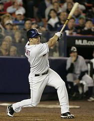
A few people have asked about the new helmets we’re wearing this season. I like them. I consider myself an old-school type of player, but I’ll try new things. The helmets are a little flashy and futuristic with the two-tone look. But they’re also light, so I’ve convinced myself that they allow me run faster and jump higher. If I seem a little more athletic this season, it’s because of the helmets.
It’s still a little cool in New York at this time of year [this entry was written on May 5th], but hopefully they’ll also keep me from overheating during the summer months coming up. I’ll keep you posted.
I’ve also gotten some questions asking why I’m wearing my pant legs down again. It’s simple: the last time I wore my pants up, we got beat, I made three errors, and didn’t get any hits. So I’ve decided to retire that look, at least for the time being.
The veterans on the team give me a hard time about it when I wear the pants up, anyway. Of course, they’ll give me a hard time about just about anything. I guess the general feeling is that the pants-up look is a high school or college type of style. Not that there’s anything wrong with that, but there’s a high value on looking and acting like a professional in this clubhouse.
Leaving aside Wright’s questionable notion of pants professionalism (not to mention the fact that one of the veterans razzing him about the high cuffs is presumably Cliff “I Untuck My Jersey Once the Game’s Over to Show How Fly I Am” Floyd), it’s interesting to hear that the high-pants look has somehow gone from being considered old-school to being youth-associated. If the kids these days are actually showing a lot of sock — and that seems to be the case in the College World Series — that could bode well for the next generation of big-leaguers (and for all of us who have to look at them). As long as “professionals” like Wright don’t talk them out of it, that is.
Uni Watch News Ticker: Looks like the Rock’s new movie, Gridiron Gang, will be featuring some major UnderArmour logo creep. Check out the trailer here (with thanks to Mike Fleishman). … Uni Watch’s deepest sympathies go to anyone who had to watch yesterday’s Nationals/Rockies game, which scaled new heights in retina damage. … Ben Roethlisberger, as a result of his little motorcycle oopsie, will reportedly switch to a Riddell Revolution helmet next season, probably with a special facemask. Additional details here. … Jeremy Brahm reports that Hiroyuki Nakajima of the Seibu Lions is wearing pink batting gloves and wristbands, because it’s his lucky color. … Still more Japanese baseball news from Brahm: “On June 9th, Shogo Akada forgot his to wear his game uniform, which is normally No. 9. So he had to wear his base running coach’s uniform (yes they have base running coaches in Japan). He just happened to be the same size.” … Note to New York readers: Looks like there’s gonna be some sort of Uni Watch presence in this Sunday’s Daily News sports section.
OH, NO!! I hope David Wright’s explanation of veterans riding guys for wearing their pants properly is isolated!!! Obviously today’s pro “veterans” have no clue regarding “old-school” uniforms or the players who paved the way for them… what continues to be more discouraging are some “old school” players who now manage/coach and wear their pant legs as pajama bottoms just like their players (save jim leyland)
on yankee telecasts, color analyst jim kaat is always poking fun at the long-leg look by relaying a story that when he came up (late 1950’s) if his pants weren’t high enough the VETERANS would razz him to no end… and he would be fined (kangaroo court).
what a shame if wright’s comments have some truth..
Stanford’s colors almost look maroon in that photo, must be lighting?
tom o’g,
please tell me that your little blurb yesterday,
…and thats the cubs…
is in direct reference to the 4/29/83 press conference of lee elia…
guys, if you havent heard it, google search lee elia and try to download it to your ipod.
sports comedy at its finest.
we play it at the bar alot and i think all of us have it memorized.
it is very similar to the buddy rich bus recordings in language (another rant to listen to).
Interesting that here in Seattle the only position player that sports the high socks is Ichiro, who used to be the king of the pajama-pants look. He and most of the Japanese team went to the old-school look this spring in the WBC, and when they won it all, Ichiro decided to stick with it throughout the MLB season. Hasn’t helped the team too much (31-37, 3rd place in the AL West), but Ichiro’s his usual hit-producing self (.364, 106 hits already).
[quote comment=”951″]tom o’g,
please tell me that your little blurb yesterday,
…and thats the cubs…
is in direct reference to the 4/29/83 press conference of lee elia…
guys, if you havent heard it, google search lee elia and try to download it to your ipod.
sports comedy at its finest.
we play it at the bar alot and i think all of us have it memorized.
it is very similar to the buddy rich bus recordings in language (another rant to listen to).[/quote]
Todd,
Here in New York, we have a sports talk program called “Mike & The Mad Dog” hosted by Mike Francessa and Chris Russo. Chris (Mad Dog) is a huge San Francisco Giants fan and he went on one of the all-time best rants after they had a disappointing postseason. I forget what year it was. Anyway, listen to it, it’s not very long.
link
-John Ekdahl, Webmaster
Info on the Riddell Revolution helment that Ben will reportedly be switching to is available link.
looks like the opposing team’s uni’s in the Rock’s new movie are exact duplicates of Maryland’s uni….which makes sense since Under Armour’s founder was a Terp.
I can’t believe nobody has said anything about the “Orange Crush” match beginning shortly…. Ivory Coast vs. Netherlands!
Who’s wearing the change strips? Holland’s looks fantastic, with the red and blue diagonal stripes.
I hope with your mention of the Nationals/Rockies game, you’re not complaining about the Nationals uniform combo of red hat, jersey, and socks with white pants. Living in the DC area, we’ve had to deal with the various poor choices by the new local MLB team, including:
– Their choice of a name (they couldn’t come up with something better than “Nationals”, and even worse, “Nats” for short?)
– The “W” logo. If you’re going to use the Senators old logo, why not just call yourself the Senators?
– Their mascot (though the kids do seem to like Screech).
I saw this uniform combo in person at a May 29 game vs the Dodgers, and it looked quite sharp, especially on the players who, like Clayton pictured, wear the pants up. It has the added benefit of incorporating the very nice “DC” logo, which should really be what’s on their caps all the time.
[quote comment=”962″]
– Their choice of a name (they couldn’t come up with something better than “Nationals”, and even worse, “Nats” for short?)[/quote]
The original Senators actually wore “Nationals” on their jerseys in 1905 and 1906.
Those Rockies jerseys are the worst jerseys in the MLB. Why is it neccesary to have the vest style jersey when you are just going to wear the same color underneath. It would be much better if they just had a solid black jersey with sleves. It looks really high school to have a solid color vested jersey. The Rockies are in desperate need of a complete uniform make over. Colors inculuded.
Also, on the subject of high socks, I have worn high socks throughout my baseball career, and then I walk into my first day of college baseball practice and the coach tells me to put my socks down because it looks un professional. I was shocked. I have petitioned him to change his policy but I have had little luck. THis is a disturbing trend.
[quote comment=”965″]The original Senators actually wore “Nationals” on their jerseys in 1905 and 1906.[/quote]
That is correct. Prior to 1905 the owner asked sportswriters for a new name, and they came up with “Nationals”, and the team that had been the Washington Senators (AL founded in 1901 version) was renamed the Nationals. After a while, this was realized to be a somewhat bad decision, as there was confusion of having an American League team be called the Nationals. The name disappeared from the jerseys, and from 1907 to 1956 the team mostly went by the Senators, but were still also sometimes called the Nationals. If that isn’t true wishy-washy Washington, DC style, I don’t know what is. Finally, in 1957, the name was officially changed back to the Senators (though it didn’t show up on the jerseys until 1959. Prior to that, and excluding the 1906-07 years, the jerseys said either “Washington” or had a “W” on them.)
The current team is just as confused. They use the Nationals name from the 1901-1960 Washington team (at least they’re in the National League now), but use as a logo a curly “W” based on the 1961-1971 team. They completely ignore their own franchise history by reusing the numbers that were retired when they were the Montreal Expos (the 10 pictured in the link above worn by Royce Clayton was previously retired for Andre Dawson and Rusty Staub, Marlon Anderson currently wears the 8 retired for Gary Carter, and Mike Stanton wears 30 which was retired for Tim Raines). I’m not sure if they’ve managed to honor the Washingon Statesmen of the American Association (1891) or the National League Washington Senators (1982-1899), but maybe they can come up with patches or something.
[quote comment=”969″]I’m not sure if they’ve managed to honor the Washingon Statesmen of the American Association (1891) or the National League Washington Senators (1982-1899), but maybe they can come up with patches or something.[/quote]
Oops, that’s the “National League Washington Senators (1892-1899)”.
Those black Rockies vest jerseys were originally paired with purple undershirts. It looked pretty bad which is probably why they went with black instead.
Todd, what’s your SN on NT?
Question of the day, was there ever any good uniform paired with purple? The rockies used to hide it well, but the MLB craze for alternate unis has driven us to have to view such horrible stuff like the Nats or Rockies, the D-Rays super Green look or even…gulp…the Braves red alternates (Tough to watch your favorite team in bright red, although the alt hats are really nice).
Lets do what we can to put a stop to unnessary alternate uniforms.
Hmm…spellcheck?
micah,
its krvanch on NT. i helped start it and am one of the original 4 administrators for the board since its inception.
Anyone here think the College World Series logo patches on the players’ hats are big enough?
I can’t find a picture, but as soon as the Clemson vs. Georgia Tech game is over there should be pictures up on ESPN.com
link
[quote comment=”974″]Question of the day, was there ever any good uniform paired with purple? [/quote]
I actually like the color, but I’m struggling to come up with some.
Ummm… Northwestern has had some decent ones for basketball, football and baseball. There have been some LSU basketball unis that I’ve liked.
Wait! Stanford is wearing pullover jerseys?
I guess I am in the very distinct minority, because I really like the Rockies’ vests, especially with the purple undershirts.
But I went to Northwestern, so …
Anyone else notice in the Brewers-Indians game how the “CA” is separated and crooked from the “PUANO” on the back of Capuano’s jersey? This seems to happen a lot- it’s a growing trend.
Any other examples?
Why in the name of all that is holy can’t the Cleveland Indians match the color of blue in their batting helmets to the color of blue in their road alt jerseys?
It would be understandable if they were a high school team or a beer league softball team, but come on!!!
I wonder if the Mets clubhouse convinced Reyes to get rid of the high socks too, he used to wear them all the time when he first came up:
link
[quote comment=”981″][quote comment=”974″]Question of the day, was there ever any good uniform paired with purple? [/quote]
I actually like the color, but I’m struggling to come up with some.
Ummm… Northwestern has had some decent ones for basketball, football and baseball. There have been some LSU basketball unis that I’ve liked.[/quote]
How about Furman’s home football unis…I like them alot…
Here’s a decent picture…
link
YAY! ESPN finally realized how much Americans suck at commentating soccer matches and put two familiar Brits in the booth for the Netherlands-Ivory Coast game. Let’s hope this trend continues…
[quote comment=”989″]Why in the name of all that is holy can’t the Cleveland Indians match the color of blue in their batting helmets to the color of blue in their road alt jerseys?
[/quote]
The Cubs have a similar problem (just one of many for them…). Their blue jerseys are a much lighter shade of blue than their caps.
@Greg: Tommy Smyth is IRISH! I’m sure Dave O’Brien (American) will be calling the US game today.
Mr. Wright’s blog corroborates my argument a few days back that high socks were not for adults. Woot.
I was at that game David Wright mentions. April 18th against Tim Hudson and the Braves. I made the observation that he was wearing high socks from all the way up in the Upper Deck Reserved section. I thought it was very cool, but after that performance I can’t say I blame him for going back to the “other” way to wear your pants. He was awful. Mets fans will forgive him though for his uni discrections, though, if he keeps playing the way he does.
They can’t seem to get it right! Ghana keeper Richard Kingston (as he’s listed) did not have a “t” in his name on the back of his jersey again today against the Czechs. What gives?
link
What’s wierd though is that on the World Cup website, he’s listed as Kingson, but I’ve seen many other rosters that list him as Kingston.
link
link
BY the way, Brian On, I know Tommy’s Irish, that’s why I said British, instead of English. :)
Ireland is separate from Britain…
But it’s part of the greater British Isles, no? The point is the guys speak European English and actually know about soccer because they’ve commentated hundreds of games. Unfortuanately I haven’t seen them since.
Anyone got a closeup of the Father’s Day pin the players were wearing today?
Also, I was just watching the Red Sox/Braves game, and yikes, those red Braves unis are atrocious. WAY too much piping, in my opinion.
link
[quote comment=”1019″]But it’s part of the greater British Isles, no? The point is the guys speak European English and actually know about soccer because they’ve commentated hundreds of games. Unfortuanately I haven’t seen them since.[/quote]
Agreed. I like Tommy too…although I’ve noticed in things I’ve read that alot of people don’t…
I can’t find pics, but on the subject of high sock/low sock, Ray durham started the Game Sat with his sock up and then by the 3rd inning he had switched to long paunts and I BELIEVE changed his shoes ….. ???? Anyone able to find pics?
I personally find Tommy dificult to understand, especially when he’s talking fast like he does. (and not just becuase he says “pitch” and “kit”)
On the topic of high socks at the College Series, check out the fantastic good taste of my alma mater, OSU. About half of the team looks like they’re playing in a throwback game.
link
No shiny pullover jerseys (I’m looking at you, UNC) for the Beavers! Three of their four jersey sets feature the retro numbers/letters. (The fourth matches the modern font on their caps)
Eek, bad link. Hope this works.
link