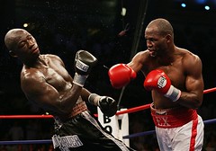
Time was when you could pretty much assume that both combatants in a big boxing match would be wearing Everlast gloves, which you could easily discern by the Everlast logo on the gloves’ cuffs (and note that fighters also wore cool striped socks back then). But those days are gone. In last Saturday’s Hopkins-Tarver bout, for example, Tarver wore Everlast gear but Hopkins wore Reyes, and the logos these days appear on the gloves themselves, not on the cuffs.
Uni Watch could go on at length here about various subtleties, such as the way tape on the cuffs led to the logo creep on the glove proper, the way Everlast increased the size of the cuff logo back in the 1950s when boxing became popular on television, and the whole sub-topic of glove colors, but that will have to wait for another day. For now, Uni Watch is happy to yield the floor to reader Mike Weippert, who recently provided a mini-treatise on this very topic. So:
Logo creep in boxing gloves has gotten a bit out of control lately. For instance, there’s this odd character, which debuted on Grant gloves several years ago. Prior to the logo’s advent, Grant gloves looked like this; when the new logo was introduced, the gloves initially looked like this, but now the logo has swollen and the word “Grant” has been dropped. Now, Grant gloves are some of the best in the business, a true puncher’s glove, but this hideous cartoon has completely taken over the glove.
Reyes gloves, another fixture of the fight game, have featured the “Hecho en Mexico” logo. More recently, though, the wording of the logo has changed to “Cleto Reyes Professional” (same design, just different slogan). If you look closely here, you can see Oscar De La Hoya wearing the new logo, and Ricardo Mayorga wearing the old one.
Then there are Winning gloves, a Japanese brand gaining popularity in the U.S., particularly on the West Coast, which have smaller but distinctive logos.
Of course, logo creep in boxing goes way beyond the gloves, from Larry Holmes wearing the Sasson jeans logo on his trunks to Bernard Hopkins wearing “GoldenPalace.com” on his back. And then there’s Julius Francis, who wore an ad for the British newspaper The Mirror on the soles of his shoes for his 2000 match against Mike Tyson. The Mirror‘s brain trust figured Francis’s soles would get plenty of exposure — which turned out to be a prescient analysis.
This morning’s Spain-Ukraine game is easily the most visually disturbing match of the World Cup so far.
Anybody see Utah State’s new football uniforms yet? I hear they’re done by Nike. Should be interesting.
Here is the new Utah Utes uniforms. In the article it even mentions how it was copied off of Miami. The helmets now match the jersey…same color of red.
link
just testing…
did anyone notice reggie bush?
he endorses adidas yet
check link
not only that, notice the reebok, adidas, and nike logos all present.
The Spain-Ukraine game today made me think of something: Why do soccer teams have an infatuation with this font?
link
I don’t believe I’ve seen this font on any other sports uniforms (calling all readers), but it’s almost as though this font equals soccer only. Here’s another look.
link
Just a thought.
Bush continues to wear Nike cleats because adidas has not yet got his signature cleat in production yet; although it’s beyond me why he doesn’t just wear a standard pair of another adidas cleat. The Reebok logos; they are just there; Reebok is the offical sponsor of the NFL so the Vector is gonna be on all jerseys and such. The gloves he is wearing is a Nike design, although without the Swoosh since Reebok is the only company allowed to show its logo, other than cleats. You think that when you sign a guy like Bush, you would have his sig all ready to go.
The font you see in this world cup is adidas’ font for every football(soccer for you yanks) uni. You’ll see it for the next two years, when it will be replaced by some other font for the new template for all adidas teams. No unique fonts or unis, just same ole template for all, thats how they do it, why can’t they be more original, even Nike did it for this world cup.
[quote comment=”879″]Bush continues to wear Nike cleats because adidas has not yet got his signature cleat in production yet; although it’s beyond me why he doesn’t just wear a standard pair of another adidas cleat. The Reebok logos; they are just there; Reebok is the offical sponsor of the NFL so the Vector is gonna be on all jerseys and such. The gloves he is wearing is a Nike design, although without the Swoosh since Reebok is the only company allowed to show its logo, other than cleats. You think that when you sign a guy like Bush, you would have his sig all ready to go.[/quote]
micah,
are you on niketalk?
1993+ BLUE JAYS – The font may not be EXACTLY the same (two parallel lines, as opposed to 4 on the adidas world cup jerseys) but they use the same curvature on the numbers and (and lettering)
link
[quote comment=”878″]The Spain-Ukraine game today made me think of something: Why do soccer teams have an infatuation with this font?
link
I don’t believe I’ve seen this font on any other sports uniforms (calling all readers), but it’s almost as though this font equals soccer only. Here’s another look.
link
Just a thought.[/quote]
[quote comment=”880″]The font you see in this world cup is adidas’ font for every football(soccer for you yanks) uni. You’ll see it for the next two years, when it will be replaced by some other font for the new template for all adidas teams. No unique fonts or unis, just same ole template for all, thats how they do it, why can’t they be more original, even Nike did it for this world cup.[/quote]
I also think it takes a lot of influence from the 1970 WC-all of the marketing, etc, featured this font as well. I find it to be very, as the kids say, “dope.”
Mexico 86 also drew on this design as well.
I agree with JJ. Those soccer (football) unis instantly make me think of the old Jays unis.
link
MLB item: I saw Mariano Rivera last night on TV from an angle where you could see he too has something written on the underside of his cap’s brim. Anyone got info?
JJ, good snag! I completely forgot about the Blue Jays (I almost wish they would return to these unis instead of the black monstrosities they sport now).
And Nico, also good spot. I didn’t realize Adidas was using that font (although I was thinking more along the lines of the font w/lines as opposed to the solid).
As much as I dispise logos popping up everywhere, you have to give credit to goldenpalace.com. They don’t hesitate when it comes to an out of the box advertisement. One thing though, I wish they’d stop sponsoring streakers. It was funny the first time but now it’s getting kinda old.
The Utah uniforms look an awful lot like Idaho State’s new uniforms…
link
The Uniwatch article on World Cup unis didn’t mention that the Ukraine would be going ALL yellow.
link
Sheesh, some contrasting shorts or at least socks wouldn’t have killed them. Of course, not all uniforms at that game were bad:
link
On the “soccer” font tip, Stanfurd’s basketball team’s number set is similar, again 2 lines instead of four but close. The numbers and the “S” on the shorts are set in this font.
link
fifth photo down
nice touch in minny tonight.. some twins are wearing their American Flag patches in honor of Flag Day today (6/14)… shame MLB doesn’t recognize this day as one of the designated flag-cap days…
only some of the twins are taking part… and I haven’t spotted any other teams tonight….
nybatt
Anyone notice that Mark Prior in his rehab start in Iowa was Stirrup clad.
link
Hope he keeps that up when he returns to the cubbies.
anybody know if the blue jays have canadian flags on their hats on specific days the way the rest of the teams have american flags? (or if the expos once did this?)
I’m pretty sure Mark Prior has been wearing stirrups all along. I can’t picture him without them. Here is a pic from a couple years ago.
link
Todd, yeah, I am on NT. I barely post though, just browse the Nike/JB forums ’cause most of the people on there are ridiculous and have no real good info anymore.
I have to agree about NT, it’s become a contest to see who was bought the most outrageous overpriced crap ……
There are a few threads about the RB footwear subject @ Chris Creamers:
link