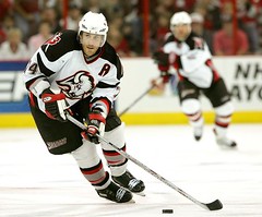
Just when you’re thinking the world begins and ends with baseball, along comes a note from reader Mike Shanahan, who’s picked up on a hockey-related factoid. To wit: “The OLN broadcast crew had a close-up of Jay McKee’s skates during Tuesday night’s Sabres/Hurricanes game. They showed how he wears some kind of padding over his top laces and ankle. I don’t know what they said about it on TV, because I muted it in favor of Rick Jeanneret’s far superior radio call, but a friend told me they were speculating that he used them to reduce the sting of blocking so many shots. Looks like his teammate Toni Lydman wears something similar [here are the two of them together], but only on his right skate. I don’t know of anyone else wearing these pads, although Chris Pronger seems to have something fishy on the front of his skates.” Anyone know what these pads are, or who makes them?
Metscetera: Very promising developments in Flushing, where the Mets have been resplendent in their blue caps and blue sleeves for two consecutive games (Sunday and Tuesday), both of which were played on cool, brisk evenings. The significance there is that aesthetically challenged equipment manager Charlie Samuels, who has ruinously been entrusted with the task of deciding what the team wears each day, has previously said that he thinks the blue cap clashes with the club’s black dugout jacket, and has therefore idiotically refused to break out the blue gear except on very warm afternoons when he expects nobody to wear a jacket. The fact that the team’s worn blue on consecutive jacket-friendly evenings suggests that Samuels might finally be getting a clue, and not a moment too soon.
New ESPN column tomorrow, but I’ll still have a little something here as well.
Couldn’t agree more. The addition of black across sports, except with teams where it’s featured (i.e. the Raiders), has been particularly annoying. If you’re going to use a third uniform, keep it within the team’s regular colors, like the Braves or Nationals Sunday wear.
The Mets look great in the light blue, reminds me of Nails Dykstra.
I also agree. Another option I like is having an alternate uniform that is completely different from the primary color/logo scheme, like some hockey teams do (Edmonton Oilers, Anaheim Ducks, New York Rangers – it’s a different shade of blue and silver is added on the third uniforms).
The blue sleeve, blue hats combo looks great. They are still wearing the black belts. Do they have blue belt to go with the rest of the uni ?
I am also happy to see them wear the regular home uni more often
Actually, they do have a blue belt, which they’re supposed to wear when using the blue caps/sleeves/sox. But I guess Charlie Samuels couldn’t be bothered to break those out of storage, so everyone was wearing the black belts instead. Of course, several of the Mets (Reyes, Sanchez, Julio) wear their jerseys so loose and blousey that you can’t even see their belts anyway.
Amen. The Mets should ONLY wear their blue caps at Shea with either the white or pinstriped uniforms. I can even deal with the all-black cap with the black jersey, but perhaps Mr. Samuels could try something radical and pair the blue cap with the black jersey. I think that would look good.
During the Yankee series, SNY showed some footage of the first Met-Yankee game in 1997, in which the Mets wore their all-time greatest uniform: the grey jersey with the arched Tiffany-font “NEW YORK,” without the black drop-shadow, and the blue cap. I miss this uniform so, so much.
The black cap with the blue bill and blue NY logo with orange outline has to go, period. The black drop-shadow on the uniform lettering has to go. Hopefully the team will come to its senses when (or before) it moves into the new ballpark.
I couldn’t agree more with everyone’s pro-Blue anti-Black Mets opinions. I find it hard to believe that they have blue belts, though. Typically, the team belt color matches the team’s shoe color and I don’t know of any team that wears two different colors of shoes. Therefore, I would say they only have a black belt as opposed to a blue belt/shoe combo, similar to my Royals (who I wish, along w/ the Mets, would return to their blue belts/shoes days of the 80’s-mid 90’s).
Sorry everybody, I love the all blue too, but I actually like the Mets black hat, and I really like the black hat with the blue bill. I just think it looks good. It’s the black shirts that really are horrible, especially the road one with the arched New York. It’s looks a little too NASCAR to me.
Hockey? Did someone say “hockey”?
Dad, what’s a hockey?
The Amazins have had bad uni’s for years, and it’s a darn shame. The history of their colors (NY Giants orange and Brooklyn Dodger blue) gives them a chance to have some sweeeet unis.
PLEASE!!! Drop the black and go a little retro. Tip the cap to the Polo Grounds and Ebbetts Field. C’mon, Mets.
It’s been heaven seeing the Amazin’s in the traditional (well, as close as these times allow) garb. I’m not crazy of the Good Humor unis–but anything is better than the black tops.
BTW, someone throws out that this looks reminds them of Nails Dykstra– i’d add that it reminds me more of Felix Millan and Eddie Kranepool.
Cheers Paul.. Great stuff as per Usual.
I was there at Shea last night (just not for the entire 16 innings) and inevitably thought of you, Paul. The Mets clean orange and blue identity is attractive, proprietary, and unique in baseball. Five uniform combinations is beyond ridiculous and dilutes the power of the Mets brand, just now re-emerging after years of slumber.
They should re-attach the orange and blue corregated squares on Shea, too.
For those wondering what the “orange and blue corrugated squares” were, you can sort of get a view of them link.
As it happens, I wrote something about the panels several years ago. Scroll down to the “Metro Retro” section of link link.
Mark me down for another one who longs for the blue cap & pinstriped home uni of the Mets. It’s always a treat when they break that combo out. Hopefully it will be in the rotation a little more.
“Mets management decided that they should be blue and orange, which are the team’s colors. And the city agreed, because those are also the city’s official colors. Not many people realize that.”
I can tell you that every Yankee fan I know will soon be made aware of it!
Now, if someone can talk to Charlie Samuels…
I don’t think anyone should be mentioning Dykstra in conversation about aesthetics. The guy forever scarred my uni-nerd youth by wearing a YELLOW undershirt when he was with the Phillies. He should not be forgiven. What is it with lead-off men and horrid undershirts? Seen Juan Pierre’s cammo?
Those pads on the skates are indeed to protect from broken feet from blocking shots. They have been in the NHL for several years now. I’m not sure who makes them though.
From what I saw watching the Sabres/Hurricanes game, the close-up on his skates showed not padding, but hard plastic guards that reminded me of the neck guards that the goalies wear. I also missed almost all os the conversation. The only bit I heard was the announcers trying to figure out why more players don’t wear them.
Mets are wearing the blue hats again tonight (Wednesday), with the all-whites again.
This is good.
Just got home from Shea; happy to report on unprecedented 3rd-straight game featuring blue caps, 3rd straight NIGHT game no less, not to mention VERY nice win. Let us hope Mr. Lukas is correct re: Mr. Samuels’ acquisition of said clue.
TRUE METS = BLUE METS.
Even though I know that no one cares about hockey, I’ll throw this out there anyway: why have the Mighty Ducks been wearing their third jerseys during the playoffs? I acknowledge the possibility that they have been using that all year, and that with them being a west coast NHL team, that I may have missed that jersey being established as the normal dark jersey. But it seems odd to me that they would use these jerseys, which say “Mighty Ducks of Anaheim”, when they are changing the team’s name next year to simply, the “Anaheim Ducks”. Anyone have any ideas?
I was complimenting the Mets on wearing the home whites with pinstripes. Which I think it much less common than the home all whites. The pinstripes are listed as their official home jersey.
Am I the only person who thinks it is a little strange to allow an equipment manager to choose what the players will be wearing that day? A lot of teams allow the starting pitcher to chose the uni for the day, i.e. the Cubs. I think this is a good idea except that Carlos Zambrano of the Cubs ALWAYS chooses the blue jersey when he pitches. Dreadful.
As for the Ducks’ jerseys, I imagine they are trying to get away from the dreadful Mighty Ducks symbol with which the movie and owner at the time Disney stuck them. Has there ever been another team whose nickname was determined by a movie? I know the Toronto Raptors were probably chosen because of the popularity of Jurassic Park, but any other examples?
The “things” on McKee’s (and others’) skates are called “ankle guards”, and they are something that are rarely worn anymore, with the advent of more protective shin guards. They used to be made of laether with hard plastic inserts, and buckled over the outside of the skate boot. These modern versions look much sleeker and less clunky, and probably stay on better, thanks to neoprene, spandex, velcro, and the like.
Way back in the old days, many defenseman wore them, specifically because of blocked shots hitting the tender ankle between the shin pad and skate boot, which were just leather back then. I owned a pair, being a d-man who liked to block shots.
These days, the shin pads are slimmer, so they can protect further down, and the skate boots usually have some padding themselves. This makes the ankle guard mostly obsolete, sadly…
Maybe the advent of composite sticks, and the bigger offensive zone, reulsting in more 100-mph slap shots, have neccesitated them coming back in vogue?
As for Pronger’s skate thing, it looks like something to protect the top of his feet for blocking shots like the guys on OLN were speculating. Skates are getting lighter so players can skate faster, but the trade-off is less padding. Pronger goes down to block shots a lot, and a good slapper to the foot can end a season.
I know that the Texas Rangers as recently as last year allowed the starting pitcher to pick the jersey for the team to wear each game (and probably still do). The Astros, like a few other teams have done since alternative jerseys came into vogue in the early 1990s, have fairly strict guidelines for each of their 5 uniform combinations. Pinstripes with black hats for Home nigth games, white unis with red hats for Home day games, Red ‘Astros’ jerseys for Home Sunday, Red ‘Houston’ jerseys for Away Sunday, and Road ‘Houston’ grays for every other away game. Since they switched to their current uniforms in 2000 (and then altered them a little in 2001 by changing their Sunday uniforms from Black to Red and their day Home uniforms from a red Star on the front to a red ‘Astros’ across the front) I have seen very few examples where these guidelines were not followed.
100% agreement that black trim/shadow uniforms are abominable….Mets, Reds, Royals have ruined their images with these ill-advised designs
Actually, Dr. Rick the Royals got rid of the black trim/shadow on their uniforms this past offseason. Also, as reported in Uni Watch awhile back, the Reds are losing the black trim from their color scheme starting next year in favor of a shade of blue. Now, if only the Mets will rid themselves of the black forever, we could all rest easy.
Yup, those things the hockey players are wearing are indeed ankle guards; anyone who has played can attest to the fact that taking a slapshot off the ankle is probably the most painful thing that can happen to you when playing (aside from illegal moves, like cross-checks to the neck, etc.). It is unbelieveable…which is why I used to wear a pair of old leather ones. Even the new skates of “nowadays” can’t truly protect someone from taking a slapper off the ankle and NOT having it hurt.
I am on a mission to rid the Mets of all of the black in their uniforms. What is worse than the black uniforms themselves is the black shadowing that has ruined the pinstripes and gray uni’s. I e-mail the Mets every so often, but have yet to get a response. Let’s start a petition to get this fixed immediately.
It was great to see the Mets clinch last night! Too bad it was in those horrible black rags!! Charlie Samuels…..its a clinching game!!! Bring out the traditional uniforms!!!!!!!!!!!!!!!