By Jeremy Brahm
Professional baseball in Taiwan is similar to that of Japan and Korea in that teams are owned/sponsored by a corporation. Taiwan has only had professional baseball since 1990 with the creation of the Chinese Professional Baseball League (CPBL). The league started with four teams, then expanded to six in 1993 and then seven in 1997. But a second league came into existence in 1997 called the Taiwan Major League (TML) with four teams. After six seasons, the TML called an end to its war and merged with the CPBL to form a six team league, and after last season the CPBL has become a four team league.
In part one, I will look at the first decade’s (1990-1999) worth of uniforms from both the CPBL and TML, with the teams listed in alphabetical order with CPBL first.
The Brother Elephants are based Taipei and are one of the original teams of CPBL. Brother is actually a hotel and they are known for their yellow uniforms with black lettering and a cap logo that looks like an exploding flower. Kind of like the Pittsburgh Pirates from the “We are Family” Years. Actually this picture is a little unique because they have Elephants in script on their uniform. More often than not over the years Brother has had their name in pictographs. Sometimes the team would adopt black pants for their road uniform, but I cannot find any pictures of this in the 1990s, other than from this video game picture.
The China Times Eagles were based in Pingtung and played from 1993-1997. The Eagles were distinct because of their red pinstripes on a white uniform with black raglan sleeves. China Times was written in red pictograph lettering. Sometimes they would wear black pants for road games. Also they would wear a helmet with a black brim instead of a red brim from time to time. Supposedly they wore an all black uniform with Eagles in a white script, but I cannot figure the date for this.
The China Trust Whales were an expansion team in 1997 and were based in Taipei. The Whales had two distinct uniforms for their team. Their home uniform was white with dark green raglan sleeves and had a green cap/helmet with brackets, which was China Trust’s corporate logo. For their road uniform was a blue with white pictograph lettering with China Trust across the chest. Also the helmet was changed to blue with white brackets.
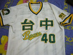
The Jungo Bears were an expansion team in 1993 and based in Taichung. The Jungo Bears are not related to the LaNew Bears, because the Jungo Bears became the Sinon Bears in 1996, before they then became the Sinon Bulls. The Jungo Bears had a green and yellow color scheme. Their original home uniform was white with green pictograph letters saying Taichung with green lettering and yellow outlines. There was a Bears script in yellow with light green outlines on the bottom right and numbers of the left below Taichung. It also had green and yellow collar and sleeve stripes. In this shot it appears that they had green yoke stripes, but not on the previous picture. The road uniform was green with yellow stripes on the collar and sleeves with Jungo in pictographs in yellow. The Bears script was in white and the numbers in yellow. The cap/helmet was green with yellow brim and lighter shade of green for the T (Tai) and small C (Chung) which was to the right corner of the T.
In 1995 the home uniform had Jungo in green with a yellow outline on the left side vertically with a green yoke stripe. By shifting Jungo vertically, the numbers were moved to the right side of the uniform. The road uniform changed from green to a two-tone grey uniform. The Bears also had an alternate uniform that had Bears in script across the chest. The Bears were acquired by Sinon Corp. after the 1995 season and became the Sinon Bears with this cap and logo are the only things that I can find online about this team that lasted 6 months before becoming the Sinon Bulls (CPBL) in June 1996 and they are still based in Taichung. The Bulls kept the green and yellow color scheme of the Jungo Bears, but added red to their colors.
For the 1996 season, the Bulls had a white base with green pinstripes on their tops and pants. Their tops had green raglan sleeves with yellow and red sleeve stripes and a red outlined yoke. Their caps were green with yellow brims and a red S that was outlined in yellow. Sinon was written in pictographs vertically, just like Jungo had been in their last uniform. Their road uniform was, well, atrocious — yellow base top with green pinstripes, green raglan sleeves with red numbers and lettering. Put them with white pants and green pinstripes. Even the bright Oakland A’s of the 1970s would say this was tacky. I even forgot to mention the yellow and red belt and pant leg stripes. They even added green pants as an alternate to their road uniforms, why!!!! My retinas still hurt from looking at this.
Thankfully in 1997, Sinon came to their senses and toned down the color. Their road uniform had green tops with grey pants. The tops had Sinon in yellow script with red outlines and a grey striped yoke. Their caps were grey or white with green brims and a red S that match the chest, it may have a yellow outline, but it is very difficult to see. The home uniform (lower left corner) was had white or grey tops and pants and had Sinon in red. This is the only shot that I can find of this uniform.
For 1998, Sinon added Taichung in pictographs vertically to the left side of their chest in red. They also added the Sinon Corp. logo to the right side of the uniform, or as I like to call it, the Alien Head.
Their road uniform changed to have Sinon written in pictographs in yellow with red outlines. And finally instead of sticking with the same uniform for a year, the Bulls went to grey road uniform with Sinon in script and moved the Alien Head to the left side. Check out the font for the number on the back. It is great that they keep flipping back and forth like an English Premier League team, got to keep the dough rolling in on the uniforms.
The Mercuries Tigers (CPBL) were based in Taipei and one of the original franchises in the league and expired after the 1999 season. The Tigers started with white, blue and yellow as their color scheme. Here is their road uniform, blue base with yellow and black sleeve and collar stripes and Mercuries written in white pictographs with yellow outlines. The pants had yellow and black stripes. Their home uniform was white with black pinstripes and Tigers in block letters with yellow outlines. Do you also see the left handed catching Tiger? They must have flipped the logo. Their cap for both home and road was an interlocking M (Mercuries) and a fanned T (Tigers). At a distance, it looks like an elephant. In 1992, the Tigers dropped this cap logo and went with a singular white M. As you can see they went with white pants for their road uniform and at home they dropped the pinstripes and put Mercuries in pictographs.
In 1994 the Tigers shifted to a light blue, red and green scheme, similar to the Seibu Lions. The home uniform was white with light blue pictographs. While the road uniform was blue with white pictographs. The cap was a Tiger’s head, but the batting helmet was an interlocking white M and green T, very odd design. In 1996 the Tigers changed their logo and their uniforms. Their home uniform became a light blue pinstripe with the Tigers script and their cap became a white T on top of a yellow M. The road uniform (lower right corner) kept the blue, red, green and added the new cap. In 1998, the Tigers dropped the stripes on the home uniform, added a blue Yoke and blue pants. The road uniform was also blue with Mercuries in white pictographs, a white yoke and pant leg stripe.
The Uni President Lions is one of the original franchises of the CPBL and are based in Tainan. The Lions have always had a white, orange and green color scheme. Their home uniform was white with green pictograph lettering. Check out the numbers, some are orange, while others are green, weird. The Lions had a curved white panel on an orange cap/helmet. Their road uniform had green tops with orange pictograph lettering with white outlines and white pants.
In 1991 the road uniforms changed to all white pictographs and the home uniforms went to green pinstripes with orange pictographs and numbers. The Lions kept this look until 1998, when they made a change to the 1980s beach blanket “White Sox design” with their home uniform. They kept their same road uniform.
The Wai Chuan Dragons were an original member of CPBL and based in Taipei. The Dragons played through the 1999 season. They had a red and white color scheme. Their first road uniform was red with white pants, white logo on the chest and lettering with black outlines. Thick red pant leg stripes. While their home uniform was white with red pinstripes, red logo and red script. Their caps for home and road were red with a white W, while their batting helmets were red with 5 circles, forming a W that matched the logo on the chest.
In 1992 the Dragons changed their road uniform to a grey top and pants, but kept everything else the same. The caps now had a serif W. In 1994, the road uniforms added red (black?) pinstripes and white outlines.
In 1995 they decided to put Dragons in a white script on a red top with white pants. It looks very similar to the Chunichi Dragons in Japan. The home uniform put Wai Chuan across the chest in pictographs in red. In 1999, the road uniform would also add Wai Chuan in pictographs across the chest in white. This picture is from their championship celebration, but sadly the team was disbanded after the championship.
The Chianan Luka (Braves) had a green and yellow color scheme. Their home uniforms had a white base with yellow raglan sleeves, green axes from the collar to the edge of the sleeves, green yoke and Luka written in English in green with yellow outlines. The caps/helmets were black with yellow bills and Luka in green with yellow outlines. The road uniform had a green base, with Luka in pictographs in green with yellow outlines, yellow axes, yellow yoke and white pants. The Braves also came out with a purple alternate with green pictographs with yellow outlines.
The Kaoping Fala (Lightning or Thunder) was based Kaohsiung and Pingtung. Their color scheme was purple and yellow. Their road uniform was yellow with Fala in light yellow pictographs with purple outlines. It also had purple raglan sleeves with white outlines and yellow and white sleeve stripes. Their home uniform was white with yellow raglan sleeves with purple outlines. Fala was written in English in yellow with purple outlines. The batting helmet had yellow lightning bolt on a purple base. Their cap was purple with yellow letters with a white outline.
The Taichung Agan (Robots) had a white, light blue and orange color scheme. Their home uniform was white with the Agan logo across the chest, light blue and orange raglan sleeves, and a black yoke. The road uniform was a light blue base had Agan in pictographs with black outlines, orange semi raglan sleeves and white pants with light blue and black pant leg stripes. The batting helmet was a two tone, light blue and dark blue. The cap was light blue with a dark blue brim with the Agan logo.
The Taipei Gida (Suns) had a red, yellow and black color scheme. Their home uniform had Gida in yellow with black outlines on a white base. There were red/yellow/red raglan sleeves. The road uniform had a red base with white pants with red, white and yellow pant leg stripes. The red/yellow/red raglan sleeves still in use. Gida was written in yellow pictographs on the chest with black outlines. The cap/helmet was red with a red brim and Gida in yellow with white outlines. However the helmet did have orange/red fire balls that matched the logo.